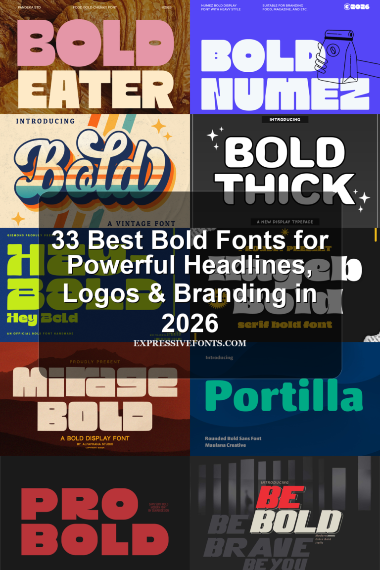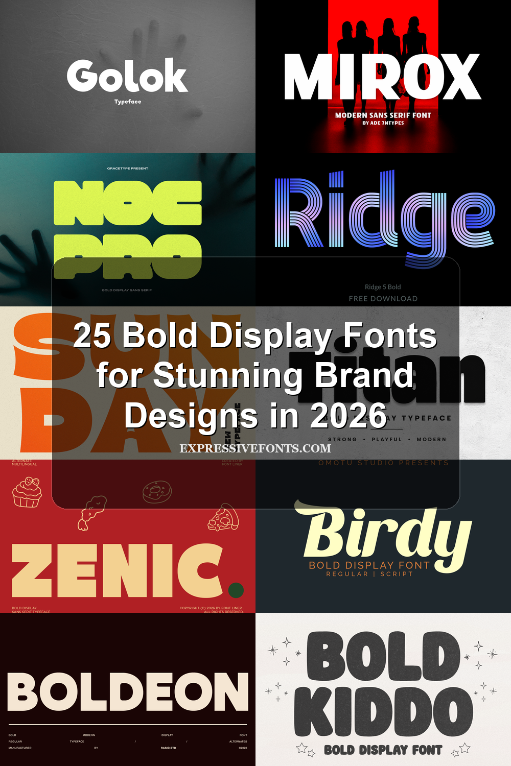
25 Bold Display Fonts for Stunning Brand Designs in 2026
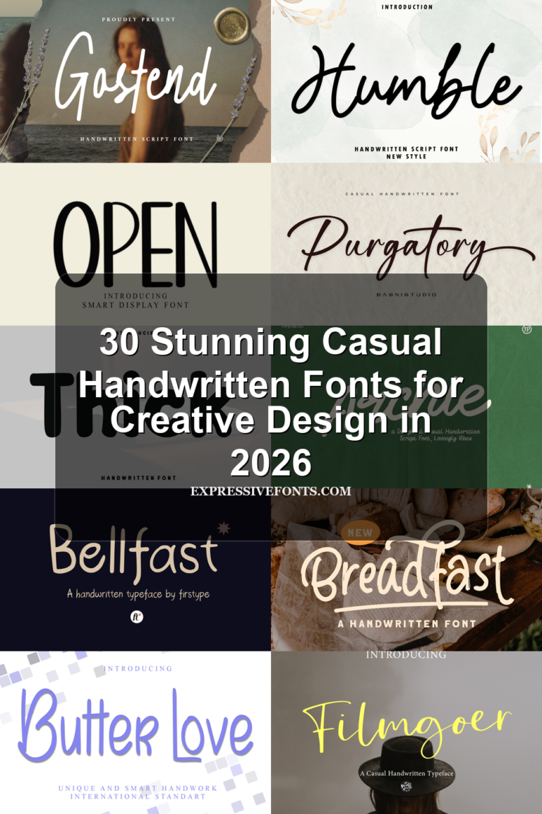
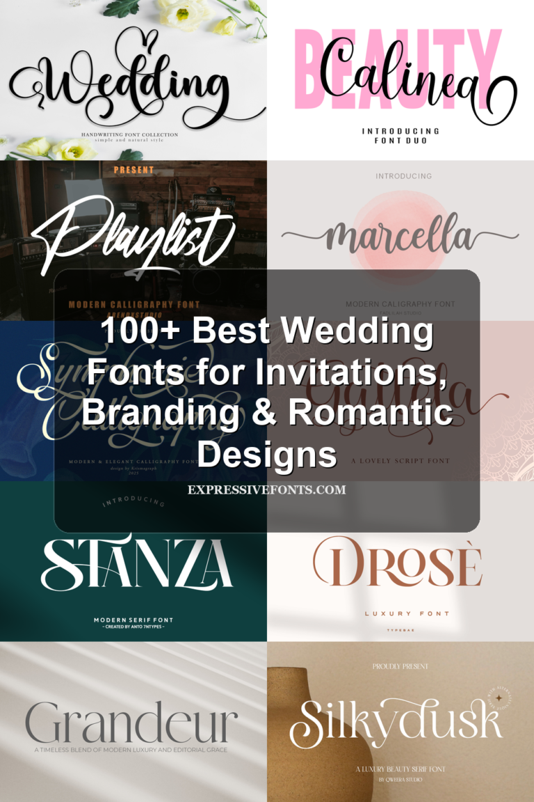
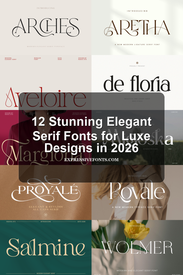
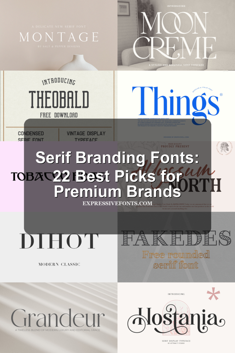
Bold Display Fonts help designers build louder titles, logos, posters, packaging, merch graphics, and social media visuals. This roundup is for anyone choosing heavy, high-impact type that needs to stand out fast without losing a clear visual direction.
Looking for more display fonts? Browse our complete Display Fonts collection to compare bold, retro, playful, poster, groovy, creative, vintage, cartoon, headline, and decorative display styles.
Vintage Slab & Serif Bold Display Fonts
These heavy serif and slab styles suit vintage labels, poster titles, packaging marks, and logos that need a bold old-school presence.
Rysel Font
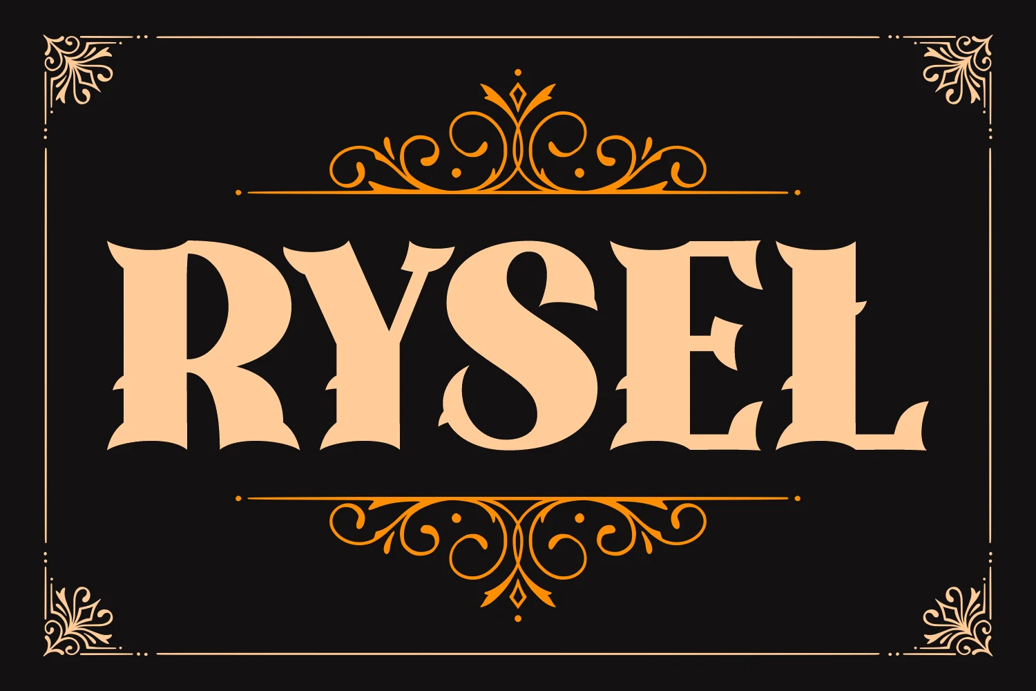
Best For: logos, posters, product labels, vintage designs
Rysel Font has the heavy presence of late 19th-century display lettering, with broad vertical stems, flared wedge serifs, and carved inner curves that keep the wordmark sharp rather than blocky. Its theatrical shape makes Bold Display Fonts feel especially suited to labels, poster titles, and vintage brand marks.
The letters carry enough detail to command attention, but the ornate cuts need clear spacing and strong contrast around them. Keep Rysel to short words or stacked headlines, where the dramatic serifs can define the hierarchy without fighting smaller supporting text.
Bonaro Family Font
Best For: posters, product labels, signage, vintage designs
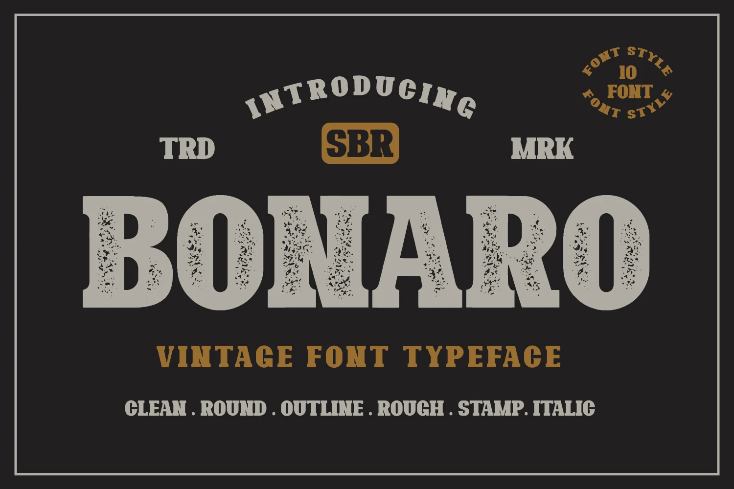
Bonaro Family Font uses a heavy slab-serif build with broad counters, squared stems, and blunt bracketed serifs that give the lettering a stamped antique weight. The distressed texture in the preview pushes it toward old shop signs, packaging marks, and poster typography, where Bold Display Fonts need impact before refinement.
The ten-style family is useful when a design needs one vintage voice with different levels of roughness, outline, stamp, or italic emphasis. Keep the spacing firm and the supporting type quieter; Bonaro works best as the main title layer, not as dense paragraph text.
Monteba Font
Best For: logos, posters, headlines, branding
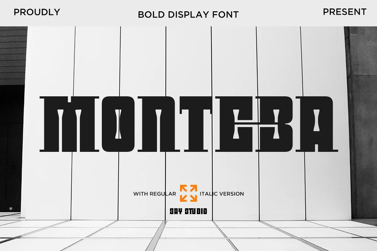
Monteba Font is built around massive slab-serif forms, with square shoulders, heavy horizontal stress, and narrow cut-in details that add a mechanical edge to the counters. It gives Bold Display Fonts a firm architectural tone, useful for titles that need force rather than ornament.
The dense weight reads best when the wordmark has enough width and clear contrast around it. Use Monteba for short headlines, poster names, or logo blocks, then balance it with cleaner secondary type so its thick serifs do not crowd the hierarchy.
Brianne Font
Best For: logos, posters, headlines, retro designs
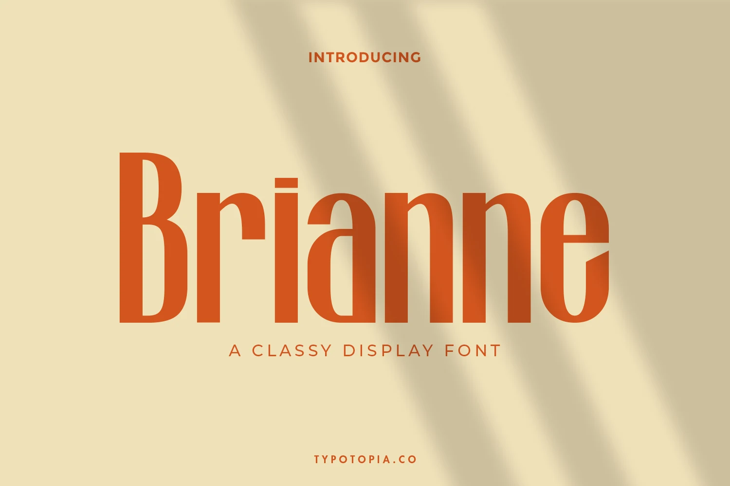
Brianne Font has a tall, condensed display shape with firm vertical stems, rounded bowls, and a retro serif-like rhythm that feels polished without becoming delicate. Its narrow proportions give Bold Display Fonts a cleaner editorial feel, suited to posters, logo titles, and classy promotional graphics.
The long letterforms create strong height in a layout, so Brianne works best when the wordmark has generous horizontal space and clear contrast. Use it for short names or headline lines, and keep supporting type smaller with wider tracking so the main title stays measured and readable.
Rounded & Playful Bold Display Fonts
These chunky rounded fonts work best for kids’ graphics, stickers, playful packaging, cheerful merch, and bold brand titles with a softer tone.
Zenic Font
Best For: logos, packaging, posters, fun designs
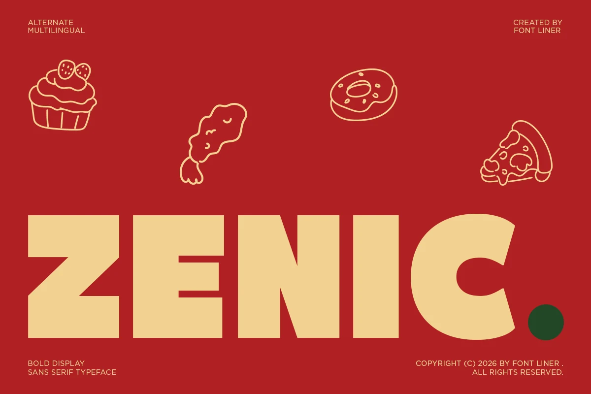
Zenic Font is a chunky display sans with thick block strokes, flat terminals, and a rounded C that softens the otherwise solid construction. The wide letterforms make Bold Display Fonts feel loud without becoming harsh, especially for food packaging, promo graphics, and playful brand marks.
Its clean shapes keep short headlines readable, but the weight needs open spacing and strong color contrast to avoid feeling crowded. Use Zenic as the primary wordmark or title layer, then let smaller supporting text stay lighter so the heavy forms hold the composition.
Garpit Font
Best For: logos, packaging, posters, playful designs
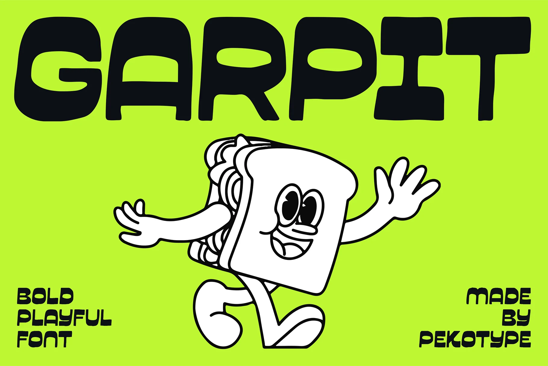
Garpit Font has a chunky all-caps build with swollen curves, tight inner counters, and reverse-contrast stress that gives each letter a rubbery, irregular rhythm. Its oversized shapes make Bold Display Fonts feel energetic and graphic rather than rigid.
The playful weight works best in short words, food branding, youth packaging, and loud promo titles where personality matters more than restraint. Keep the tracking slightly open and avoid busy textures behind it, because the small counters need clear negative space to stay readable.
Bold Kiddo Font
Best For: children’s designs, stickers, T-shirts, playful designs
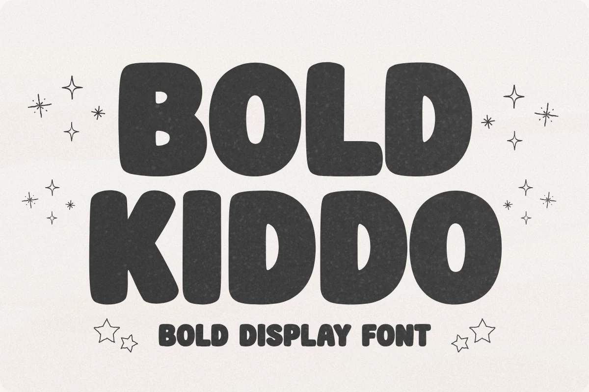
Bold Kiddo Font uses thick, rounded letterforms with soft corners, wide bowls, and slightly irregular proportions that keep the alphabet friendly rather than polished. Its chunky silhouette gives Bold Display Fonts a clear kids’ craft direction for birthday graphics, school projects, nursery pieces, and cheerful merch.
The broad shapes are useful for stickers, vinyl cuts, sublimation designs, and custom T-shirts because small fragile details are avoided. Keep the spacing open enough around tight pairs like KIDDO, and pair it with a simple supporting font so the rounded headline stays readable.
Titan Font
Best For: logos, packaging, posters, playful designs
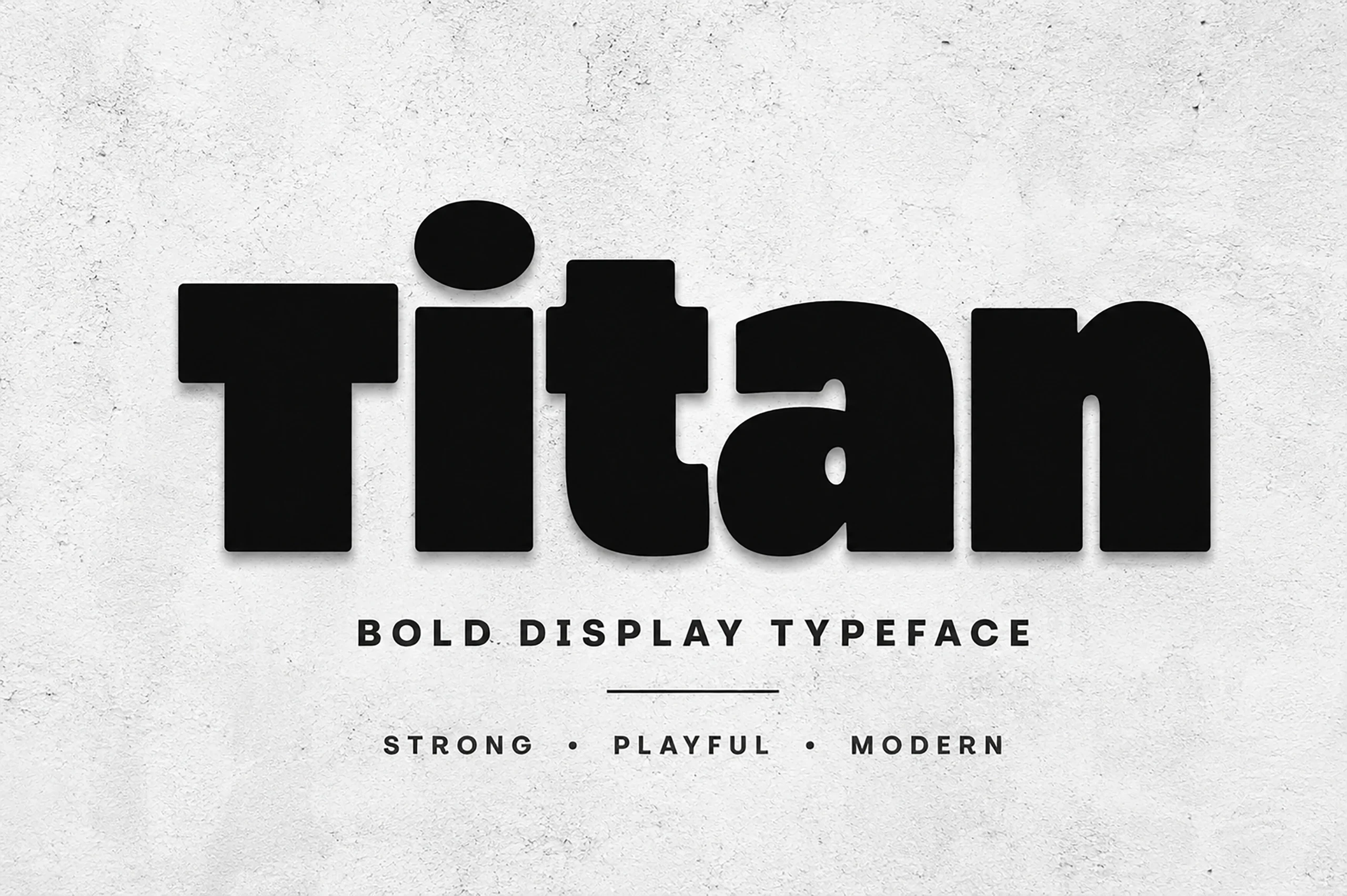
Titan Font has a dense, rounded display build with oversized lowercase forms, heavy vertical weight, and smooth corners that make the word feel solid but not severe. Its modern retro tone gives Bold Display Fonts a strong fit for packaging, streetwear-style graphics, posters, and logo marks with a playful edge.
The tight counters and thick stems need clear spacing, especially around compact letters like t and a. Use Titan for short headline blocks or single-word branding, then keep secondary text lighter and more open so the chunky main title keeps control of the layout.
Rose Titan Font
Best For: beauty branding, packaging, posters, feminine designs
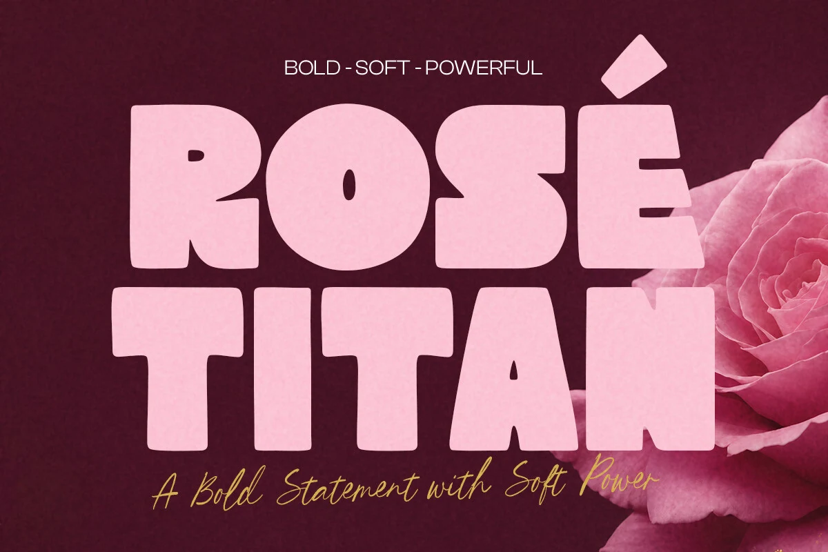
Rose Titan Font has a thick retro display shape with soft corners, rounded bowls, and tight internal cuts that make the letters feel powerful without turning harsh. Its smooth blocky structure gives Bold Display Fonts a softer beauty-branding angle for posters, packaging, and statement logo work.
The compact spacing and heavy curves work best when the headline is short and scaled up. Keep contrast high around the pink, rounded forms, and let lighter script or simple sans text handle supporting lines so Rose Titan stays dominant in the title hierarchy.
Golok Font
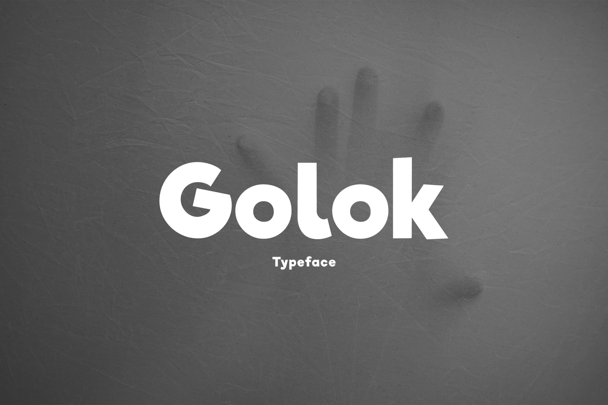
Best For: logos, headlines, posters, bold designs
Golok Font has a thick rounded build with heavy stems, soft circular counters, and a blunt angled cut through the uppercase-style G. Its compact word shape feels clean rather than decorative, giving Bold Display Fonts a more casual, logo-ready direction.
The dense strokes work best when the title has enough surrounding space and a clear background behind it. Keep tracking moderate, avoid squeezing long words, and let the rounded bowls carry the visual weight in poster headers, badges, product marks, and short brand names.
Sunday Font
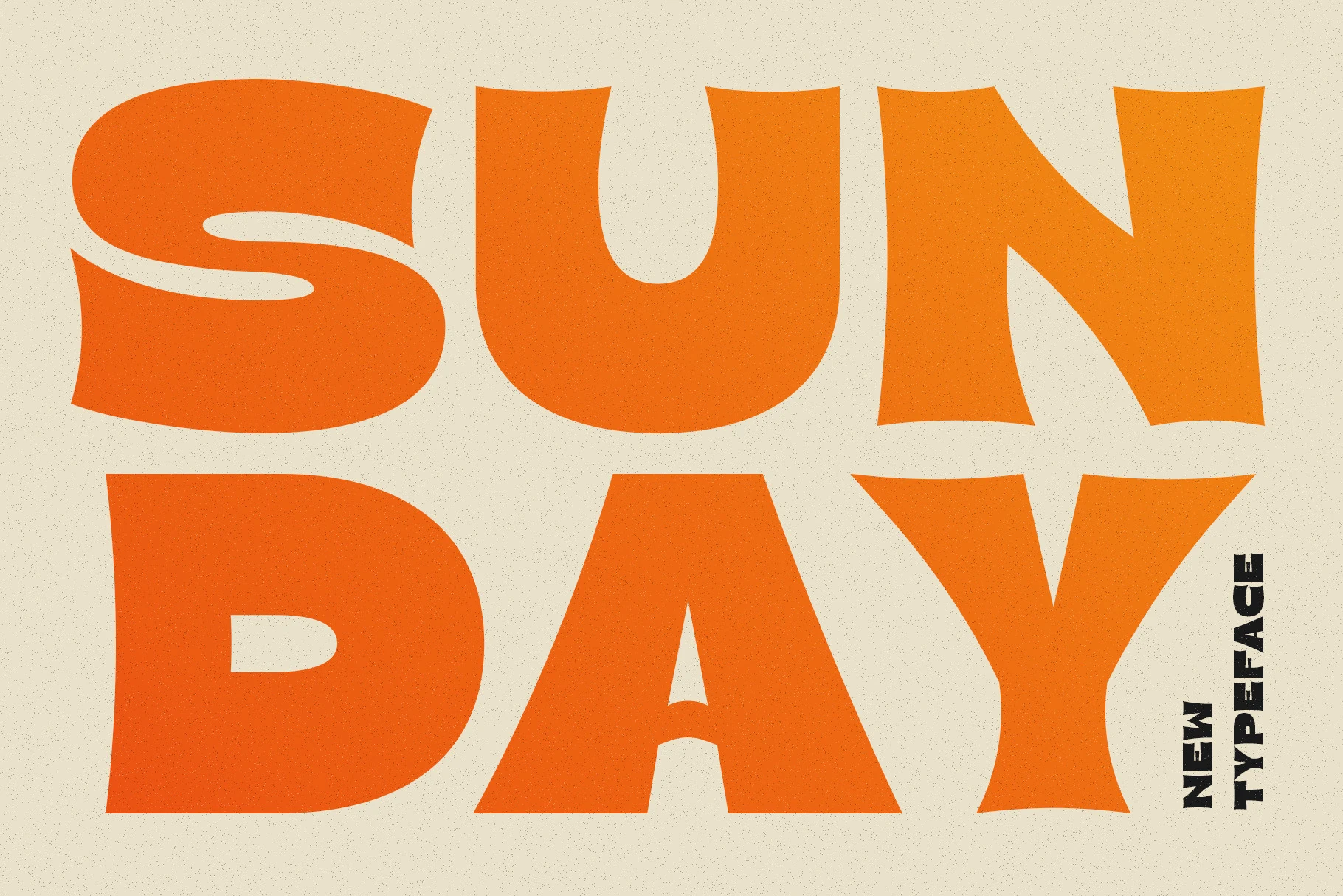
Best For: posters, headlines, merch design, retro designs
Sunday Font pushes Bold Display Fonts toward a loud retro poster style, with oversized rounded strokes, bulging curves, and wedge-like cuts that keep the letters from feeling too soft. The S has a sweeping inner channel, while the broad U, D, A, and Y create a dense, sunny block of type.
Use it for short words and compact headline stacks where the exaggerated proportions can become the main graphic element. Strong contrast and generous margins matter here; tight layouts can make the swollen forms feel cramped, while open space lets the playful weight read clearly.
Corva Bold Inside Font
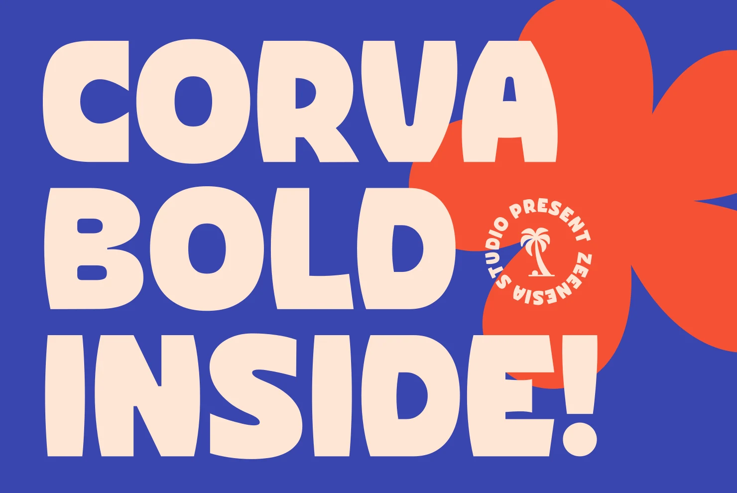
Best For: branding, packaging, posters, headlines
Corva Bold Inside Font has a chunky display build with soft inflated curves, wide counters, and subtly warped verticals that keep the letters from looking mechanical. Its oversized caps give Bold Display Fonts a playful, confident feel without relying on outlines or extra texture.
The font works well when the type becomes the main graphic shape in a poster, package front, or brand headline. Use short stacked phrases, keep the background contrast high, and avoid over-tight tracking; the rounded forms need enough separation to stay readable at full weight.
Retro World Font
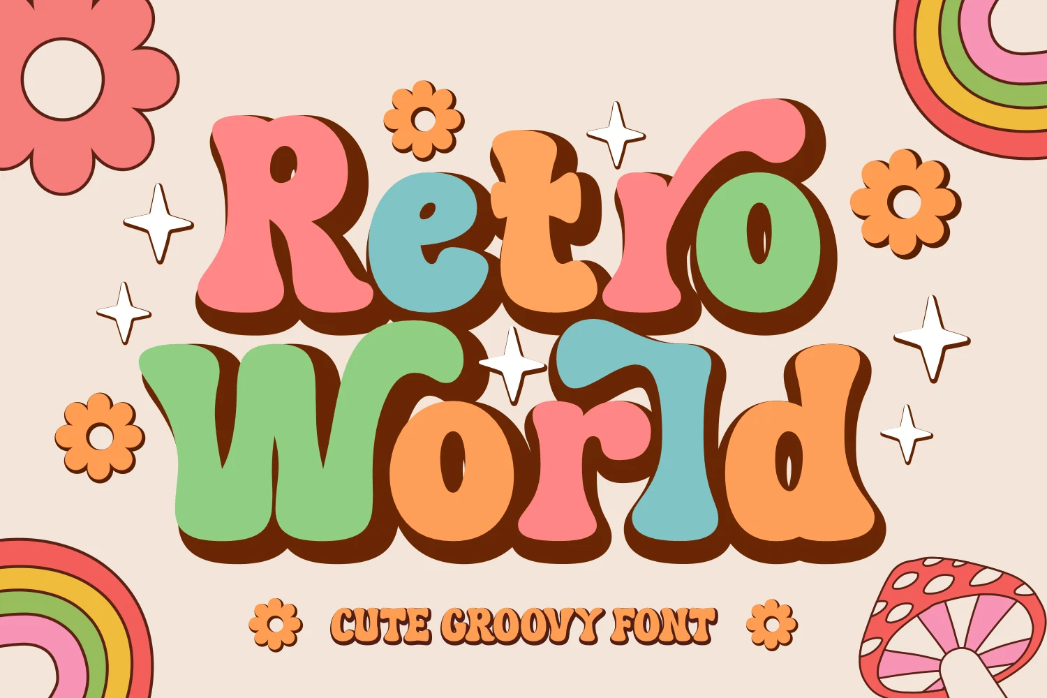
Best For: playful designs, retro designs, children’s designs, stickers
Retro World Font has a loose groovy build with swollen strokes, rounded slab-like ends, and playful uneven curves that make each letter feel hand-shaped. Its cheerful 1970s rhythm gives Bold Display Fonts a cute, nostalgic direction rather than a hard poster tone.
The letterforms are best kept large and short, especially when using multiple colors or shadow effects. Let the chunky shapes overlap the layout as the main illustration, but keep supporting text simpler so the bubbly curves stay readable in stickers, classroom graphics, party titles, and kids’ merchandise.
Slanted Sport & Motion Bold Display Fonts
These italic and motion-led styles are built for racing graphics, sports branding, energetic posters, food labels, and titles that need forward movement.
Birdy Font
Best For: logos, packaging, posters, headlines
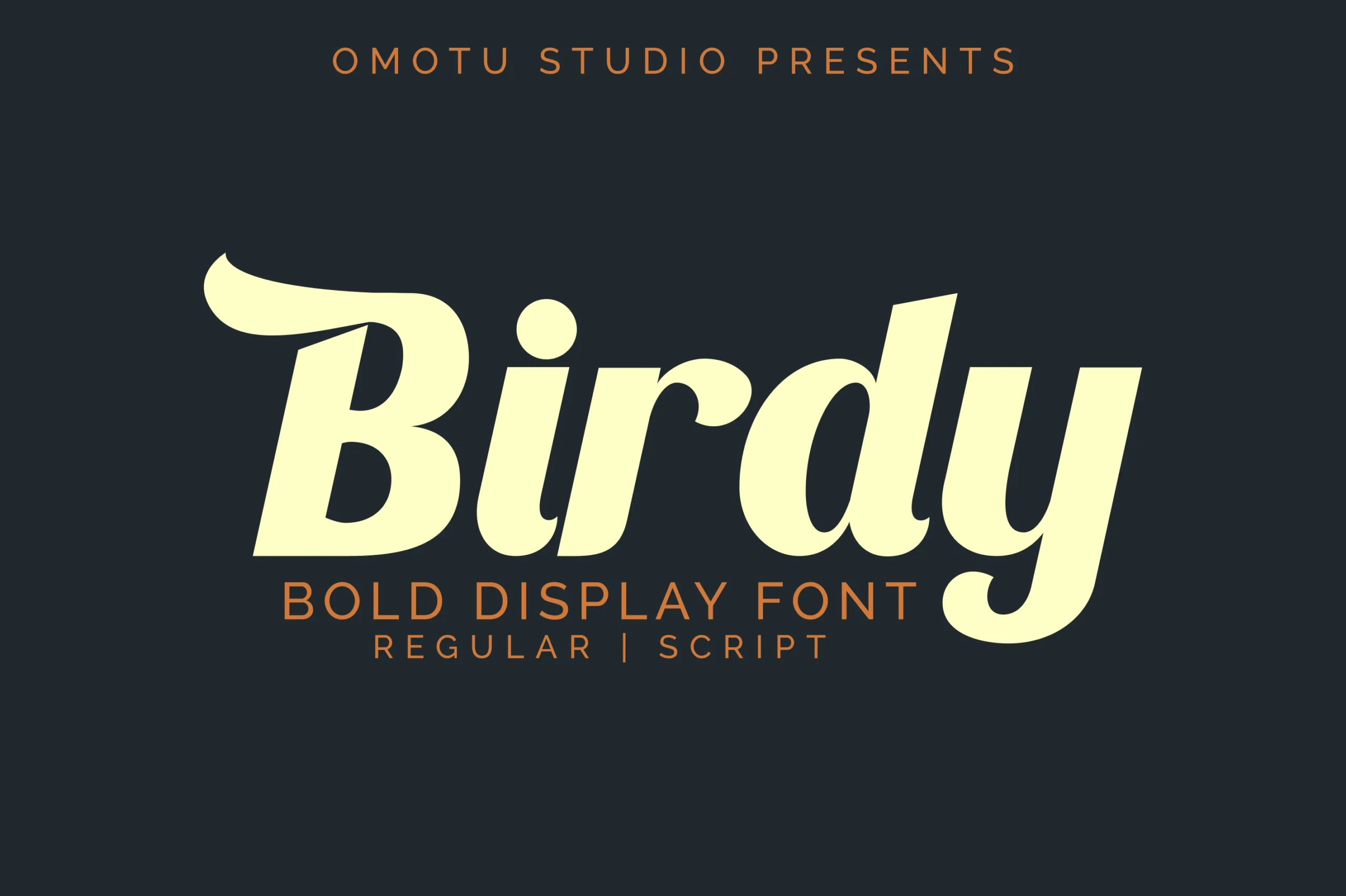
Birdy Font brings a heavy slanted display style with soft curves, thick rounded bowls, and a sweeping entry stroke on the capital B. The long descender on the y gives the wordmark a loose script rhythm, so Bold Display Fonts feel more fluid than rigid here.
The regular and script styles give designers room to separate a strong headline from a more expressive logo treatment. Keep Birdy in short titles with generous surrounding space; its thick joins and rounded counters need contrast and scale to stay clean.
Speed Font
Best For: logos, posters, headlines, eye-catching designs
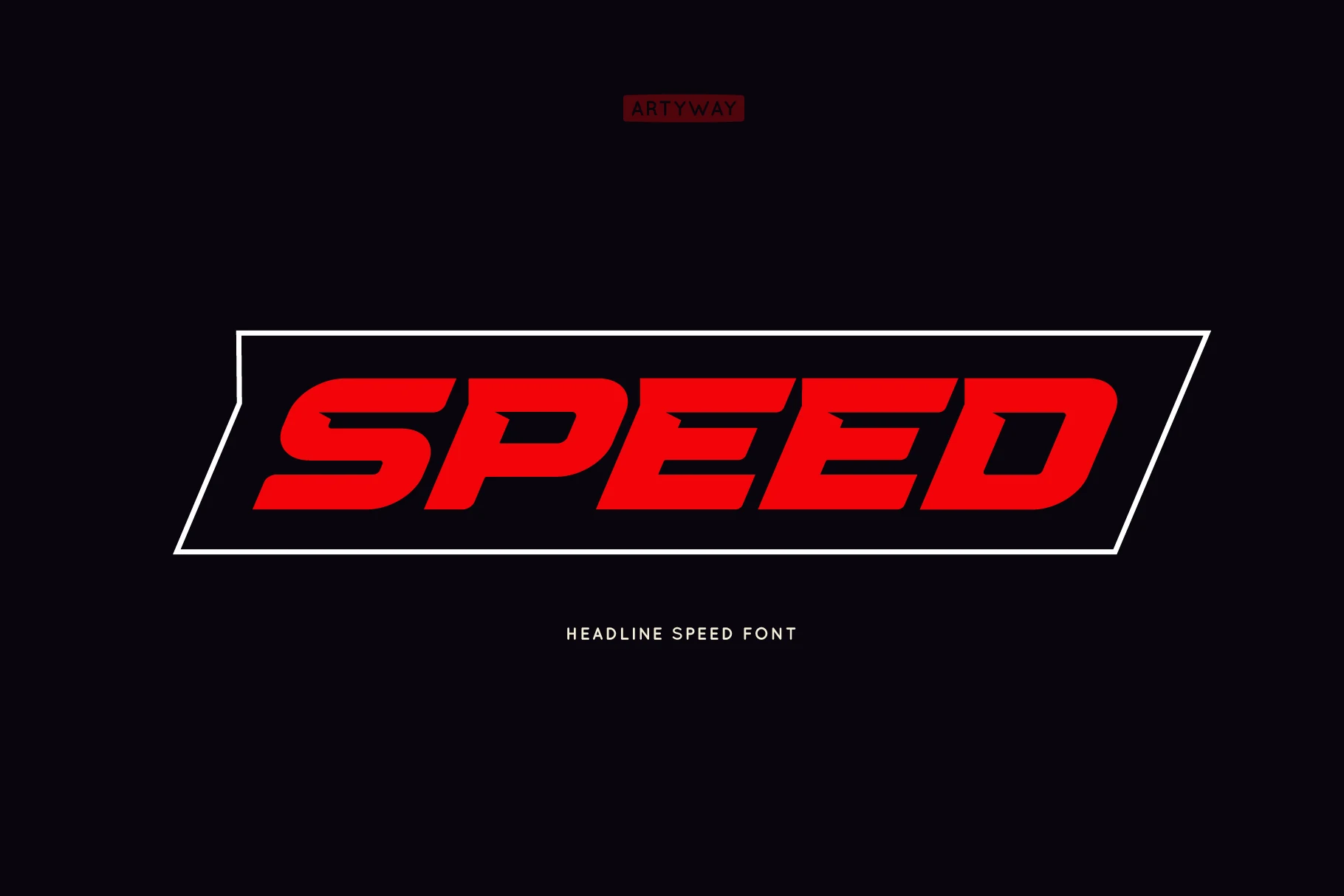
Speed Font uses a sharply slanted display structure with thick strokes, clipped joins, and angular cut-ins that suggest forward motion. Its compact, racing-inspired rhythm gives Bold Display Fonts a direct automotive feel for sports graphics, event posters, and high-impact logo work.
The letterforms stay readable because the counters are open enough despite the heavy weight, but the strong angle needs clean horizontal space around it. Use Speed for short names, monograms, or headline strips, where the italic force can lead the composition instead of competing with dense copy.
Forega Sport Font
Best For: logos, branding, posters, merch design
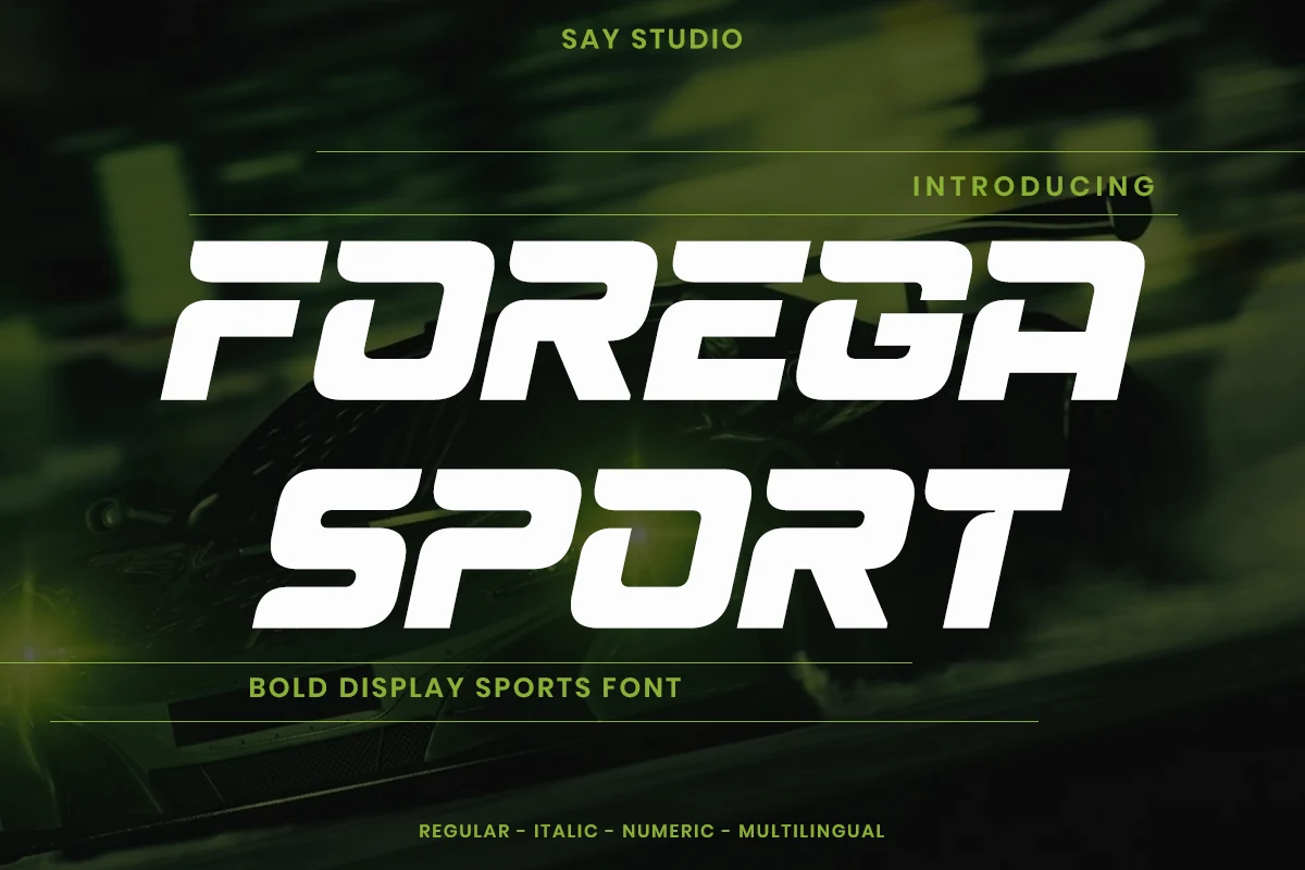
Forega Sport Font has a fast italic stance with wide squared letters, rounded corners, and sharp aerodynamic cuts through the strokes. Its racing-style construction gives Bold Display Fonts a strong competitive tone for team identities, motorsport graphics, athletic branding, and performance-led posters.
The letterforms are bold but still readable because the counters stay open and the cuts follow a consistent horizontal rhythm. Use Forega Sport across short names or stacked title lines, keeping contrast high and spacing controlled so the speed effect feels intentional rather than crowded.
Collins Butter Font
Best For: logos, branding, packaging, headlines
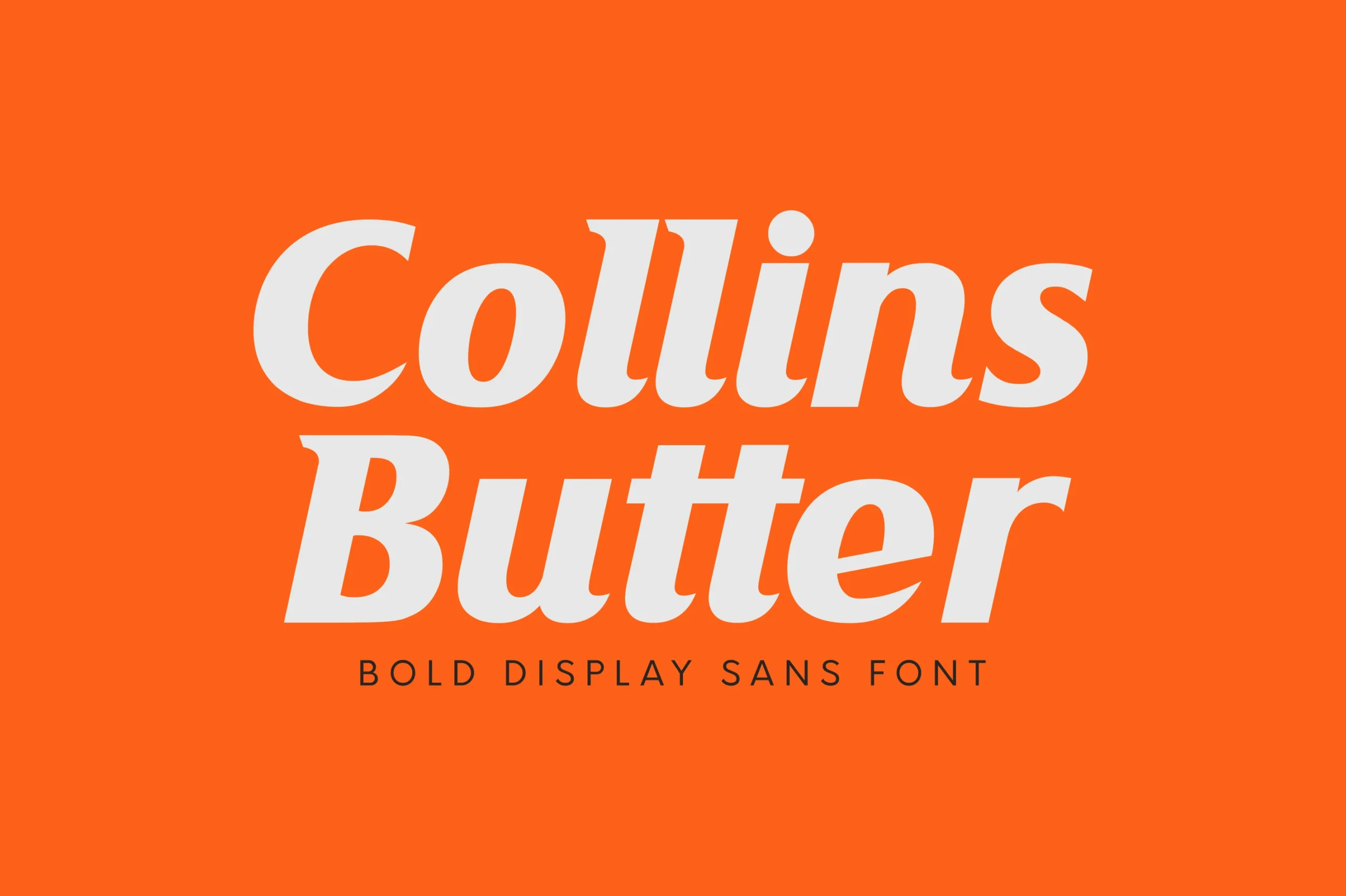
Collins Butter Font has a heavy italic stance with thick rounded strokes, soft wedge-like terminals, and compact counters that give each word a smooth forward push. It brings Bold Display Fonts into a more retro-commercial space, closer to a confident food label or punchy editorial masthead.
The solid and hollow styles give designers two levels of density for the same layout: filled for strong logos and headlines, hollow when the composition needs a lighter display layer. Keep spacing slightly open around the italic forms, especially in stacked packaging or poster typography where the broad curves can quickly dominate the page.
Geometric & Futuristic Bold Display Fonts
These dense geometric fonts suit sci-fi titles, streetwear marks, editorial posters, banners, and modern branding where structure matters more than ornament.
Ridge 5 Bold Font
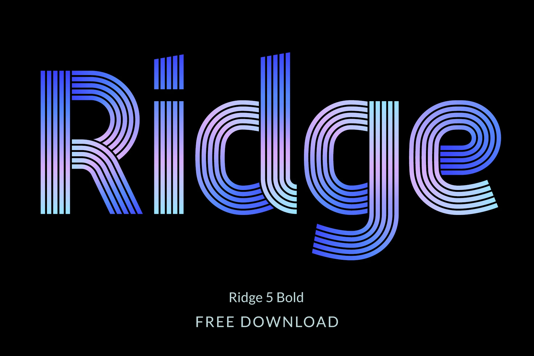
Best For: logos, posters, headlines, retro designs
Ridge 5 Bold Font uses a multi-line construction where each letter is built from parallel stripes, rounded bends, and clean geometric terminals. The effect gives Bold Display Fonts a futuristic retro rhythm, with enough structure for posters, album-style graphics, and logo titles that need an immediate graphic hook.
The lowercase set and European diacritics make it more useful than an uppercase-only novelty face, while alternate characters help adjust repeated shapes in tight compositions. Keep the background simple and the word length controlled, because the striped interiors need clear negative space to stay sharp.
Nocpro Font
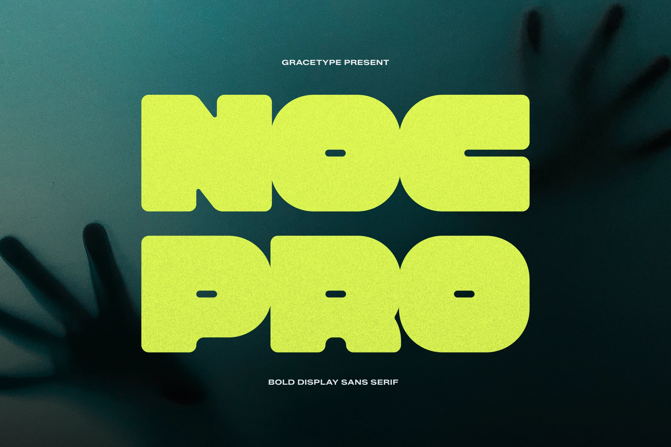
Best For: logos, posters, merch design, bold designs
Nocpro Font is built from ultra-thick block shapes with rounded outer corners, tiny horizontal apertures, and compressed negative spaces that make each word feel dense and futuristic. Its industrial weight gives Bold Display Fonts a severe, graphic tone for streetwear marks, sci-fi titles, event posters, and aggressive sports layouts.
The font works when the headline is allowed to dominate the frame, but the tight cuts need scale and clean contrast to stay legible. Keep word counts short, avoid narrow tracking, and let lighter supporting type handle details while Nocpro carries the main visual impact.
Mirox Font
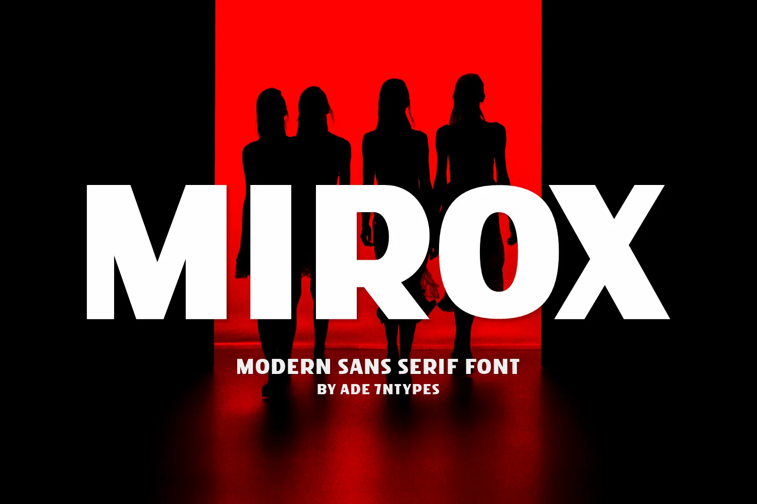
Best For: logos, posters, branding, headlines
Mirox Font uses a heavy modern sans structure with wide uppercase letters, clean vertical stems, and sharp diagonal cuts that make the wordmark feel direct and cinematic. Its massive white forms give Bold Display Fonts a strong editorial-poster presence, especially when the design needs a bold title over photography or high-contrast color.
The letter spacing can stay fairly tight because the counters are open and the shapes are simple, but Mirox still needs scale to carry its impact. Use it for short brand names, cover-style headlines, or campaign graphics, then keep smaller text compact and secondary so the main title stays dominant.
Boldeon Font
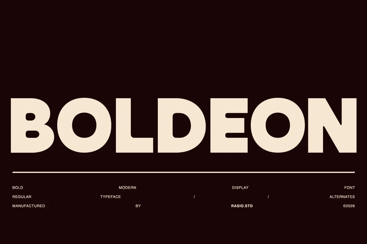
Best For: logos, posters, headlines, bold designs
Boldeon Font is built from broad geometric capitals with dense strokes, rounded bowls, squared terminals, and tight horizontal rhythm. It fits Bold Display Fonts where the headline needs a solid poster-like mass rather than decorative detail.
The compact counters and near-monoline weight make it strong for logos, packaging, and editorial openers, but it needs clear spacing around the wordmark so the heavy forms do not merge. The included alternates help vary a short title while keeping the same blocky voice.
Urban Block Font
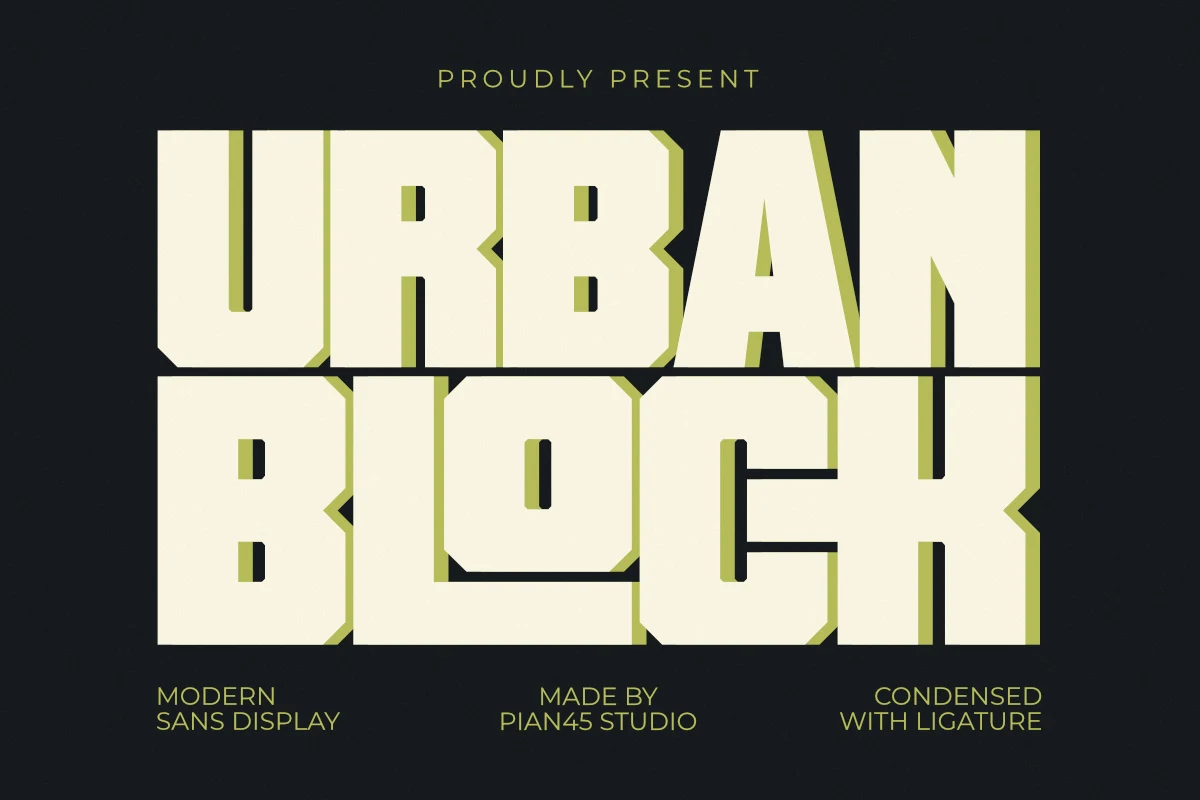
Best For: logos, merch design, posters, headlines
Urban Block Font uses an all-caps block sans structure with ultra-heavy strokes, tight spacing, chamfered corners, and narrow internal counters. Its stacked, concrete-like mass gives Bold Display Fonts a hard industrial tone suited to aggressive title systems.
The typeface works best when the words are short and the layout gives the edges room to stay legible. Use high contrast, avoid cramped side margins, and let the squared rhythm drive posters, sports-style marks, streetwear graphics, and merchandise headlines.
Turin Font
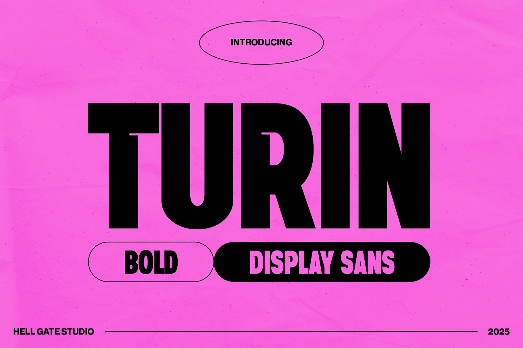
Best For: branding, posters, headlines, bold designs
Turin Font is a compressed black display sans with hard rectangular tops, narrow counters, and a deep curved cut inside the R. The letters lock into a tight vertical rhythm, making it a direct fit for Bold Display Fonts that need impact without decorative noise.
Use it where hierarchy matters: one large word, a sharp supporting label, and high contrast around the type. Its dense stroke width can close up in smaller settings, so keep tracking controlled but not squeezed, especially in posters, banners, and brand headlines.
Horror & Distorted Bold Display Fonts
These expressive horror styles are display-only choices for Halloween graphics, band merch, comic posters, seasonal titles, and designs that need unstable energy.
Spooky Friday Font
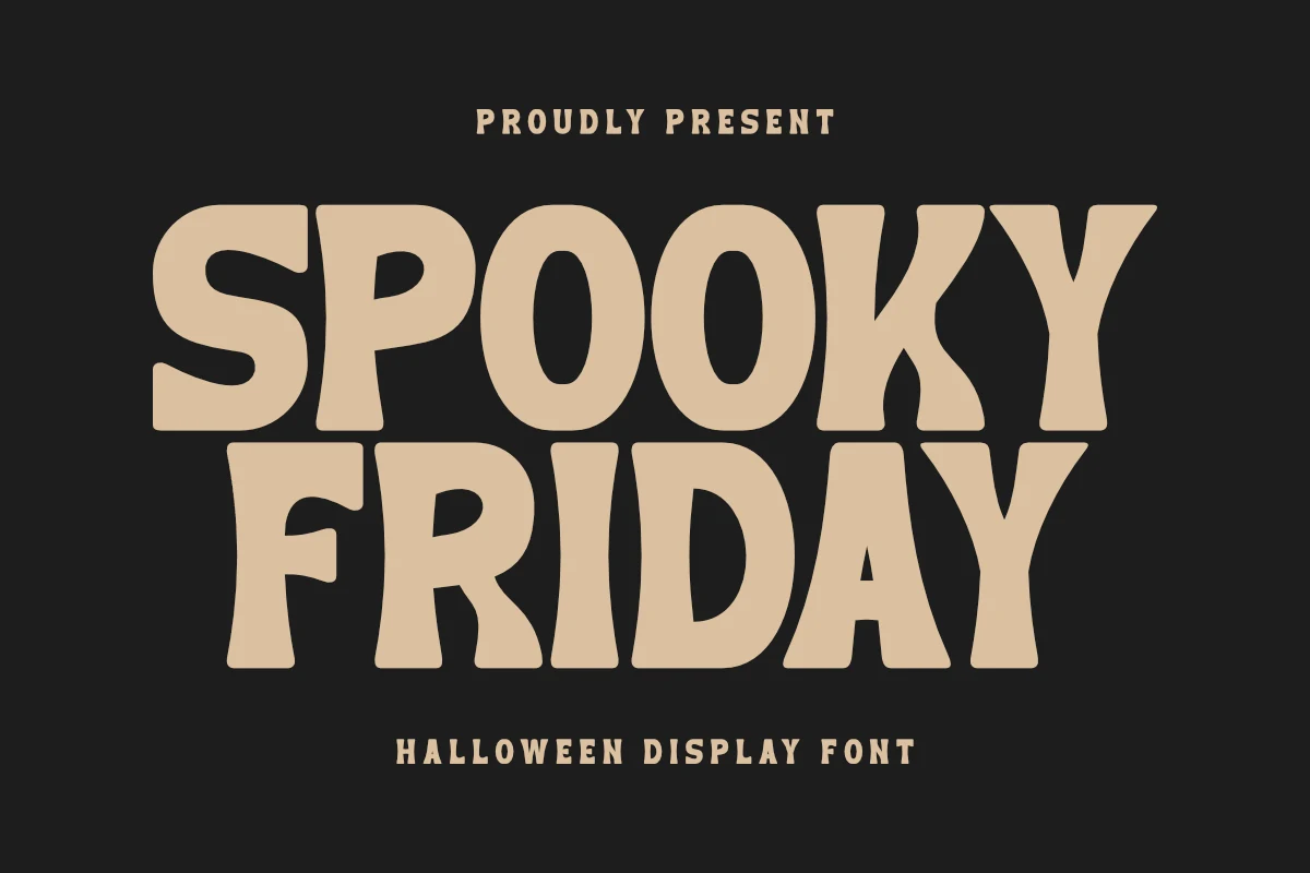
Best For: T-shirts, merch design, stickers, fun designs
Spooky Friday Font uses chunky rounded capitals with uneven horror-poster cuts, soft corners, and compact spacing. It sits on the playful side of Halloween lettering, but the warped verticals and heavy silhouettes give it enough bite for a Bold Display Fonts roundup.
The wide strokes suit T-shirt art, POD graphics, party titles, and cut-file designs where the word shape needs to read fast. Keep it to short phrases, use strong contrast behind the letters, and avoid adding busy texture around the outline; the irregular forms already provide the decorative movement.
Lazzleto Font
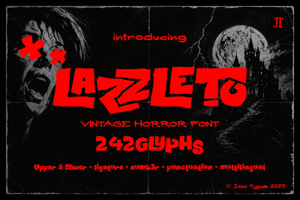
Best For: posters, merch design, display text, expressive designs
Lazzleto Font turns Bold Display Fonts toward vintage horror, with jagged handmade strokes, slashed diagonals, warped baselines, and uneven letter widths. The forms feel cut from a retro slasher poster rather than drawn from a clean sans grid, giving each word a loud, unstable rhythm.
Use it as a display-only face for horror titles, underground poster work, band-style merch, or comic-inspired graphics. Keep the wording short, scale it large, and pair it with plain supporting type; the distorted anatomy already supplies the motion, so extra effects can quickly make the text harder to read.
Conclusion
Choose slab and serif styles when you need vintage authority, rounded fonts for playful packaging, sport styles for motion, geometric fonts for clean impact, and horror fonts for expressive seasonal graphics.