11 Best Retro Display Fonts for Bold Vintage Design in 2026
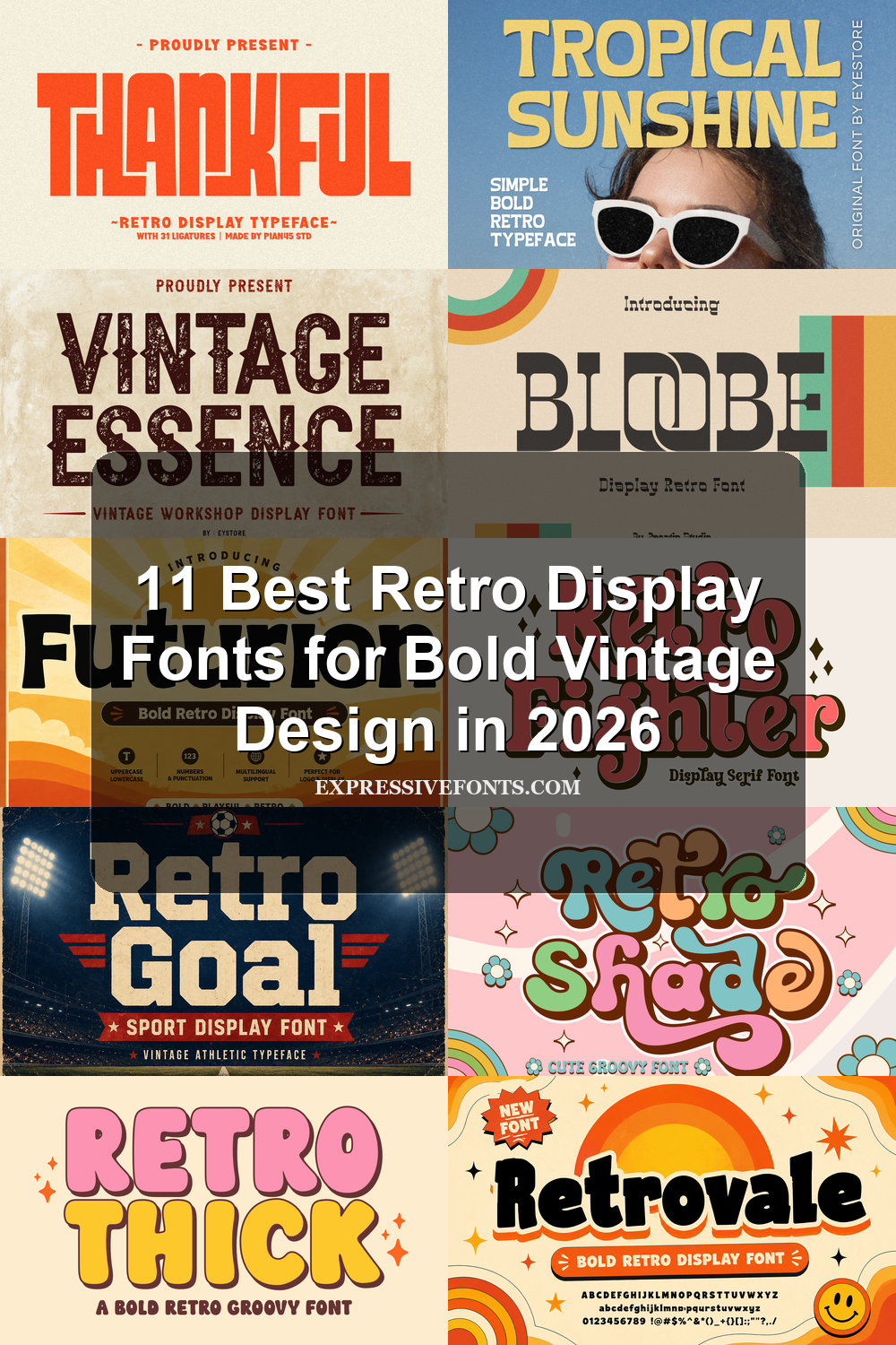
Retro Display Fonts are built for designers who need bold, nostalgic type that can carry a layout by itself. This collection covers 11 fonts for posters, logos, packaging, stickers, T-shirts, and social graphics, from chunky 70s block letters to groovy bubble shapes and worn vintage signage.
Looking for more display fonts? Browse our complete Display Fonts collection to compare bold, retro, playful, poster, groovy, creative, vintage, cartoon, headline, and decorative display styles.
Blocky & Rounded Retro Display Fonts
These fonts use thick rounded forms, compact counters, and strong poster weight for logos, merch, packaging, and bold retro headlines.
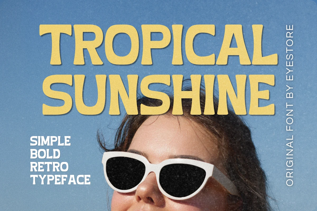
Tropical Sunshine Font
Best For: retro designs, T-shirts, posters, quotes
Tropical Sunshine brings the beach-poster side of Retro Display Fonts into heavy uppercase letters with soft corners, low contrast, and a slightly handmade rhythm. The broad shapes feel simple rather than slick, so the retro mood comes from proportion and weight instead of decorative effects.
Use it where the words need to read fast on products or posters: short stacked phrases, summer quotes, and t-shirt graphics. The letters can sit tightly in big titles, but a little extra tracking helps longer words keep their rounded counters and compact rhythm from merging.
Thankful Font
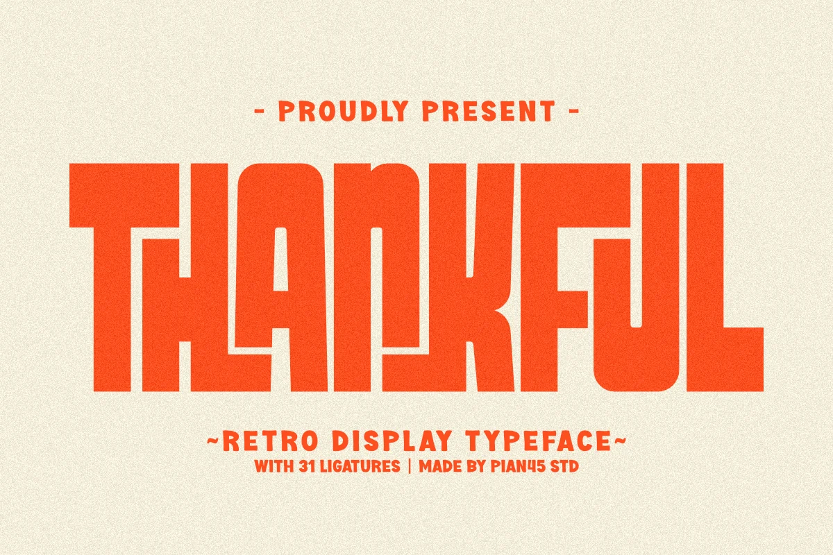
Best For: retro designs, vintage designs, posters, merch design
Thankful pushes Retro Display Fonts into a heavy 70s poster direction, with huge block capitals, squared stems, and rounded internal cuts that keep the wordmark from feeling rigid. The tight, chunky proportions give each line a loud title shape, while the playful ligatures help some letter pairs lock together with a more custom feel.
Keep it in short headlines, seasonal branding, apparel graphics, and event posters where the type can dominate the layout. Because the letters are wide and dense, strong background contrast and controlled line spacing matter more than extra decoration; long phrases need room so the counters and joined forms do not close up.
Bloobe Font
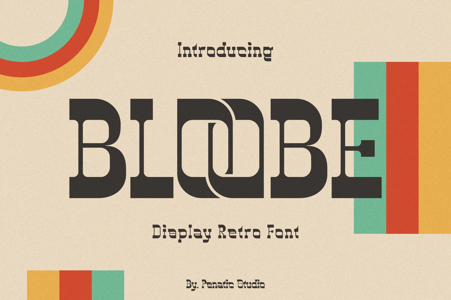
Best For: retro designs, vintage designs, logos, posters
Bloobe has a solid mid-century display build: heavy slab-like stems, rounded inner corners, and compact counters that give the letters a dense poster shape. Within Retro Display Fonts, it leans more structured than groovy, using bold geometry and unusual cutaway forms to create its nostalgic character.
The face works best when the word itself becomes the graphic, especially for logos, concert posters, packaging, and promotional titles. Keep spacing fairly tight for a strong vintage lockup, but avoid squeezing smaller captions; the thick strokes and narrow interior cuts need clear contrast to stay readable.
Retrovale Font
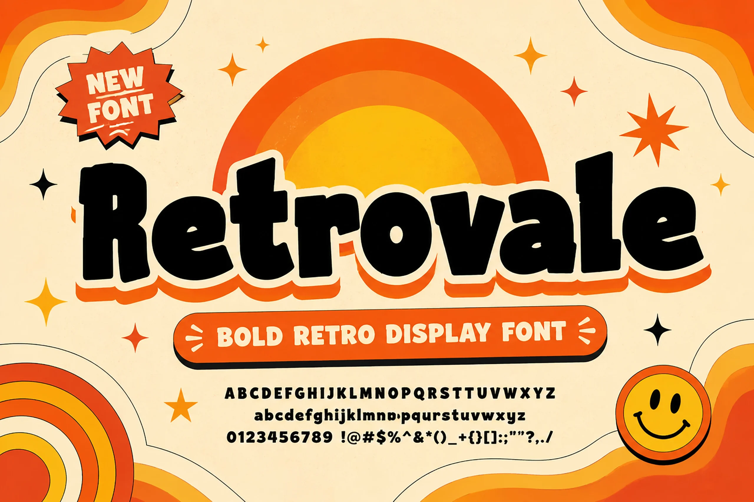
Best For: retro designs, playful designs, stickers, T-shirts
Retrovale takes Retro Display Fonts into a bright cartoon-signage direction, with thick black letters, rounded corners, and slightly irregular proportions that make the wordmark feel loose without losing clarity. The compact counters and soft curves give it a heavy, friendly shape suited to 70s-inspired graphics.
Use it for short headlines, stickers, packaging labels, and t-shirt artwork where the type needs to carry the mood quickly. It works best with bold color contrast and simple supporting text; avoid cramming long lines, because the chunky strokes need open margins to keep the playful rhythm readable.
Futurion Font
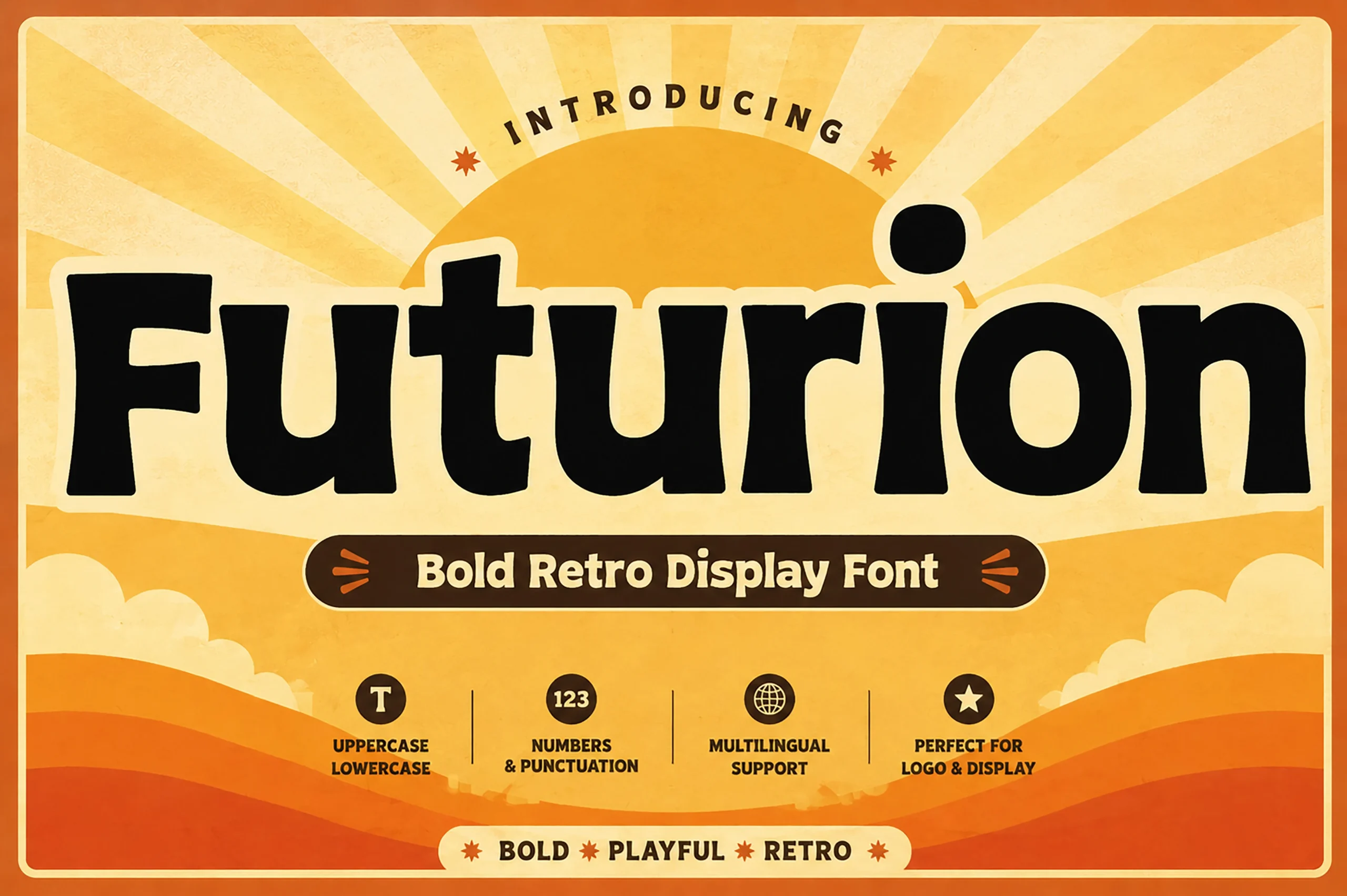
Best For: logos, display text, retro designs, playful designs
Futurion pushes Retro Display Fonts into a bold 70s sunrise mood, using thick black letterforms, soft corners, and slightly wobbly verticals that keep the title friendly instead of rigid. The rounded counters and heavy weight give each word a compact, poster-like silhouette.
It fits logo marks, display headlines, packaging, and upbeat promo graphics where a single word needs strong visual pull. Keep the background contrast high and leave a clean outline or margin around the letters; the chunky forms can stack tightly, but crowded details will flatten their playful curve rhythm.
Groovy & Playful Retro Display Fonts
This group leans into bubbly curves, swashes, sticker-like outlines, and loose hand-drawn rhythm for cheerful brands and expressive graphics.
Retro Fighter Font
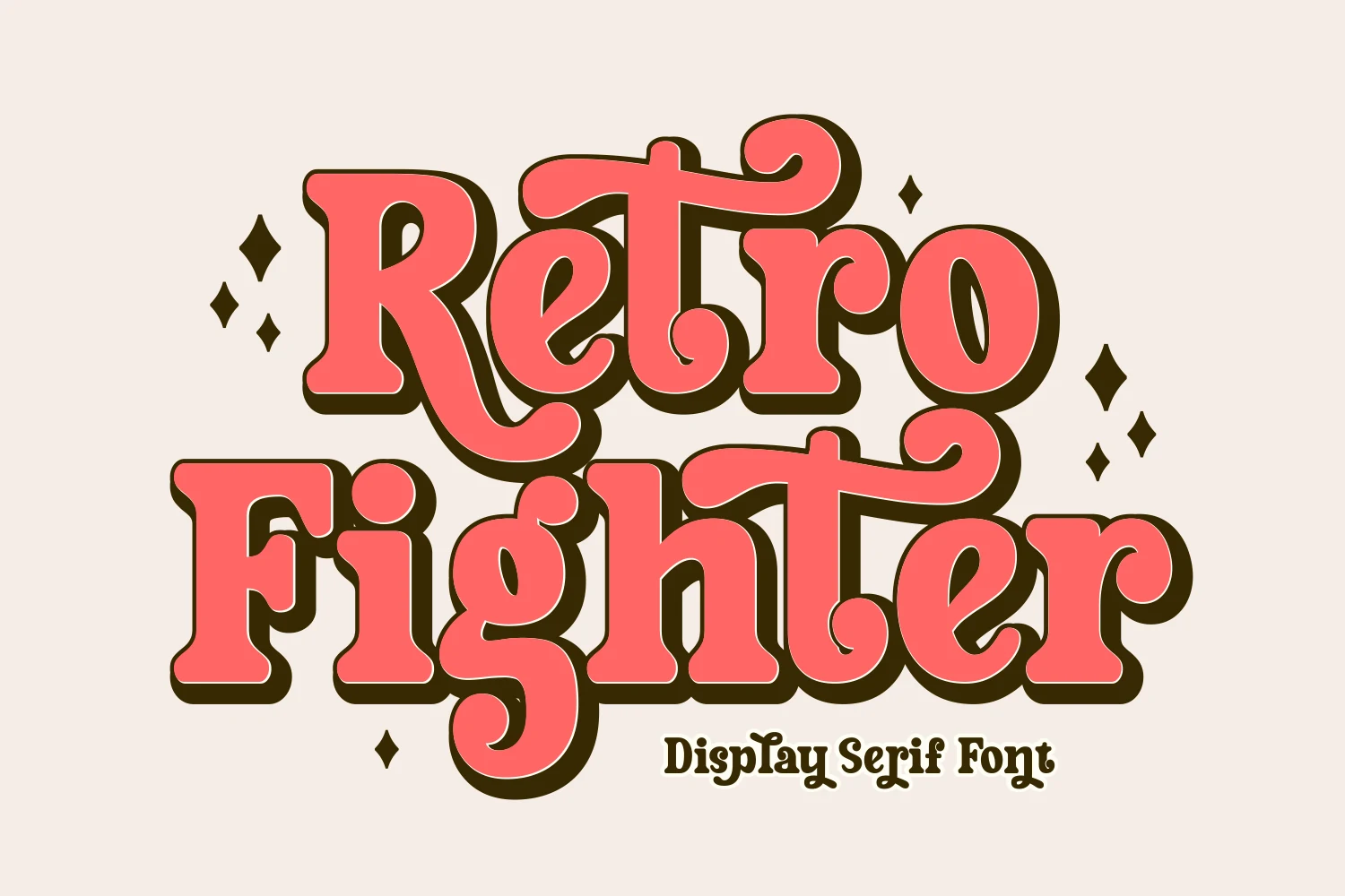
Best For: retro designs, playful designs, posters, greeting cards
Retro Fighter is a chunky hand-drawn display serif with rounded slab weight, curling terminals, and lively swashes that make the letters feel packed but animated. It brings Retro Display Fonts into a more playful, poster-ready lane, with enough internal shape variation to keep a large wordmark from looking mechanically repeated.
Use it for short stacked headlines, greeting cards, social graphics, and event artwork where the outline or shadow can act as part of the composition. Keep supporting text simpler and give the swashes space around descenders and crossbars; tight vertical stacking works, but cramped side margins will make the curls feel clipped.
Grvs Colonimbus Retro Display Font
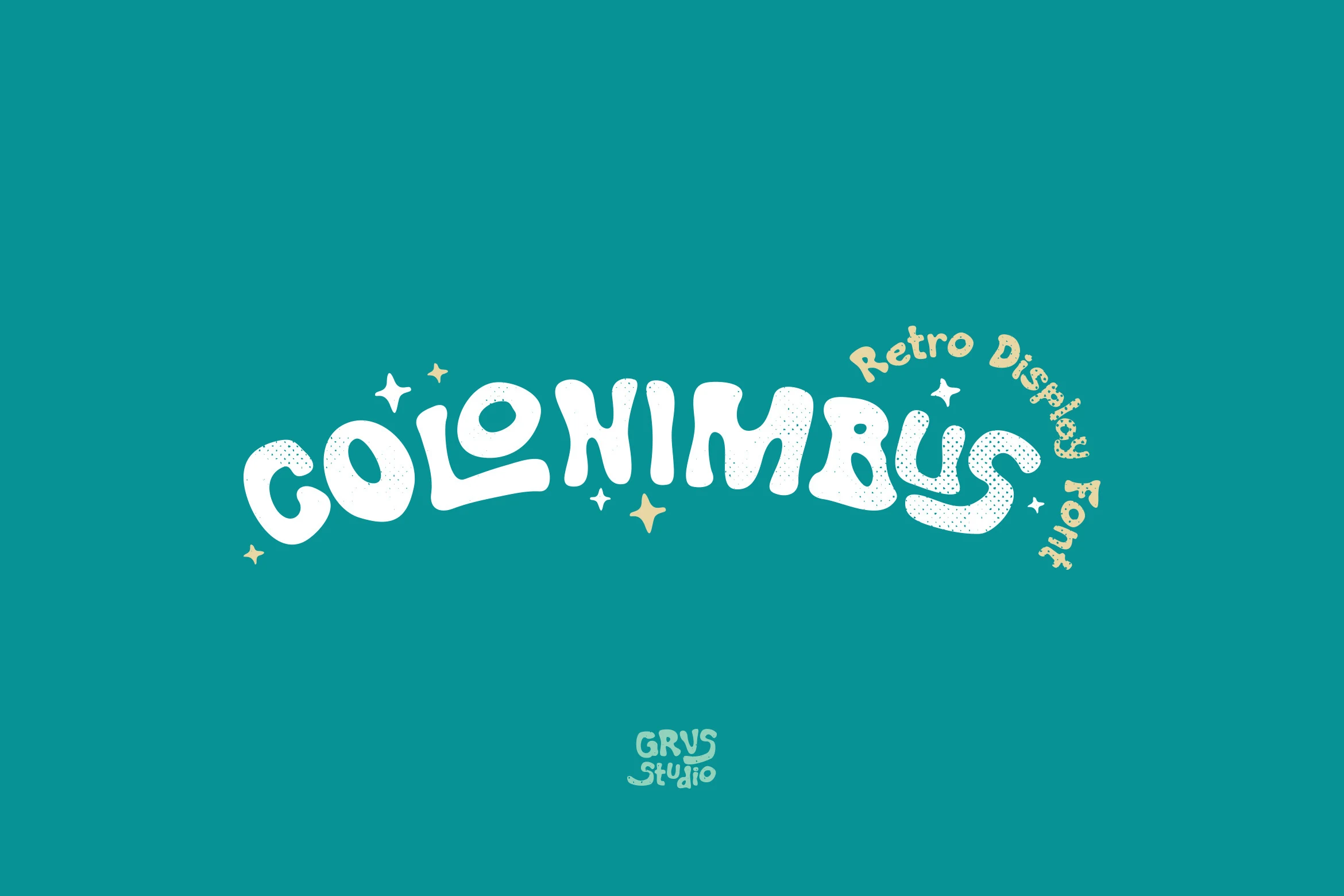
Best For: logos, retro designs, playful designs, stickers
Grvs Colonimbus Retro Display Font uses soft, inflated letter shapes with uneven curves, rounded terminals, and a loose baseline that gives the wordmark a mascot-like bounce. Its speckled surface texture and playful distortion place it among Retro Display Fonts with a lighter, sticker-ready personality rather than a strict vintage poster feel.
It suits logos and brand marks that need immediate charm from the lettering itself. Keep phrases short and let the curves form the main silhouette; generous side spacing and a clean supporting typeface will help the bubbly counters stay open instead of turning into a dense shape.
Retro Shade Font
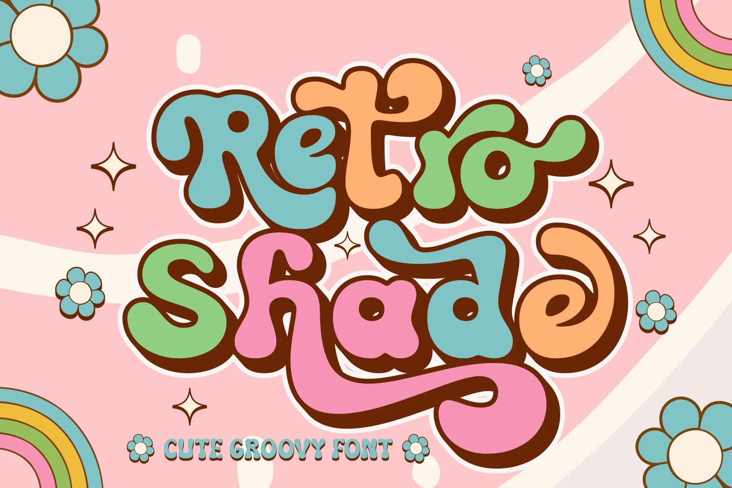
Best For: retro designs, playful designs, stickers, T-shirts
Retro Shade brings a softer side to Retro Display Fonts, built from puffy groovy letters, rounded terminals, and thick shadowed outlines that make each word feel like a sticker. The swashes give the lowercase forms a loose, hand-lettered rhythm, especially in descenders and extended tails.
Use it for cute brand marks, apparel graphics, quotes, and playful packaging where the lettering can be the main illustration. Keep phrases short and avoid tight cropping around the curves; the wide outlines and long strokes need clean spacing so the shapes stay readable instead of bunching together.
Retro Thick Font
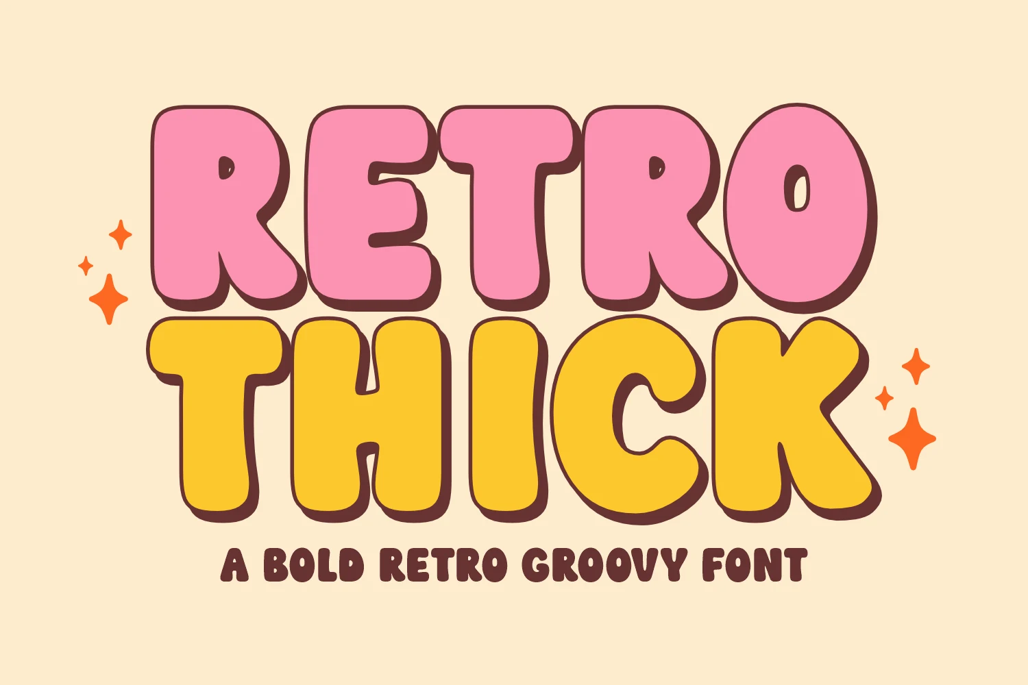
Best For: retro designs, playful designs, T-shirts, posters
Retro Thick uses the oversized bubble proportions expected from Retro Display Fonts, but keeps the shapes clean enough for fast reading. Its rounded caps, swollen counters, and soft slab-like weight create a groovy 70s title style without relying on complicated ornaments.
Use it for logotypes, posters, clothing graphics, and bold headlines where the lettering needs to feel cheerful and heavy. Tight stacking works well because the forms are broad and stable, but keep enough margin around the shadowed edges so the chunky outline does not crowd nearby text or artwork.
Distressed & Athletic Retro Display Fonts
These fonts bring worn textures, varsity structure, and rugged sign-painting energy to badges, sports merch, signage, and vintage posters.
Vintage Essence Font
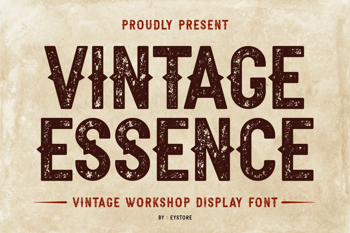
Best For: vintage designs, signage, badges, posters
Vintage Essence has the blunt weight and worn surface of an old workshop sign, with tall uppercase forms, squared terminals, and sharp side notches that give the letters a rugged industrial rhythm. In the Retro Display Fonts category, it reads more rustic and functional than playful, using texture and block structure as its main character.
Use it for badges, signage, posters, and packaging where the distressed finish can look intentional rather than accidental. The heavy strokes hold up well at display size, but smaller text needs strong contrast and simple surrounding type so the weathered gaps do not compete with the message.
Retro Goal Font
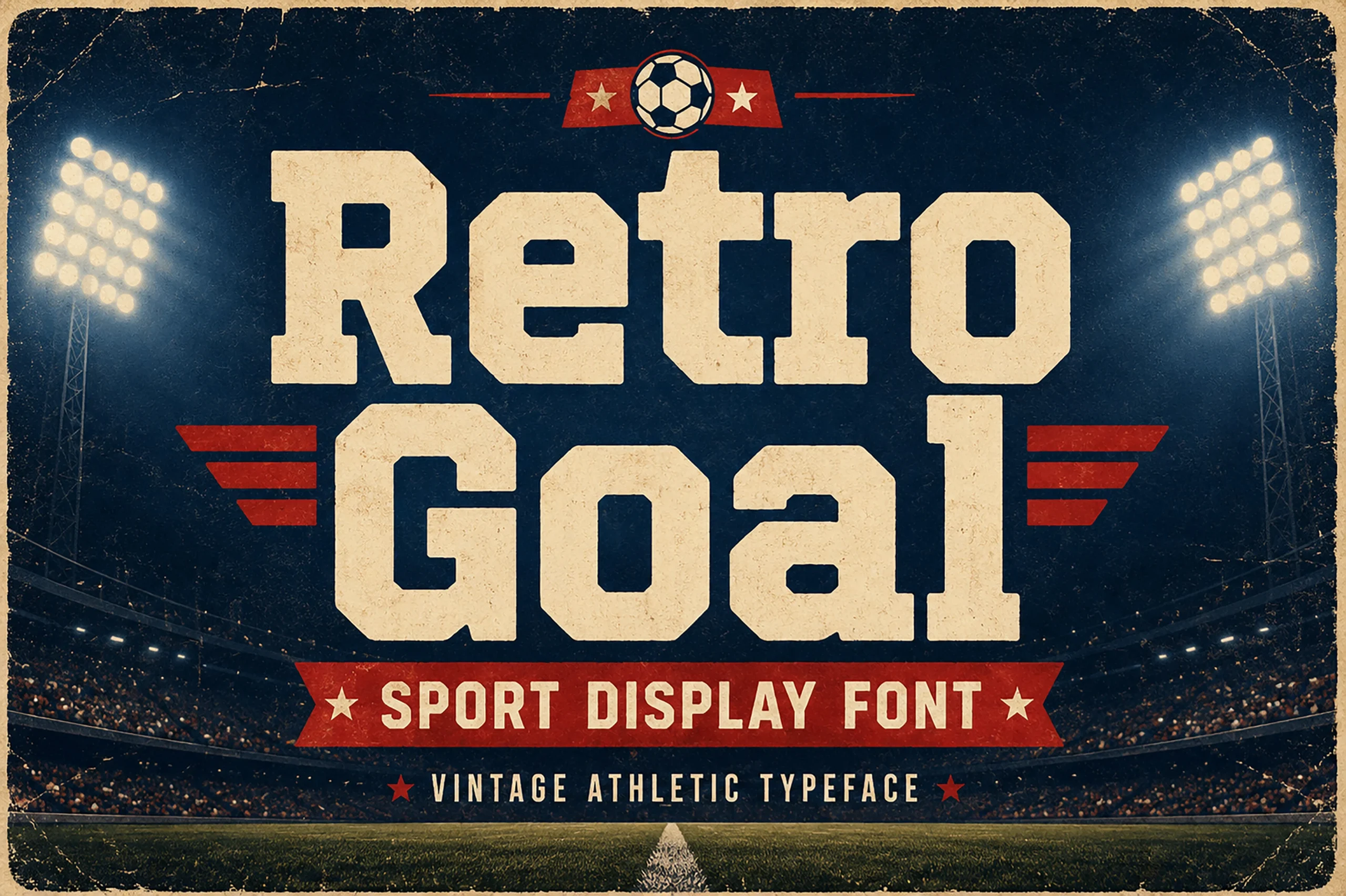
Best For: vintage designs, posters, T-shirts, signage
Retro Goal turns Retro Display Fonts toward varsity lettering, with broad slab forms, squared counters, and clipped corners that feel built for athletic headlines. The worn surface texture gives the heavy characters a printed memorabilia look instead of a clean digital finish.
Use it for sports posters, team-style merch, stadium signage, and college-inspired branding where the words need to look solid from a distance. Keep tracking controlled but not cramped; the block weight can handle tight title layouts, while the rough texture needs strong contrast to stay sharp.
Conclusion
Choose blocky rounded fonts when you need a clean retro headline, groovy fonts for playful stickers or apparel, and distressed styles for badges, signage, sports graphics, or vintage packaging.