19 Stunning Creative Display Fonts for Bold Designs in 2026
Creative Display Fonts are built for designers who need type to act as the main visual element, not just supporting text. This collection covers bold poster lettering, retro logos, streetwear graphics, packaging, merch, gaming headers, and social media designs, with each font grouped by the style it serves best.
Looking for more display fonts? Browse our complete Display Fonts collection to compare bold, retro, playful, poster, groovy, creative, vintage, cartoon, headline, and decorative display styles.
Brush & Street Creative Display Fonts
These fonts use brush texture, graffiti edges, and liquid motion for posters, apparel, music graphics, and street-led branding that needs visible energy.
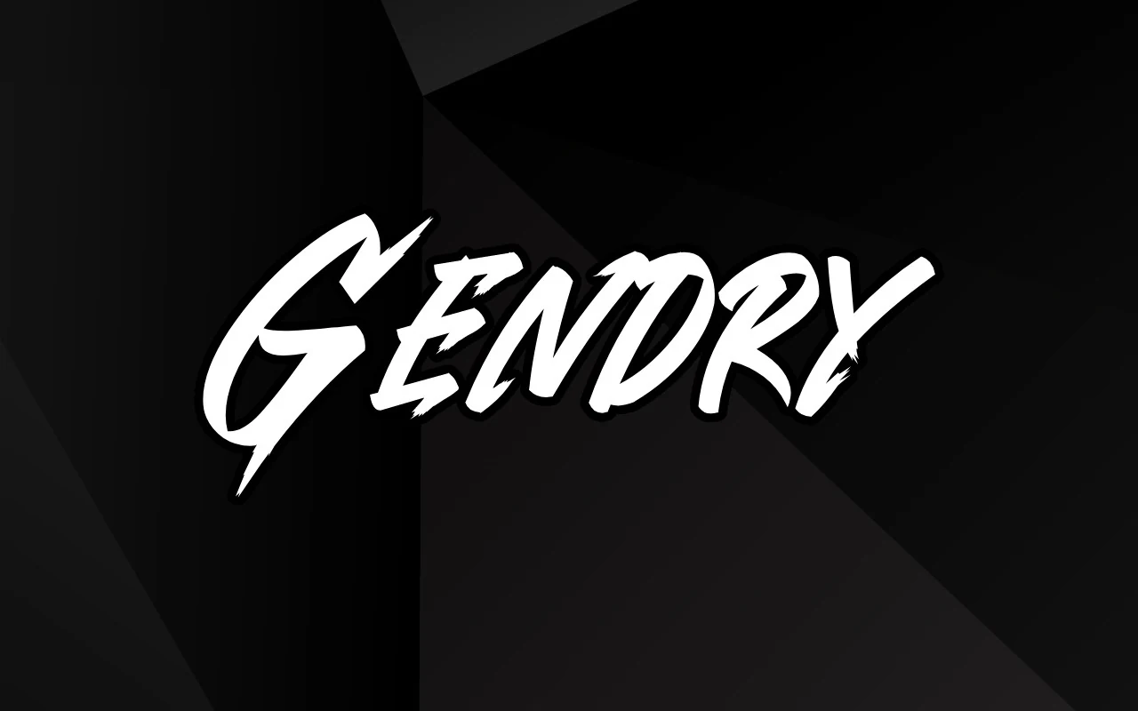
Gendry Font
Best For: posters, T-shirts, logos, expressive designs
Gendry Font uses fast, slanted brush lettering with a wide sweeping G, angular mid-strokes, and sharp cutaway terminals. The letters carry enough weight for poster-scale contrast, while the broken brush edges keep the wordmark from feeling too polished.
Use it where Creative Display Fonts need motion rather than neat symmetry: music artwork, gaming titles, streetwear graphics, or punchy promo headers. Keep tracking close and set it in short phrases; the jagged diagonals work best when the word shape stays compact against a plain, high-contrast field.
Brick Edgie Font
Best For: posters, T-shirts, stickers, expressive designs
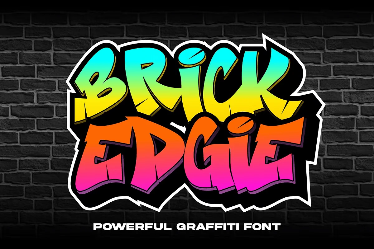
Brick Edgie Font has the punch of hand-painted wall lettering, with thick strokes, sharp corners, and chopped terminals that keep the word shape active from start to finish. The letters lean and lock together like a graffiti piece, giving the font a dense silhouette with plenty of movement.
It fits Creative Display Fonts that need instant street energy, especially for posters, apparel, and sticker-style graphics. Keep it in short words or tight headline lines so the angular details stay readable, and pair it with plain secondary text to let the bold outline and attitude lead the composition.
Graffiti Stroke Font
Best For: fashion branding, logos, posters, expressive designs
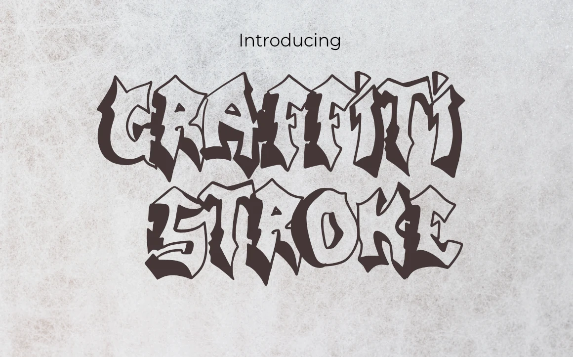
Graffiti Stroke twists blackletter structure into a rough graffiti silhouette, with jagged crowns, pointed terminals, and thick shadow-like cuts. The letters look chipped and stacked, giving the word shape a gritty wall-painted feel while still keeping enough structure to read clearly in short display settings.
It suits Creative Display Fonts that need attitude in fashion branding, poster titles, and logo work. The many ligatures help you build tighter, more custom-looking headline shapes, especially when you keep the wording short and let the angular edges carry the texture against a clean background.
Liquid Unflow Font
Best For: logos, T-shirts, social media graphics, expressive designs
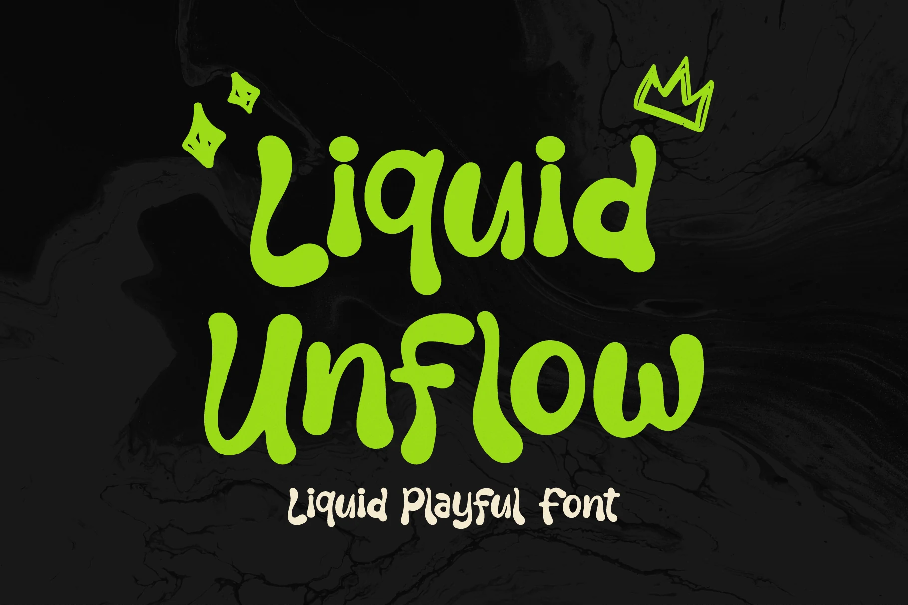
Liquid Unflow Font uses thick melting letterforms with rounded strokes, uneven curves, and bulbous baseline drops. The soft, wavy posture gives each word a loose hand-drawn rhythm, while the heavy weight keeps the forms bold enough for loud display use.
It fits Creative Display Fonts built around skate graphics, alternative streetwear, party headers, and product labels with a rebellious tone. Keep phrases short and give the letters strong contrast; the liquid shapes stay clearer when the layout avoids cramped supporting text.
Temur Amorak Urban Bold Brush Font
Best For: posters, logos, T-shirts, expressive designs
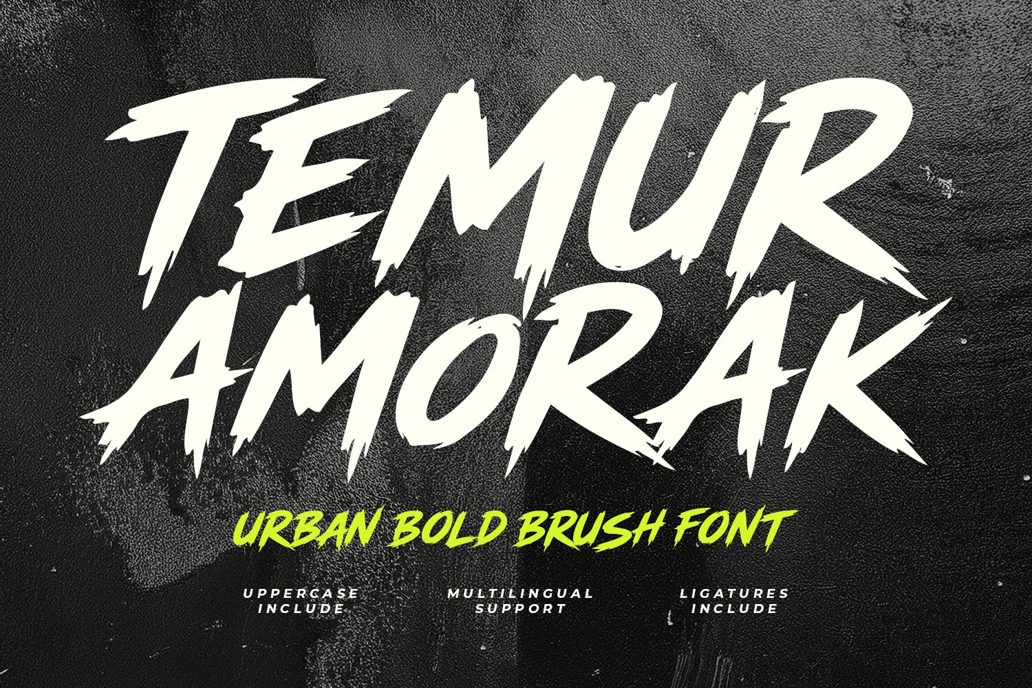
Temur Amorak Urban Bold Brush Font is built from fast uppercase strokes with jagged edges, dry-brush breaks, and long pointed terminals. The angled forms create aggressive forward motion, while the thick inked weight keeps each word strong enough for high-impact display work.
Use it where Creative Display Fonts need grit: concert graphics, sports marks, gaming titles, or cinematic headers. Its ligatures help headlines feel less mechanical, and the multilingual support is useful for broader campaign work; keep spacing tight but avoid long lines so the sharp stroke texture stays readable.
Rounded & Playful Creative Display Fonts
These chunky rounded fonts keep layouts bold but friendly, making them useful for packaging, social graphics, food labels, and playful brand headlines.
Textan Font
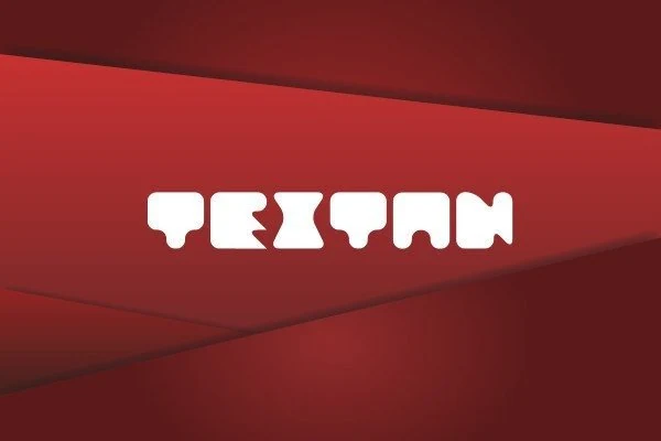
Best For: logos, posters, headlines, playful designs
Textan Font uses soft, chunky shapes with rounded corners and quirky cut-ins that make each letter feel compact and toy-like. The heavy build gives it strong presence, but the smooth curves keep the mood friendly rather than harsh, which helps the wordmark stay bold and approachable.
It works well for Creative Display Fonts when you need short headlines, logo ideas, or packaging with a playful edge. The family’s multiple styles, including an icon and doodle option, open up more ways to build matching graphics, and the thick forms read best when you keep spacing fairly open and the wording brief.
North Hype Font
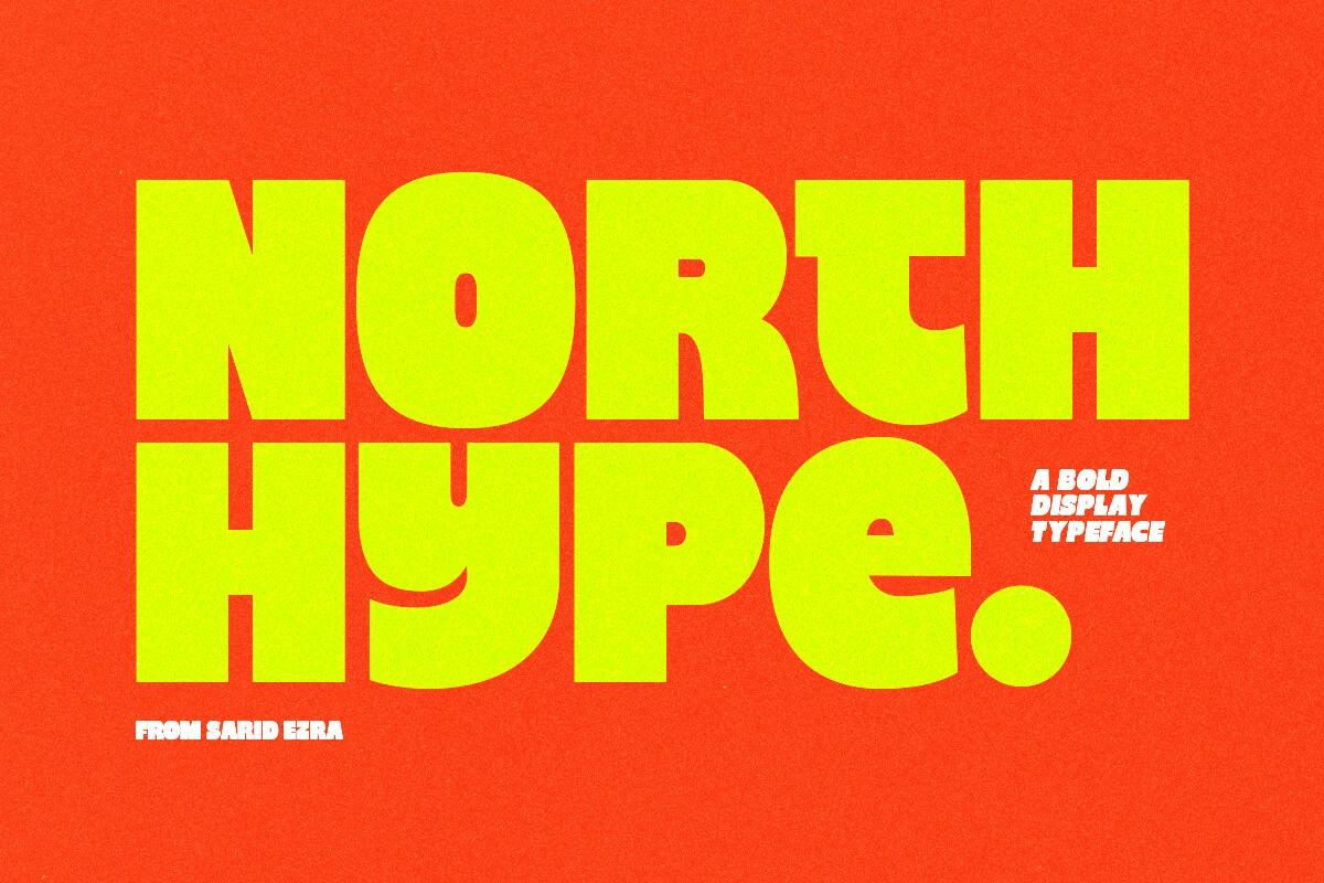
Best For: posters, T-shirts, social media graphics, eye-catching designs
North Hype Font is built from massive block shapes with ultra-tight spacing, rounded corners, and deep ink-trapped cuts that give the heavy forms extra bite. The letters feel compressed and slightly unruly, so even a short word turns into a dense slab of color with real poster presence.
For Creative Display Fonts, it shines in short headlines, apparel marks, and loud social graphics where scale and tension matter. Keep the wording brief and let the kerning do the work; a simple supporting sans underneath helps the oversized forms hold the hierarchy without making the layout feel crowded.
Avoge Font
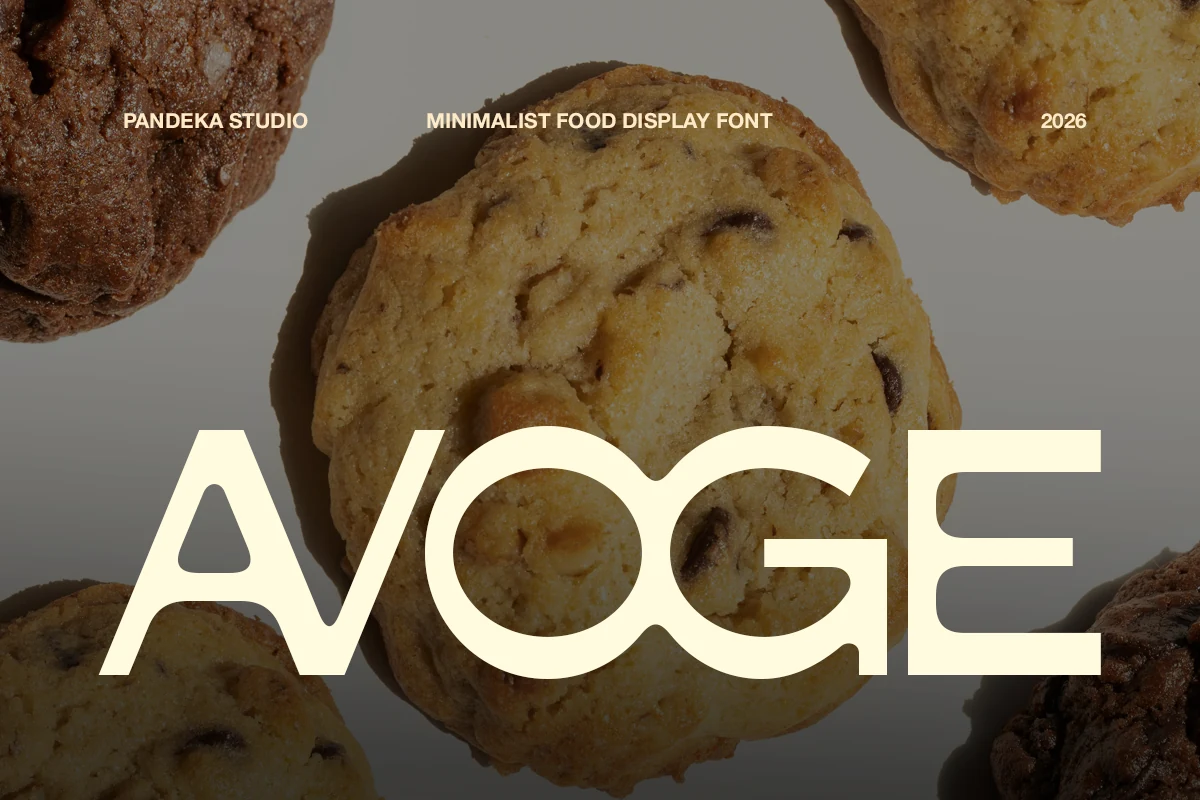
Best For: packaging, product labels, restaurant menus, signage
Avoge has a clean geometric build with broad circular counters, rounded terminals, and a softened monoline weight that feels friendly without losing structure. The wide O and G, along with the open triangular counter in the A, give the word shape a simple, appetizing rhythm that reads clearly at a glance.
That makes it a smart fit for Creative Display Fonts in food branding, where you want warmth and clarity at the same time. It holds up especially well on menus, labels, and pack fronts; set it with generous scale and a little breathing room so the smooth curves stay crisp beside busier product photography.
Kafu Font
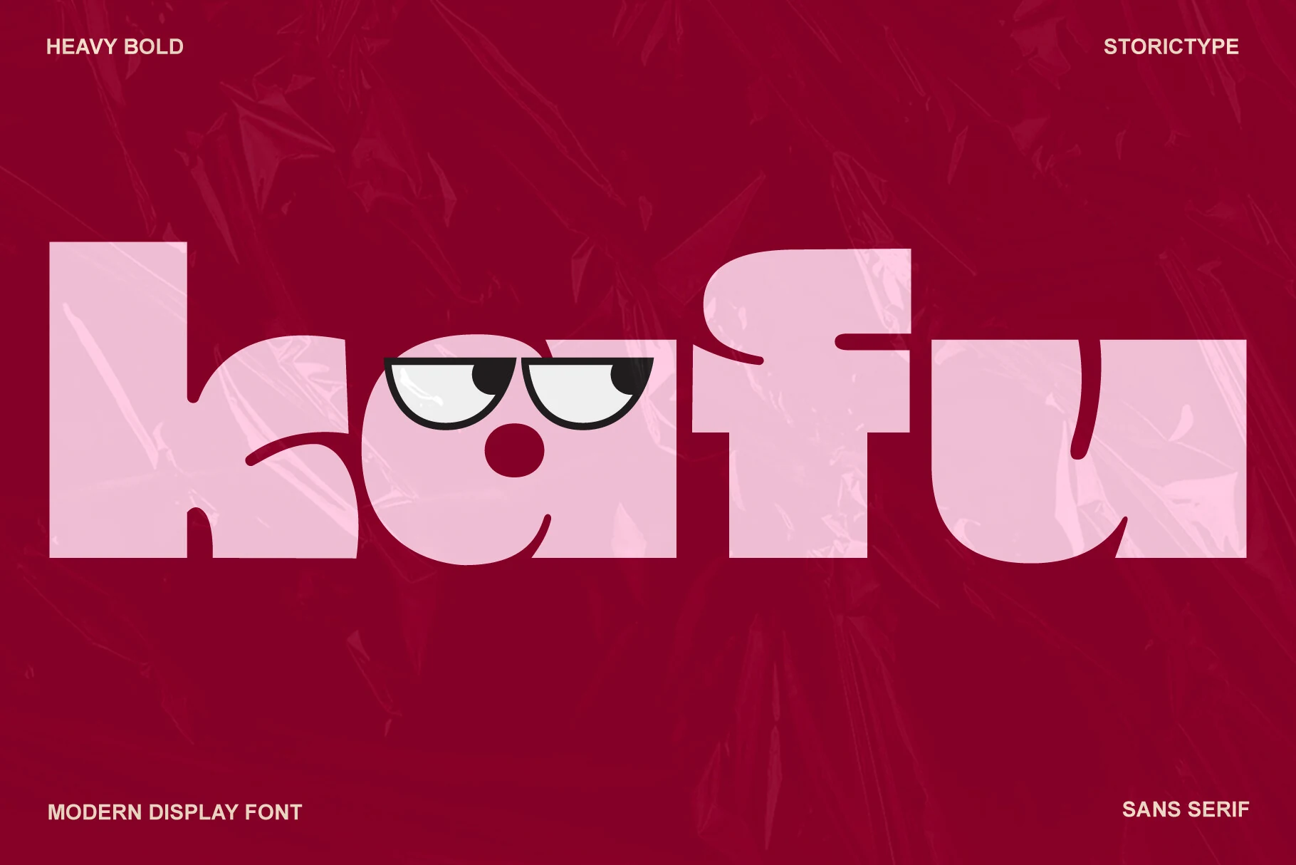
Best For: fashion branding, posters, editorial designs, social media graphics
Kafu Font has oversized lowercase forms, broad curves, and blunt terminals that create a smooth, sculptural silhouette. Its heavy weight is balanced by generous counters and crisp inner cut-ins, so the letters feel bold and architectural rather than clumsy.
It gives Creative Display Fonts a polished, fashion-led tone, especially in posters, editorial covers, and branding. Use it large and keep the surrounding type restrained; the compact shapes and soft corners do the most work when paired with clean spacing and a lighter secondary face.
Geometric & Futuristic Creative Display Fonts
These display fonts rely on modular outlines, sliced letterforms, stripes, and engineered shapes for tech logos, gaming titles, and modern poster systems.
Cut out Font
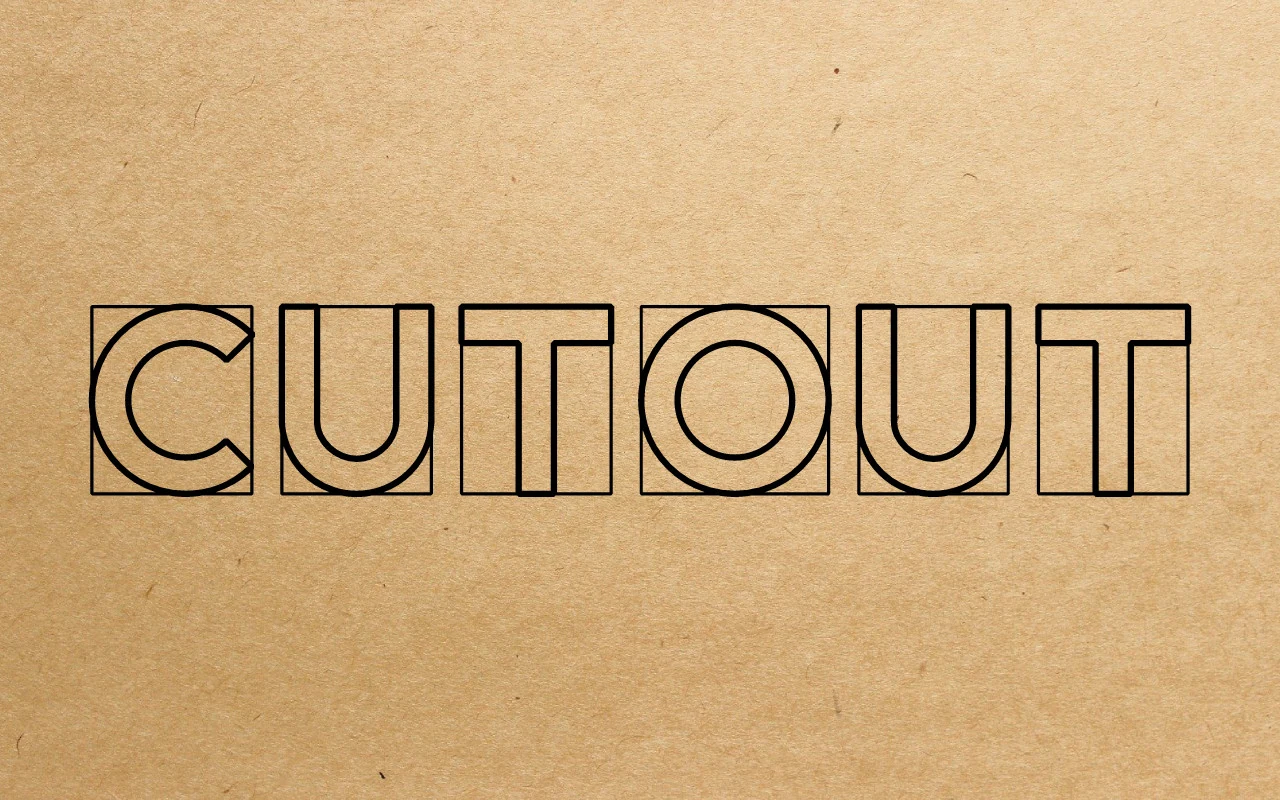
Best For: logos, posters, headlines, modern designs
Cut out Font has a modular outlined build that turns each letter into a clean geometric unit. Rounded curves inside square frames give the alphabet a measured rhythm, while the even stroke weight keeps the design crisp rather than overly decorative.
It suits Creative Display Fonts projects that need structure and personality in equal measure, especially logos, posters, and title work. Because the forms are open instead of filled, it performs best at larger sizes or in short words, where the negative space and grid-like proportions stay clear.
Ridge 5 Bold Font
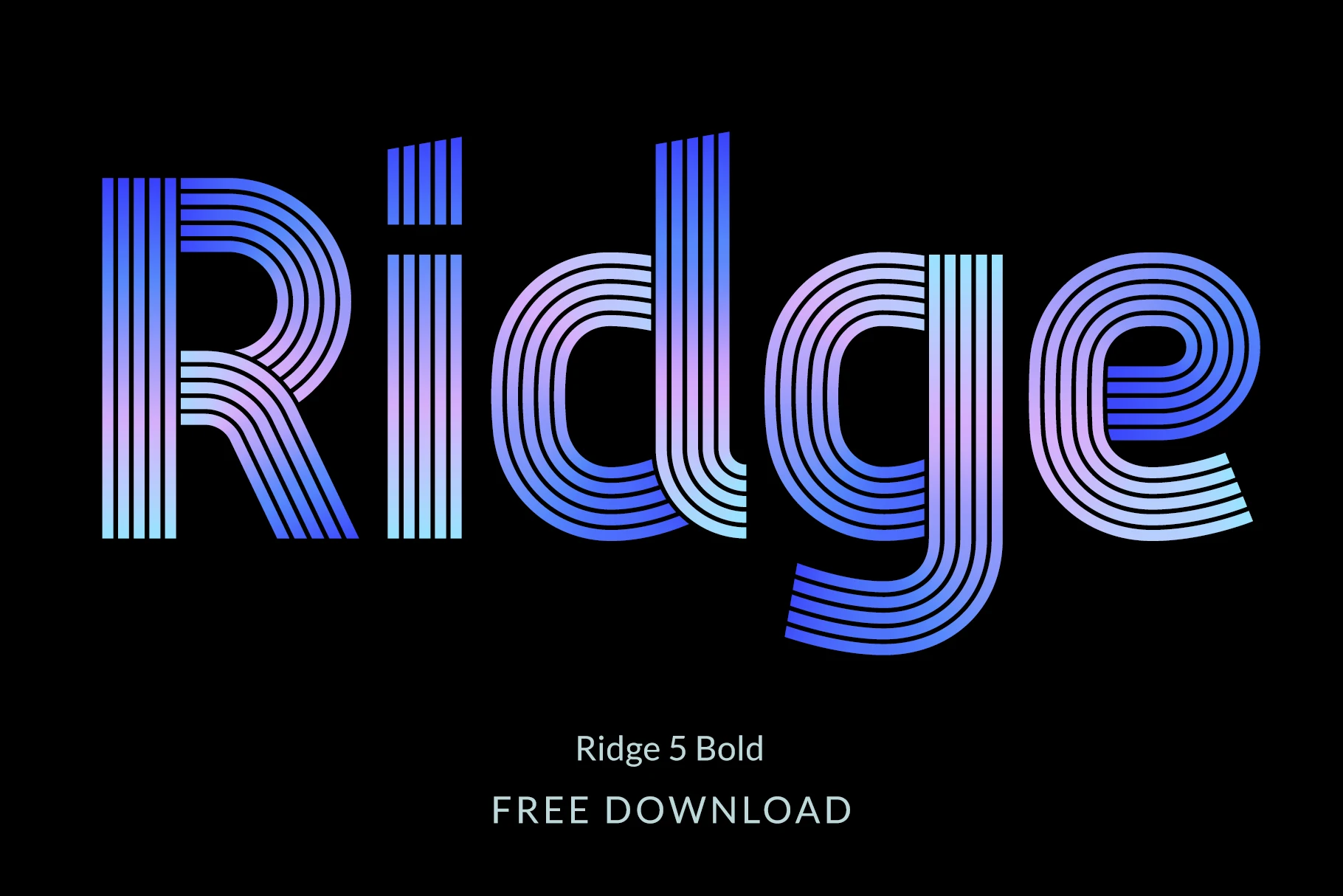
Best For: logos, posters, headlines, creative projects
Ridge 5 Bold Font builds each letter from parallel lines, creating a sleek layered texture that feels both retro and futuristic. The rounded bowls, tall stems, and clean lowercase forms keep the rhythm smooth, so the striped construction looks graphic without becoming difficult to read.
It brings a strong visual system to Creative Display Fonts, especially when you want headlines with movement and depth. Because it includes lowercase and alternate characters, you get more flexibility in shaping titles and logos; use it large and keep the wording short so the linework stays crisp and intentional.
Aexiron Font
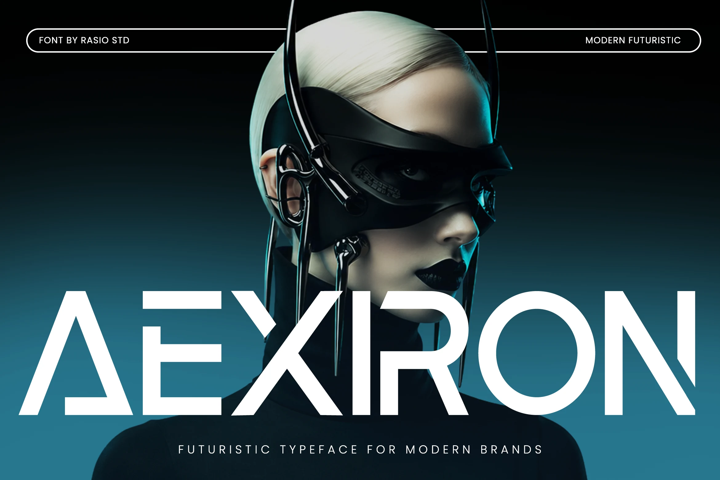
Best For: logos, website headers, gaming interface elements, modern designs
Aexiron Font uses wide geometric sans-serif letters with sharp diagonal cuts, open stencil-style breaks, and missing crossbars that make the word shape feel engineered rather than decorative. Its heavy structure gives Creative Display Fonts a clean sci-fi edge without relying on messy texture or exaggerated ornament.
The font works best when the typography is allowed to act as the main graphic element: short names, tech headers, electronic music branding, gaming UI labels, or biotech-style marks. Keep spacing controlled but not tight, because the cut-in letter details need clear contrast to stay readable at impact sizes.
Folgore Font
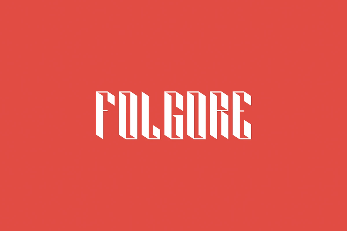
Best For: posters, headlines, display text, eye-catching designs
Folgore Font turns narrow vertical letters into sharp faceted forms, with wedge-like cuts and a compact 3D effect built into the strokes. Its angular rhythm gives Creative Display Fonts a bold, architectural character, closer to poster lettering than everyday sans typography.
Use it for short words, title marks, gig graphics, merch, or covers where the type can sit as the main visual shape. Slightly open the tracking and keep the background contrast high, because the sliced inner details need space to stay readable instead of collapsing into solid blocks.
Retro & Vintage Creative Display Fonts
These fonts borrow from vintage posters, varsity marks, slab lettering, and stamped industrial type for merch, signage, branding, and nostalgic headlines.
Notre Font
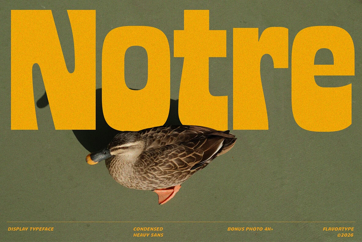
Best For: posters, logos, headlines, retro designs
Notre Font has the kind of condensed heft that fills a layout fast. The tall verticals, compact spacing, and softly rounded counters give it a vintage advertising feel, while details like the angled N and broad t keep the silhouette lively instead of rigid.
For Creative Display Fonts, this one works best when you let the width do the talking in short headlines, poster titles, and bold logo lines. Tight tracking is part of its charm, so pair it with smaller supporting text that stays simple and give your title enough scale to show off the curves.
Drip Haus Font
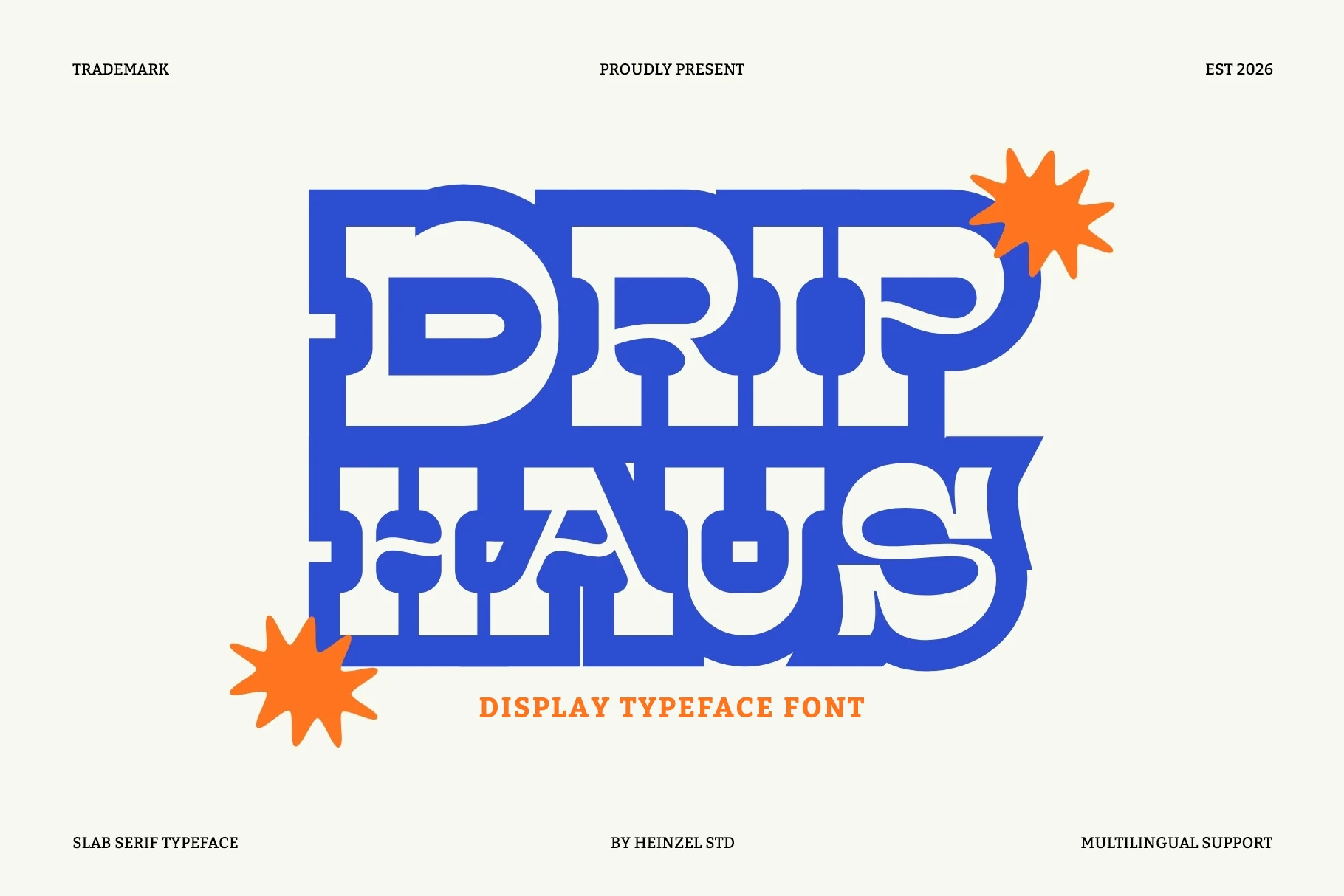
Best For: logos, posters, packaging, merch design
Drip Haus Font has a heavy slab serif build with broad curves, deep cut-ins, and chunky terminals that make every letter feel locked together. The stacked preview shows how its retro-inspired shapes create a dense, graphic silhouette with plenty of attitude.
It’s a strong pick for Creative Display Fonts when you want short words to hit hard in branding or poster layouts. Keep it large and let the unusual counters and thick serifs carry the texture, then pair it with simpler supporting text so the title keeps its bold hierarchy.
De Augusta Font
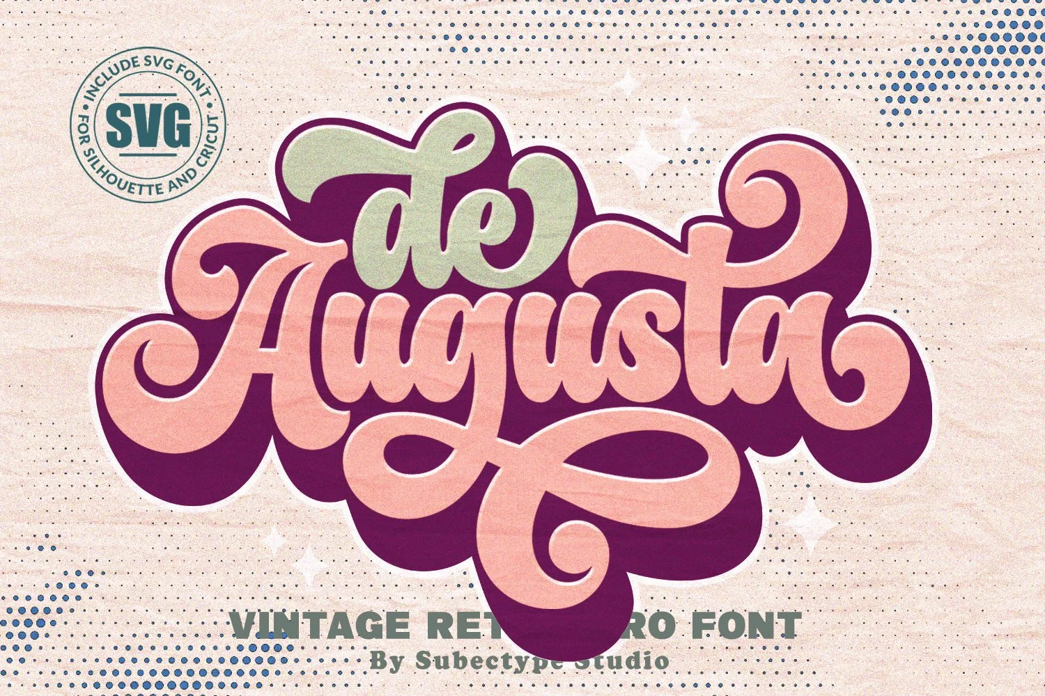
Best For: logos, posters, retro designs, vintage designs
De Augusta leans into 70s lettering with oversized swashes, rounded weight, and soft teardrop counters. The broad capital A, curled terminals, and looping descender on the g give the word shape a flowing silhouette that feels bold rather than delicate.
It stands out in Creative Display Fonts when you want a logo or poster title to carry the mood by itself. Keep it to short phrases and leave room around the flourishes; the chunky forms stay clearer when paired with plain supporting text and a simple layout.
Propaganda Font
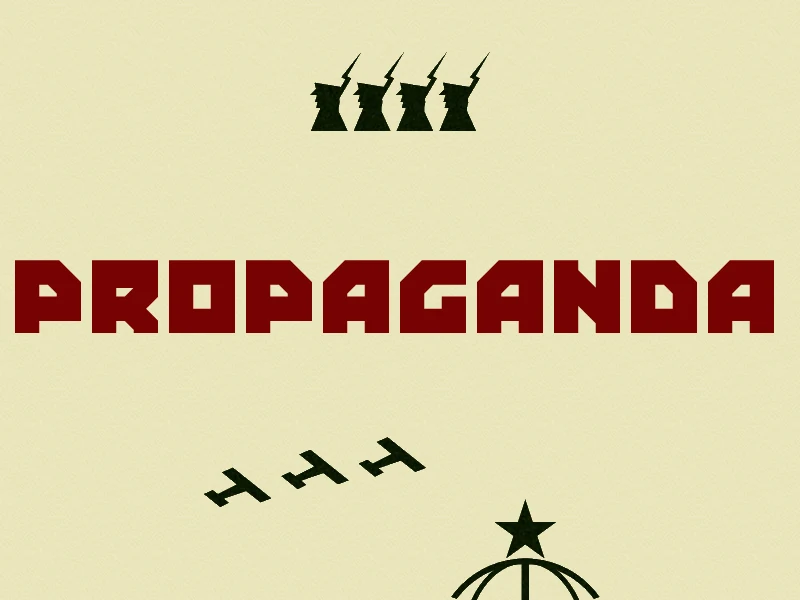
Best For: posters, headlines, signage, retro designs
Propaganda Font has the blunt force of vintage political poster lettering, with heavy block capitals, clipped corners, and a rigid rhythm that makes every word feel deliberate. The squared shapes and compact counters give Creative Display Fonts a stern, graphic presence that reads more like a statement than decoration.
It works best in short headlines where impact matters more than nuance—think poster titles, merch, signage, or bold editorial callouts. Keep the layout simple and the contrast strong, because this style carries its power through scale and structure; longer lines can feel dense, but brief phrases land hard.
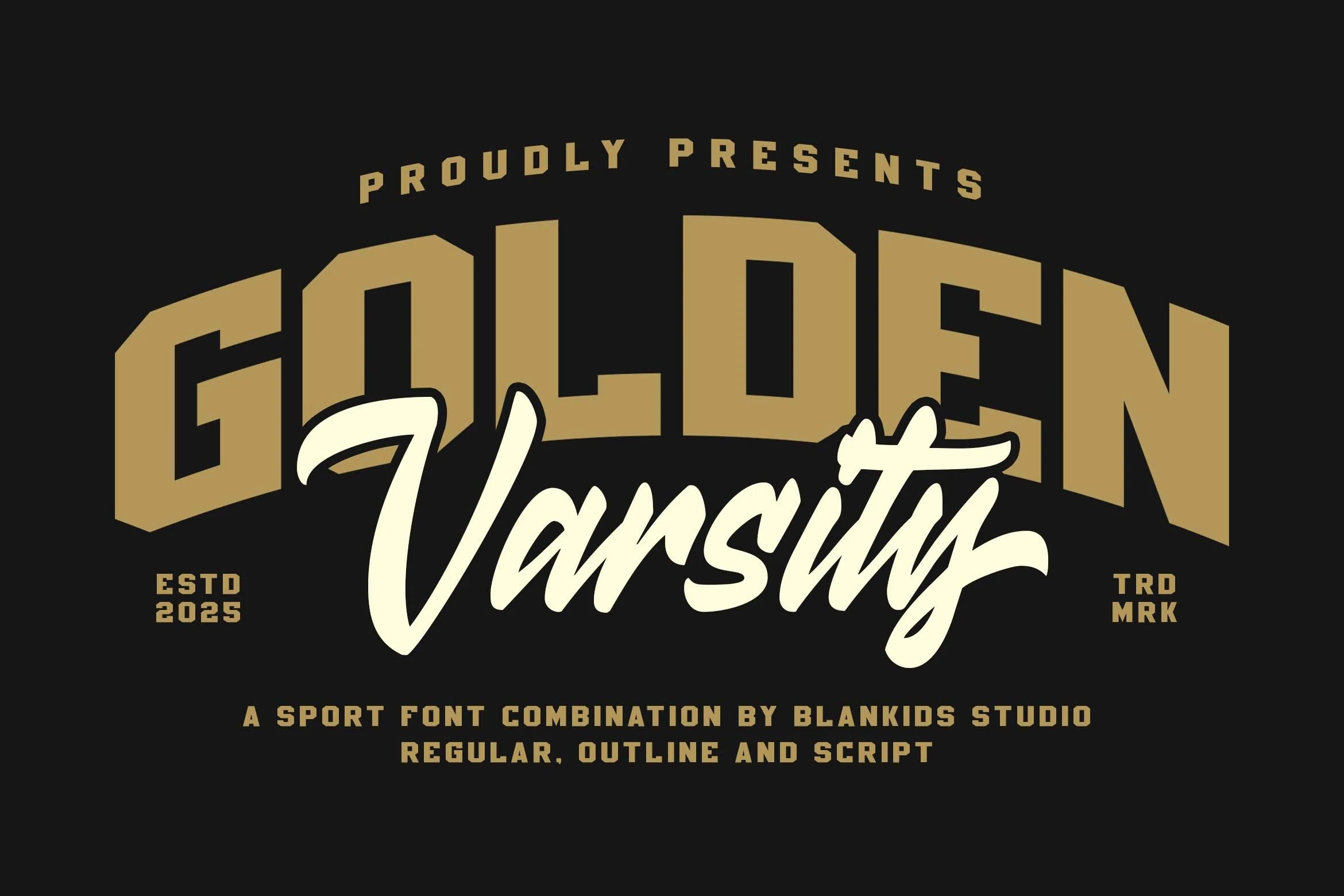
Golden Varsity Font
Best For: logos, posters, branding, merch design
Golden Varsity Font mixes oversized collegiate block letters with a sweeping script overlay, giving it the instant feel of a team crest or vintage sports badge. The structured arches, thick strokes, and compact proportions make it a strong fit for Creative Display Fonts that need energy, confidence, and a built-in sense of hierarchy.
The combination works especially well when you separate roles: use the varsity caps for the main name, then let the script carry the secondary word or mascot line. That contrast keeps logos, promo graphics, and apparel marks readable while adding motion, instead of letting everything compete at the same visual weight.
Industrial Font

Best For: logos, headlines, product labels, signage
Industrial Font has the blunt authority of a rubber stamp, with heavy uppercase letters, squared forms, and worn ink texture that breaks up the strokes in a convincing way. That rough impression gives Creative Display Fonts a practical, workmanlike edge rather than a polished studio finish.
It is strongest in short applications where the stamped effect can stay crisp—think logos, headings, labels, or packaging marks. Give it enough size and contrast so the distressed detail reads clearly, because the texture is what keeps the bold shapes from feeling flat or generic.
Conclusion
Choose brush and street styles when the design needs motion, rounded styles for friendly impact, geometric styles for tech-driven work, and retro fonts for posters, merch, or nostalgic branding with stronger period character.