28 Groovy Display Fonts for Stunning Retro Designs in 2026
Groovy Display Fonts are made for designers who need retro lettering with instant visual weight. This collection works for posters, logos, T-shirts, stickers, social graphics, invitations, and playful branding where rounded, wavy, or psychedelic type should carry the main headline.
Looking for more display fonts? Browse our complete Display Fonts collection to compare bold, retro, playful, poster, groovy, creative, vintage, cartoon, headline, and decorative display styles.
Rounded Bubble Groovy Display Fonts
These rounded and bubbly styles use soft curves, thick forms, and playful outlines, making them useful for stickers, merch, children’s graphics, social posts, and cheerful retro headlines.
Chunky Groovy Font
Best For: retro designs, T-shirts, stickers, children’s designs
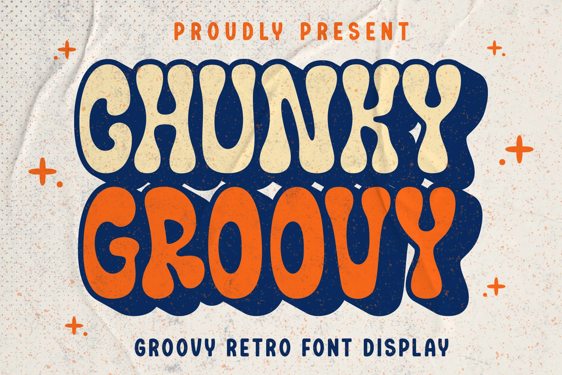
Chunky Groovy Font uses swollen bubble shapes, soft vertical curves, and irregular inner counters that give each word a dense 70s poster rhythm. The heavy rounded forms make it feel loud and friendly rather than sharp, which suits Groovy Display Fonts aimed at merch, stickers, and playful cover art.
Keep the copy short and let the letters interlock as a compact headline. Its wide shapes can carry strong color contrast, but tight tracking will quickly clog the counters, so leave moderate spacing between stacked lines and use simpler supporting type for small details.
Stay Funky Font
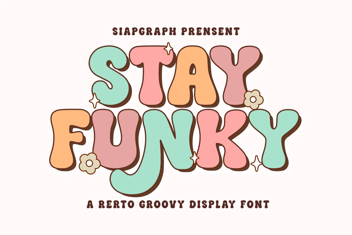
Best For: retro designs, posters, social media graphics, T-shirts
Stay Funky Font leans into thick bubble shapes, soft wobbling curves, and rounded terminals that echo hand-cut 70s lettering. The broad counters and chunky silhouette give it an upbeat, friendly feel, making it a strong fit for Groovy Display Fonts when you want a headline to feel cheerful rather than polished.
It shines in short titles, merch text, and stacked compositions where those wide forms can keep their bounce. Give the letters a bit of space and pair them with a clean secondary typeface; that contrast keeps the playful rhythm intact and stops denser words from feeling crowded.
Classic Night Font
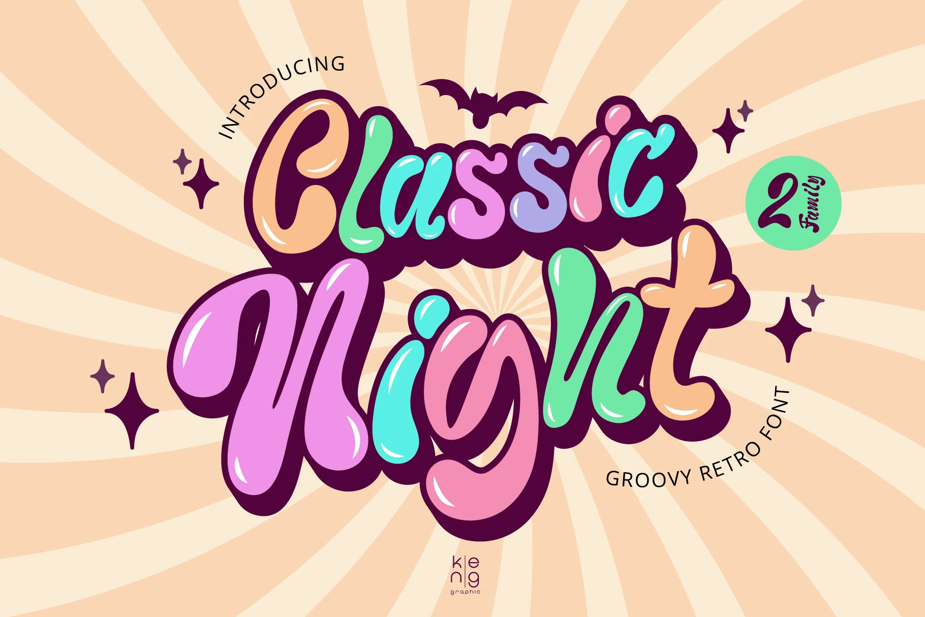
Best For: posters, T-shirts, social media graphics, playful designs
Classic Night Font plays with swollen bubble forms, glossy inner highlights, and thick shadowed outlines that push the lettering forward with comic-book energy. The exaggerated curves and uneven rhythm give it the instant punch you want from Groovy Display Fonts, especially when a title needs to feel youthful, loud, and a little mischievous.
Because the letters are wide and highly stylized, it works best in short words and stacked titles where the silhouette can stay clear. Let color contrast carry some of the impact, keep the spacing slightly open, and use a simpler companion typeface for smaller details so the playful shapes remain the main event.
Fun Groovy Font
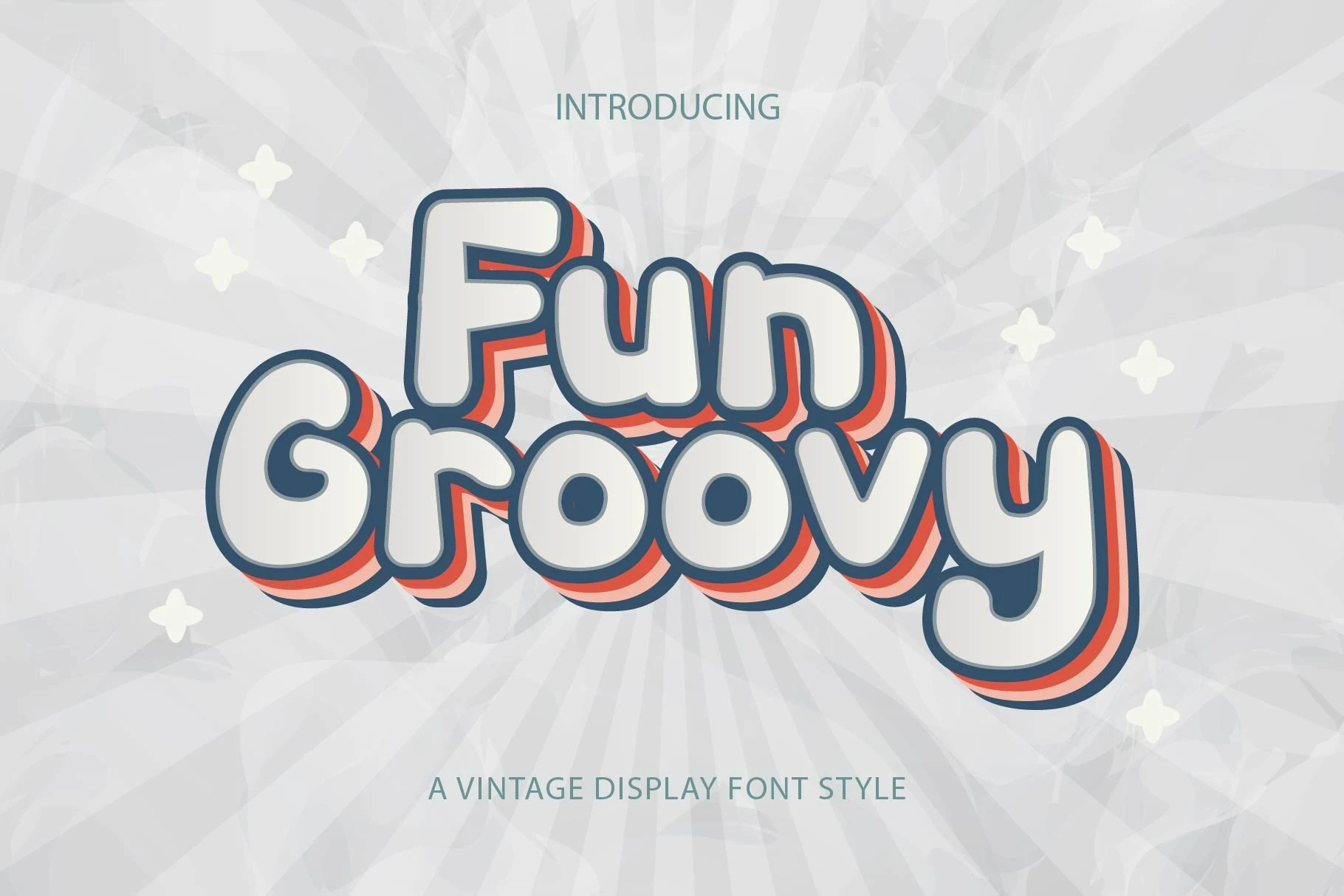
Best For: T-shirts, stickers, children’s designs, social media graphics
Fun Groovy Font uses chunky rounded letterforms, open counters, and a soft vintage silhouette that feels friendly at first glance. The clean blue outline and warm offset shadow give it the upbeat depth often seen in Groovy Display Fonts, making short words feel lively without turning messy.
Because the outline treatment adds visual weight, this style works best in bold headlines, stickers, and cover titles rather than long lines. Keep tracking slightly open and let the retro layering stand against a simple background, so the rounded shapes stay crisp and easy to read.
Retro Santa Font
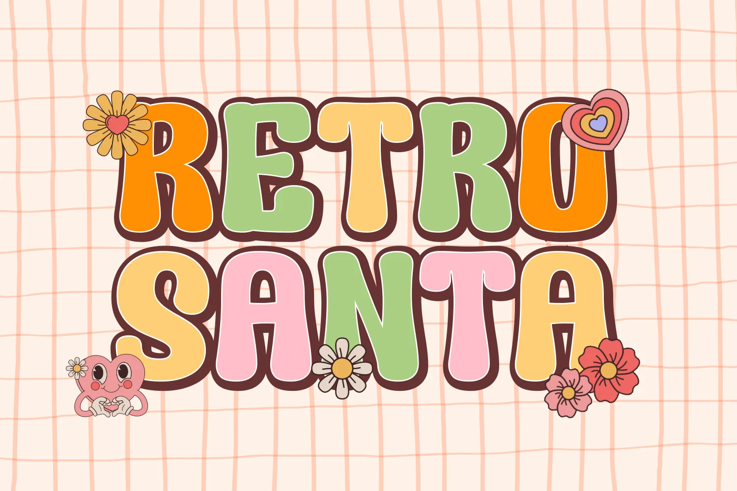
Best For: retro designs, playful designs, posters, stickers
Retro Santa Font uses chunky rounded block letters with soft corners, broad counters, and a thick outline that gives each word a warm 70s bounce. Its sturdy silhouette feels sweet rather than loud, which makes it a natural fit for Groovy Display Fonts with a more playful, approachable mood.
The wide shapes hold up well in short titles and sticker-style layouts, especially when you want color to do part of the work. Keep headlines compact, add a little extra line spacing in stacked words, and pair it with a plain secondary face so the bubbly proportions stay clear and cheerful.
Holysweet Font
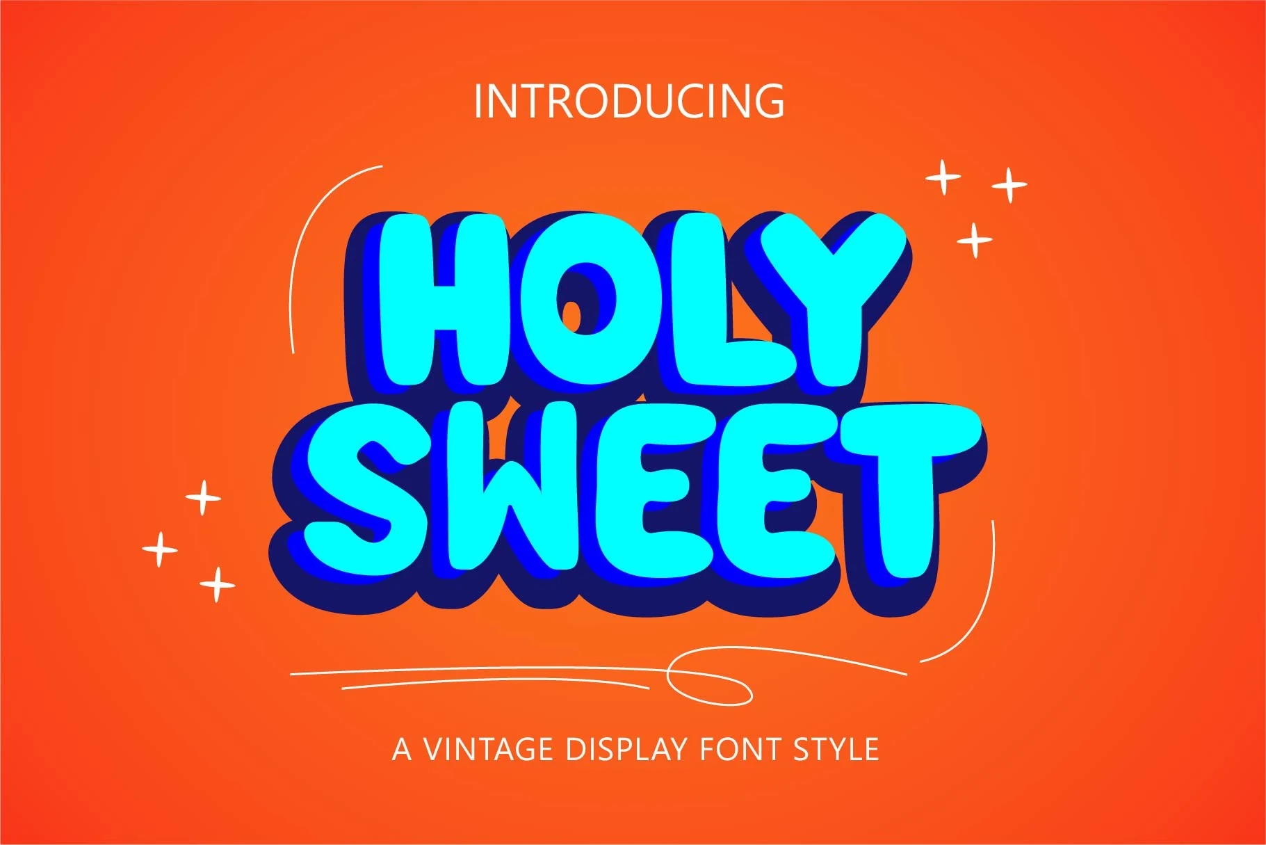
Best For: social media graphics, T-shirts, posters, short phrases
Holysweet has a soft, chunky bubble style with rounded uppercase letters and a cheerful retro bounce. The strokes stay thick and even, while the curved corners and deep shadow-friendly shapes give each word a bright, toy-like presence that reads quickly at display size.
It fits naturally into Groovy Display Fonts, especially for short words that need a bold, upbeat silhouette. The uppercase set keeps layouts clean, and the extra symbols can help build playful accents around titles without competing with the main lettering.
Sunnyland Font
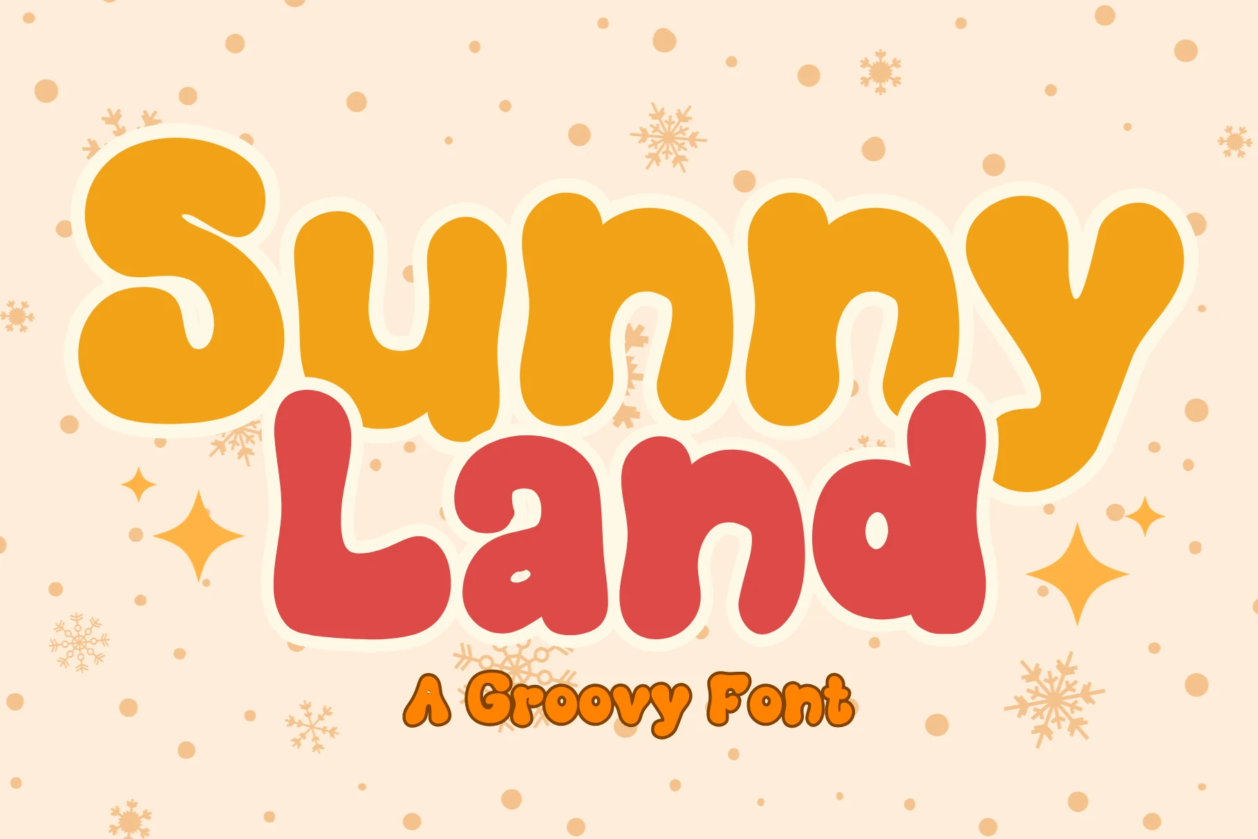
Best For: logos, invitations, stickers, playful designs
Sunnyland uses oversized rounded letters with a soft, squishy rhythm that feels instantly cheerful. The monoline weight stays thick throughout, while the broad curves, gentle joins, and open counters keep the words friendly and easy to read even when the layout is compact.
Within Groovy Display Fonts, it leans more cute than flashy, which makes it a strong fit for logos, invitations, and other short headline work. Let it sit large with a little breathing room around each line, because those chunky shapes form a dense block quickly and look best when the silhouette can stay clear.
Only Monday Font
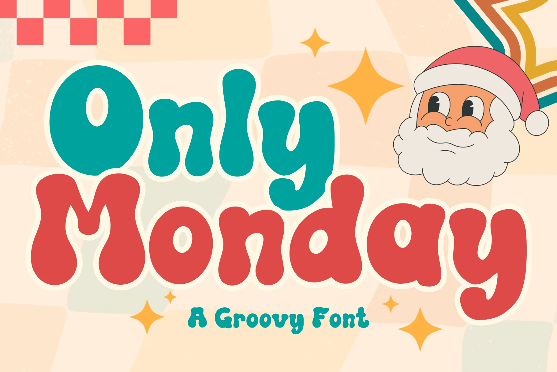
Best For: logos, invitations, playful designs, cute designs
Only Monday has big rounded letterforms with soft edges, deep curves, and a compact, bouncy rhythm. The strokes stay thick and even, so the words feel friendly and full without turning stiff, while details like the droplet-shaped counters and bulbous terminals keep the texture lively.
Among Groovy Display Fonts, this one leans especially cute and approachable, which makes it work well for branding, invitations, and short headline treatments. Keep the text brief and let the letters sit large, because the tight, puffy shapes create a strong silhouette that carries the layout on its own.
Quick Font
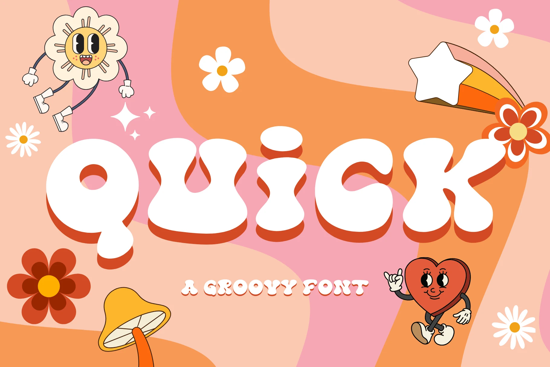
Best For: logos, invitations, playful designs, cute designs
Quick has inflated, rounded letters with deep curves and a low, soft rhythm that makes the word feel almost cushioned. The heavy monoline build, bulb-shaped terminals, and generous counters give it a bubbly presence without losing readability.
Its place in Groovy Display Fonts comes from shape rather than ornament, with exaggerated weight creating instant retro charm. Use it for short names or headlines, and keep the spacing fairly snug so those chunky forms lock together as one compact, cheerful block.
Tf Bombass Font
Best For: posters, T-shirts, merch design, retro designs
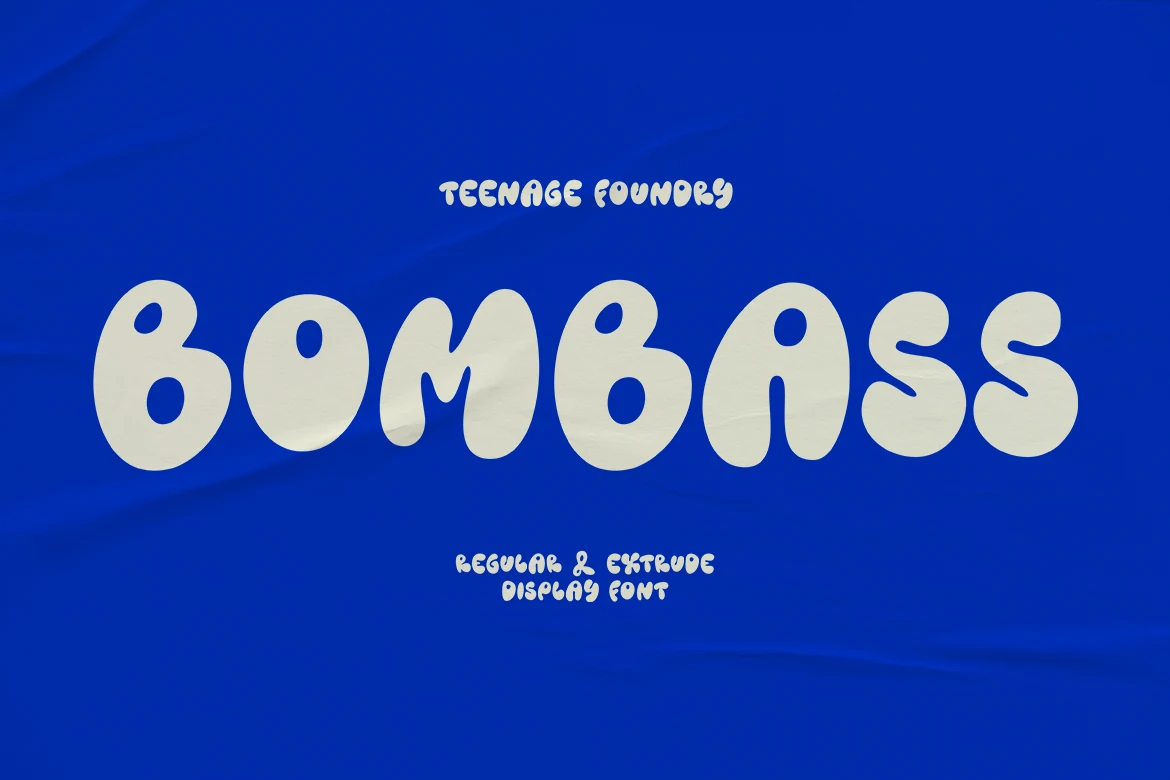
Tf Bombass Font has a plump, blobby silhouette with rounded terminals and slightly irregular curves that keep it feeling loose and hand-drawn. The heavy strokes give it plenty of presence, but the open shapes stop the words from turning stiff or overly dense.
Its appeal in Groovy Display Fonts comes from that soft psychedelic rhythm, which makes short titles feel upbeat and instantly retro. It works best when you let the letters stay large and close-set, since the rounded forms already build enough movement without extra spacing.
Chunky Retro Groovy Display Fonts
These heavier retro fonts keep the groovy mood but add sturdier shapes, compact proportions, and stronger headline weight for posters, covers, branding, and display text.
Monstra Guthen Font
Best For: branding, posters, headlines, retro designs
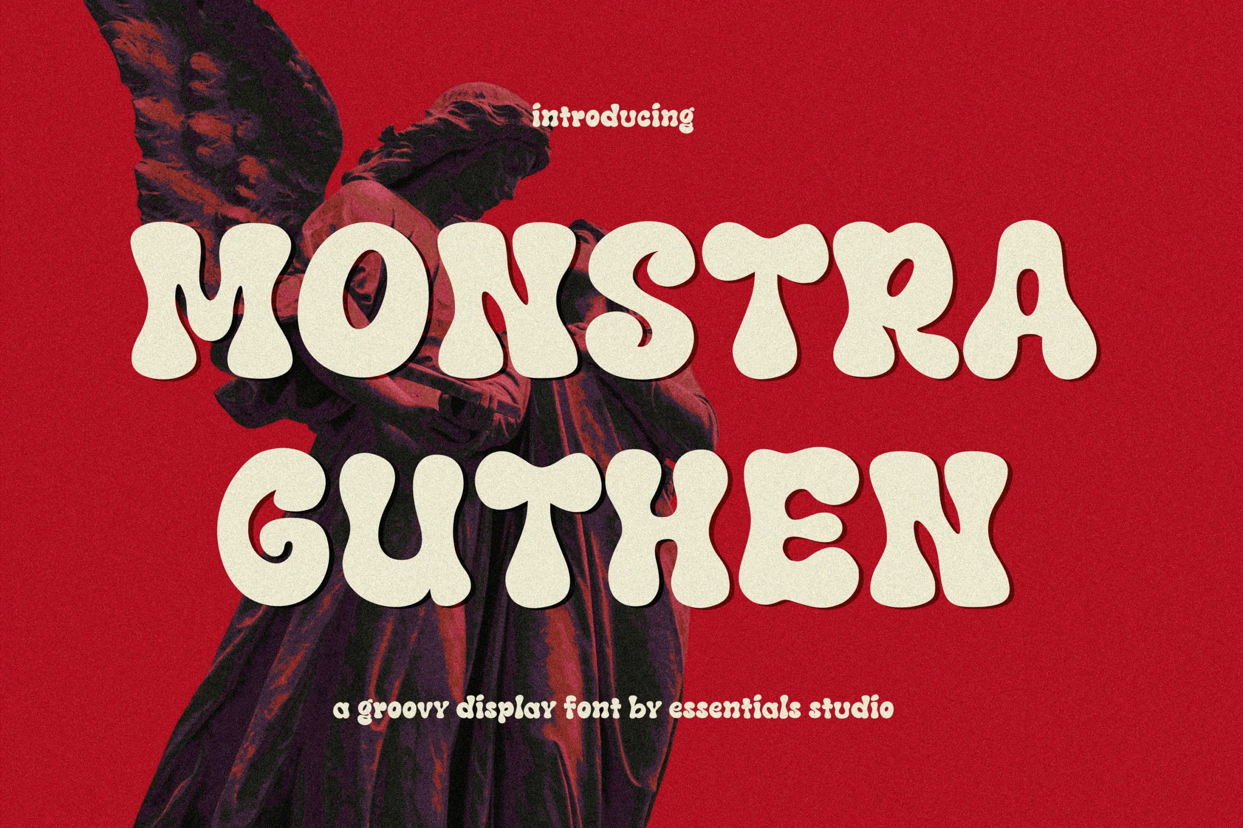
Monstra Guthen Font has inflated, low-contrast letterforms that instantly take over a layout. The broad bowls, soft notches, and rounded feet give it a heavy 70s pulse, while the smooth finish keeps it cleaner than many Groovy Display Fonts with a rougher, more distressed feel.
It works best in short headlines where those oversized curves can stay clear and punchy. Use generous line spacing and pair it with quiet backgrounds or simple supporting type; the letters are visually dense, so a restrained composition helps the word shape stay bold and readable.
Retro Font
Best For: retro designs, posters, T-shirts, stickers
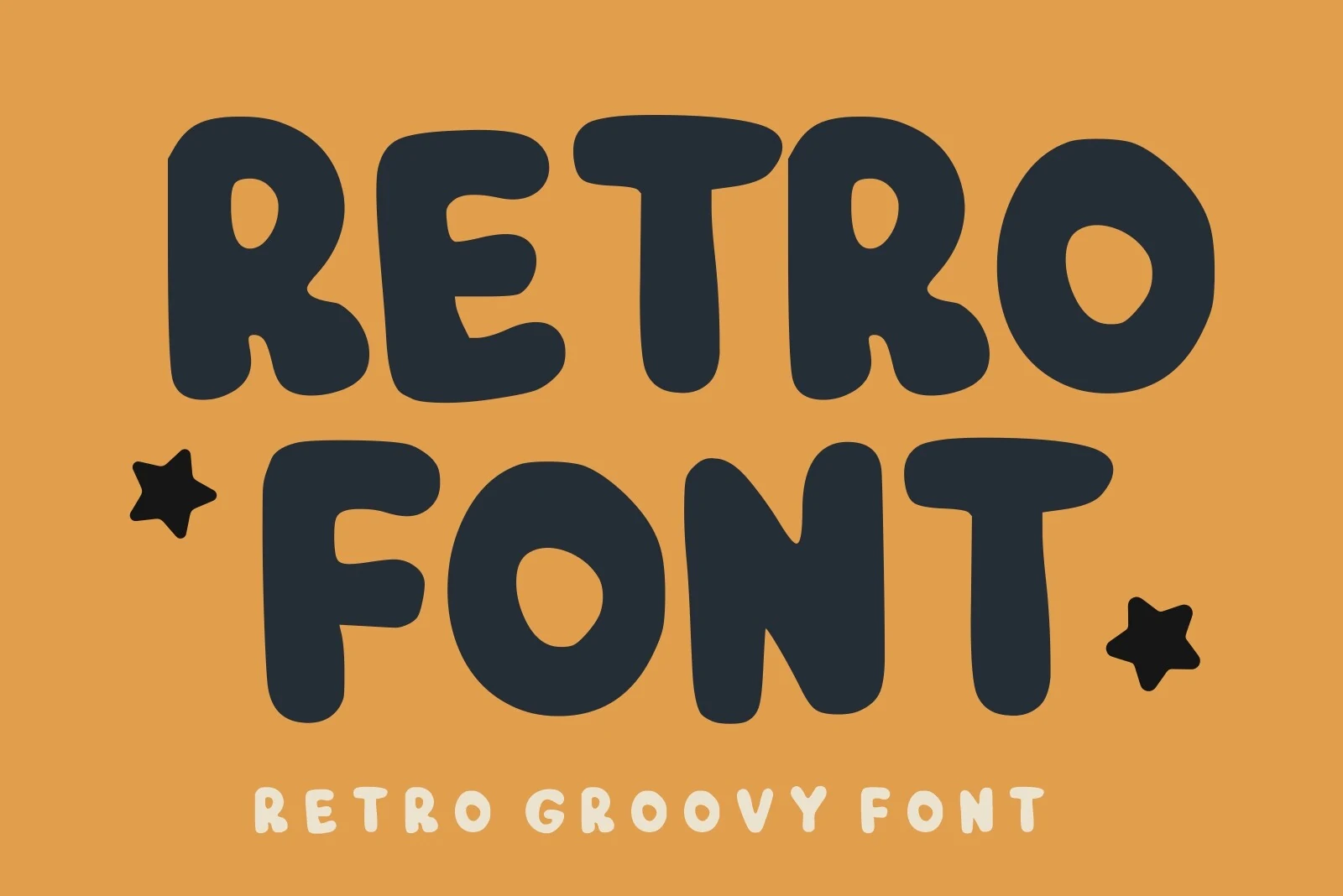
Retro Font keeps things simple and punchy with thick rounded strokes, broad proportions, and soft corners that echo easygoing 70s lettering. The letterforms feel sturdy rather than decorative, which gives it a cheerful, approachable voice and makes it a natural fit for Groovy Display Fonts with a clean, readable look.
Because the shapes are so full and compact, it performs best in short headlines where the silhouette can do the work. Try it with generous scale and straightforward color contrast, then pair it with a lighter supporting face so the chunky rhythm stays clear instead of overwhelming the layout.
Choco Groovy Font
Best For: retro designs, T-shirts, book covers, playful designs
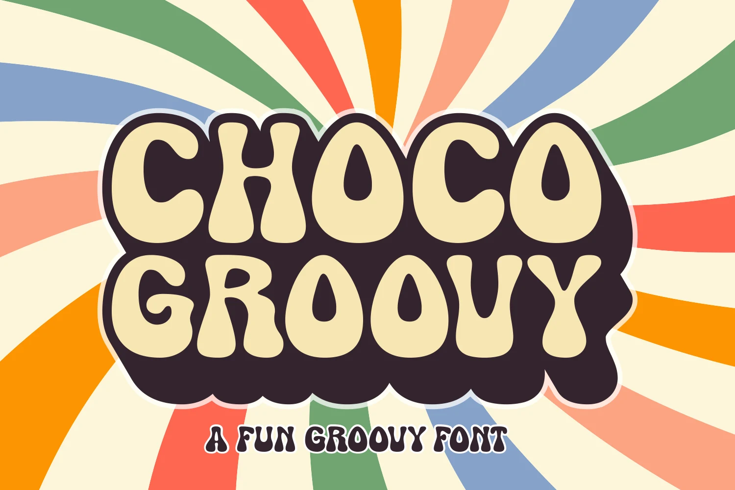
Choco Groovy Font has thick rounded letterforms with soft corners, narrow inner counters, and a dense silhouette that reads like classic 70s bubble typography. The heavy dark backing shape gives the words extra weight, so it fits Groovy Display Fonts that need a cheerful retro voice without looking fussy.
It performs best in short titles where the compact shapes can hold together and create a strong block of color. Try it on apparel or cover work with simple supporting type, and keep enough spacing around the headline so the chunky forms and bold contrast do not feel crowded.
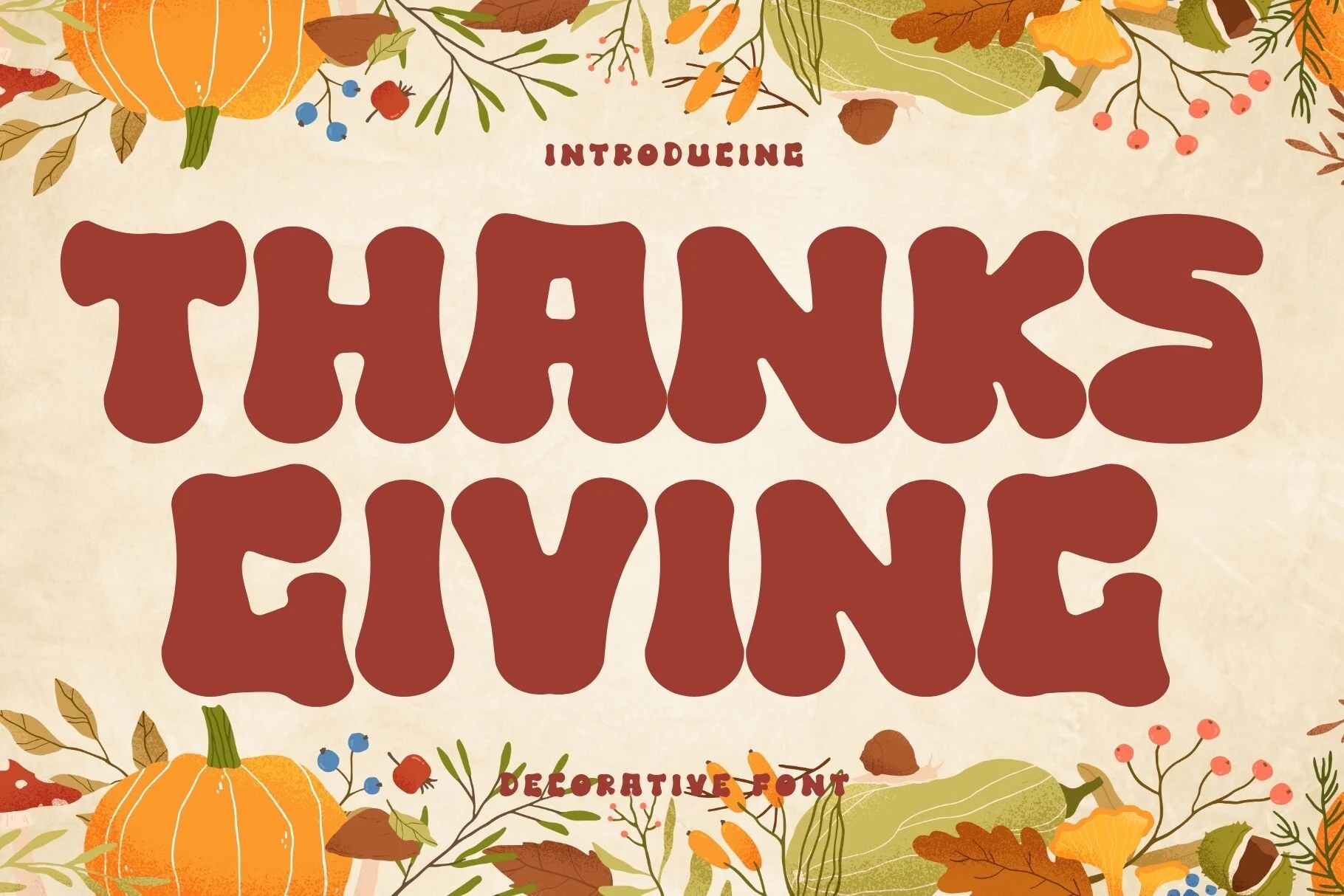
Thanksgiving Font
Best For: logos, branding, invitations, retro designs
Thanksgiving Font has broad rounded strokes, soft inward curves, and a slightly irregular rhythm that gives each word a warm retro weight. The chunky silhouette feels friendly rather than sharp, so it suits Groovy Display Fonts that need a nostalgic headline with plenty of personality.
The letterforms are wide and visually dense, which makes them strongest in short titles, logos, and card fronts instead of longer copy. Give the lines a little extra breathing room and pair them with a quieter secondary typeface; that contrast keeps the playful shapes readable while letting the bold proportions carry the mood.
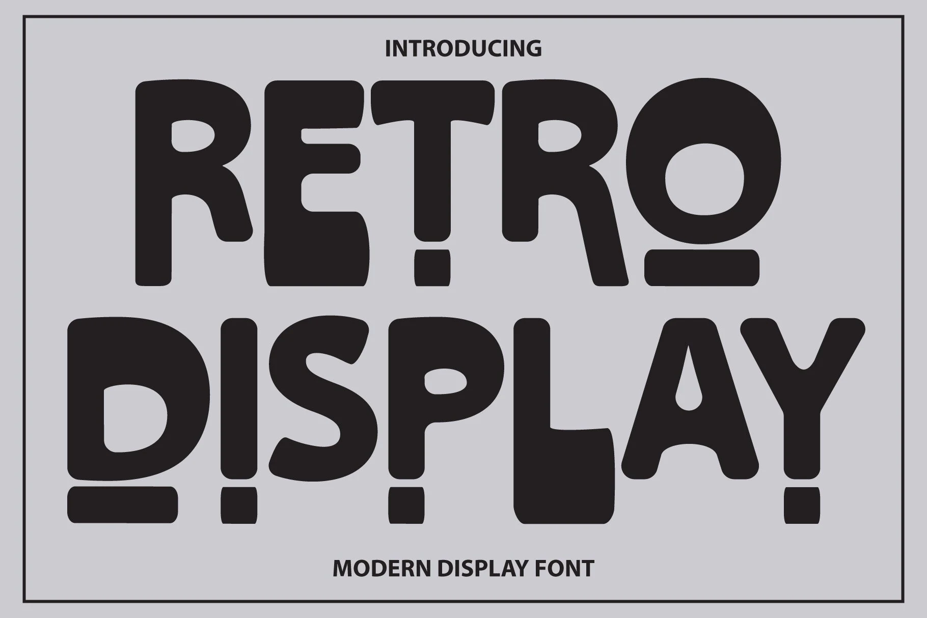
Retro Display Font
Best For: retro designs, posters, headlines, display text
Retro Display Font uses thick, rounded letters with a slightly uneven groovy rhythm. The counters stay open enough to keep the heavy weight readable, while the squared-off terminals and low-slung punctuation give the alphabet a poster-like, graphic punch.
Its place in Groovy Display Fonts comes from proportion more than decoration: wide curves, compact spacing, and blunt shapes create instant impact without extra texture. Use it for short titles where the word shape matters, and keep contrast high so the dense black forms stay crisp.
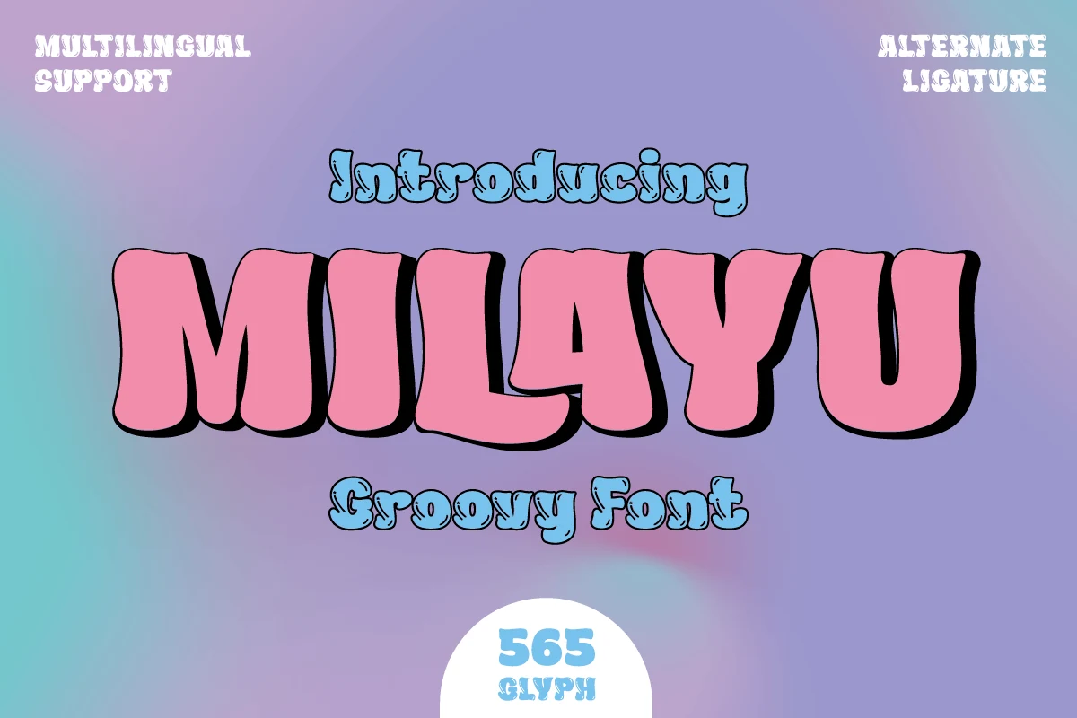
Milayu Font
Best For: logos, posters, headlines, retro designs
Milayu has thick, pillowy letterforms with rounded corners, soft inward curves, and a slightly condensed build that makes each word feel full and weighty. The heavy black shadow in the preview suits its shape well, showing how the font holds onto bold contrast without losing readability.
Milayu sits naturally within Groovy Display Fonts because its chunky silhouette brings retro energy without becoming messy. It works best for short headlines or logos where the wide strokes can stay large, and tighter spacing helps the letters lock together into one strong, graphic block.
Wavy Psychedelic Groovy Display Fonts
These wavy and psychedelic fonts bring stretched curves, uneven rhythms, and liquid silhouettes for poster art, music graphics, nostalgic packaging, and bold 70s-inspired layouts.
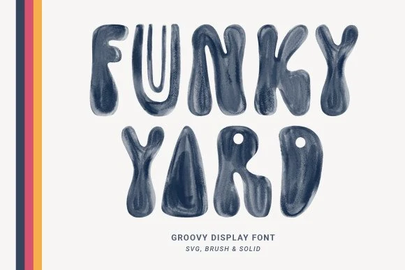
Funky Yard Font
Best For: retro designs, posters, stickers, playful designs
Funky Yard Font leans into a liquid retro look, with swollen strokes, pinched joins, and a soft brushy texture that makes each letter feel hand-shaped. Those wobbly silhouettes create a cheerful, offbeat rhythm that suits Groovy Display Fonts when you want a headline to feel playful rather than polished.
It works best in short display lines where the unusual proportions stay readable and the texture has room to show. Try wider line spacing and keep supporting text clean and simple; the font already brings plenty of movement, so a restrained layout helps the chunky forms hold attention.
Chups Font
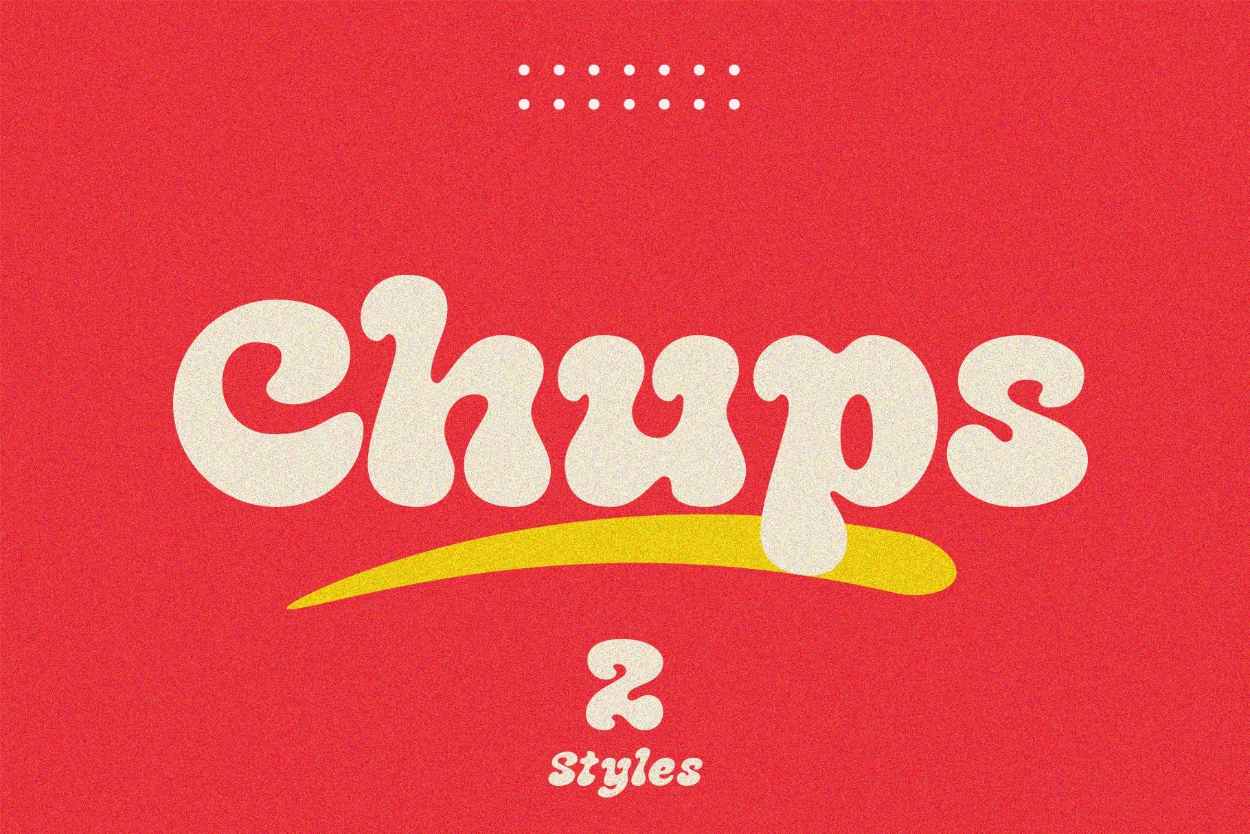
Best For: posters, invitations, retro designs, fun designs
Chups Font leans fully into a psychedelic 70s mood, with swollen curves, heavy rounded strokes, and soft hooked terminals that make each word feel elastic. The broad counters and bouncy rhythm give it the cheerful punch expected from Groovy Display Fonts, especially when you want a title to feel loud, warm, and a little nostalgic.
It is strongest in short phrases where the wavy silhouette can stay readable and decorative at the same time. Use it large, keep surrounding typography simple, and give the letters enough breathing room so the chunky forms and curved baseline movement do not crowd each other.
Chunky Smile Font
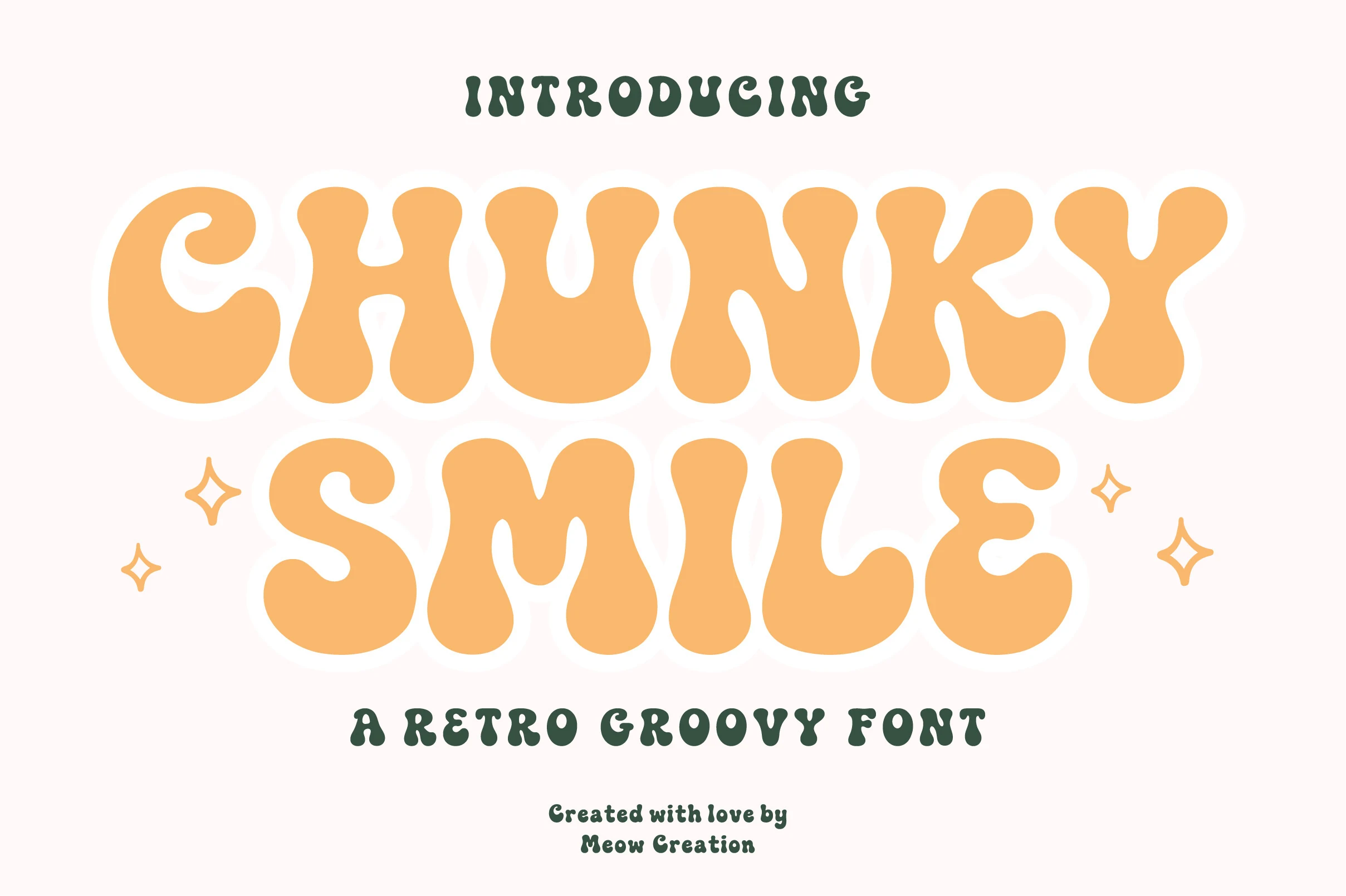
Best For: retro designs, posters, headlines, playful designs
Chunky Smile Font has swollen 70s-style letterforms with soft droplet terminals, rounded corners, and slightly pinched joins that give each word a mellow, bouncy rhythm. That easygoing silhouette makes it a strong fit for Groovy Display Fonts when you want something bold but not overly heavy.
The medium weight helps the shapes stay open, so it works especially well in short headlines where the quirky contours can stay clear. Give it room around the edges and pair it with a plainer companion face; the contrast keeps the retro personality front and center without making the layout feel crowded.
Sunday Brunch Font
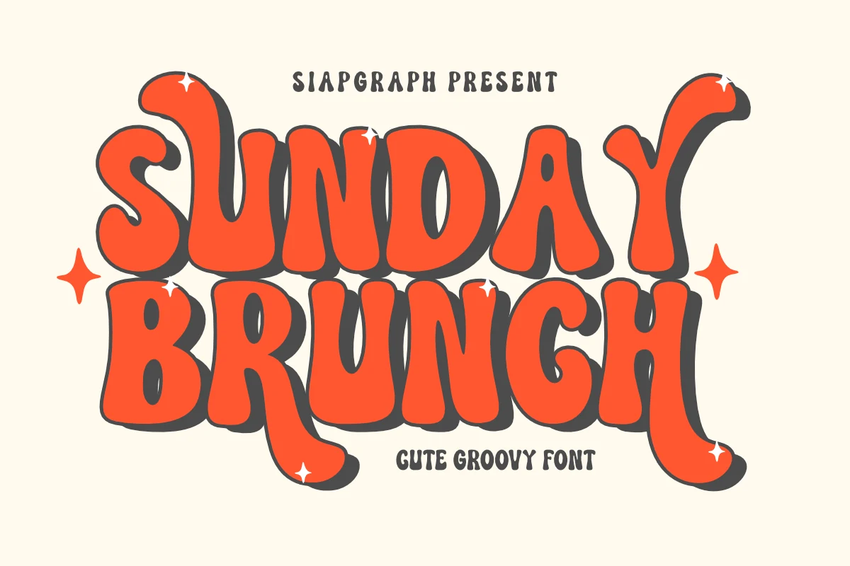
Best For: posters, packaging, T-shirts, retro designs
Sunday Brunch has the kind of chunky, wavy rhythm that instantly feels upbeat. The letters are broad and bubbly, with soft bends, pinched joins, and dramatic tails that give the words a rolling 70s bounce instead of a rigid blocky look.
It fits naturally into Groovy Display Fonts thanks to its playful silhouette and bold presence, especially when used on short phrases where the letterforms can stay large and expressive. Give it a little extra line spacing in stacked titles, since those extended terminals and curves are part of what makes the composition feel lively.
Groove Tribe Font
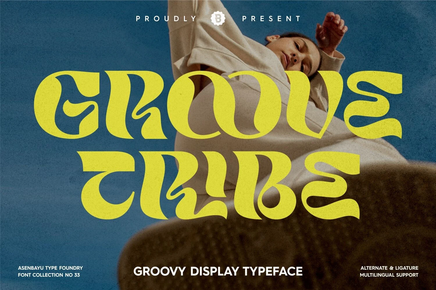
Best For: logos, posters, social media graphics, fashion branding
Groove Tribe has a fluid, heavy silhouette with sweeping inner curves and soft flared terminals that make each letter feel almost poured onto the page. The forms are wide and sculpted rather than blocky, which gives it that youthful retro pull without losing clarity.
Within Groovy Display Fonts, this one stands out for its broad rhythm and slightly stretched proportions, making short headlines feel full and graphic very quickly. It works best when you let the letterforms lead the layout, especially in logos or posters where a little extra breathing room keeps those curving details readable.
Brisker Font
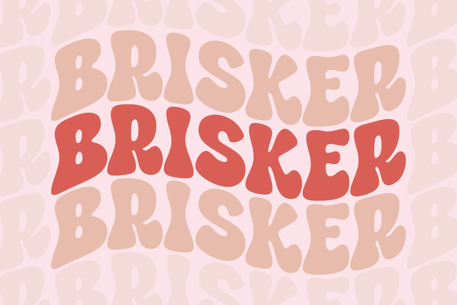
Best For: posters, T-shirts, invitations, headlines
Brisker leans into thick, undulating shapes with wide bowls, pinched joins, and softly tapering ends that keep the lettering lively. Even with its heavy weight, the forms feel buoyant rather than blocky, which gives the type a cheerful retro texture instead of a rigid poster look.
That makes it a natural fit for Groovy Display Fonts, especially when a short phrase needs to carry the whole design. Set it large and keep spacing fairly close, since the irregular silhouette is the real appeal and reads best when the letters can lock together as one bold shape.
Holiday Sunshine Font
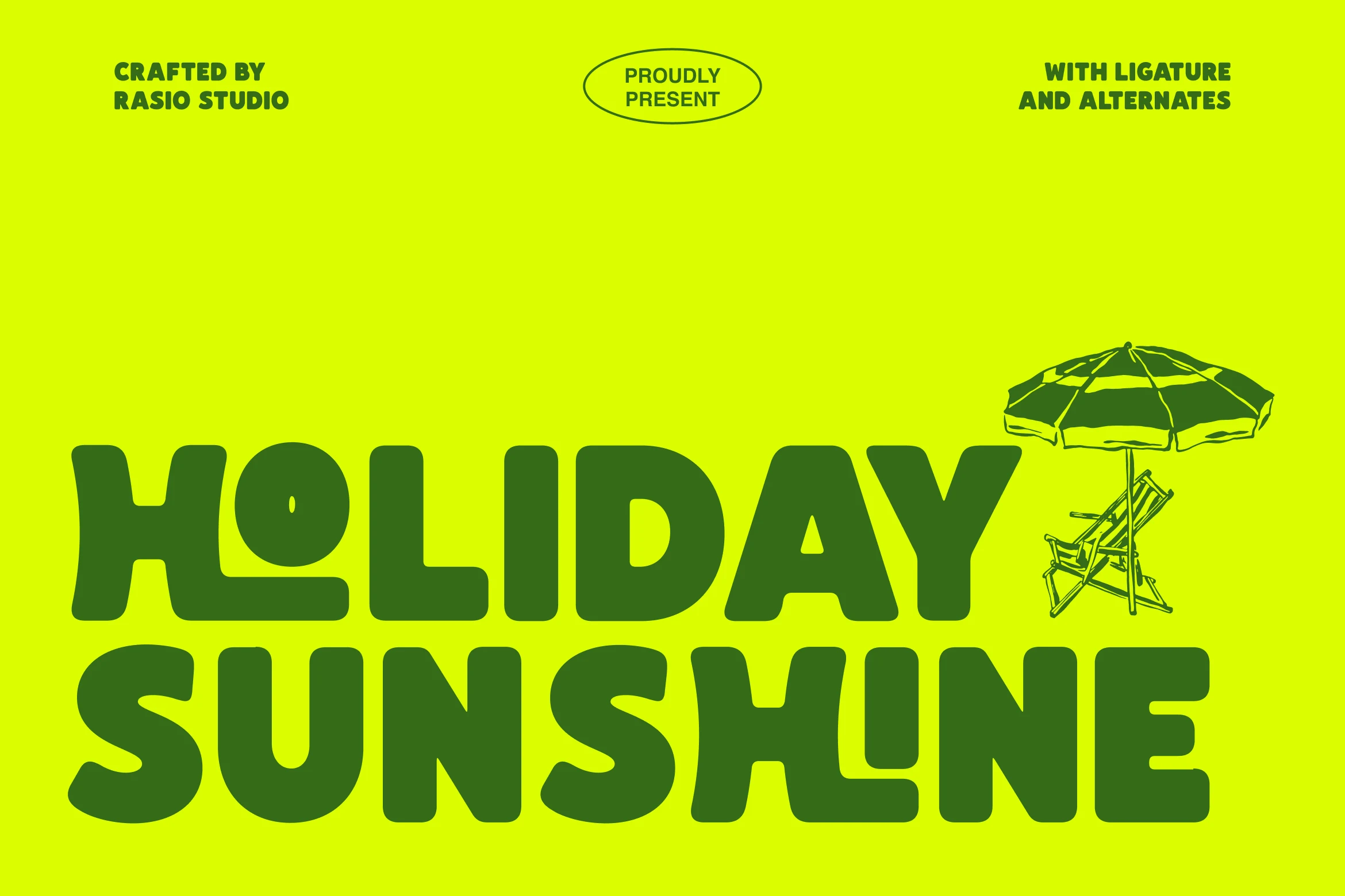
Best For: branding, social media graphics, website headers, T-shirts
Holiday Sunshine Font has thick rounded caps, soft inner corners, and playful cut-in counters that give each line a buoyant, almost liquid silhouette. That clean heaviness keeps it bold and readable, while the retro energy makes it a strong pick for Groovy Display Fonts when you want summer-focused headlines with instant presence.
The included ligatures and alternates are useful when you want a smoother wordshape or a slightly different rhythm across logos and hero text. Keep it at generous sizes and pair it with simple supporting type, since the broad strokes and tight spacing already create a dense block of visual impact.
Script & Flowing Groovy Display Fonts
These flowing groovy scripts use connected strokes, swashes, and brushy movement, giving logos, fashion branding, posters, and retro wordmarks a more expressive feel.
Arighton Font
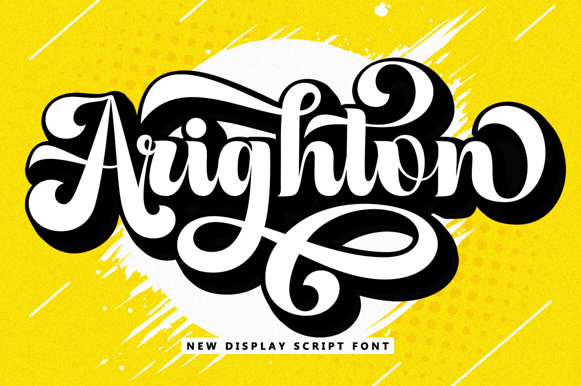
Best For: logos, fashion branding, T-shirts, retro designs
Arighton Font combines thick flowing strokes with oversized swashes, giving it a confident retro script presence that fills the page fast. The rounded joins, curled terminals, and long looping flourish create the kind of bold silhouette that makes Groovy Display Fonts especially effective for logos and statement branding.
This is a display face for short wording, where the connected rhythm and dramatic shadow space can stay clear. Let the swash do the work by keeping surrounding elements simple, and use strong size contrast in your layout so smaller details do not compete with its dense script movement.
Regisa Font
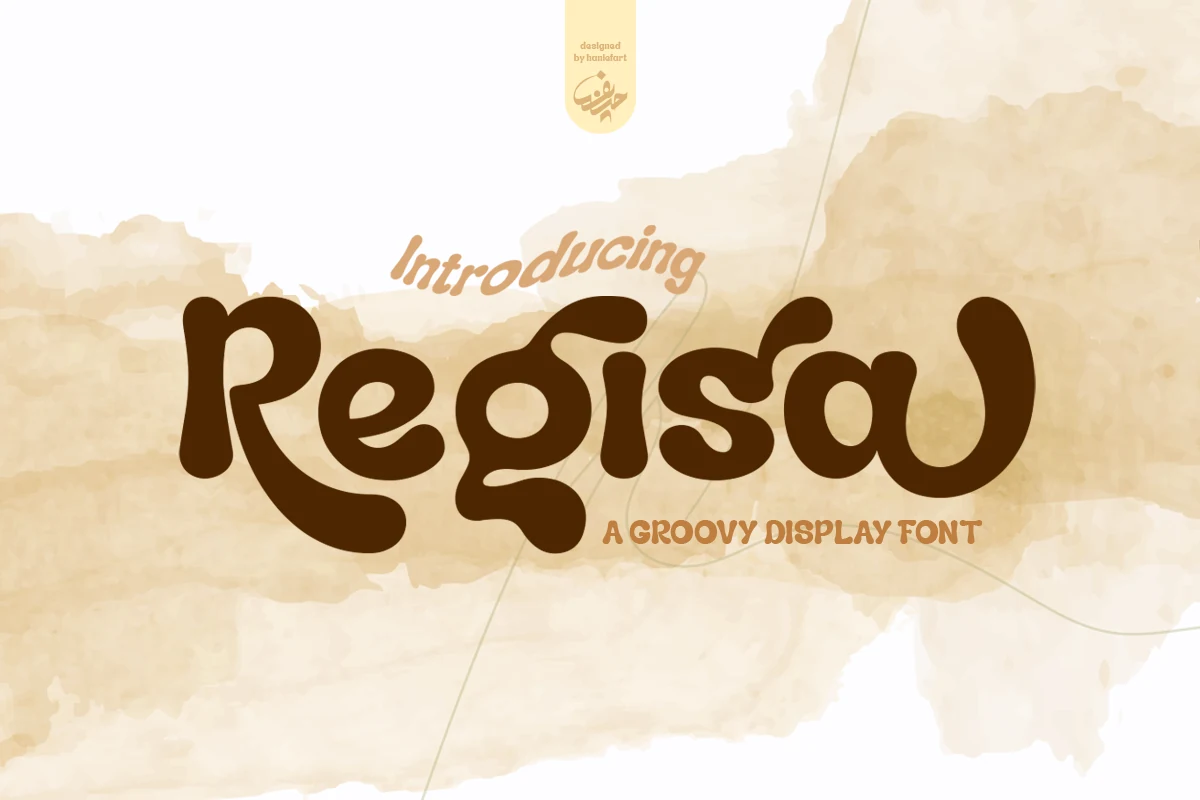
Best For: branding, magazine covers, T-shirts, retro designs
Regisa Font has thick, flowing strokes with rounded terminals and soft inward curves that give the wordshape a loose hand-drawn rhythm. The looped capital R and slightly connected movement make it stand out from more rigid Groovy Display Fonts, giving headlines a warmer, more fluid personality.
It works best in short branding lines, cover titles, and merch where those broad curves can stay clear. The letters carry plenty of motion on their own, so keep spacing a touch open and pair it with a clean supporting sans to keep smaller details from competing with the font’s sweeping forms.
Homey Font
Best For: logos, branding, posters, retro designs
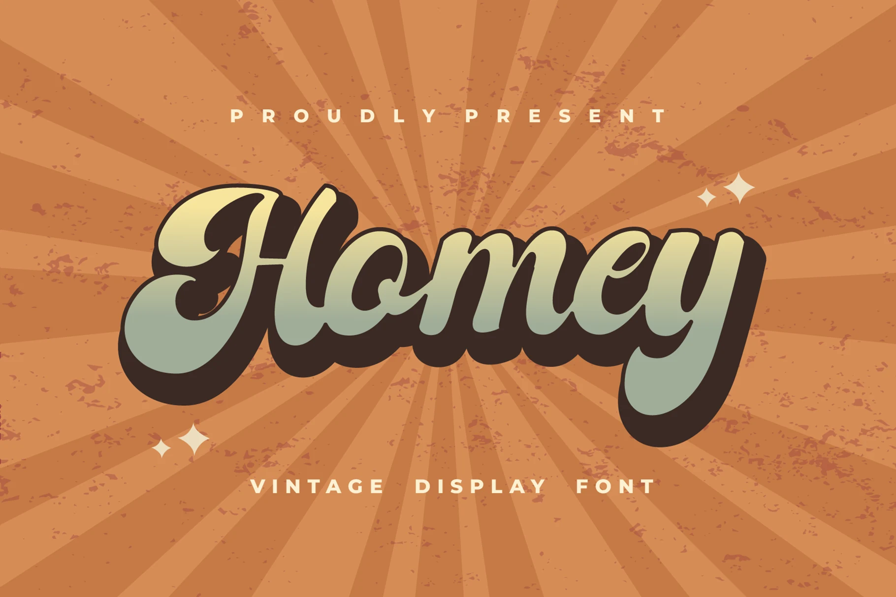
Homey leans into a slanted, brushy display shape with thick connected strokes, wide rounded joins, and an oversized swash on the H and y. The letters feel cushioned rather than sharp, so even with its heavy weight the wordmark keeps a relaxed, sun-faded rhythm.
That warmth gives it a natural place in Groovy Display Fonts, especially for logos or poster titles that need a laid-back 70s voice. Keep supporting text simple and give it some horizontal room, because the long curves and deep shadow read best when the lettering can stretch across the layout.
Serif & Vintage Groovy Display Fonts
These serif-led groovy fonts add vintage structure, flared strokes, and poster-like weight, making them useful for editorial titles, fashion layouts, logos, and refined retro branding.
Bright Elegance Font
Best For: posters, fashion branding, social media graphics, website headers
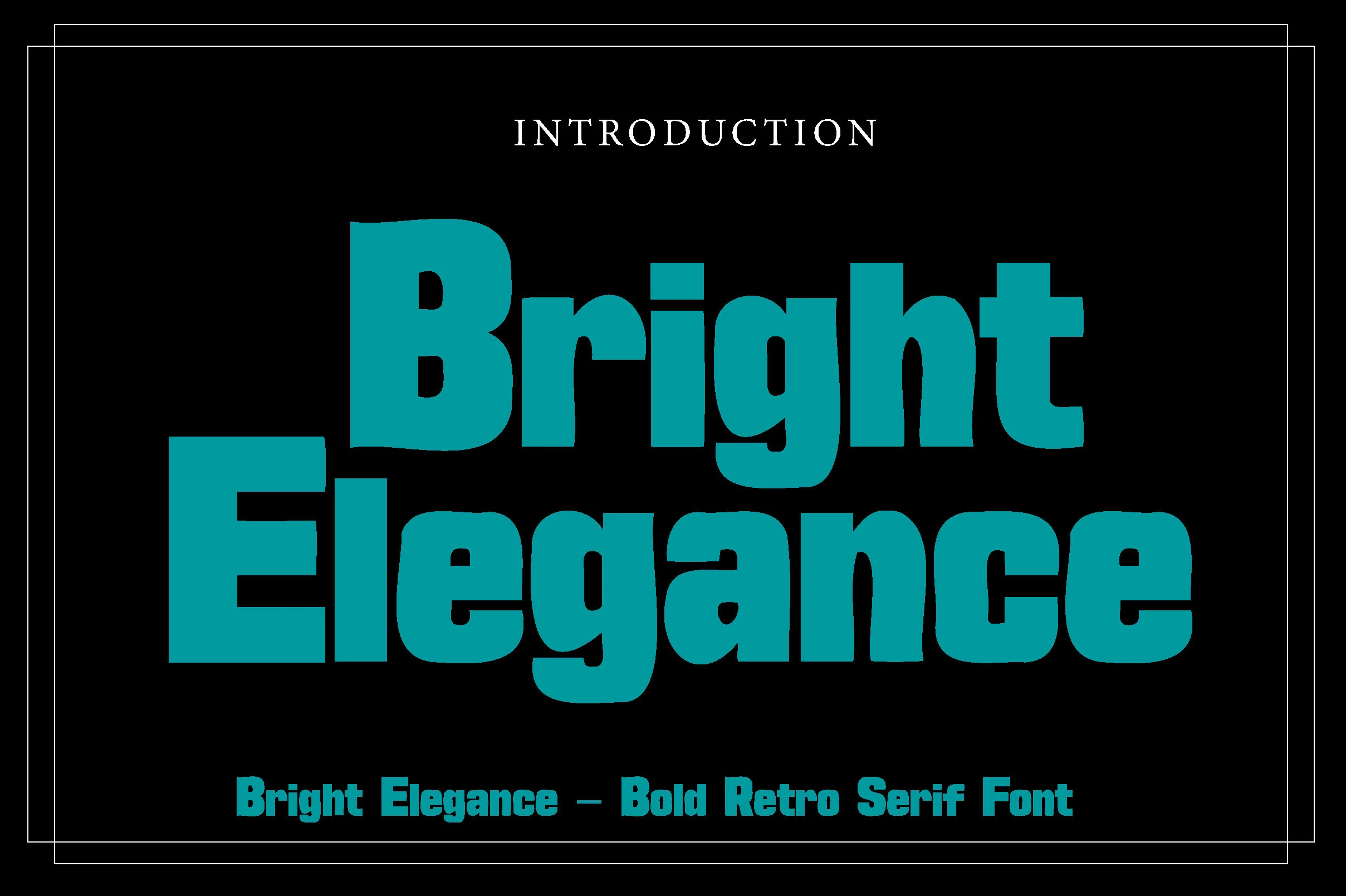
Bright Elegance has a dense retro serif build with thick stems, soft-edged serifs, and broad curves that keep all that weight feeling smooth instead of stiff. The capitals read big and confident, while details like the rounded terminals and deep bowls give stacked words a strong poster silhouette.
It earns its place in Groovy Display Fonts through rhythm rather than ornament, using exaggerated proportions to create a bold 70s pulse. Keep it on short titles or branding lines, and add a little more line spacing in stacked layouts so the oversized forms and chunky serifs stay crisp.
Geumeon Groovy Display Font
Best For: logos, posters, headlines, vintage designs
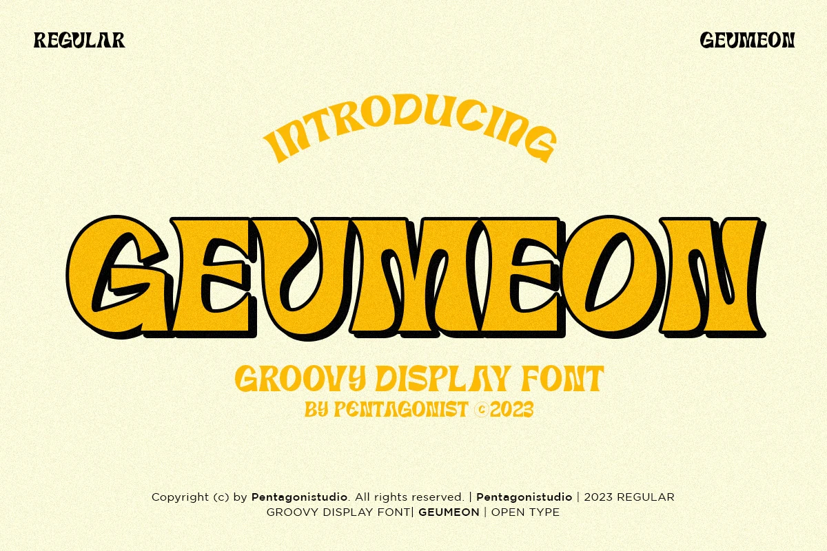
Geumeon has broad retro serif letters with pinched curves, flared strokes, and a dramatic shadowed outline that gives the wordmark a carved, dimensional feel. The forms are theatrical and heavy, yet the counters stay open enough to keep the silhouette readable at large display sizes.
It brings a sharper serif edge to Groovy Display Fonts, blending psychedelic movement with a more structured vintage look. This works especially well for titles, posters, and logo-style layouts where the letterforms can carry the whole composition, so pair it with simpler supporting text and give it room to show its shape.
Conclusion
Choose rounded bubble styles when you need a loud retro headline, wavy psychedelic fonts when movement matters, flowing scripts for logo work, and vintage serif options when the design needs more structure and brand polish.