22 Luxury Sans Serif Fonts for Premium Branding in 2026
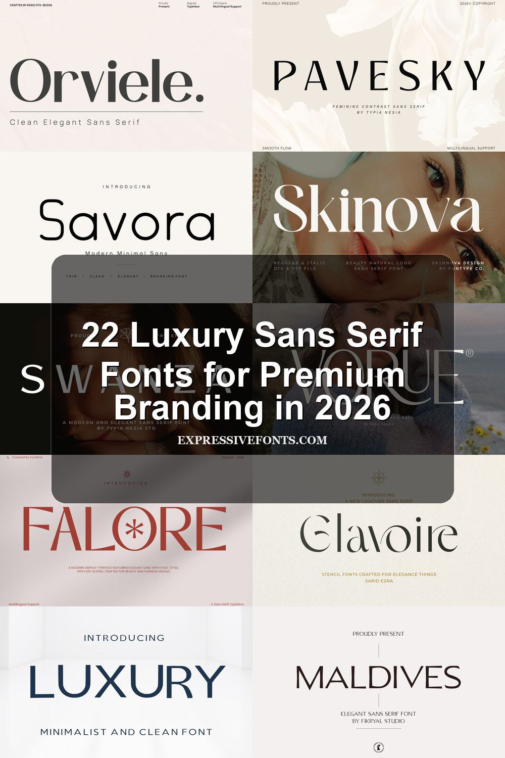
Luxury Sans Serif Fonts give premium branding a cleaner, sharper voice without losing elegance. This collection is built for designers working on logos, beauty packaging, fashion editorials, wedding stationery, product labels, and high-end social graphics where spacing, proportion, and restraint matter.
Minimal & Wide-Tracked Luxury Sans Serif Fonts
Choose these airy, restrained sans serifs when you need clean logo marks, fashion headers, or premium layouts built around spacing, scale, and quiet control.
Luxury Font
Best For: logos, beauty branding, fashion branding, luxury designs
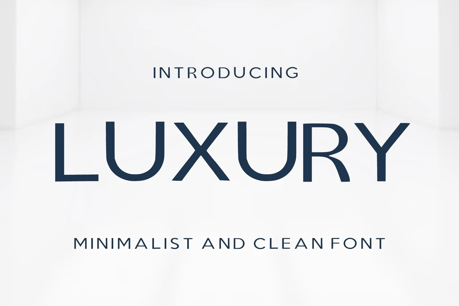
Luxury Font uses broad spacing, clean capital forms, and a controlled geometric rhythm to create a polished identity style without decorative excess. The main wordmark shows confident weight, sharp diagonals, and a smooth rounded U, while the lighter supporting text shows how the same minimalist construction can handle quieter hierarchy.
It belongs naturally with Luxury Sans Serif Fonts, especially where contrast comes from scale, spacing, and restraint rather than ornament. Keep headlines short, let the tracking stay open, and pair it with understated body text so the wide proportions keep their premium, editorial tone.
Highfield Font
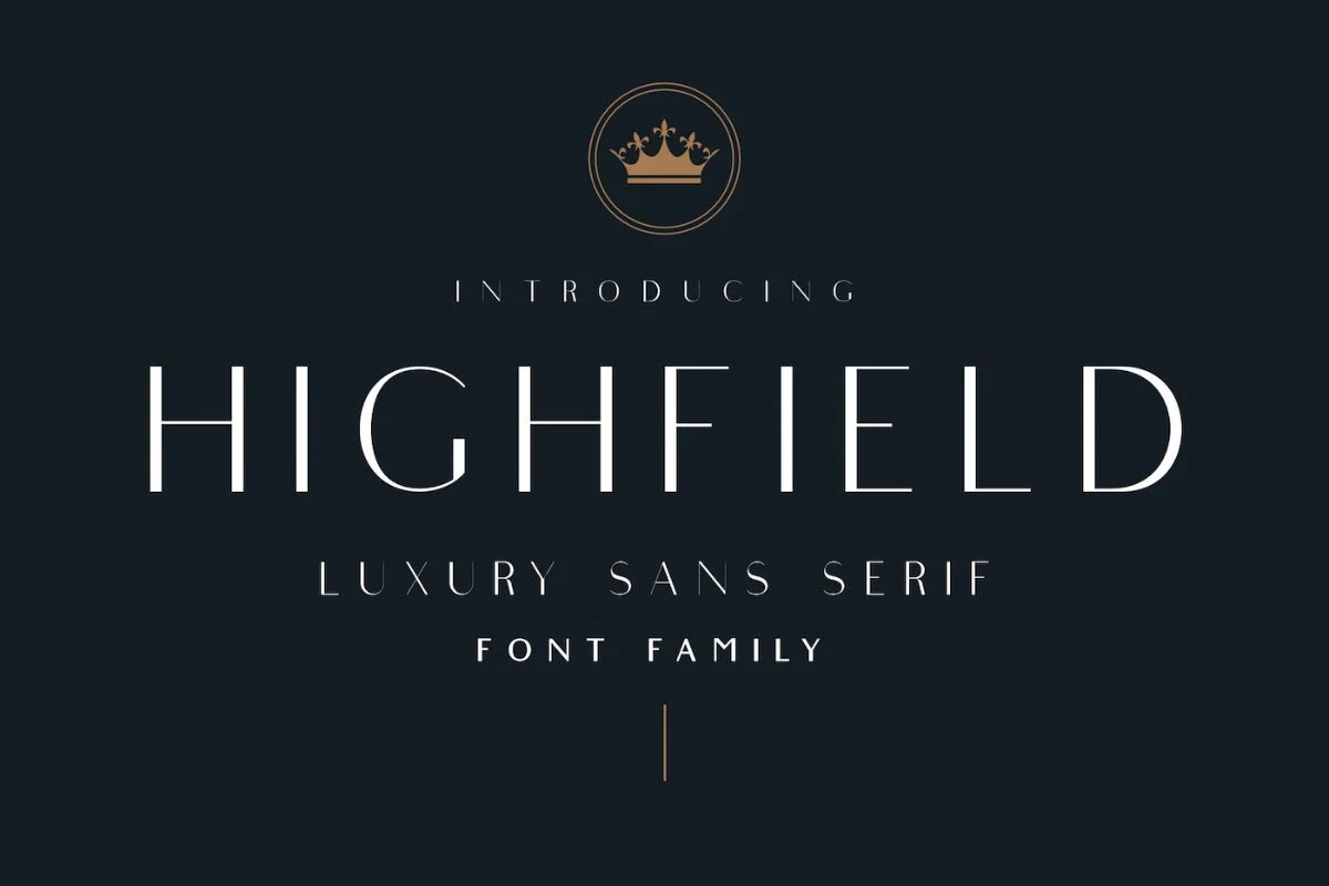
Best For: logos, editorial designs, fashion branding, high-end designs
Highfield Font has a polished editorial feel built from tall, slender capitals, even monoline strokes, and generous spacing that gives each letter room to breathe. The geometry is clean, but the optical corrections keep the forms from feeling cold, so headings look sharp and balanced rather than rigid.
Within Luxury Sans Serif Fonts, this one stands out for controlled elegance and strong hierarchy. Its three weights with matching italics make it easier to build refined title systems, and it works best when you contrast the airy uppercase display style with quieter supporting text or smaller subheads.
Caveline Font
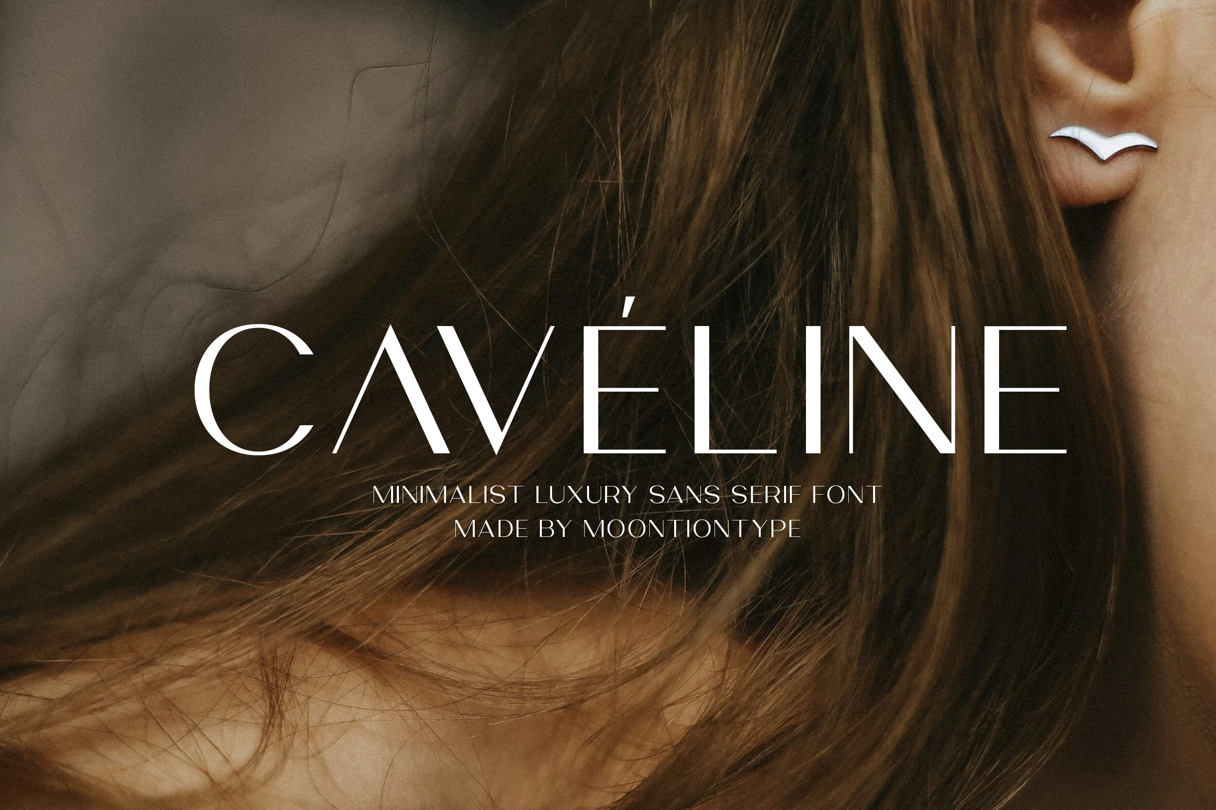
Best For: logos, fashion branding, editorial designs, premium designs
Caveline Font feels pared back and polished, with tall uppercase forms, fine strokes, and a crisp accented É that gives the wordmark a signature detail. The spacing is open and measured, which keeps the letters airy, while the elongated proportions add a quiet fashion-editorial elegance.
Caveline fits the mood of Luxury Sans Serif Fonts, especially when you want a sleek identity without ornamental fuss. It works best in short names, logos, and headlines where scale and negative space can carry the composition, then pairs cleanly with restrained body text for a refined hierarchy.
Swanza Font
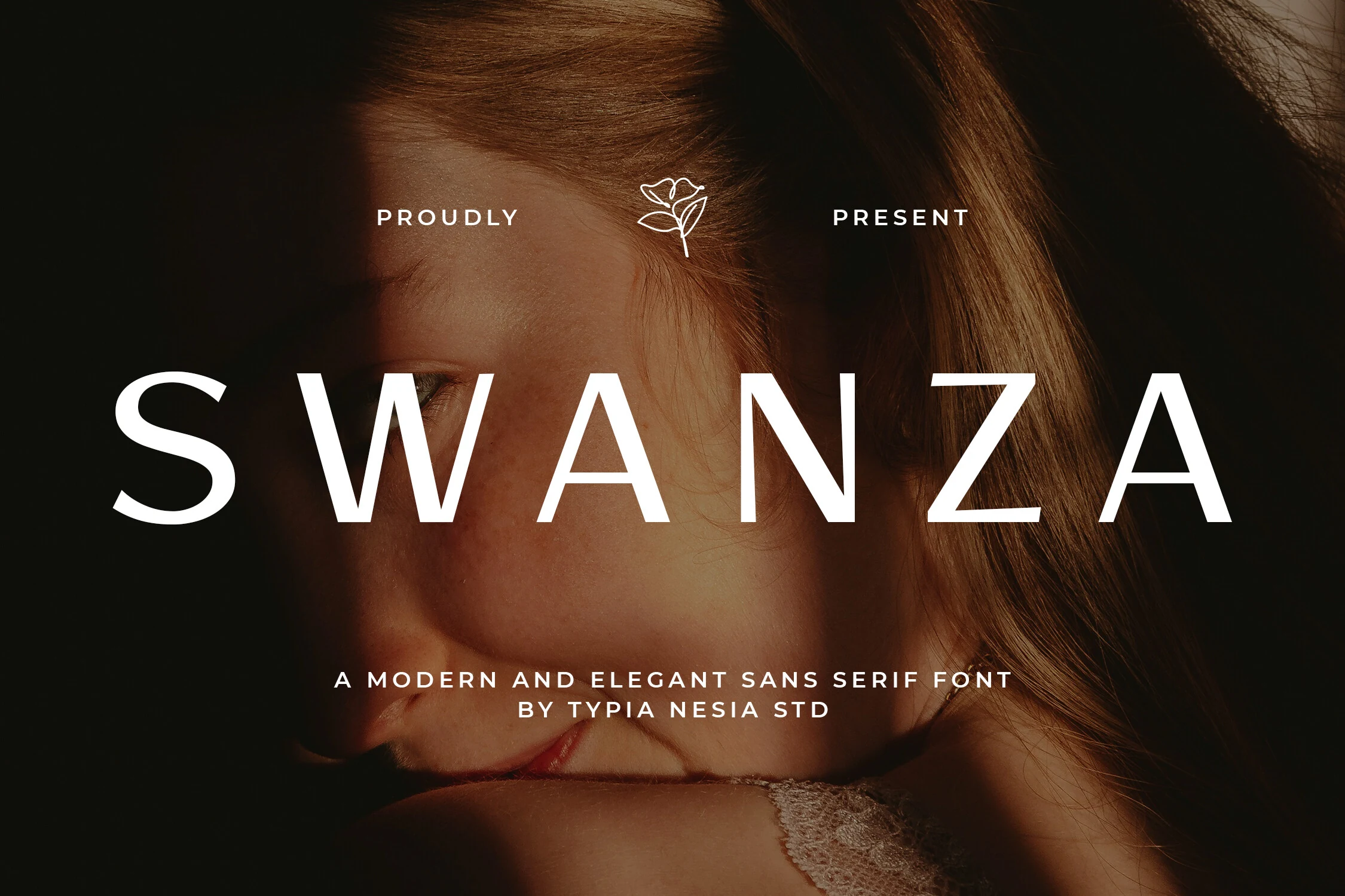
Best For: logos, beauty branding, fashion branding, luxury designs
Swanza Font has a sleek, high-clarity presence built from broad uppercase proportions, even strokes, and generous spacing. The simple verticals and open bowls keep the wordmark calm and modern, while the softly rounded curves stop it from feeling sterile.
Swanza sits comfortably with Luxury Sans Serif Fonts when a brand needs polish without extra ornament. It works especially well for beauty or fashion titles: keep the tracking open and pair it with quieter secondary text so the clean silhouette and scale carry the hierarchy.
Elvara Font
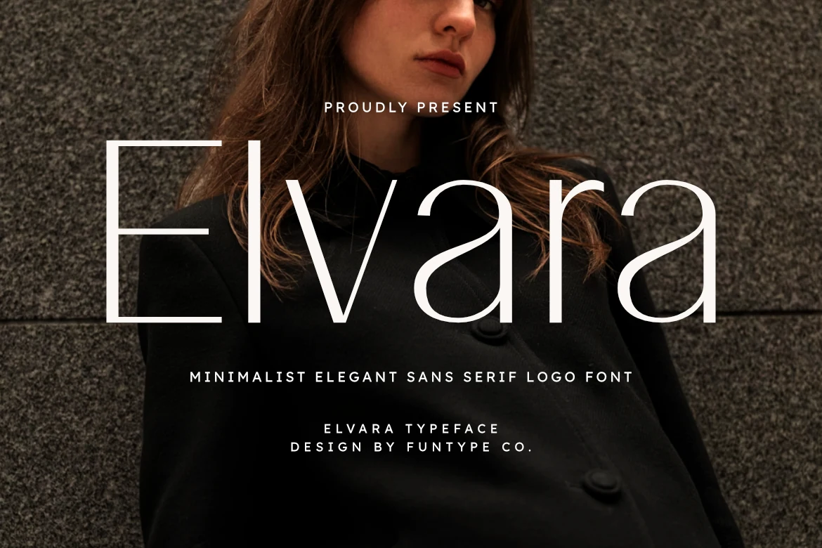
Best For: logos, editorial designs, fashion branding, high-end designs
Elvara Font is built around fine strokes, elongated verticals, and wide open curves that give the wordmark a light, floating rhythm. The single-storey a and restrained proportions keep it modern, while the slim construction adds a crisp editorial polish instead of feeling delicate or ornate.
That makes it a natural fit for Luxury Sans Serif Fonts when elegance needs to come from proportion rather than decoration. Use it for short logos or section titles, and keep the supporting text simpler and slightly smaller so its airy silhouette can hold the top of the hierarchy without losing clarity.
Savora Font
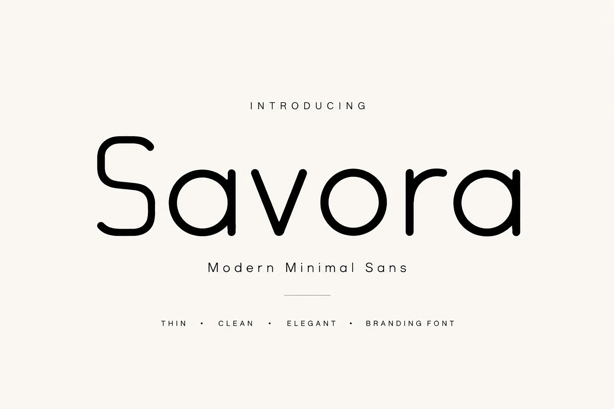
Best For: logos, branding, luxury designs, minimal designs
Savora Font has a calm, rounded sans structure with thin monoline strokes, wide spacing, and smooth geometric curves. The open rhythm keeps the wordmark clean, while the soft terminals stop the design from feeling too rigid.
For Luxury Sans Serif Fonts, Savora works best where restraint is part of the brand voice: beauty marks, fashion labels, studio identities, and premium packaging. Keep tracking generous and use strong contrast around it so the fine strokes stay sharp instead of fading into the layout.
Elvera Font
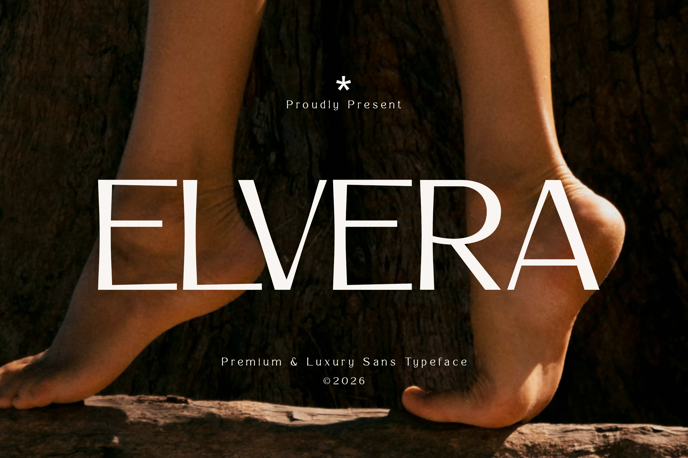
Best For: logos, fashion branding, editorial designs, high-end designs
Elvera Font pairs slim geometric strokes with generous proportions, so the all-caps wordmark feels poised rather than severe. The wide E, crisp V, and clean bowl of the R give it a quiet editorial polish, while the even stroke weight keeps the silhouette modern and controlled.
Within Luxury Sans Serif Fonts, Elvera is strongest for fashion identities, campaign mastheads, and cosmetic packaging where space and restraint matter. Use it in short names or titles and let the margins stay open—the measured spacing is part of the look, and it helps the thin structure read with confidence.
Avery Font
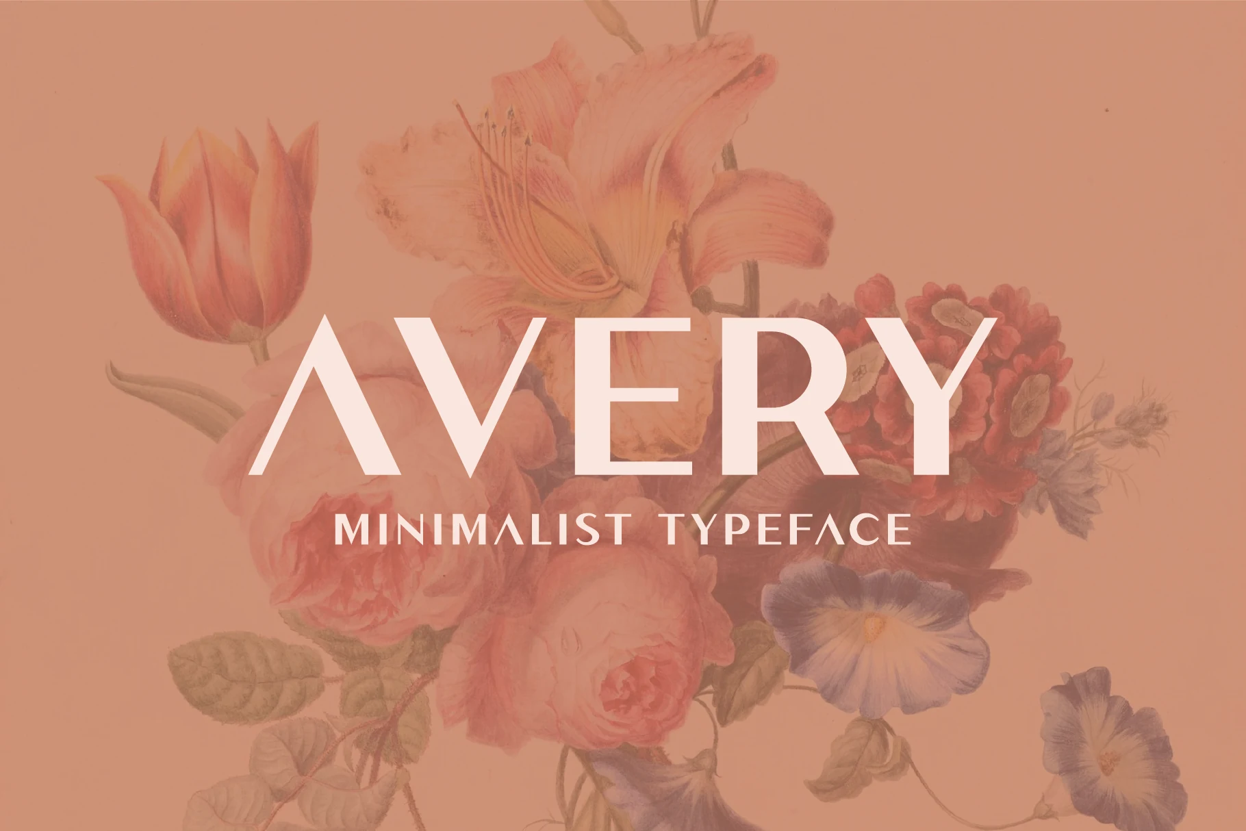
Best For: logos, social media graphics, headlines, quotes
Avery Font has a crisp, pared-back look built from tall uppercase forms, smooth strokes, and a steady geometric rhythm. The pointed A and sharp V bring structure, while the even line weight and open spacing keep the wordmark airy instead of severe.
In Luxury Sans Serif Fonts, Avery works especially well for titles, logo concepts, and polished social posts where you want clarity without losing style. Keep the wording short and give it room around the edges, since its clean silhouette and spacing do most of the visual work.
Editorial & High-Contrast Luxury Sans Serif Fonts
This group uses slim joins, bold curves, and refined contrast for beauty campaigns, magazine covers, boutique packaging, and polished display typography.
Falore Font
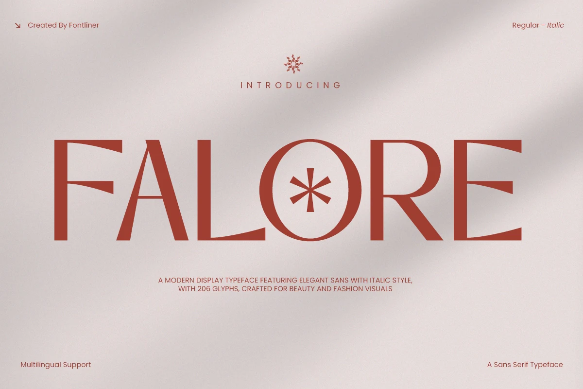
Best For: fashion branding, beauty branding, editorial designs, luxury designs
Falore Font leans into a fashion-editorial mood with tall high-contrast forms, crisp verticals, and elegant curves that feel both sharp and controlled. The narrow proportions, refined R, and elongated oval O give the wordmark a poised rhythm, while the clean sans structure keeps it from drifting into something overly ornate.
That balance makes it a strong fit for Luxury Sans Serif Fonts, especially when you want display type with a softer feminine edge. Its italic companion can add movement in subheads or pull quotes, but the upright style is strongest for short titles where spacing, scale, and contrast can do most of the visual work.
Skinova Font
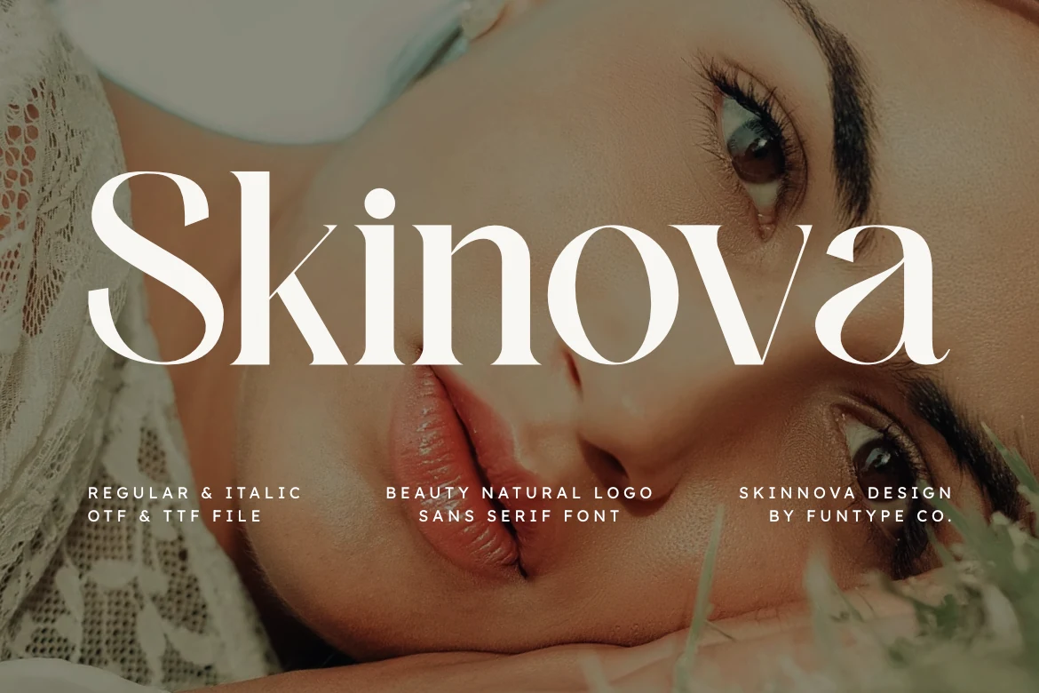
Best For: beauty branding, fashion branding, packaging, product labels
Skinova Font has a graceful display character shaped by high-contrast strokes, smooth bowls, and soft tapering curves. The oversized S and rounded o forms give it a polished beauty-editorial mood, while the clean structure keeps the wordmark crisp instead of overly decorative.
It sits comfortably among Luxury Sans Serif Fonts, especially for branding that needs softness with a premium finish. Use it for short names, packaging, or covers where the contrast can stay visible, and support it with simpler secondary text so the refined letterforms remain the focal point.
Vetto Font
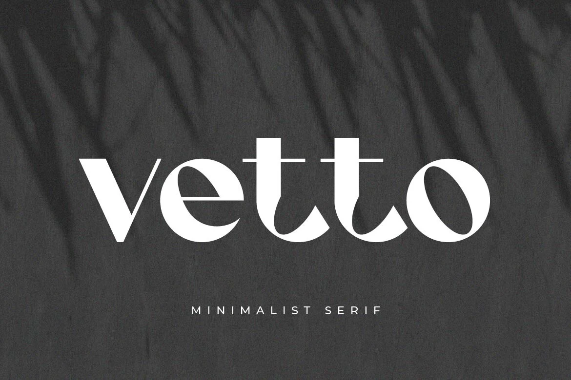
Best For: logos, beauty branding, fashion branding, high-end designs
Vetto Font has a sculpted display feel, with rounded bowls, tapered joins, and elegant contrast between thick stems and slim cross-strokes. The lowercase forms make it feel softer and more intimate, while details like the curved t terminals and smooth e keep the wordmark polished and fashion-forward.
For Luxury Sans Serif Fonts, Vetto brings the most character to short brand names, packaging fronts, and boutique headers where the lettering can stay large. Give it a little space in the tracking and avoid long lines, so the distinctive counters and flowing curves do not start to feel cramped.
Pavesky Font
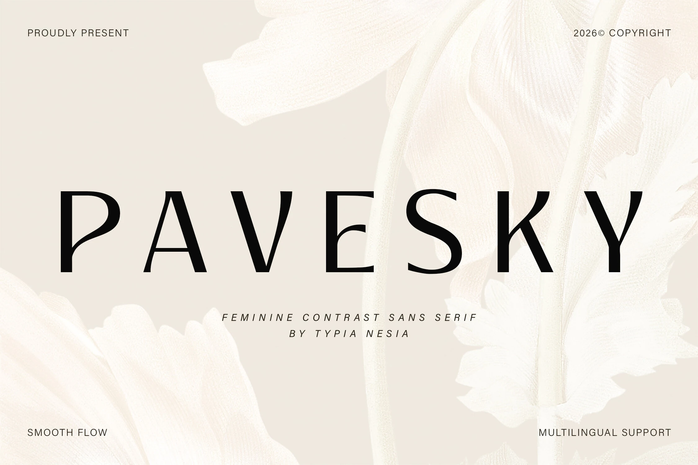
Best For: logos, beauty branding, wedding designs, high-end designs
Pavesky Font has a poised, airy look shaped by tall capitals, smooth curves, and a clear contrast between broad verticals and lighter connecting strokes. The clean structure keeps it polished, while details like the slim A and refined S give it a softer, feminine rhythm without losing clarity.
For Luxury Sans Serif Fonts, Pavesky is strongest when the typography needs to feel graceful but still readable, especially in logos, invitation titles, and beauty packaging. It holds its elegance best in short lines with generous margins, where the spacing and balanced proportions can do the visual work.
Orviele Font
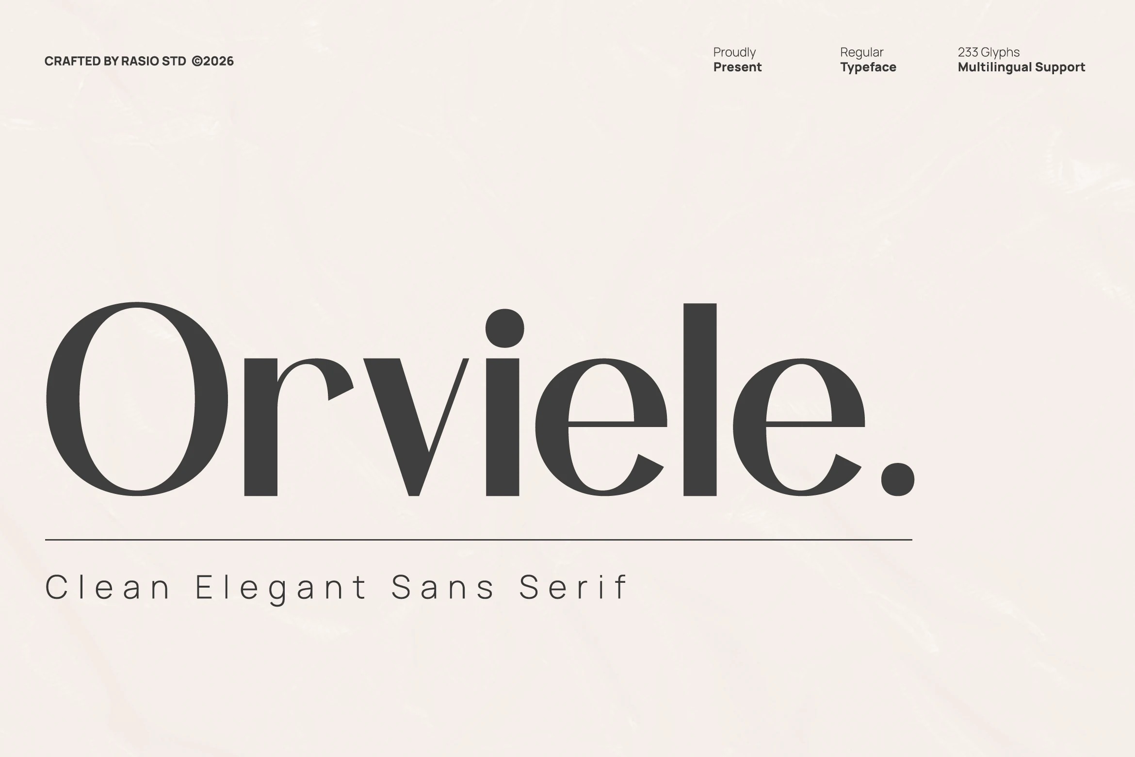
Best For: logos, beauty branding, magazine covers, high-end designs
Orviele Font has the poise of a fashion display face, with deep stroke contrast, broad bowls, and slim connecting lines that give the wordmark a graceful sweep. The oversized O and rounded e forms bring softness, while the heavy verticals keep the overall silhouette polished and commanding.
Among Luxury Sans Serif Fonts, Orviele feels especially suited to beauty packaging, magazine covers, and upscale logo work where the type is meant to lead the composition. It performs best in short titles with generous scale, letting the contrast and curved rhythm create hierarchy without extra ornament.
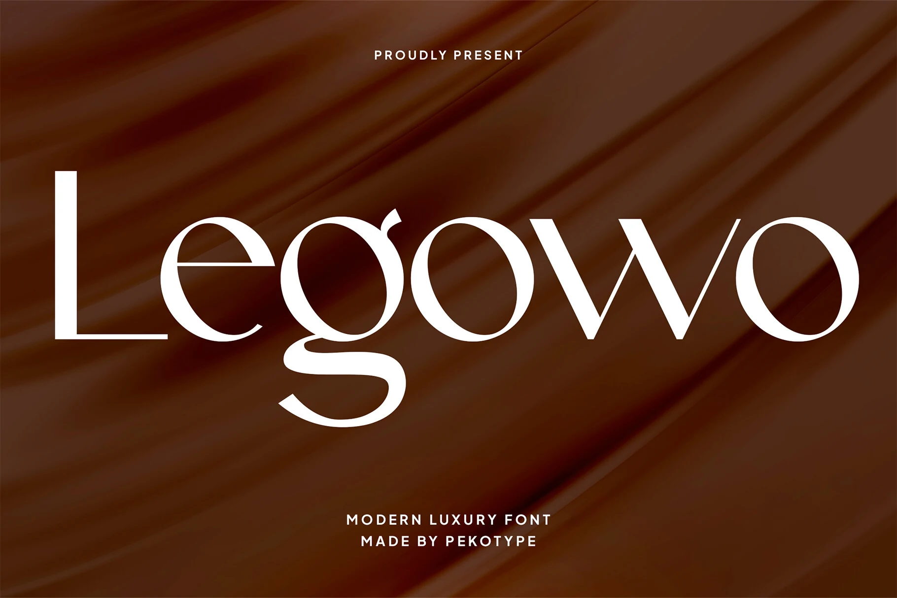
Legowo Font
Best For: logos, branding, editorial designs, social media graphics
Legowo Font feels sleek and fashion-forward, with strong contrast between slim hairlines and fuller curves. The tall L, wide round counters, and dramatic looping g give it a refined rhythm, while the sharp joins in the w keep the wordmark crisp instead of overly soft.
Legowo brings a more editorial tone to Luxury Sans Serif Fonts, especially for logos, campaign headlines, and polished brand visuals. It works best in short phrases with a clear size jump over supporting text, so the elegant contrast and distinctive descender stay visible rather than flattening out.
Retro & Decorative Luxury Sans Serif Fonts
Use these more expressive luxury sans serifs when a project needs Art Deco rhythm, retro curves, stencil cuts, ligatures, or memorable display details.
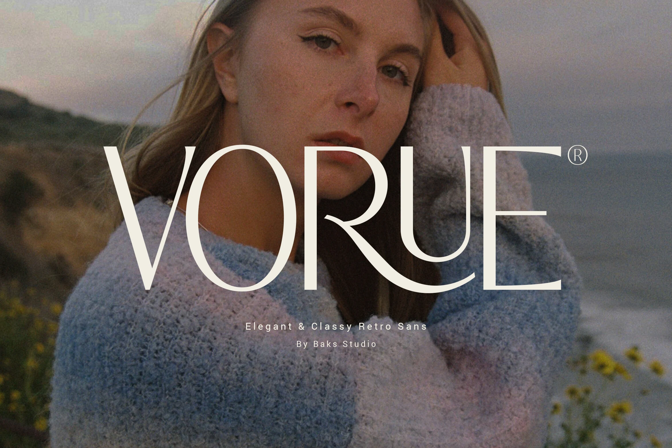
Vorue Font
Best For: logos, fashion branding, premium designs, editorial designs
Vorue Font has a poised display presence built from slim strokes, tall proportions, and a beautifully curved R that introduces a subtle retro accent. The rounded O and U soften the structure, so the letterforms feel polished and airy instead of severe.
It fits naturally with Luxury Sans Serif Fonts, especially for identities that need elegance without extra ornament. Use it for short headlines, logotypes, or hero typography, and keep the spacing a touch open so its refined silhouette and clean hierarchy stay crisp at larger sizes.
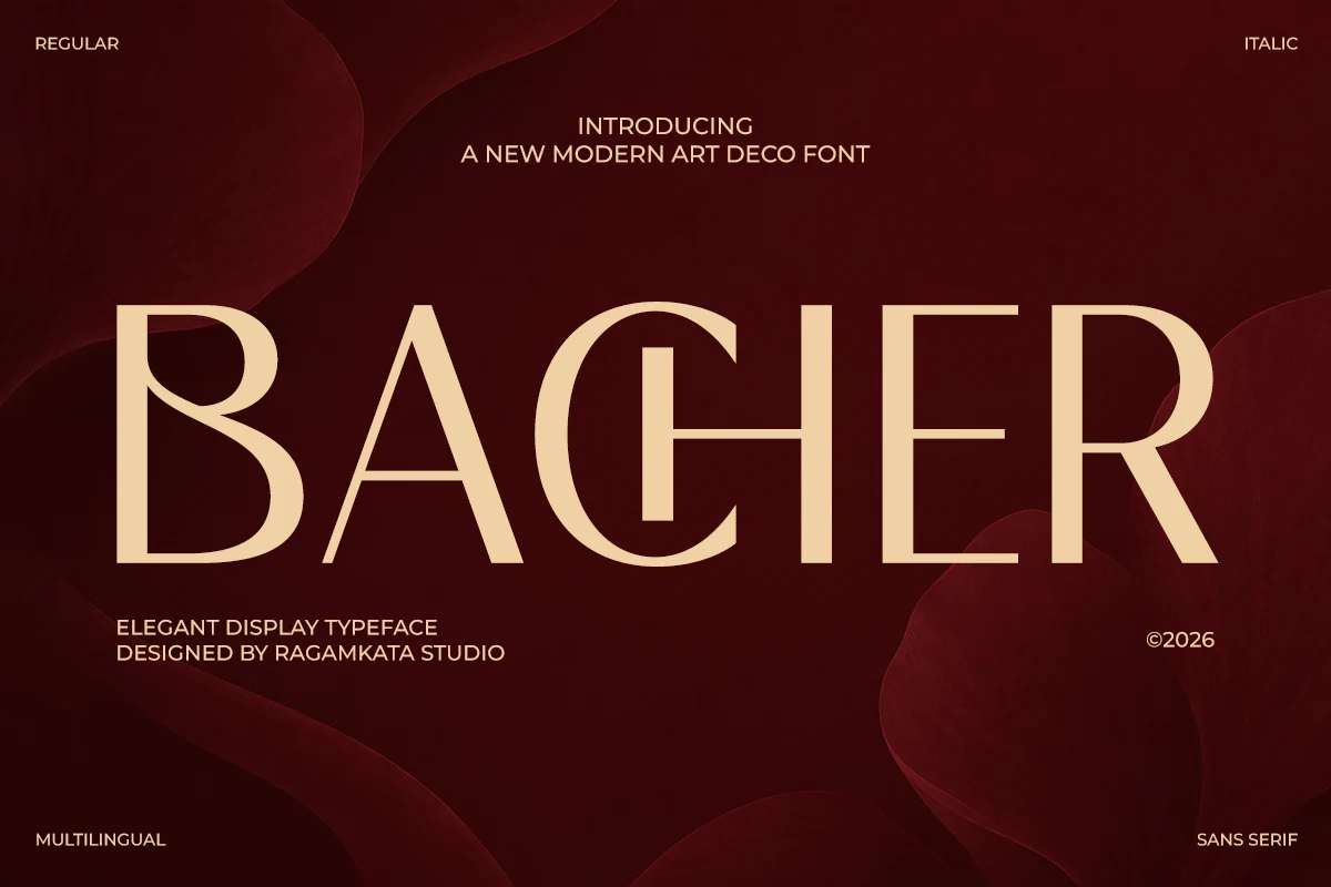
Bacher Font
Best For: headlines, posters, editorial designs, luxury designs
Bacher Font has a striking Art Deco rhythm, mixing tall geometric forms with smooth curves and crisp contrast. The oversized B and R feel sculpted rather than rigid, while the narrow counters and clean verticals give the wordmark a polished, upscale presence.
It brings a more theatrical edge to Luxury Sans Serif Fonts, especially for covers, posters, and statement headlines. Keep copy short and let the scale do the work—this is a display face that reads best when its long strokes and elegant spacing can lead the hierarchy.
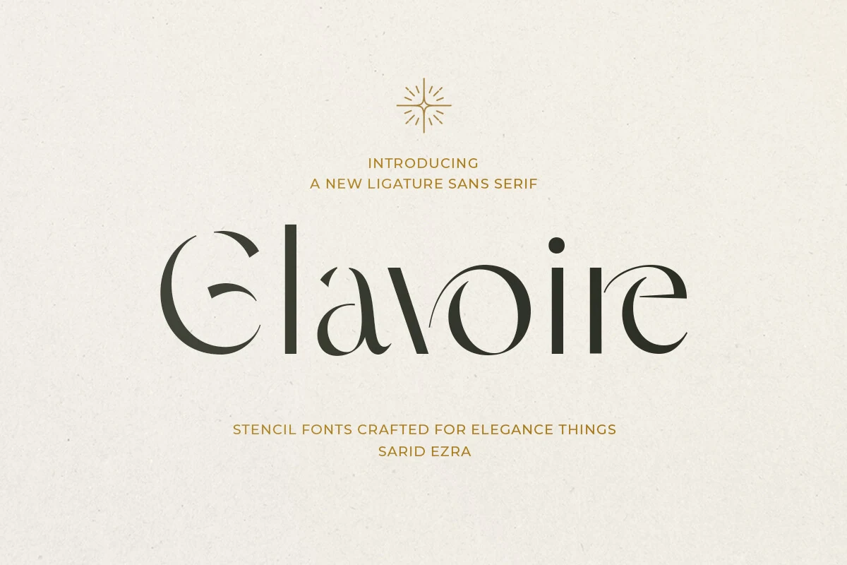
Glavoire Font
Best For: logos, packaging, editorial designs, high-end designs
Glavoire Font leans into elegance with sharp stencil cuts, flowing ligatures, and a measured contrast that makes each letter feel sculpted rather than simply set. The carved openings in the curves create a striking rhythm of negative space, giving even one-word titles a refined, fashion-editorial presence.
Within Luxury Sans Serif Fonts, Glavoire is especially effective for perfume packaging, boutique signage, and mastheads where the type needs to carry the mood on its own. Keep it to short lines and give it generous margins, so the ligatures and delicate cut-ins stay crisp instead of getting lost in dense layouts.
Good Flash Font
Best For: logos, wedding designs, fashion branding, beauty branding
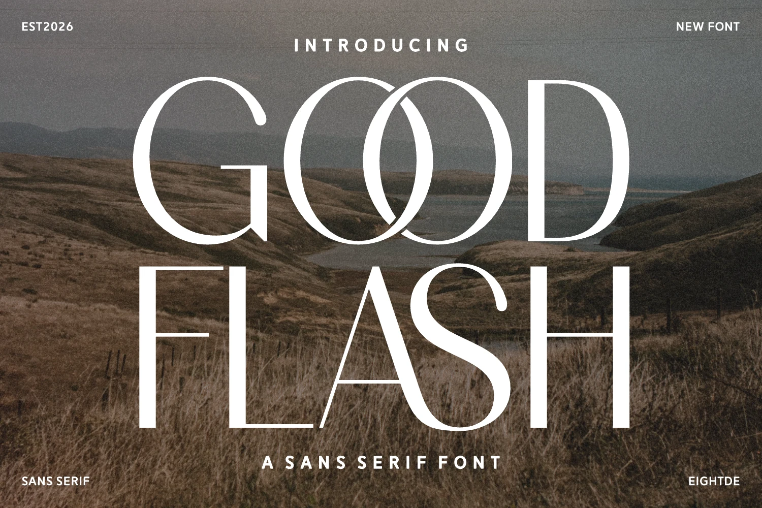
Good Flash Font has a striking display presence built on tall proportions, hairline joins, and generous curves, with the overlapping double O adding a signature flourish. The narrow stems and open counters keep the large forms airy, so it feels polished rather than heavy.
For Luxury Sans Serif Fonts, Good Flash is especially effective in logos, wedding stationery, and fashion editorials where a short title needs elegance with real presence. Let it lead the layout at large sizes and keep supporting text simple, since its elongated rhythm and distinctive O pair do the styling for you.
Bold & Logo-Ready Luxury Sans Serif Fonts
These fonts are built for strong identity work, with sharper silhouettes, sculpted counters, condensed impact, and enough presence for logos or packaging fronts.
Saudah Font
Best For: logos, packaging, editorial designs, luxury designs
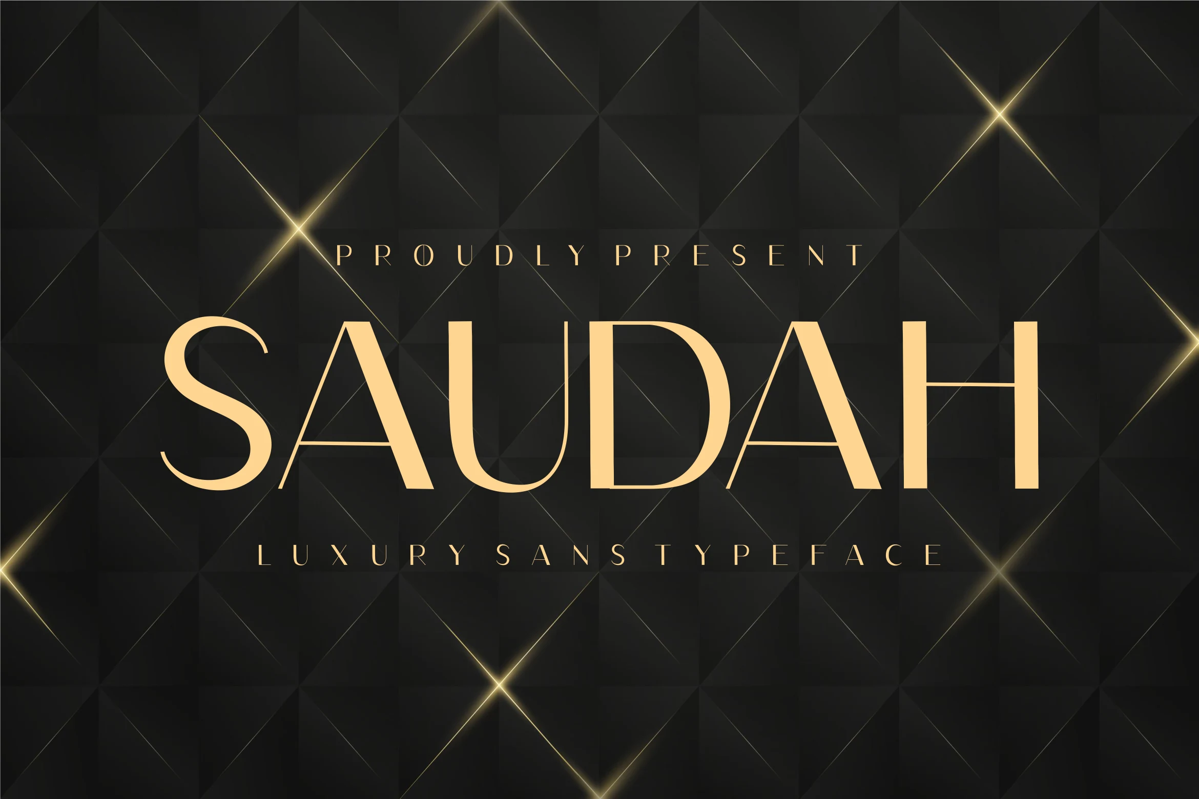
Saudah Font has a polished display-sans look built around wide capitals, slender hairline joins, and sharp triangular cuts in the A. The broad S and rounded D soften the otherwise architectural rhythm, while generous tracking gives the wordmark a deliberate premium pace.
For Luxury Sans Serif Fonts, Saudah works best where the type carries the identity: beauty logos, packaging fronts, editorial mastheads, and short hero titles. Keep the copy brief, preserve the spacing, and set it against strong contrast so the fine internal lines do not disappear.
Barium Font
Best For: logos, packaging, beauty branding, high-end designs
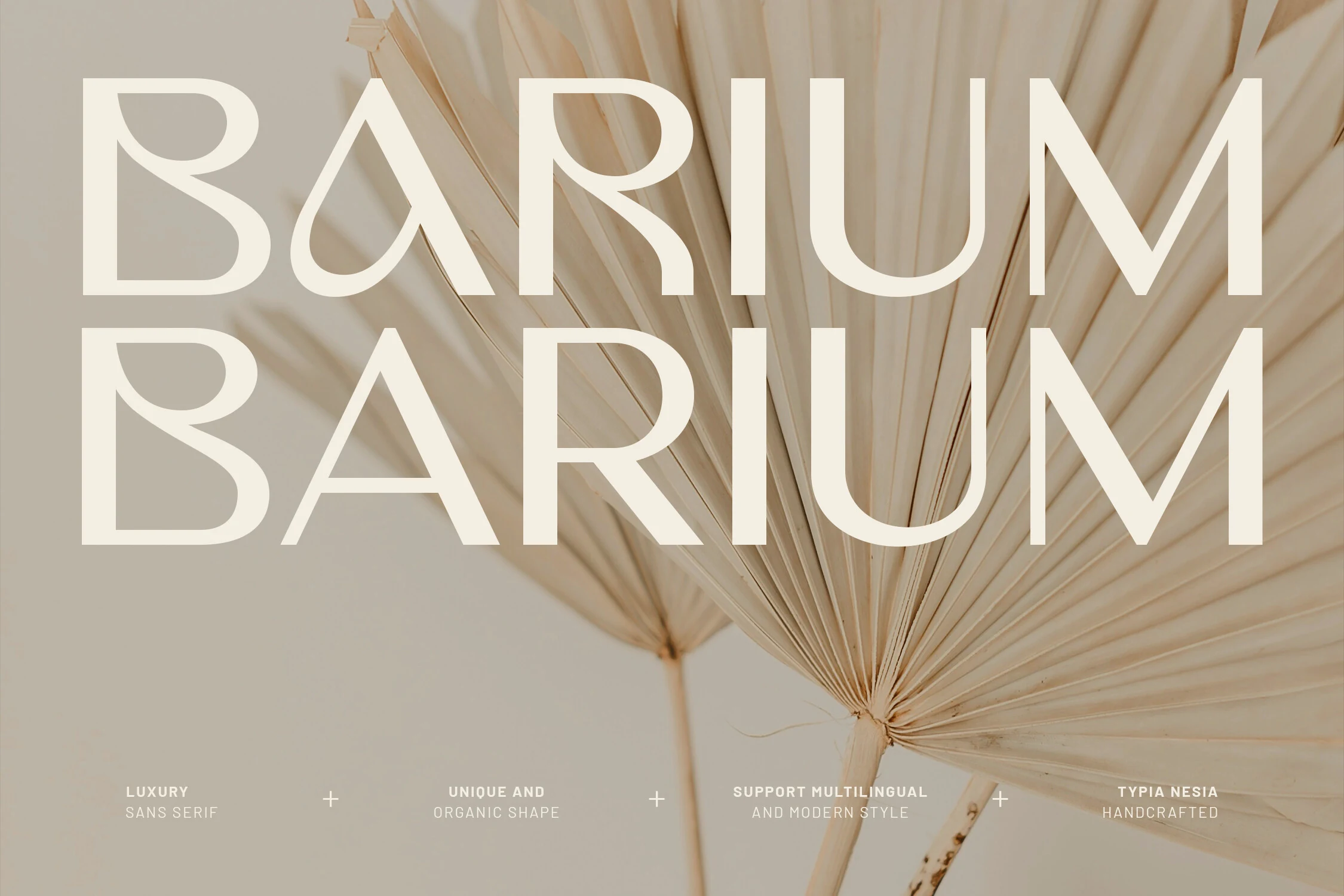
Barium Font pairs a clean luxury sans structure with softer organic details, especially in the teardrop counter of the A and the sculpted bowls of the B and R. The tall uppercase forms and broad spacing give it a calm, elevated presence that feels polished rather than rigid.
Within Luxury Sans Serif Fonts, Barium is strongest in logo-led layouts, beauty packaging, and refined covers where subtle personality matters. It works best in short titles and wordmarks; keep the tracking open and let its distinctive counters provide the interest instead of crowding the layout with extra decoration.
Maldives Font
Best For: logos, branding, headlines, high-end designs
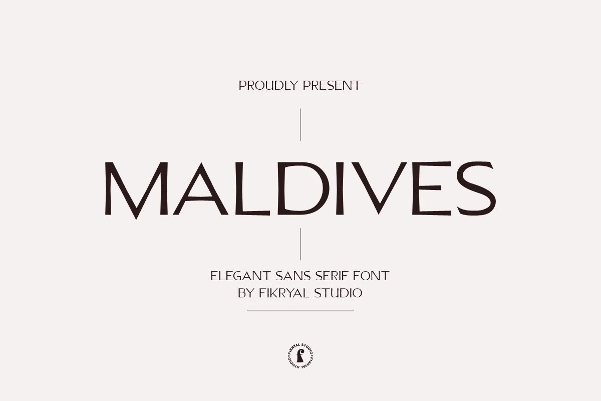
Maldives Font has an elegant all-caps presence shaped by slim strokes, tall proportions, and a lightly sculpted rhythm that keeps it from feeling cold. The pointed A, narrow V, and clean verticals give the wordmark a poised, assertive look, while the open spacing helps each letter hold its own.
In Luxury Sans Serif Fonts, Maldives suits identity work where restraint matters as much as style. It reads best in logos, mastheads, and short headings, especially when you give it generous scale and breathing room so the fine structure and refined spacing stay crisp.
Modern Luxury Font
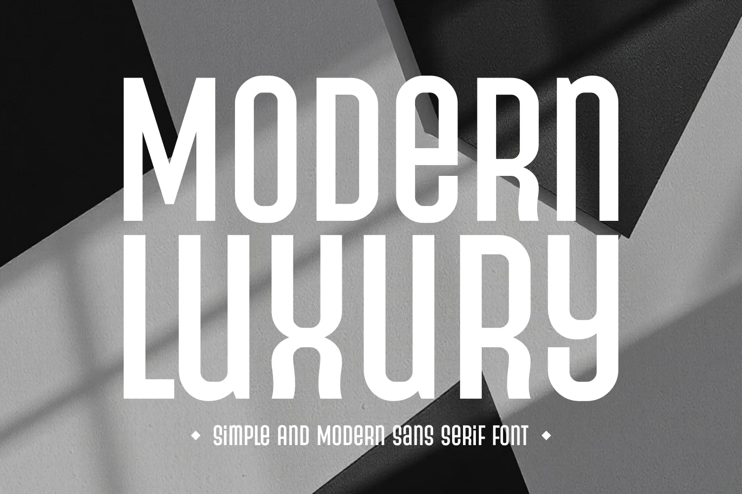
Best For: logos, headlines, posters, fashion branding
Modern Luxury Font has a bold condensed silhouette with tall stems, squared curves, and softly rounded terminals that keep the heavy structure feeling sleek. The narrow counters and vertical rhythm make each line look crisp and architectural, especially in stacked words and large display settings.
For Luxury Sans Serif Fonts, this one works best when space is tight but the headline still needs impact. Use it for fashion-led branding, posters, and logo concepts where the compressed width can build a strong title hierarchy without crowding the layout.
Conclusion
For the cleanest brand systems, start with minimal and wide-tracked styles. Choose high-contrast or editorial fonts for beauty and fashion work, retro options for stronger personality, and bold logo-ready choices when the type needs to carry the whole layout.