14 Best Clean Sans Serif Fonts for Polished 2026 Design
Clean Sans Serif Fonts are useful when you need modern typography that feels clear, polished, and easy to apply across real design work. This selection is made for designers building logos, websites, posters, packaging, invitations, and brand systems, with styles grouped by visual strength so you can quickly compare bold, rounded, slim, and geometric options.
Bold Condensed Clean Sans Serif Fonts
These condensed and heavy sans serif fonts are built for tight headlines, posters, merch graphics, and logos where short words need strong visual pressure.
Sabang Island Font
Best For: logos, website headers, posters, headlines
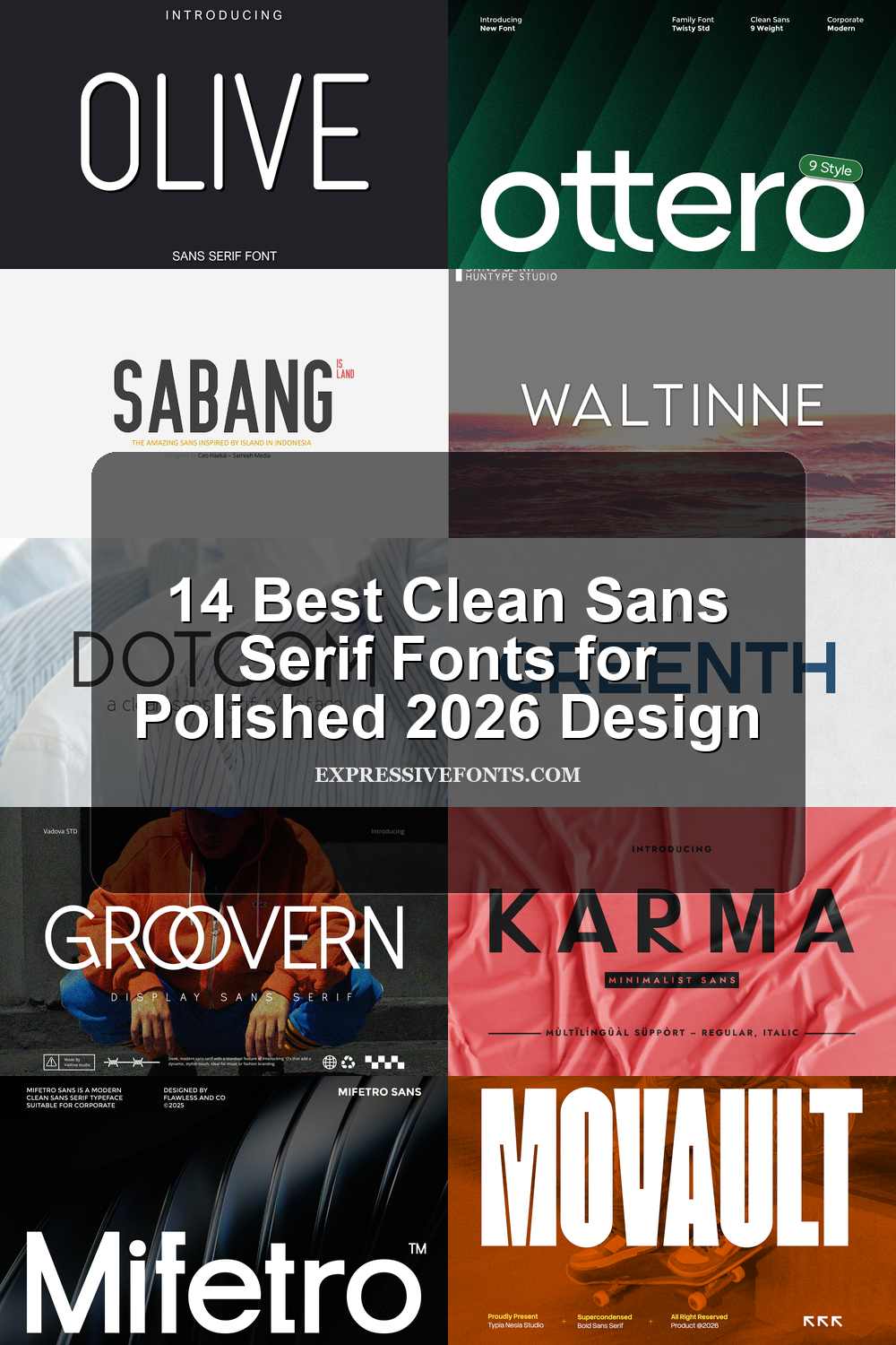
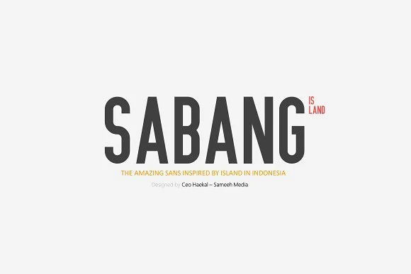
Sabang Island Font has a tall, condensed sans serif build with heavy upright stems, narrow counters, and a firm headline rhythm. The preview leans on uppercase structure, giving the letters a compact poster-like presence without adding decorative noise.
Use it where Clean Sans Serif Fonts need strength in a limited horizontal space: logo text, travel-inspired titles, headers, and display layouts. Keep the wording short, control tracking carefully, and pair it with a quieter text face so the compressed proportions hold the top of the hierarchy.
Movault Font
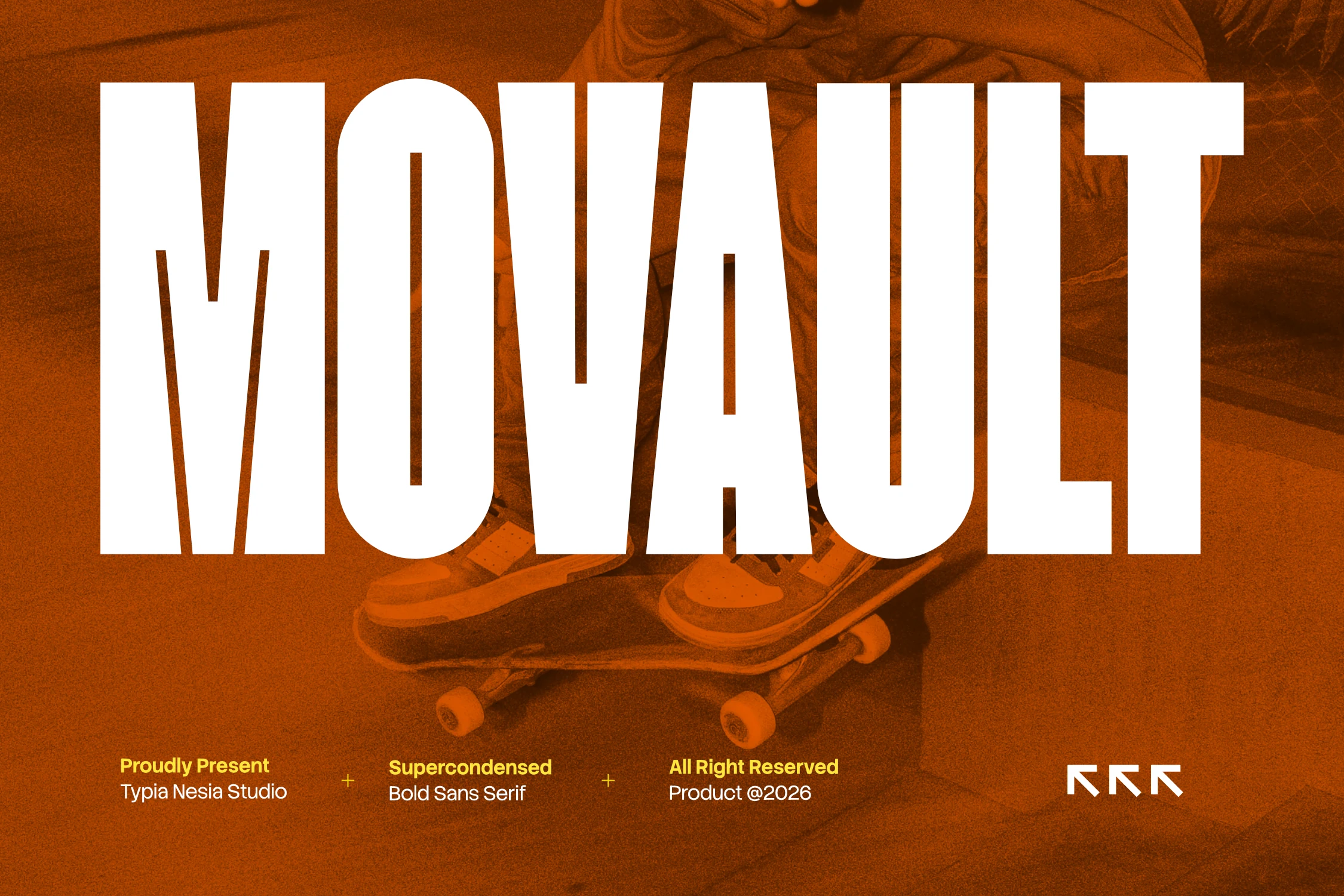
Best For: logos, posters, headlines, merch design
Movault Font is built for impact, with towering super-condensed letterforms, heavy vertical strokes, and very narrow inner spaces that create a strong block of type. The silhouette feels sharp and graphic, giving short words an immediate poster-scale presence.
If you like Clean Sans Serif Fonts with more edge, this one works best as a headline tool rather than a reading font. Keep copy brief, give the lines enough breathing room, and use the condensed width to fit bold titles into tight layouts without losing intensity.
Overbold Font

Best For: posters, headlines, quotes, T-shirts
Overbold Font has a super-condensed build with dense vertical strokes, narrow counters, and a loud poster presence that reads instantly from a distance. The heavy weight and tight width make each word feel compact and forceful, while the clean sans serif structure keeps the message sharp rather than messy.
If you’re browsing Clean Sans Serif Fonts for high-impact display work, Overbold works best in short slogans, poster titles, and merch graphics where space is limited but emphasis matters. Let the font carry the hierarchy, avoid long lines, and use strong contrast or generous margins so its compressed shapes don’t feel crowded.
Rounded Minimal Clean Sans Serif Fonts
These rounded and lighter sans serif fonts bring softer edges to clean branding, stationery, web headers, and minimal layouts that need clarity without a hard corporate tone.
Ottero Font
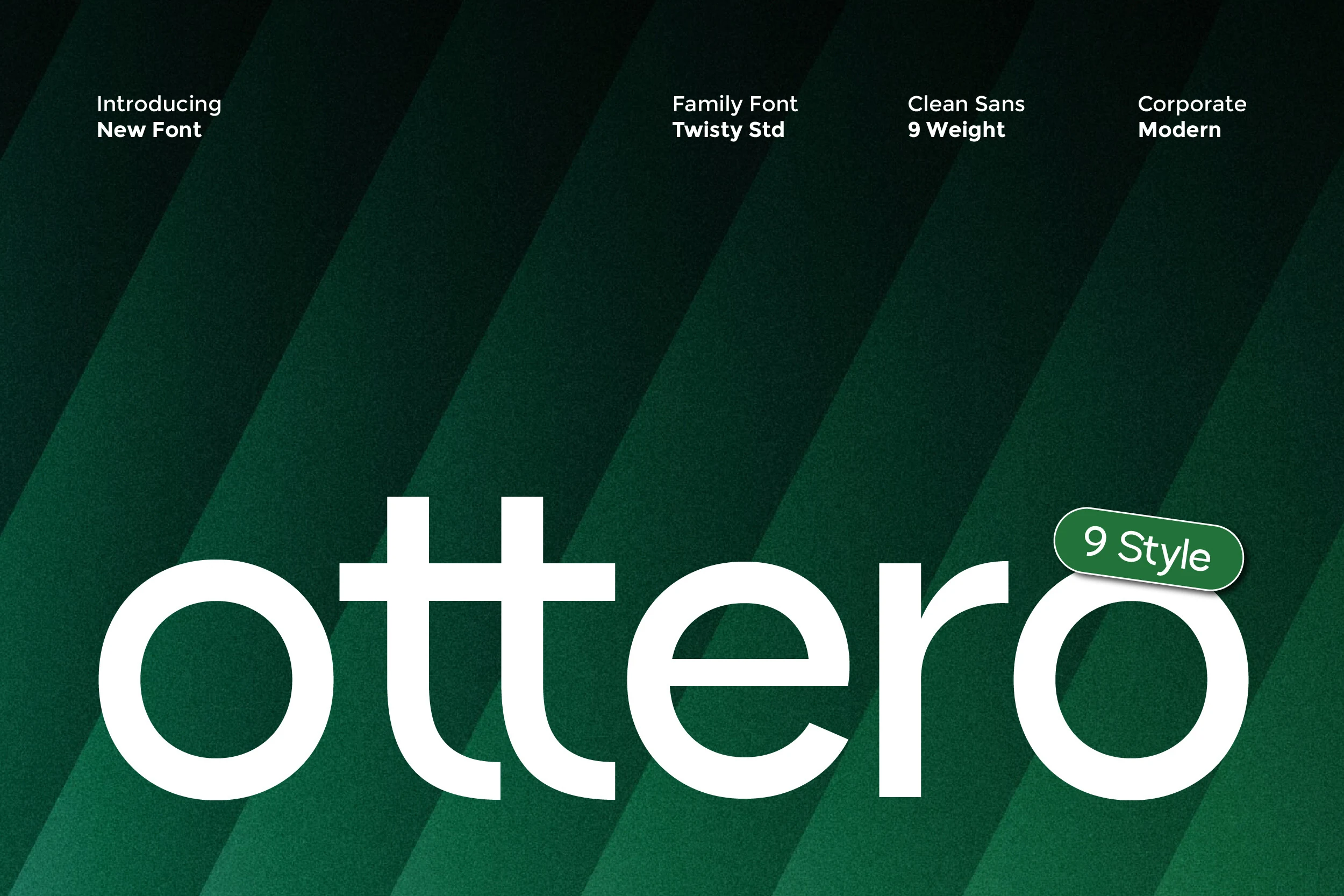
Best For: branding, website headers, editorial designs, professional designs
Ottero Font has a smooth, rounded sans serif voice with even strokes, wide counters, and a calm lowercase rhythm that feels polished without turning cold. In the preview, the generous curves and clean structure keep the word highly legible while giving it a softer, more approachable edge.
If you’re choosing Clean Sans Serif Fonts for a full identity system, Ottero is especially useful because its 9 styles let you build hierarchy without losing consistency. Use heavier cuts for titles and lighter ones for longer copy; the balanced spacing and refined proportions help layouts stay crisp across branding, editorial work, and interface text.
Paper Cloud Font
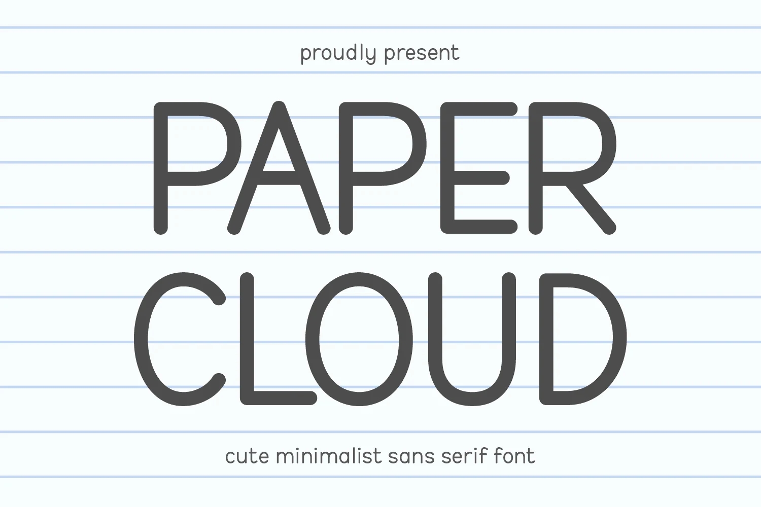
Best For: logos, invitations, minimal designs, cute designs
Paper Cloud Font has a light monoline build with rounded corners, open bowls, and a soft, airy rhythm that feels neat rather than clinical. The letterforms stay slender and evenly weighted, which gives the large preview a calm, friendly presence with a distinctly minimalist tone.
For Clean Sans Serif Fonts that need a gentler mood, this one works well in short titles, branding, and simple stationery layouts. Keep tracking slightly open and pair it with plenty of white space, so the thin strokes and smooth curves retain their quiet charm instead of getting crowded.
Olive Font
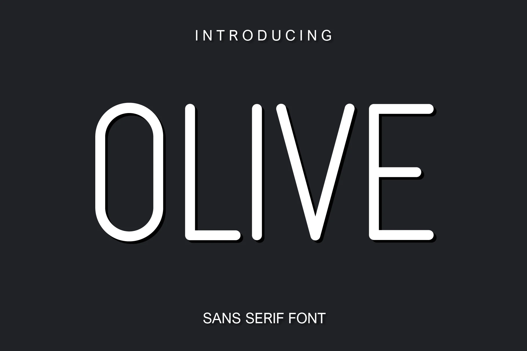
Best For: logos, website headers, minimal designs, clean designs
Olive Font has a lean monoline structure with rounded terminals, tall proportions, and a softly squared “O” that gives the face a calm, modern signature. The even stroke weight keeps the wordmark crisp, while the gentle curves stop it from feeling cold or mechanical.
Within Clean Sans Serif Fonts, Olive stands out for its quiet display presence and the flexibility of its three variants. It works best in short titles, logos, and pared-back layouts where the rounded corners can stay visible; keep spacing a touch open to preserve its airy minimalist rhythm.
Slim Editorial Clean Sans Serif Fonts
These slim editorial sans serif fonts use airy spacing, refined strokes, and distinctive letter details for fashion branding, invitations, packaging, and elegant web headings.
Groovern Font
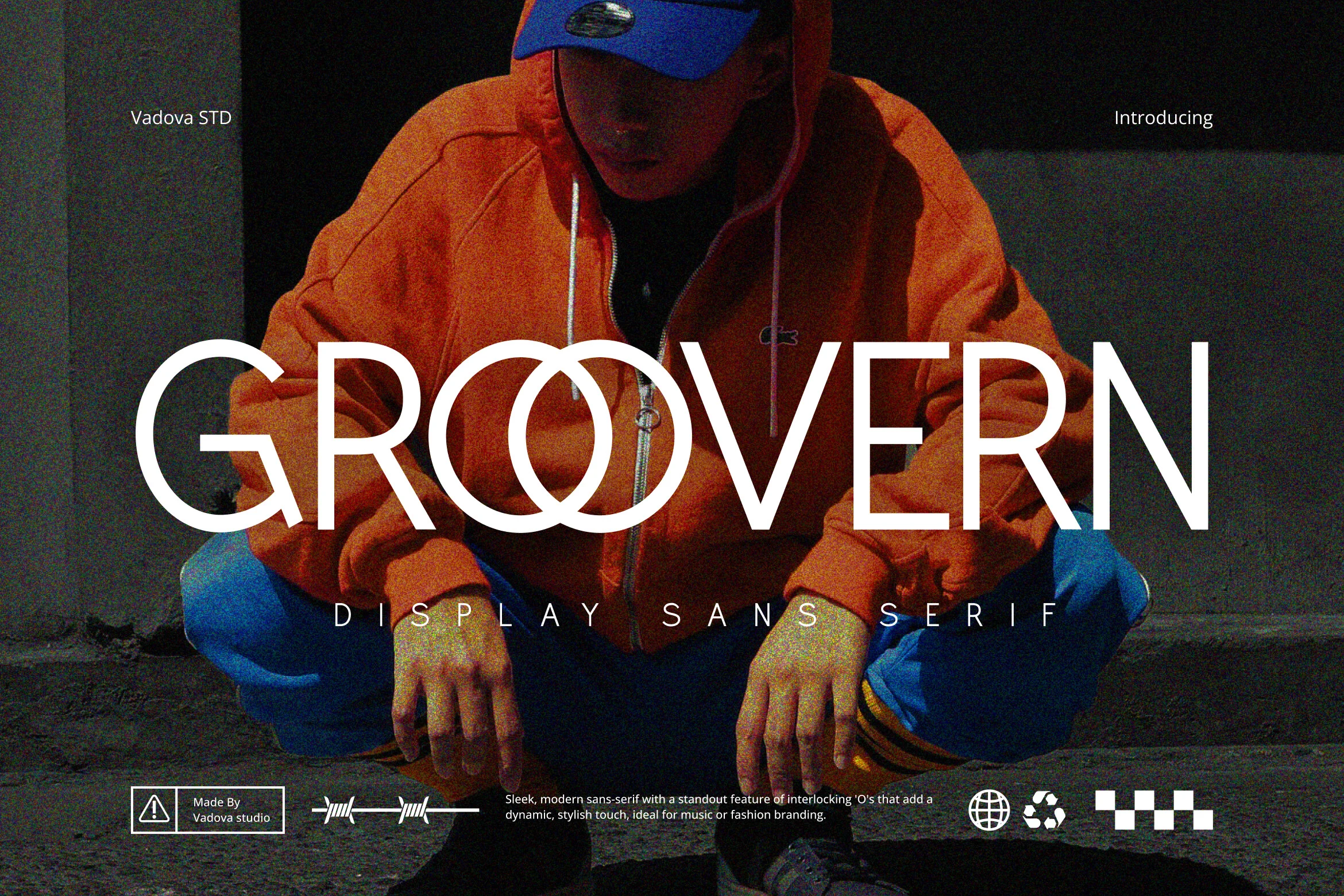
Best For: logos, social media graphics, website headers, fashion branding
Groovern Font takes a clean display approach, but the details keep it from feeling plain. The strokes are slim and even, the curves stay smooth, and the interlocking double “O” creates a signature focal point that gives the wordmark a sharper fashion-editorial attitude.
It fits Clean Sans Serif Fonts projects that need a modern edge without extra ornament. Use it for short titles, branding, or packaging where the overlapping counters can do the visual work, and keep spacing around the line generous so that distinctive center detail stays clear.
Waltinne Font
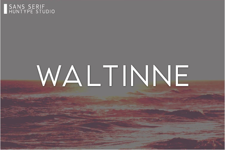
Best For: logos, branding, website headers, clean designs
Waltinne Font has a light, refined uppercase look with smooth strokes, open spacing, and just enough contrast to keep the letterforms from feeling flat. The preview shows a clean silhouette with a calm modern rhythm, so the type reads crisply while still feeling soft and elegant.
Waltinne suits Clean Sans Serif Fonts projects that need clarity without heavy visual weight. It works especially well for logos and web headings where shorter words can breathe, and a little extra tracking helps the slender shapes hold their presence beside simpler body text.
Dotcom Font
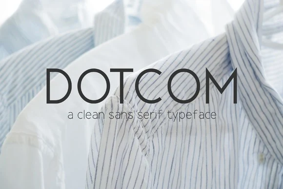
Best For: logos, branding, website headers, minimal designs
Dotcom Font has a slim, refined sans serif look, with narrow strokes, round O forms, and generous spacing that keep the wordmark light and polished. The uppercase preview feels restrained and airy rather than cold, which gives the face a clean minimalist tone suited to understated layouts.
For Clean Sans Serif Fonts, Dotcom is especially useful when you want structure without visual heaviness. Its three weights help build tidy hierarchy across logos, web headings, and packaging, while slightly open spacing preserves the font’s crisp rhythm in short lines.
Alein Font
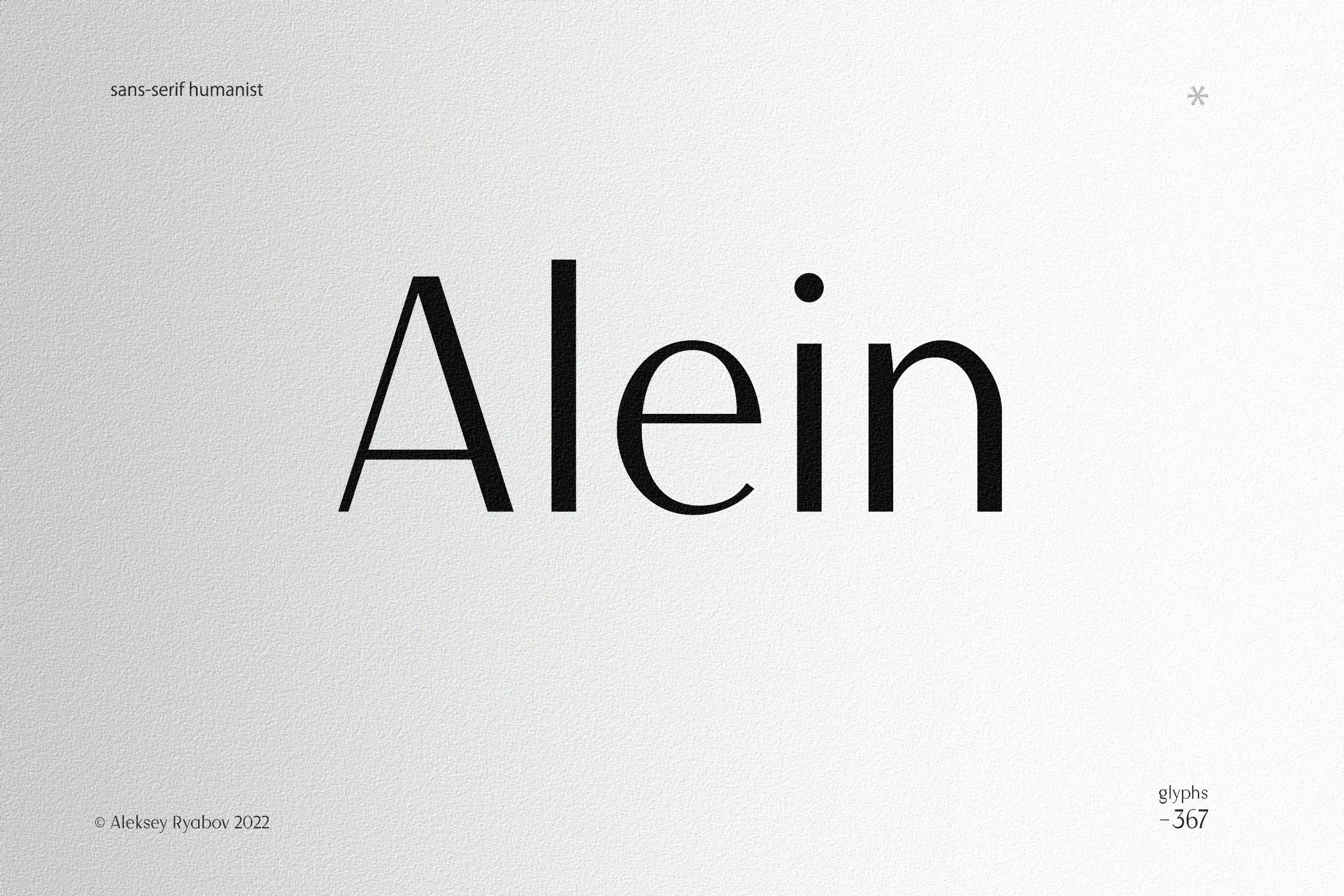
Best For: logos, invitations, editorial designs, wedding designs
Alein Font has a refined humanist sans serif feel, with a slim uppercase A, rounded e, and smooth strokes that keep the wordmark light and balanced. The mix of clean verticals and softer curves gives it a polished look without making it feel stiff.
For Clean Sans Serif Fonts with a quieter editorial tone, Alein works especially well in logos, invitations, and magazine-style layouts. Keep line spacing open and let shorter headings lead the hierarchy, so its airy proportions and clean rhythm stay clear on the page.
Modern Geometric Clean Sans Serif Fonts
These balanced geometric sans serif fonts suit professional identities, modern websites, packaging, and structured layouts that need clean hierarchy with broader usability.
Greenth Font
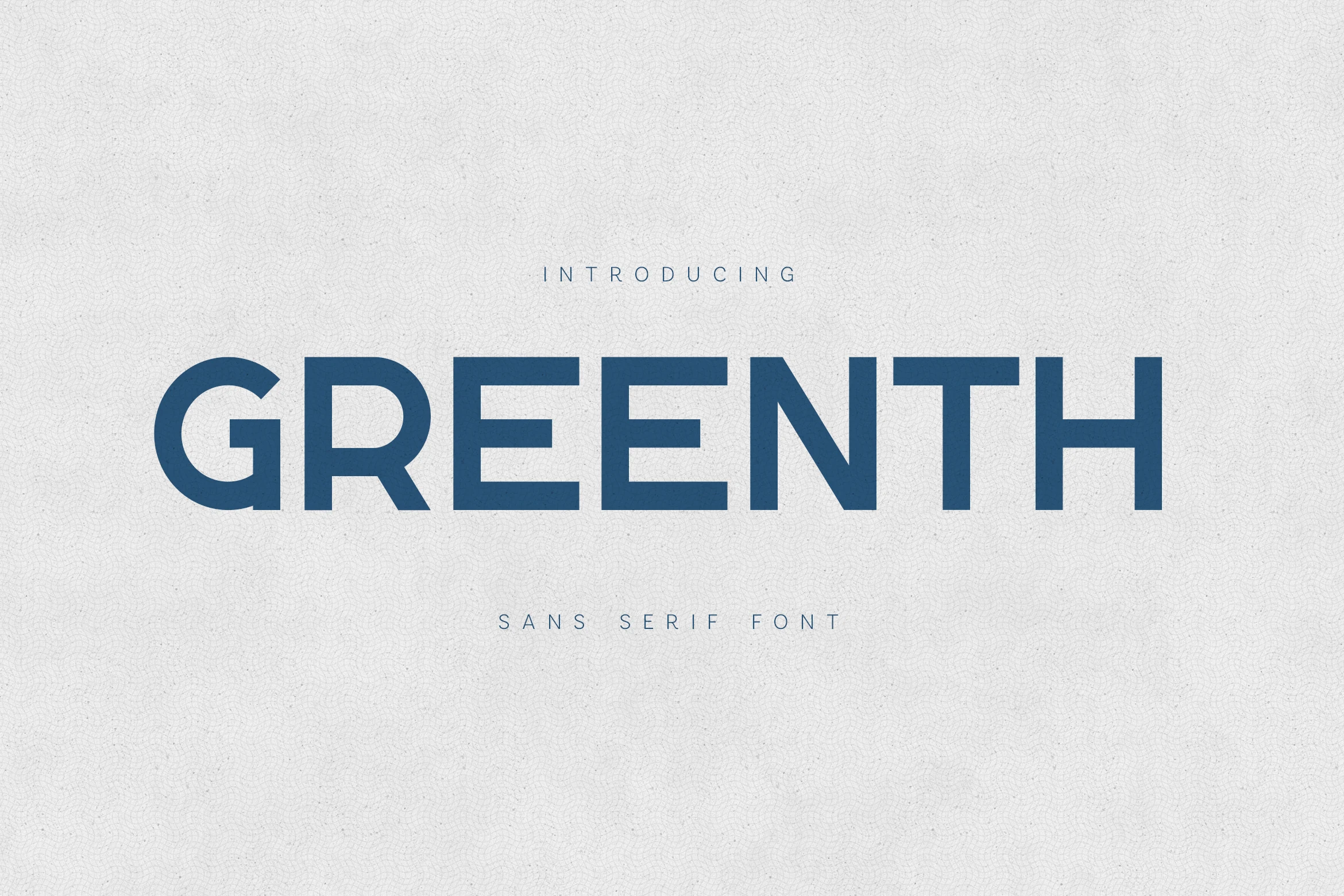
Best For: logos, website headers, headlines, minimal designs
Greenth Font has a crisp display feel built from broad, even strokes and simple geometric shapes. The uppercase preview shows open counters, steady proportions, and a calm modern rhythm, so the type reads clearly even when scaled up for bold, single-line statements.
For projects that lean toward Clean Sans Serif Fonts, this one works especially well when you want a confident headline without visual clutter. Give it space around the edges, use wider tracking for short titles, and let lighter supporting text sit beneath it to keep the hierarchy sharp.
Mifetro Font
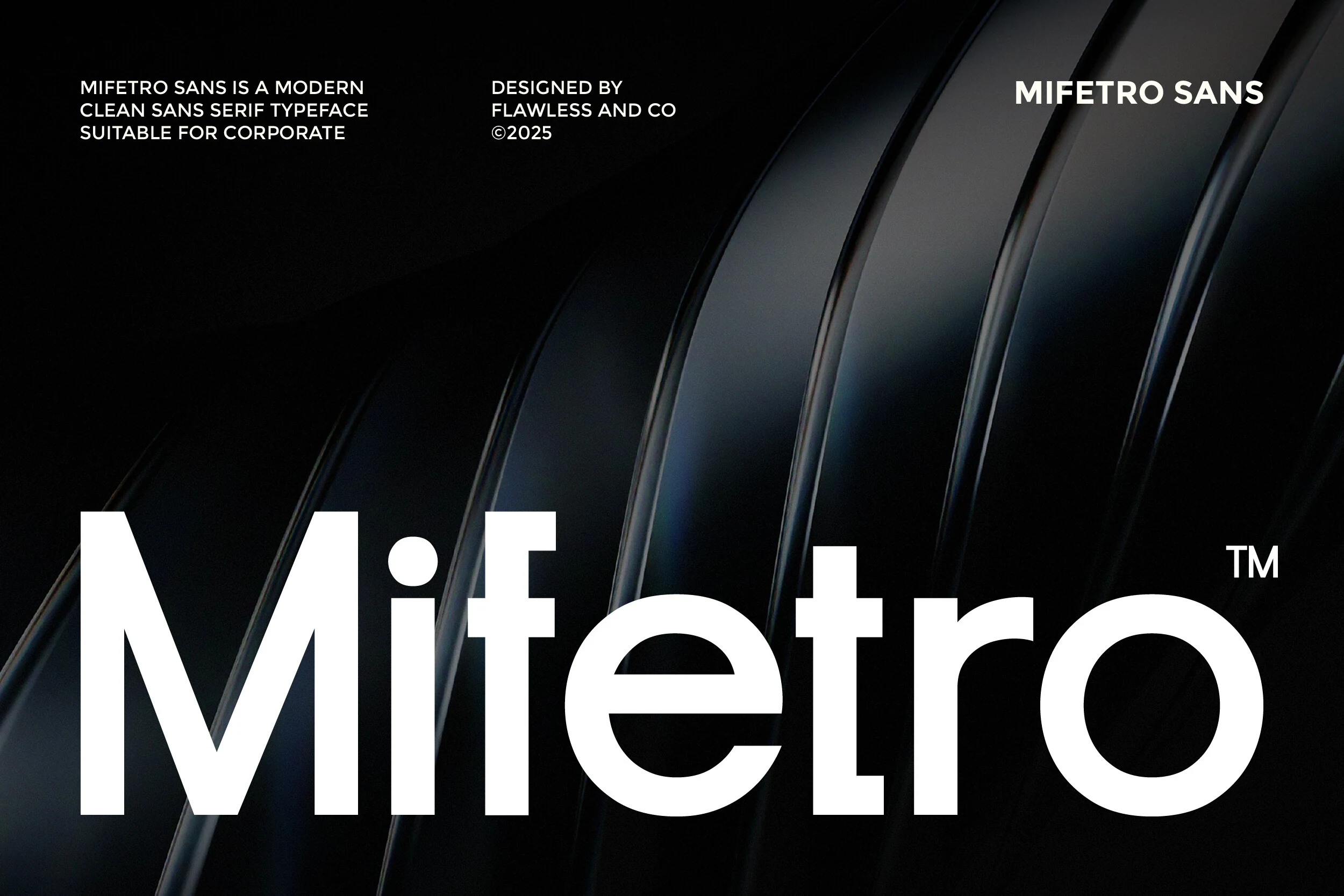
Best For: branding, business cards, website headers, professional designs
Mifetro Font has a polished corporate tone, with broad, open letterforms, even stroke weight, and balanced geometry that keeps the wordmark easy to read at a glance. The shapes feel modern and dependable rather than sterile, which gives the font a steady professional presence.
For Clean Sans Serif Fonts, Mifetro is especially effective when you need clarity across logos, headers, and identity materials. Its precise proportions help create tidy hierarchy, and the generous counters keep medium-length words readable, so it pairs well with structured layouts and restrained spacing.
Neuria Font
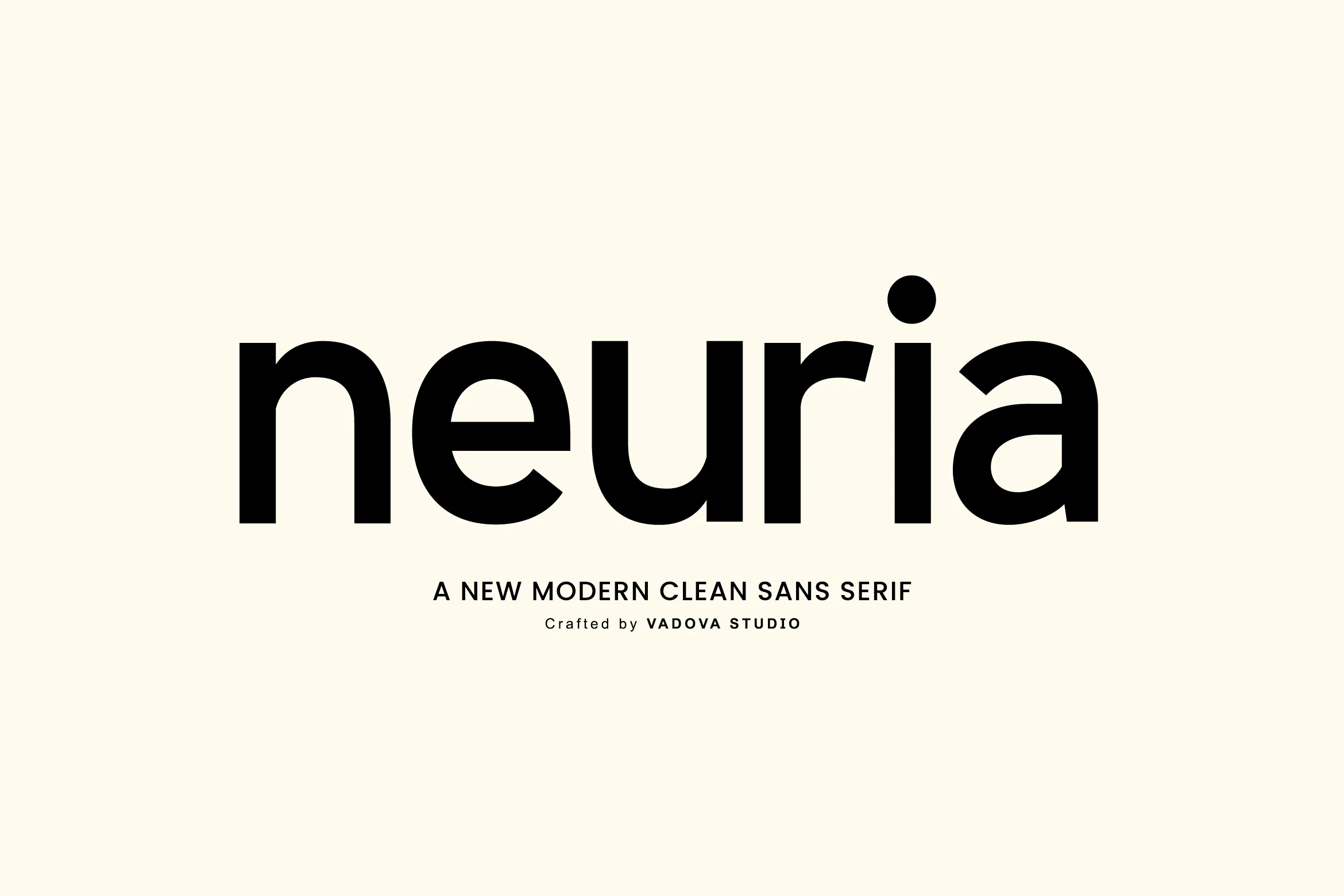
Best For: branding, website headers, editorial designs, modern designs
Neuria Font has a sturdy modern sans serif voice, pairing broad lowercase shapes with smooth curves and crisp terminals. In the preview, the rounded bowls, balanced geometry, and open spacing give it a direct, readable character that feels polished without looking rigid.
Neuria fits Clean Sans Serif Fonts projects that need strong hierarchy across branding and interface-style layouts. With uppercase, lowercase, numerals, and punctuation, it is easier to keep one consistent tone from headlines to smaller supporting text, especially in grid-based compositions where its geometric rhythm stays clean.
Karma Font
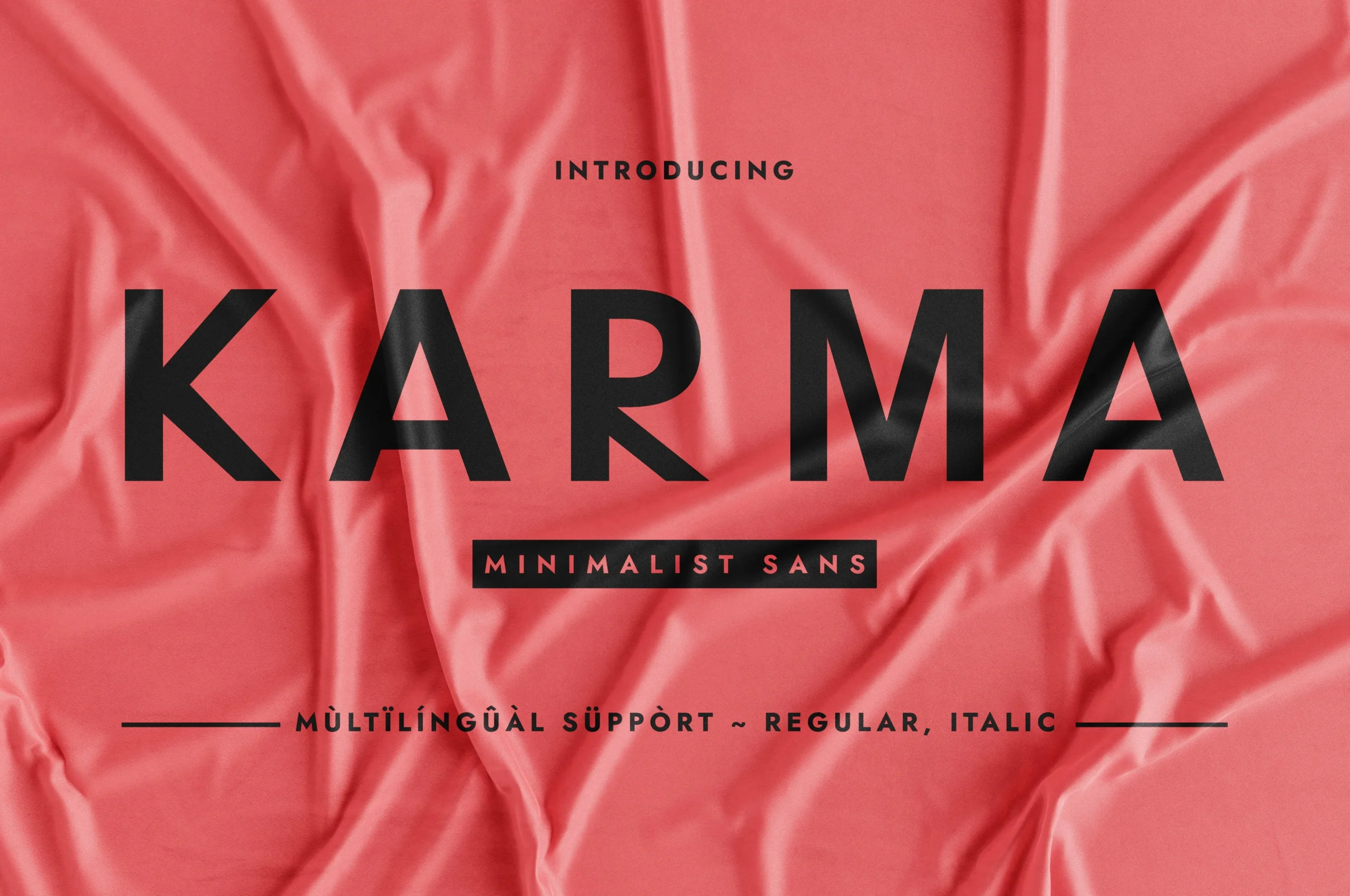
Best For: packaging, fashion branding, posters, modern designs
Karma Font has a strong minimalist presence, with broad uppercase forms, clean diagonals, and smooth curves that make the wordmark feel crisp and contemporary. The letter construction is simple but not bland, giving the face a confident display look that reads clearly at a glance.
If you are exploring Clean Sans Serif Fonts for packaging, fashion graphics, or poster layouts, Karma works best when the headline does most of the visual work. Use it in short phrases, keep supporting text restrained, and rely on clear size contrast so its bold shapes hold the hierarchy without feeling crowded.
Conclusion
Choosing the right clean sans serif font depends on how much visual force the layout needs. Use bold condensed styles for posters and merch, rounded minimal fonts for friendly branding, slim editorial faces for refined titles, and geometric options for flexible identity systems.