20 Bold Handwritten Fonts for Powerful Designs in 2026
Bold Handwritten Fonts are built for designers who need heavy, handmade lettering that reads fast in posters, logos, packaging, stickers, apparel, and social graphics. This collection focuses on thick marker styles, energetic brush scripts, rounded playful fonts, and retro wordmark lettering so you can choose the right bold look for each project.
Looking for more handwritten fonts? Browse our complete Handwritten Fonts collection to compare modern, cute, casual, bold, brush, signature, script, wedding, Cricut, and logo-friendly handwritten styles.
Chunky Marker Bold Handwritten Fonts
These heavy marker and block-style fonts suit posters, merch, stickers, and short headline layouts that need direct impact without script flourishes.
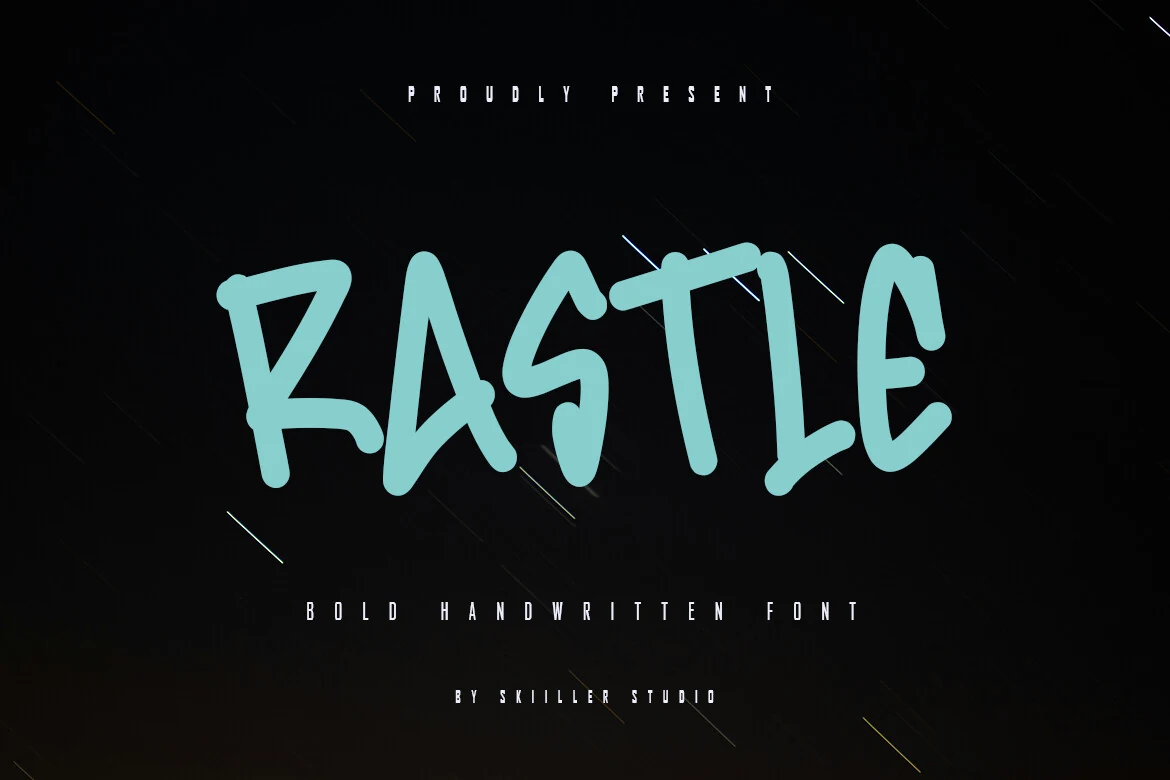
Rastle Font
Best For: posters, T-shirts, bold designs, eye-catching designs
Rastle Font uses thick, marker-like strokes with angular bends, clipped turns, and an uneven handmade rhythm. The tall uppercase shapes feel direct rather than polished, giving it the punch needed for layouts built around Bold Handwritten Fonts.
Keep Rastle on short words, headlines, and product graphics where its heavy forms can dominate the composition. Extra space around the lettering helps the sharp counters and dense strokes stay readable, especially when placed over busy textures or high-contrast backgrounds.
Swift Marker Font
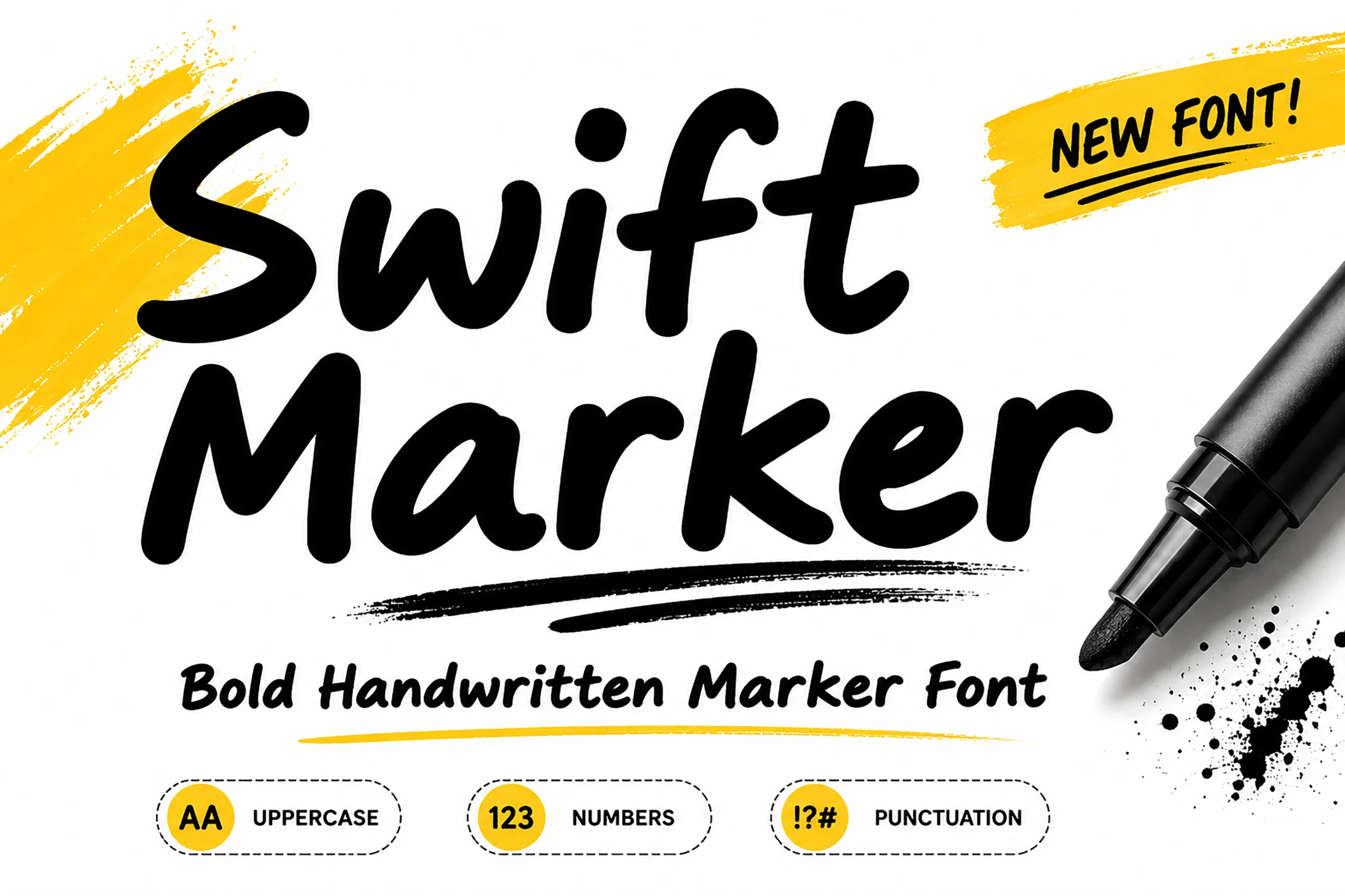
Best For: posters, social media graphics, merch design, quotes
Swift Marker Font has thick marker-built strokes, rounded corners, and a relaxed handwritten rhythm that feels quick and direct. If you want Bold Handwritten Fonts with a clean, modern attitude, this one stands out through its solid weight and simple shapes rather than rough brush texture.
The broad letters hold up well in posters, packaging, and short promotional lines where readability matters as much as personality. Keep the wording brief and give it a little breathing room, since the heavy strokes and close joins can make longer phrases feel dense in tighter layouts.
Thick Font
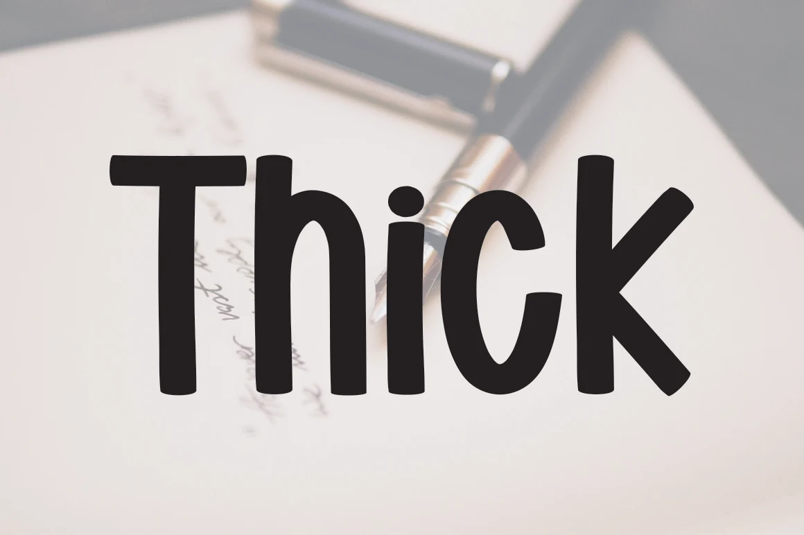
Best For: headlines, posters, logos, bold designs
Thick Font uses a heavy handwritten build with rounded block-like strokes, compressed counters, and slightly uneven verticals. The result is blunt rather than delicate, giving headlines a direct, marker-cut look without relying on decorative swashes.
For Bold Handwritten Fonts, this one works best when the word count stays short and the contrast around the letters is high. Keep spacing fairly open in logos or poster titles, because the dense weight can close up quickly at smaller sizes.
Letter Marker Font
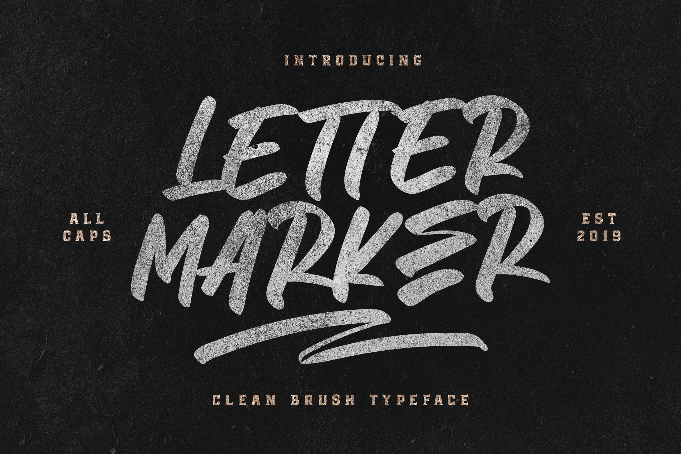
Best For: logos, posters, T-shirts, bold designs
Letter Marker Font has a forceful all-caps marker style with rough texture, uneven stroke edges, and compact spacing. The tall letters feel direct and handmade, making it a strong fit for Bold Handwritten Fonts used in posters, logos, apparel graphics, and bold display layouts.
Use it when you need short words to look loud without adding script swashes or decorative curls. Its textured strokes work best at larger sizes, while generous tracking helps the dense uppercase forms stay readable across T-shirts, signs, and social media graphics.
Sevarozi Font
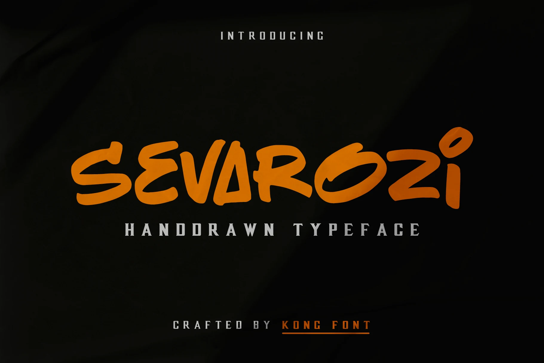
Best For: logos, headlines, stickers, bold designs
Sevarozi Font has a chunky all-caps handwritten style with blunt marker strokes, angular cuts, and uneven internal shapes. The letters feel loud and casual, with enough irregularity to keep the wordmark from looking like a standard block display font.
For Bold Handwritten Fonts, Sevarozi is best kept to short names, labels, and craft-forward titles where the rough rhythm can stay readable. Its solid forms suit Photoshop mockups and Silhouette design workflows, but looser tracking helps the heavier letters avoid crowding.
Fast Brush Bold Handwritten Fonts
This group focuses on slanted brush movement, rough edges, and quick handwritten energy for apparel graphics, posters, bold logos, and high-impact social titles.
Hunting Season Font
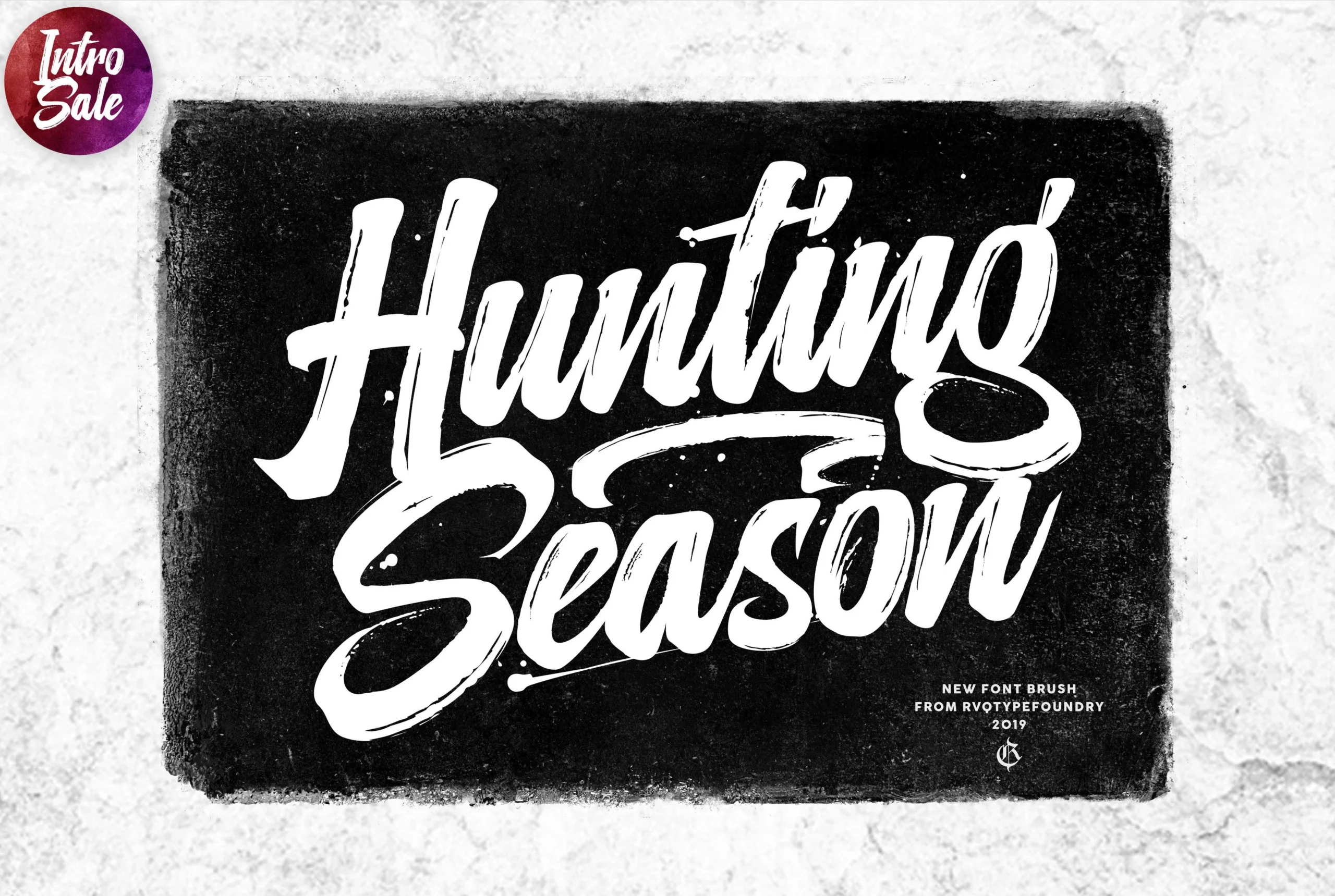
Best For: posters, merch design, display text, headlines
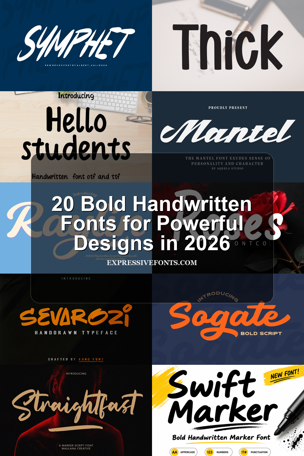
Hunting Season Font has the kind of brush-built presence that fills the page fast. The letters are tall, thick, and slightly compressed, with rough edges, dry-brush texture, and long sweeping terminals that push it firmly into Bold Handwritten Fonts territory.
It works best when you let the strokes do the heavy lifting in short, high-impact wording. Use it for titles or statement graphics with plenty of negative space, because the dense weight and oversized swashes can start to crowd smaller layouts if the line length gets too long.
Symphet Font
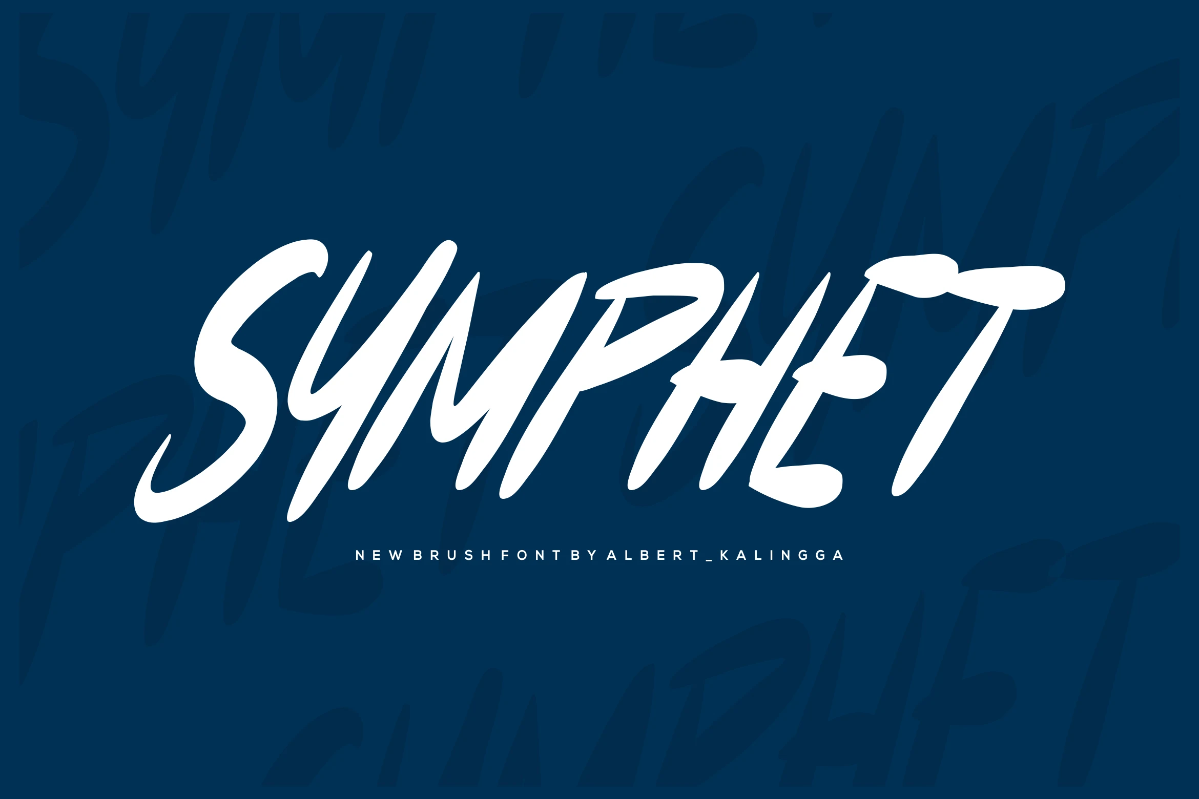
Best For: logos, headlines, retro designs, posters
Symphet Font has a fast, all-caps brush look with narrow proportions, pointed stroke endings, and a strong forward slant. The letters feel carved with a loaded brush rather than drawn slowly, which gives Bold Handwritten Fonts a more dynamic, poster-ready edge.
Its biggest strength is momentum, so it shines in headlines and logo work where the long diagonals and compressed spacing can create tension. Pair it with a quiet sans serif and keep the wording short; that contrast lets the energetic texture read clearly without losing its nostalgic punch.
Jhon Standup Font
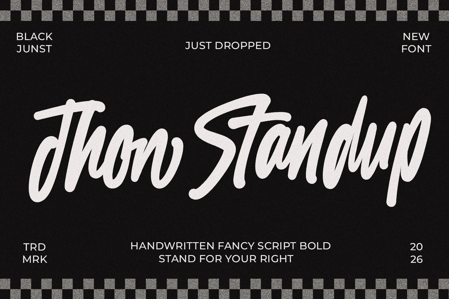
Best For: logos, posters, T-shirts, social media graphics
Jhon Standup Font uses a fast connected brush rhythm with thick strokes, tall ascenders, and wide looping entries. The slanted movement and smooth joins give Bold Handwritten Fonts a confident street-style feel without relying on rough texture.
It is strongest in logos, apparel graphics, and poster headlines where one phrase can stretch across the layout. Keep supporting type simple and watch the word length, since the tight script connections and oversized opening strokes need room to stay legible.
Straightfast Font
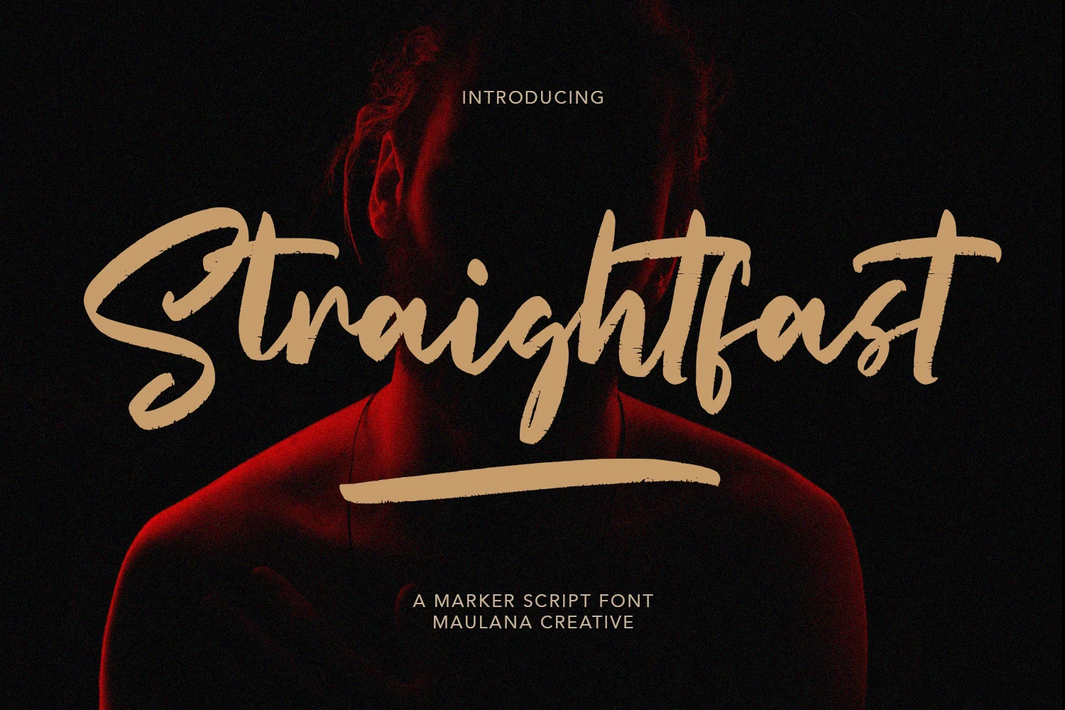
Best For: logos, headlines, posters, expressive designs
Straightfast Font has a fast marker-script build with wide sweeping caps, sharp turns, and dry brush texture along the stroke edges. The connected rhythm feels energetic and slightly aggressive, giving short words a strong display presence without the polish of a formal script.
In a set of Bold Handwritten Fonts, this is the option for titles that need speed and impact. Keep the surrounding typography quiet and give the underline-style strokes enough horizontal space, since the extended entry and exit marks are part of the composition.
Rounded Playful Bold Handwritten Fonts
These chunky rounded fonts work best for children’s designs, stickers, classroom graphics, and casual labels that need a friendly handmade tone.
Hello Students Font
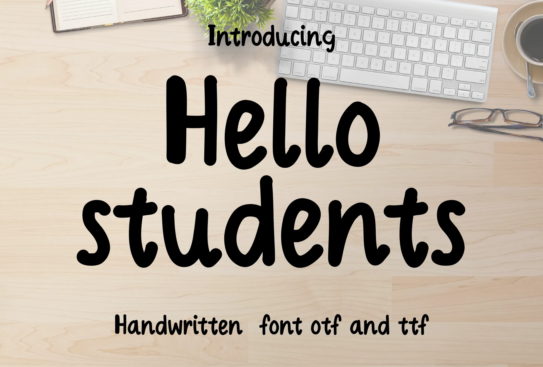
Best For: children’s designs, stickers, posters, casual designs
Hello Students Font uses thick rounded strokes, soft terminals, and a steady monoline rhythm that gives every word a cheerful classroom feel. The wide curves and simple shapes keep it approachable, which makes it an easy fit when you need Bold Handwritten Fonts with a friendly tone.
Because the letters are so full and smooth, it reads best in short titles, labels, and kid-focused graphics rather than dense text blocks. Give it moderate spacing and enough margin around the text so the chunky forms stay open instead of feeling crowded in tighter compositions.
Bullog Font
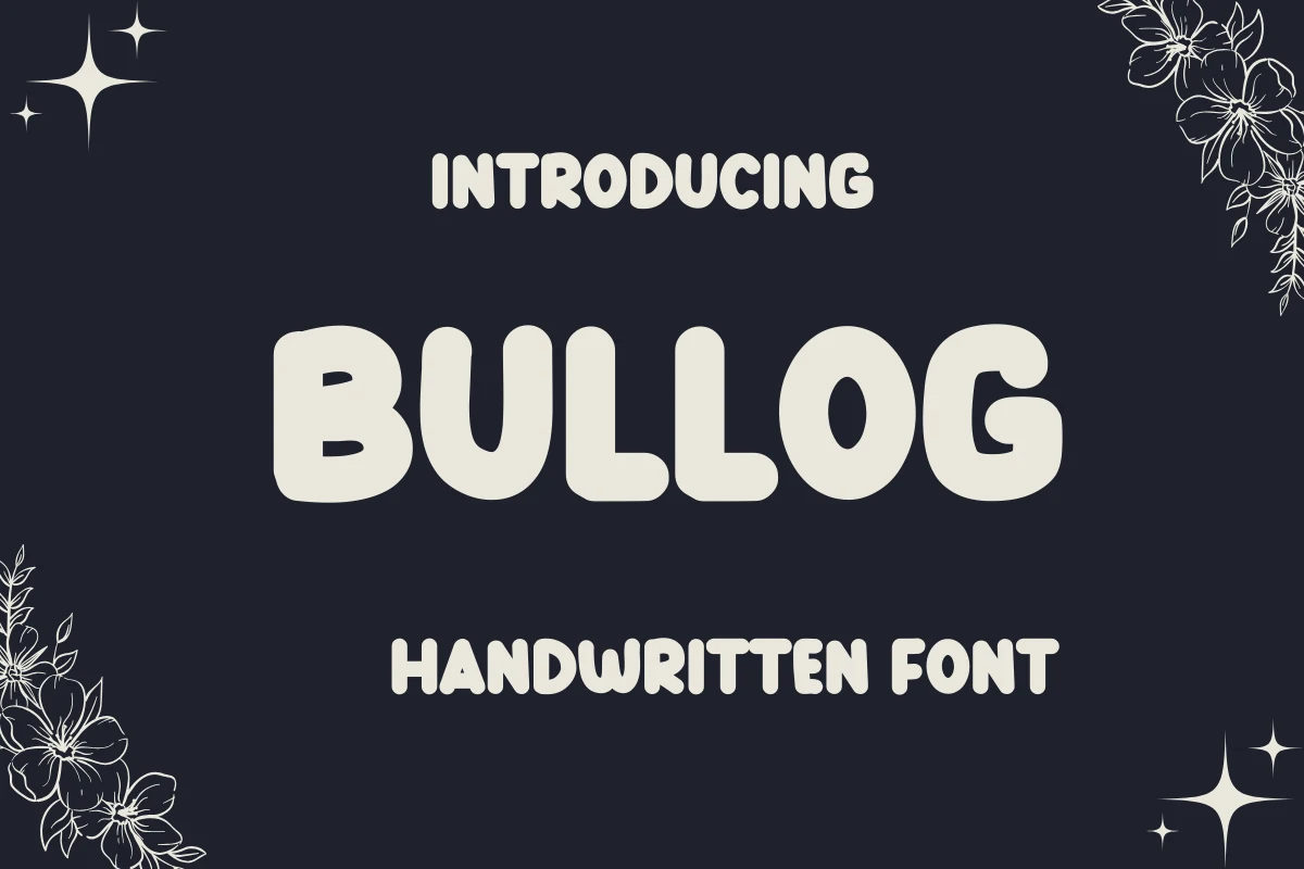
Best For: children’s designs, stickers, bold designs, fun designs
Bullog Font is built from chunky rounded letters with soft corners, heavy weight, and a simple hand-drawn rhythm. The forms are wide and friendly rather than sharp or fast, giving Bold Handwritten Fonts a more playful, kid-facing personality.
Its thick shapes make short words easy to spot in stickers, classroom graphics, and cheerful display layouts. Keep the spacing slightly open and use strong contrast behind the lettering, because the compact counters and inflated strokes can close up when scaled too small.
Humble Moon Font
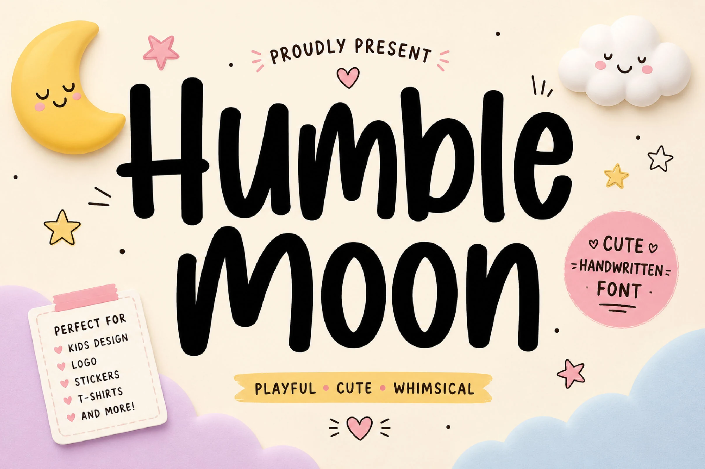
Best For: children’s designs, stickers, logos, quotes
Humble Moon Font has thick rounded strokes, tall simple letterforms, and a soft handmade rhythm that reads as playful rather than polished. Its bold weight gives Bold Handwritten Fonts a kid-friendly display option with clear shapes and a warm, casual voice.
The chunky monoline build works well for stickers, children’s product graphics, logo marks, and cheerful quote layouts. Keep the text short and avoid tight tracking; the rounded counters need space to stay open when the font is used at smaller sizes or placed inside busy compositions.
Retro Script Bold Handwritten Fonts
These bold retro scripts use swashes, italic pressure, and sign-painter curves for logos, packaging, vintage posters, labels, and nostalgic brand marks.
Mantel Font
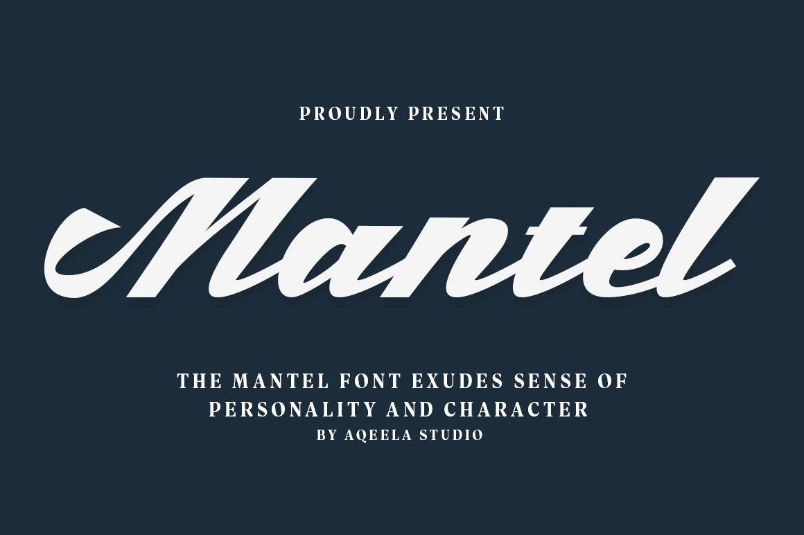
Best For: logos, headlines, signage, vintage designs
Mantel Font brings a vintage sign-painter feel through its heavy italic strokes, broad curves, and sharp cut-in details. The capital M has a dramatic entry flourish, while the connected lowercase forms keep the word moving with the confident pressure expected from Bold Handwritten Fonts.
Use Mantel where a single word or compact phrase needs to carry the layout. Its thick script weight benefits from strong contrast and generous side spacing; keeping supporting text smaller and more rigid lets the sweeping forms stay readable without flattening the retro character.
The Minstar Font
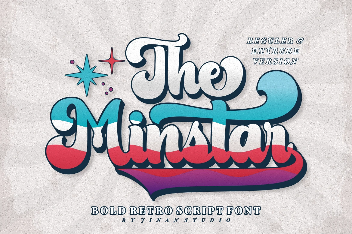
Best For: logos, headlines, magazine covers, retro designs
The Minstar Font leans into retro display lettering with chunky rounded curves, deep joins, and a long sweeping terminal that stretches across the word. Its bold script rhythm feels lively and theatrical, giving Bold Handwritten Fonts a more nostalgic, sign-inspired personality.
This is the kind of face that works best when the word itself becomes the focal point. Use it in short headlines or logos, and leave enough horizontal space for the broad swashes to breathe; a simpler supporting font will keep the layout balanced without competing with its weight.
Viyona Font
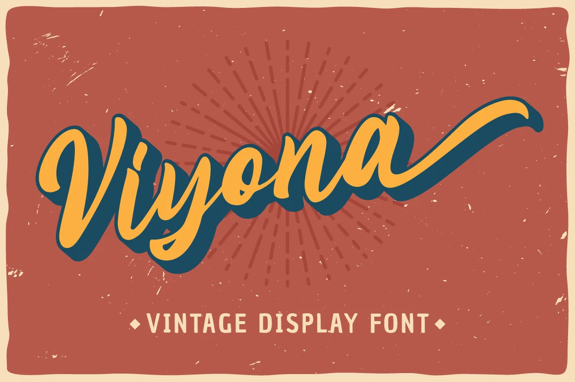
Best For: logos, headlines, retro designs, vintage designs
Viyona Font has a bold retro script look with thick curves, tight joins, and a long finishing swash that stretches the word into a full display piece. The deep offset shadow and rounded brush rhythm give it the standout attitude many people want from Bold Handwritten Fonts, especially when a logo needs vintage energy.
This style works best in short headlines and wordmarks where the sweeping tail can stay visible instead of fighting surrounding elements. Pair it with compact serif or sans text for contrast, and leave enough horizontal room so the broad stroke weight and nostalgic movement do not feel cramped.
Kandel Font
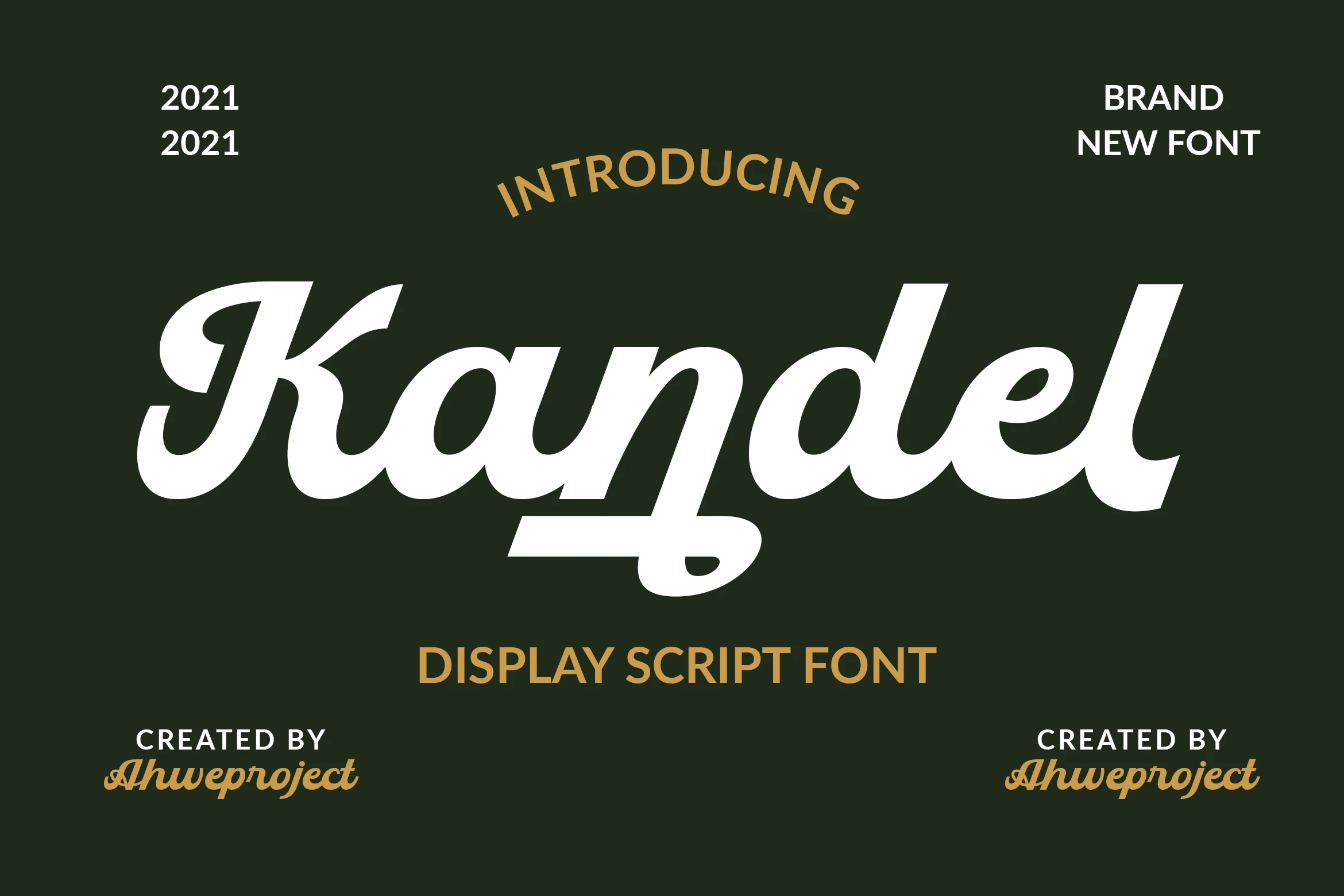
Best For: logos, headlines, retro designs, vintage designs
Kandel Font has a polished retro script build, with a heavy italic body, rounded joins, and a long underline stroke pulled from the descender. The strong contrast between thick curves and sharp cut-in details puts it clearly within Bold Handwritten Fonts for logo-led work.
Its PUA encoding gives access to glyphs and swashes, which is useful when building a more customized wordmark. Keep the main text short and give the underline room to extend; a compact sans or serif secondary line will keep the vintage display shape from feeling crowded.
Sogate Font
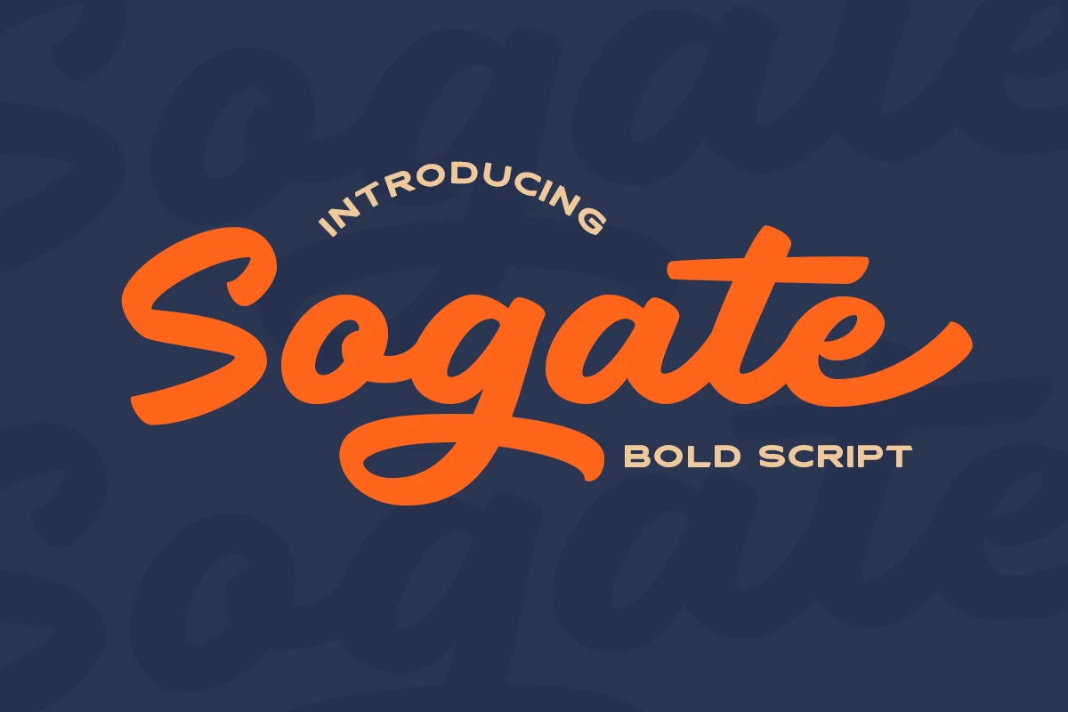
Best For: logos, headlines, retro designs, display text
Sogate Font uses a bold connected script with rounded brush pressure, a high-sweeping S, and a long underline-style descender that gives the word a fast retro pull. The dense curves stay clean, while the confident rhythm places it firmly among Bold Handwritten Fonts for display-heavy layouts.
Use Sogate for short logotypes, poster titles, and nostalgic brand marks where one word can carry the composition. Keep secondary text compact and structured, and leave extra room below the baseline so the sweeping stroke does not collide with captions or supporting details.
The Ralston Font
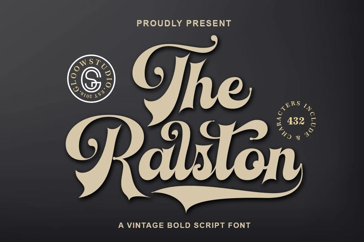
Best For: logos, product labels, packaging, vintage designs
The Ralston Font carries a bold 70s script shape with inflated downstrokes, sharp wedge terminals, and curled entry strokes that make each word feel like a compact logo mark. Its heavy contrast and sweeping underline-style rhythm give the letters a vintage sign-painter presence rather than a casual marker feel.
Use it for Bold Handwritten Fonts when the title needs ornament and authority in the same lockup. The flourishes need controlled spacing around the word, so keep supporting text smaller and plainer while letting the script own the main hierarchy.
Smooth Logo Bold Handwritten Fonts
This category keeps the bold handwritten weight but softens the tone with smoother curves, making the fonts useful for logos, invitations, personal brands, and romantic titles.
Raylin Font
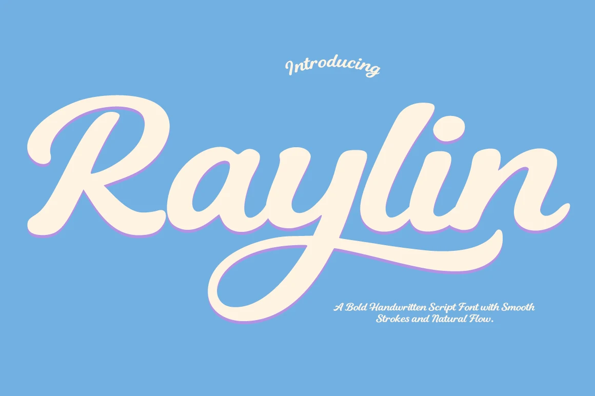
Best For: logos, website headers, headlines, personal branding
Raylin Font has a broad, easy rhythm with thick rounded strokes, soft joins, and a sweeping tail that gives the wordmark real movement. It lands comfortably in Bold Handwritten Fonts, but the clean contours keep it more polished than rough, so it feels confident without turning heavy.
This style works especially well in logos and title treatments where the large curves can stay open. Keep line spacing loose and avoid crowding the long descenders; paired with a plain sans serif, Raylin holds the visual focus while the secondary text stays crisp and supportive.
Roses Font
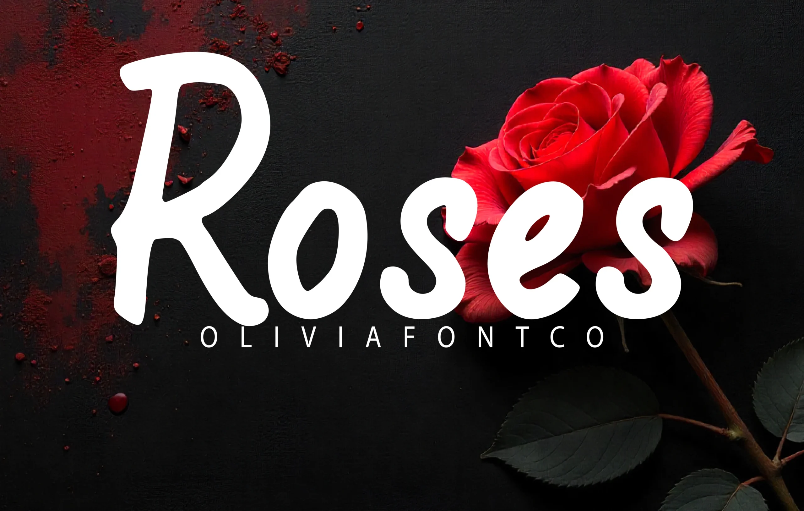
Best For: logos, headlines, romantic designs, invitations
Roses Font uses a heavy handwritten script style with smooth curves, rounded terminals, and a tall dramatic capital R. Its broad white strokes feel romantic but still direct, giving Bold Handwritten Fonts a softer display option with strong emotional weight.
The open counters help the letters stay readable, even with the thick connected forms. Use it for compact names, invitation titles, and logo marks where contrast can be high; avoid long lines, since the large loops and close joins work better when the word has room to stand alone.
Conclusion
Choose chunky marker fonts when the layout needs blunt impact, fast brush styles when it needs motion, rounded fonts for playful work, retro scripts for vintage branding, and smoother bold scripts for logos or invitations.