11 Best Brush Handwritten Fonts for Bold Designs in 2026
Brush handwritten fonts bring painted texture, loose movement, and bold personality to digital and print design. This collection is built for designers choosing fonts for logos, packaging, posters, T-shirts, invitations, stickers, and social media graphics where a hand-drawn brush style needs to feel expressive but still usable.
Looking for more handwritten fonts? Browse our complete Handwritten Fonts collection to compare modern, cute, casual, bold, brush, signature, script, wedding, Cricut, and logo-friendly handwritten styles.
Smooth & Elegant Brush Handwritten Fonts
These smoother brush fonts keep the hand-painted feel softer and more refined, making them useful for invitations, stylish branding, editorial covers, and social graphics.
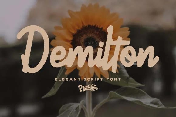
Demilton Font
Best For: invitations, wedding designs, social media graphics, feminine designs
Demilton Font has a soft paint-brush feel, but its letterforms are cleaner and more polished than rough marker scripts. The broad opening strokes, rounded terminals, and connected rhythm give words a smooth flowing shape, while the thicker downstrokes help names and short phrases stay readable over busy photo backgrounds.
It suits Brush Handwritten Fonts projects that need warmth without losing elegance, especially invitation titles, stationery, and styled social graphics. The script has enough weight to carry a headline on its own, so supporting text works best in a lightly spaced sans serif or small caps line underneath to keep the hierarchy crisp.
Stars Font
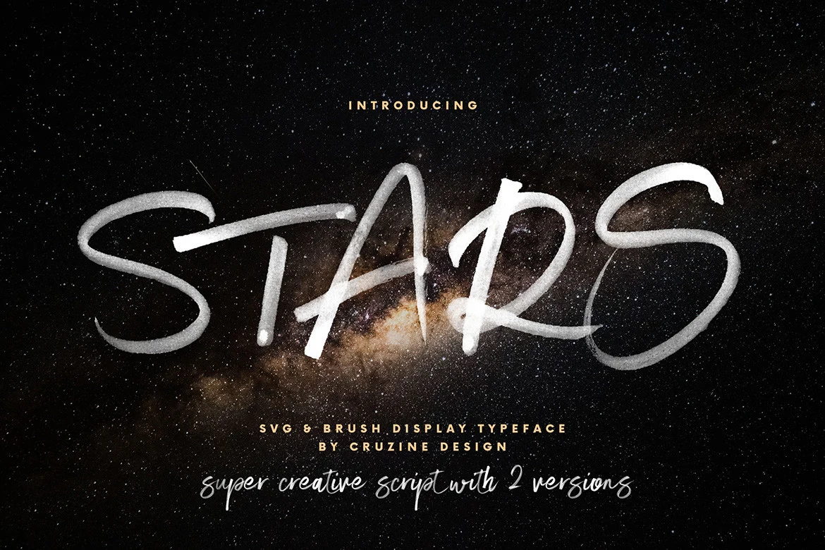
Best For: branding, packaging, editorial designs, logos
Stars Font is built with long, sweeping brush strokes and narrow joins that make each letter feel quick and hand-drawn. The tall uppercase forms, airy spacing, and softly textured edges give it strong motion, so a single word lands with real impact instead of reading like a delicate script.
Among Brush Handwritten Fonts, this one is best used at display size where the stroke texture stays visible and the exaggerated shapes can breathe. It suits branding, packaging, and editorial covers especially well; pair it with a compact sans serif for supporting text so the extended brush lines stay sharp and untangled.
Chunky Script Brush Handwritten Fonts
These heavy connected scripts use rounded brush strokes, broad swashes, and strong word shapes, making them useful for logos, merch, signage, labels, and quote graphics.
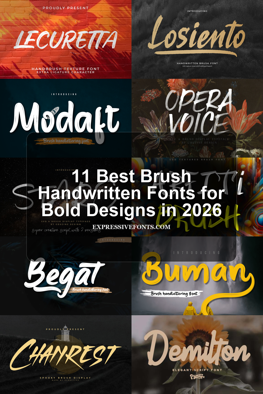
Modaft Font
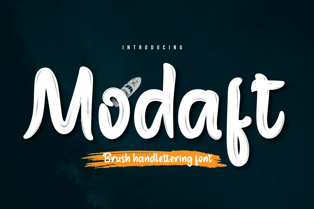
Best For: logos, T-shirts, signage, handmade designs
Modaft Font has a chunky brush-script build with tall rounded strokes, compressed counters, and a sweeping first letter that gives the wordmark a loose hand-painted push. The dry streaks inside the strokes keep it from looking too polished, while the high x-height makes short names read with more force than delicate signature scripts.
Use it where Brush Handwritten Fonts need immediate display impact: logo words, T-shirt phrases, sticker headers, or social posts. Keep spacing slightly open around the heavier letters and pair it with a plain sans label so the brush texture stays dominant instead of turning into visual noise.
Begat Font
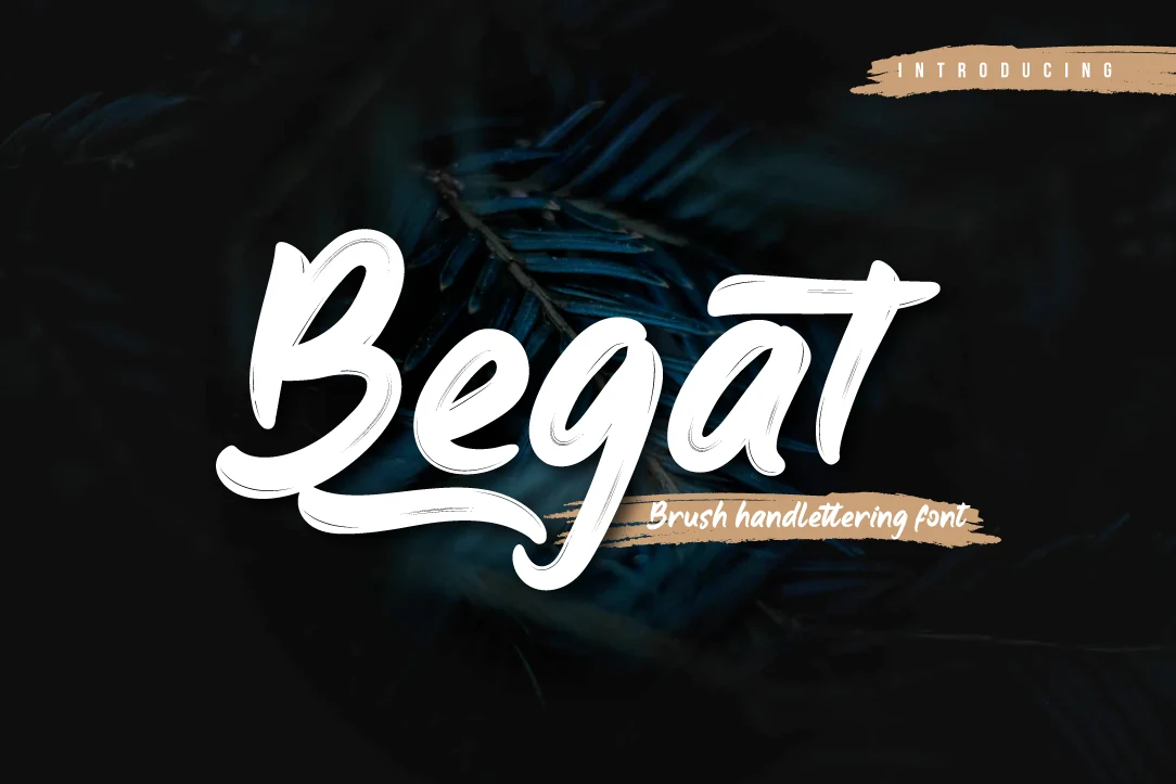
Best For: logos, signage, T-shirts, handmade designs
Begat Font leans into a chunky brush-script style with broad rounded strokes, soft inner counters, and a long sweeping flourish that anchors the wordmark. The letters connect smoothly, but the slight dry-brush streaks keep it from feeling too polished, giving short titles a bold handmade presence.
If you’re sorting through Brush Handwritten Fonts for branding or merch, Begat works best on short words where its weight and curved rhythm can stay open. Give it a little extra breathing room and pair it with a narrow sans serif for supporting copy, so the heavy script remains the focal point instead of crowding the layout.
Buman Font
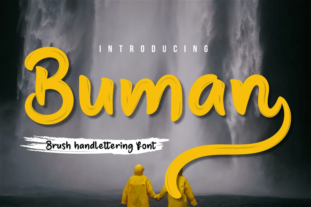
Best For: logos, quotes, social media graphics, playful designs
Buman Font has a chunky brush-script look with rounded bowls, smooth joins, and a long finishing swash that gives the lettering an easy, upbeat rhythm. The strokes are thick and friendly rather than rough, so the word shape feels bold and approachable while still keeping a hand-drawn character.
When you need Brush Handwritten Fonts with strong display presence, Buman works best on short phrases, logos, and quote graphics. Keep the line length tight and let the oversized tail have room to travel, then pair it with a clean sans serif for secondary text so the script stays lively without crowding the layout.
Losiento Font
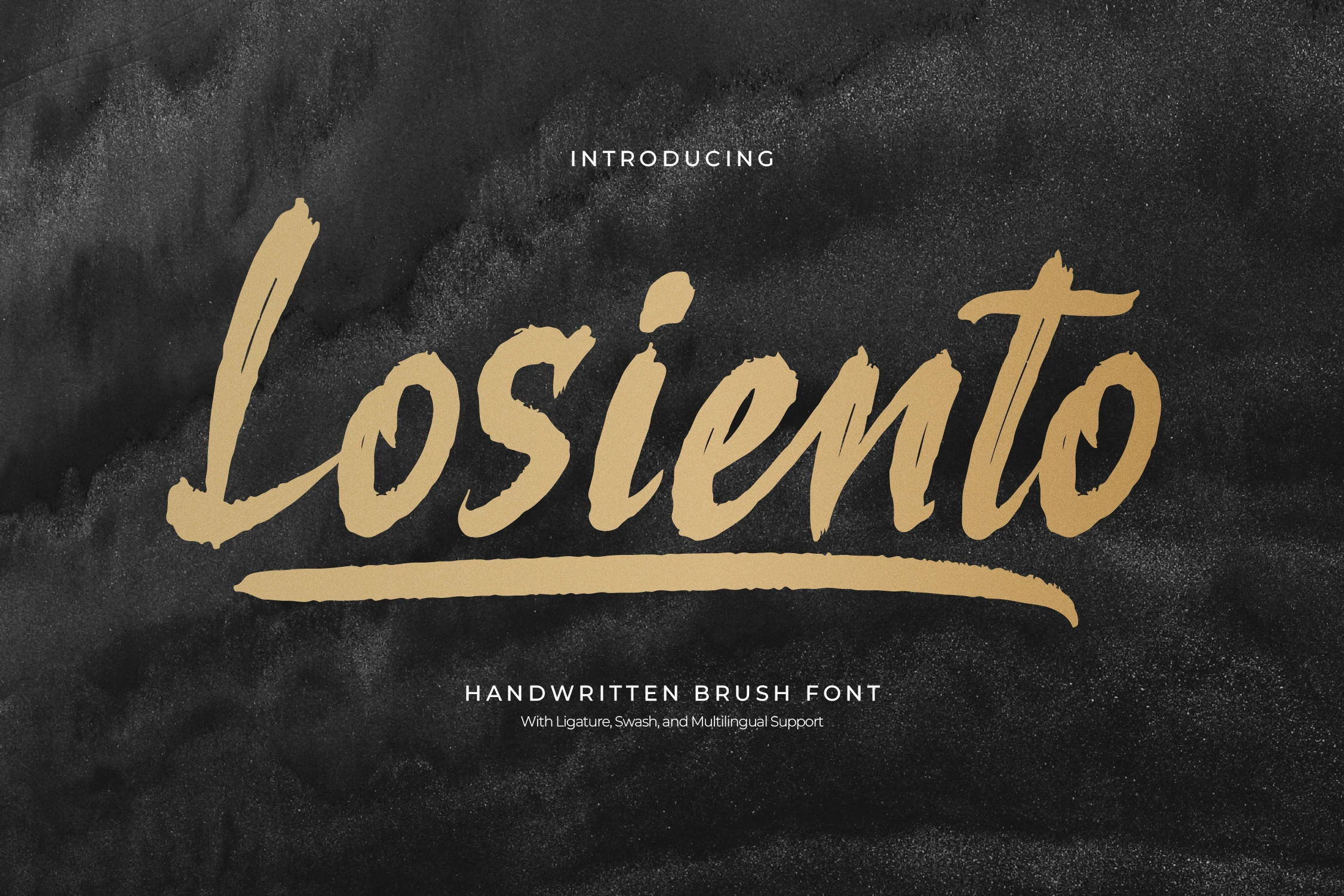
Best For: logos, branding, product labels, posters
Losiento Font has a sturdy brush-script look with thick painted strokes, blunt terminals, and rough edges that keep the lettering tactile. The characters are wide and easy to read, while the heavy underline adds a grounded, poster-like finish that gives short words extra emphasis.
For Brush Handwritten Fonts, Losiento works especially well when you want a bold headline that still feels handmade. Use it on short brand names, labels, or cover lines, and leave enough horizontal room for the underline flourish so it supports the composition instead of colliding with nearby text.
Rough All-Caps Brush Handwritten Fonts
These uppercase brush fonts use dry texture, fractured edges, and bold painted strokes for posters, packaging, editorial titles, and high-impact brand marks.
Lecuretta Font
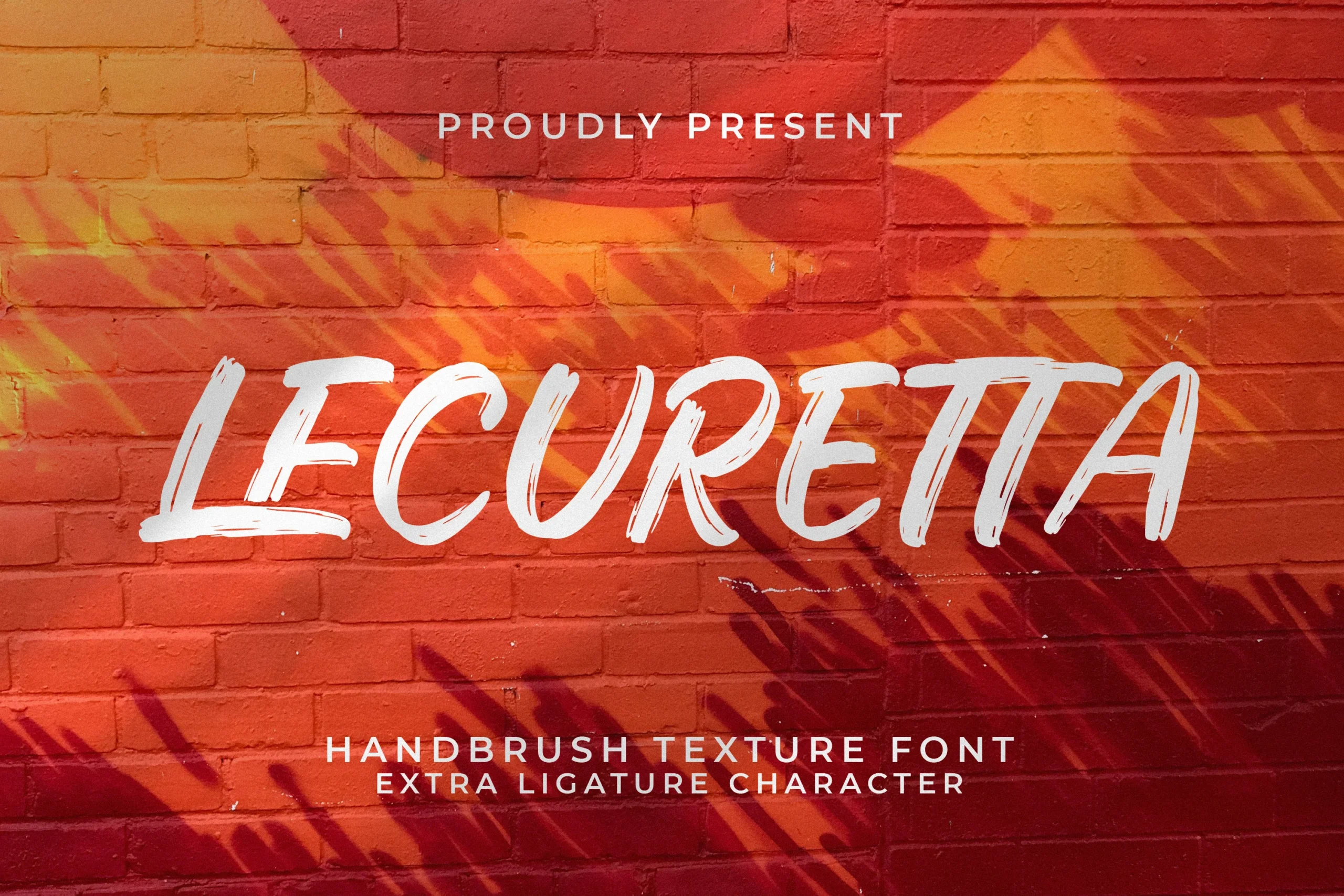
Best For: logos, packaging, social media graphics, handmade designs
Lecuretta Font has a bold all-caps brush look with long, slightly slanted strokes and visible dry-brush breaks that keep the lettering lively rather than polished. The wide proportions and open counters help the word shape stay clear, while the uneven stroke edges give it the kind of movement that suits energetic display work.
For Brush Handwritten Fonts, this one leans best into short, high-impact text where texture does the talking. It works especially well when you give it room across the line and pair it with a tight sans serif subtitle, letting the rough stroke rhythm carry logos, packaging titles, or graphic headers without feeling cramped.
King Star Font
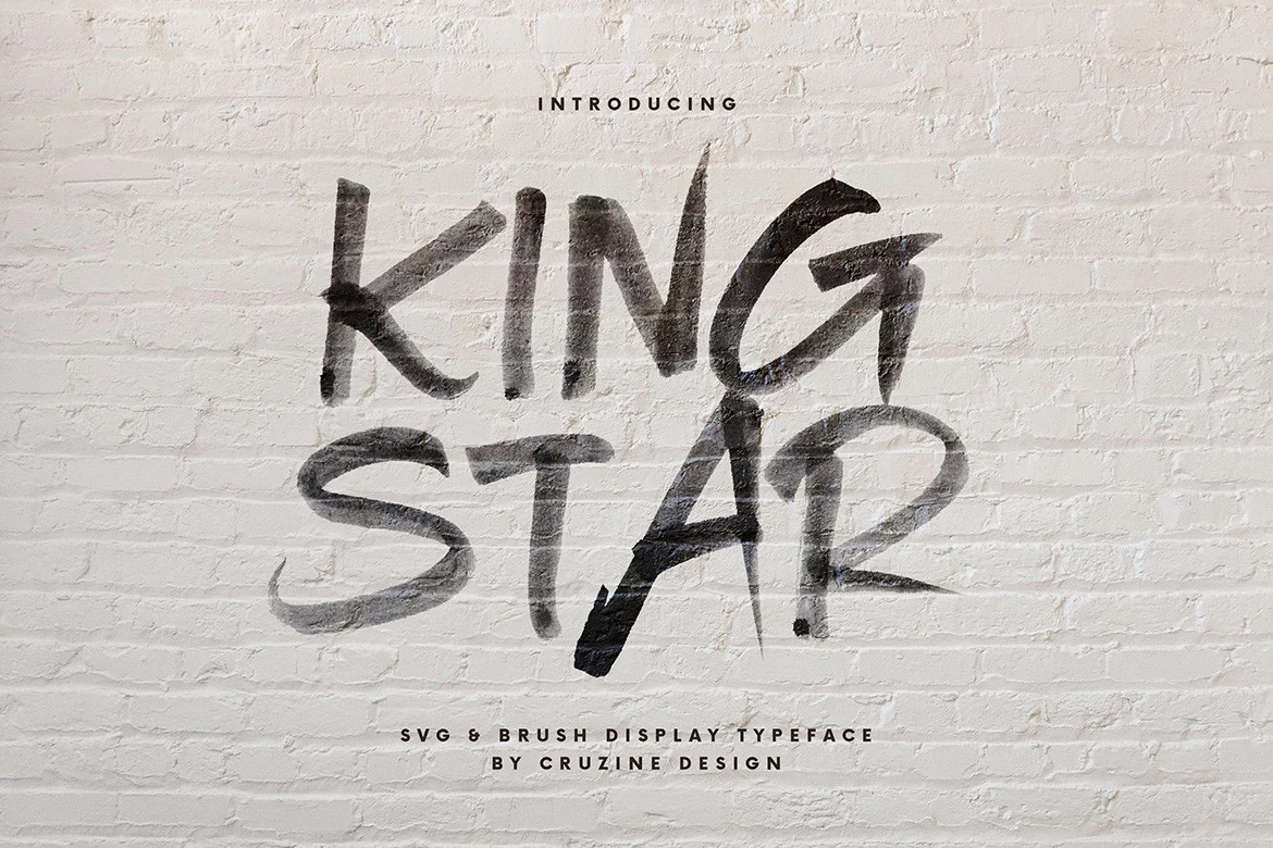
Best For: branding, packaging, editorial designs, posters
King Star Font uses raw all-caps brush lettering with fractured edges, dense dry texture, and uneven stroke pressure that makes each line feel painted straight onto the surface. The narrow verticals and sweeping curves give the word shape a forceful, handmade rhythm, so it reads more like expressive display lettering than a smooth script.
Within Brush Handwritten Fonts, it performs best in short headlines where the rough stroke detail can stay visible. It suits branding, packaging, and poster-style editorial designs particularly well; keep supporting text compact and clean, and leave enough open space around the title so the jagged brush texture stays sharp instead of turning muddy.
Opera Voice Font
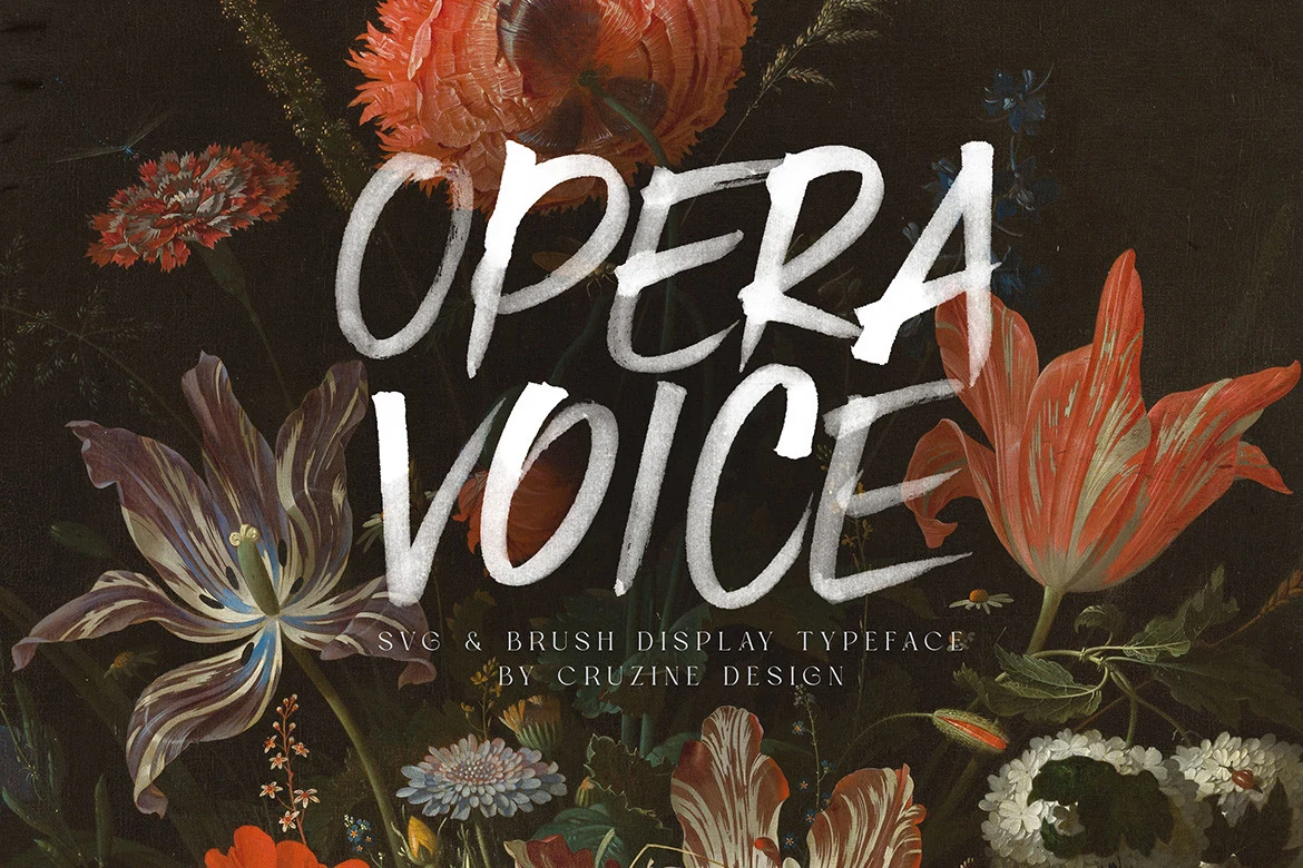
Best For: logos, editorial designs, social media graphics, expressive designs
Opera Voice Font uses tall uppercase brush lettering with brisk diagonal cuts, tapered terminals, and dry edges that keep the strokes looking painted rather than polished. The forms feel bold without turning blocky, and the uneven pressure across each letter gives headlines a dramatic rhythm that reads clearly from a distance.
For Brush Handwritten Fonts, this one has a more theatrical presence than a casual script, so it works best in short titles where the texture can stay visible. Use it for logos, editorial covers, or social graphics with generous line spacing, then anchor it with a restrained serif or compact sans to keep the composition sharp and controlled.
Edgy & Graffiti Brush Handwritten Fonts
These sharper brush fonts lean into aggressive angles, street-art texture, and restless motion, making them useful for posters, stickers, T-shirts, and expressive headlines.
Chanrest Font
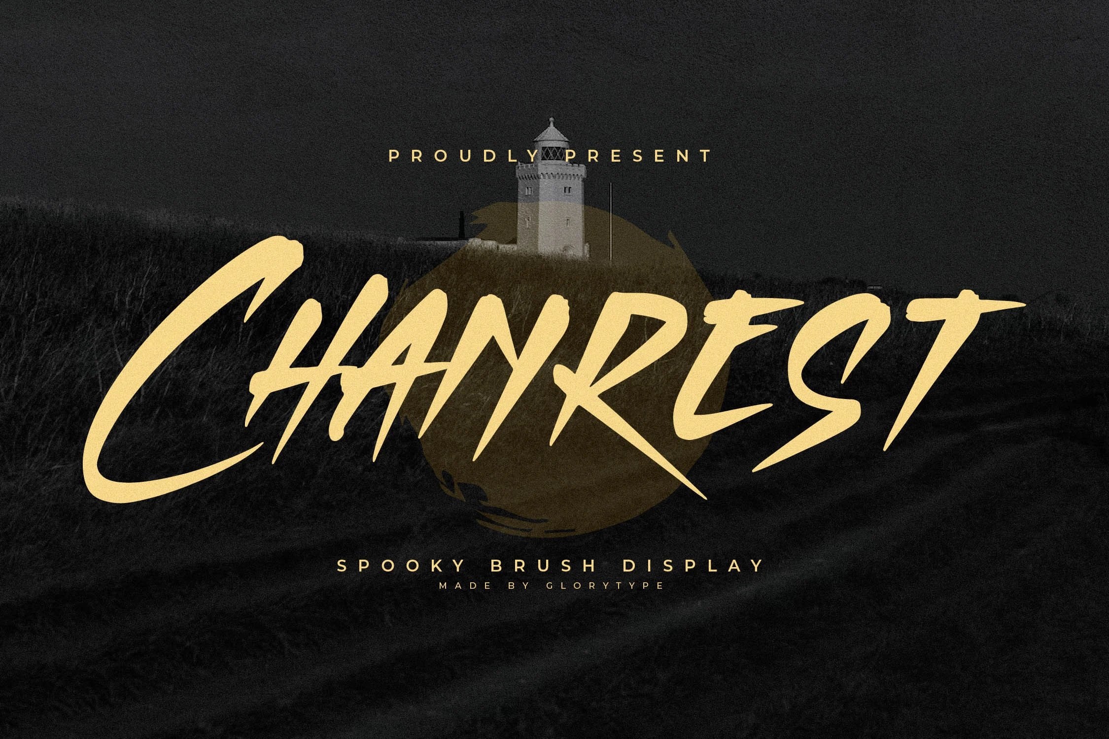
Best For: posters, headlines, logos, expressive designs
Chanrest Font has a tense, slashing brush style with pointed terminals, steep diagonals, and uneven stroke pressure that gives every word a restless edge. The all-caps construction keeps it bold and direct, while the narrowed joins and sharp inner angles make the lettering feel more cinematic than casual.
For Brush Handwritten Fonts, Chanrest stands out when you keep the text short and let those jagged shapes carry the mood. It works best in headlines, logos, and poster titles, especially with a clean sans or spaced small caps underneath so the aggressive brush rhythm stays clear instead of competing with the supporting copy.
Arfiti Brush Font
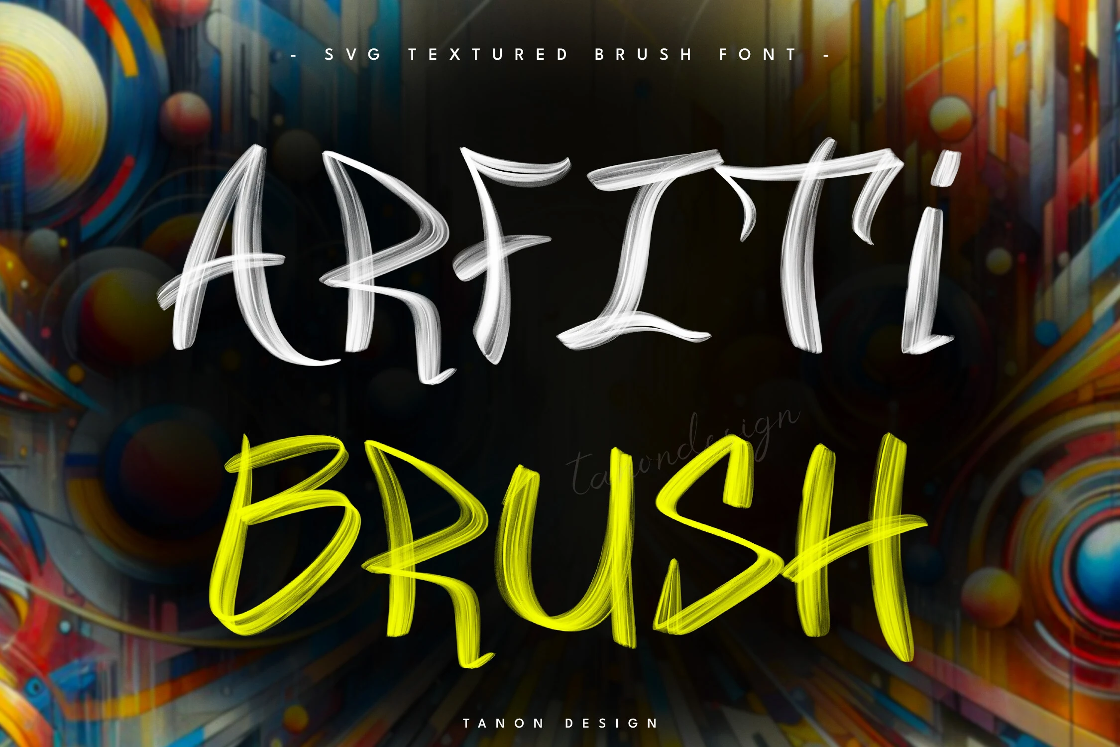
Best For: T-shirts, stickers, artistic designs, bold designs
Arfiti Brush Font has a bold graffiti feel, built from tall uppercase forms and layered brush strokes that look almost painted with a loaded marker. The semi-transparent texture gives each letter visible movement, while the narrow proportions and curved terminals keep the word shape lively instead of blocky.
If you want Brush Handwritten Fonts with a street-art edge, this one works best in short headlines where the textured strokes can stay clear. Use it large on dark backgrounds and keep supporting text simple, since the energetic brush layering already adds enough rhythm for T-shirts, stickers, and other graphic-led layouts.
Conclusion
Choose smooth brush fonts for refined invitations and branding, chunky scripts for logos and merch, rough all-caps styles for posters and packaging, and edgy graffiti-inspired lettering when the design needs sharper movement and stronger visual tension.