10 Editorial Serif Fonts for Stunning Designs in 2026
Looking for more serif fonts? Browse our complete Serif Fonts collection to compare luxury, elegant, modern, vintage, editorial, display, bold, feminine, and logo serif styles.
Editorial Serif Fonts give magazines, fashion brands, covers, packaging, and premium identities a sharper typographic voice. This collection is built for designers who need refined serif display fonts with contrast, structure, and enough personality for headlines, mastheads, logos, and campaign visuals.
High-Contrast Editorial Serif Fonts
These refined editorial serif fonts use sharp contrast, tall forms, and elegant details for magazine covers, fashion identities, beauty packaging, and premium headlines.
Borello Font
Best For: editorial designs, magazine covers, branding, headlines
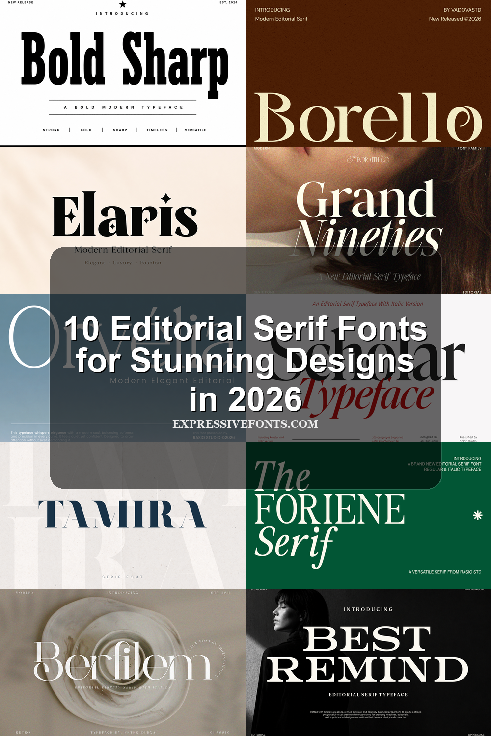
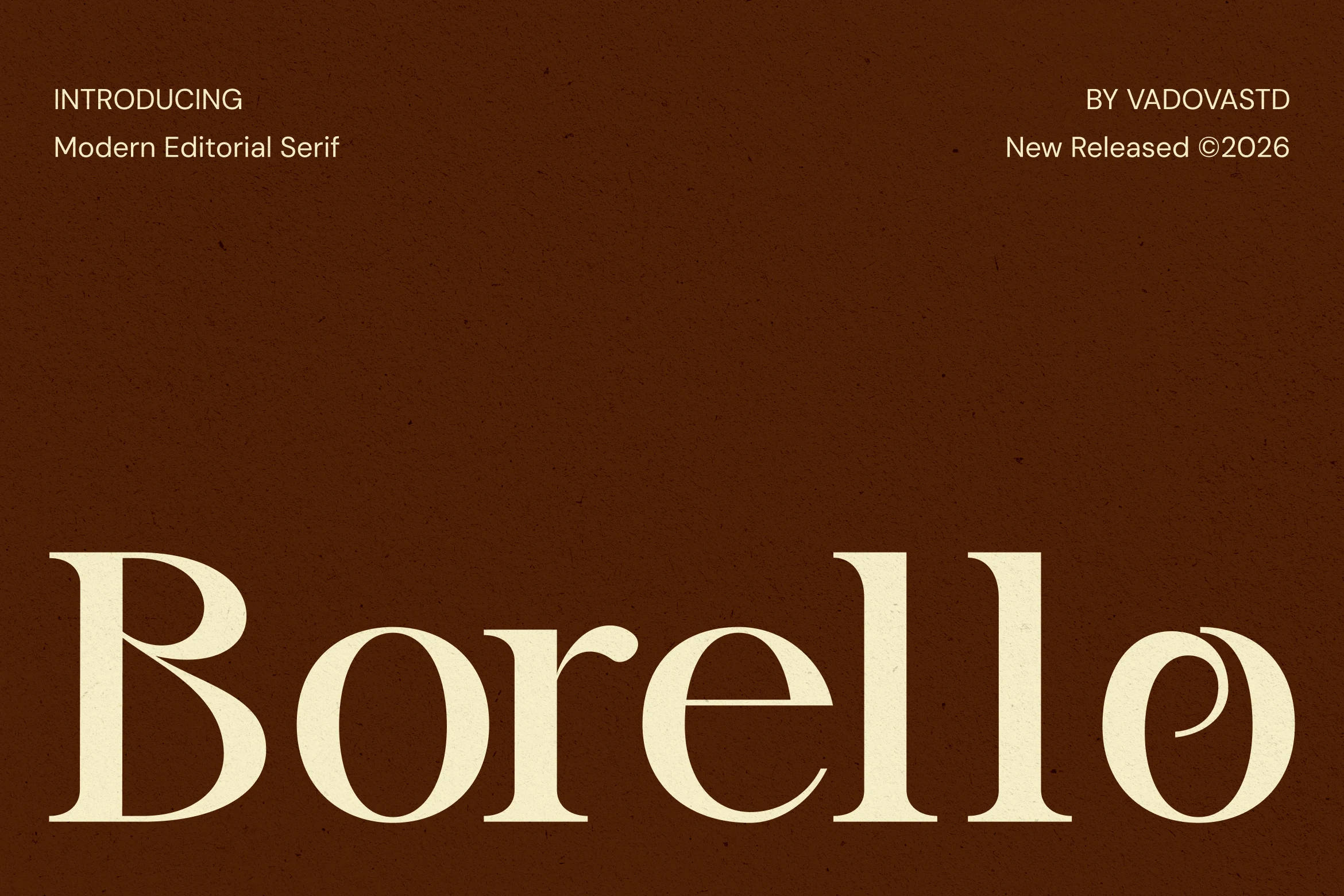
Borello Font has the controlled drama expected from Editorial Serif Fonts: broad vertical stems, smooth rounded bowls, crisp serif endings, and a distinctive alternate-style “o” that gives the wordmark a custom editorial accent. The contrast is refined rather than fragile, so the letters hold presence without turning overly delicate.
Use Borello where the title needs to feel composed and premium, especially in mastheads, fashion branding, covers, and campaign headlines. Its stylistic alternates help introduce a more expressive rhythm, while the balanced spacing keeps large serif layouts from feeling crowded or ornamental.
Tamira Font
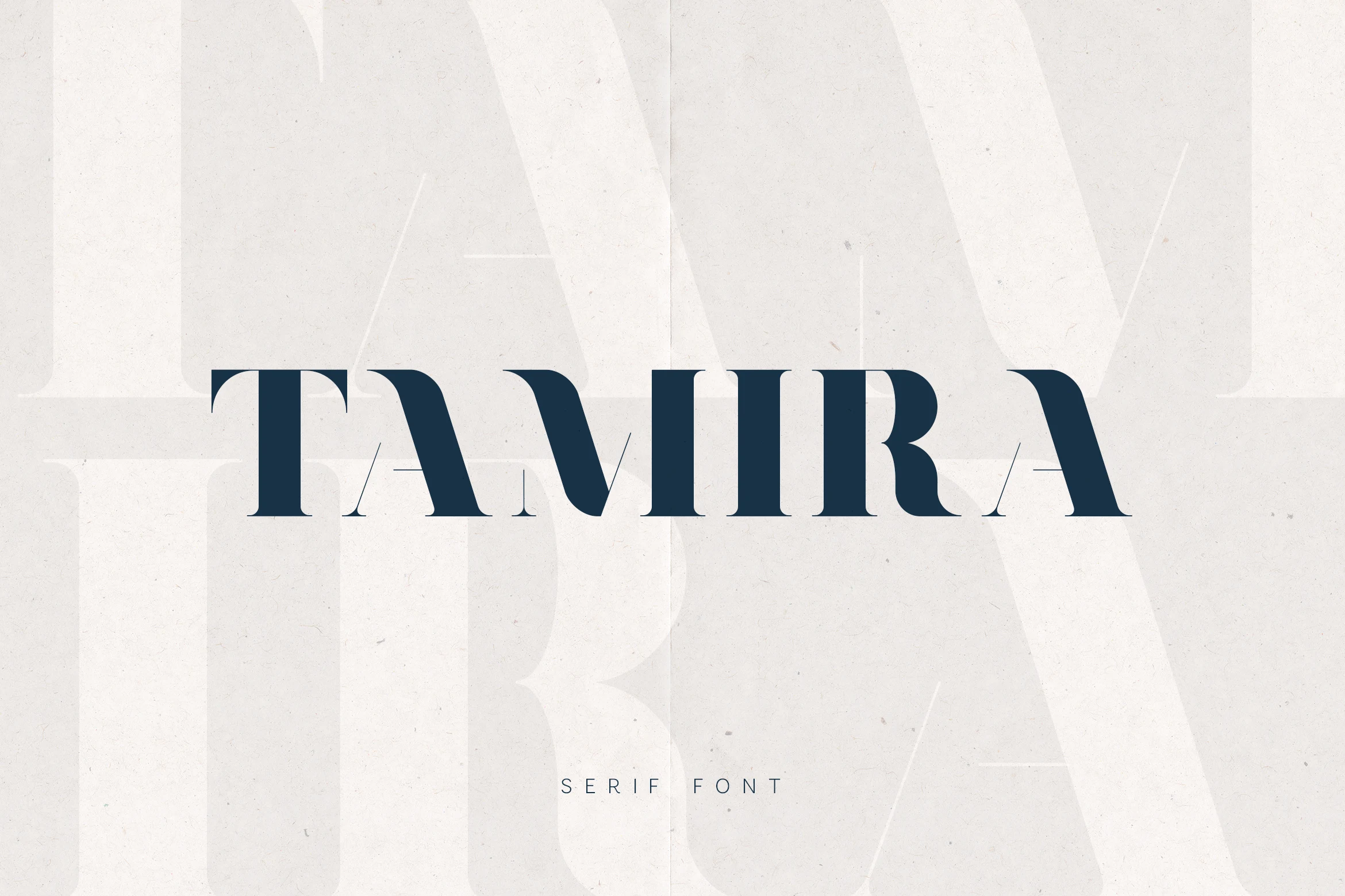
Best For: editorial designs, fashion branding, magazine covers, headlines
Tamira Font has the kind of sculpted contrast that gives Editorial Serif Fonts their authority. The preview shows broad vertical strokes, hairline serifs, and crisp angled cuts that make each capital feel tall, sharp, and composed. It carries a fashion-led mood, but the forms stay controlled rather than ornate.
That thick-and-thin structure works especially well when you want a headline to dominate the page without looking heavy. Give Tamira generous tracking and clear hierarchy, and its narrow counters and delicate joins will read with more precision in mastheads, luxury branding, and cover-style layouts.
Berfilem Font
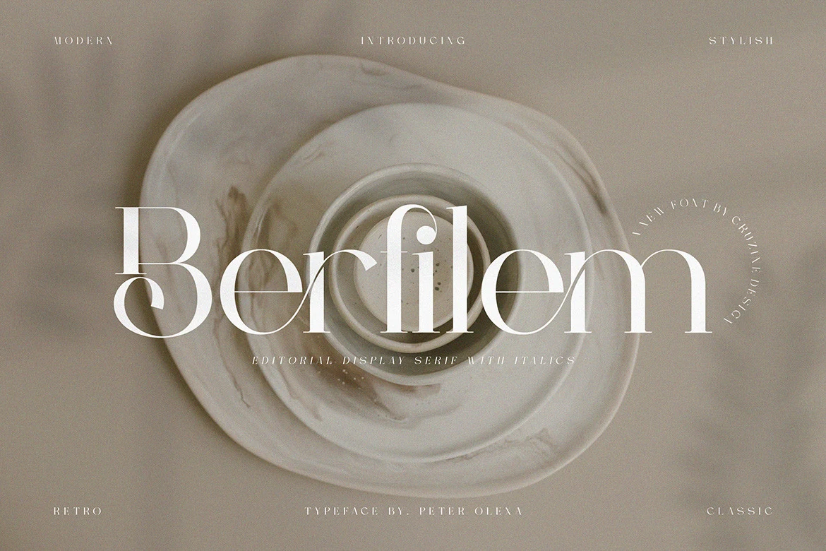
Best For: editorial designs, branding, magazine covers, fashion branding
Berfilem brings a polished take on Editorial Serif Fonts, with tall stems, dramatic thick-to-thin contrast, and wide rounded bowls that keep the lettering graceful at a large scale. The hairline connections and elongated curves give it a refined fashion-editorial mood without feeling stiff or overly formal.
It shines most in display settings where the contrast can stay visible, especially on covers, identities, and hero headlines. Keep the supporting typography quiet and give the wordmark a little room in the layout, and the delicate joins and sharp serif edges read much more cleanly.
Orvelia Font
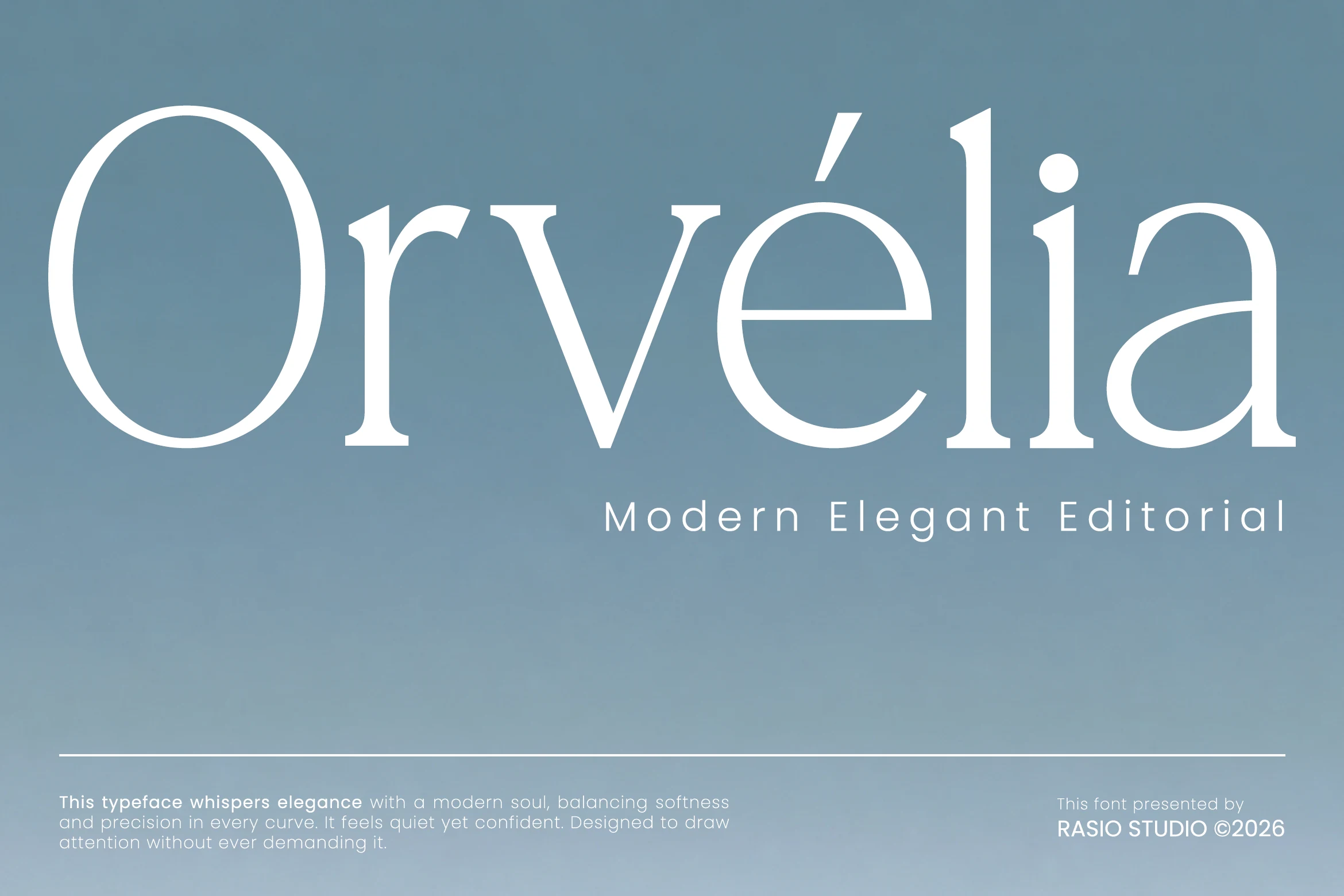
Best For: editorial designs, beauty branding, packaging, magazine covers
Orvelia feels poised and airy, with a tall oval O, finely tapered joins, and sharp calligraphic serifs that keep the wordmark polished rather than severe. Its smooth proportions and clean contrast give Editorial Serif Fonts a quieter kind of drama, where the elegance comes from balance, spacing, and those neatly sculpted terminals.
That restraint makes it especially effective for magazine titles, beauty packaging, and boutique identities. Set Orvelia at generous sizes and let the natural spacing breathe; the thin crossbars and refined curves stay clearer when the layout is uncluttered and the supporting text remains simple.
Bold Display Editorial Serif Fonts
These heavier editorial serif fonts bring stronger weight and sharper display impact for posters, mastheads, logo marks, packaging, and statement headlines.
Elaris Font

Best For: editorial designs, fashion branding, magazine covers, luxury designs
Elaris Font leans into the polished side of Editorial Serif Fonts with strong verticals, soft curves, and crisp contrast that gives the wordmark real authority. The heavy weight keeps it grounded, while the elegant shaping stops it from feeling blunt, so it reads as bold, upscale, and distinctly fashion-led.
It works best when you let the serif details carry the composition instead of competing with too many extras. Use Elaris for short titles, covers, or branding where clear hierarchy matters, and pair it with lighter supporting text so the thick forms and refined curves stay sharp and intentional.
Best Remind Font
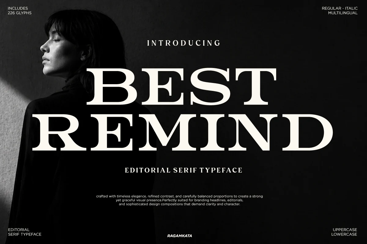
Best For: editorial designs, magazine covers, packaging, high-end designs
Best Remind has the commanding silhouette that makes Editorial Serif Fonts feel instantly established. The preview shows broad uppercase letterforms, dense vertical weight, and fine hairline bars that sharpen the contrast without losing clarity. Those bracketed serifs keep the structure stately, so the overall effect feels luxurious rather than blunt.
It works especially well when you want a headline to own the composition. The wide proportions give titles a cinematic spread, while the italic companion can introduce a softer secondary voice for subheads or pull quotes. With 226 glyphs and multilingual support, it also gives branded layouts more range without breaking the visual tone.
Bold Sharp Font
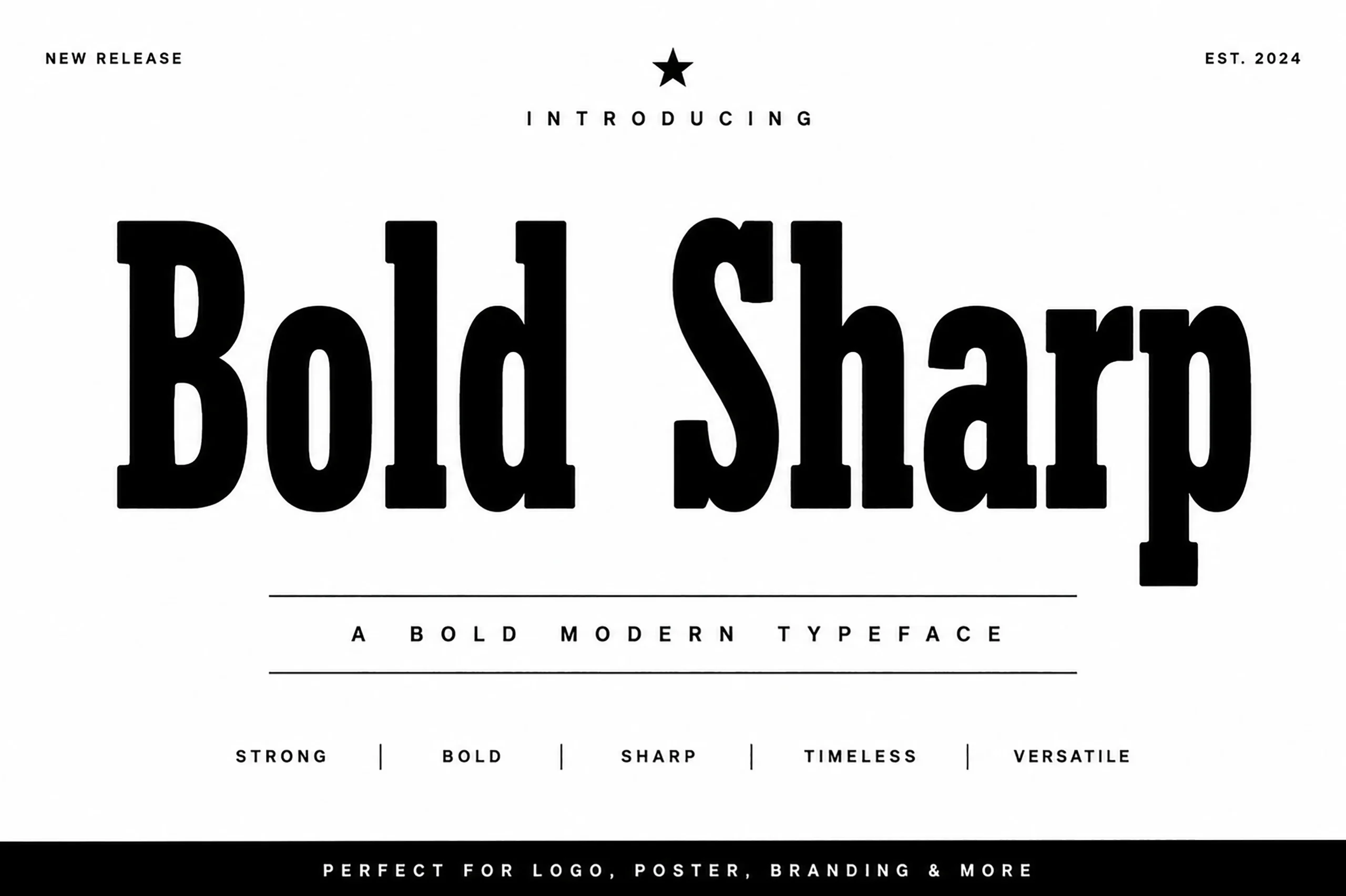
Best For: branding, posters, headlines, bold designs
Bold Sharp Font leans into the assertive side of Editorial Serif Fonts, with extra-heavy stems, a tall x-height, and crisp serif cuts that give the letters a poster-scale presence. The shapes are broad and compact at once, so the texture feels sturdy and graphic rather than delicate.
This is a display face that works best when the words are short and the hierarchy is clear. Give it room in headlines or wordmarks, and let the block weight do the work; tighter supporting text and simpler pairings help its sharp edges and strong proportions stay clean and controlled.
Italic & Fashion Editorial Serif Fonts
These editorial serif fonts use italic companions, graceful movement, and polished fashion styling for layouts that need hierarchy, emphasis, and magazine rhythm.
Grand Nineties Font
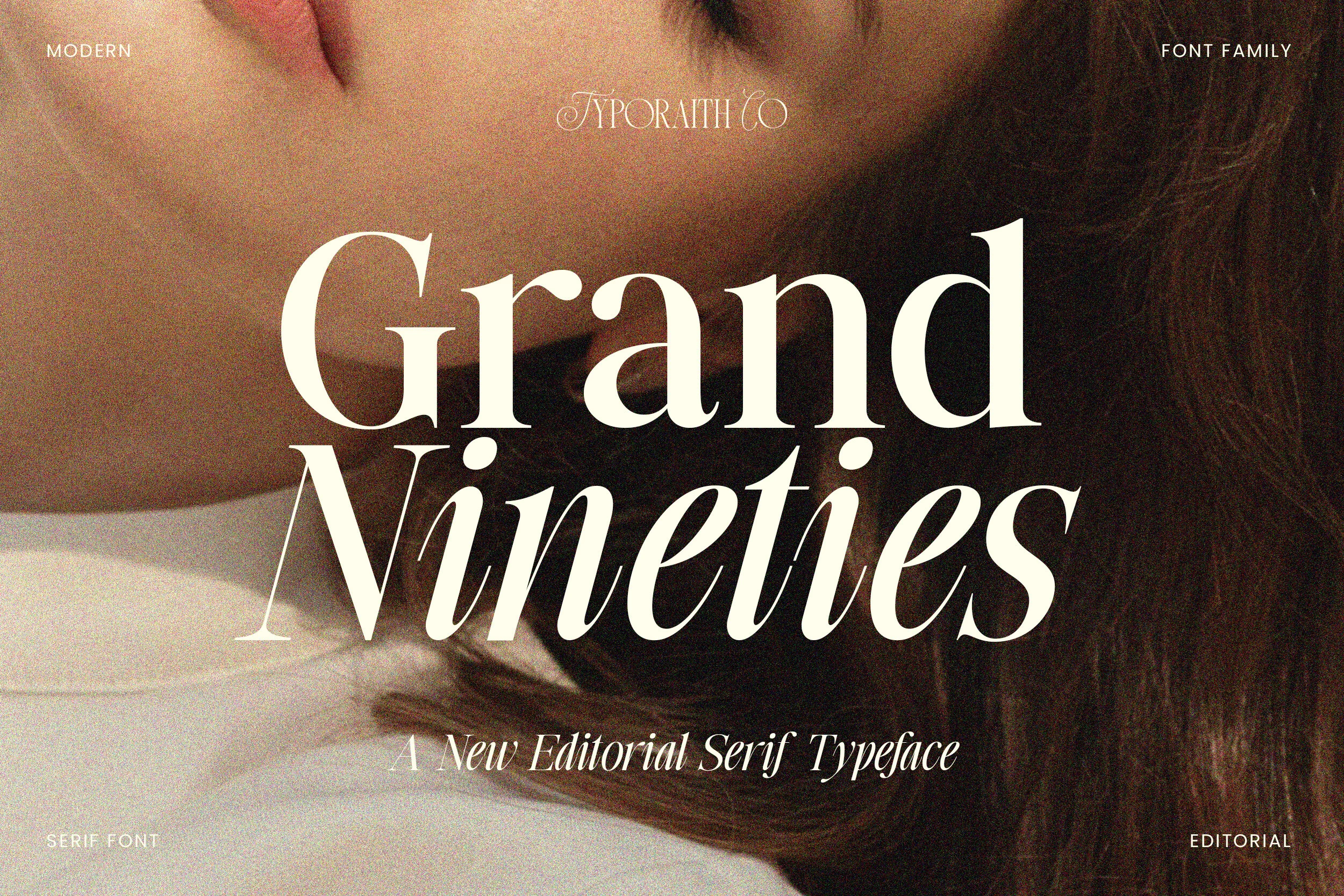
Best For: editorial designs, magazine covers, fashion branding, luxury designs
Grand Nineties captures the polished drama that makes Editorial Serif Fonts so effective, pairing broad upright capitals with a graceful italic that feels lifted straight from fashion publishing. The contrast is sharp but smooth, and the curved italic forms add movement without breaking the refined, upscale tone.
Its strongest feature is the dialogue between roman and italic styles, which gives you an easy way to build hierarchy inside one typographic system. Let the upright cut anchor mastheads or logos, then use the italic for subheads or pull quotes so the layout feels styled rather than overdesigned.
Scholar Typeface Font
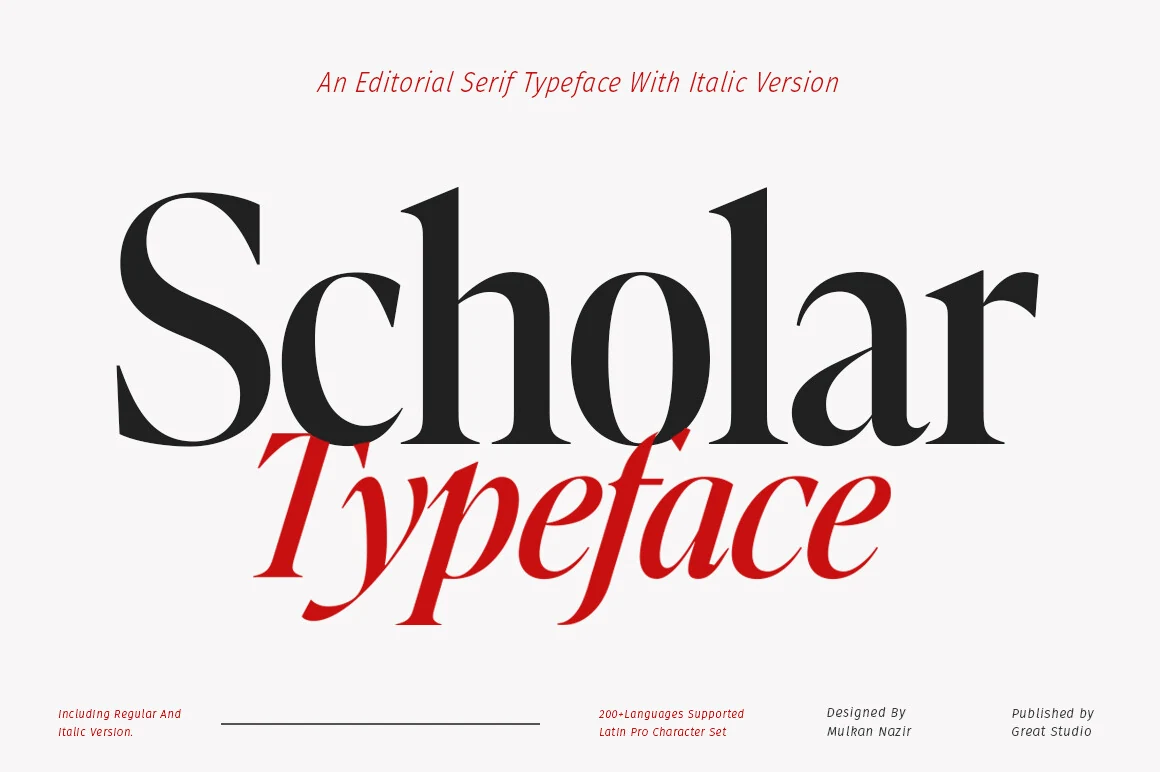
Best For: editorial designs, magazine covers, branding, headlines
Scholar Typeface Font has the poised contrast that gives Editorial Serif Fonts their polished authority. The letterforms combine tall verticals, tight curves, and crisp serif tips, so the texture feels smooth and controlled rather than stiff. Even at a heavy display size, the rounded bowls keep the wordmark elegant.
Its strongest advantage is hierarchy. The solid upright style carries a headline with confidence, while the slanted companion look shown in the sample adds a lighter counterpoint for subheads or quotes. Keep line lengths short and spacing measured, and those narrow joins and sharp transitions stay clear and refined.
The Foriene Serif Font
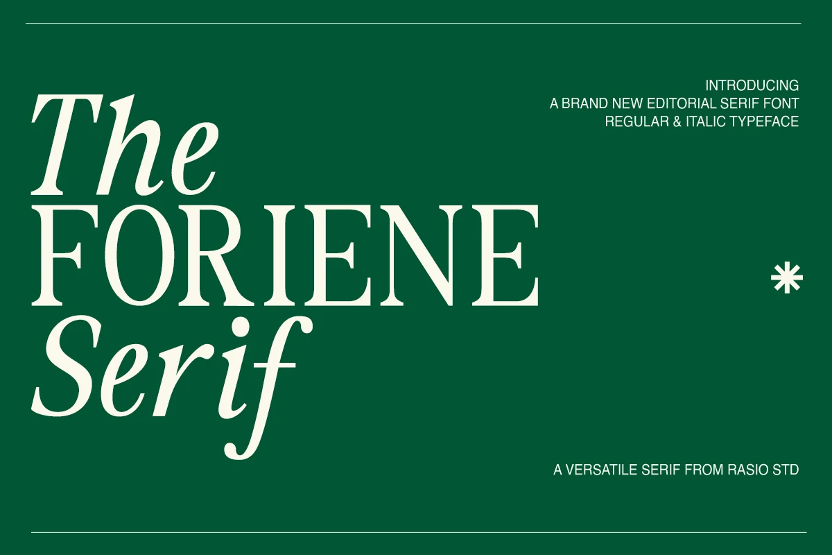
Best For: editorial designs, magazine covers, branding, fashion branding
The Foriene Serif Font brings a composed mix of structure and movement, pairing tall, steady capitals with graceful italic forms that soften the layout. Its contrast feels refined rather than brittle, and the open counters help the large shapes stay readable, which gives Editorial Serif Fonts a polished, fashion-leaning presence.
Its real strength is how easily the roman and italic styles create hierarchy inside one system. Let the upright cut anchor the headline, then use the italic for emphasis or secondary lines so the page feels styled without becoming busy. That balance works especially well in magazine covers, branding, and clean advertising layouts.
Conclusion
Choose high-contrast editorial serif fonts for refined fashion layouts, bold display options for stronger headline impact, and italic-led families when a magazine-style composition needs built-in hierarchy. For branding, keep the words short, the spacing controlled, and the supporting type quiet.