28 Display Serif Fonts for Stunning Designs in 2026
Looking for more serif fonts? Browse our complete Serif Fonts collection to compare luxury, elegant, modern, vintage, editorial, display, bold, feminine, and logo serif styles.
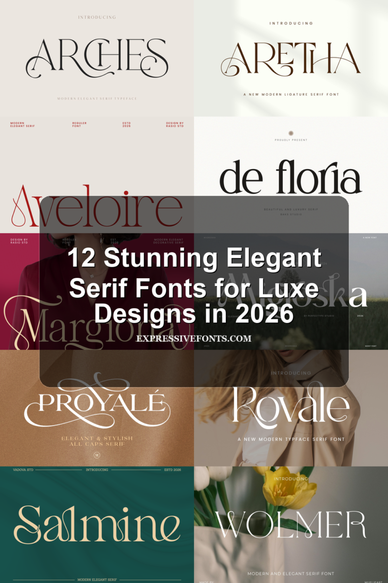
Display Serif Fonts are built for designers who need type with stronger presence than a standard text serif. This collection focuses on high-contrast, editorial, vintage, swash, and luxury styles for logos, packaging, magazine covers, posters, invitations, and brand identities where the headline needs to carry the visual mood.
High-Contrast & Luxury Display Serif Fonts
These refined display serifs use sharp contrast, polished curves, and premium spacing for luxury logos, fashion branding, packaging, and editorial headlines.
Vogane Font
Best For: logos, branding, editorial designs, high-end designs
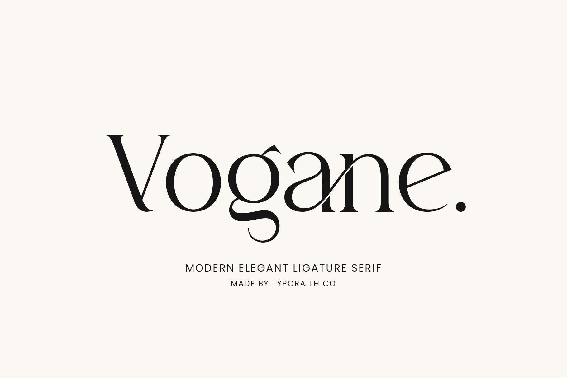
Vogane Font has a high-contrast serif structure with slim hairlines, heavy verticals, and sharp, sculptural joins. The preview shows its strongest character in the linked letter shapes, especially the flowing descender and tight transitions that give it a polished place among Display Serif Fonts.
The included ligatures and alternate characters support more distinctive logo marks and editorial titles without making the composition feel crowded. Use it with careful tracking and strong contrast against simpler supporting type, because the refined curves and delicate details work best when the headline has enough space to show its shape.
Dihot Font
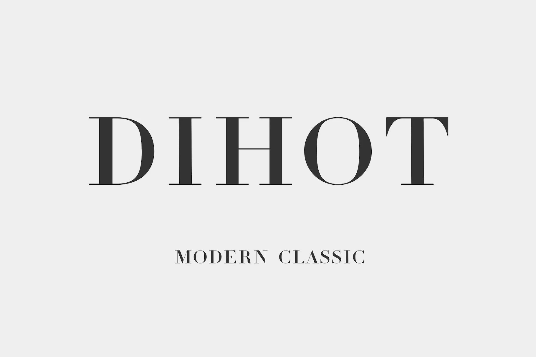
Best For: logos, magazine covers, headlines, luxury designs
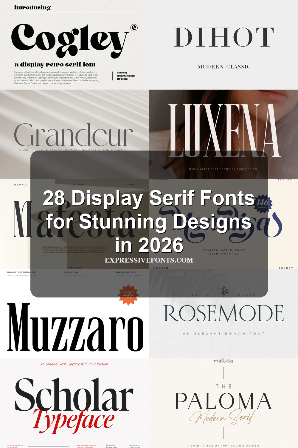
Dihot Font channels a classic Didot spirit with tall capitals, crisp serifs, and dramatic contrast between thick stems and hairline strokes. That refined tension gives it a poised, fashion-leaning voice that stands out easily in Display Serif Fonts without relying on extra ornament.
The spacing and sharp vertical rhythm make it especially effective for mastheads, cover lines, and logo treatments where scale can show off its delicate details. Keep it for larger settings and pair it with quieter supporting text, because the thin strokes look best when the hierarchy is clean and the layout has room to breathe.
Welp Clair Font
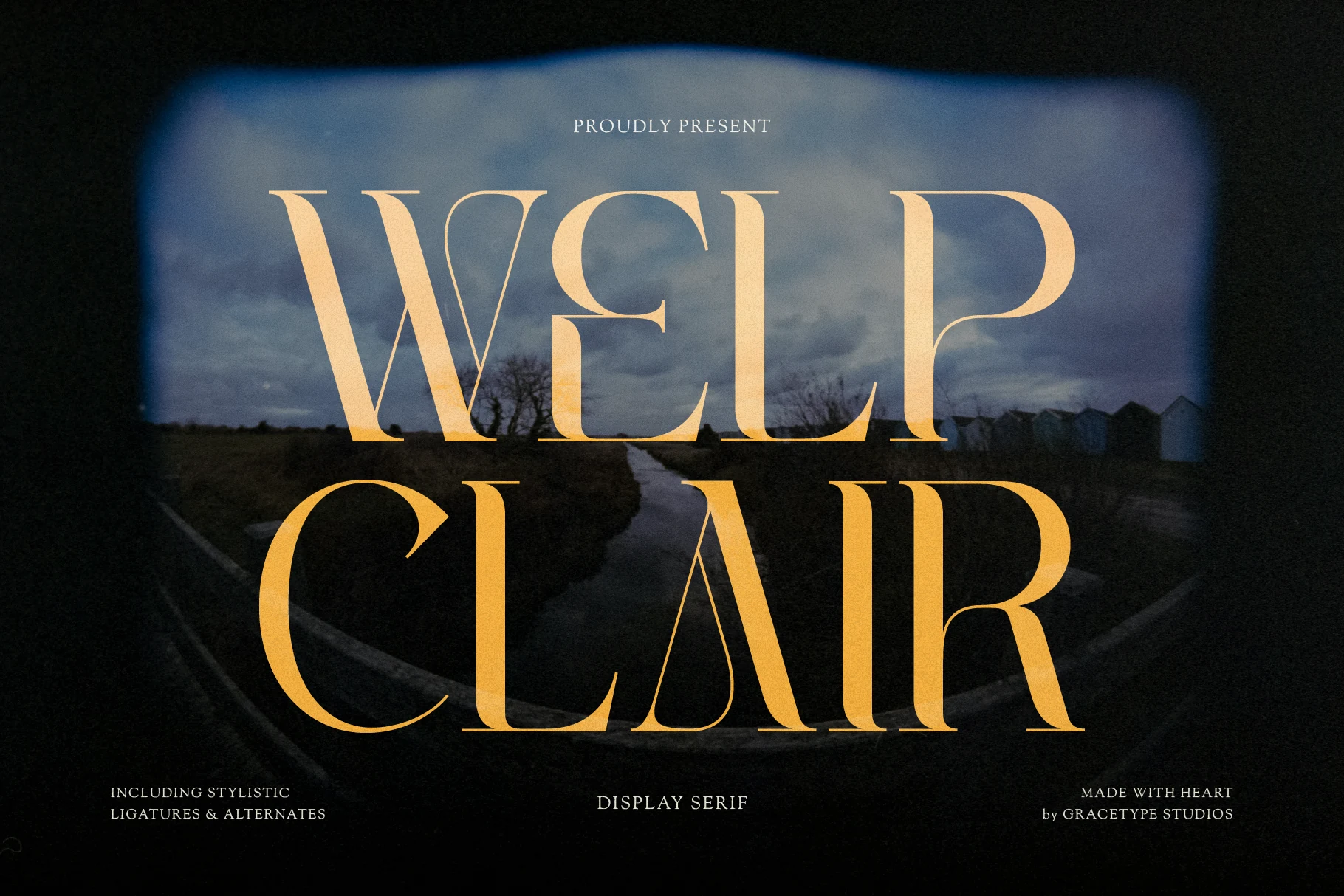
Best For: logos, packaging, editorial designs, luxury designs
Welp Clair Font has tall, high-contrast letterforms with razor-thin hairlines, broad vertical strokes, and deep sculpted joins that give the headline a stately pull. The sweeping terminals and narrow curves make it a strong choice within Display Serif Fonts, especially when a layout needs drama without looking heavy.
Its stylistic ligatures and alternates help build more distinctive wordmarks and editorial headings, particularly in short titles where those unusual connections stay visible. Keep the spacing deliberate and the supporting type quiet, because Welp Clair works best when the main line has enough scale and contrast to show off its elegant tension.
Rethena Font
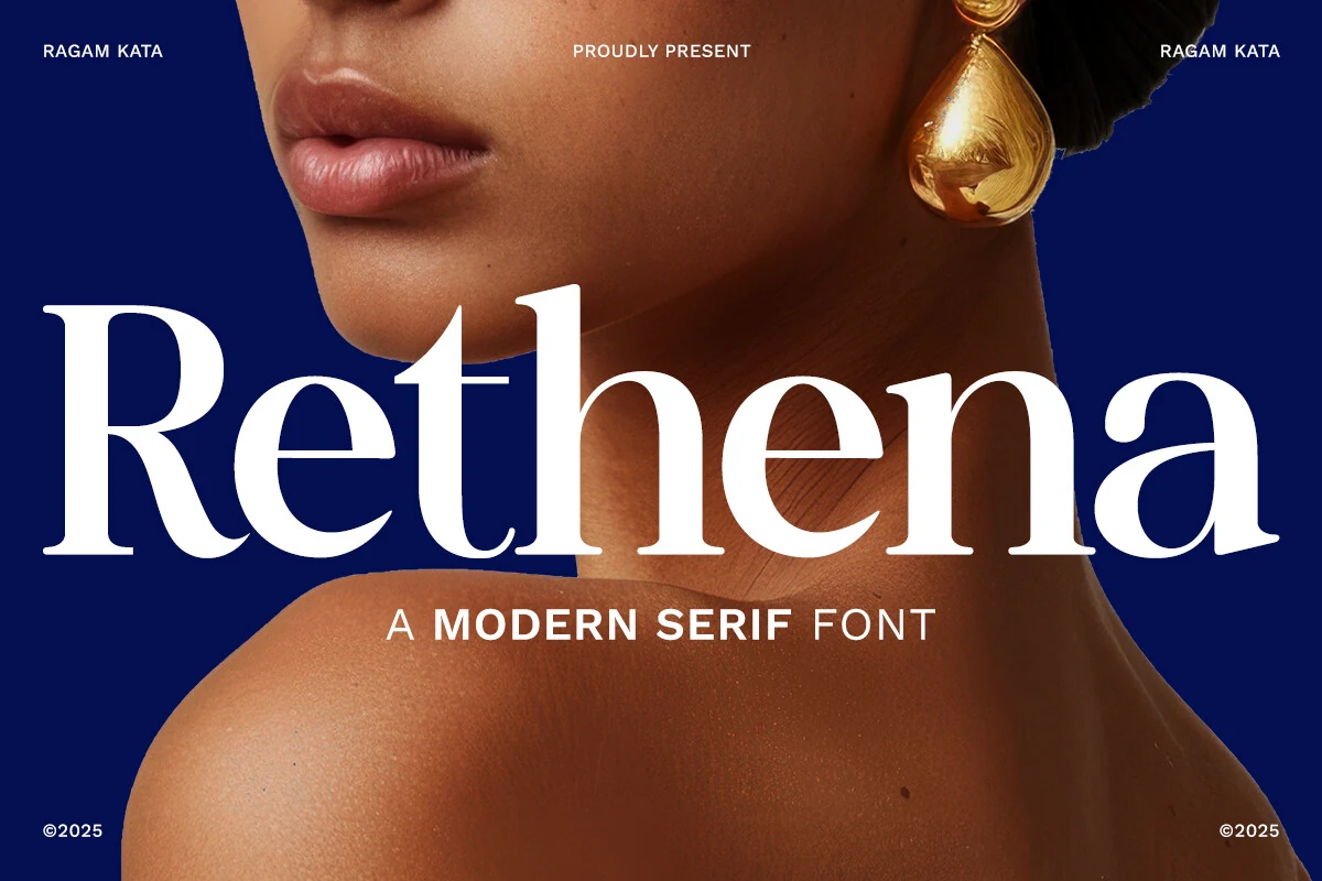
Best For: logos, beauty branding, fashion branding, luxury designs
Rethena Font leans into glamour with tall high-contrast strokes, smooth rounded bowls, and fine hairlines that sharpen its silhouette. The oversized capitals and generous curves give it a polished, fashion-led presence that feels right at home in Display Serif Fonts.
Its bold weight helps short names and titles hold focus, while the delicate thin strokes keep the composition refined rather than heavy. For branding work, pair Rethena with restrained secondary text and let it lead the hierarchy, especially in logos or hero headlines where the contrast can stay crisp and visible.
The Paloma Font
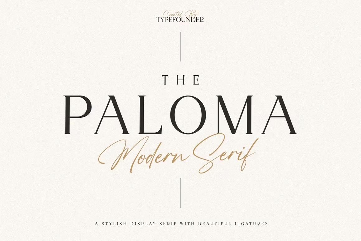
Best For: logos, editorial designs, minimal designs, luxury designs
The Paloma Font has the kind of poised contrast that gives Display Serif Fonts their lasting appeal: slender hairlines, sharp refined serifs, and tall capitals with a calm, sculpted rhythm. The generous spacing in the preview keeps the letterforms airy, so the overall look feels polished rather than formal.
That balance suits luxury branding and editorial titles especially well, where a wordmark needs presence without excess decoration. Use it at medium to large sizes and keep surrounding text restrained, because The Paloma carries a layout best when its crisp contrast and elegant proportions are allowed to lead the hierarchy.
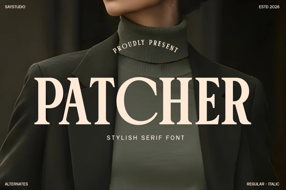
Patcher Font
Best For: logos, packaging, fashion branding, editorial designs
Patcher Font has broad, high-contrast serif capitals with steady verticals, open counters, and clean bracketed serifs that give the wordmark a poised fashion-editorial tone. That mix of clarity and polish makes it an easy fit for Display Serif Fonts, especially when a layout needs presence without losing readability.
Because the forms stay crisp at large scale, Patcher works well for magazine-style headlines, logos, and luxury packaging where the name needs to sit confidently at the top of the hierarchy. Pair it with simpler supporting text and moderate spacing so its refined structure can carry the composition instead of competing with it.
Condensed Editorial Display Serif Fonts
These narrow serif fonts create tall, dramatic headlines for magazine covers, posters, mastheads, and fashion layouts where space and hierarchy matter.
Wackers Font
Best For: headlines, posters, editorial designs, fashion branding
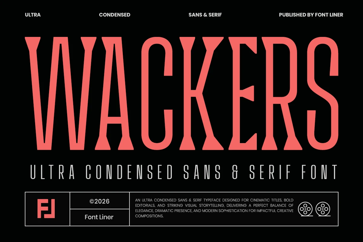
Wackers Font is built around extreme height and narrow proportions, with rigid vertical strokes, flared terminals, and a sharp mix of serif character and stripped-back sans clarity. In Display Serif Fonts, that compressed rhythm feels bold and cinematic, turning even a single word into a strong visual block.
The duo structure helps create contrast between commanding titles and cleaner supporting text, which is useful in mastheads, fashion layouts, and poster systems. Keep the copy short and let the narrow width work for you; Wackers is most effective when used for punchy hierarchy or tight spaces where wider type would lose impact.
Thalier Estelle Font
Best For: magazine covers, fashion branding, posters, editorial designs
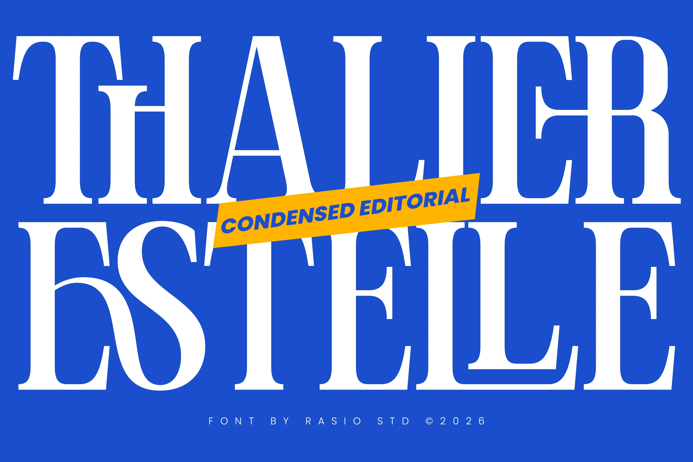
Thalier Estelle Font has an unmistakably editorial voice, built from towering proportions, crisp contrast, and narrow serif forms that stretch dramatically across the page. That condensed structure gives it a commanding look in Display Serif Fonts, especially when a headline needs scale, polish, and a distinctly fashion-led rhythm.
The clean spacing keeps those sharp forms readable even at very large sizes, so titles stay elegant instead of cramped. Use it where line length matters: its slim width lets you fit more characters into a masthead, poster title, or brand headline while preserving a refined hierarchy and strong visual tension.
Muzzaro Font
Best For: magazine covers, fashion branding, packaging, editorial designs
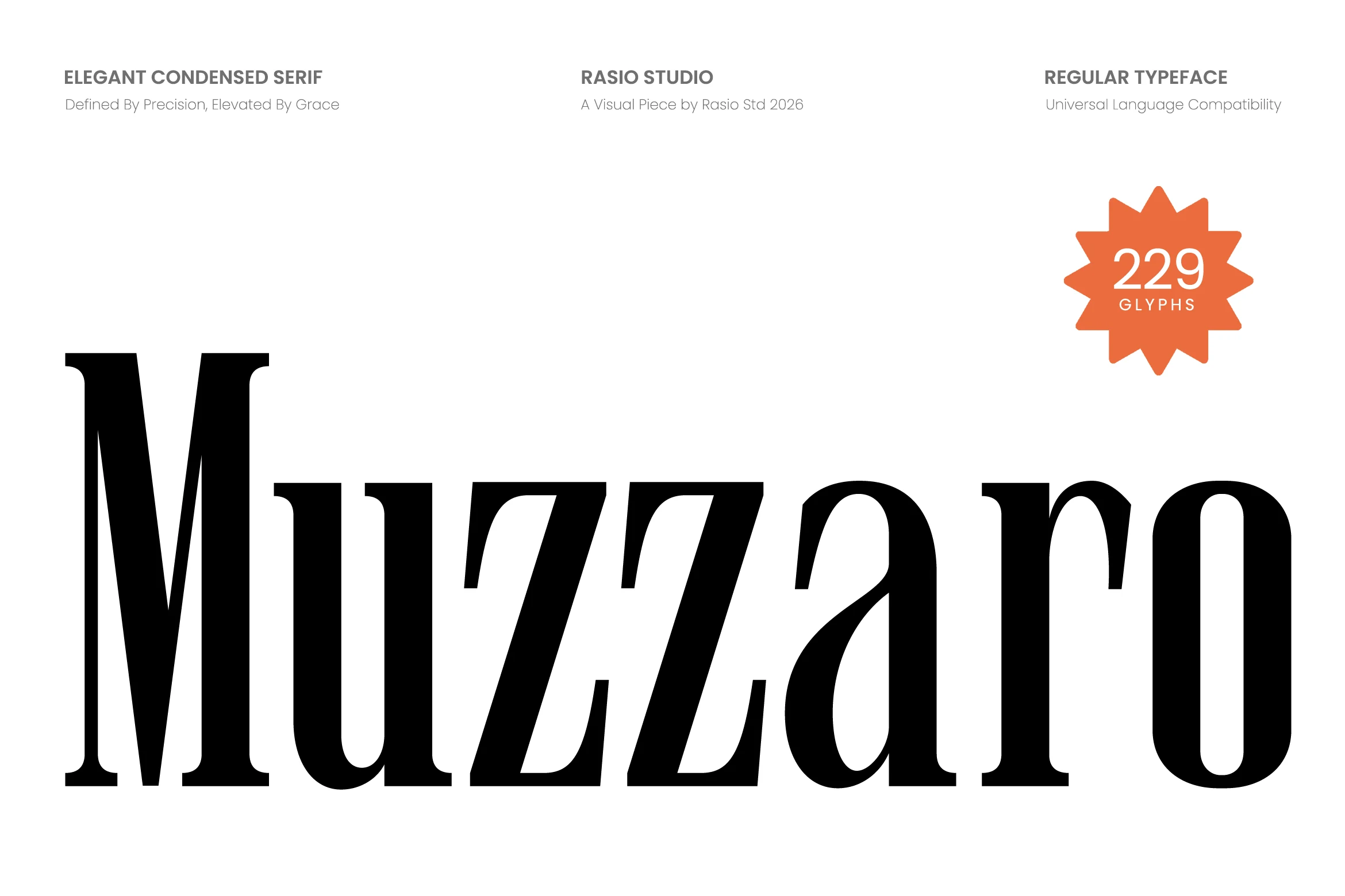
Muzzaro Font brings a sleek editorial attitude with tall condensed proportions, crisp high-contrast strokes, and tapered curves that give each letter a polished silhouette. Its narrow build and sharp serif details make it a natural fit for Display Serif Fonts, especially when you want something refined but unmistakably assertive.
The slim structure is especially useful for headlines that need to carry more characters without losing elegance, whether on a masthead, label, or fashion layout. With uppercase, lowercase, numerals, and punctuation included, Muzzaro is easy to build clean hierarchy around, but it looks strongest when the main line has room to show its vertical rhythm.
Mafesta Font
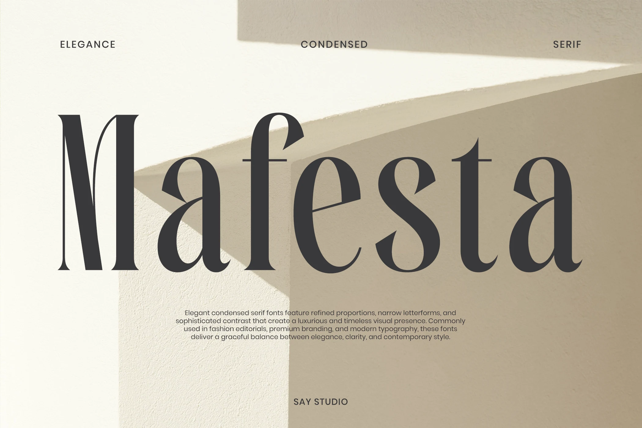
Best For: fashion branding, editorial designs, luxury designs, packaging
Mafesta Font has a narrow, high-contrast serif structure with tall vertical strokes, slim counters, and curved wedge details that give each word a polished editorial rhythm. The condensed proportions let headlines feel expansive without taking up much horizontal space, which is useful when building strong title hierarchy in refined layouts.
For Display Serif Fonts, Mafesta works best where the typography is meant to carry the composition: fashion covers, premium packaging, architectural layouts, and luxury identity systems. Keep spacing deliberate rather than tight; the thin internal strokes and dramatic contrast need clean surrounding space to stay readable and controlled.
Luxena Font
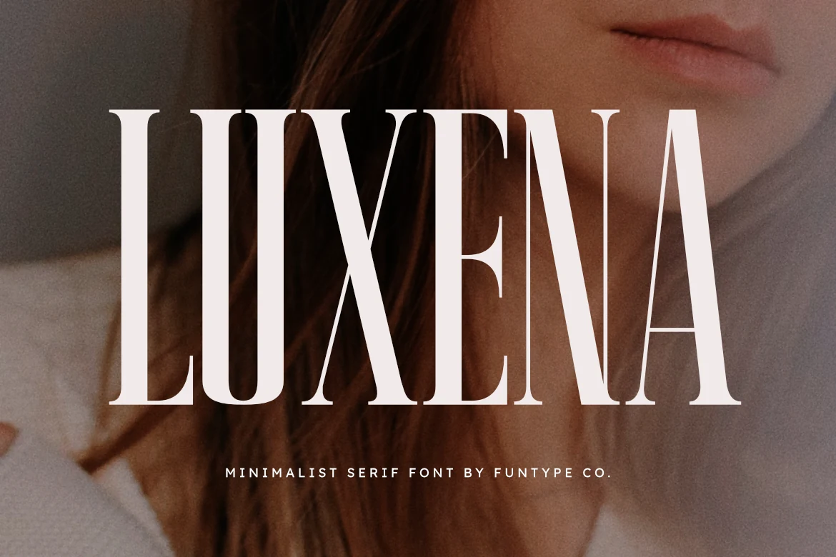
Best For: headlines, fashion branding, posters, luxury designs
Luxena Font has a tall, condensed silhouette with crisp serifs and clean vertical strokes that give it an immediate editorial presence. The narrow proportions create strong impact without adding visual weight, so a single word can feel sharp, polished, and highly controlled.
For Display Serif Fonts, Luxena is especially effective in fashion logos, posters, and hero headlines where height and precision matter. It works best with short wording and a little breathing room between lines, which helps the slim shapes stay clear and keeps the composition looking sleek rather than cramped.
Swash & Decorative Display Serif Fonts
These expressive serif fonts use swashes, ligatures, and ornamental tails for statement logos, invitations, posters, and premium headline treatments.
Praise Font
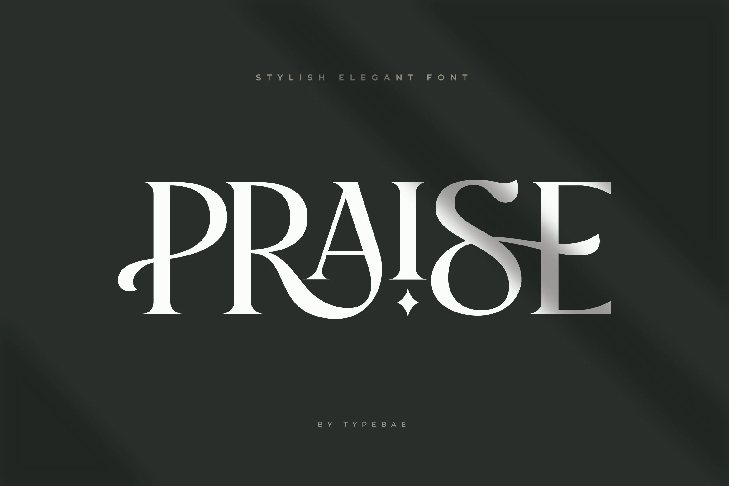
Best For: logos, branding, elegant designs, luxury designs
Praise Font has a sleek high-contrast serif structure with long tapering strokes, sharp terminals, and graceful flourishes that soften its formal edge. That balance gives it a polished, fashion-leaning presence, making it a strong fit for Display Serif Fonts when a wordmark needs elegance with a little drama.
Its standout detail is the swash movement in letters like P and A, which helps short names feel custom rather than simply typeset. Keep the copy brief and the spacing measured, because Praise works best in logos and headline treatments where those decorative curves can stay clear and carry the composition.
Monalisa Font
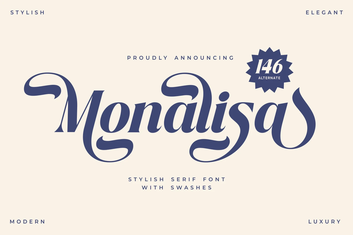
Best For: branding, packaging, invitations, display text
Monalisa Font pairs classic serif contrast with sweeping swashes that curl through the wordshape and give it a distinctly ornamental rhythm. The tapered terminals and flowing structure make even a short title feel dressed up, so the lettering can carry much of the visual mood on its own.
Within Display Serif Fonts, Monalisa is strongest in logos, invitations, and statement headlines where elegance should feel expressive rather than rigid. Keep supporting text simple and leave generous spacing around it; those long entry and exit strokes need room to stay graceful instead of crowding the layout.
Stanza Font
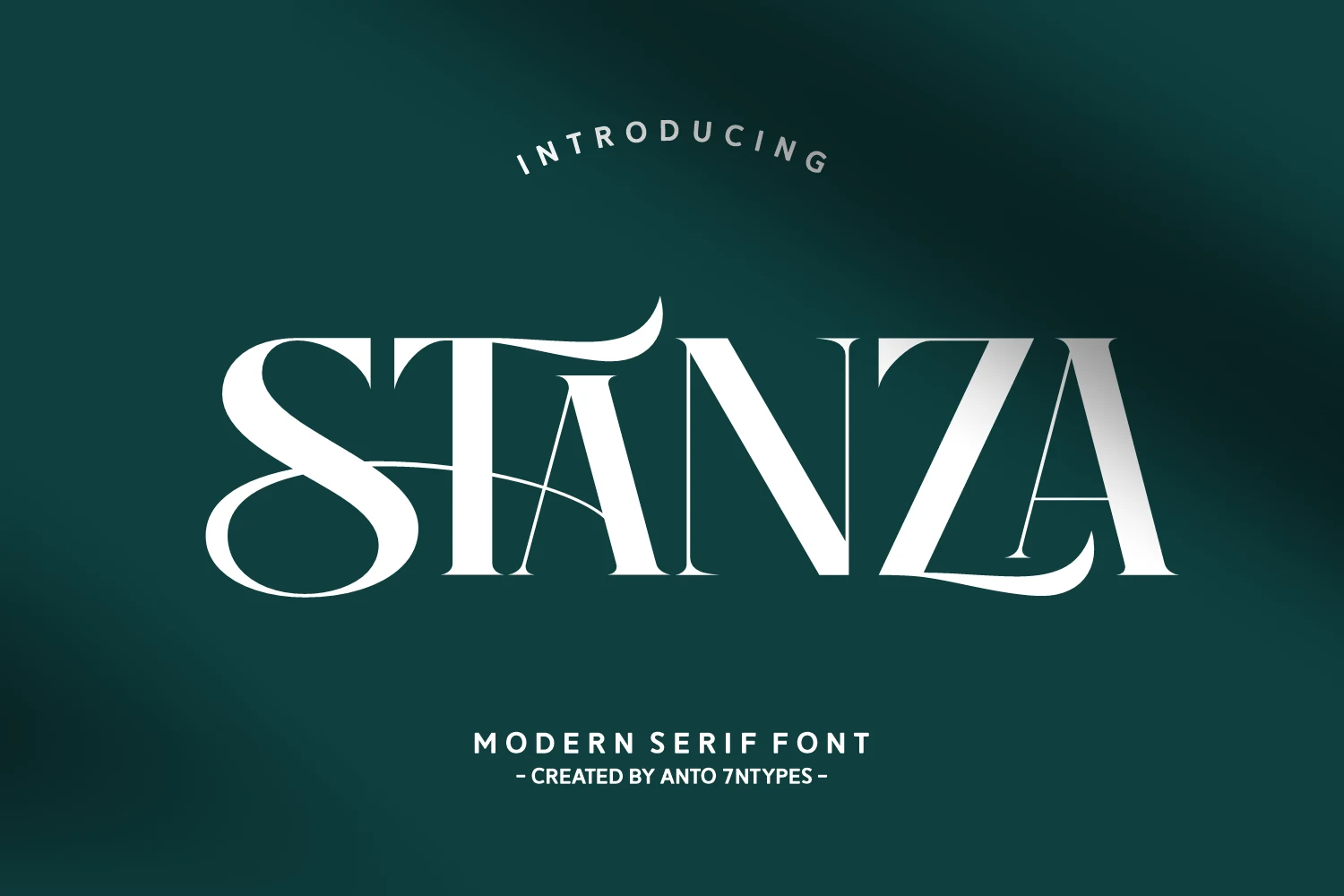
Best For: branding, posters, display text, luxury designs
Stanza Font has a crisp high-contrast serif structure, but its real character comes from the long swashes that run through the capitals and soften the formality. The broad S, lifted T terminal, and sweeping Z create a theatrical rhythm, so even a single word feels fully styled and visually complete.
Stanza suits Display Serif Fonts when you want a headline to feel polished yet expressive. It works especially well for centered logos, posters, and refined branding, where the flourishes can stretch into the surrounding space. Keep the wording short and avoid cramped tracking so those extended strokes stay elegant instead of crowded.
Ronsa Font
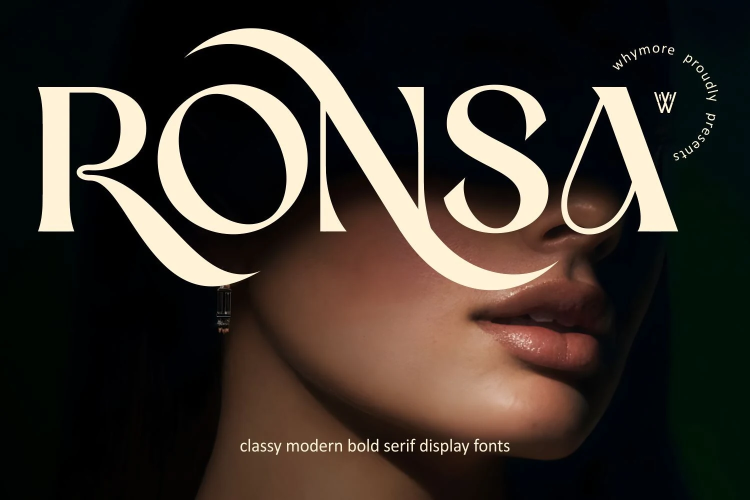
Best For: fashion branding, posters, display text, luxury designs
Ronsa Font has a bold serif structure with sharp contrast, generous curves, and dramatic swashes that pull the eye across the word. The oversized terminals and sweeping N give it a sculpted, high-fashion feel, so even one short line reads as a finished statement rather than just a heading.
In the world of Display Serif Fonts, Ronsa works best when you want elegance with real visual weight. It suits posters, luxury branding, and other hero placements where the lettering leads the composition. Keep the text short and let the flourishes overlap open space, which helps the details feel intentional instead of crowded.
Delmora Font
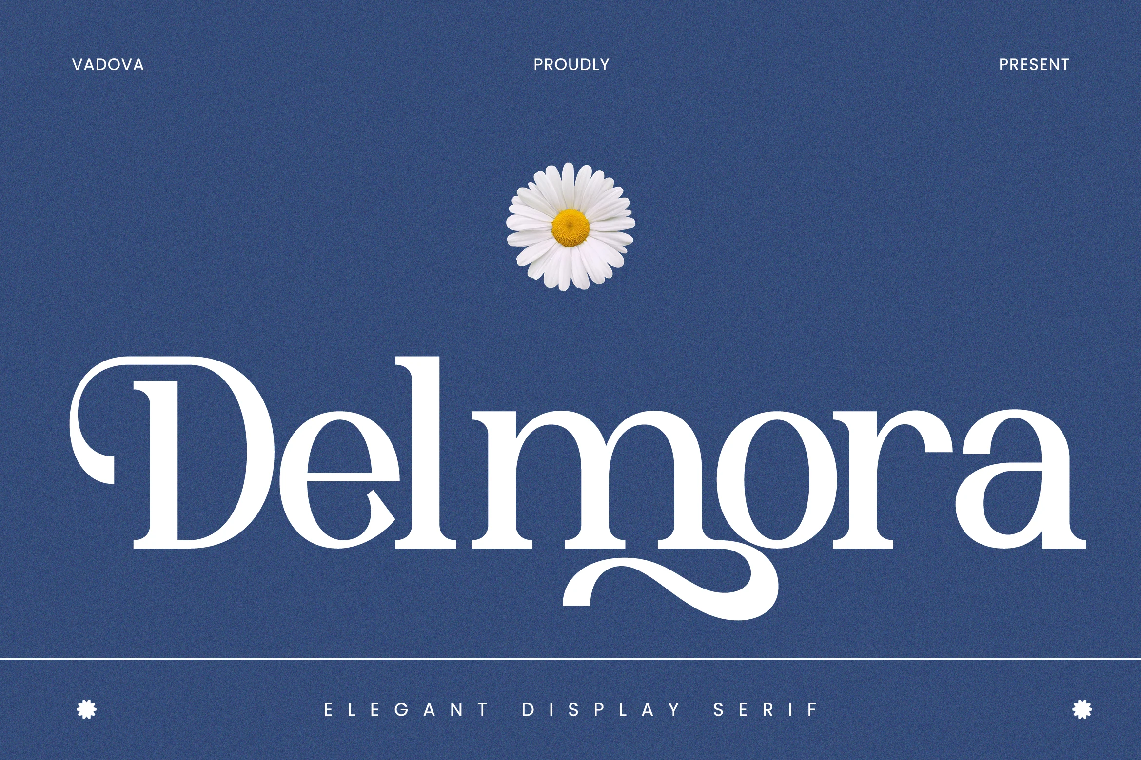
Best For: branding, packaging, invitations, editorial designs
Delmora Font has a graceful serif structure with soft contrast, rounded bowls, and a long ornamental tail on the g that gives the wordmark a gentle sense of movement. The details feel refined rather than busy, so the decoration adds character while the main letterforms stay clear at large sizes.
Among Display Serif Fonts, Delmora is a strong fit for branding, invitations, and editorial layouts that need elegance with a little personality. Its alternates work best when used selectively; one swashed character in a logo or headline can create a focal point without making the composition feel overly dressed.
Clean & Classic Display Serif Fonts
These balanced serif fonts rely on proportion, clarity, and controlled contrast, making them useful for readable logos, refined covers, and polished brand systems.
Fontrize Font
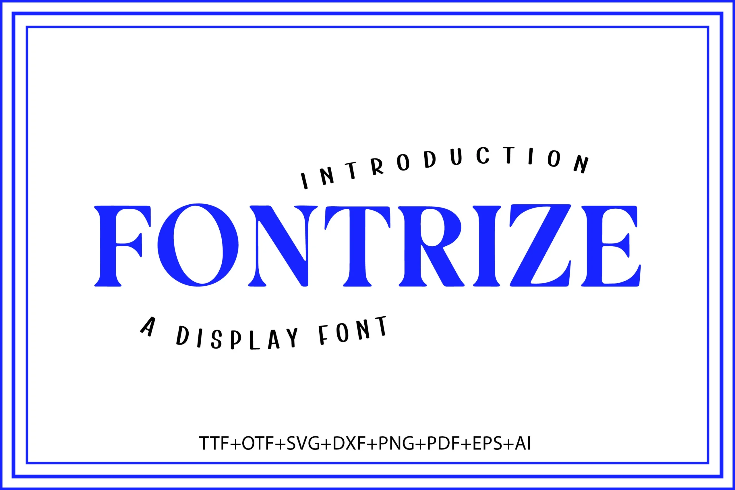
Best For: headlines, logos, branding, display text
Fontrize Font has a tall, high-contrast serif structure with crisp vertical stems, sharp serifs, and broad capitals that read with instant authority. The preview gives it a clean, poster-like presence that fits naturally into Display Serif Fonts, especially when a headline needs both impact and readability.
Its strong vertical rhythm makes short titles feel orderly and assertive, which is useful for branding and other top-level display work. Keep the hierarchy simple and give the letters a little space, because the bold contrast and clear shapes do their best work when they are not competing with busy supporting text.
Strong Font
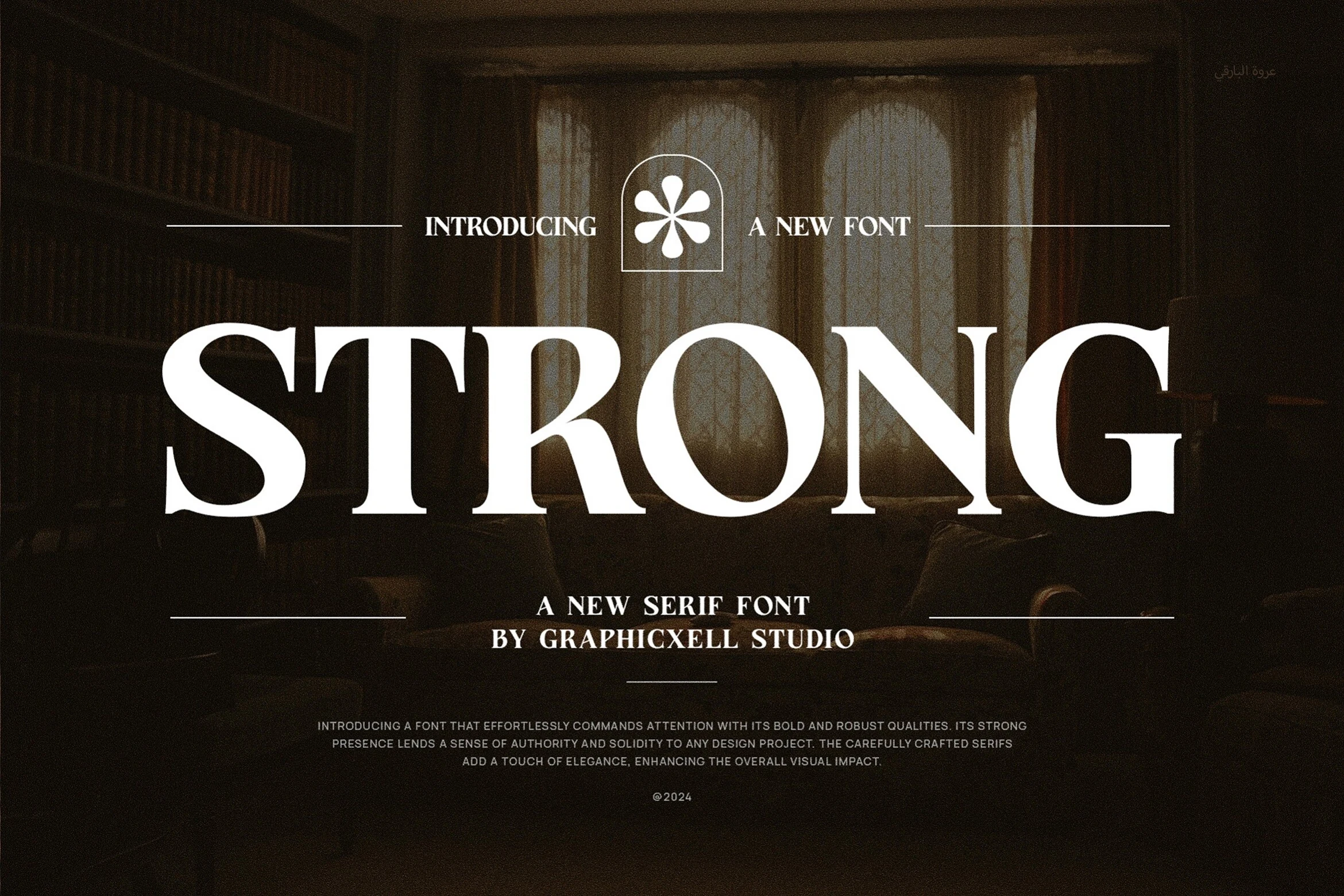
Best For: branding, logos, invitations, wedding designs
Strong Font uses broad serif forms, sturdy verticals, and measured contrast to create a confident headline style with excellent readability. It has the composed authority many designers look for in Display Serif Fonts, with clean counters and firm terminals that keep large titles elegant rather than ornate.
That balance makes it a practical choice for logos, packaging, and invitation work where tone matters but the message still needs to read quickly. Strong performs best in short titles and brand lines, especially when paired with lighter supporting text so its solid rhythm can anchor the whole hierarchy.
Grandeur – Elegant Classic Serif Font
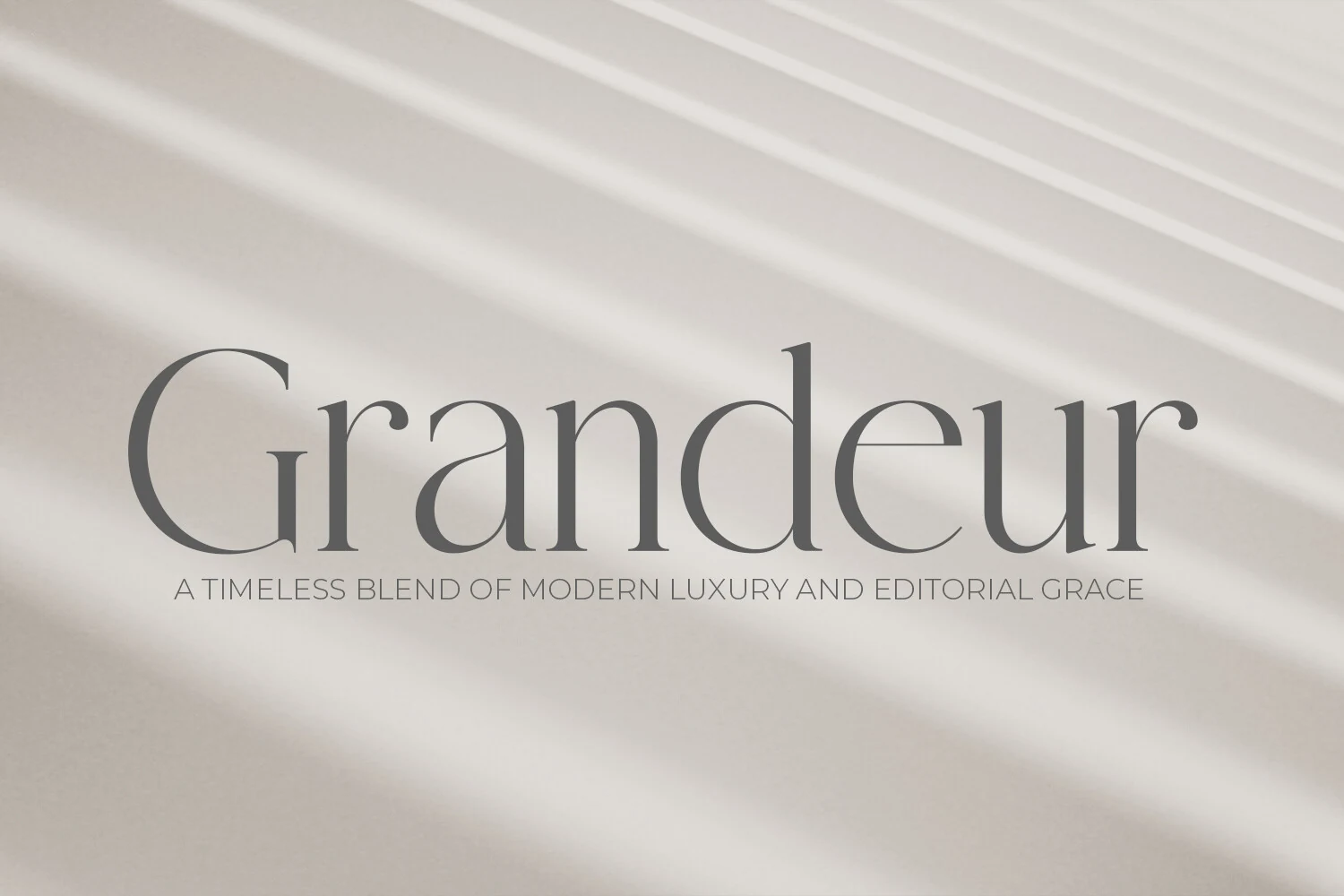
Best For: logos, editorial designs, luxury designs, minimal designs
Grandeur has a restrained classic voice, with slim serif details, smooth curves, and generous proportions that keep the wordmark light and composed. It fits naturally into Display Serif Fonts, especially for layouts that want elegance to come from proportion and spacing rather than ornament.
The refined print-inspired structure gives headlines and brand names a calm editorial finish, particularly at medium to large sizes where the delicate shapes stay clear. Pair it with simple supporting text and avoid cramped tracking, because Grandeur works best when the layout leaves room for its graceful rhythm to show.
Nivella Font
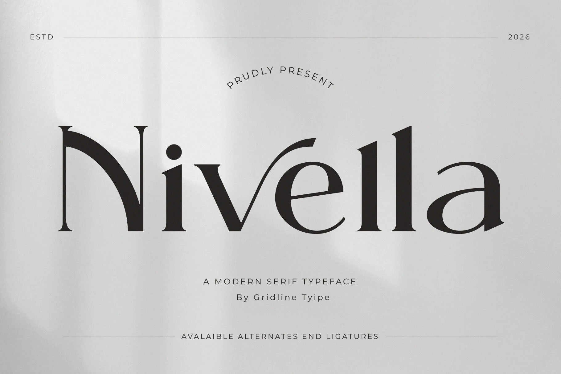
Best For: branding, magazine covers, website headers, high-end designs
Nivella Font has a calm modern serif voice built from high-contrast strokes, crisp terminals, and balanced proportions that feel polished without looking rigid. In the preview, the wide curves and slender joins give the word a clear, airy rhythm, which helps large titles look sophisticated rather than heavy.
As a choice for Display Serif Fonts, Nivella suits branding, editorial-style covers, and web headers where clean refinement matters. Its traditional serif structure keeps the message grounded, while the minimalist finish makes layouts feel current. Give it enough scale and moderate tracking so the contrast stays sharp and the overall composition remains elegant.
Scholar Typeface Font
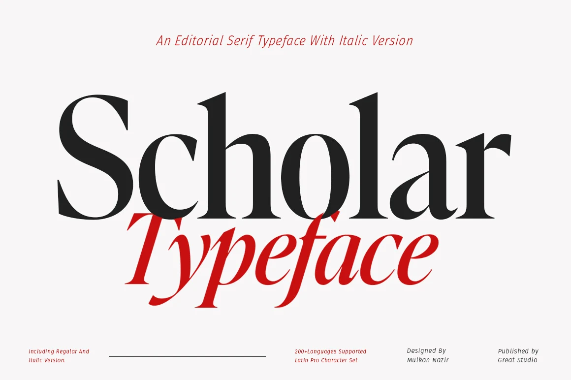
Best For: editorial designs, magazine covers, branding, high-end designs
Scholar Typeface Font has a distinctly editorial tone, with tall verticals, tight curves, and sharply cut serifs that keep the large forms crisp and self-assured. The upright style feels stately without turning heavy, and the italic shown in the preview brings a lively counterpoint that works beautifully for subheads or layered title treatment.
For Display Serif Fonts, Scholar is especially strong when hierarchy needs to do the visual work. It suits magazine-style covers, polished branding, and statement headlines where contrast between roman and italic can create emphasis more elegantly than added decoration. Give it room at larger sizes so the smooth joins and serif tension stay clear.
Retro & Vintage Display Serif Fonts
These display serifs bring nostalgic weight, distressed texture, and old-style character to packaging, signage, posters, stickers, and heritage branding.
Cogley Font
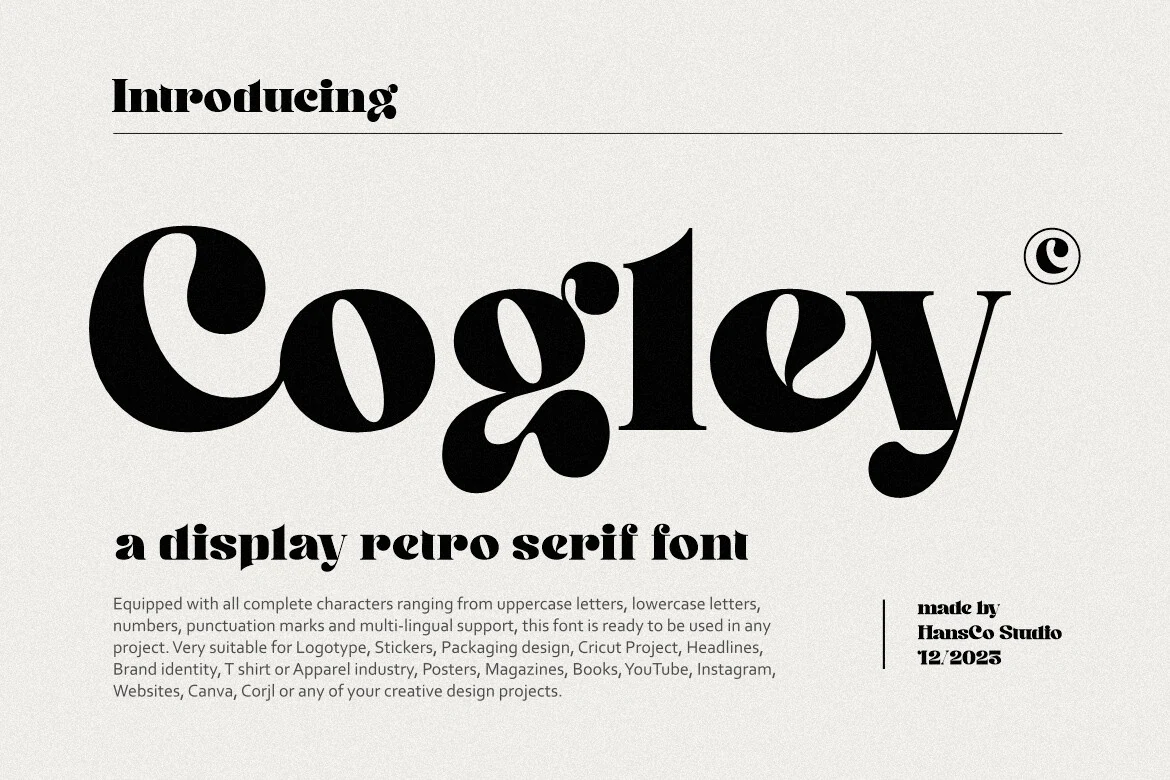
Best For: logos, stickers, packaging, retro designs
Cogley Font has a chunky retro serif look with rounded bowls, compact counters, and dramatic curving terminals that give every word a lively, poster-ready silhouette. It stands out in Display Serif Fonts because the heavy shapes feel playful and nostalgic, while still reading clearly in bold headline settings.
The complete character set helps carry that same personality across logos, packaging copy, and short promotional lines without breaking the visual mood. Keep it focused on short words or titles, where its dense weight and unusual curves can do the work, and pair it with simpler supporting text for cleaner hierarchy.
Eagles Font
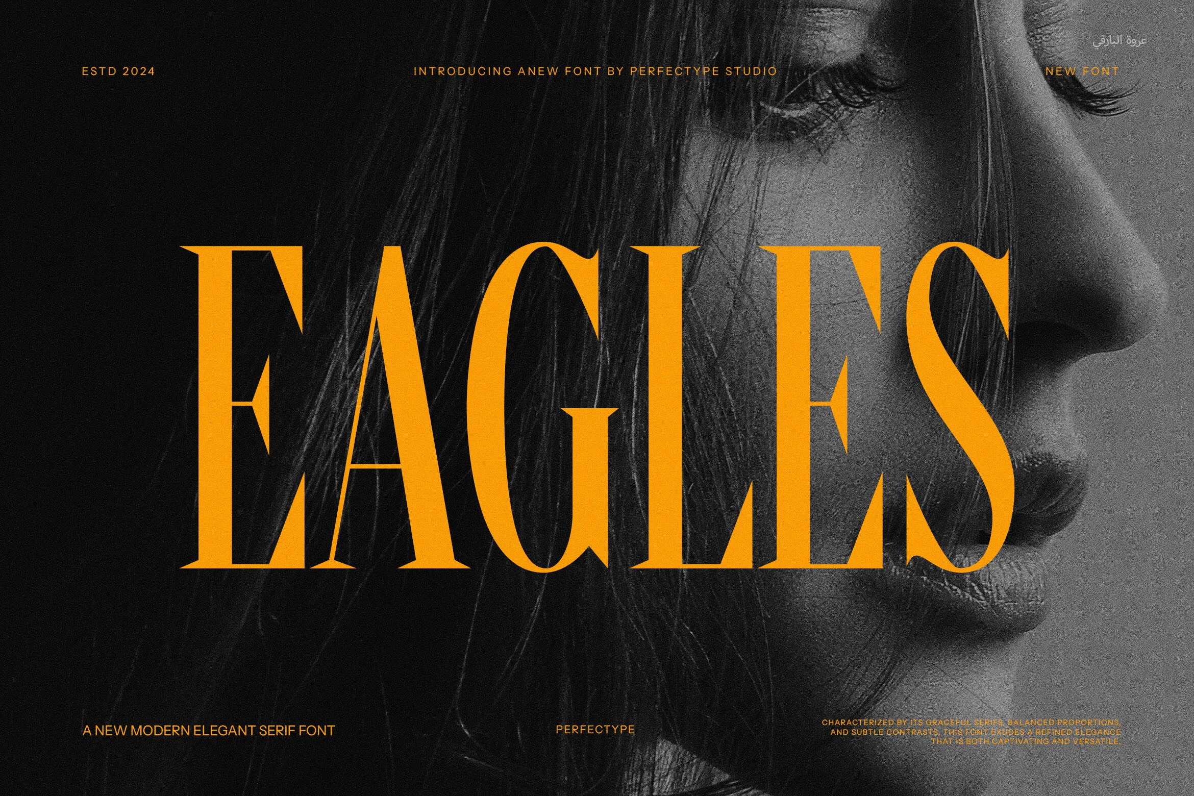
Best For: posters, branding, vintage designs, display text
Eagles Font has a tall vintage serif structure with crisp contrast, narrow capitals, and pointed terminals that give it a commanding old-style presence. The letterforms feel elegant rather than ornate, so the wordmark reads with strong period character while still looking clean in a modern layout.
Within Display Serif Fonts, Eagles works best when the title needs to carry both mood and scale. Its vertical proportions make it especially useful for posters, branding, and other headline settings where you want height without excessive width. Keep the copy short and let the sharp serifs sit against simple supporting elements for the clearest impact.
Maestro Font
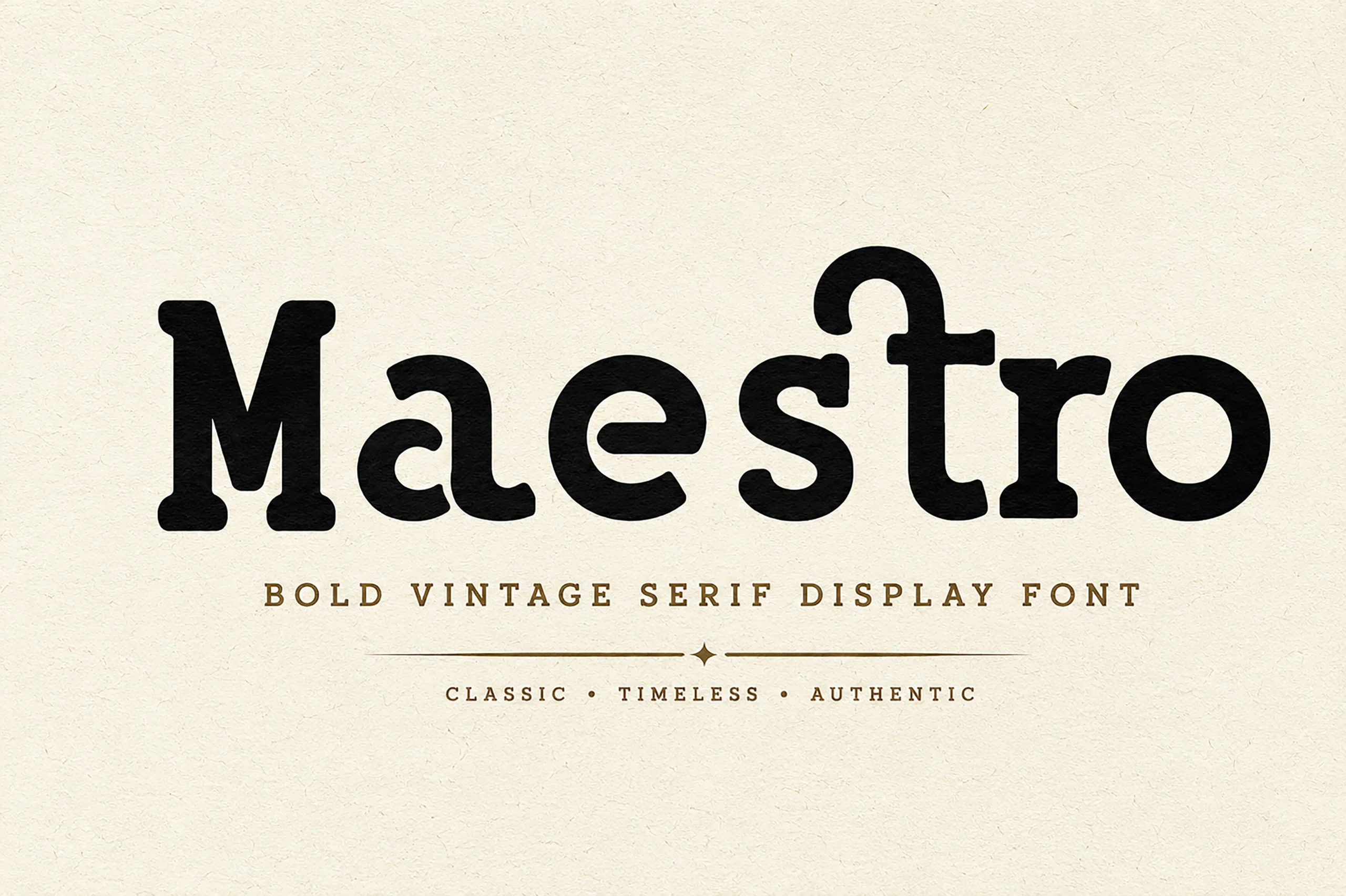
Best For: branding, packaging, signage, vintage designs
Maestro Font has a sturdy vintage serif build with chunky stems, rounded slab-like serifs, and softened inner curves that keep the heavy weight friendly rather than harsh. The broad proportions and low contrast give it a handcrafted heritage feel, making short words look grounded, confident, and easy to read.
For Display Serif Fonts, Maestro suits packaging, signage, and heritage-style branding where you want bold presence without ornate detail. It handles stacked layouts well because the wide shapes hold their texture at medium to large sizes; pair it with simple secondary text so its nostalgic character stays clear.
West Postage Font
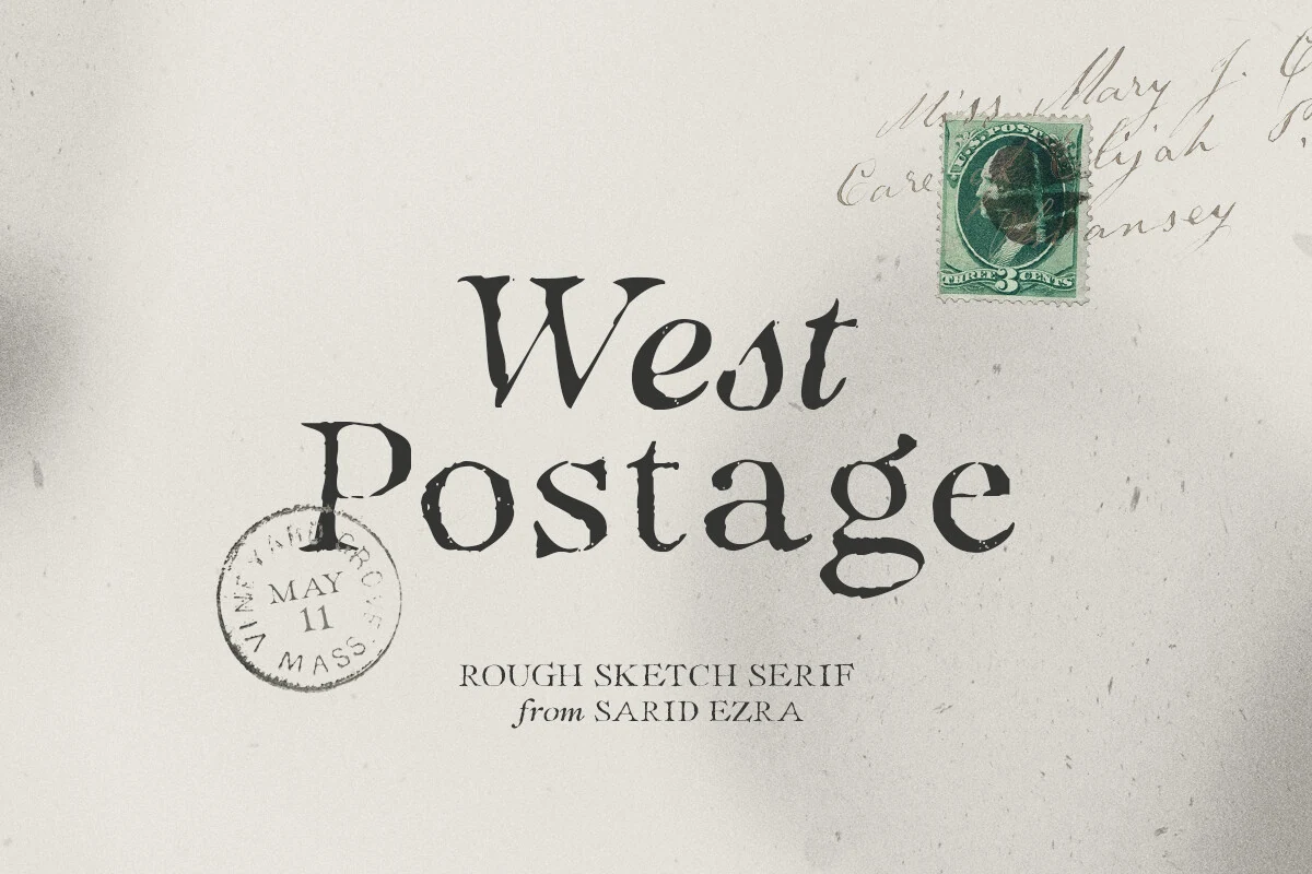
Best For: branding, invitations, quotes, vintage designs
West Postage Font has a worn, sketchy serif texture with uneven edges, narrow joints, and an organic rhythm that feels printed by hand rather than mechanically polished. That rough finish gives short words immediate character, especially when you want the typography to carry an old-paper, imperfect charm.
In Display Serif Fonts, West Postage stands out for invitations, branding, and quote graphics that need a more tactile voice. The true italic is useful for secondary lines or signature-style accents, creating contrast without breaking the vintage mood. Keep spacing a touch open so the distressed details stay readable instead of muddy.
Soft & Feminine Display Serif Fonts
These softer serif fonts use graceful curves, thin strokes, and airy spacing for beauty branding, romantic invitations, boutique logos, and elegant packaging.
Olivera Font
Best For: logos, beauty branding, fashion branding, feminine designs
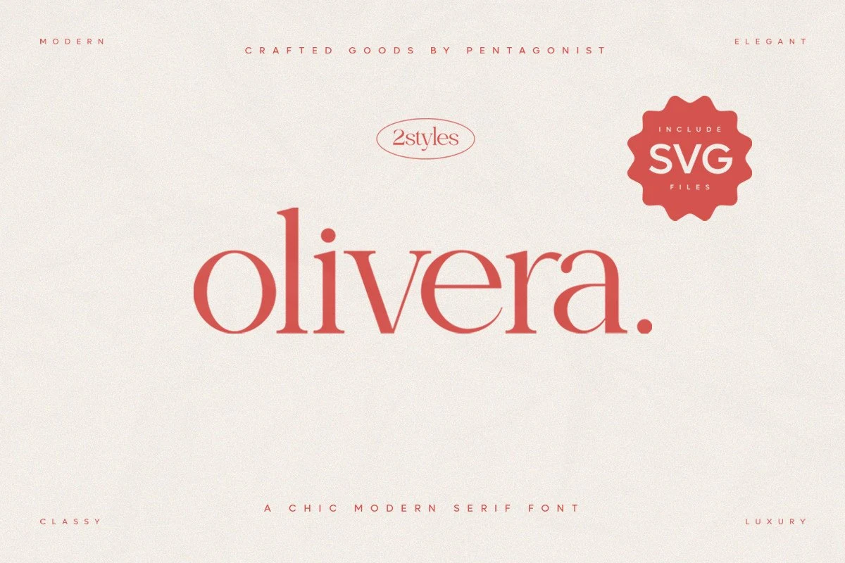
Olivera Font has a light, fashion-minded serif style with smooth curves, fine contrast, and rounded lowercase forms that feel polished without becoming stiff. Within Display Serif Fonts, it reads as chic and approachable, with a soft rhythm that gives names and short titles a distinctly boutique tone.
That balance makes it especially convincing for beauty labels, packaging fronts, and feminine brand marks where elegance needs to stay clean rather than ornate. Keep the surrounding typography restrained and leave a little breathing room between elements, because Olivera’s charm comes through best when its curved shapes have space to lead the composition.
Elegant Font
Best For: fashion branding, editorial designs, magazine covers, luxury designs
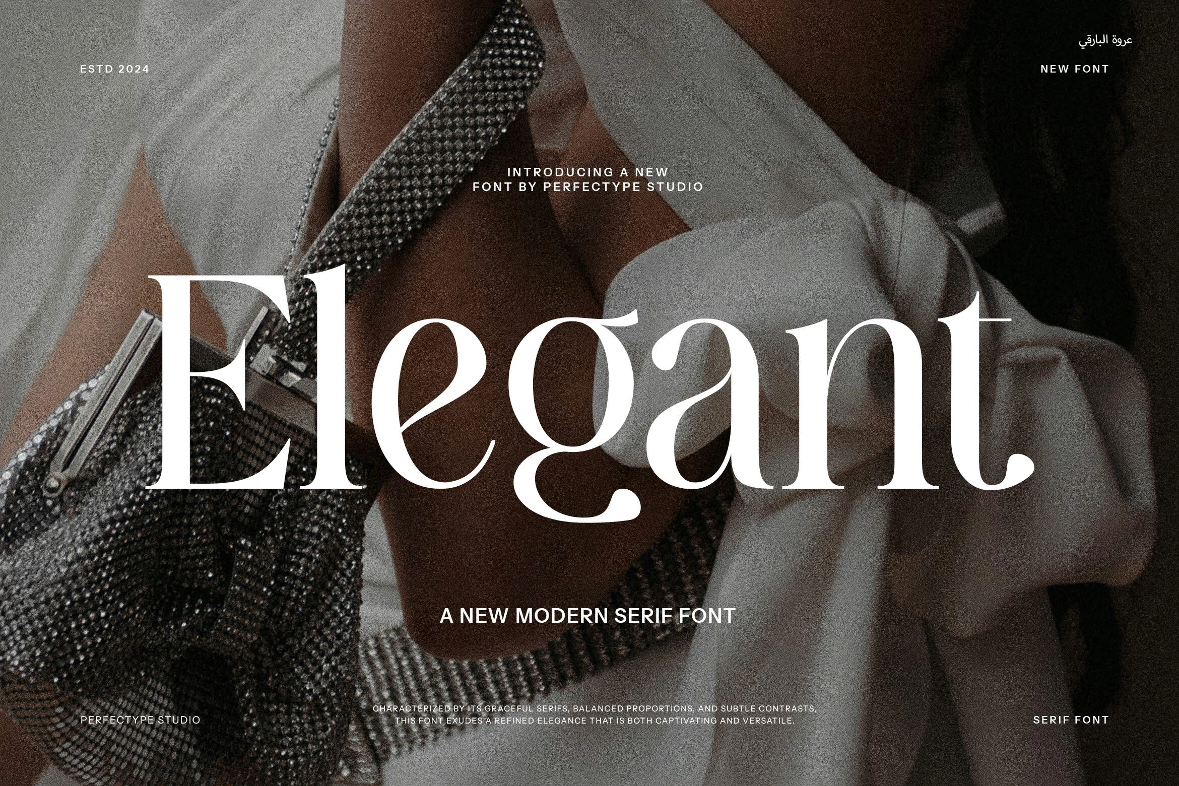
Elegant Font has soft high-contrast curves, fine serifs, and a poised rhythm that gives the wordshape a polished editorial feel. The capital E sets a formal tone, while the rounded lowercase forms keep it approachable, so titles look refined without feeling stiff.
Elegant fits naturally into Display Serif Fonts for fashion branding, magazine-style covers, and elevated packaging. It performs best in short headlines or hero words, where the thin details stay crisp and the open spacing can do the work; keep supporting text minimal so the contrast remains the focus.
Rosemode Font
Best For: invitations, branding, beauty branding, romantic designs
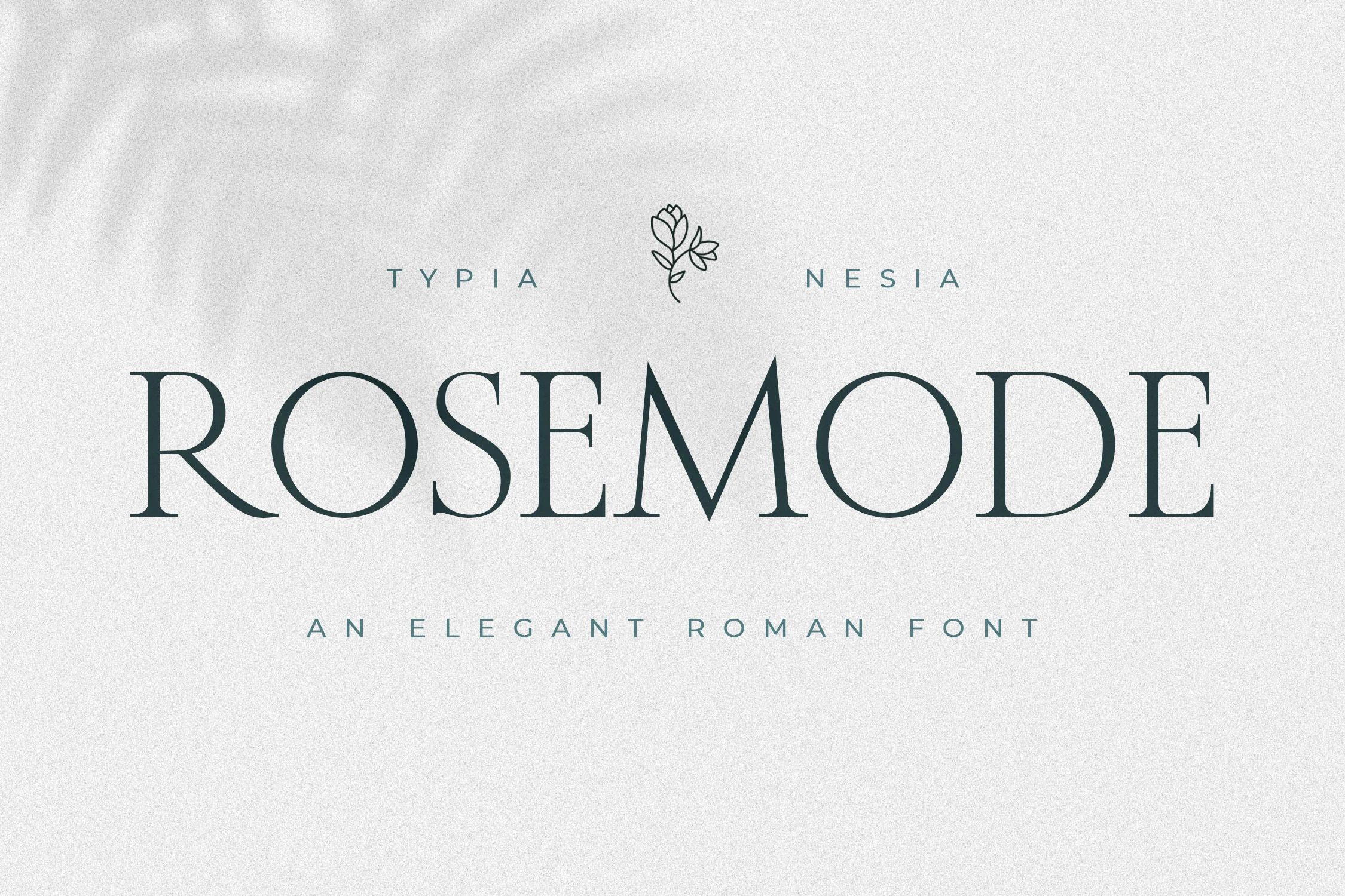
Rosemode Font leans on slender strokes, crisp serif terminals, and broad Roman-style capitals that give it an airy, composed rhythm. The rounded counters and fine horizontals keep the wordmark graceful, so large titles feel refined instead of heavy.
Rosemode brings a softer note to Display Serif Fonts, making it a strong choice for invitations, beauty branding, and romantic headlines. It works best at generous sizes with open spacing, where the thin structure and quiet contrast can stay clear without losing their delicate presence.
Conclusion
If you need polished branding or editorial hierarchy, start with the high-contrast and clean classic options. Choose condensed styles for fashion layouts, swash fonts for expressive wordmarks, vintage fonts for nostalgic packaging, and softer serif designs for beauty, invitations, or romantic branding.