Modern Sans Serif Fonts 19 Powerful Picks for 2026
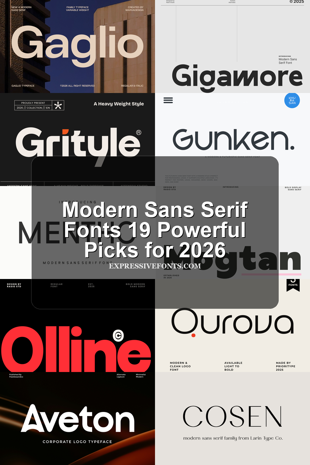
Modern Sans Serif Fonts are useful when a design needs clarity, polish, and a current brand voice without decorative noise. This collection is built for designers choosing type for logos, packaging, websites, posters, editorial layouts, fashion branding, and social graphics, with each font grouped by its strongest visual role.
Bold & Rounded Modern Sans Serif Fonts
These heavier rounded fonts work best for friendly logos, punchy headlines, social graphics, and display layouts that need clean impact without sharp edges.
Gigamore Font
Best For: logos, branding, website headers, packaging
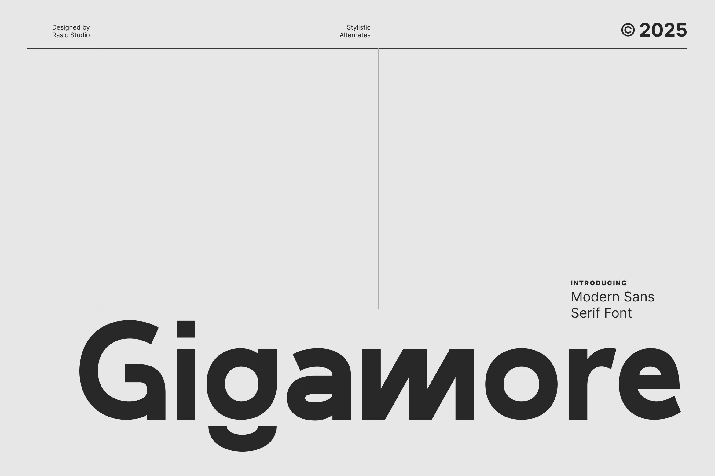
Gigamore Font has a dense geometric build with rounded bowls, a heavy open G, square i dots, and a single-storey g that drops into a smooth hook. The broad lowercase proportions give it a stronger brand presence than a neutral corporate sans, while the softened curves keep the word shape from feeling rigid.
The result suits Modern Sans Serif Fonts with a clear branding bias rather than body-copy neutrality. Its stylistic alternates are the useful detail: they help headings and logos avoid a stock sans look without adding ornament. Keep tracking controlled rather than tight so the thick counters in g, a, o, and e stay readable at display sizes.
Olline Font
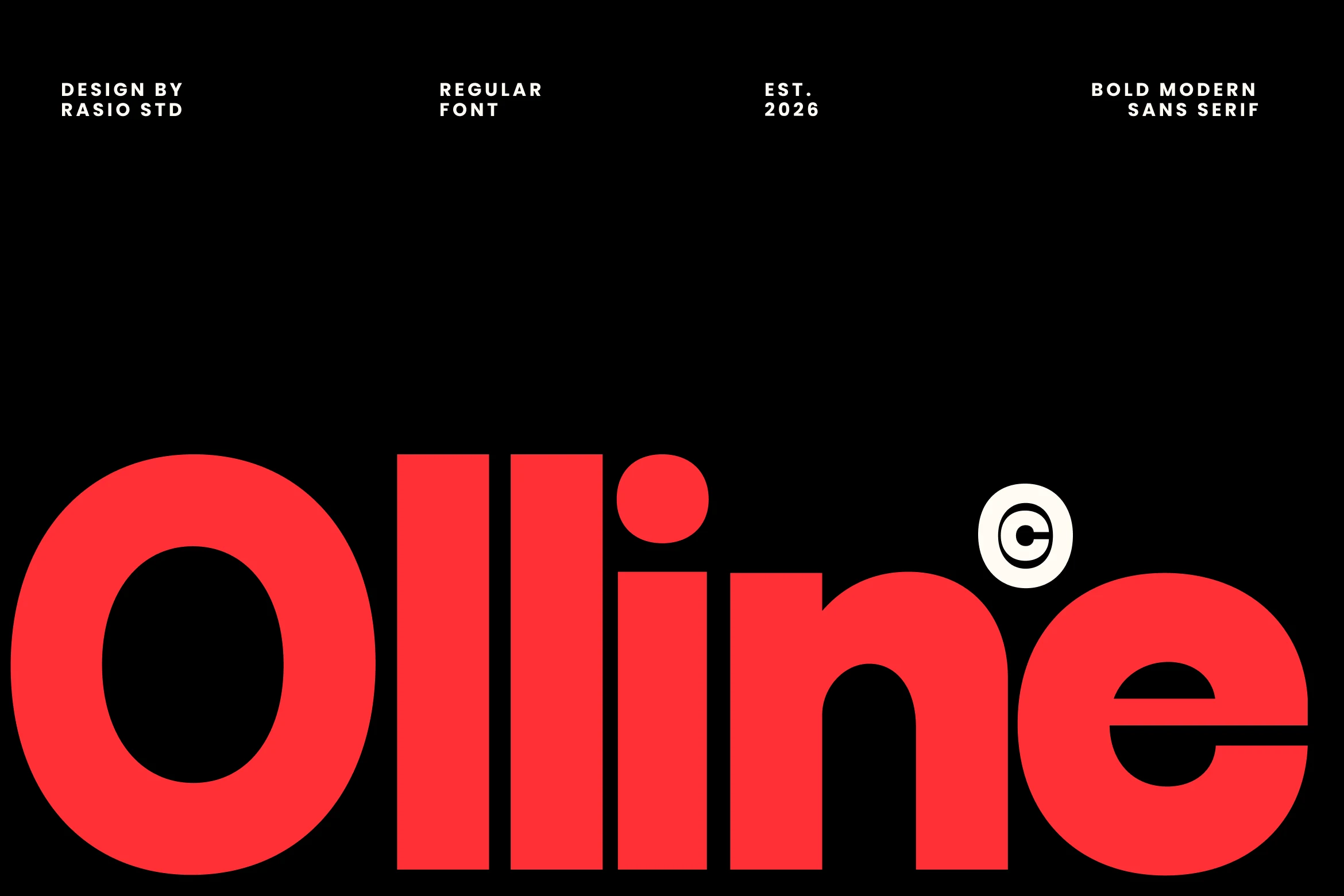
Best For: logos, branding, headlines, posters
Olline Font is built for impact, with oversized geometric forms, dense strokes, and smooth rounded counters that make every word feel immediate. The near-monoline structure keeps it clean, while details like the circular dot on the i and the sharply sliced e add a crisp contemporary edge instead of a purely utilitarian look.
It earns its place among Modern Sans Serif Fonts when a layout needs confidence more than restraint. The strong weight keeps headlines highly readable, but its real advantage is how well it holds shape at large scale across branding and display work. Use short line lengths and leave enough margin around it so the heavy verticals and tight inner spaces do not crowd the composition.
Raftern Font
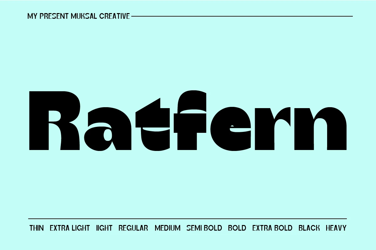
Best For: logos, branding, posters, website headers
Raftern Font uses a heavy rounded sans structure with cut-through counters and compressed negative spaces that make the wordmark feel engineered rather than plain. Its broad curves, blocky terminals, and sliced interior shapes give it a distinct place within Modern Sans Serif Fonts without losing the clean impact expected from the category.
The family range shown from thin to heavy gives designers room to build hierarchy inside one identity system. Use the boldest weights for short titles or logos where the unusual counters can be read clearly, then rely on lighter styles for supporting text so the composition keeps contrast instead of turning into one solid block.
Cutta Font
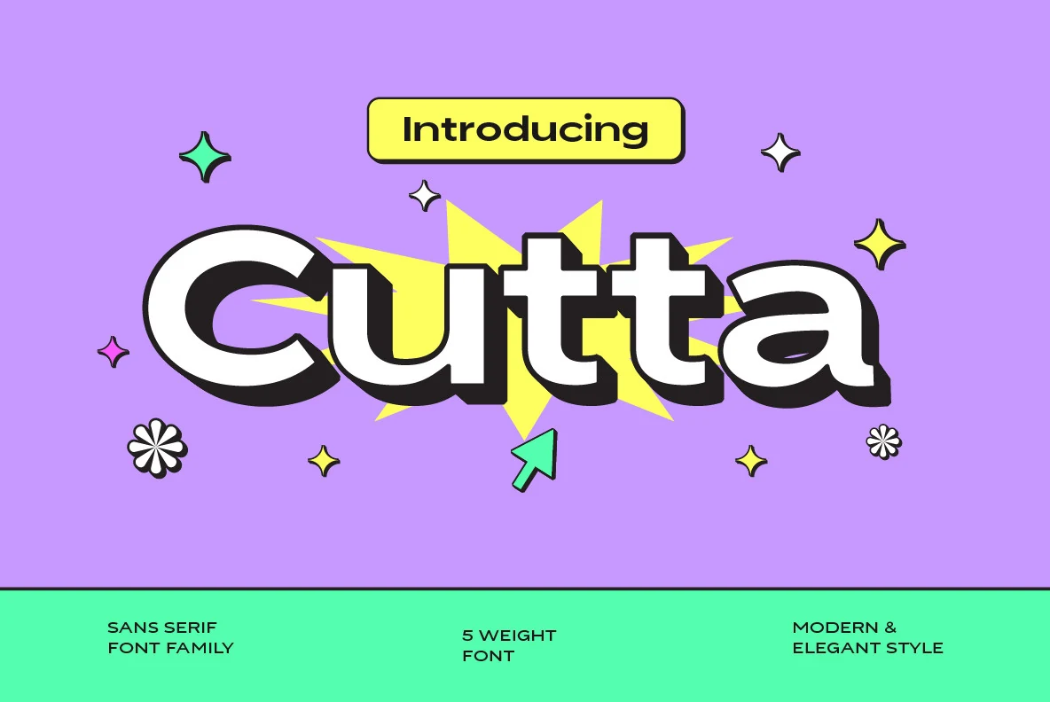
Best For: branding, social media graphics, posters, headlines
Cutta Font has a soft, rounded build with thick strokes, wide curves, and compact counters that give it a friendly display presence. Even with its playful weight, the letterforms stay clean and solid, which helps it sit comfortably among Modern Sans Serif Fonts while bringing more personality than a neutral geometric sans.
The family’s lighter and heavier styles give you useful range for title systems, so you can push contrast without changing typefaces. Heavier cuts work best for short headlines where the broad shapes can fill space confidently, while lighter styles keep supporting lines from feeling too dense in posters, branding, or web graphics.
Okaybro Font
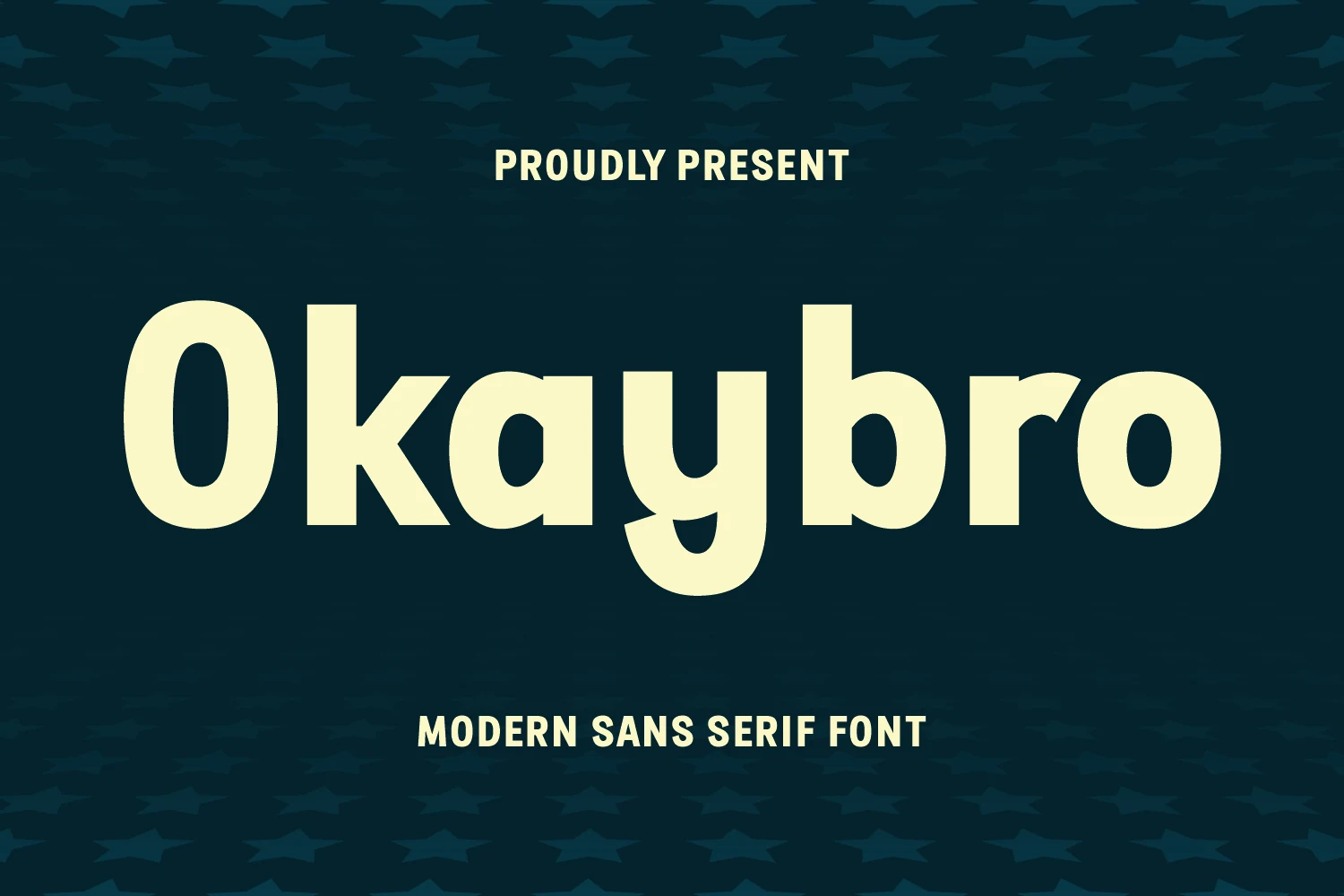
Best For: logos, branding, magazine covers, posters
Okaybro Font has a bold, rounded build with smooth joins, broad counters, and a slightly playful rhythm that keeps it from feeling too rigid. The heavy strokes give it real presence, but the soft curves make it approachable, which is a useful balance if you want Modern Sans Serif Fonts with personality rather than a purely neutral tone.
Its clear structure makes large words read fast, even when set thick and tight, so it works especially well for titles, covers, and branding where impact matters. The more expressive letters, especially the sweeping descender on the y, look strongest when paired with clean spacing and a simple secondary font that lets the headline carry the visual weight.
Magenta Family Font
Best For: logos, branding, posters, website headers
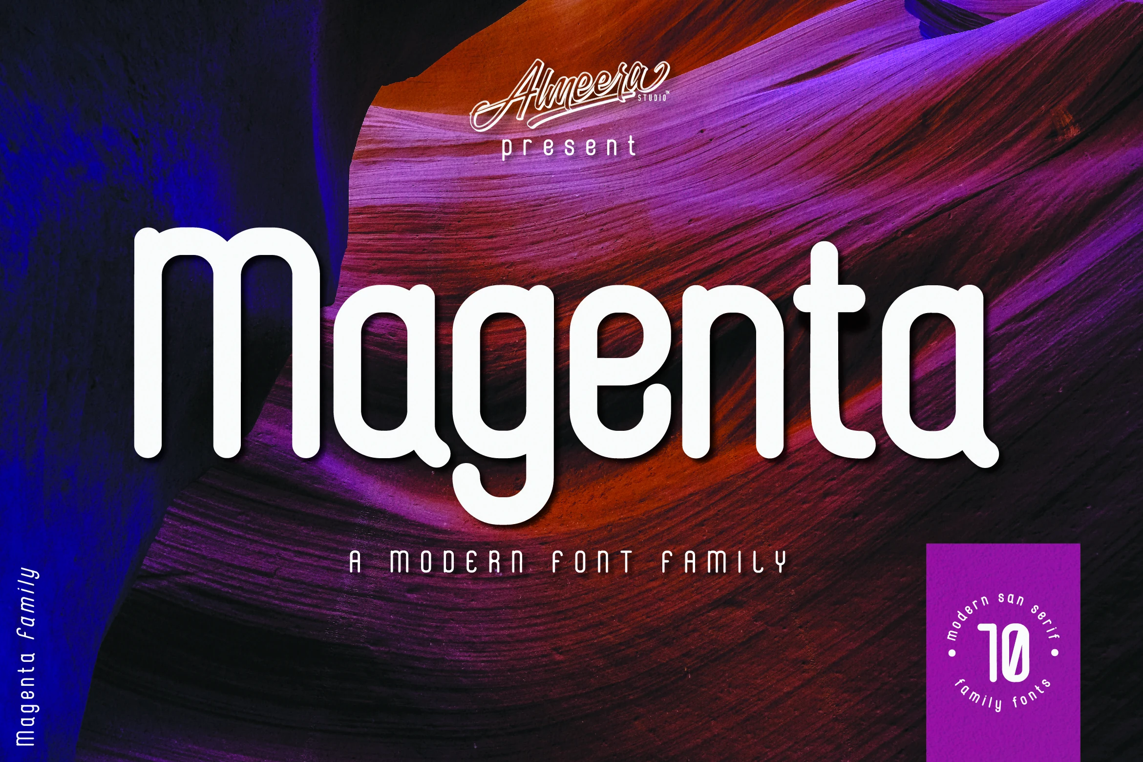
Magenta Family Font has a smooth, rounded sans serif look with tall stems, soft corners, and a friendly rhythm that keeps large words feeling approachable. Its clean shape gives it the polish expected from Modern Sans Serif Fonts, while the single-storey forms add a more relaxed and contemporary voice.
With 10 fonts covering black, bold, regular, thin, and outline styles, plus italics for each, Magenta gives you useful range for layered branding and headline systems. The heavier cuts hold attention well, while the outline and italic options help create contrast without switching families, especially in posters or logo presentations.
Mogtan Font
Best For: branding, editorial designs, posters, logos
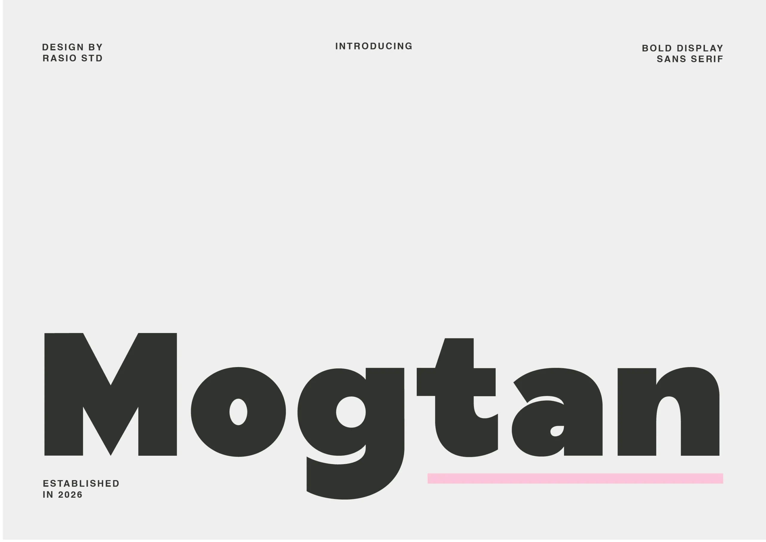
Mogtan Font has a dense, display-led build with thick verticals, broad round counters, and a single-storey g that gives the wordmark extra punch. The heavy weight feels controlled rather than clumsy, so it stands out among Modern Sans Serif Fonts when you need something bold but still orderly.
Its balanced curves and clear lowercase forms make it useful for short editorial titles, posters, and identity work where readability still matters. Try it in larger sizes with compact line breaks or a quieter secondary font; that contrast lets the blocky shapes carry the hierarchy without making the layout feel overloaded.
Olive Font
Best For: logos, branding, headlines, social media graphics
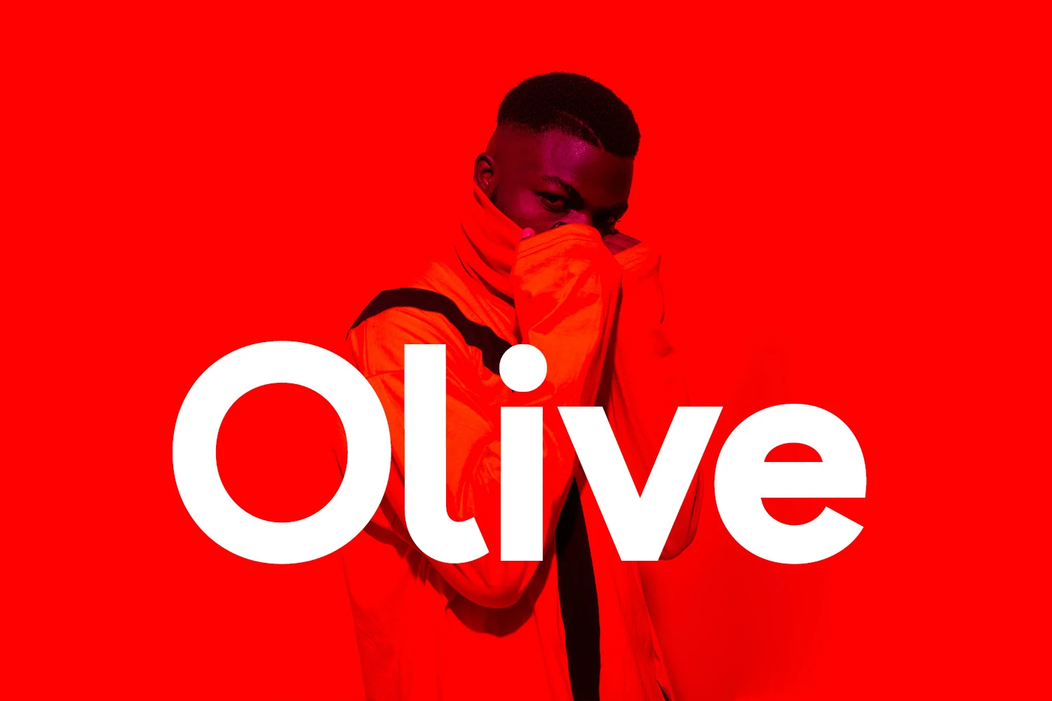
Olive Font has a bold, rounded build with smooth lowercase forms, wide bowls, and a soft rhythm that feels friendly without losing punch. That balance gives it a distinctive place among Modern Sans Serif Fonts, especially when you want a clean look with a little warmth and personality.
The open shapes keep short words clear at both large and smaller sizes, which is useful for logos, captions, and image-led layouts. It handles tight compositions well, but it looks strongest when you let the heavier letters do the work and pair them with simpler supporting text for contrast.
Clean Branding Modern Sans Serif Fonts
This group focuses on balanced sans serif families for logos, business cards, websites, and brand systems that need clarity, polish, and dependable spacing.
Meigan Font
Best For: branding, logos, website headers, business cards
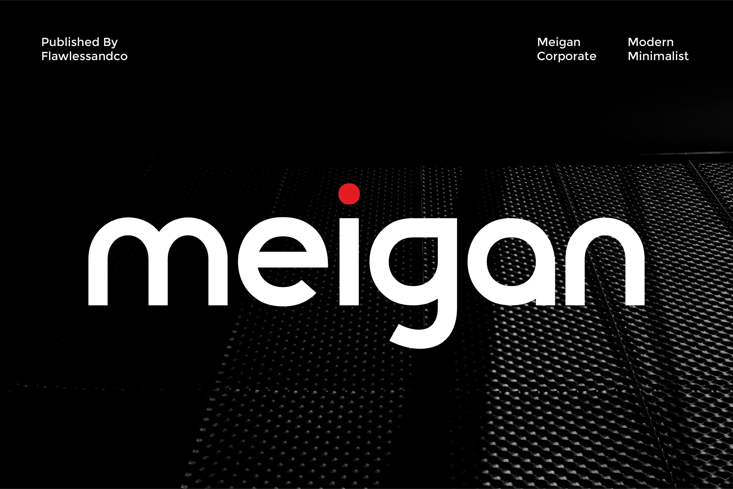
Meigan Font has a calm geometric structure with rounded terminals, even stroke weight, and a spacious lowercase rhythm that keeps the wordmark clear at a glance. The circular forms in the e, g, and a give it a friendly modern tone, while the red dot over the i adds a small accent that keeps the minimalist design from feeling too plain.
Within Modern Sans Serif Fonts, this one fits especially well into corporate identities and clean brand systems. Its strength is balance: the shapes feel approachable without losing professionalism. Keep tracking slightly open and use disciplined spacing, because the wide counters and soft curves look best when the layout gives them enough room to stay crisp and trustworthy.
Aveton Font
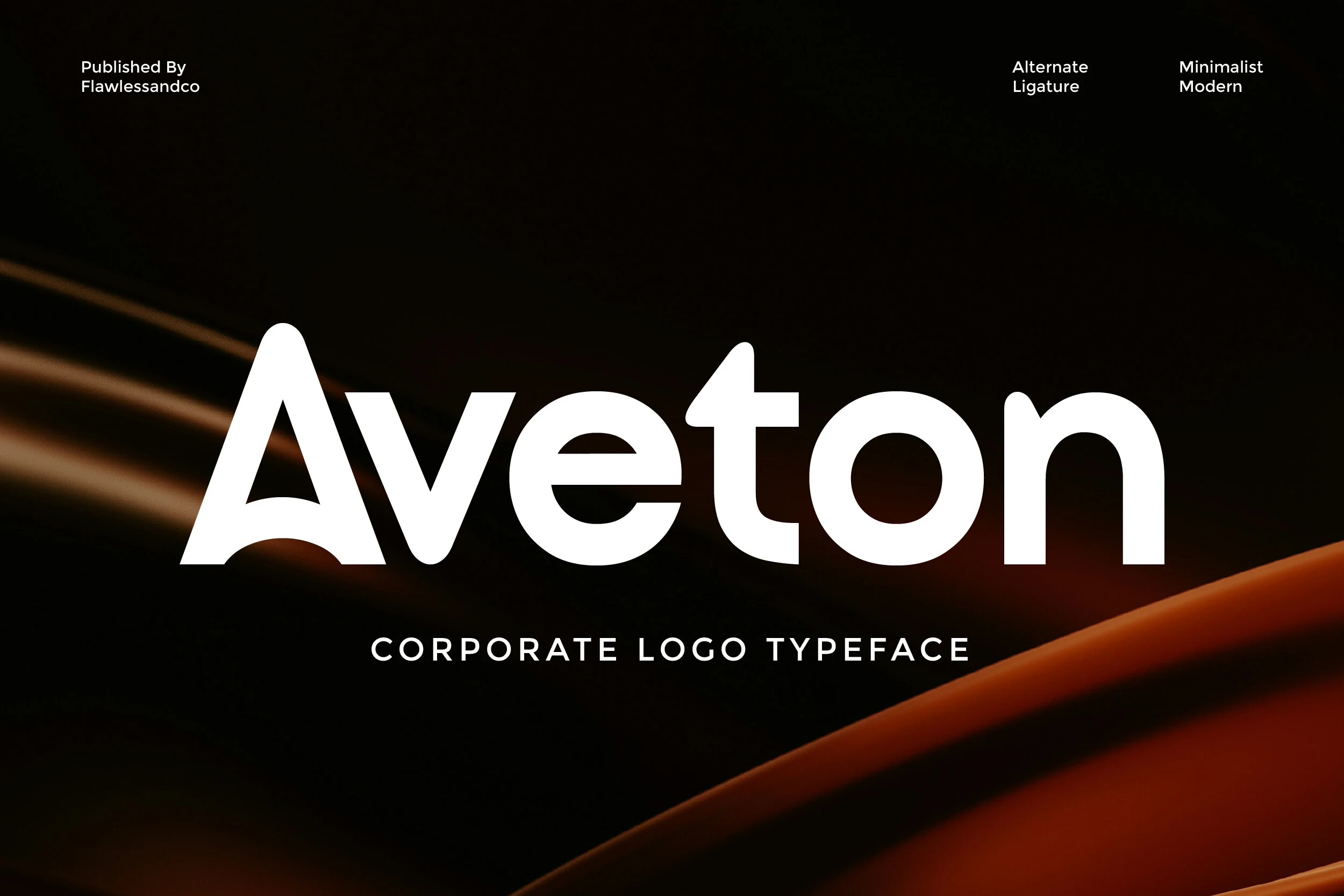
Best For: logos, branding, website headers, professional designs
Aveton Font has a restrained, corporate feel built from smooth curves, open counters, and a wide, even rhythm. The tall angled A and rounded terminals keep the shapes polished rather than severe, which gives it a confident presence suited to Modern Sans Serif Fonts with a clean brand-first attitude.
It works especially well in mixed-case logos and sleek headers where the generous proportions can stay clear at a glance. Leave a little breathing room in the spacing for larger wordmarks, and use the cleaner forms to contrast with tighter subheads or smaller support text when building a balanced identity system.
Qurova Font
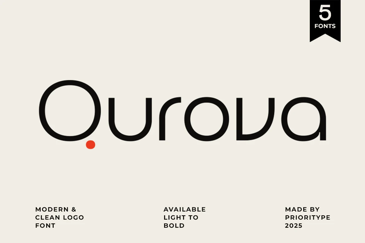
Best For: logos, branding, website headers, business cards
Qurova Font has a restrained geometric look with smooth monoline strokes, broad round bowls, and a spacious rhythm that feels calm and intentional. It sits comfortably within Modern Sans Serif Fonts, but the soft curves keep it from turning sterile, which makes the wordmark feel polished without looking overly rigid.
With weights ranging from thin to bold, Qurova gives you an easy way to build hierarchy across one identity system. Lighter cuts suit refined wordmarks and airy layouts, while the heavier styles hold up well for headers and brand touchpoints where clarity matters. It also benefits from generous spacing, which helps the clean shapes read even more confidently.
Futuristic & Wide Modern Sans Serif Fonts
These wider and more technical styles suit tech branding, posters, sports graphics, packaging, and bold headers where a stronger geometric voice is useful.
Gunken Font
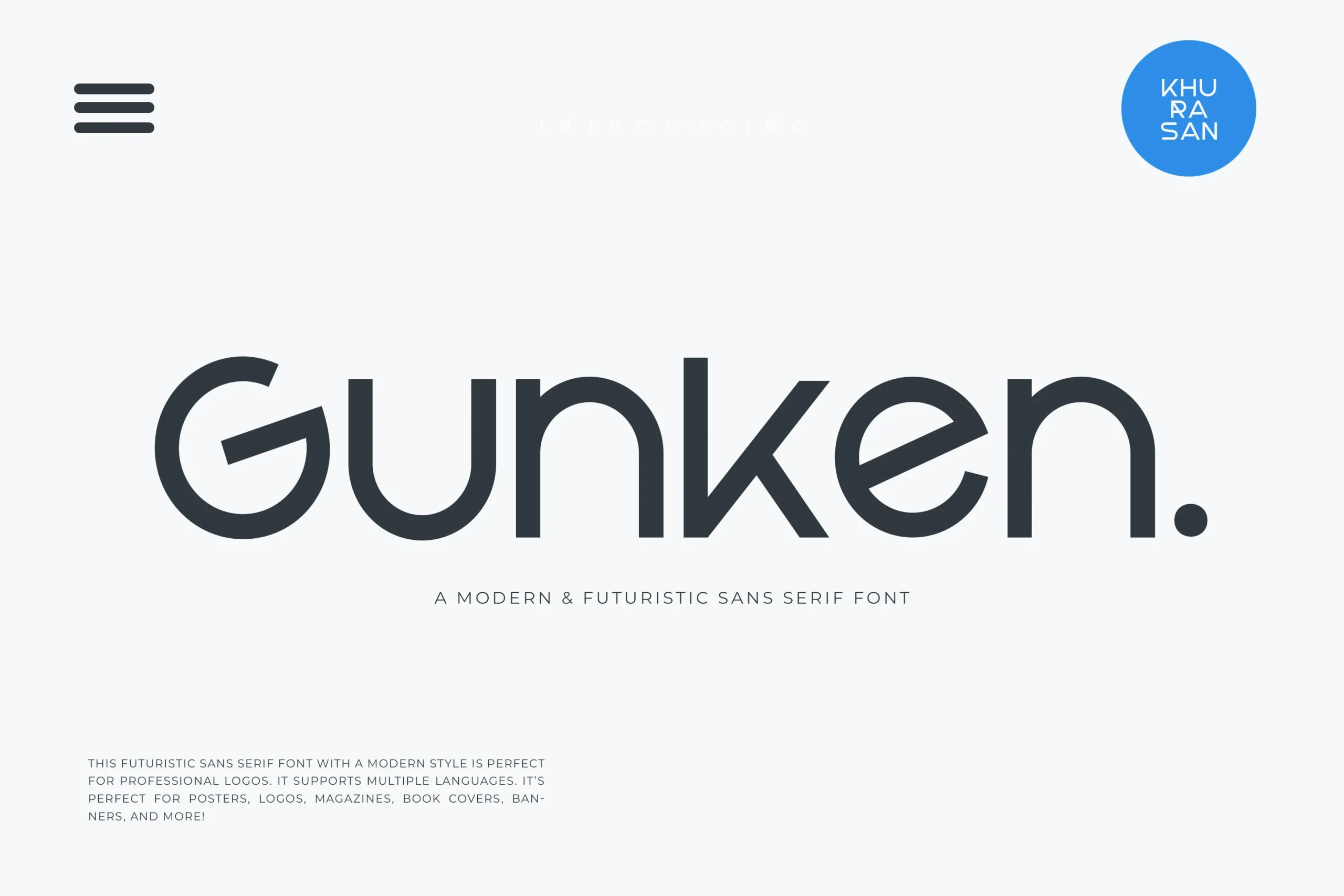
Best For: logos, posters, website headers, magazine covers
Gunken Font has a streamlined geometric build with rounded terminals, wide bowls, and a sharply carved G that gives the wordmark an immediate futuristic edge. The monoline strokes and roomy counters keep the letters smooth and clean, while the angular k adds just enough tension to stop the design from feeling too soft.
Within Modern Sans Serif Fonts, it reads best when you want technology-friendly clarity without going cold or mechanical. It suits logos and display layouts especially well; give it moderate tracking and plenty of white space so the broad curves and diagonal joins stay crisp across headers, covers, and poster-scale compositions.
Charlos Font
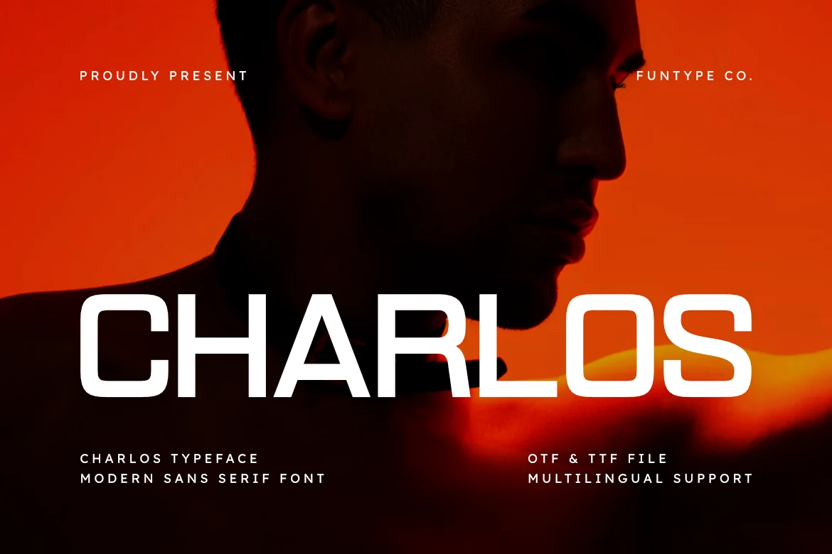
Best For: logos, product labels, posters, website headers
Charlos Font has a wide geometric build with squared curves, rounded corners, and steady stroke weight that gives it a technical, high-visibility presence. The shapes feel streamlined rather than ornamental, so it fits Modern Sans Serif Fonts that need a bolder, more engineered voice.
Because the letters occupy a lot of horizontal space, Charlos works best when headlines stay short and intentional. Its broad proportions help logos and packaging look stable and assertive, while slightly tighter tracking can make large titles feel more unified without losing the clean rhythm of the forms.
Homush Font
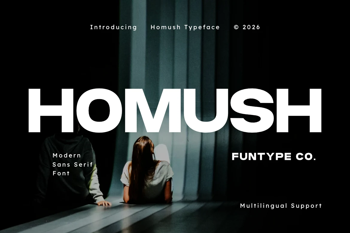
Best For: logos, posters, T-shirts, website headers
Homush Font is built on a wide geometric skeleton with thick strokes, squared curves, and a firm all-caps stance that gives it immediate presence. The extended proportions set it apart from narrower Modern Sans Serif Fonts, making even a single word feel assertive and sharply contemporary.
Because the letters spread horizontally, Homush works best in short, high-impact lines where the rhythm stays clean and readable. It is especially effective for streetwear marks, sports-style branding, and bold headers, and it benefits from tighter tracking or generous surrounding space so the heavy forms stay controlled rather than loose.
Grityle Font
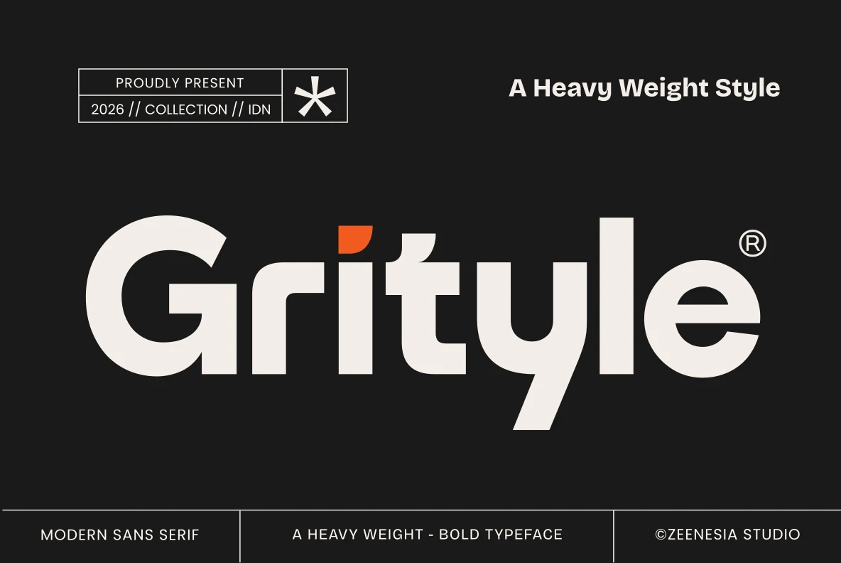
Best For: logos, branding, headlines, posters
Grityle Font has a dense, heavy sans serif build with squared curves, compact counters, and a strong geometric rhythm that gives it immediate authority. The small accent on the i adds a sharp detail, but the overall tone stays controlled and industrial, which makes it a striking option within Modern Sans Serif Fonts.
Its weight does most of the talking, so Grityle works best for short headlines and branding where the broad shapes can fill space with confidence. Keep supporting text lighter and leave a little room around the wordmark; that contrast helps the blunt forms feel intentional instead of overpowering.
Elegant & Editorial Modern Sans Serif Fonts
These lighter and more refined fonts are better for fashion logos, editorial titles, invitations, covers, and layouts that need restraint and visual space.
Cosen Font
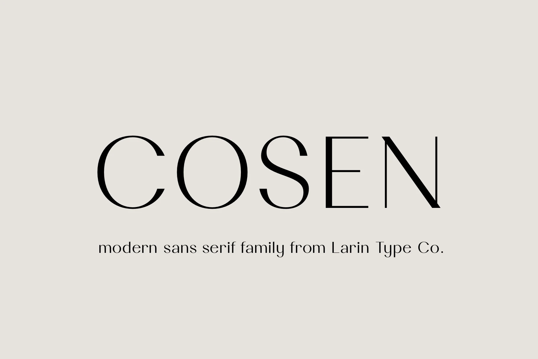
Best For: logos, branding, editorial designs, fashion branding
Cosen Font leans refined rather than neutral, with slim strokes, generous curves, and a calm rhythm that gives the uppercase forms an airy editorial presence. The wide C and O balance beautifully against the sharper structure of the N, creating a look that feels graceful, polished, and deliberately modern.
It stands out in Modern Sans Serif Fonts when you want a clean identity with a softer, more fashionable tone. This style is strongest in logos, mastheads, and short headings, where the delicate lines can stay crisp. Give it a little scale and breathing room so the thin horizontals and open shapes keep their elegance.
Eloise Font
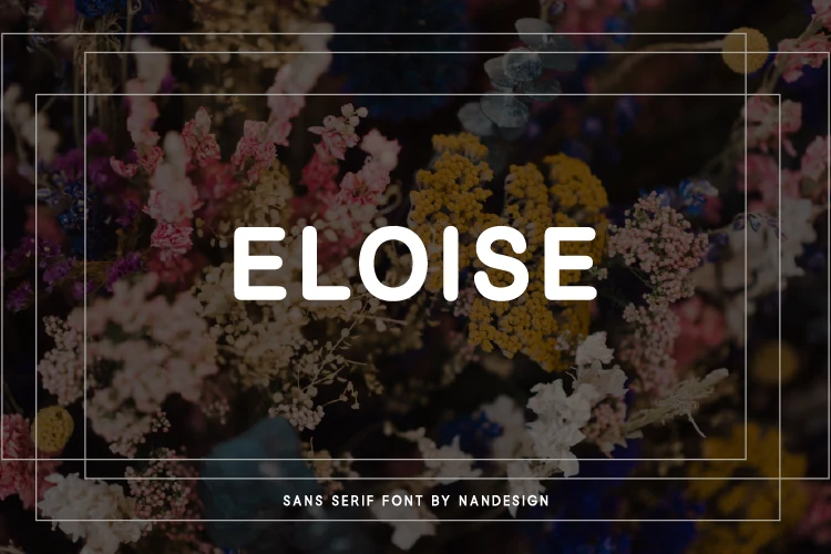
Best For: logos, branding, invitations, modern designs
Eloise Font reads as a clean rounded sans serif with soft corners, even stroke weight, and generous spacing across its all-caps setting. Its smooth terminals keep the wordmark calm rather than stiff, giving Modern Sans Serif Fonts a more approachable editorial direction.
The wide tracking works well for short names, refined labels, and title lines where the letters need to sit quietly over photography or textured backgrounds. Keep contrast strong and avoid compressing the spacing; the font’s polished rhythm depends on open air between the rounded forms.
Mentho Font
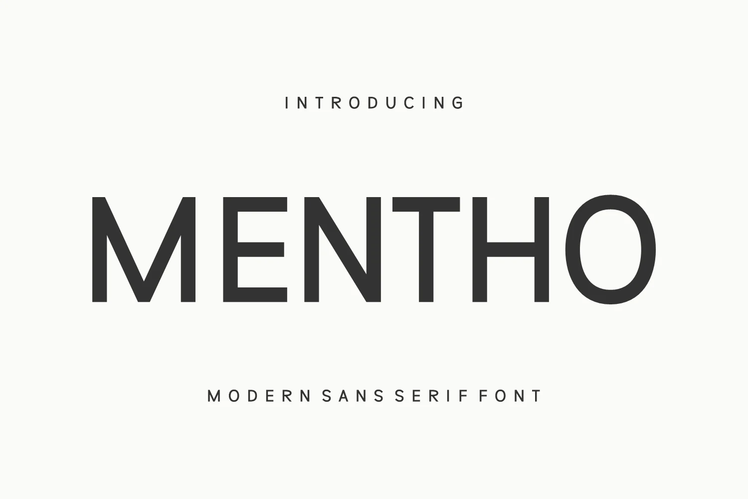
Best For: logos, posters, magazine covers, book covers
Mentho Font leans into a pared-back uppercase look with even strokes, generous spacing, and broad circular forms that keep the wordmark calm and polished. That restrained construction gives it a clear place in Modern Sans Serif Fonts, especially when you want something sleek and contemporary without decorative distractions.
The tall proportions and smooth rhythm make it effective for titles that need clarity at a glance, from posters to covers and logo work. It pairs especially well with tighter supporting text, since the open spacing in the main letters creates a clean hierarchy and lets larger headlines feel refined rather than heavy.
Molani Font
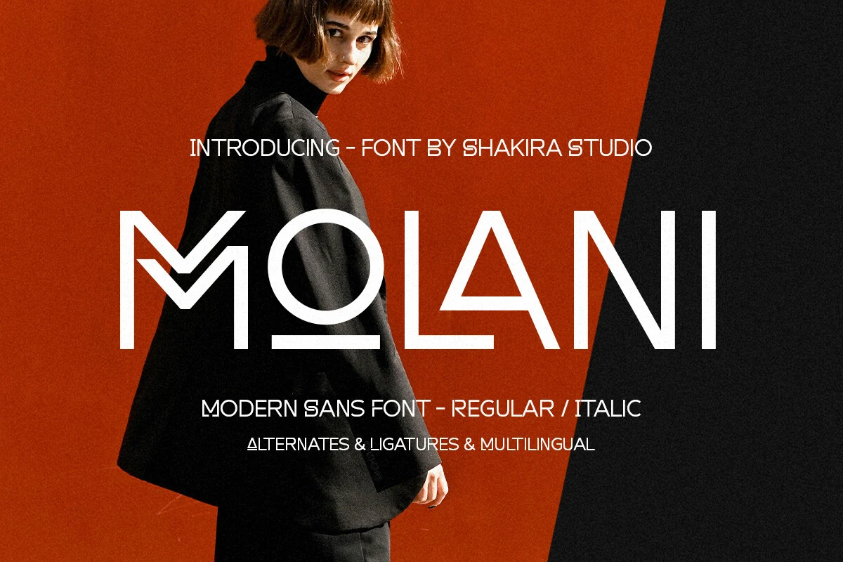
Best For: logos, editorial designs, fashion branding, website headers
Molani Font has a refined display feel built from thin strokes, open counters, and crisp geometric construction. Details like the stylized M and sharp triangular A give it a fashion-led edge, making it a strong pick within Modern Sans Serif Fonts when you want something clean but not anonymous.
Its Regular and Italic styles, plus alternates and ligatures, give you room to shape a wordmark or headline without breaking the visual system. Molani works best at larger sizes where the lighter structure can breathe, and it pairs especially well with compact body text or restrained layouts that let the letterforms stay elegant and precise.
Conclusion
Choose a bold rounded sans serif when the design needs instant impact, a clean branding font for corporate systems, a futuristic wide style for stronger display work, or an elegant editorial font when the layout needs refinement and space.