22 Best Playful Display Fonts for Stunning 2026 Designs
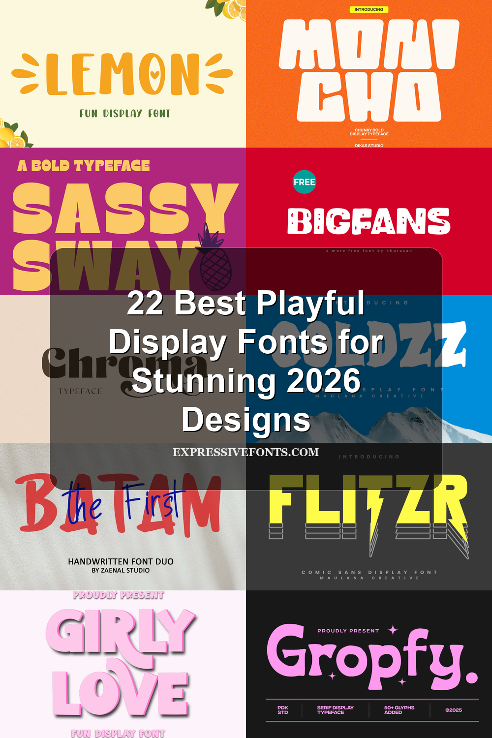
Playful Display Fonts are built for designers who need type that feels fun, bold, and instantly visible. This collection covers chunky cartoon letters, retro poster styles, brush fonts, quirky serifs, and angular display faces for stickers, packaging, children’s graphics, merch, logos, and social media headlines.
Looking for more display fonts? Browse our complete Display Fonts collection to compare bold, retro, playful, poster, groovy, creative, vintage, cartoon, headline, and decorative display styles.
Chunky Rounded Playful Display Fonts
These fonts use thick rounded shapes, soft corners, and oversized proportions, making them strong choices for stickers, kids’ graphics, merch, packaging, and friendly headline work.
Lemon Font
Best For: playful designs, cute designs, children’s designs, stickers
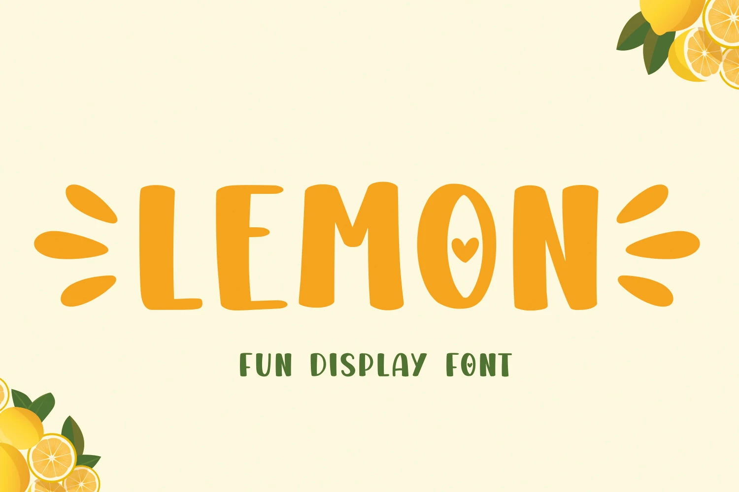
Lemon Font uses thick rounded capitals with softly uneven sides, blunt terminals, and an oval counter that turns the O into a citrus-like focal point. Its bouncy width shifts and small heart detail give the letters a cheerful handmade rhythm without making the main word hard to read.
Use it where Playful Display Fonts need immediate friendliness: kid-focused headers, sunny product labels, craft graphics, or sticker text. Keep tracking fairly open and pair it with a quieter supporting face, because the chunky shapes and decorative personality work best when the title hierarchy stays simple.
Truth Dare Font
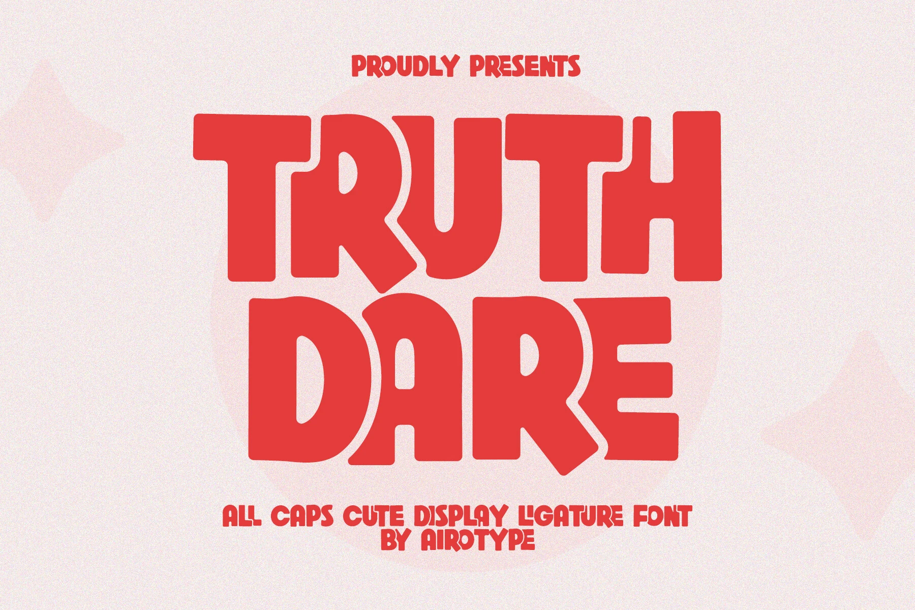
Best For: T-shirts, stickers, quotes, cute designs
Truth Dare Font leans into oversized all-caps shapes with rounded corners, broad stems, and soft inner curves that keep the weight feeling cheerful rather than heavy. The letters sit close together with a sturdy rhythm, but the counters stay open enough to keep short words clear and punchy.
Within Playful Display Fonts, this one is especially strong for bold phrases that need a cute graphic presence. Its ligatures give you more control over repeated letters and tighter combinations, which helps short quote layouts, sticker text, and tee designs look smoother and more intentional.
Thick Spirit Font
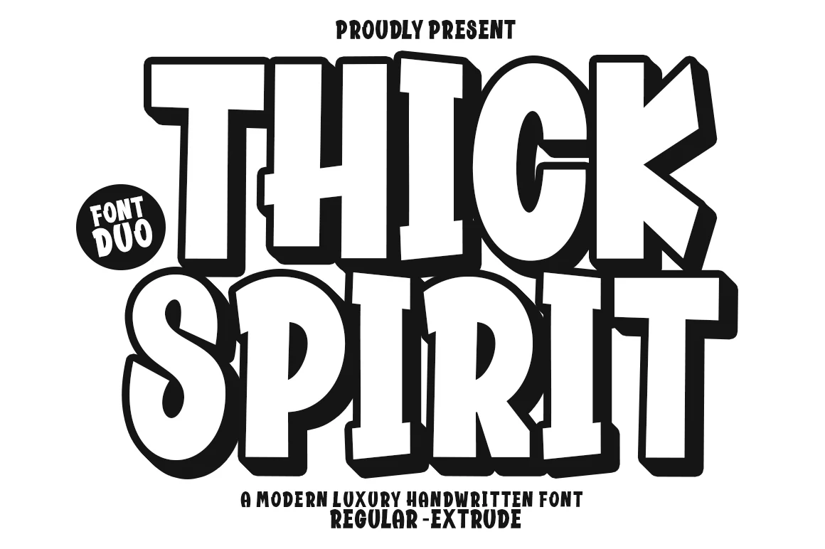
Best For: posters, headlines, merch design, eye-catching designs
Thick Spirit Font has oversized block letters, heavy black edging, and a slightly offbeat stance that gives it a lively cartoon punch. The broad counters and simple shapes keep it readable at a glance, while the outlined, extruded look adds depth without losing that cheerful display energy.
Among Playful Display Fonts, this one works especially well when you want the title to do most of the visual work. Its ligatures can help awkward letter pairs sit more smoothly in tight headline settings, and the thick silhouette holds up best with short words, stacked layouts, and strong contrast.
Bigfans Font
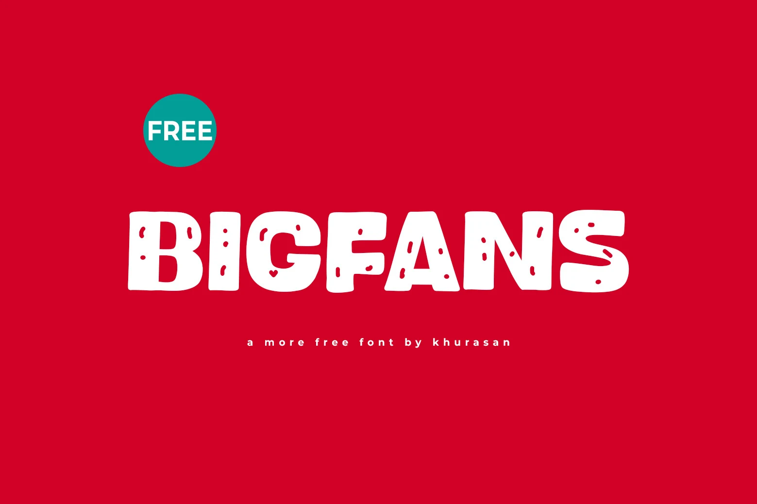
Best For: posters, logos, book covers, playful designs
Bigfans Font has thick rounded capitals with soft corners, broad proportions, and little rough cut-ins that give the letters a hand-finished texture. The shapes feel bold without looking stiff, so the overall tone lands somewhere between quirky, friendly, and punchy.
It suits Playful Display Fonts best when you want a headline to carry the personality of the layout. Use it large enough for the distressed details to stay visible, and keep the supporting type simple so the chunky forms can stand out cleanly on posters, covers, and logo-focused graphics.
Sausage Font
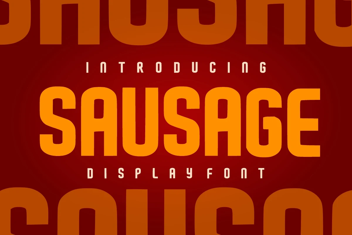
Best For: headlines, branding, posters, bold designs
Sausage Font is an all-caps display face with thick vertical strokes, rounded outer corners, and narrow squared counters that keep the heavy letters readable. Its clean block structure gives the type confidence, while the softened edges stop it from feeling too rigid or industrial.
Use it where Playful Display Fonts need strength more than decoration: brand headers, presentation covers, greeting cards, or craft graphics. Keep the tracking moderate and let the tall letterforms lead the hierarchy; over-compressing the spacing will make the rounded counters feel cramped.
Super Bubble Font
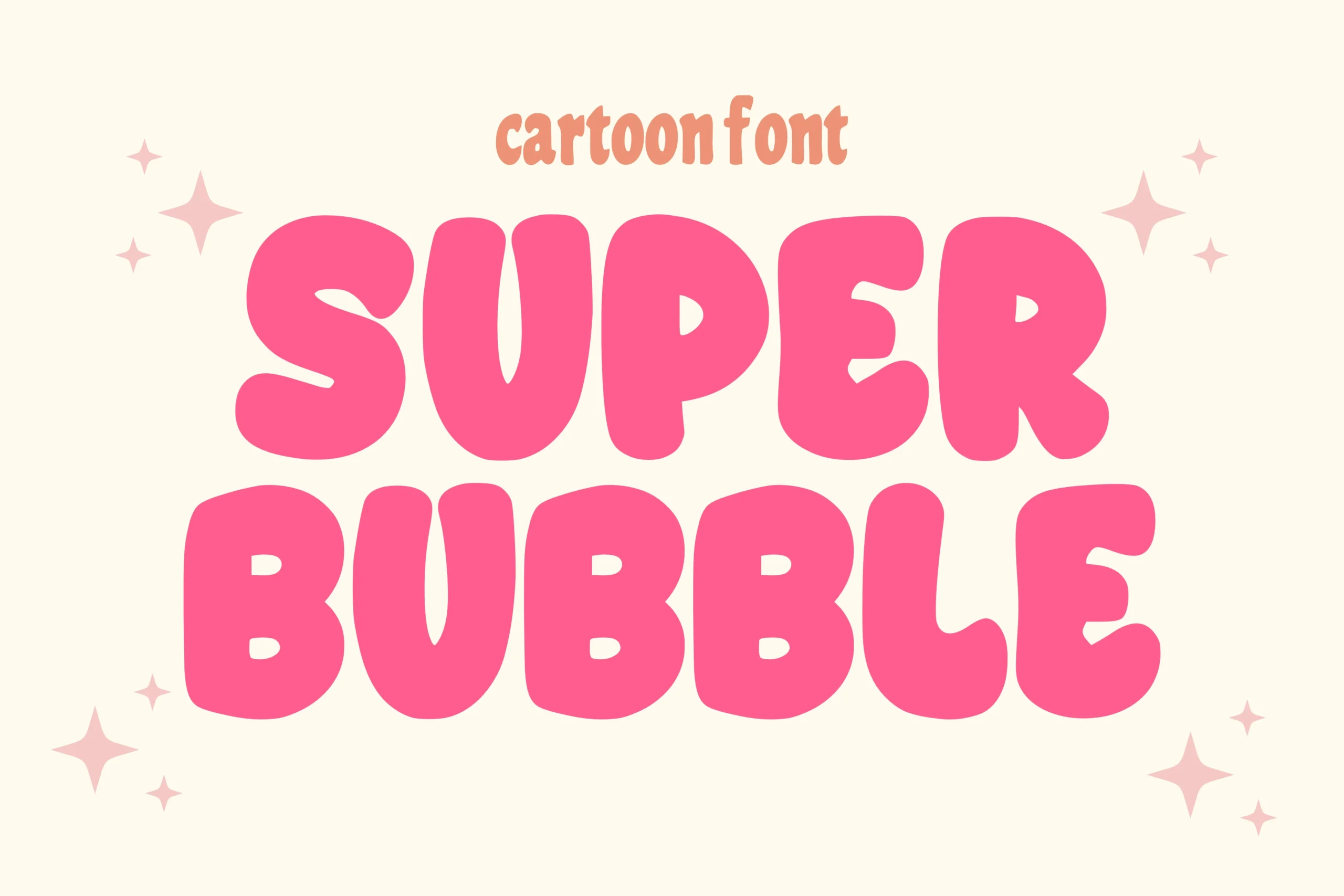
Best For: stickers, packaging, T-shirts, fun designs
Super Bubble Font has inflated cartoon letterforms with thick rounded strokes, soft uneven edges, and compact counters that make the words feel squishy and oversized. The irregular curves keep the alphabet playful, while the simple interior shapes stop the heavy style from becoming difficult to read.
Use it where Playful Display Fonts need a bright comic or sticker-style voice for packaging, apparel, social posts, or bold title graphics. Keep phrases short and let the letters sit large; tight spacing works, but cramped multi-line layouts can make the bubble shapes collide.
Girly Love Font
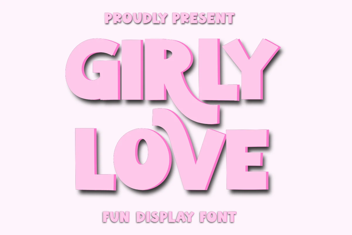
Best For: T-shirts, packaging, cute designs, playful designs
Girly Love Font uses oversized block letters with blunt corners, thick vertical strokes, and a dramatic curved R leg that gives the layout a bold craft-label personality. The shapes are heavy, but the open counters and simple silhouettes keep the pink display style easy to read.
For Playful Display Fonts aimed at shirts, mugs, tote bags, posters, or packaging, this one works best as the main title rather than supporting copy. Use compact spacing and strong contrast; the uppercase and lowercase mix can build hierarchy, but the chunky forms need room to keep their cheerful weight intact.
Super Magic Font
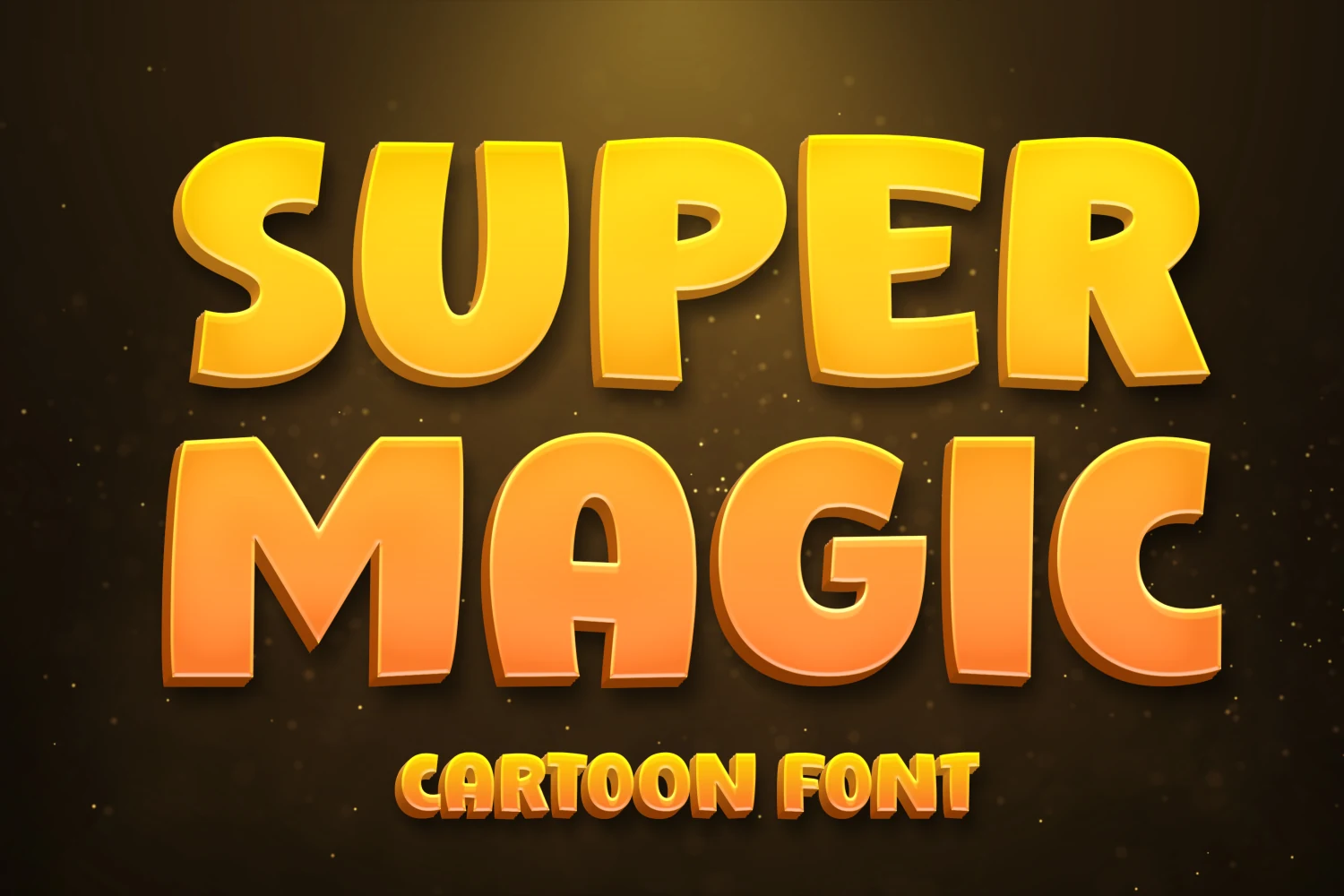
Best For: children’s designs, fun designs, posters, bold designs
Super Magic Font uses rounded block letters with thick cartoon proportions, soft corners, and a raised 3D effect that makes each word feel bright and toy-like. The wide counters and simple shapes keep the heavy style readable, even when the lettering takes over most of the layout.
It works best when Playful Display Fonts need a children’s poster, school activity header, or game-style title with immediate visual weight. Keep the hierarchy simple and avoid long phrases; the inflated forms need scale and clear contrast to hold their cheerful cartoon impact.
Retro & Groovy Playful Display Fonts
This group leans into vintage rhythm, wavy forms, and nostalgic lettering, which works well for posters, signage, summer branding, apparel, and relaxed logo concepts.
Monicho Font
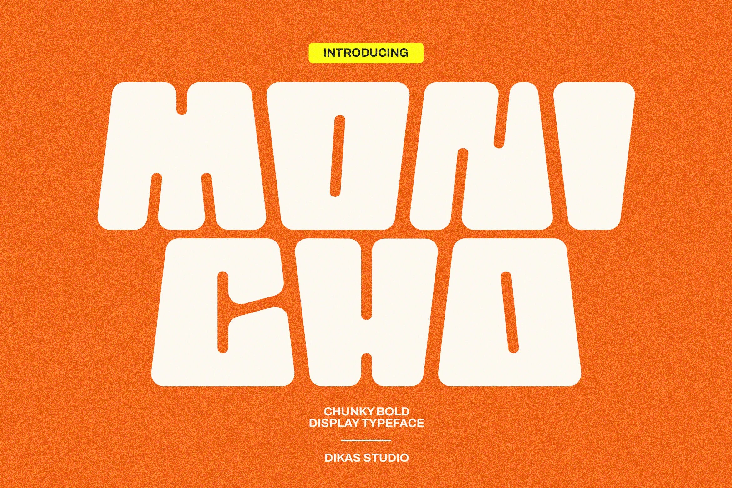
Best For: logos, posters, headlines, retro designs
Monicho Font uses inflated block shapes, soft squared corners, and narrow vertical counters that give each letter a heavy retro punch. Its compressed rhythm keeps the words compact, while the rounded geometry stops the weight from feeling too rigid.
Monicho fits Playful Display Fonts best when the typography is the main graphic element: logo marks, poster titles, packaging names, and short social headers. Keep tracking tight but not crushed, and use strong color contrast so the thick forms and inner cutouts stay readable.
Oldport Script Font
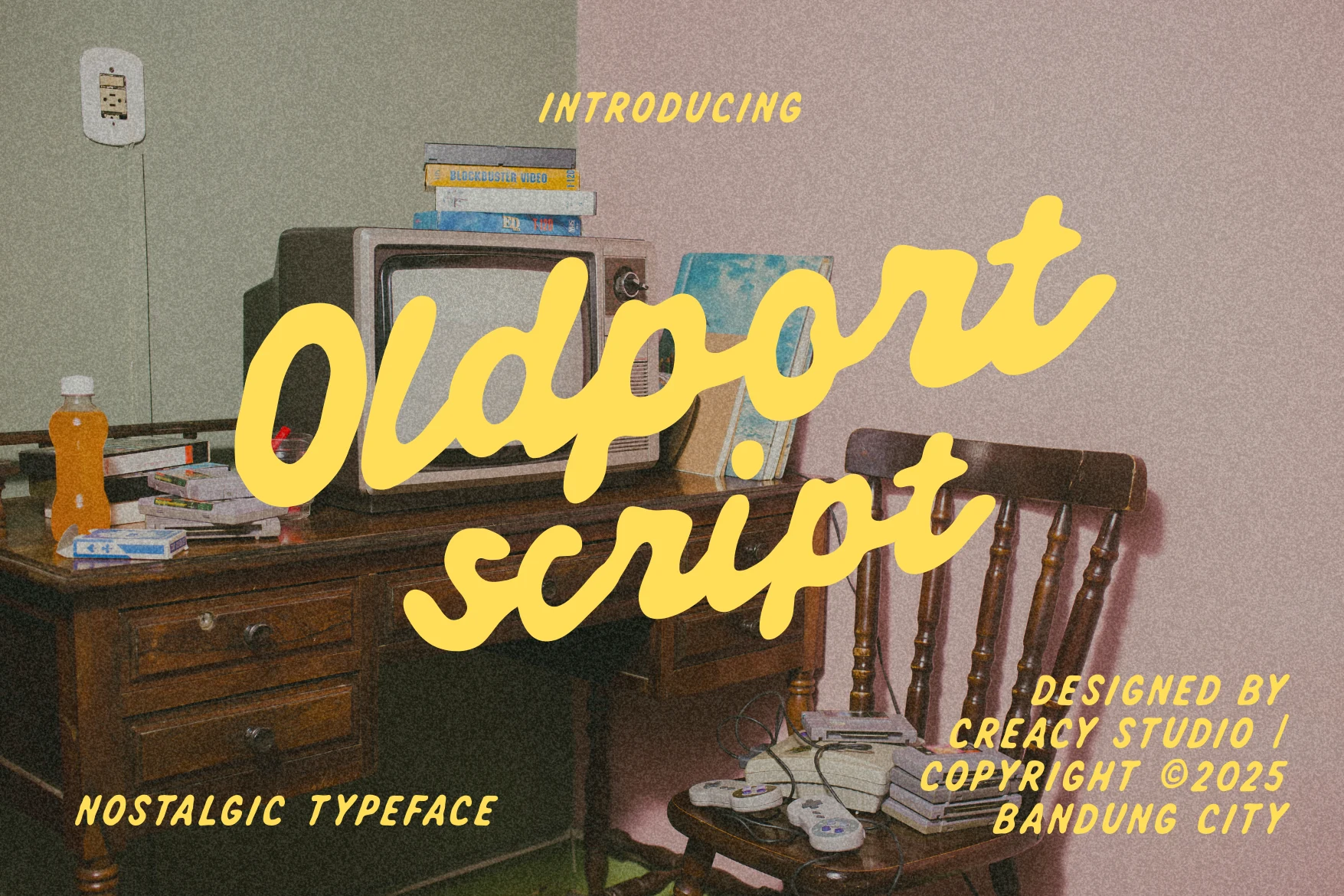
Best For: posters, signage, quotes, nostalgic designs
Oldport Script Font has a warm handwritten flow, with thick rounded strokes, smooth joins, and broad looping curves that feel easygoing rather than formal. The letters lean slightly and stretch wide across the line, which gives it a relaxed vintage rhythm with plenty of personality.
Used alongside other Playful Display Fonts, Oldport Script brings a softer nostalgic note that works well for short titles, packaging names, and quote graphics. It looks best when you give the connected letters enough line spacing and keep surrounding type simple so the sweeping script remains clear.
Helpful Person Font
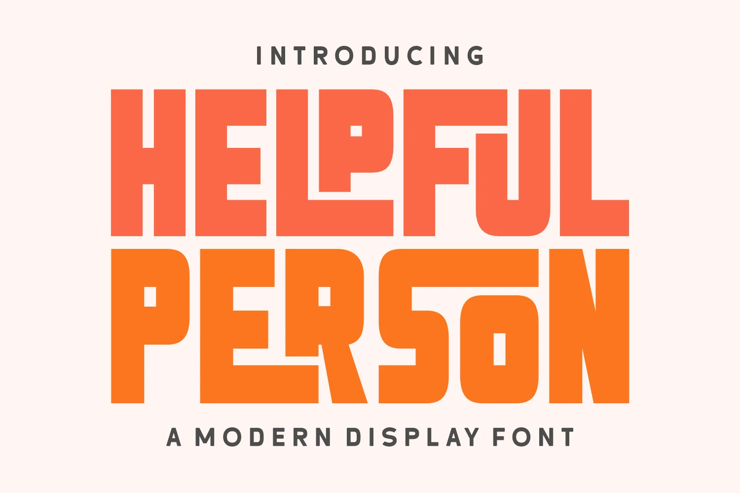
Best For: posters, T-shirts, retro designs, playful designs
Helpful Person Font is built from oversized block letters with softened corners, squared counters, and compact spacing that gives the words a dense 70s display rhythm. The playful cuts inside the P, O, and R add character without turning the alphabet into pure novelty.
For Playful Display Fonts with a retro holiday angle, this one works best in short, stacked titles where the chunky proportions can dominate the layout. Use firm contrast around it and avoid loose tracking; the tight fit is what keeps the heavy shapes connected and poster-like.
Laguna Tropic Font
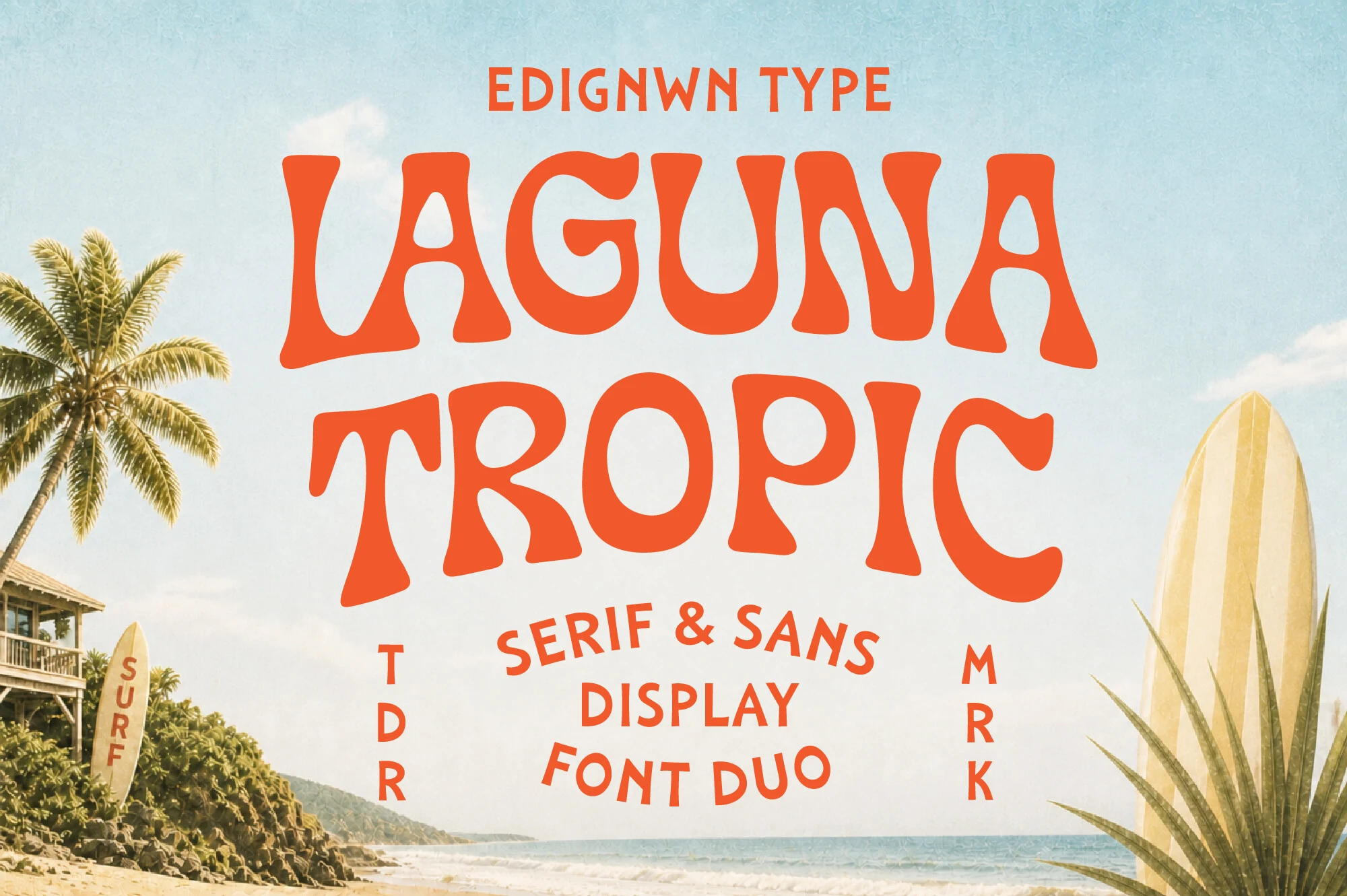
Best For: logos, posters, signage, retro designs
Laguna Tropic Font pairs a bold wavy serif with a simpler sans companion, giving the design a clear retro surf hierarchy. The serif letters have flared stems, soft organic curves, and uneven vintage proportions that feel closer to coastal signage than polished corporate display type.
For Playful Display Fonts with a beachside angle, it works well in stacked logos, resort posters, packaging, and summer apparel graphics. Use the serif for the main title and the sans for smaller support text; that contrast keeps the composition readable while preserving the nostalgic travel-poster mood.
Sassy Sway Font
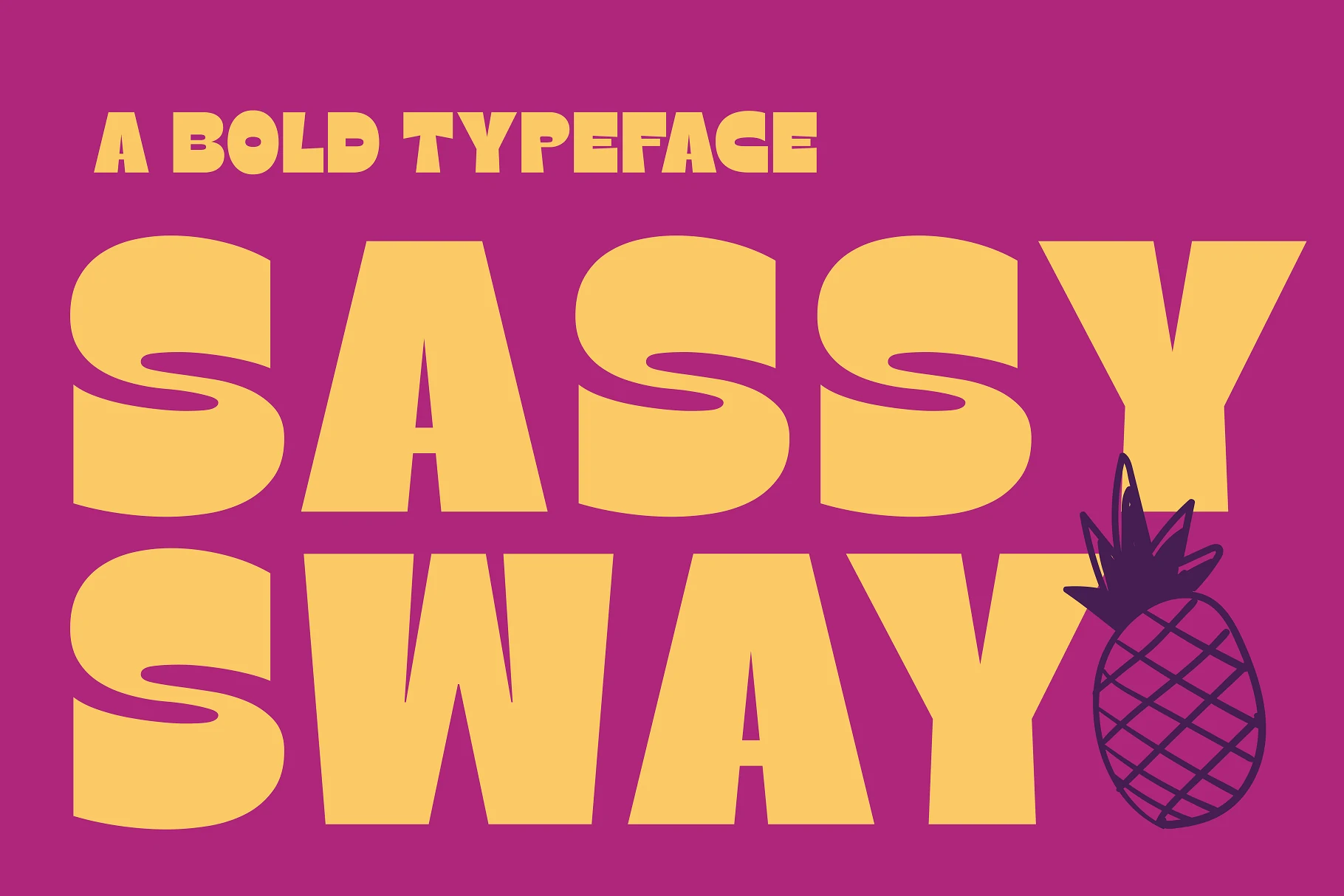
Best For: headlines, posters, branding, bold designs
Sassy Sway Font uses massive geometric letterforms with rounded corners, stretched curves, and angled sides that give the all-caps words a loud retro-pop stance. The S shapes have exaggerated horizontal cuts, while the A, W, and Y keep a solid block rhythm for strong headline readability.
Use it when Playful Display Fonts need confident weight for posters, branding, product graphics, or social titles. Keep the layout simple and let the letters dominate; tight color contrast works well, but long copy will fight against the oversized proportions and heavy counters.
Kicking Limos Font
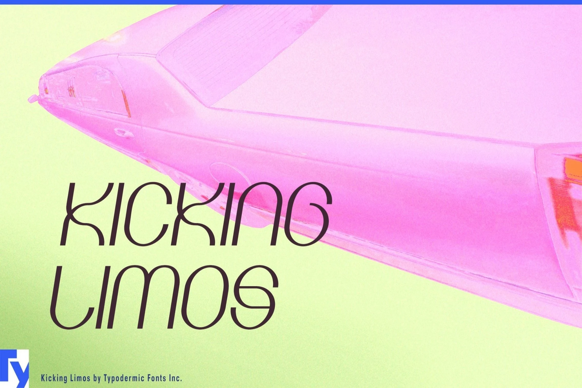
Best For: quotes, T-shirts, playful designs, modern designs
Kicking Limos Font uses slim monoline strokes, rounded loops, and long curvilinear joins that give the lettering a smooth retro-futurist feel. The forms are decorative but not heavy, with open spacing and clean counters that help the unusual curves stay legible in short phrases.
It brings a lighter option to Playful Display Fonts, especially for quotes, notes, and T-shirt graphics that need motion rather than bulk. Keep the contrast strong and avoid squeezing the lines too tightly; the looping structure needs horizontal room to read as intentional shape instead of tangled script.
Bold & Energetic Playful Display Fonts
These fonts bring sharper motion, brush texture, and comic-style impact, making them useful for loud posters, apparel graphics, book covers, and short high-contrast titles.
Flitzr Flash Font
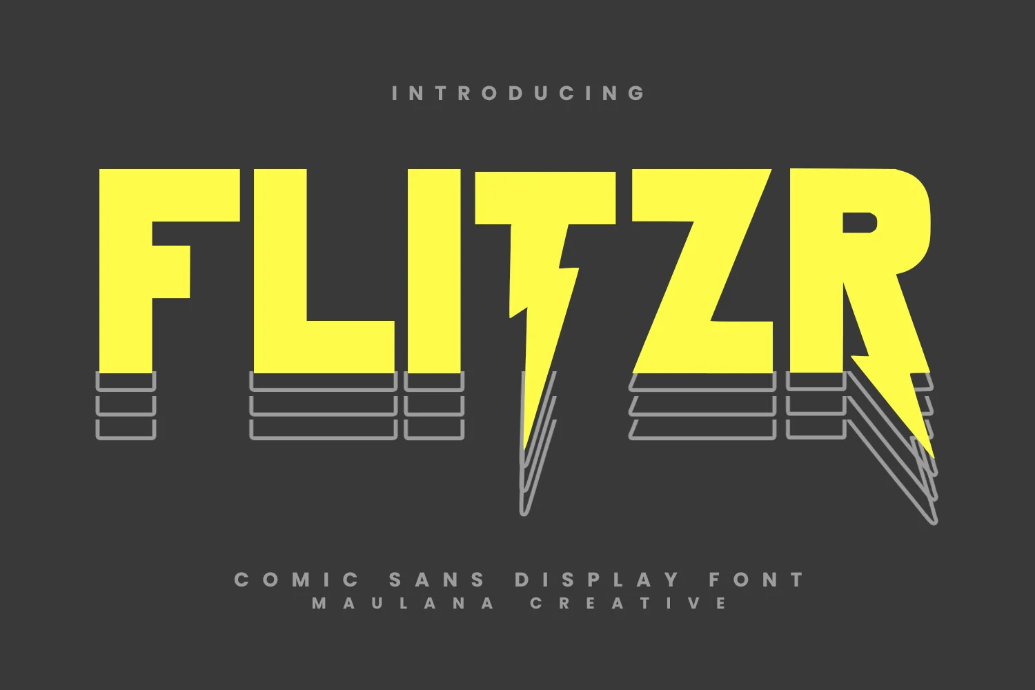
Best For: posters, headlines, short phrases, eye-catching designs
Flitzr Flash Font has a comic-book punch, built from tall block capitals, sharp diagonal cuts, and a lightning-bolt center that gives the wordmark real motion. The strokes are thick and uncomplicated, so the letters read fast while still feeling loud and graphic.
In Playful Display Fonts, this one is especially effective for titles that need instant impact rather than subtlety. It performs best in short headline settings, where its compact width and angular details can create a strong hierarchy without the layout feeling crowded.
Happy Brush Font
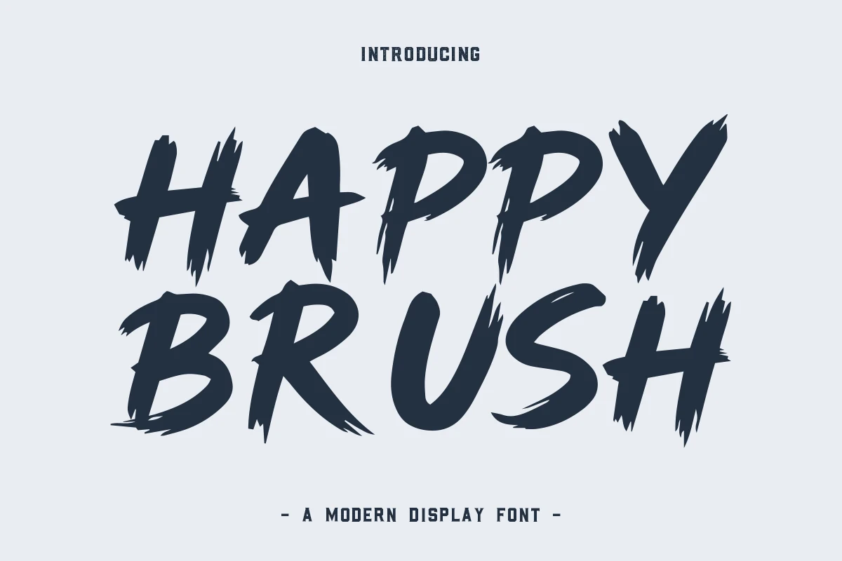
Best For: posters, T-shirts, stickers, handmade designs
Happy Brush Font uses broad hand-painted strokes with ragged edges, dry-brush breaks, and sharp tapered ends that make the uppercase letters feel fast and physical. The slanted rhythm gives the words movement, while the thick forms keep the impact strong at headline scale.
Choose it when Playful Display Fonts need a rougher, more energetic voice for posters, apparel graphics, or bold social headers. Keep phrases short and give the brush texture clear contrast; cramped layouts will blur the torn edges and weaken the hand-painted character.
Neodex Font
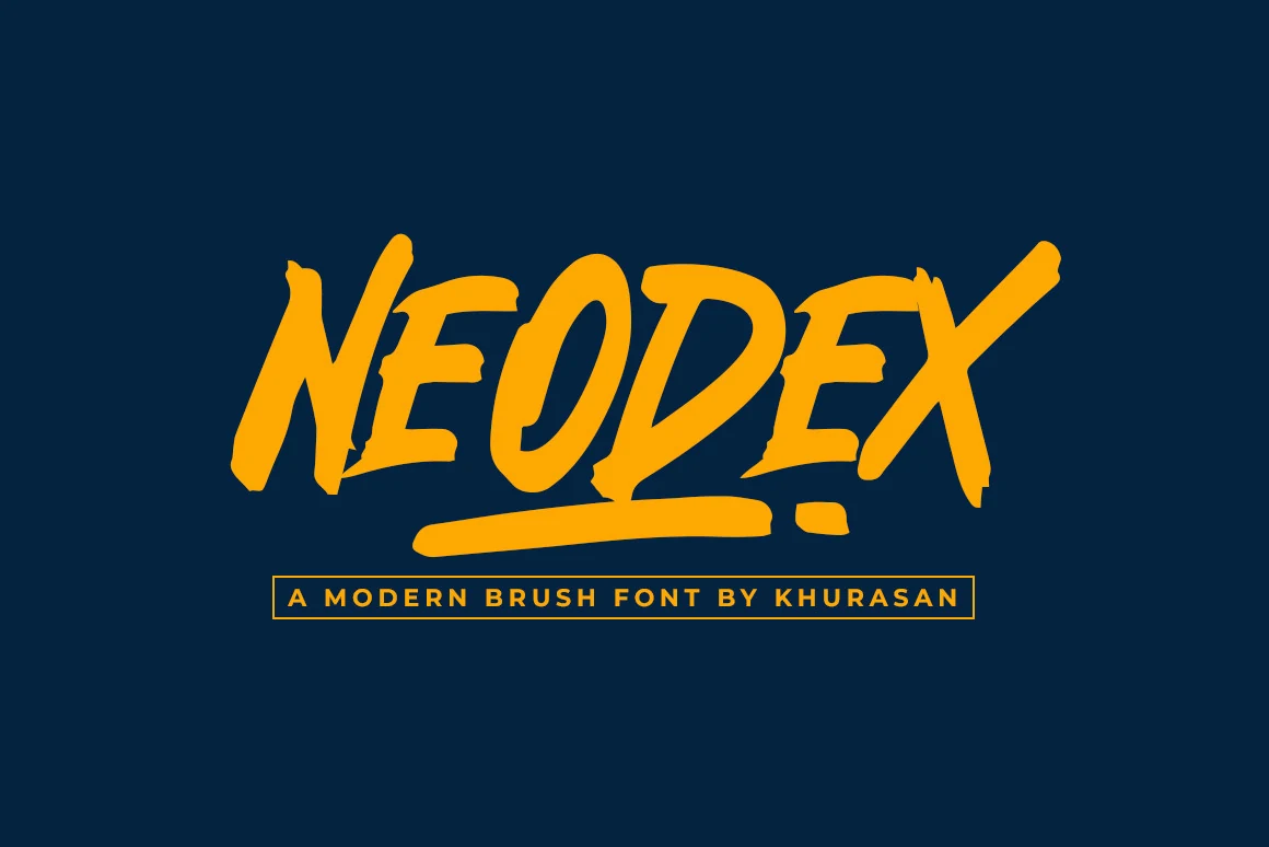
Best For: posters, logos, book covers, bold designs
Neodex Font is a bold brush display face with steep slants, thick painted strokes, and sharp torn edges. The letters lean forward with aggressive momentum, while the extended underline in the preview reinforces its logo-ready, street-poster rhythm.
Within Playful Display Fonts, it suits designs that need loud motion rather than soft charm: posters, book covers, banners, or compact brand marks. Keep words short and use high contrast; the angled cuts and rough edges lose definition when packed into small supporting text.
Angular & Futuristic Playful Display Fonts
These options use sharp cuts, modular construction, and faceted forms, giving game titles, tech posters, website heroes, and cinematic wordmarks a more engineered feel.
Remuria Font
Best For: headlines, posters, website headers, logos
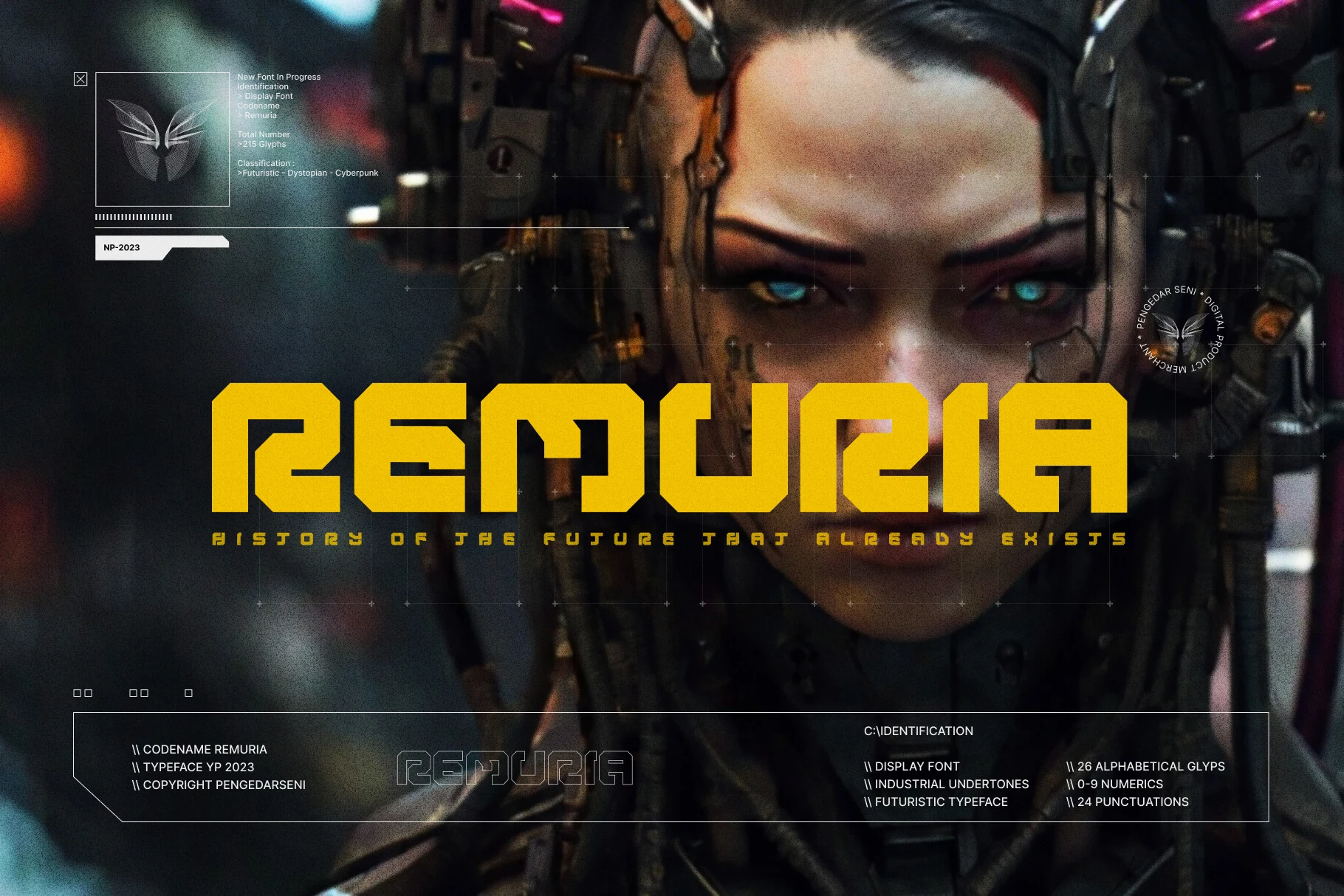
Remuria Font uses a heavy modular build with squared corners, angular cuts, and hollowed interior paths that make each letter feel engineered rather than drawn. The tight kerning gives the word shape a compact, cinematic force, while the broad strokes keep it readable as a display face.
Use it where Playful Display Fonts can lean into sci-fi branding: game titles, tech posters, landing-page heroes, or clothing graphics. Keep line lengths short and increase tracking only slightly; too much space breaks the connected mechanical rhythm.
Folgore Font
Best For: posters, headlines, logos, decorative designs
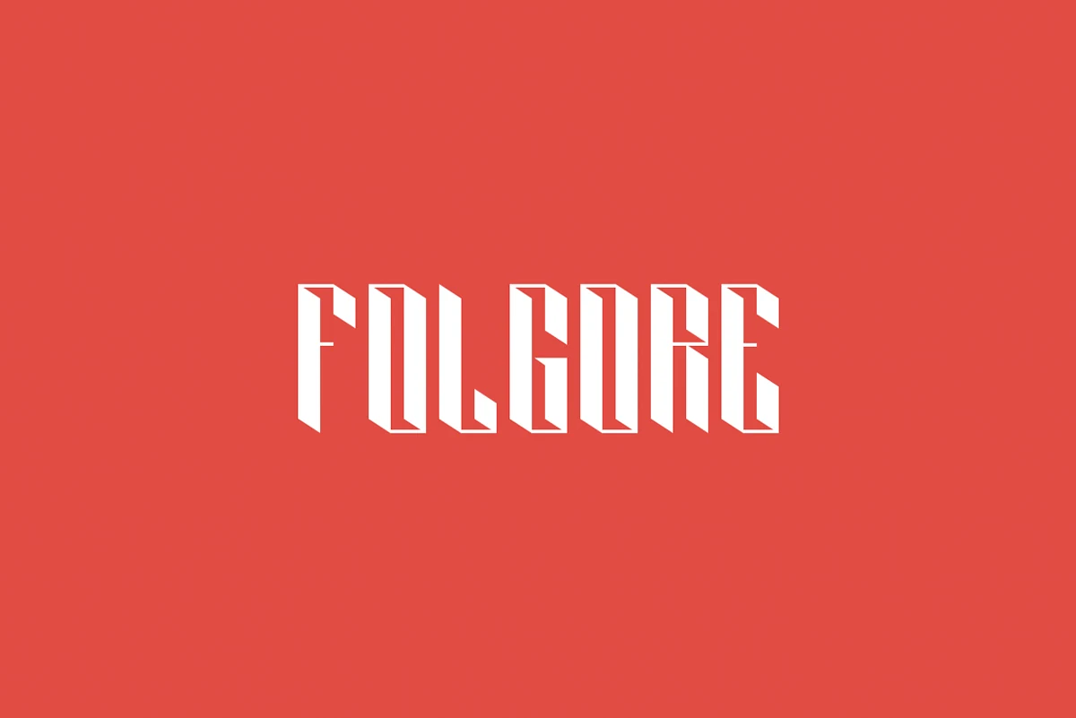
Folgore Font has a narrow, angular display structure with sharp vertical cuts and folded 3D facets built into the strokes. The letterforms carry a gothic edge, but the abstract geometry keeps the result graphic and experimental rather than traditional.
It fits Playful Display Fonts when the design needs tension, depth, and a strong emblem-like wordmark. Keep it to short names or compact titles; the carved shapes need enough scale to stay clear, and tight spacing helps preserve the faceted rhythm.
Quirky Decorative Playful Display Fonts
This category covers oddball, hand-drawn, and serif-led display styles that suit expressive packaging, editorial graphics, stickers, and custom brand marks.
Coldzz Font
Best For: posters, headlines, stickers, fun designs
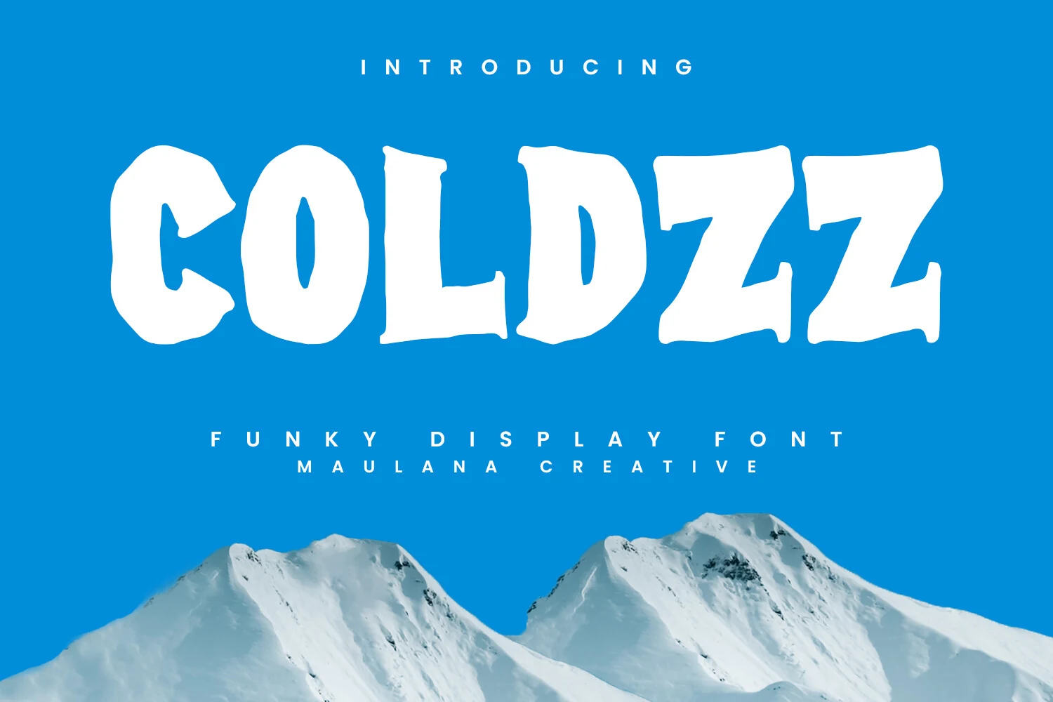
Coldzz Font has thick, uneven letterforms with soft dents, lumpy curves, and roughened edges that give the alphabet a frozen, hand-cut look. The counters stay simple, so the quirky silhouette remains readable even when the word shape gets wide and heavy.
Use it when Playful Display Fonts need a goofy winter tone without losing headline impact. It works best in short words, bold color contrast, and loose title hierarchy; avoid tight line stacking because the irregular tops and bottoms need space to keep their shape clear.
Gropfy Font
Best For: posters, packaging, playful designs, expressive designs
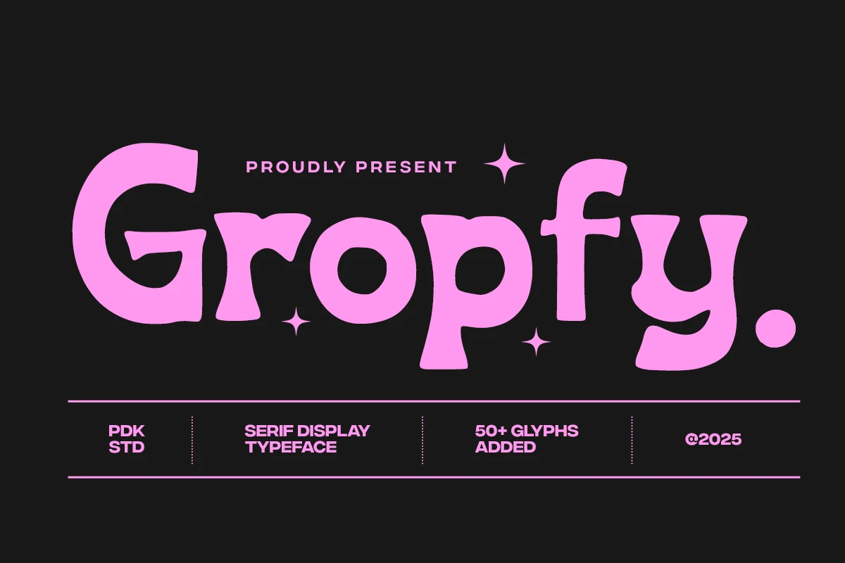
Gropfy Font has a chunky serif build with swollen curves, uneven hand-drawn edges, and rounded terminals that make the letters feel loose and cartoonish. The oversized G, soft bowl shapes, and heavy dot punctuation give it a loud display presence without making the word shape difficult to read.
Use it where Playful Display Fonts need a goofy editorial or packaging voice rather than a clean retro look. The included 50+ stylistic glyphs can help vary repeated letters in logos or poster titles, but keep spacing fairly open so the thick serifs do not crowd each other.
Chroma Font
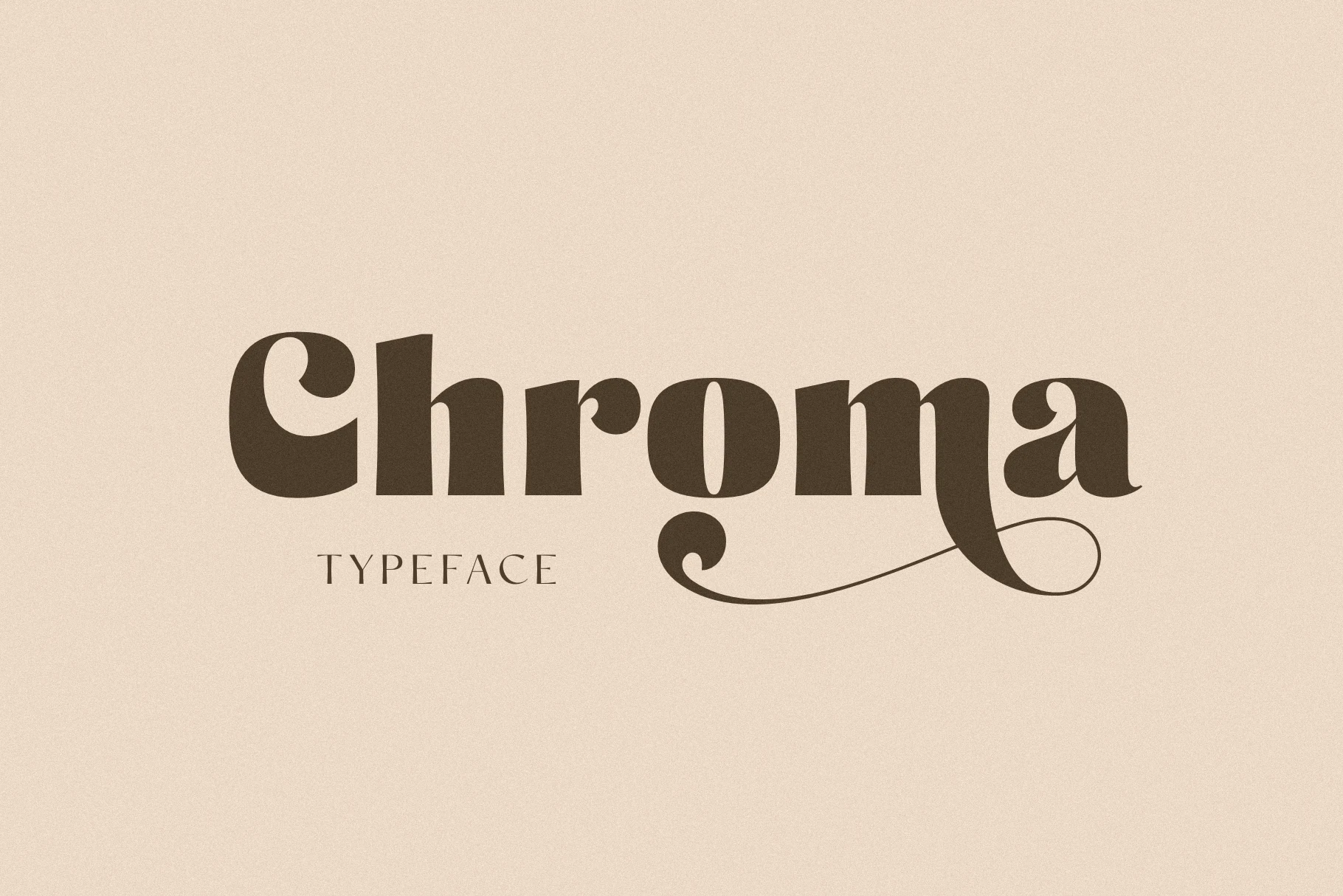
Best For: logos, packaging, headlines, decorative designs
Chroma Font uses a bold serif structure with heavy rounded bowls, soft slab-like terminals, and a long looping swash under the final letters. The contrast is moderate but the volume is high, giving it decorative display presence with old-style warmth rather than clean minimalism.
Within Playful Display Fonts, Chroma is a more polished choice for logos, headlines, packaging, or short brand marks. Its PUA-encoded glyphs and swashes help build custom word endings, but keep them selective; too many curls will pull attention away from the main title.
Conclusion
Choose chunky rounded fonts for cute, high-volume graphics, retro styles for nostalgic branding, brush fonts for motion, angular faces for tech-heavy titles, and decorative options when the wordmark needs a stranger custom voice.