21 Feminine Serif Fonts in 2026 for Stunning Designs
Looking for more serif fonts? Browse our complete Serif Fonts collection to compare luxury, elegant, modern, vintage, editorial, display, bold, feminine, and logo serif styles.
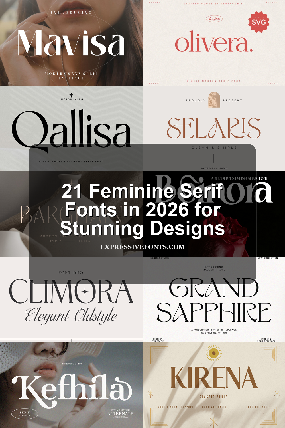
Feminine Serif Fonts give logos, beauty branding, wedding stationery, packaging, and editorial layouts a refined visual voice. This collection is built for designers who need graceful contrast, polished curves, and elegant display type for premium projects.
Elegant & Editorial Feminine Serif Fonts
These polished serif fonts use refined contrast, smooth curves, and balanced spacing for beauty brands, fashion layouts, packaging, and editorial headlines.
Beinora Font
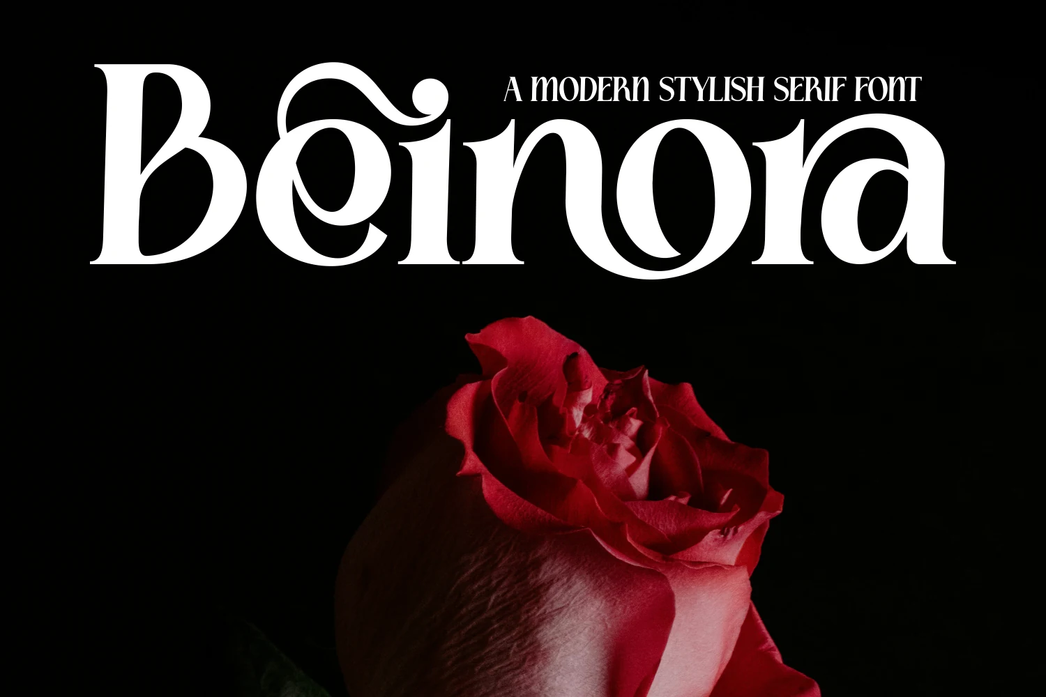
Best For: beauty branding, fashion branding, invitations, feminine designs
Beinora has the kind of high contrast that immediately reads polished: thick verticals, hairline joins, and rounded bowls that feel smooth rather than severe. A curled flourish at the top gives the capitals extra personality, while the wide lowercase shapes keep the wordmark elegant and calm.
If you are collecting Feminine Serif Fonts, this one stands out for titles that need softness without losing structure. It performs best at display size, where the thin strokes stay crisp and the contrast can breathe; pair it with simple spacing and let the decorative capital carry the hierarchy.
Selaris Font
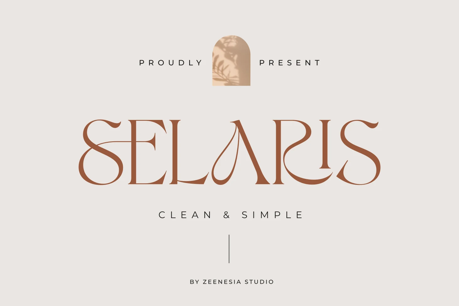
Best For: invitations, feminine designs, romantic designs, elegant designs
Selaris has a light, polished serif structure with fine hairlines, tall contrast, and graceful curves that keep it looking airy rather than stiff. The standout detail is its decorative teardrop-style flourish, which gives certain letters a romantic accent without overwhelming the overall clean rhythm.
Within Feminine Serif Fonts, this one feels especially suited to minimal layouts where the letterforms can do the work. It handles short titles best: give it moderate tracking and plenty of negative space, then pair it with a quiet sans serif so the refined terminals and sculpted curves stay crisp.
Milarose Regular Font
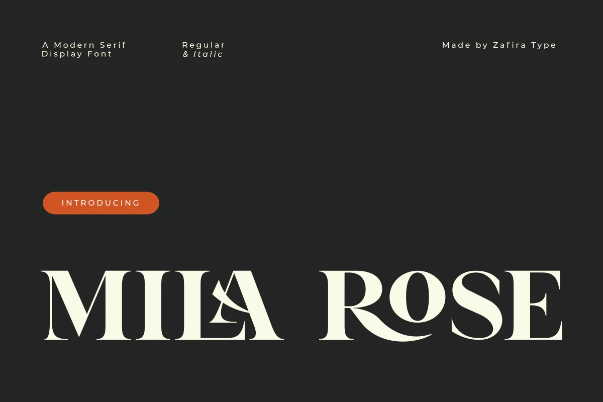
Best For: invitations, editorial designs, feminine designs, high-end designs
Milarose has a poised display rhythm built from crisp contrast, rounded bowls, and tapered serifs that feel light at the edges rather than rigid. The capitals look sculpted and spacious, while the curved cross-stroke and soft joins keep the face graceful instead of overly formal.
If you want Feminine Serif Fonts with a cleaner editorial finish, this one shines in large titles and refined branding where its thin details stay visible. Give the letterforms generous scale and moderate spacing; the wide proportions create a calm hierarchy, and simpler supporting text helps the contrast remain the focal point.
Kirena Font
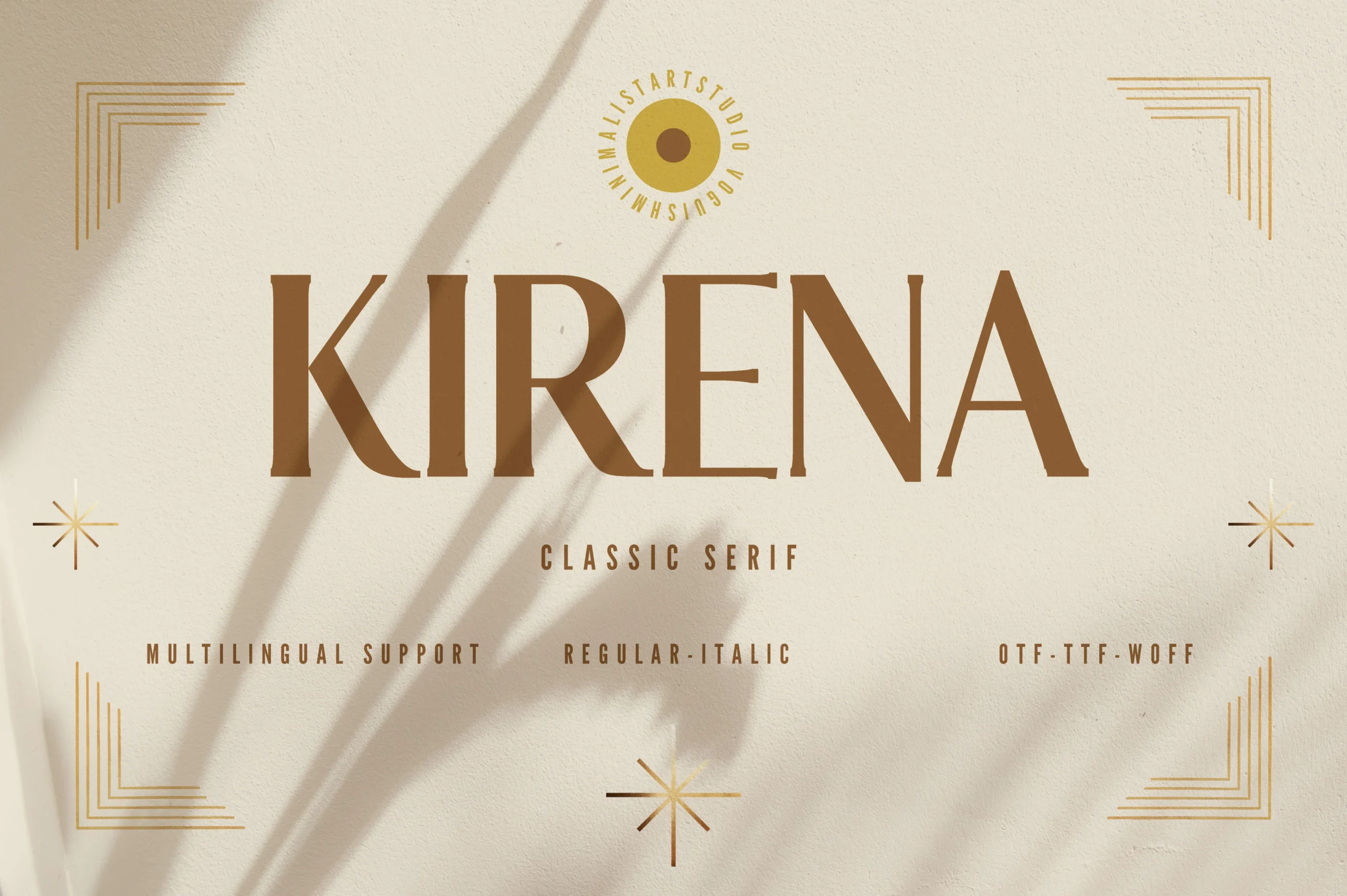
Best For: elegant designs, luxury designs, classic designs, feminine designs
Kirena keeps its elegance restrained, with tall capitals, gently tapered strokes, and smooth curves that make the word shapes feel balanced rather than ornate. The serifs are fine and clean, and the spacing reads open, giving the face a calm, classic presence well suited to polished display work.
Within Feminine Serif Fonts, Kirena works best when you let its vertical rhythm stay visible in headlines, packaging, or refined identity text. Pair it with a quiet sans and avoid crowding the tracking; the simple construction is what gives the letters their expensive, composed look.
Casser Font
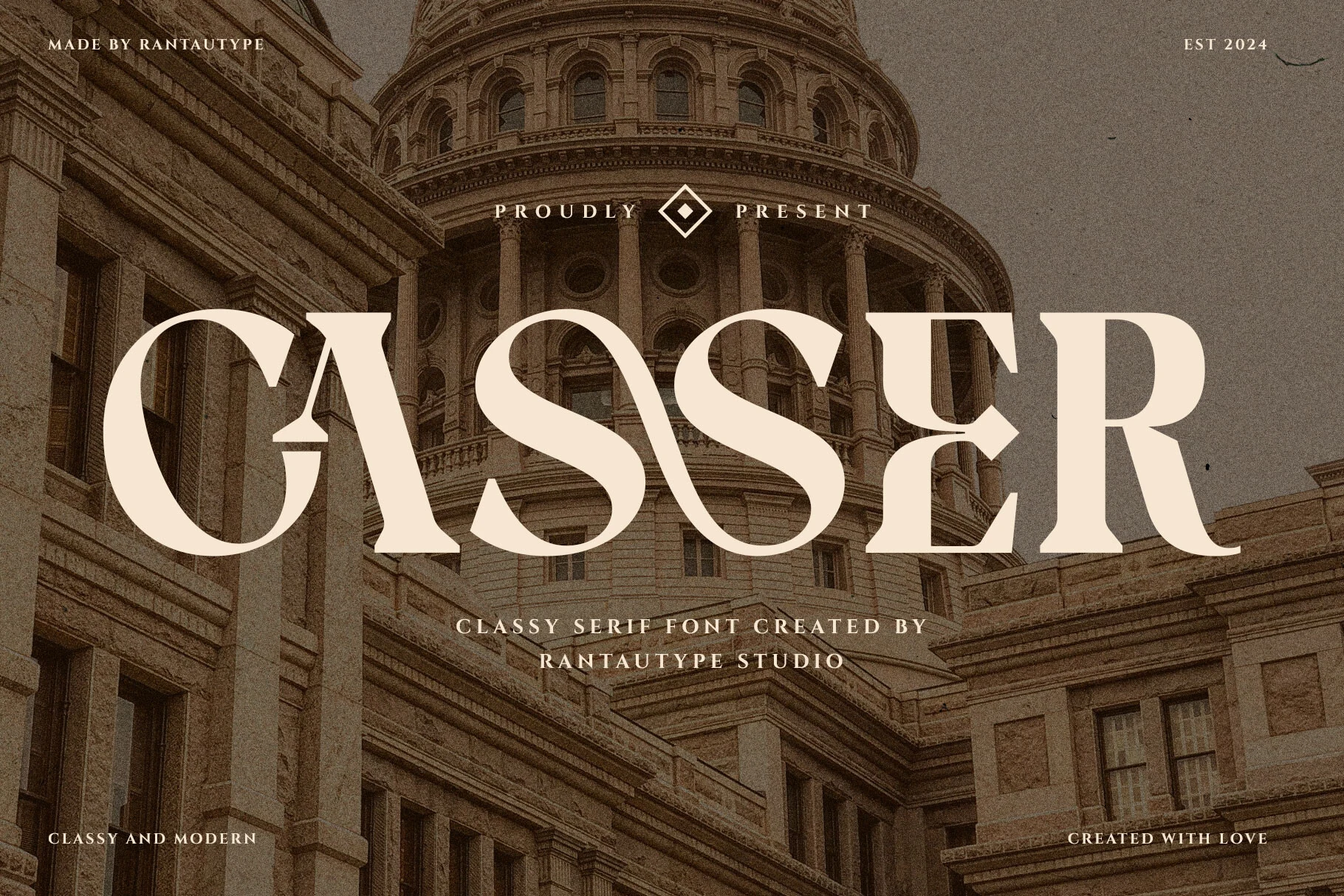
Best For: logos, editorial designs, luxury designs, feminine designs
Casser has a confident display presence built on high contrast, sweeping curves, and sharp serif endings. The broad S shapes, sculpted C, and refined leg on the R give it a polished rhythm that feels classic at first glance, yet still clean and current in the overall silhouette.
As Feminine Serif Fonts go, this one is strongest when used big enough for the thin details and elegant curves to stay visible. It suits short headlines, identity work, and refined covers especially well; keep supporting text simple so the wide letterforms and graceful contrast set the hierarchy.
Serefine Font
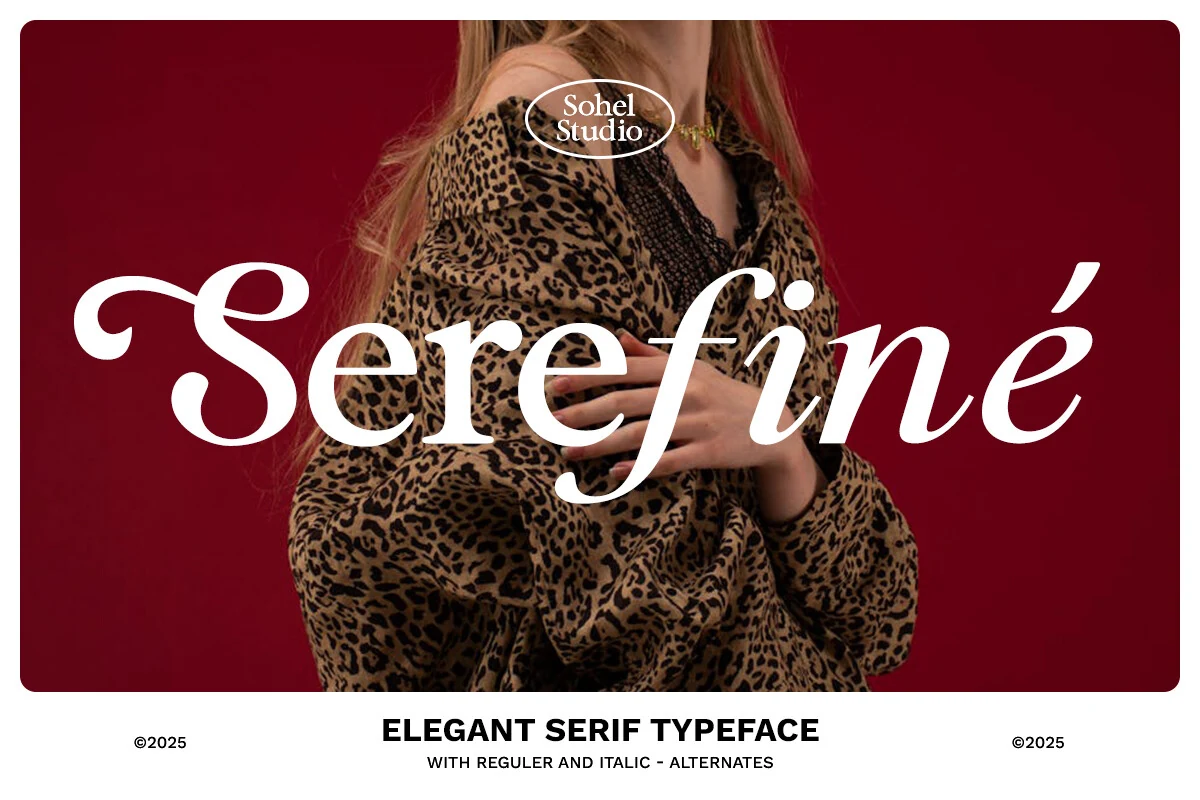
Best For: invitations, packaging, beauty branding, feminine designs
Serefine has a crisp high-contrast build with smooth bowls, fine hairlines, and an italic slant that gives the wordmark a polished sweep. The generous serif terminals and rounded counters keep it elegant, while the dramatic contrast adds enough edge to make short titles feel fashion-led rather than overly delicate.
Among Feminine Serif Fonts, this one works especially well when you want softness with a stronger editorial silhouette. Use it at display size so the thin strokes stay sharp, and let the italic forms lead the hierarchy in names or quotes while simpler supporting text keeps the composition balanced.
Zacorsea Font
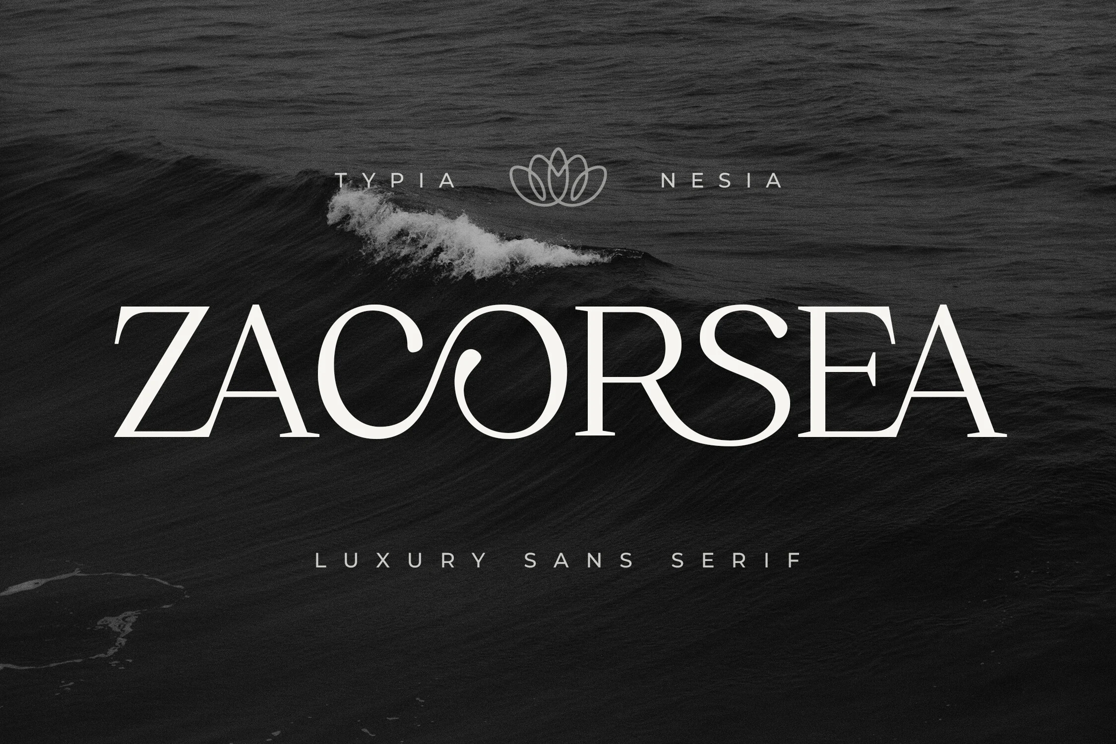
Best For: beauty branding, fashion branding, wedding designs, luxury designs
Zacorsea balances crisp contrast with soft, elongated curves, giving the capitals a polished, high-end rhythm. The flowing ligature treatment through the middle letters adds movement without breaking the clean structure, so the wordmark feels refined rather than ornate.
For Feminine Serif Fonts aimed at luxury branding, Zacorsea works best in spacious titles where its thin joins and wide proportions can stay visible. Pair it with restrained supporting text and a little extra tracking; that keeps the graceful curves clear on packaging, logos, and editorial headers.
Barghain Font
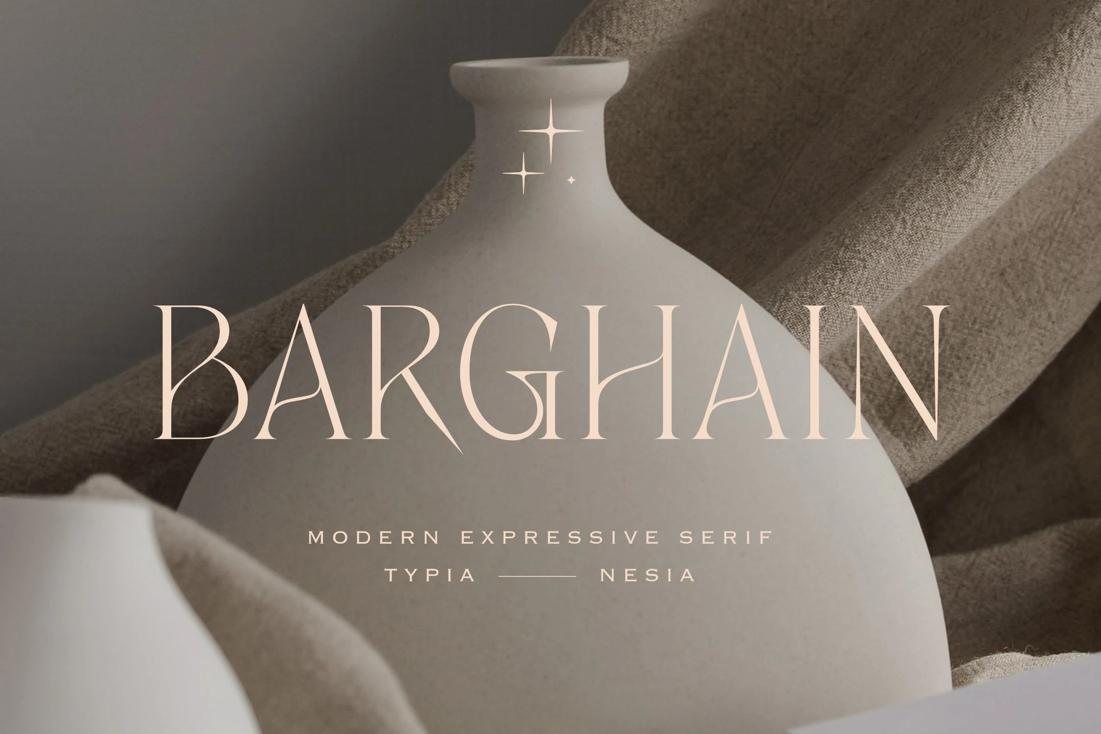
Best For: logos, beauty branding, fashion branding, feminine designs
Barghain has a refined display look shaped by tall capitals, crisp contrast, and gently tapered strokes that feel sculpted rather than stiff. The letterforms stay airy and elegant, with soft curves in the bowls and sharp interior cuts that give the wordmark a polished, expressive rhythm.
For designers comparing Feminine Serif Fonts, Barghain is strongest in logo work and short brand lines where its thin joins and wide proportions can stay clear. Keep spacing measured and supporting text quiet; that restraint lets the graceful contrast and clean silhouette carry the identity.
Mavisa Font
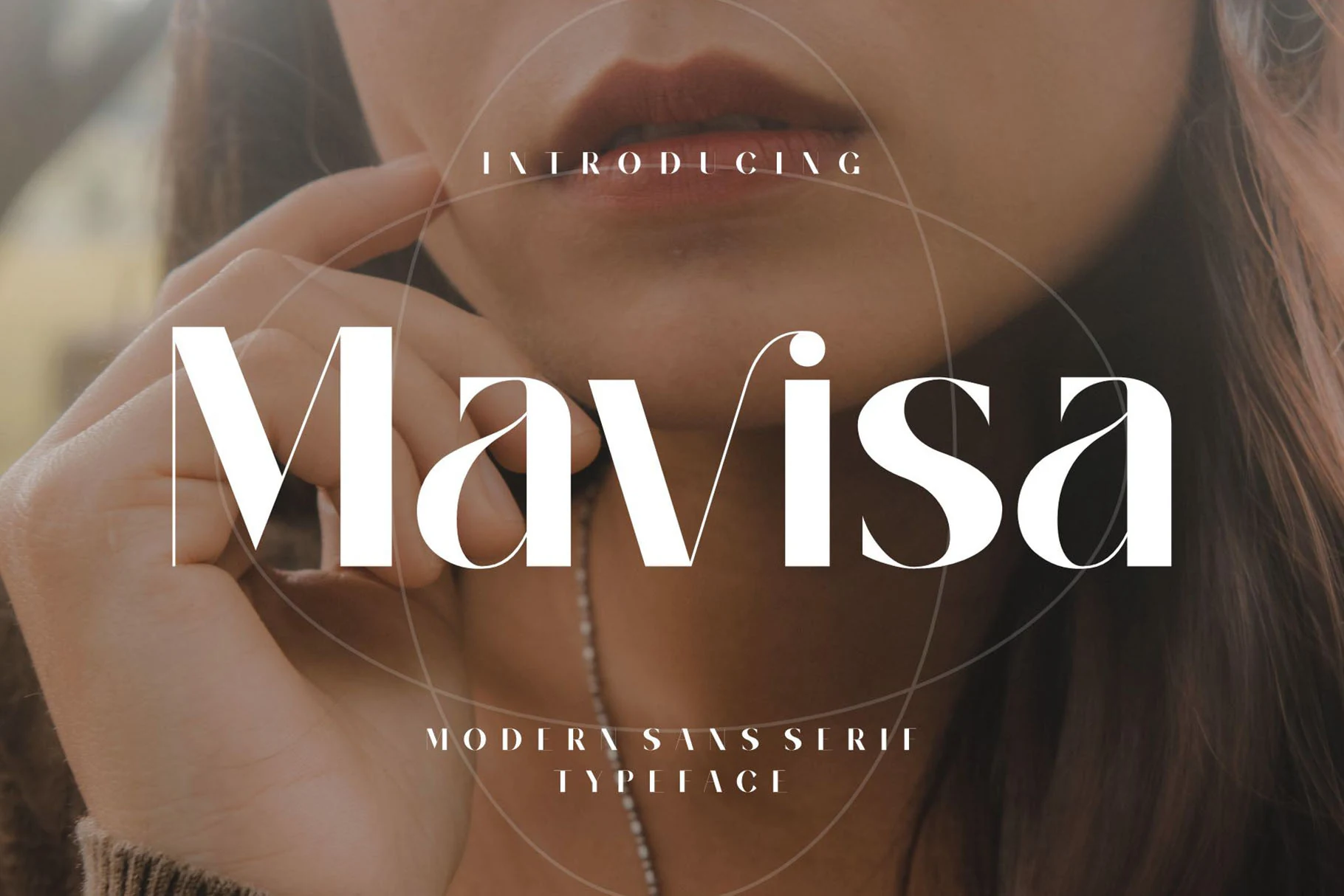
Best For: branding, editorial designs, wedding designs, feminine designs
Mavisa has a polished display feel, with broad curves, crisp contrast, and smooth joins that keep the letters graceful without looking fragile. The oversized M sets a confident tone, while the rounded bowls and tapered strokes give the wordmark a soft, fashion-forward rhythm.
If your Feminine Serif Fonts selection needs something cleaner and more modern, Mavisa works beautifully in branding, editorial layouts, and invitation titles. Use it large enough for the thin details to stay clear, then keep supporting text restrained so the curved forms and elegant proportions stay in focus.
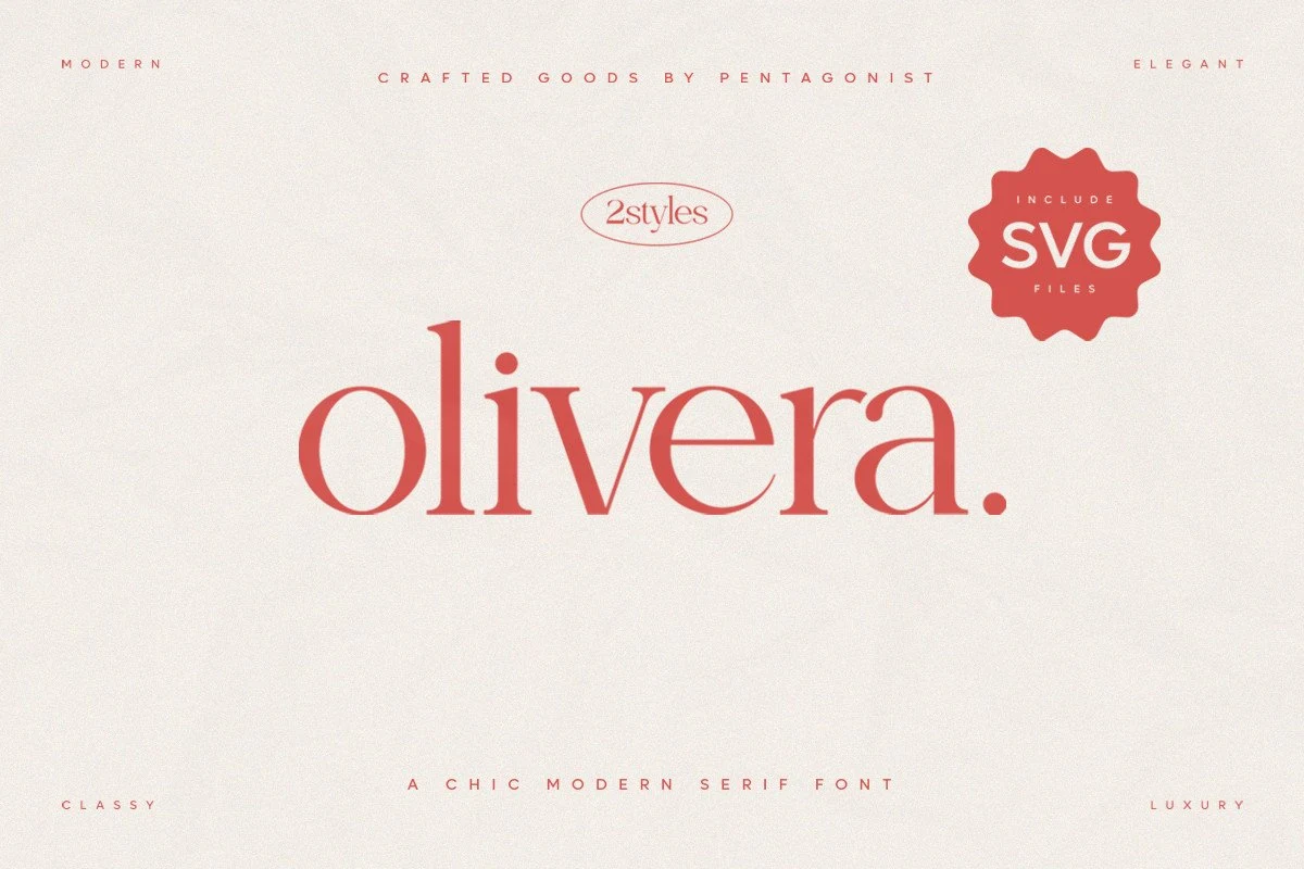
Olivera Font
Best For: logos, fashion branding, beauty branding, elegant designs
Olivera Font has a polished fashion-editorial feel, built from high-contrast strokes, soft curves, and clean lowercase forms that look graceful rather than overly ornate. The broad round bowls, delicate joins, and crisp serif finish give it a poised rhythm that feels calm, refined, and very intentional.
If you like Feminine Serif Fonts with a lighter, more modern tone, Olivera stands out in logos, packaging, and short headline treatments. It performs best when you let the thin details breathe—use generous spacing around the wordmark and pair it with a minimal secondary typeface so its elegant proportions stay sharp.
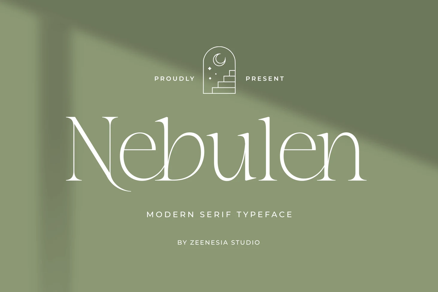
Nebulen Font
Best For: logos, invitations, beauty branding, feminine designs
Nebulen Font has a light, graceful serif structure with long verticals, fine contrast, and gently flared terminals that make the wordmark feel airy instead of rigid. The open counters and sweeping baseline details give it a soft romantic tone, while the clean construction keeps the overall look modern.
If you’re drawn to Feminine Serif Fonts with an editorial feel, Nebulen is strongest in short headlines, logos, and card fronts where its thin strokes can stay crisp. Leave a little extra space around the type and keep supporting text restrained, so the elegant proportions and delicate curves do the visual work.
Ornate & Romantic Feminine Serif Fonts
This group focuses on decorative swashes, graceful alternates, and script pairings for wedding stationery, romantic branding, invitations, and soft premium visuals.
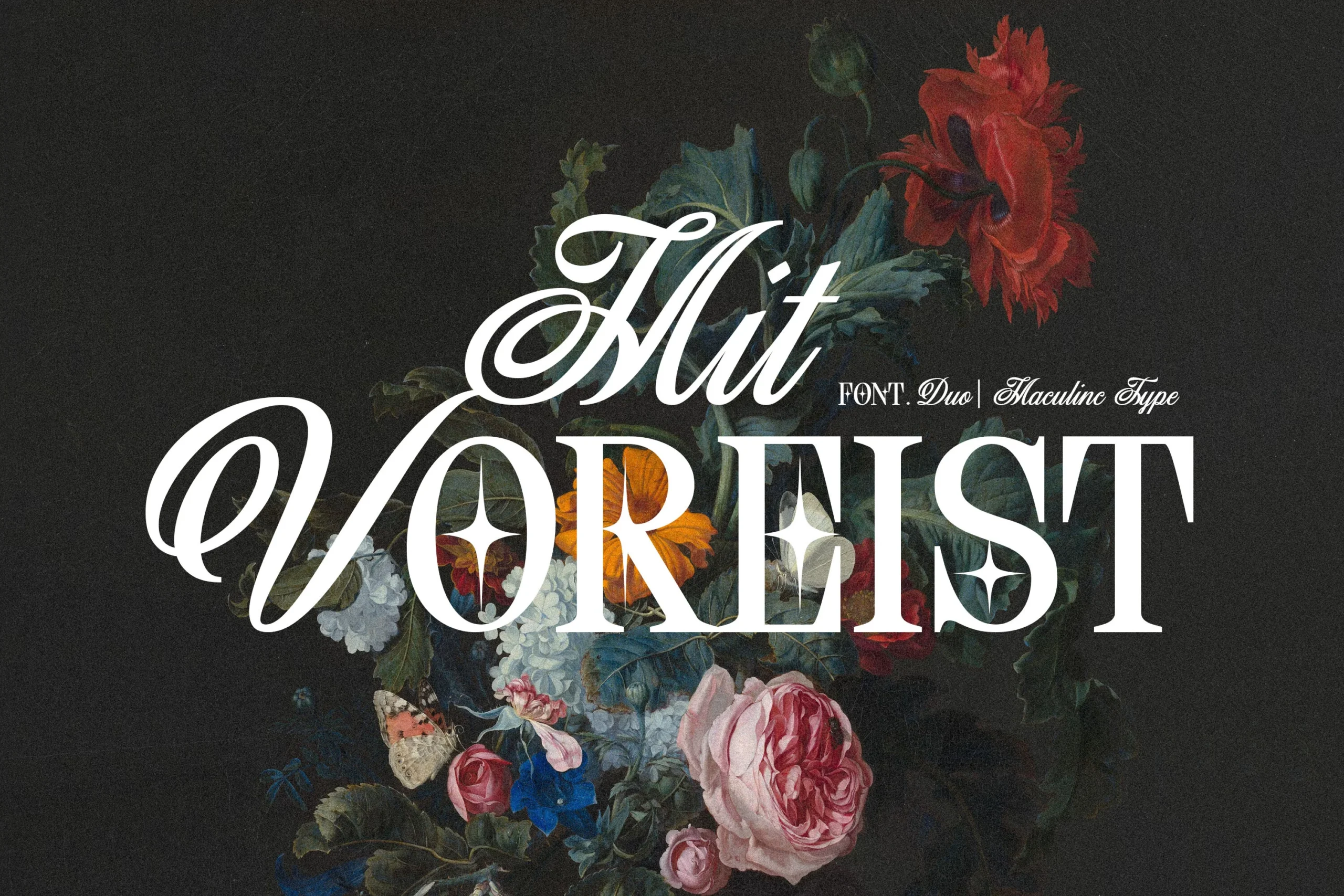
Mit Voreist Font
Best For: invitations, wedding designs, feminine designs, romantic designs
Mit Voreist combines a dramatic high-contrast serif with a sweeping script companion. The serif capitals feel formal and cut cleanly, while the script brings oversized loops, long entry strokes, and a calligraphic rhythm that makes the pair look ornamental without turning soft.
For Feminine Serif Fonts with a darker, more classic mood, it works best when the script leads the title and the serif carries the supporting word. Keep spacing generous around the swashes; tight layouts will clip the V-style loops and reduce the contrast between the two voices.
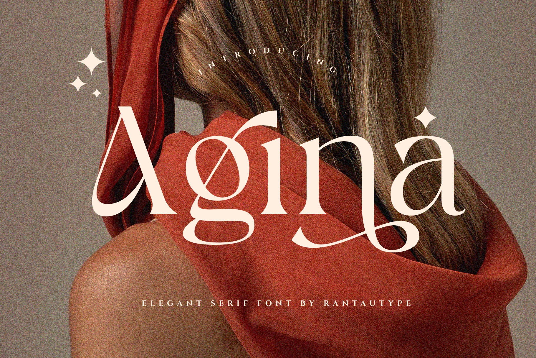
Agina Font
Best For: beauty branding, fashion branding, editorial designs, feminine designs
Agina leans into contrast and movement, with slim hairlines, full curves, and sweeping terminals that give the capitals a graceful editorial presence. The looping A, rounded g, and extended tail on the final a make the letterforms feel expressive, while the overall structure stays clean and poised.
For Feminine Serif Fonts with a polished modern mood, Agina works especially well in short headlines and brand marks where those elongated details have room to breathe. Keep tracking slightly open and use a restrained sans for secondary text so the swashes hold the hierarchy without making the layout feel crowded.
Grosia Font
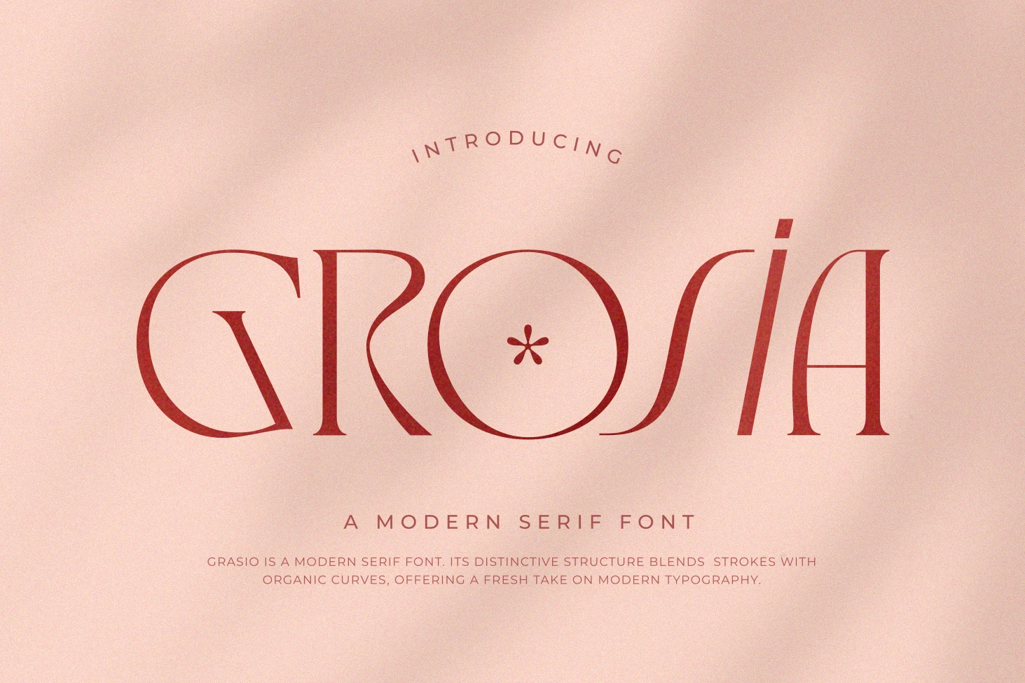
Best For: invitations, feminine designs, romantic designs, soft designs
Grosia leans into contrast and curve, with slim stems, broad bowls, and a flowing S that gives the wordmark a softer, more lyrical rhythm. The circular O and gently tapered terminals keep it modern, while the overall silhouette feels airy and decorative rather than formal.
If you are browsing Feminine Serif Fonts, Grosia stands out in short titles, invitations, and delicate branding where its elongated shapes can stay open and legible. Give it room between lines and avoid dense copy; the letterforms have enough personality to carry the hierarchy on their own.
Carien Font
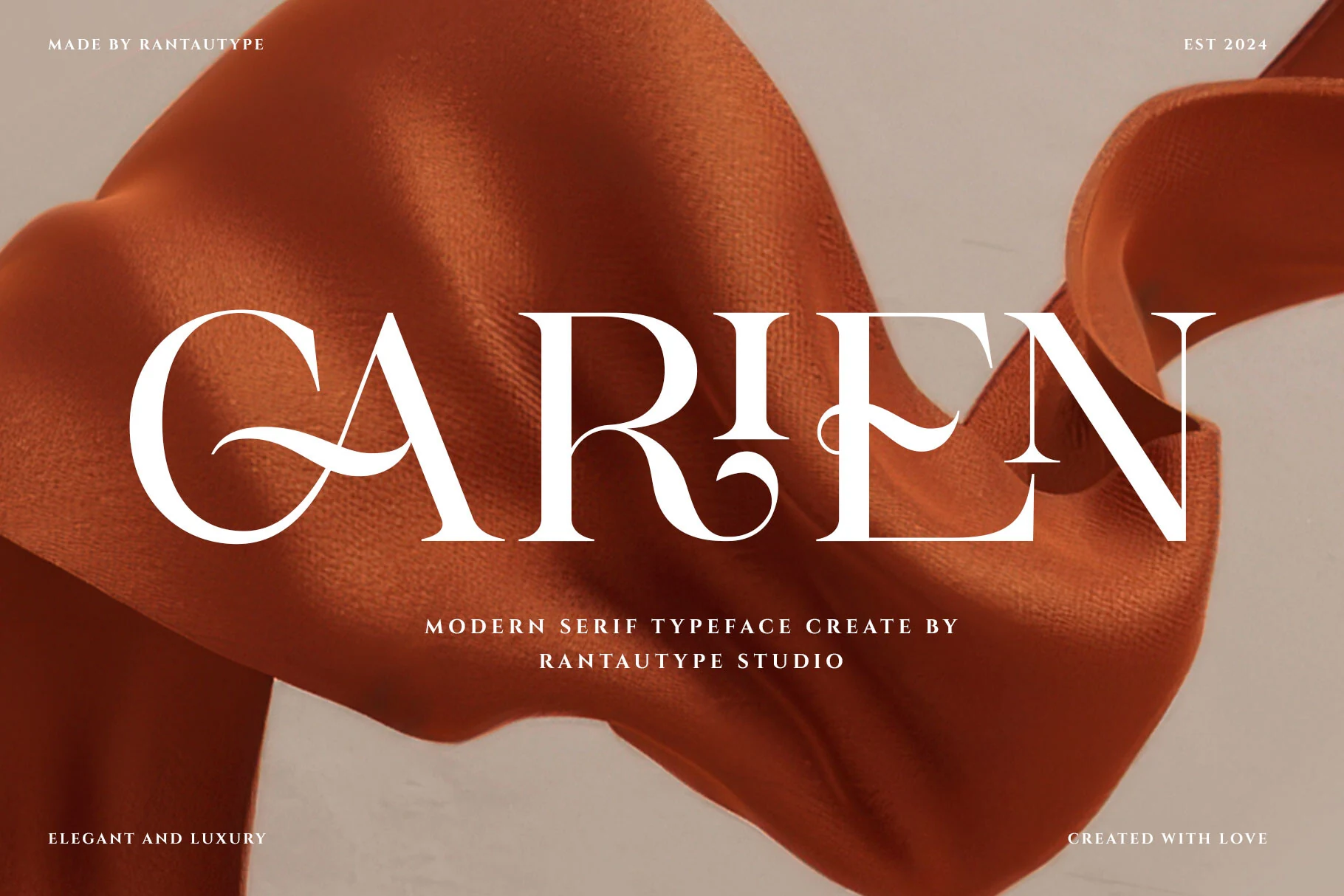
Best For: logos, feminine designs, fashion branding, invitations
Carien Font has a tall, high-contrast serif structure with carved verticals, sharp bracketed serifs, and ornamental curves that cut through the capitals. The sweeping A bar, curled R leg, and wavy E arm give the wordmark a decorative rhythm without making the letter shapes feel loose.
For Feminine Serif Fonts with a polished display tone, Carien works best in short names, mastheads, and invitation titles. Keep tracking moderate and use strong contrast around it; the flourishes need clear space so the thin strokes and sculpted curves stay readable.
Climora Duo Font
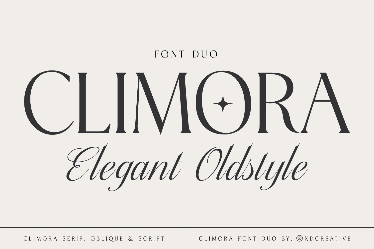
Best For: logos, invitations, wedding designs, beauty branding
Climora Duo Font pairs a poised old-style serif with a sweeping script, and that contrast is what gives it such a polished presence. The serif has tall capitals, fine hairlines, and a stately rhythm, while the script brings in fluid loops, long strokes, and a softer handwritten finish.
If you want Feminine Serif Fonts that already solve title pairing, Climora makes hierarchy easy: use the serif for names or headlines, then bring in the script for initials, taglines, or short phrases. Keep some breathing room around the script so its swashes stay graceful instead of crowding the layout.
Delmora Font
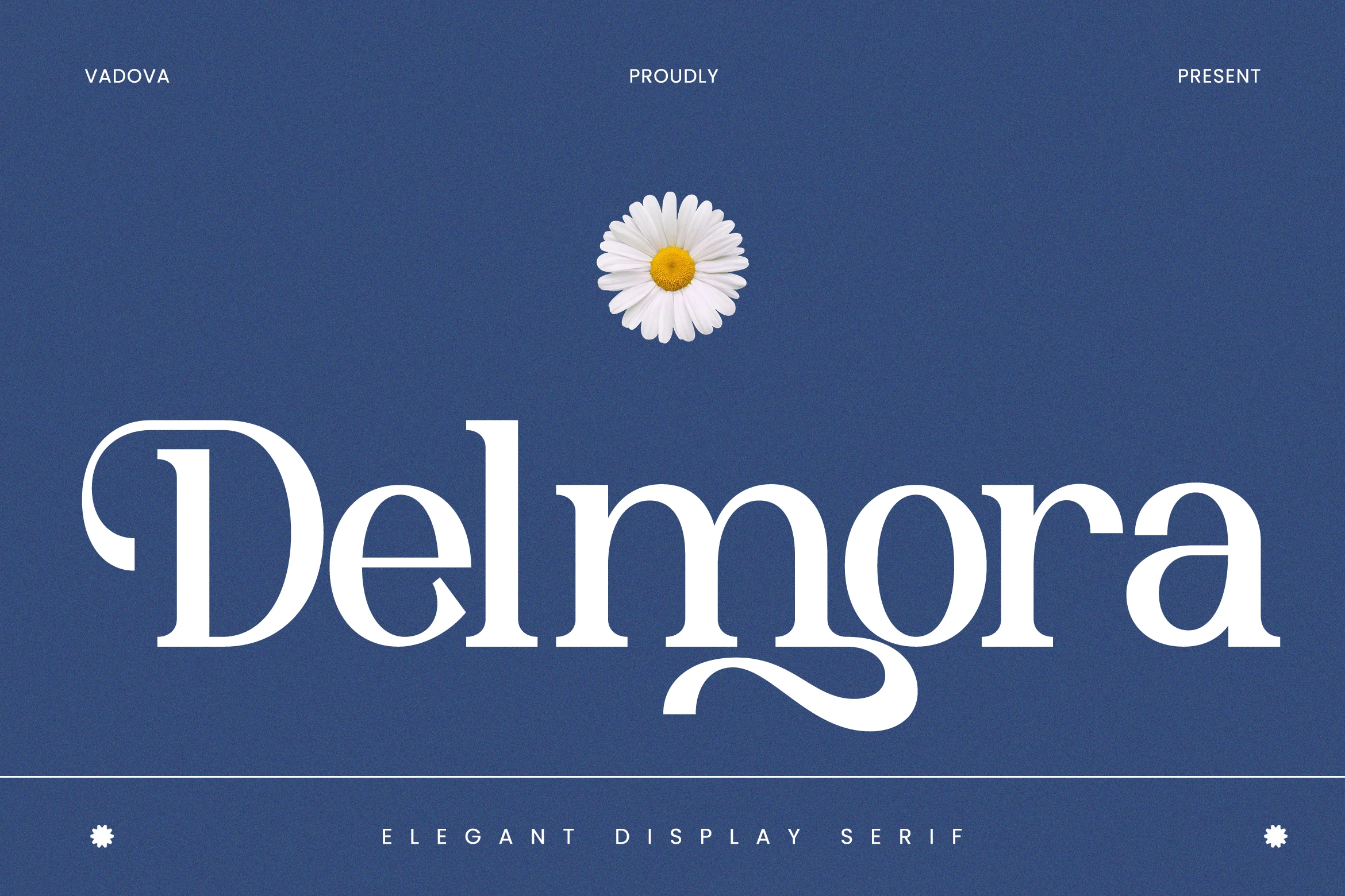
Best For: logos, packaging, invitations, fashion branding
Delmora Font has a stately display presence, with high-contrast strokes, broad rounded bowls, and crisp serifs that keep the large letterforms polished. The preview also shows a distinctive ornamental swash curling beneath the middle of the word, giving the type a softer, floral-leaning rhythm without losing its structure.
If you’re comparing Feminine Serif Fonts for premium branding, Delmora works best in short wordmarks, invitations, and packaging where its stylish alternates can shape a more custom headline. Keep the surrounding layout quiet and avoid tight spacing, so the swash detail and thin joins stay clear at display size.
Grand Sapphire Font
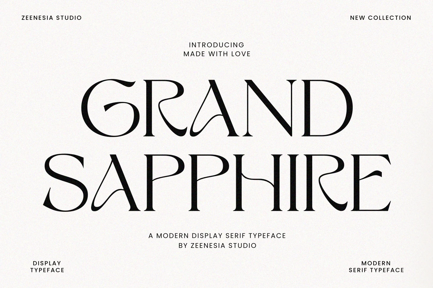
Best For: logos, invitations, wedding designs, editorial designs
Grand Sapphire Font balances crisp high-contrast serifs with graceful alternate strokes that slip into letters like A and H, giving the preview a romantic couture feel. The ornamental details add movement, but the counters stay open and the structure feels composed, so the design still reads clearly at a glance.
Among Feminine Serif Fonts, this one works especially well when you want elegance without sacrificing readability. Use the regular style for longer headings or short text, then bring in the alternate characters for names, covers, or invitation titles; that selective contrast keeps the layout refined instead of overly busy.
Tall & Statement Feminine Serif Fonts
These display serifs rely on height, bold proportions, or expressive letter shapes, making them useful for logos, signage, short headlines, and striking brand marks.
Boena Serif Font
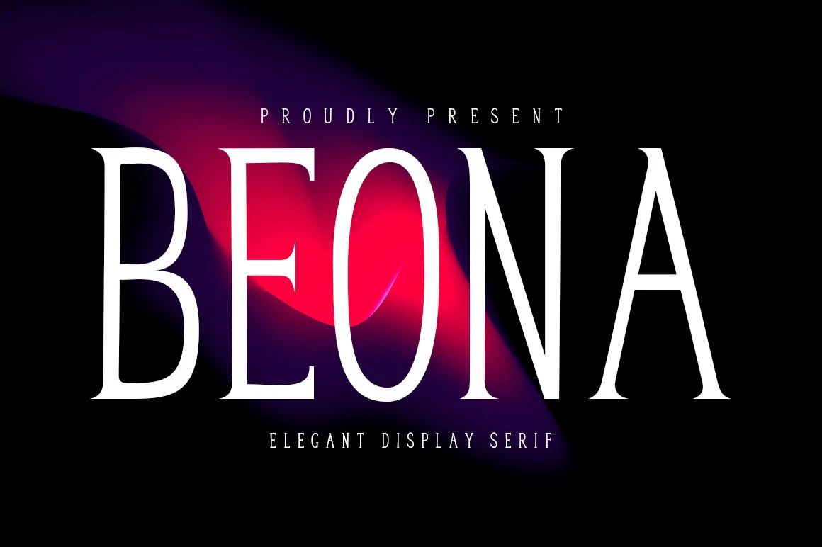
Best For: logos, branding, wedding designs, feminine designs
Boena has a tall display presence built from slim verticals, fine serifs, and crisp contrast that keeps the uppercase forms sleek rather than ornate. The narrow proportions create a polished fashion tone, while the clean counters help the wordmark stay clear and striking at large scale.
If you are collecting Feminine Serif Fonts, Boena works especially well for logos, wedding stationery, and short headline treatments. Keep the layout minimal and let the height of the letters do the work; its condensed silhouette sets hierarchy quickly, so a simple sans companion is enough for supporting text.
Qallisa Font
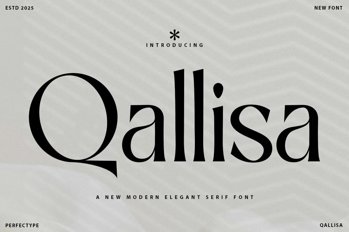
Best For: logos, headlines, signage, fashion branding
Qallisa has a sharp, polished display look built around high contrast, tall verticals, and a dramatic oversized Q that immediately sets the tone. The rounded bowl, narrow joins, and clean serif endings give the letters a formal rhythm, while the soft curves keep the wordmark from feeling severe.
For a roundup of Feminine Serif Fonts, Qallisa works best in short headlines, logos, and signage where its long Q tail and towering double l can stay clear. Keep line breaks simple and give it generous horizontal space; the letter proportions do most of the styling without needing busy supporting type.
Kefhila Font
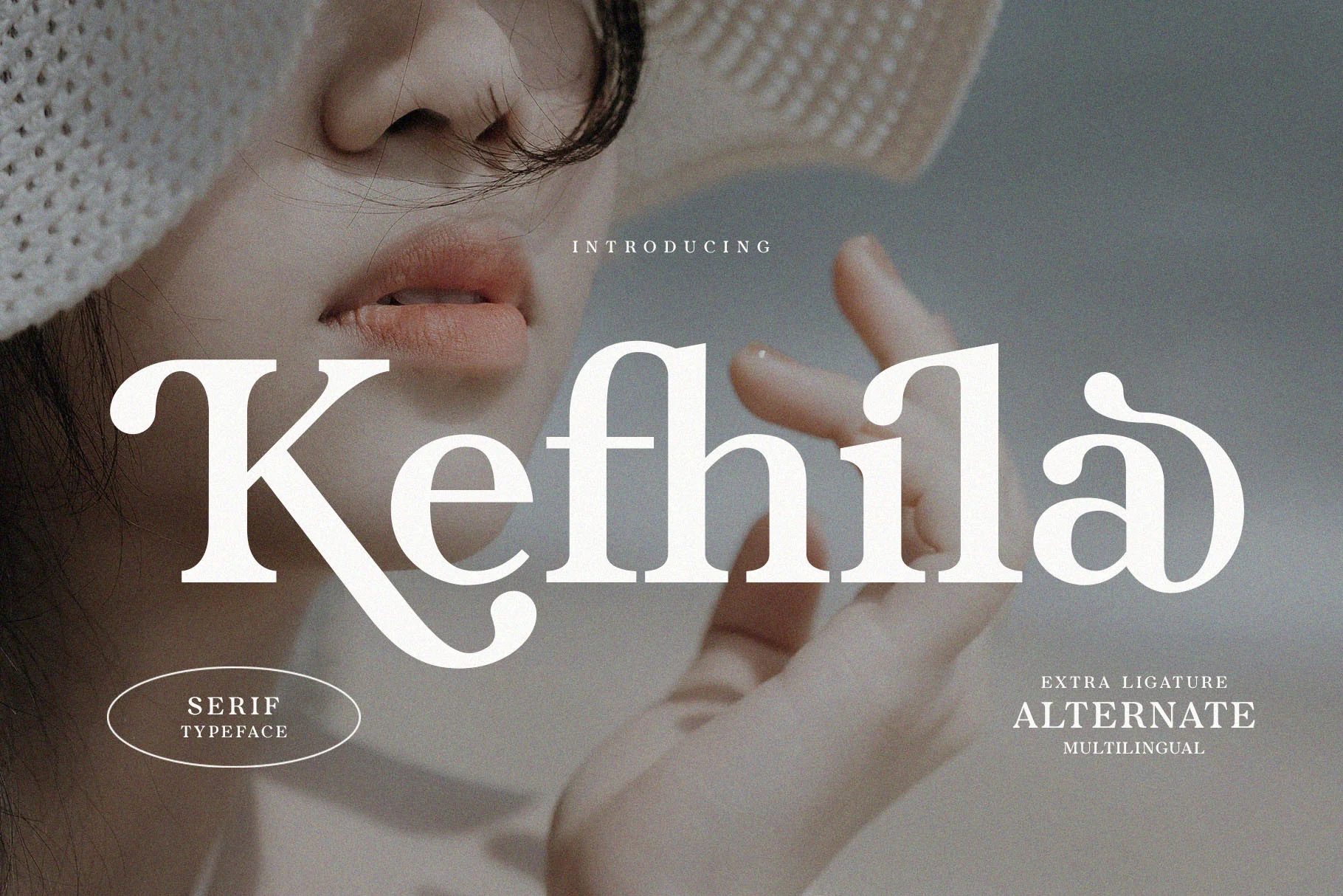
Best For: branding, editorial designs, feminine designs, expressive designs
Kefhila has a soft display rhythm shaped by organic curves, angled cuts, and broad counters that keep the wordmark expressive without losing control. The oversized K, narrow crossbars, and rounded terminals give it an indie character, while the overall structure still feels polished and balanced.
For Feminine Serif Fonts with more personality, Kefhila works especially well in branding and editorial settings where those unusual joins can stay visible. Use it for short titles or identity text, and pair it with a quieter companion face so the curved-and-angled letterforms stay crisp instead of crowded.
Conclusion
Choose elegant editorial serifs for polished brand systems, ornate romantic styles for invitations and beauty work, and tall statement serifs when the layout needs stronger logo or headline impact.