26 Best Cute Handwritten Fonts for Playful Designs in 2026
Cute Handwritten Fonts are useful for designers who need friendly lettering for stickers, kids’ graphics, packaging, invitations, classroom printables, and social posts. This collection focuses on playful handwritten styles with rounded shapes, soft scripts, chunky display forms, and casual lettering that can make short titles feel warm, cheerful, and easy to read.
Looking for more handwritten fonts? Browse our complete Handwritten Fonts collection to compare modern, cute, casual, bold, brush, signature, script, wedding, Cricut, and logo-friendly handwritten styles.
Bold & Rounded Cute Handwritten Fonts
These fonts use thick strokes, soft corners, and chunky handmade shapes, making them useful for stickers, kids’ designs, product labels, playful posters, and bold social graphics.
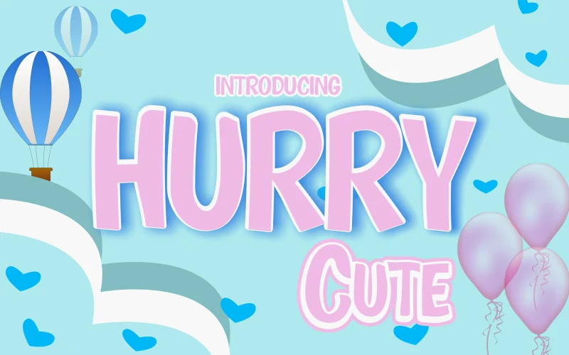
Hurry Cute Font
Best For: children’s designs, stickers, T-shirts, social media graphics
Hurry Cute Font uses thick, rounded handwritten letters with soft corners, loose upright shapes, and a bouncy rhythm that keeps the wordmark friendly without becoming messy. The broad strokes and open counters make it readable at display sizes, while the uneven letter widths give Cute Handwritten Fonts a casual, crafted feel.
Its strongest use is in short titles where the chunky forms can carry the hierarchy on their own. Keep line spacing generous and avoid dense paragraphs; the font works better as a headline, sticker phrase, kids’ apparel mark, or social post accent where contrast and scale can protect its playful shape.
Cute Monster Font
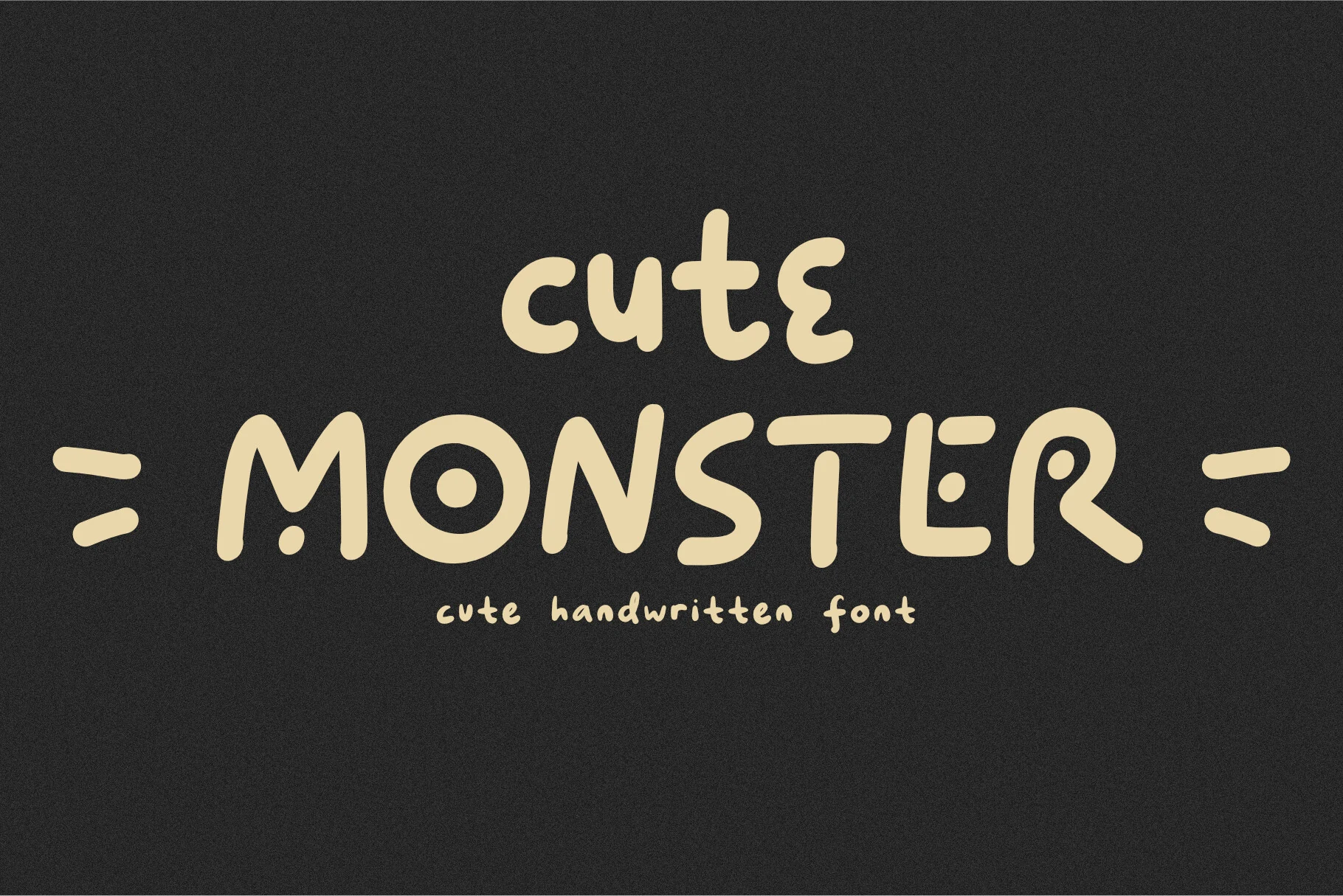
Best For: children’s designs, invitations, playful designs, cute designs
Cute Monster Font has chunky, rounded letterforms with a hand-drawn wobble that keeps the design cheerful rather than stiff. The circular counters, soft terminals, and quirky proportions give Cute Handwritten Fonts a friendly voice, while the thick strokes help short words stay clear and bold.
It works best when you let the playful shapes lead the composition. Use it in short titles, party pieces, or kid-focused branding, and give the letters a little space so details like the long T bar and offbeat curves don’t crowd each other.
Cute Bunny Font
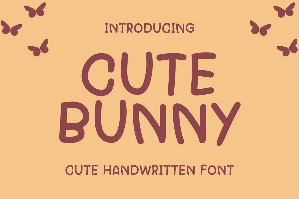
Best For: children’s designs, invitations, stickers, cute designs
Cute Bunny Font has tall rounded letters with a soft handwritten wobble, giving each character a slightly uneven but controlled shape. The thick strokes, open spacing, and blunt terminals make Cute Handwritten Fonts feel gentle and readable rather than overly decorative.
The font suits short, cheerful wording where the letters can stay large and airy. Keep the composition simple, with enough tracking to protect the curved U, N, and Y shapes, especially in party invitations, kid-focused labels, stickers, or playful title graphics.
Lucky Farmer Font
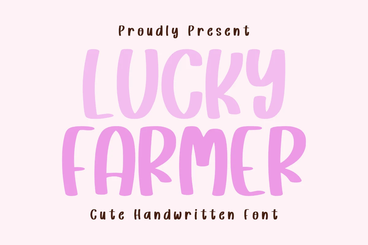
Best For: children’s designs, invitations, stickers, cute designs
Lucky Farmer Font has tall rounded letters, soft edges, and slightly uneven stroke widths that make the words feel warm and approachable. The simplified forms and gentle curves give Cute Handwritten Fonts a cheerful handmade character, while the upright rhythm keeps short headings readable and clean.
It works best in friendly display settings where the chunky stems can stay large, from kids’ pieces to greeting-style layouts and playful branding. Pair it with a quiet sans serif and add a little extra line spacing, since the broad shapes build a dense block of color when stacked.
Cute Devil Font
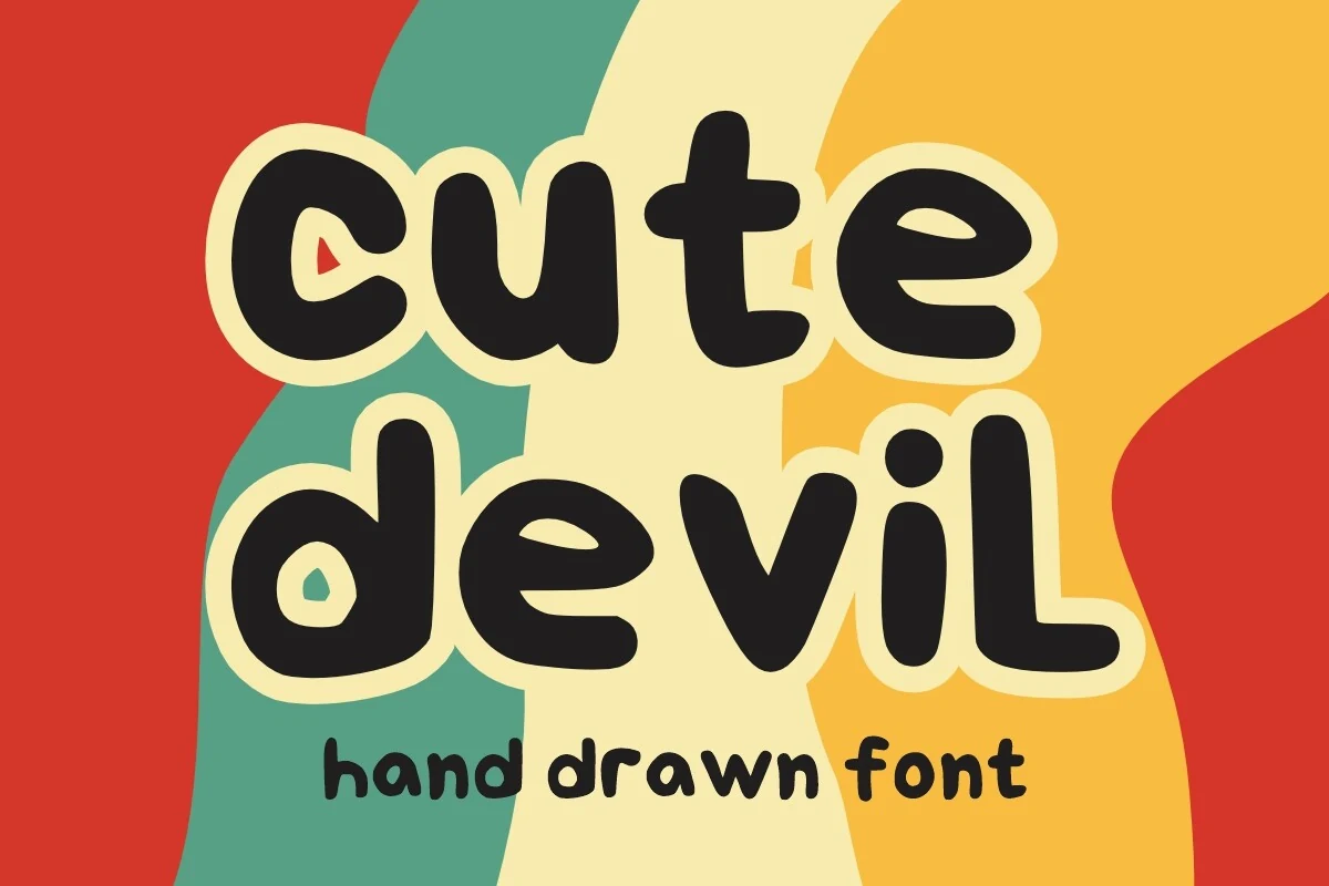
Best For: children’s designs, book covers, playful designs, cute designs
Cute Devil Font uses thick lowercase letters with rounded ends, soft blob-like curves, and irregular counters that make the words feel hand drawn without losing clarity. The heavy weight gives Cute Handwritten Fonts a bold display presence, especially when the letters are set with strong color contrast.
Its friendly shape works better for short phrases than long copy. Keep the spacing open enough for the rounded bowls and compact lowercase forms to separate cleanly, especially in children’s book covers, greeting-style graphics, craft labels, or playful digital titles.
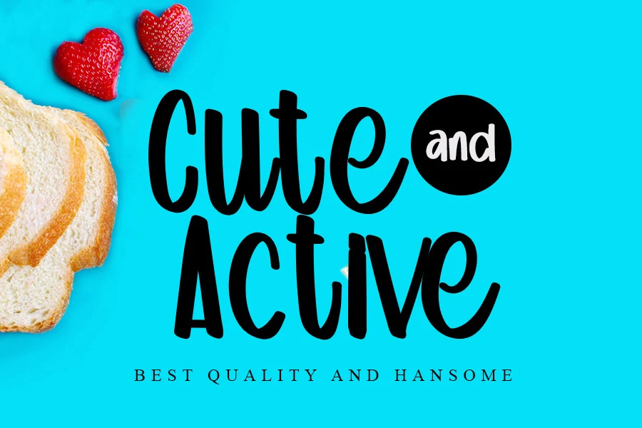
Cute and Active Font
Best For: cute designs, social media graphics, stickers, children’s designs
Cute and Active Font has the kind of bold, rounded lettering that feels instantly upbeat. The tall handwritten shapes, smooth curves, and thick monoline strokes give it a clean voice, while the slightly narrow proportions keep words compact and easy to read. It fits naturally into Cute Handwritten Fonts that need warmth without losing impact.
This style works especially well for short titles, playful labels, and cheerful branding where you want the wording to do the visual heavy lifting. Because the strokes are dense and dark, it benefits from generous spacing around the text; adding a small serif or simple all-caps subline underneath creates a clearer hierarchy without competing with its friendly rhythm.
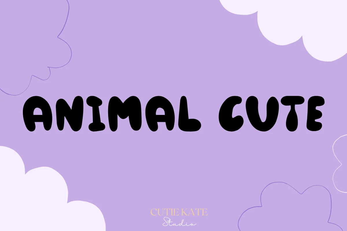
Animal Cute Font
Best For: cute designs, stickers, headlines, children’s designs
Animal Cute Font uses thick rounded letterforms with soft corners, stubby terminals, and a slightly uneven hand-drawn rhythm. It sits on the playful side of Cute Handwritten Fonts, with chunky uppercase shapes that feel friendly and graphic rather than delicate or formal.
The heavy weight makes it useful for short headlines, birthday wording, quote graphics, and sticker-style designs where the lettering needs to read at a glance. Keep the words brief, leave extra space around the line, and use strong contrast so the tight counters and rounded strokes stay clear.
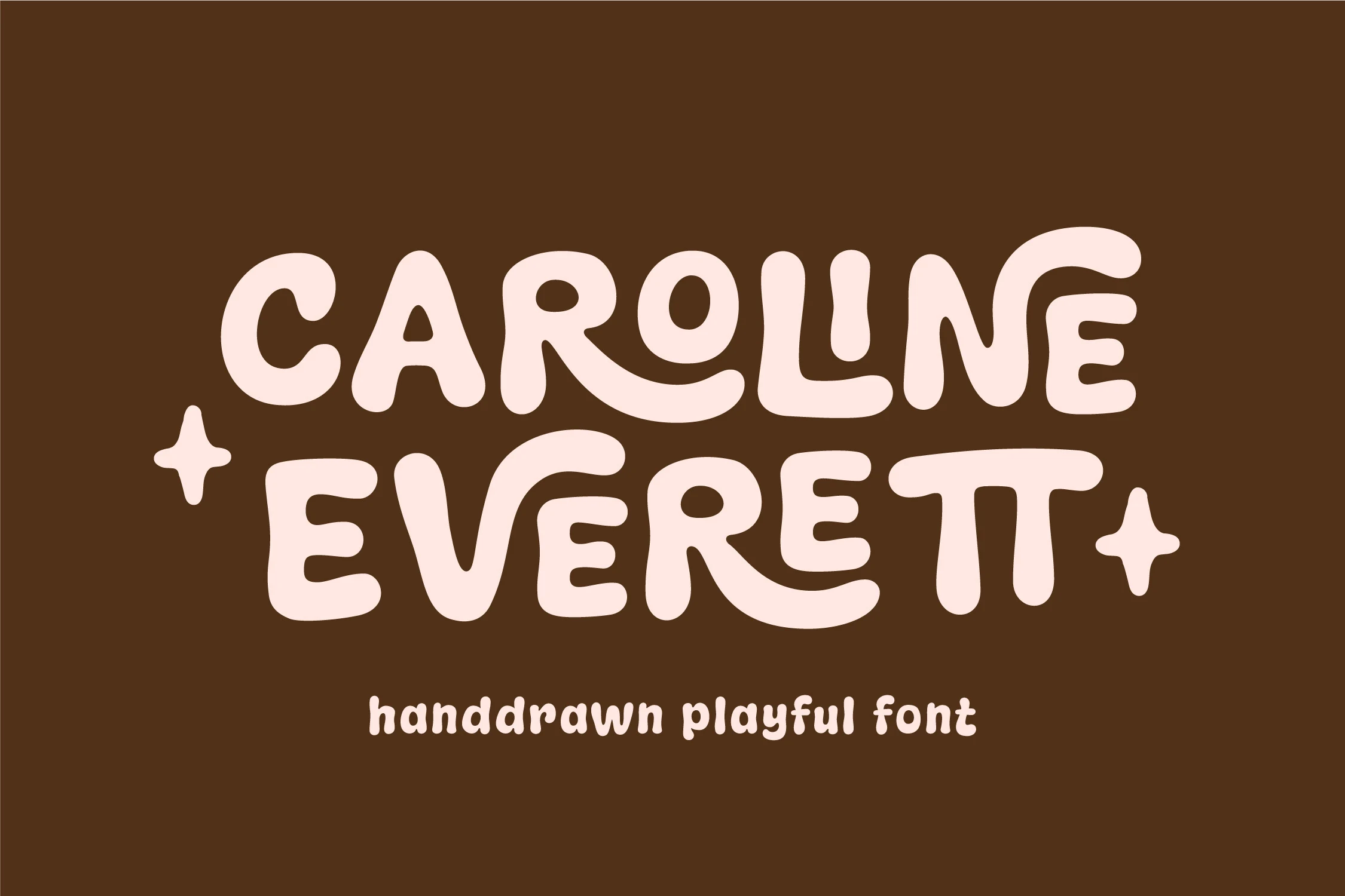
Caroline Everett Font
Best For: packaging, posters, merch design, book covers
Caroline Everett Font has a bubbly hand-drawn look with thick monoline strokes, soft corners, and wide playful curves that make each word feel bold without turning rigid. It sits comfortably within Cute Handwritten Fonts, but the heavier shapes give it more graphic punch than a delicate script.
The broad letterforms are especially useful on posters, packaging, and short title treatments where personality needs to read instantly. Because the characters are chunky and slightly irregular, keep headlines brief and let any supporting text stay clean and compact so the playful rhythm does not get crowded.
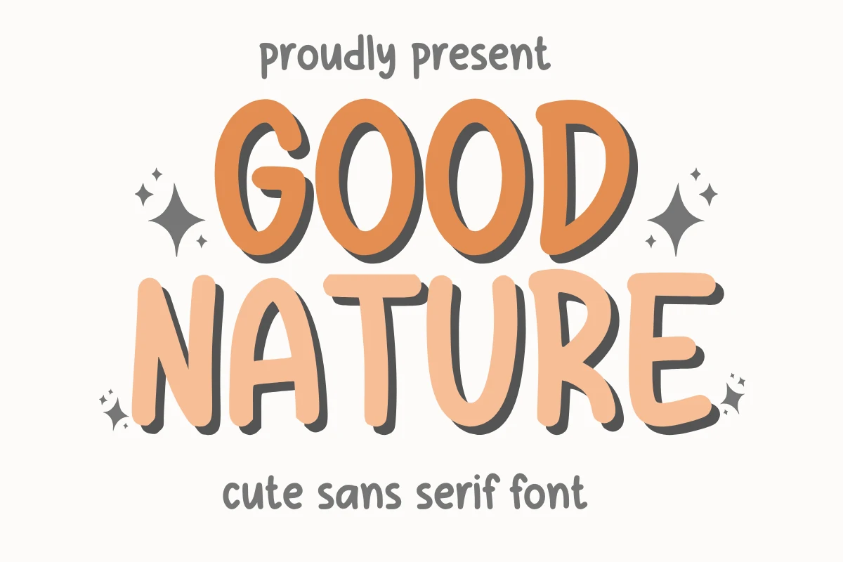
Good Nature Font
Best For: cute designs, stickers, packaging, children’s designs
Good Nature Font uses rounded uppercase shapes with thick, uneven strokes and a soft hand-cut feel. It reads like a playful handwritten sans inside Cute Handwritten Fonts, with open counters and slightly wobbly curves that keep the lettering friendly while still clear at display size.
The broad forms make it useful for short product names, sticker text, kids-focused graphics, and cheerful packaging. Keep the hierarchy simple: let the main word stay large, use strong contrast behind it, and place smaller supporting text with wider spacing so the chunky shapes do not crowd the layout.
Cute Bear Font
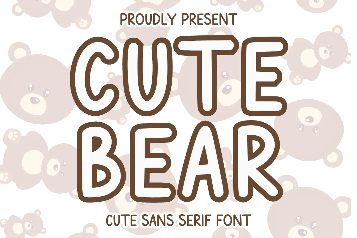
Best For: children’s designs, stickers, packaging, cute designs
Cute Bear Font has a friendly hand-drawn sans look, built from tall rounded capitals, even stroke weight, and soft corners that keep the words approachable. It fits naturally into Cute Handwritten Fonts, but the clean outline and simple structure make it read more clearly than a loose script.
The broad shapes are easy to spot at a glance, which helps on kids-focused packaging, name labels, and short display lines. Because the letters are wide and airy, it works best when you keep the wording brief and let the generous inner spaces carry the readability instead of crowding the line with too much copy.
Roster Font
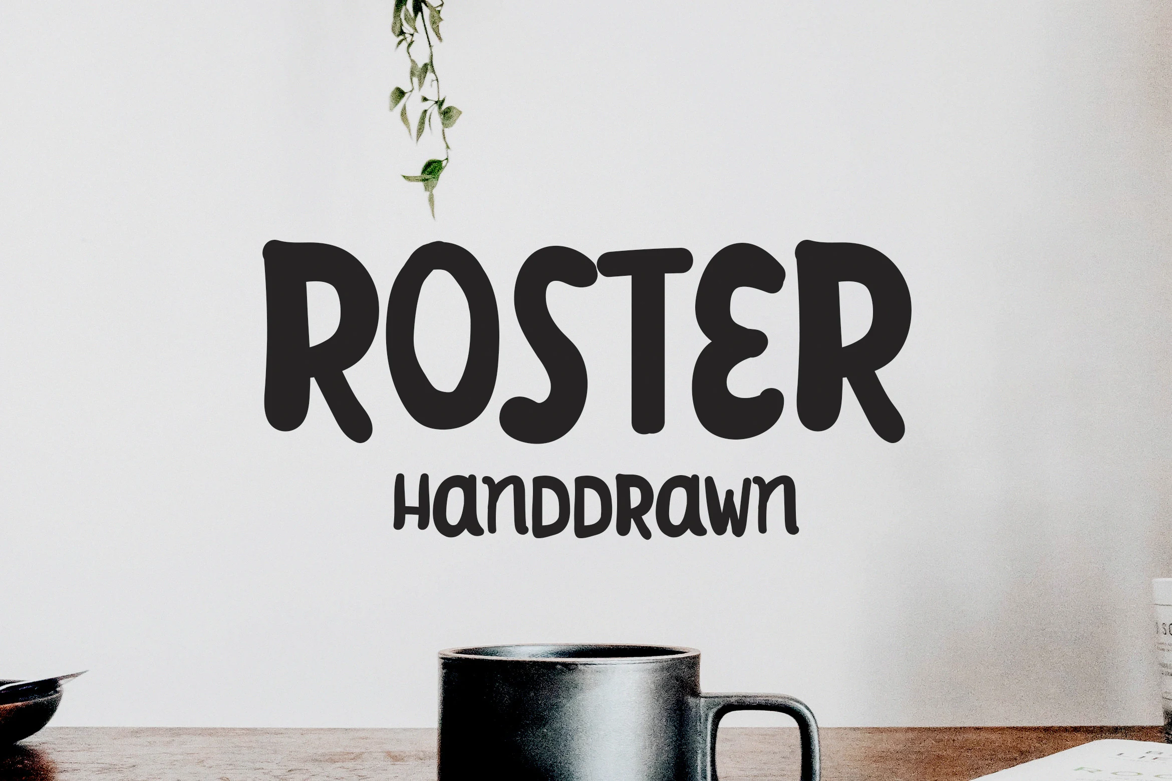
Best For: social media graphics, handmade designs, quotes, stickers
Roster Font brings a sturdy brush-cut feel to Cute Handwritten Fonts, using thick black strokes, rounded ends, and uneven handmade curves. The uppercase letters are bold but not stiff, with narrow inner spaces and a slightly compressed rhythm that gives short words a casual painted look.
It works best where the text needs to feel informal and direct: Instagram graphics, DIY-style labels, quote art, or simple sticker wording. Keep the contrast high and avoid long lines; the heavy brush weight has strong impact, but the tighter counters need enough scale and spacing to stay readable.
Cute Anne Font
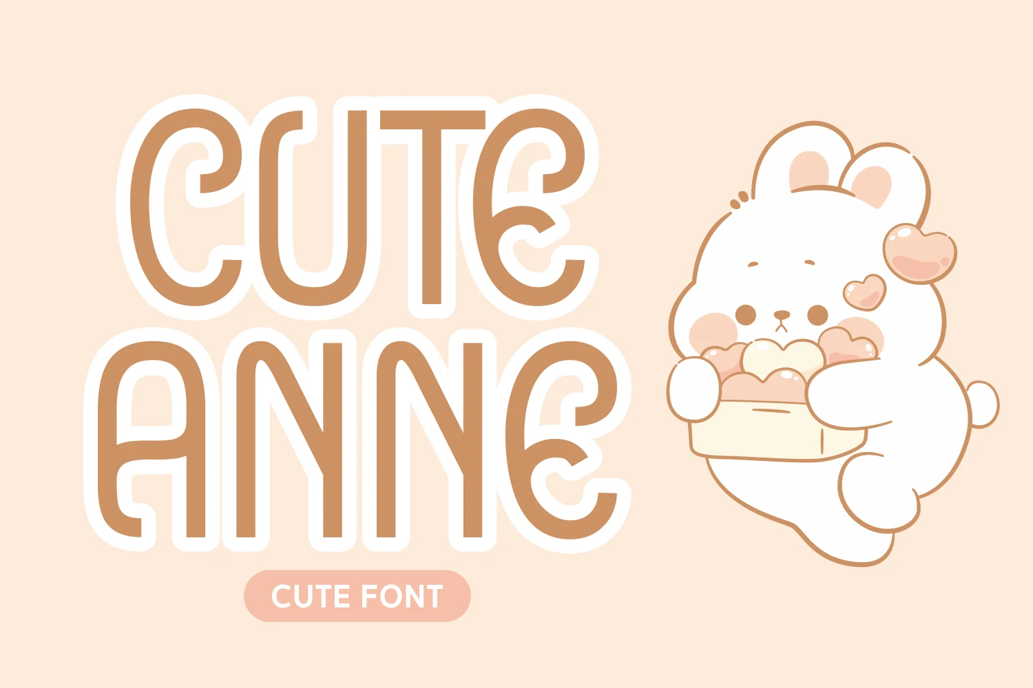
Best For: headlines, children’s designs, stickers, cute designs
Cute Anne Font has tall rounded capitals, steady stroke weight, and soft corners that give it a gentle hand-drawn feel. Within Cute Handwritten Fonts, it reads more like a playful display sans than a loose script, so the words stay clear while still feeling warm and child-friendly.
Its narrow proportions make it a strong choice for short headlines, classroom printables, and cheerful labels where you want a big friendly look without visual clutter. It performs best with simple line breaks and generous spacing around the text, especially when paired with a smaller, quieter font for supporting details.
Cute Berry Font
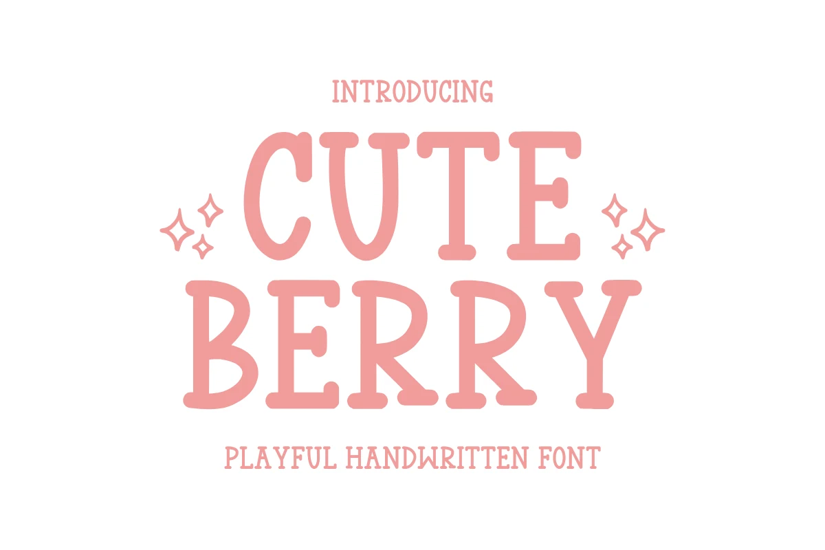
Best For: stickers, creative projects, cute designs, headlines
Cute Berry Font uses chunky slab-serif letterforms with rounded ends, soft bracketed details, and a gentle handmade wobble. It gives Cute Handwritten Fonts a more structured look than a script, while the pink, playful shapes still feel light and friendly for craft-driven layouts.
The sturdy capitals are useful for stickers, planner covers, greeting-style graphics, and short DIY headlines where the lettering needs to cut cleanly. Keep the phrase compact and use open spacing around the main word; the decorative serifs add charm, but they need clear contrast to stay crisp.
Cute Font
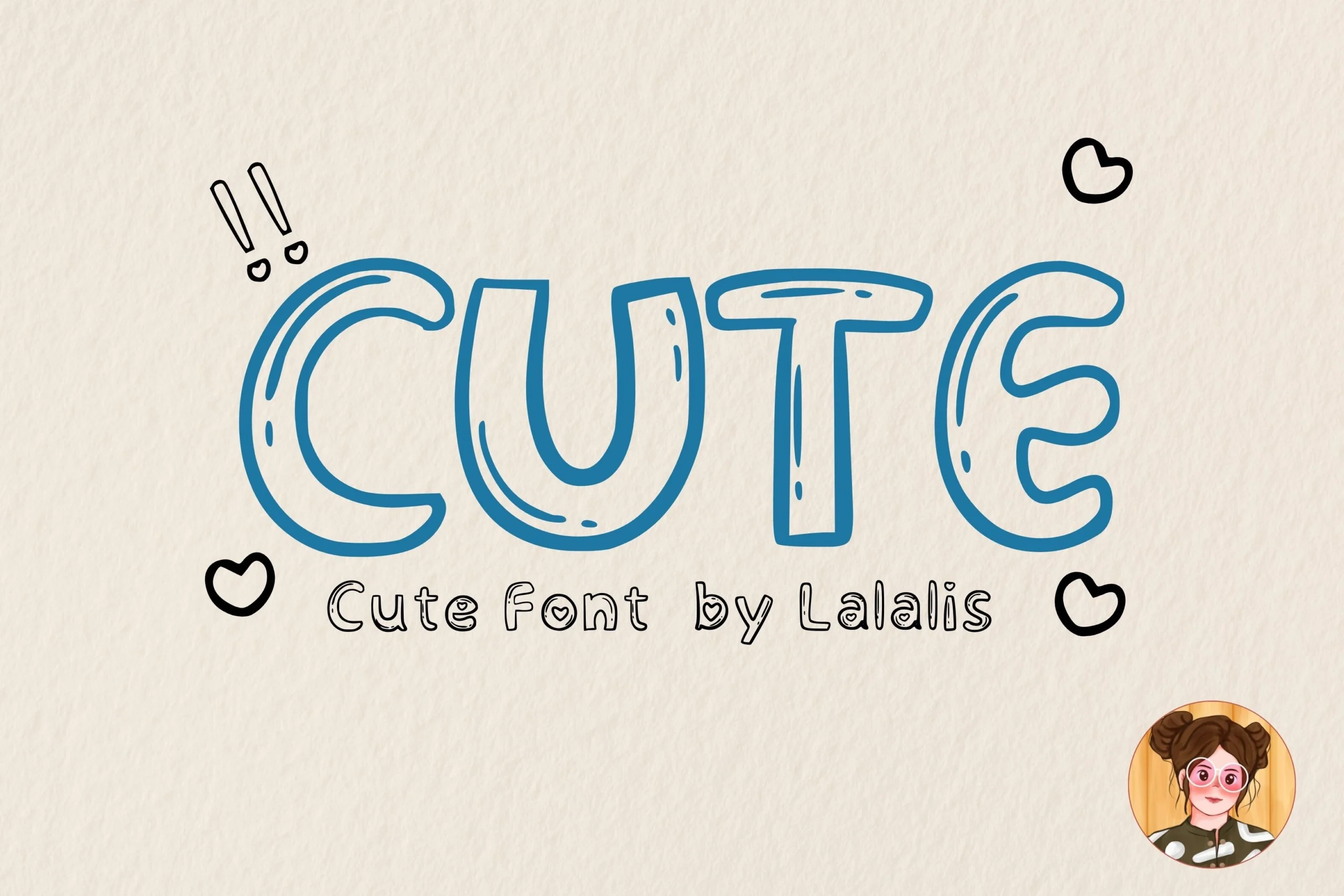
Best For: children’s designs, stickers, quotes, cute designs
Cute Font uses rounded bubble-like uppercase forms, soft corners, and open counters that keep the wordshape easy to read. The extra interior strokes add a doodled feel, giving it the light, cheerful tone people expect from Cute Handwritten Fonts without making it look messy.
It works best where you want a short message to feel warm and approachable—think labels, quote graphics, or children’s layouts. Because the letters are broad and puffy, a little extra spacing helps each shape stay distinct, especially when you build simple headings or playful name treatments.
Reyskie Font
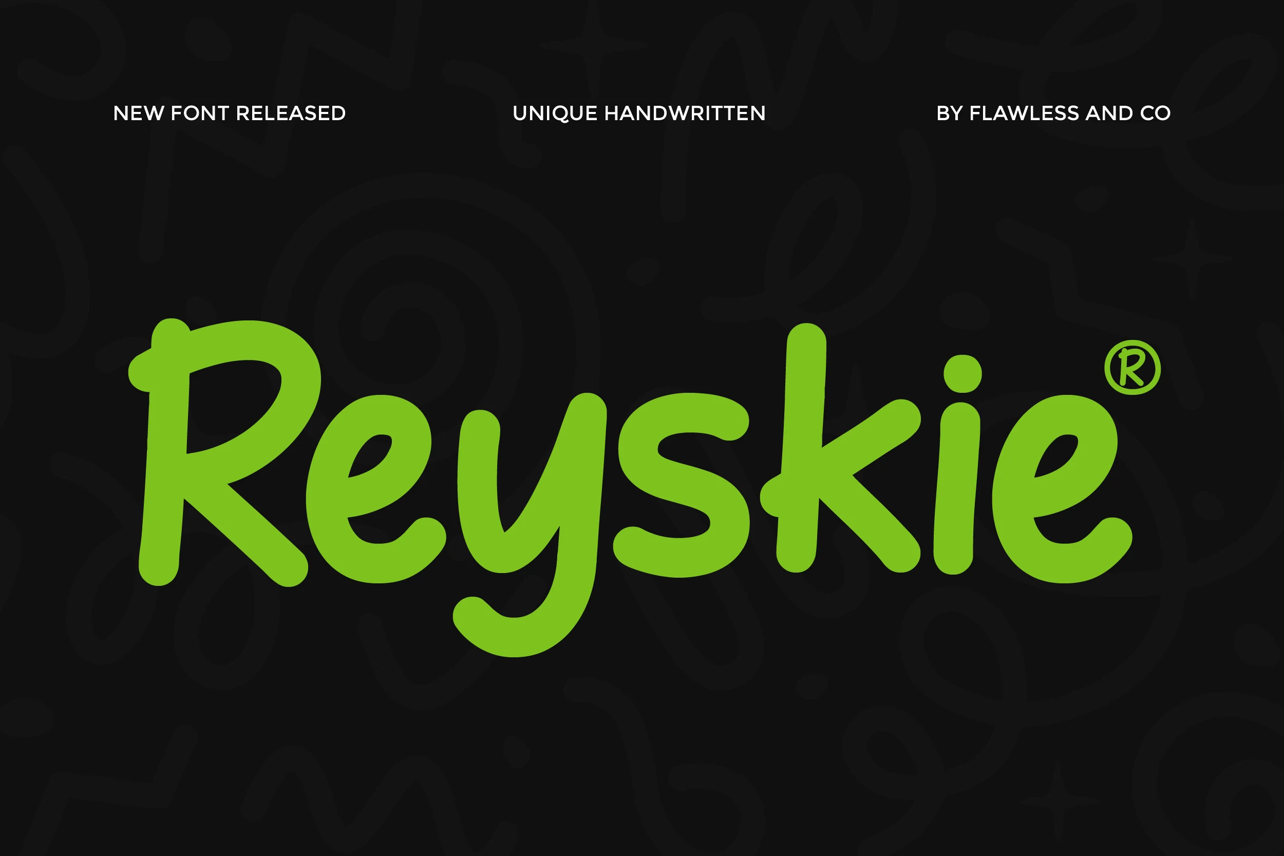
Best For: branding, social media graphics, children’s designs, playful designs
Reyskie Font has thick rounded strokes, a bouncy baseline, and slightly uneven hand-drawn shapes that keep it lively instead of polished. The broad bowls and open counters make it easy to read at a glance, giving it a strong spot in Cute Handwritten Fonts when you want something playful with real headline presence.
It works especially well for branding, kids-focused graphics, and upbeat social posts where one short phrase needs personality fast. Because the strokes are heavy and the letterforms sit close together, adding a touch of tracking helps the words breathe and keeps the cheerful rhythm clear in larger titles.
Script & Swashy Cute Handwritten Fonts
This group focuses on connected scripts, looping swashes, and retro or calligraphy movement for invitations, logos, packaging, merch, and short decorative phrases.
Barbie Cute Font
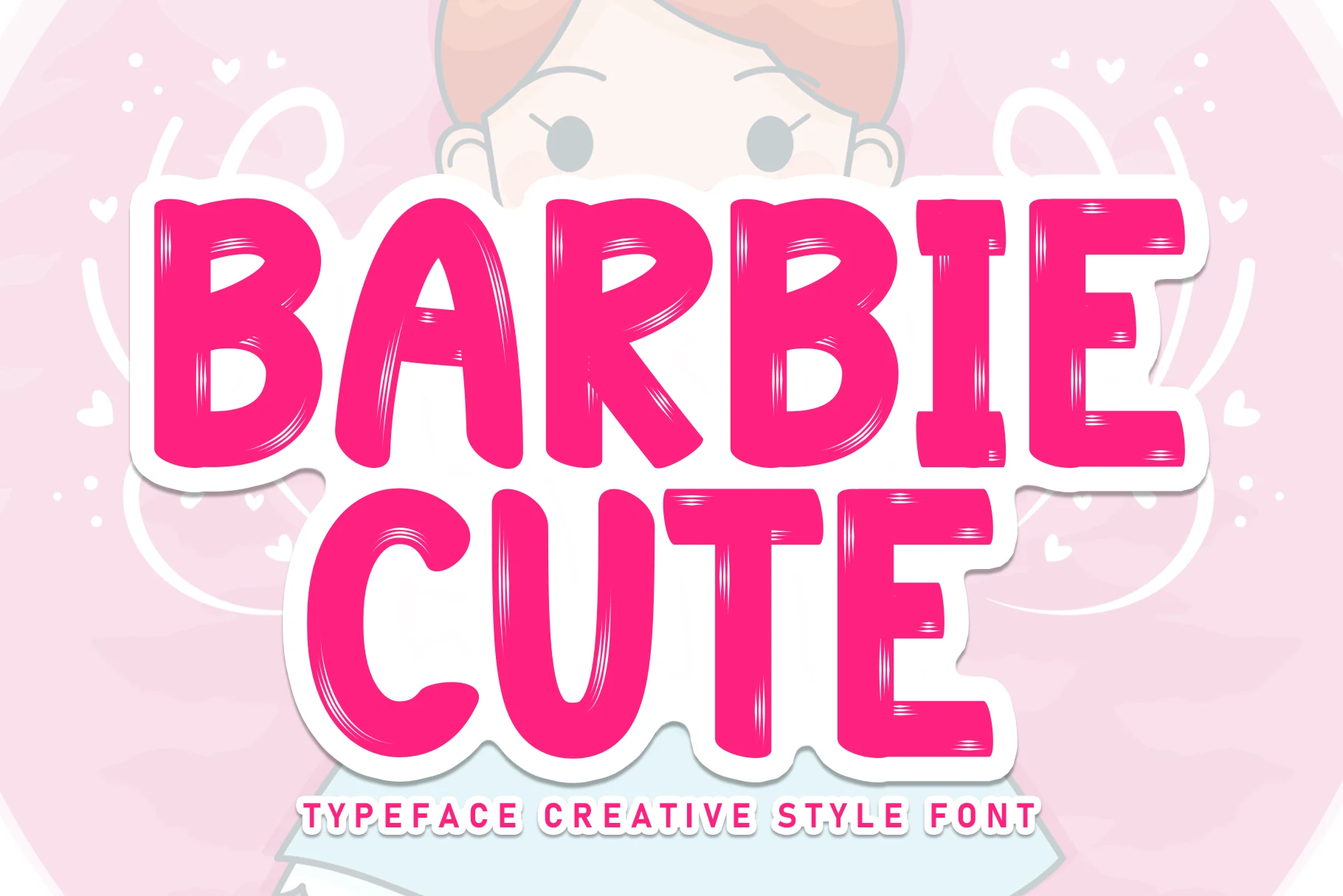
Best For: invitations, stickers, playful designs, cute designs
Barbie Cute Font leans into a bold script look with thick strokes, rounded joins, and generous looped terminals that give the lettering a soft but lively rhythm. It shows how Cute Handwritten Fonts can feel warm and approachable while still making a strong display statement, especially in short phrases and names.
The large swashes and compact connections make it best for headlines rather than long copy. Use it where you want a personal tone with a little flair, and keep the surrounding typography quiet so the curves can lead the composition on invitations, labels, or sweet branding touches.
Cute Kitty Font
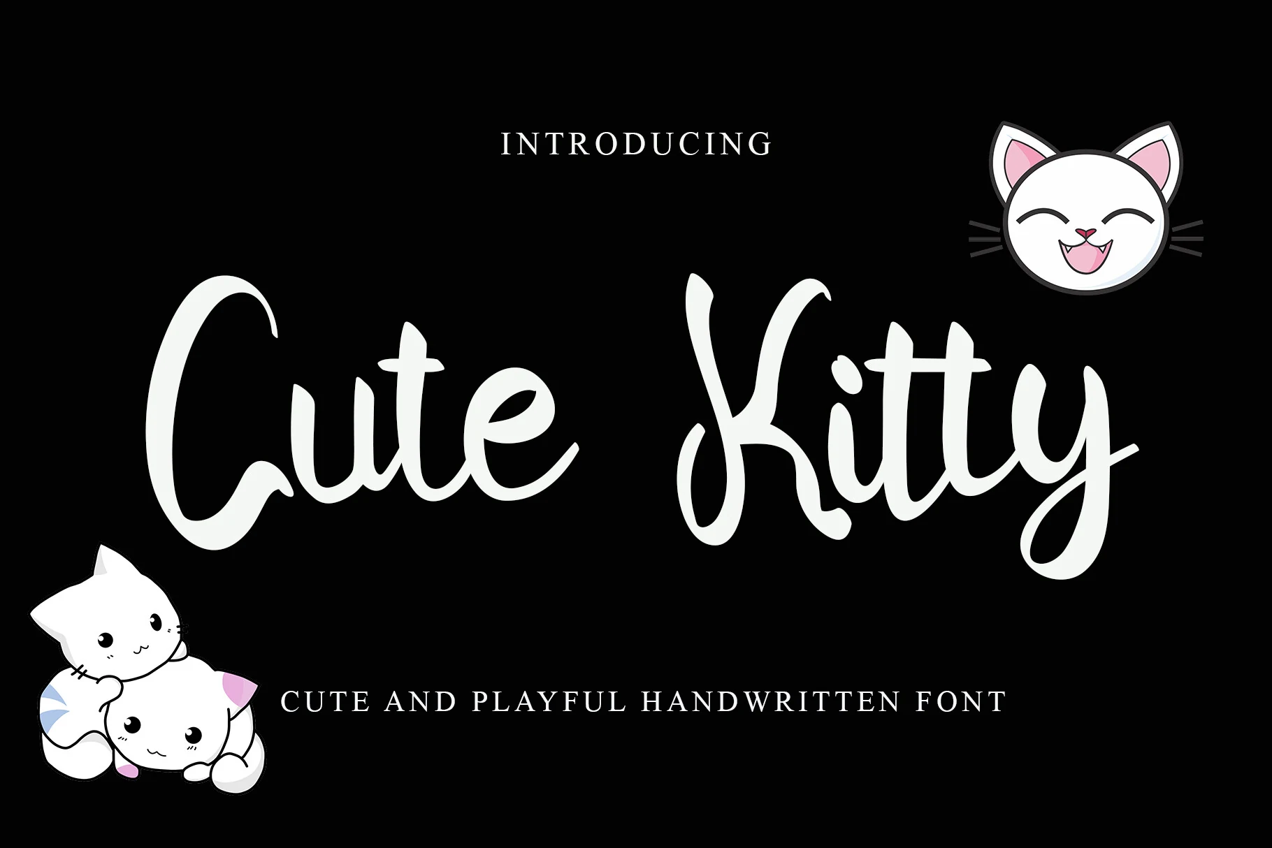
Best For: cute designs, playful designs, children’s designs, stickers
Cute Kitty Font uses thick, smooth handwritten strokes with a loose connected rhythm and a visibly uneven baseline. The tall entry stroke on the C, soft rounded turns, and looping K give it a friendly cartoon-script feel without relying on sharp decoration.
For Cute Handwritten Fonts built around charm and movement, this one works best in short names, sticker titles, greeting cards, and child-focused branding. Keep the contrast high and avoid tight line spacing, because the long descenders and raised letter shapes need room to stay readable.
Winter Script Font
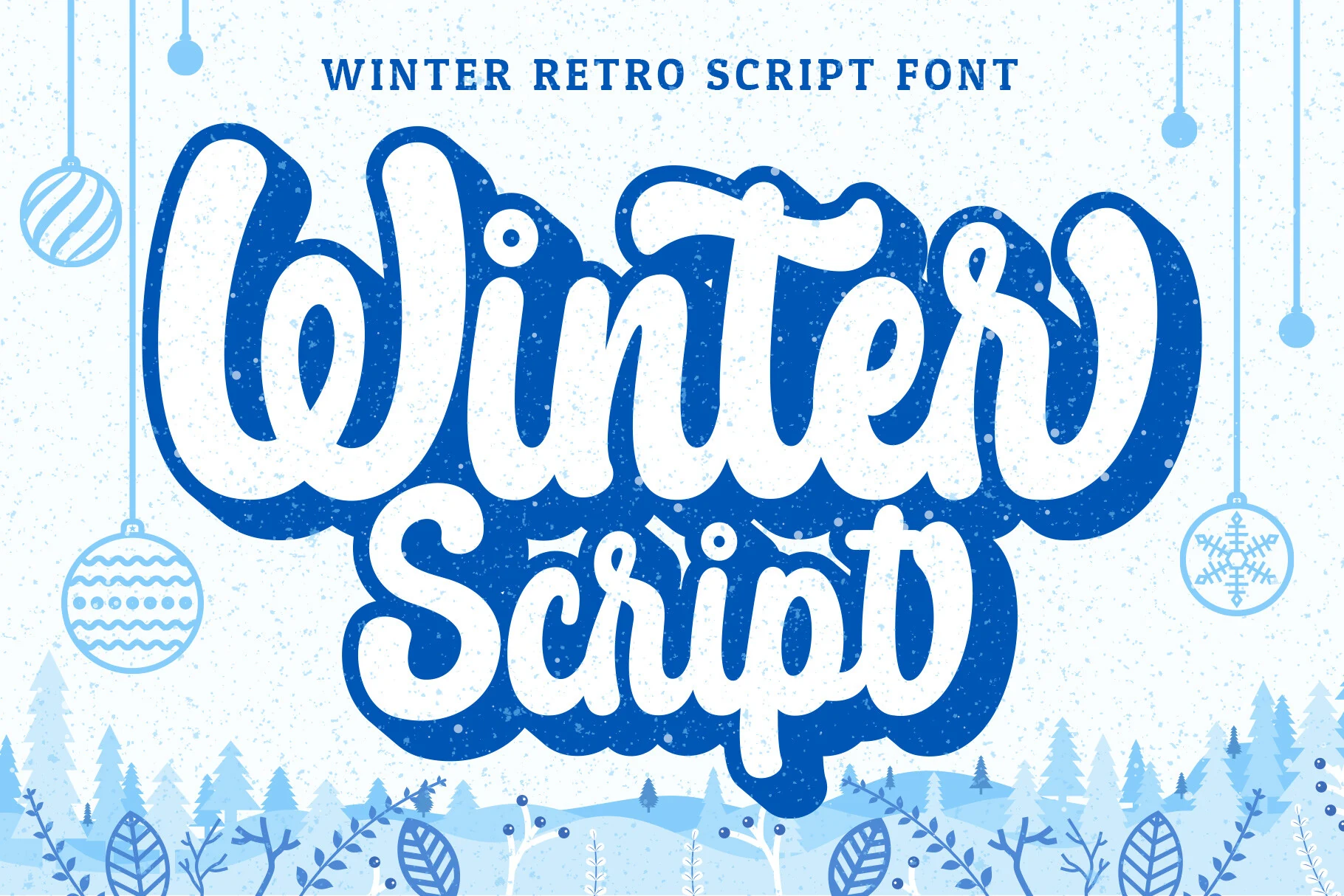
Best For: T-shirts, stickers, children’s designs, social media graphics
Winter Script brings a colder, more graphic mood to Cute Handwritten Fonts, with thick looping strokes, rounded joins, and a bouncy retro silhouette. The script has a chunky, cheerful presence that feels especially strong in short words, where its wide curves and soft terminals can really show off.
Its layered construction is useful in practice, because it helps you build contrast and dimension without relying on extra effects. For seasonal titles, stickers, or kids-focused layouts, keep the phrase brief and give the lettering room to breathe so the dense swashes and overlapping curves stay crisp.
Super Cute Font
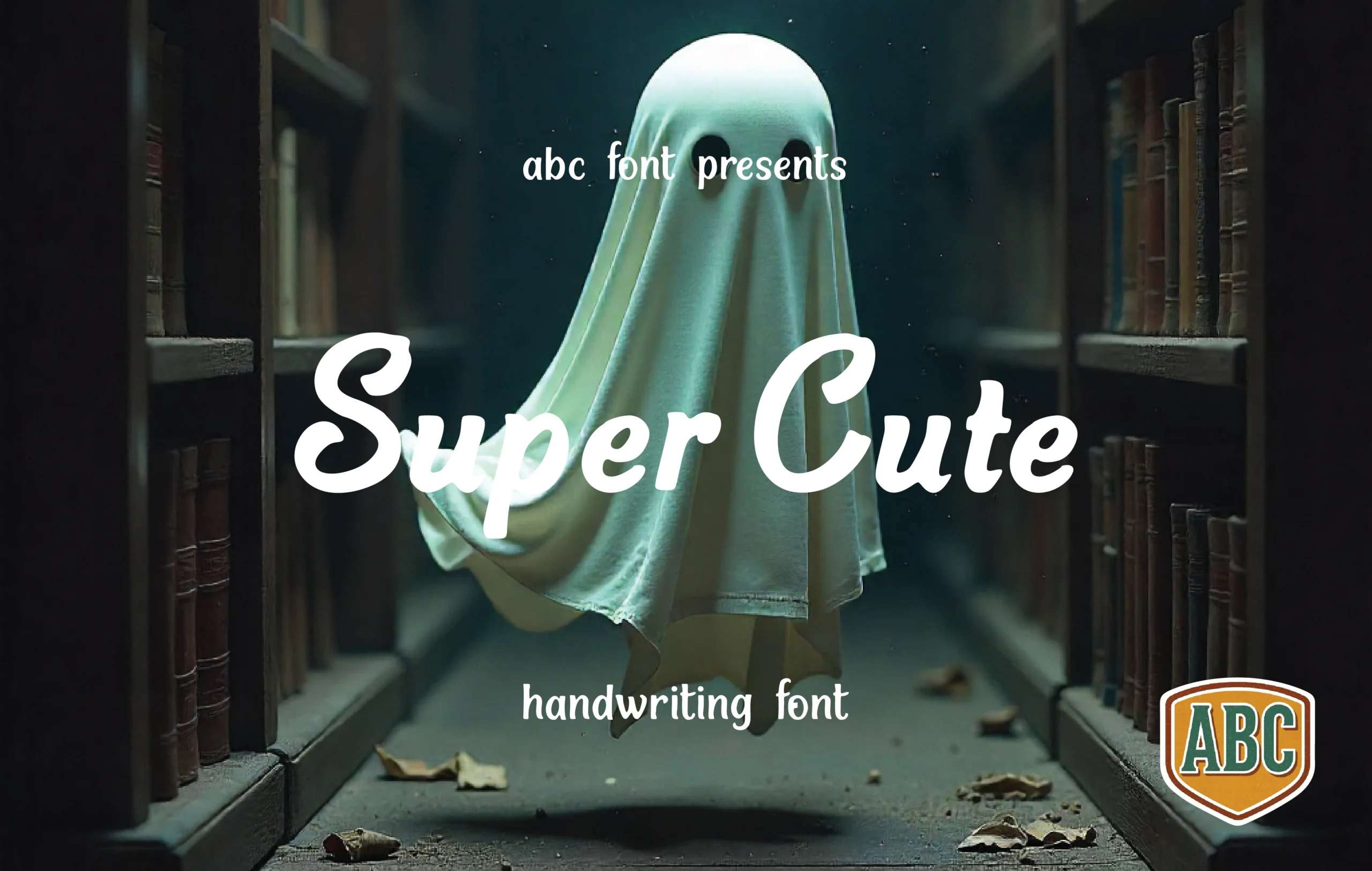
Best For: logos, branding, quotes, social media graphics
Super Cute Font has a bold handwritten script style with thick rounded strokes, loose joins, and curled uppercase forms that give the words a soft display rhythm. Within Cute Handwritten Fonts, it feels more expressive than minimal, with enough weight to hold attention in logo marks, quote graphics, and packaging titles.
The letter spacing is naturally tight because of the connected script flow, so it works best in short phrases rather than long sentences. Pair it with small upright text for captions or product details, and keep strong contrast behind the lettering so the loops, swashes, and rounded terminals remain readable.
Barbie Cute Font
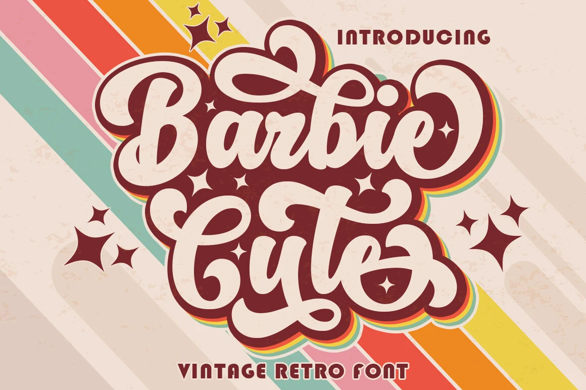
Best For: logos, badges, T-shirts, retro designs
Barbie Cute Font has a confident retro script look, with oversized loops, thick rounded strokes, and dramatic swash movement that gives each word a lively silhouette. It brings a different flavor to Cute Handwritten Fonts, leaning more nostalgic and display-focused than soft or casual.
The broad shapes make it especially effective for short logo wording, badges, posters, and merch, where the lettering needs to carry the whole composition. Its swashes add personality without extra decoration, but they need space, so keep line lengths tight and let simpler supporting text handle the smaller details.
Milkshake Font
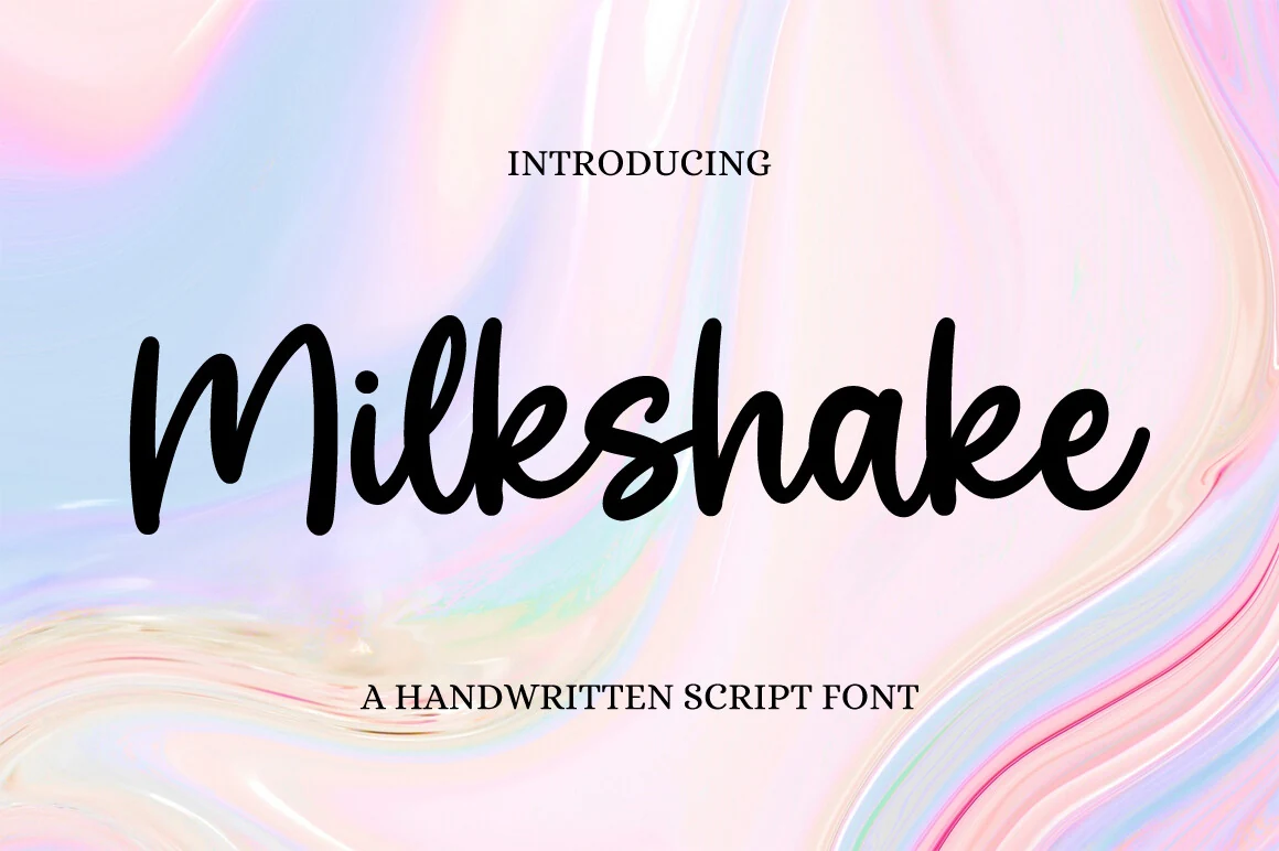
Best For: invitations, wedding designs, social media graphics, feminine designs
Milkshake Font has a flowing handwritten script style with thick smooth strokes, rounded terminals, and a relaxed connected rhythm. It fits naturally into Cute Handwritten Fonts, but the longer joins and broad curves give it a more polished, graceful tone than a casual doodled script.
The letterforms hold up well in invitation titles, feminine branding, and social graphics where you want a soft focal line with clear movement. Its strokes are fairly weighty, so it looks best with a little breathing room and a simple secondary font underneath to keep the hierarchy clean.
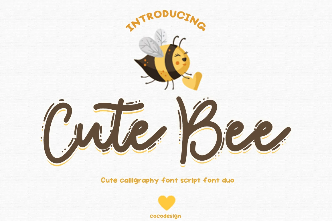
Cute Bee Font
Best For: logos, packaging, invitations, wedding designs
Cute Bee Font has a loose calligraphy script style with sweeping entry strokes, tapered terminals, and lively dot details that make the letters feel handmade. Within Cute Handwritten Fonts, it leans more decorative and swashy, giving short words a warm, crafted rhythm with enough movement for logo-style lettering.
The script and regular pairing gives designers a clearer way to build hierarchy: use the calligraphy for the main name, then let the simpler style handle small captions or product details. Keep generous side spacing around the swashes, especially on packaging or invitations, so the long strokes do not collide with nearby elements.
Soft & Simple Cute Handwritten Fonts
These lighter handwritten fonts feel cleaner and calmer, which helps on invitations, classroom printables, casual notes, social posts, and friendly layouts that need less visual weight.
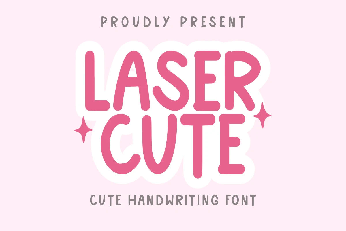
Laser Cute Font
Best For: cute designs, invitations, romantic designs, social media graphics
Laser Cute Font leans into the softer side of Cute Handwritten Fonts, with tall rounded strokes, blunt terminals, and a bouncy rhythm that keeps the lettering friendly without looking overly messy. The forms feel hand-drawn, but the thick weight gives each word enough presence for cheerful title treatments.
Use it where the message needs to feel sweet and direct: short invitation titles, sticker-style labels, love-themed branding, or social graphics. Its rounded counters and close spacing work best with a clear color contrast; for longer phrases, add a little tracking so the chunky curves do not crowd each other.
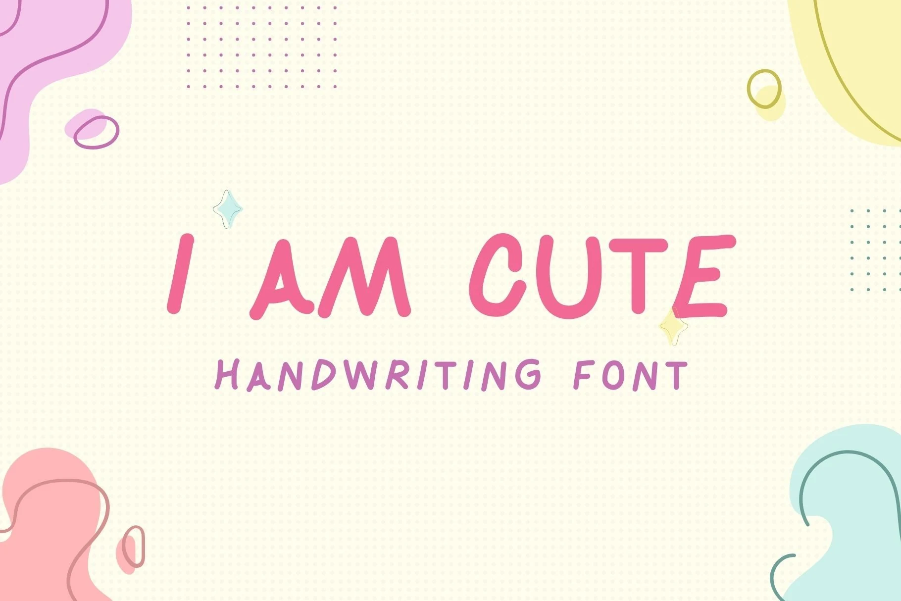
I Am Cute Font
Best For: cute designs, invitations, wedding designs, social media graphics
I Am Cute Font keeps its charm restrained, using slim rounded strokes, open spacing, and softly irregular uppercase forms. It belongs with Cute Handwritten Fonts that need a light, casual voice rather than a chunky display look, so the lettering feels friendly without overpowering the page.
The simple shapes make it useful for wedding invitation accents, note-style graphics, and social posts where the text needs to stay airy. It works best with moderate tracking and gentle contrast; keep supporting copy small and spaced out so the main handwritten line keeps its clean, soft rhythm.
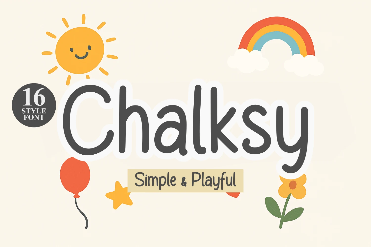
Chalksy Font
Best For: children’s designs, cute designs, invitations, stickers
Chalksy Font has a soft monoline look with rounded ends, tall loops, and a loose handwritten rhythm. The letters feel simple rather than polished, which suits kids’ themes, birthday pieces, and light craft graphics where friendliness matters more than formal structure.
Its 16 styles give designers room to build title hierarchy without leaving the same visual family. In Cute Handwritten Fonts collections, Chalksy works best for short phrases, sticker text, poster headings, and quote layouts; keep spacing fairly open so the chunky curves do not crowd smaller words.
Hello Cute Font
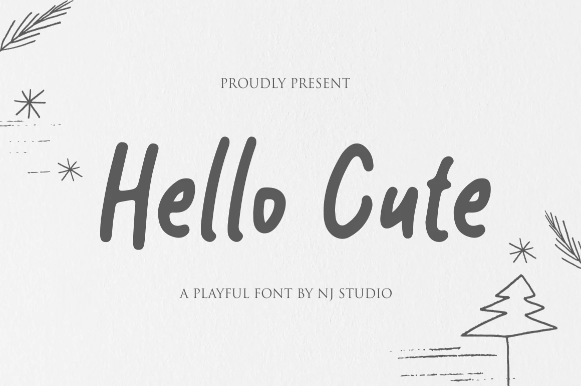
Best For: invitations, quotes, children’s designs, casual designs
Hello Cute Font has soft, rounded strokes and a relaxed handwritten rhythm that makes it feel immediately friendly. The tall stems and smooth curves keep the letterforms clear, so it brings the charm of Cute Handwritten Fonts without looking cluttered or overly fussy.
It fits cards, classroom printables, and light branding where a warm, casual voice works best. Because the shapes are slightly narrow and upright, it holds together well in short headings and name labels; pair it with a simple serif or airy sans for contrast and keep longer lines brief.
Conclusion
Choose bold rounded fonts when the design needs instant playful impact, script styles when you need movement and personality, and softer handwritten options when the layout should feel casual, light, and easy to read.