12 Stunning Vintage Display Fonts for Retro Designs in 2026
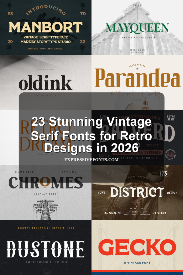
Vintage Display Fonts are built for designers who need typography with age, texture, and headline presence. This collection focuses on retro logos, posters, packaging, apparel graphics, signage, and editorial layouts, grouping each font by the kind of vintage effect it creates.
Looking for more display fonts? Browse our complete Display Fonts collection to compare bold, retro, playful, poster, groovy, creative, vintage, cartoon, headline, and decorative display styles.
Bold Block & Sports Vintage Display Fonts
These bold block styles use rounded weight, athletic structure, and rugged vintage edges for logos, merch, posters, and sports-inspired headline designs.
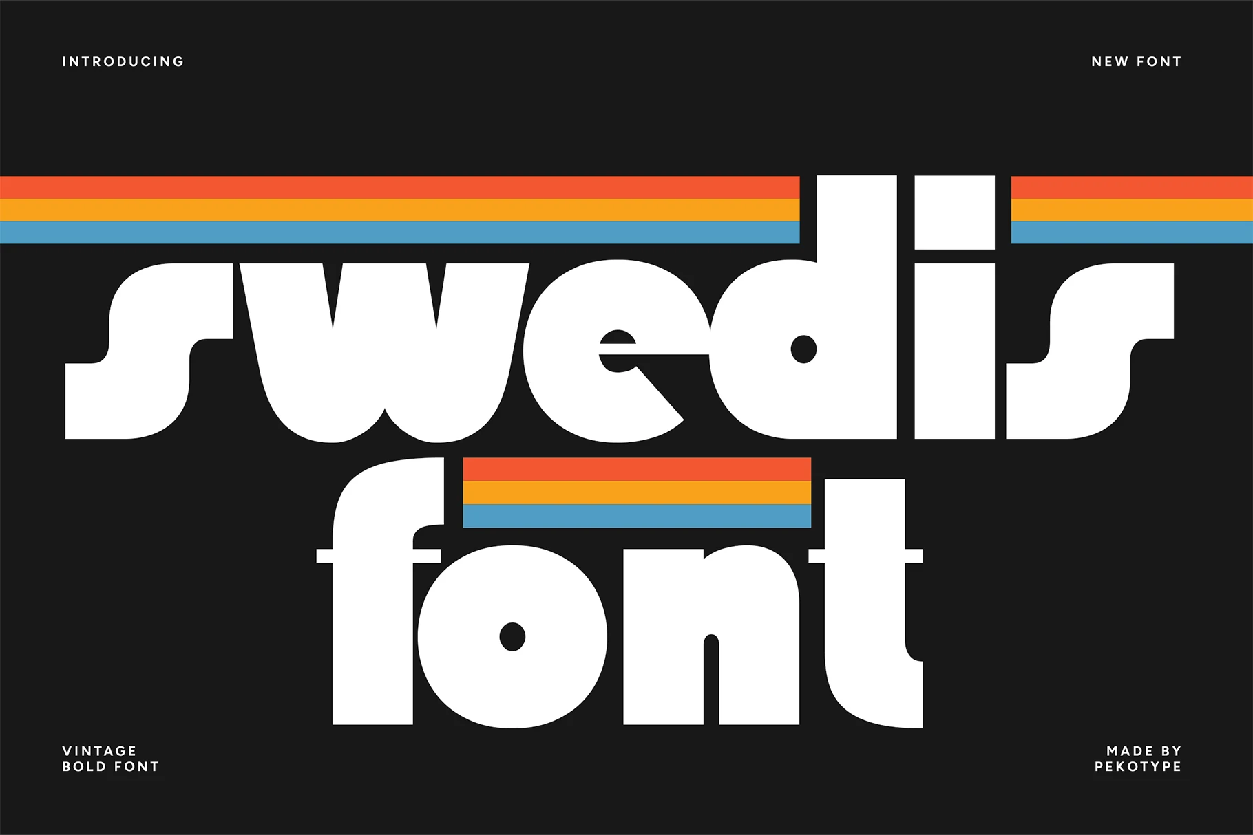
Swedis Font
Best For: logos, posters, merch design, retro designs
Swedis gives Vintage Display Fonts a heavy 80s voice: fat lowercase forms, rounded block corners, tight counters, and a compact rhythm that lands like retro sports branding. The shapes feel simple at first glance, but the oversized curves and squared verticals give each word a dense, poster-ready silhouette.
Keep the word count short and let the contrast do the work. Its thick strokes and small interior spaces can close up at reduced sizes, so Swedis is strongest as a primary headline, logo mark, or merch graphic where the typography carries the layout instead of supporting it.
Retro Goal Font
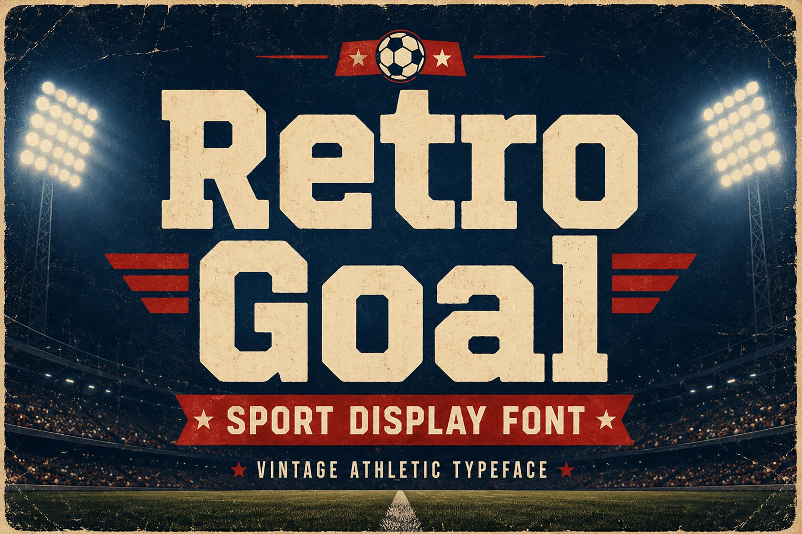
Best For: posters, logos, T-shirts, vintage designs
Retro Goal brings the sturdier side of Vintage Display Fonts, drawing on classic varsity forms with squared shoulders, chamfered corners, and broad strokes that feel built for scoreboard headlines. The heavy proportions and lightly worn texture give it the look of old athletic posters and football memorabilia without losing clarity.
It works best when you treat it like the lead player in the layout. Short titles, team names, and event graphics suit it well, while the even weight keeps big words readable and the angular cuts add enough character that you can keep supporting text simple.
Retro Riders Font
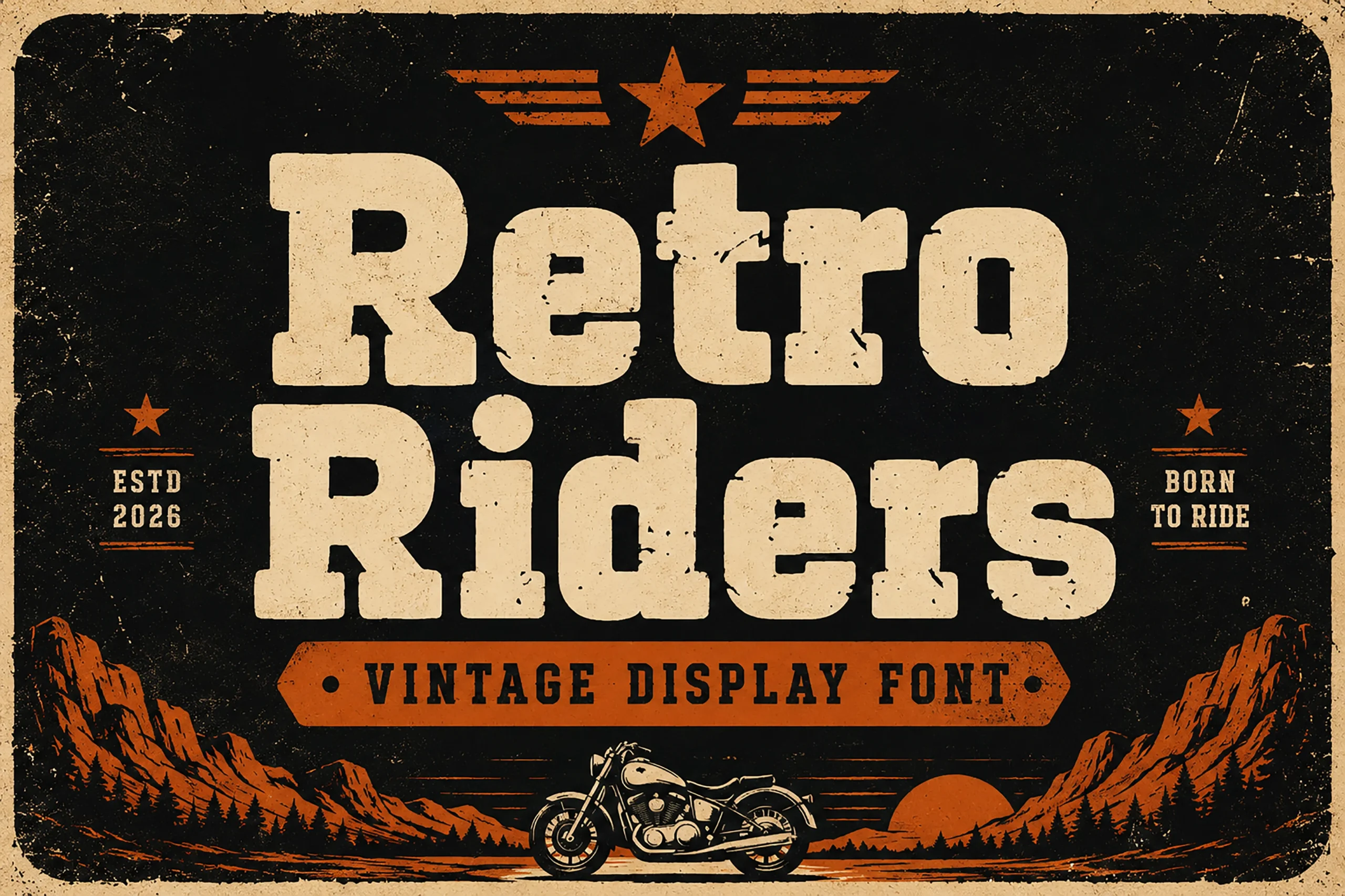
Best For: posters, signage, T-shirts, vintage designs
Retro Riders leans into the rugged side of Vintage Display Fonts with heavy slab-like letterforms, squared corners, and a worn surface that feels pulled from old biker posters and garage signs. The broad shapes hold their ground well, while the slightly softened edges keep the texture from looking stiff or mechanical.
This is a strong choice for short, high-impact wording. The distressed finish already adds plenty of character, so it works best when you keep the layout clean and let the big block forms carry the hierarchy on their own, especially in badges, apparel graphics, and bold headline treatments.
Distressed Serif & Label Vintage Display Fonts
These serif and slab fonts bring distressed texture, antique label shapes, and old-print character to packaging, posters, badges, book covers, and retro branding.
Ruiz Duo Font
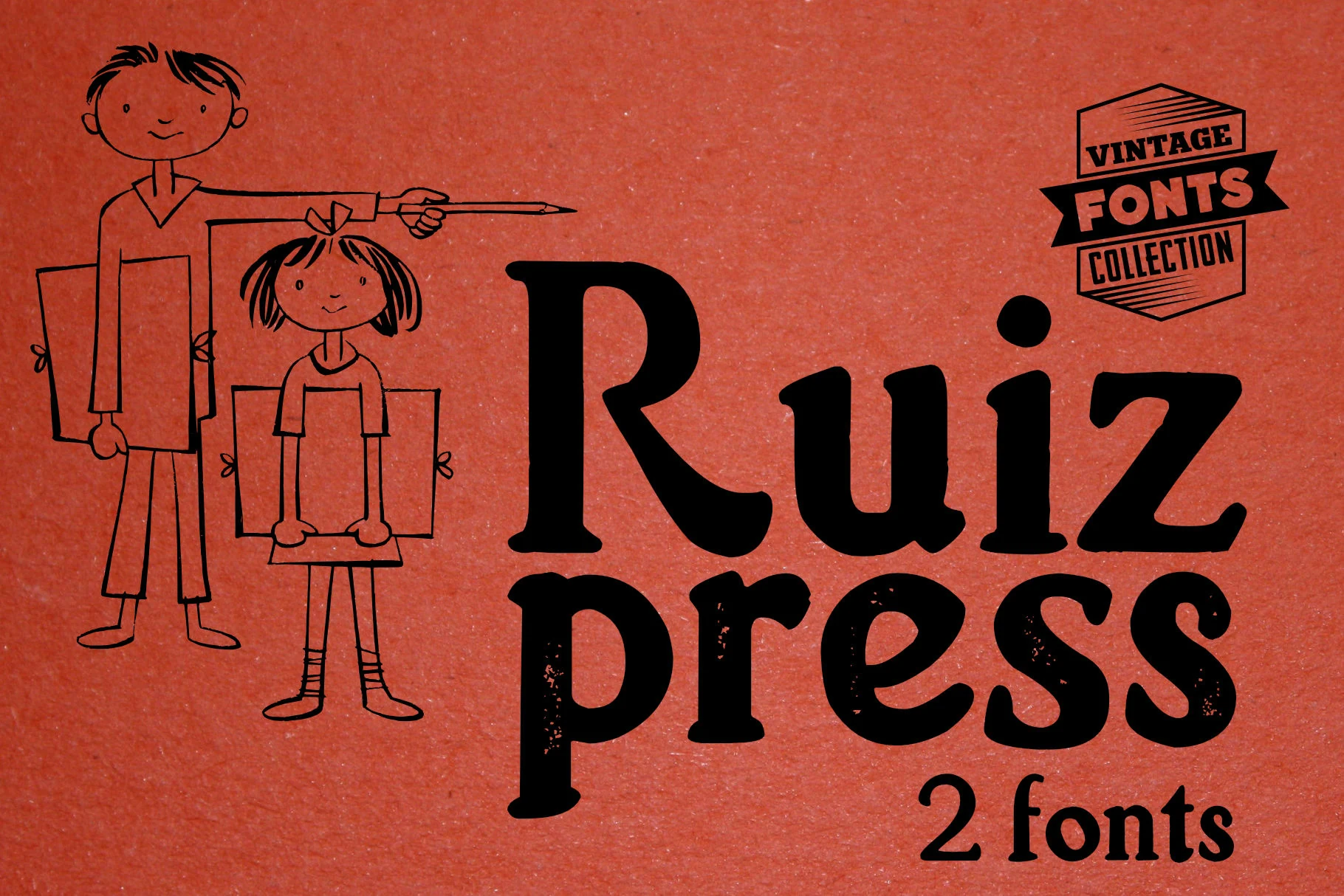
Best For: logos, posters, packaging, vintage designs
Ruiz Duo pairs two Vintage Display Fonts with clearly different personalities. One style leans on classic serif shapes with a soft retro curve, while the other is darker, chunkier, and lightly distressed, giving the set a worn print feel that reads straight out of mid-century packaging and signage.
The built-in contrast makes title hierarchy easy. Use the cleaner face for the main word, then bring in the rougher companion for emphasis, subheads, or secondary lines. That mix keeps short phrases lively without needing extra decoration, especially in badge-style layouts and vintage label work.
Nafa Grunge Font
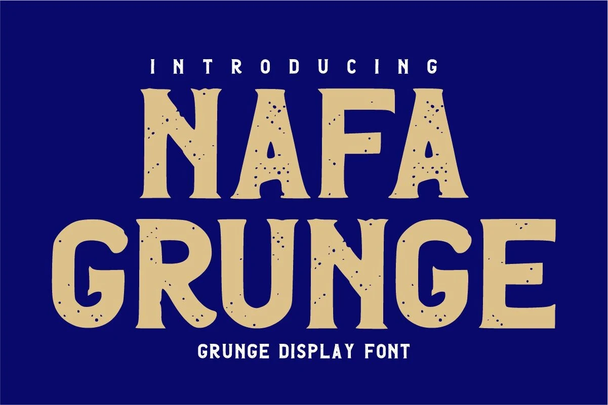
Best For: posters, logos, T-shirts, vintage designs
Nafa Grunge leans into the tougher side of Vintage Display Fonts with broad serif shapes, slightly uneven edges, and a speckled worn texture that feels lifted from old print and shop signage. The tall capitals and sturdy proportions give it a grounded western note without losing clarity.
That distressed surface does a lot of the styling for you, so it works best when the layout stays simple. Use it for short headlines or badge-style compositions where the rough texture can stay visible, and pair it with cleaner supporting text to keep the hierarchy sharp.
Bonaro Family Font
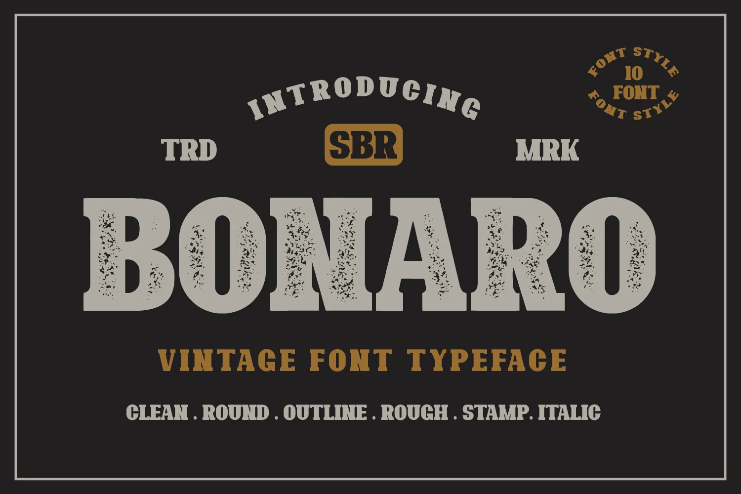
Best For: logos, posters, branding, vintage designs
Bonaro Family gives Vintage Display Fonts more range than a single headline face, collecting ten bold antique styles with a shared old-print attitude. The letterforms in the preview are wide and heavy with slab-serif structure, rounded corners, and a worn stamp texture that reads clearly while still feeling rugged and nostalgic.
The real advantage is how easily the styles can work together. With clean, rough, outline, round, and italic directions in one family, you can build stronger title hierarchy without switching visual eras. Use a rough cut for the main word and a cleaner companion for supporting lines to keep the composition cohesive.
Fika Rough Font
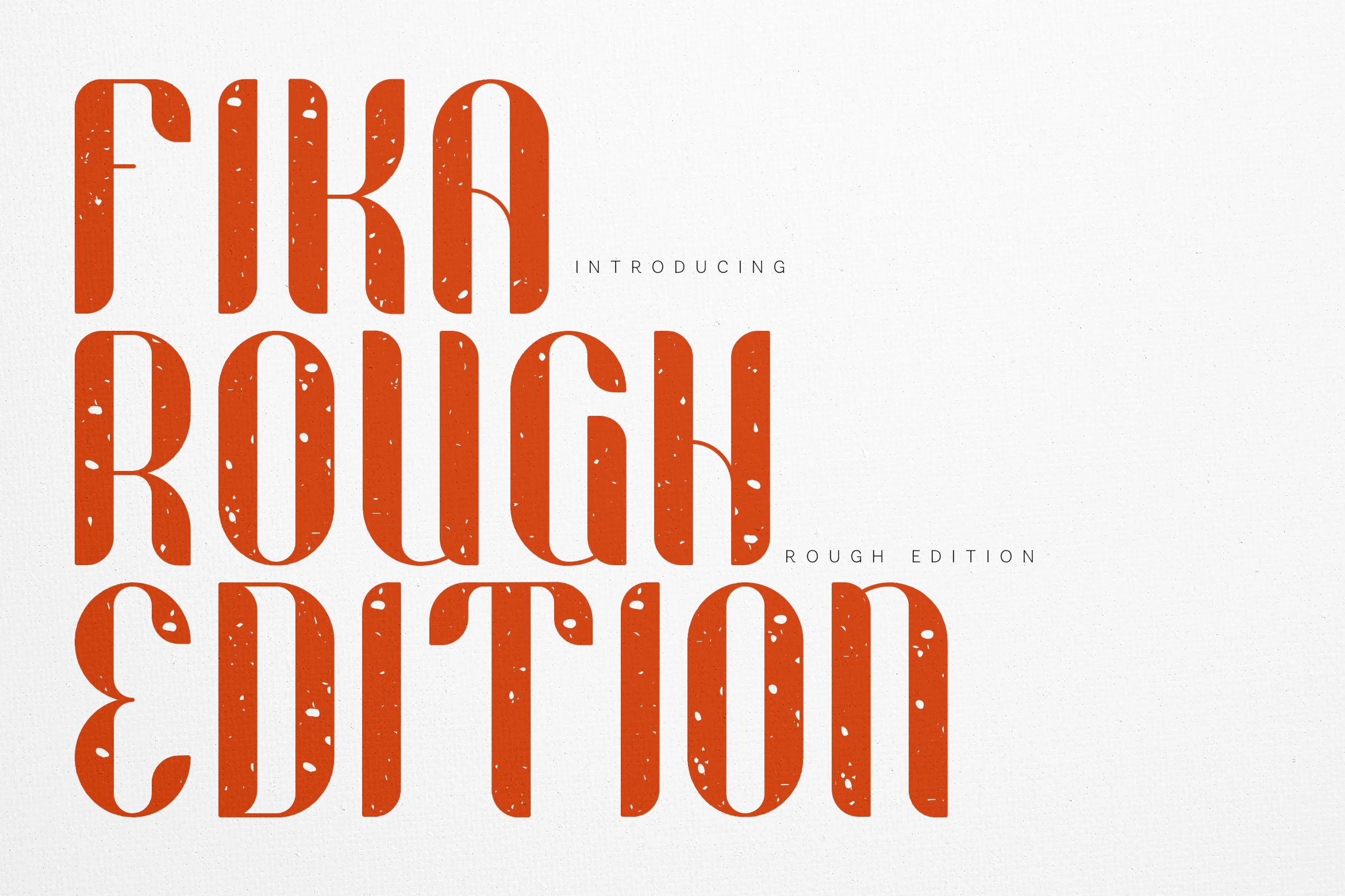
Best For: posters, branding, signage, vintage designs
Fika Rough gives Vintage Display Fonts a taller, more sculpted voice. The letterforms are narrow and vertical with softened corners, curved interior cuts, and a handmade distress that keeps the heavy shapes from feeling rigid. That mix of structure and imperfection gives headlines a printed warmth rather than a slick digital finish.
It works especially well when you want strong scale without bulky width. The condensed proportions let you stack large words into tighter spaces, while the rough texture adds enough character that simple layouts still feel finished. Keep body text cleaner beside it so the texture and rhythm stay clear.
Vintage Super Font
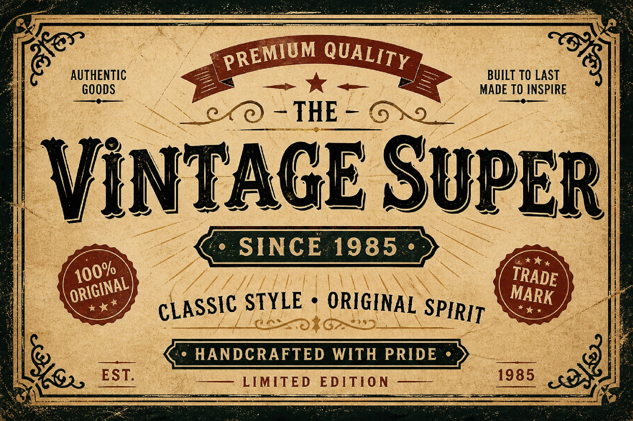
Best For: signage, posters, packaging, vintage designs
Vintage Super has the richly ornamented flavor that makes Vintage Display Fonts so effective in headline work. Its serif shapes are bold and theatrical, with curled terminals, carved interior detailing, and a slightly worn finish that gives the letters the feel of old labels, saloon signs, and premium goods packaging.
This style performs best when the wording stays short and central. The decorative shaping already creates plenty of texture, so it helps to use it as the main title and pair it with quieter support text. In framed layouts, badges, or label-style compositions, those sturdy forms hold hierarchy well without needing extra effects.
Darkwood Font
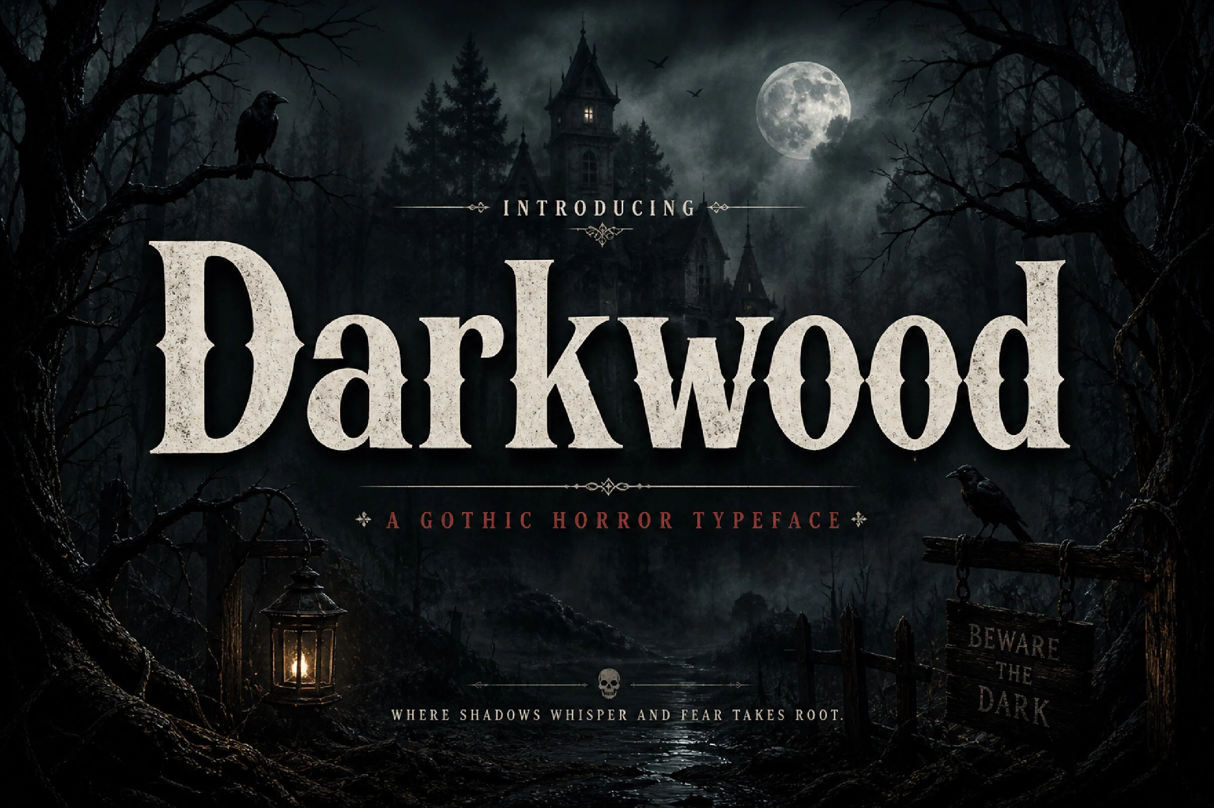
Best For: posters, logos, packaging, book covers
Darkwood gives Vintage Display Fonts a darker edge with broad serif forms, sturdy verticals, and slightly pointed joins that recall old gothic posters. The letterforms feel weighty and readable, while the soft distressing adds age and atmosphere without breaking the silhouette.
It performs best in short titles where that dramatic shape can carry the mood. Use it for a main wordmark or poster headline, then pair it with a quieter secondary face so the eerie character stays strong and the hierarchy remains easy to read.
Script & Duo Vintage Display Fonts
These script and duo fonts add flowing strokes, swashes, and built-in contrast for vintage logos, packaging fronts, signage, postcards, and expressive headline layouts.
Sanvilo Font
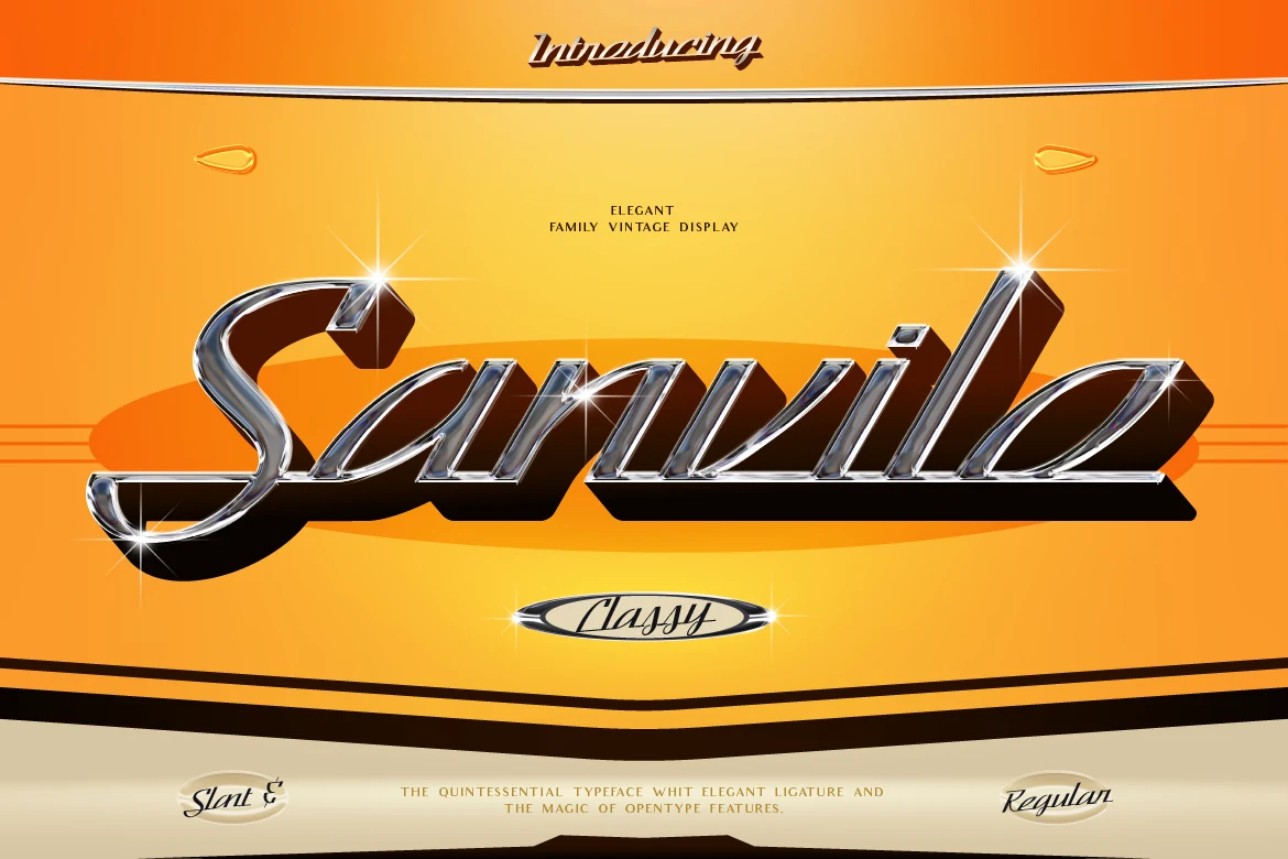
Best For: logos, signage, packaging, vintage designs
Sanvilo has the polished flair that makes Vintage Display Fonts feel instantly memorable. The letters lean forward in a smooth slant, with long connected strokes, bold weight, and elegant ligatures that give words a flowing custom-lettered rhythm rather than a rigid set type look.
It shines when you let the script carry the identity. Use it for short names or headline-length phrases where the sweeping joins stay visible, and keep supporting text simple so the rich curves and vintage attitude remain the focal point.
Magdalia Font
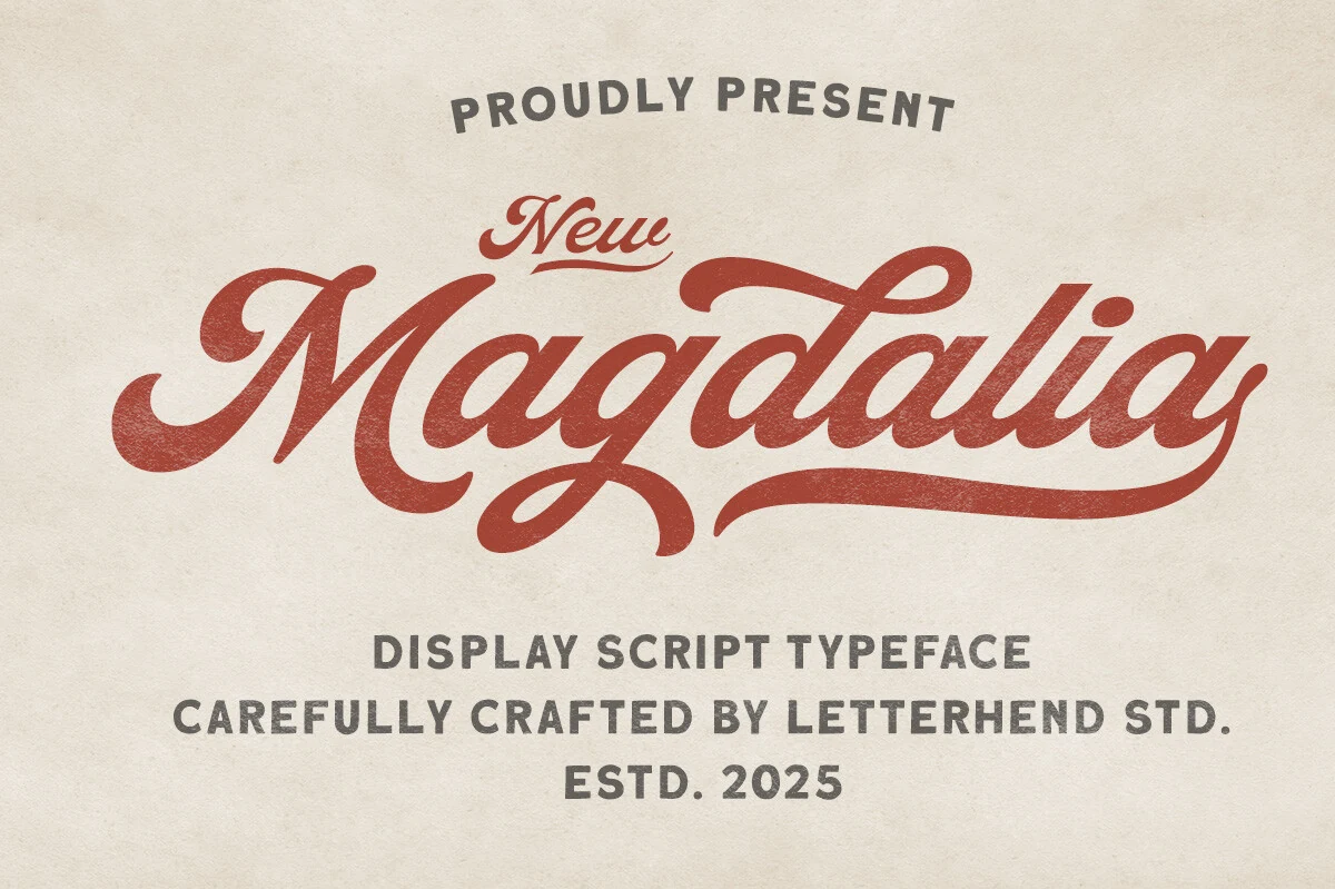
Best For: logos, packaging, posters, T-shirts
Magdalia brings a more fluid rhythm to Vintage Display Fonts, using broad script strokes, rounded joins, and generous swashes that give the lettering a hand-painted sign feel. The capital forms and long finishing strokes create a confident silhouette, while the lightly worn texture keeps the script from feeling too polished.
It works best when you let one or two words take center stage. The thick curves and extended terminals need room, so Magdalia is strongest for logos, packaging fronts, or poster headlines where the script can stretch across the layout and a plain supporting sans can handle the smaller details.
Sundown Gazette Duo Font
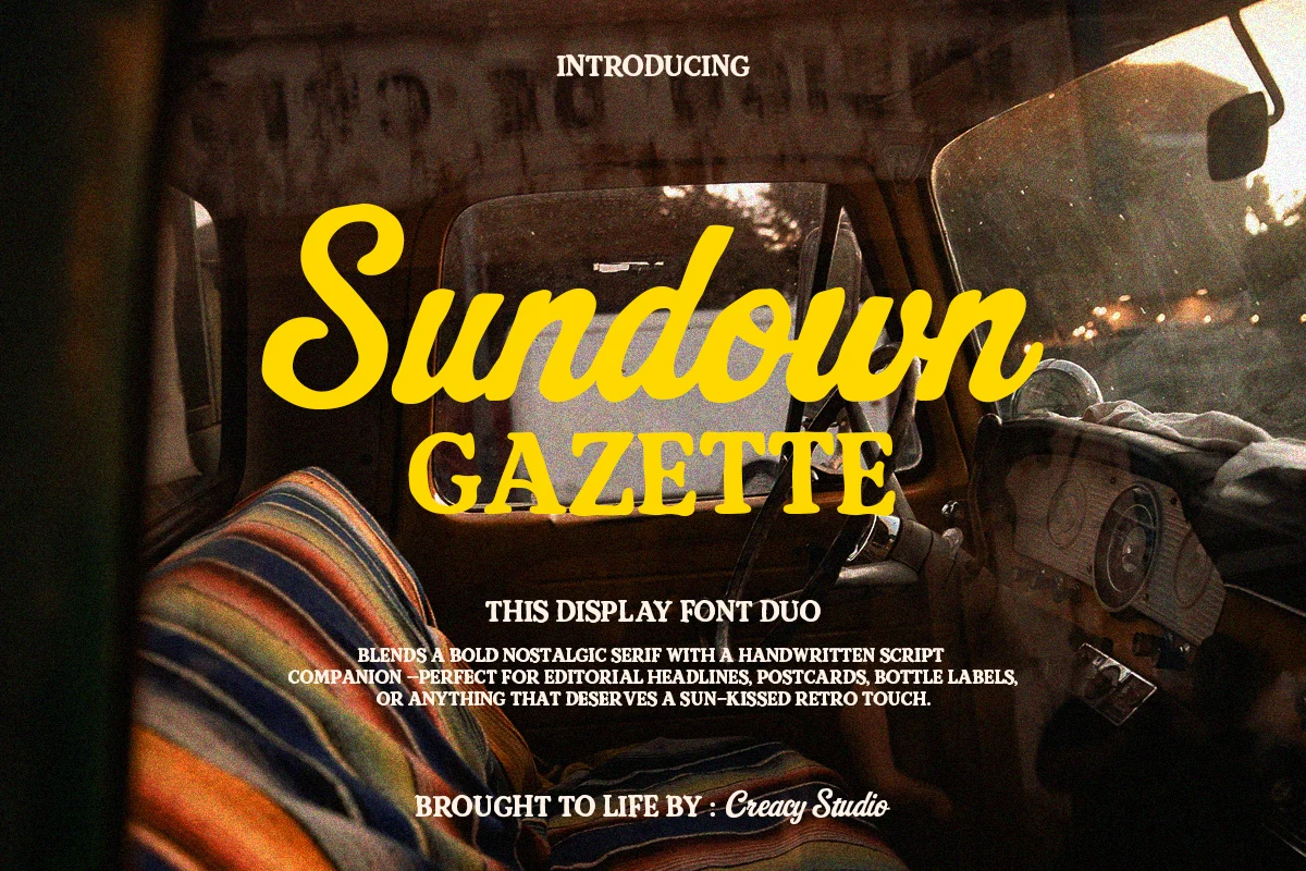
Best For: posters, packaging, editorial designs, vintage designs
Sundown Gazette Duo gives Vintage Display Fonts a relaxed editorial feel by pairing a warm handwritten script with a sturdy retro serif. The script has thick rounded strokes and an easy flowing rhythm, while the serif adds structure and a slightly nostalgic print character that keeps the duo grounded.
The pairing makes hierarchy almost effortless. Use the script for the hero word, then bring in the serif for subheads or supporting lines to create contrast without mixing unrelated styles. It works especially well for postcards, labels, and headline layouts that need charm without losing clarity.
Conclusion
Choose bold block styles when impact and readability matter first, distressed serif or slab fonts for aged packaging and poster texture, and script or duo fonts when the design needs movement, charm, and stronger title contrast.