22 Stunning Geometric Sans Serif Fonts for 2026 Designs
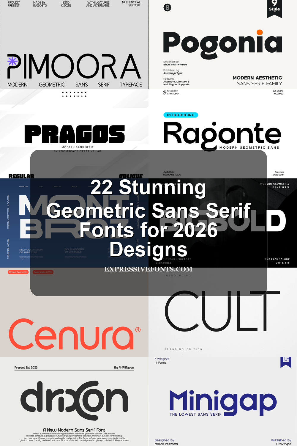
Geometric Sans Serif Fonts are built for designers who need clean structure, strong readability, and modern visual rhythm. This collection highlights 22 fonts for logos, branding, packaging, posters, website headers, editorial layouts, and social media graphics, with styles ranging from soft rounded forms to bold futuristic display faces.
Rounded & Friendly Geometric Sans Serif Fonts
These rounded geometric fonts use soft curves, open counters, and balanced proportions for approachable branding, logos, packaging, and clean website headers.
Pimoora Font
Best For: logos, branding, packaging, headlines
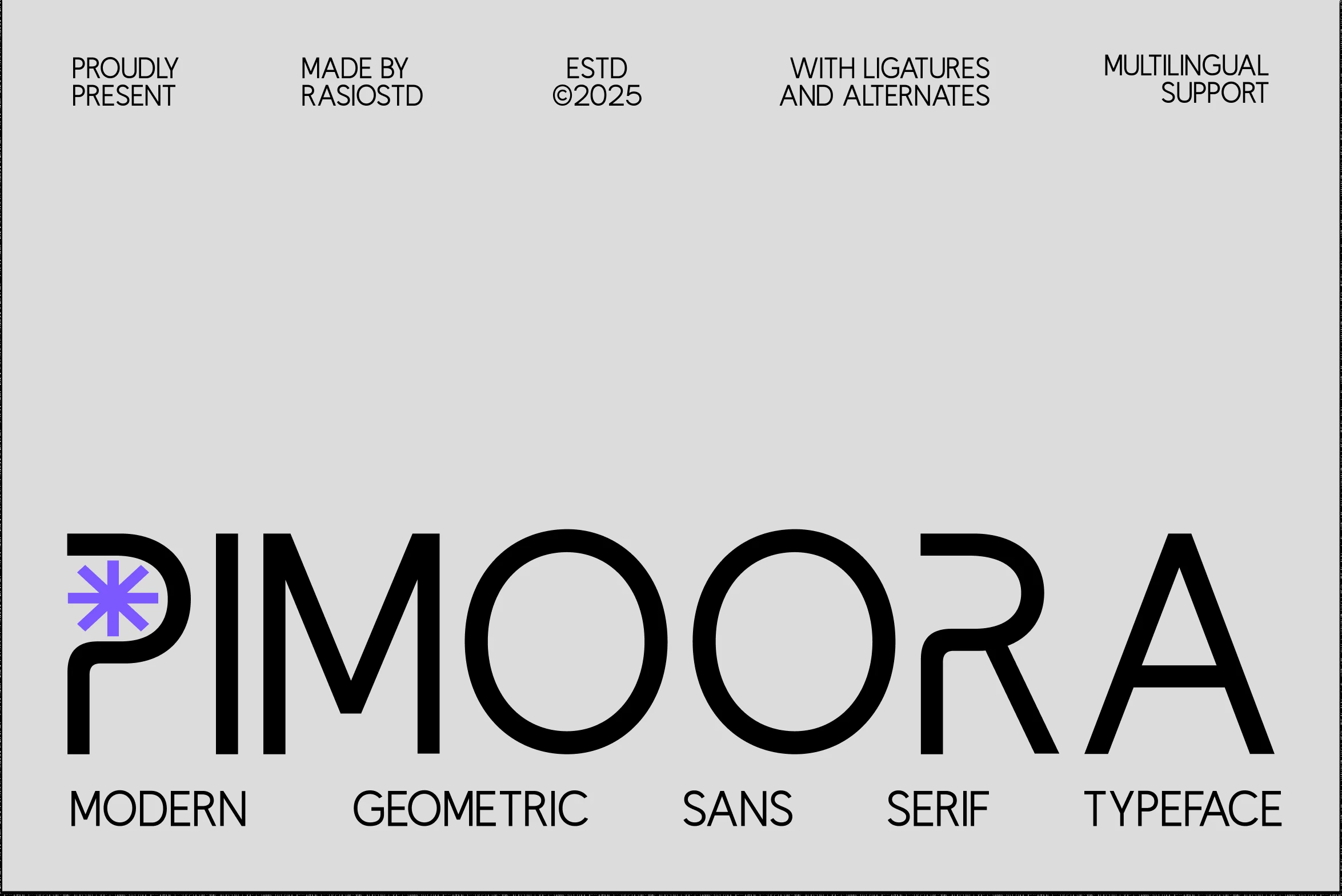
Pimoora Font has a broad geometric build with smooth curved edges, round counters, and clean monoline strokes. The large circular forms give it a controlled, futuristic rhythm, while the softened joins keep the wordmark from looking too mechanical.
For Geometric Sans Serif Fonts, Pimoora works best where the type needs to act as a visual mark, not just a label. Keep spacing deliberate and use strong contrast around it, because the wide proportions and rounded terminals read most clearly in short names, headers, and compact brand systems.
Pogonia Font
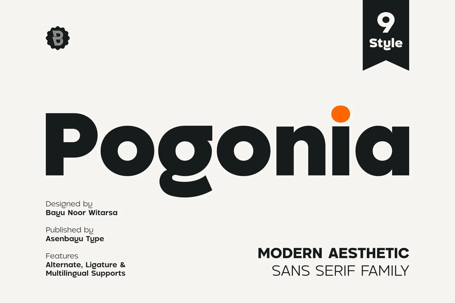
Best For: logos, posters, social media graphics, fashion branding
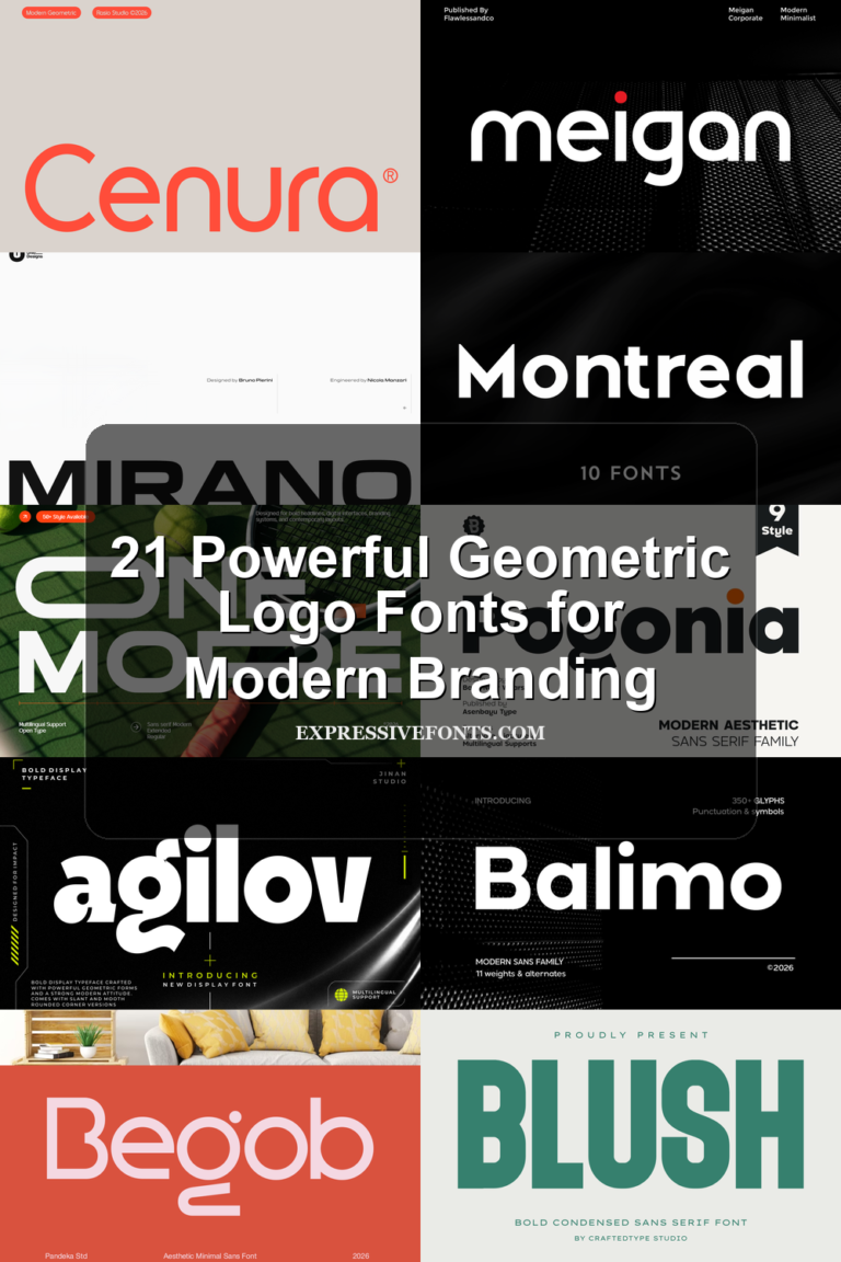
Pogonia Font mixes a sturdy geometric base with softer humanist shaping, giving it a bold look that still feels approachable. The round counters, smooth joins, and distinctive single-storey g add personality, while the heavy weight keeps the overall rhythm clean and confident.
If you are exploring Geometric Sans Serif Fonts, Pogonia is a strong choice for branding and display work that needs clarity without feeling cold. Its dense shapes read best in short headlines, logos, and poster text, and pairing it with a lighter neutral sans helps its curved details stand out in the hierarchy.
Gonelo Font
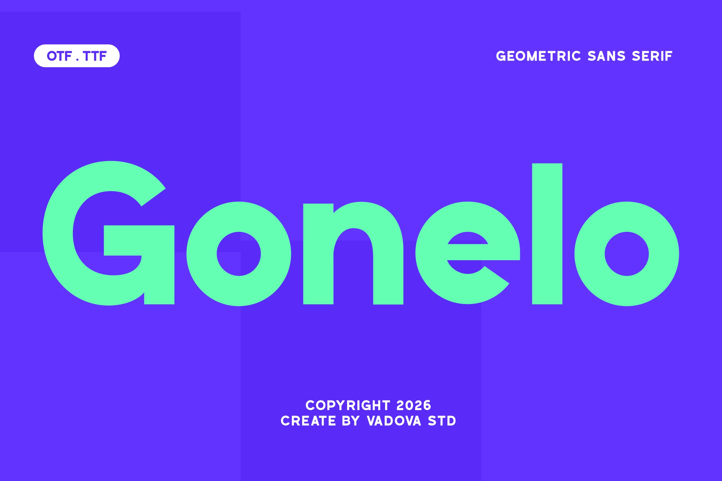
Best For: logos, branding, website headers, social media graphics
Gonelo Font has the kind of bold geometric construction that reads instantly: large circular counters, smooth joins, and a sturdy baseline that keeps the wordshape calm even at heavy weight. The rounded forms in letters like o and e give it a friendly edge, while the broad proportions keep the overall look crisp and contemporary.
When you need Geometric Sans Serif Fonts with a strong digital presence, Gonelo handles display work especially well. Its clear structure holds up in large headers and identity systems, and pairing it with tighter spacing or a lighter secondary sans helps the bold curves feel intentional rather than oversized.
Minigap Font
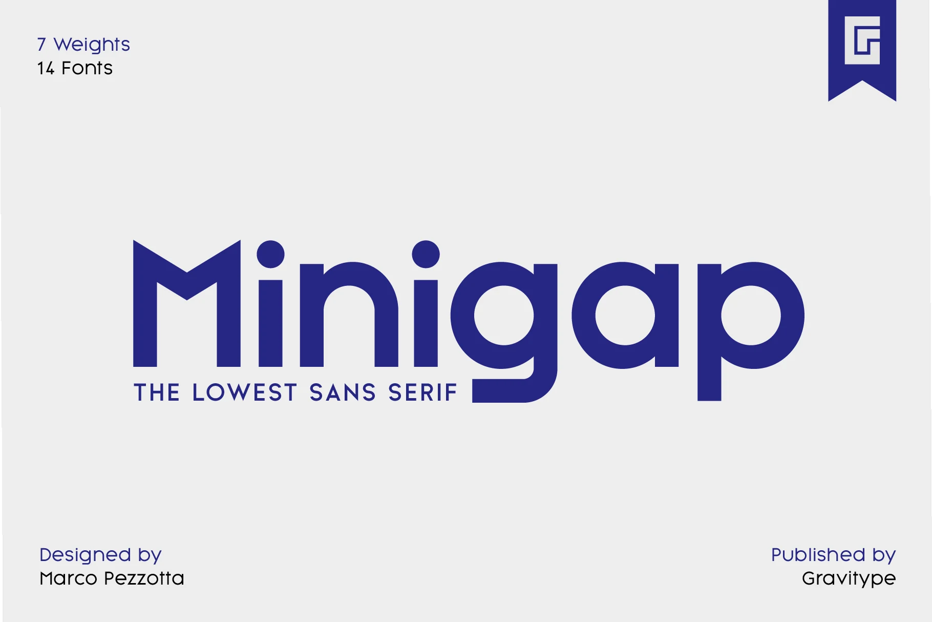
Best For: logos, branding, headlines, website headers
Minigap Font has a clean geometric build with rounded bowls, even stroke weight, and a notably high x-height that makes the lowercase sit almost level with the capitals. That gives the lettering a dense, compact rhythm, while the circular forms keep the overall feel smooth and modern rather than severe.
Among Geometric Sans Serif Fonts, Minigap is especially useful when you want strong readability without relying on dramatic contrast. The high x-height helps short titles and brand names hold their shape at a glance, and it works best when you keep line spacing a little open so the compact proportions do not feel crowded.
Etermal Font
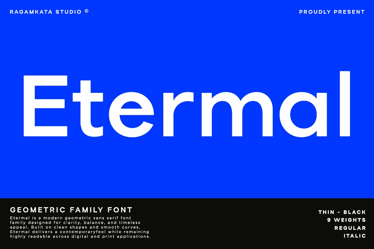
Best For: logos, branding, website headers, professional designs
Etermal Font has a calm geometric rhythm with open counters, even strokes, and smooth rounded curves that keep the large forms crisp without feeling sterile. The broad lowercase and tidy proportions give it a contemporary voice that feels polished, stable, and easy to read.
If you are comparing Geometric Sans Serif Fonts for identity work, Etermal brings enough structure for bold headers and enough restraint for everyday branding. Its clear shapes handle tight headline settings well, but a little extra space around the type helps the curves stay sharp in logos, websites, and clean editorial layouts.
Sanshiro Font
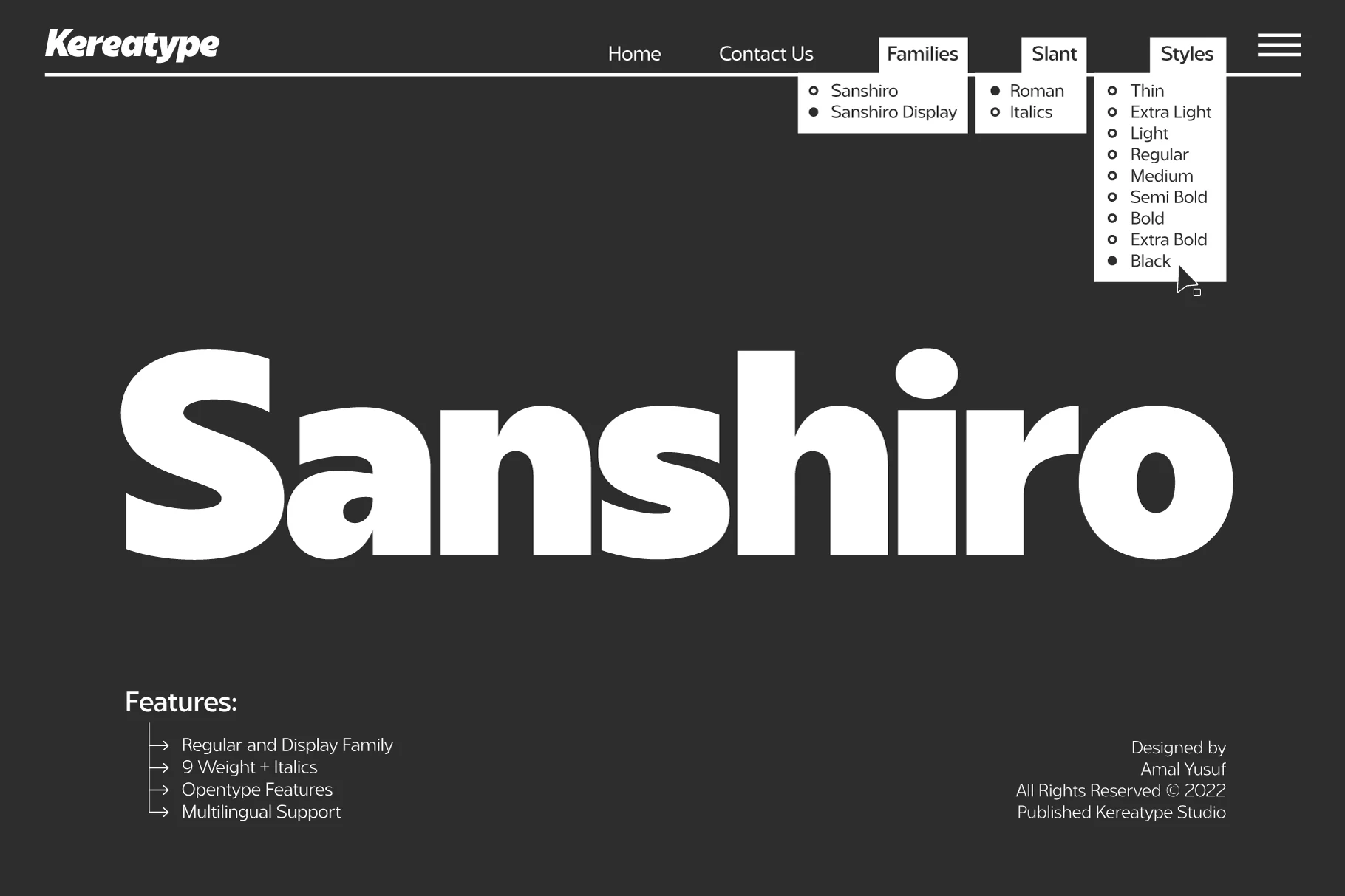
Best For: logos, branding, website headers, headlines
Sanshiro Font has a solid geometric build with smooth curves, broad bowls, and balanced proportions that keep even the heaviest styles looking clean rather than bulky. In the preview, the bold weight shows a confident display voice, while the rounded shaping gives the wordmark a polished, contemporary rhythm.
For Geometric Sans Serif Fonts, Sanshiro is especially useful because the family spans nine weights with matching italics, so you can move from readable text settings to stronger headlines without losing consistency. The lighter cuts benefit from tighter hierarchy work, while the heavyweight styles hold up best in short titles, logos, and bold navigation.
Tower Font
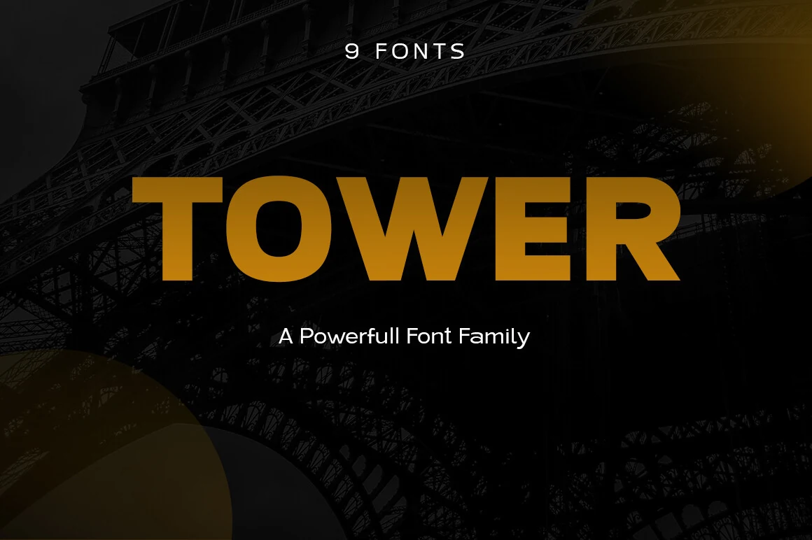
Best For: branding, packaging, headlines, website headers
Tower Font has a sturdy geometric build with broad strokes, low contrast, and a large x-height that gives it a calm, dependable presence. In the preview, the bold weight feels compact and substantial, while the simple shapes keep the wordmark clean rather than overly mechanical.
If you want Geometric Sans Serif Fonts that can move between text and display, Tower stands out for its range from light to black. Use the heavier weights for short, high-impact titles, then step down to lighter cuts for subheads so the hierarchy stays clear without changing the overall tone.
Futuristic & Modular Geometric Sans Serif Fonts
Use this group for tech branding, interface headers, digital campaigns, and modern identity systems that need engineered shapes with a sharp visual rhythm.
Drixon Font
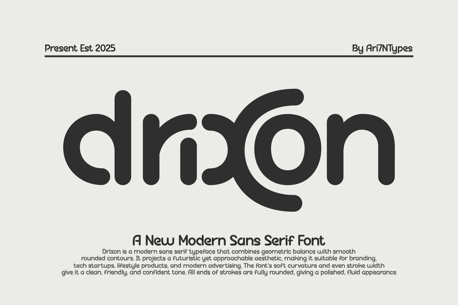
Best For: logos, branding, website headers, modern designs
Drixon Font has a soft geometric build with fully rounded stroke endings, even weight, and wide circular counters that make it feel smooth rather than strict. Its futuristic tone comes from the simplified shapes and unusual letter construction, but the overall rhythm stays clean and friendly.
Within Geometric Sans Serif Fonts, Drixon stands out when you want a modern look with less hardness than a typical tech sans. The broad curves and compact spacing suit short brand names and headers especially well, and giving it generous negative space helps its rounded forms stay crisp at display sizes.
Ragonte Font
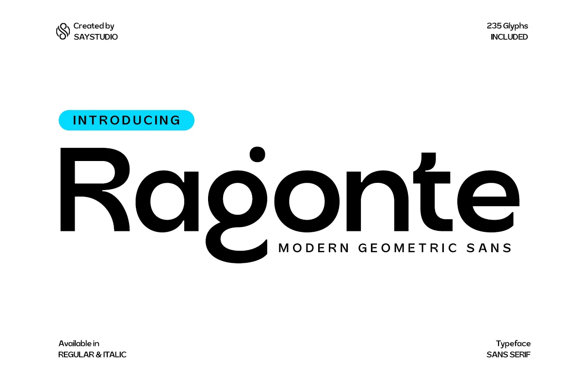
Best For: logos, branding, website headers, social media graphics
Ragonte Font combines bold geometric structure with smooth curves and open counters, giving it a sleek futuristic tone without losing clarity. The standout single-storey g and rounded bowls keep the wordshape memorable, while the even weight makes the large forms feel stable and deliberate.
For Geometric Sans Serif Fonts, Ragonte is strongest in identity work where the type needs to read fast and leave a modern impression. It suits short headlines, logos, and interface-led branding especially well, and a little extra tracking helps the broad curves and distinctive g hold their shape cleanly.
Prompt Font
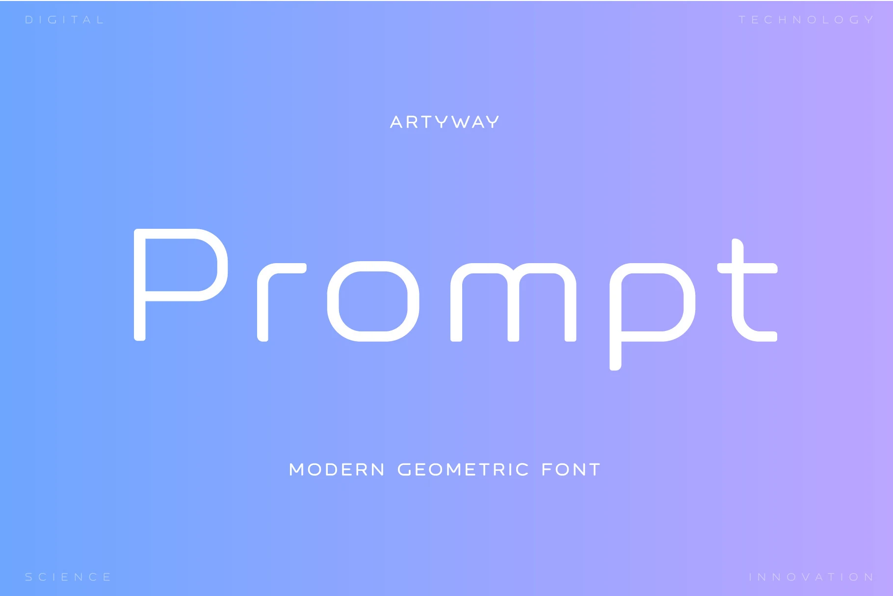
Best For: branding, website headers, modern designs, professional designs
Prompt Font has a sleek monoline build with wide rounded curves, modular proportions, and softly finished corners that keep the design feeling technical without turning cold. The tall stems and open counters create an airy rhythm, so even large words look calm, light, and sharply organized.
For Geometric Sans Serif Fonts, Prompt is especially convincing in interface-led branding and presentation layouts where precision matters. Its lighter stroke weight benefits from generous spacing and a clean hierarchy, which helps buttons, headings, and short labels stay crisp instead of fading into the background.
Hugos Font
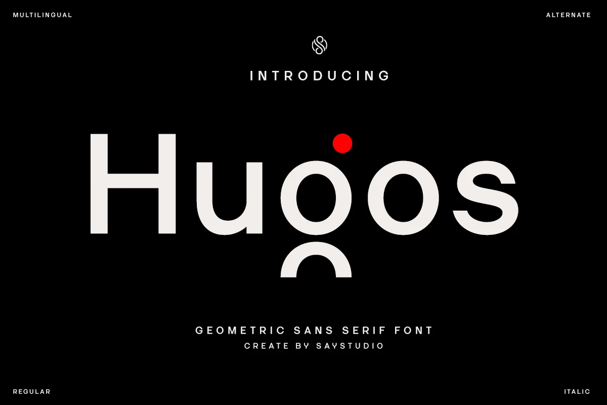
Best For: logos, branding, website headers, social media graphics
Hugos Font pairs clean geometric structure with soft rounded counters and a calm monoline weight, but its standout detail is the stylized g, built from a circular bowl and detached lower curve. That small twist gives the wordshape personality without breaking the sleek, controlled rhythm.
When Geometric Sans Serif Fonts start to feel too familiar, Hugos offers a sharper identity for logos, UI-led branding, and modern headers. It performs best in short lines where the open spacing and distinctive g can lead the hierarchy, while the regular and italic styles make it easier to add contrast in buttons, captions, or secondary labels.
TRT Makron Font
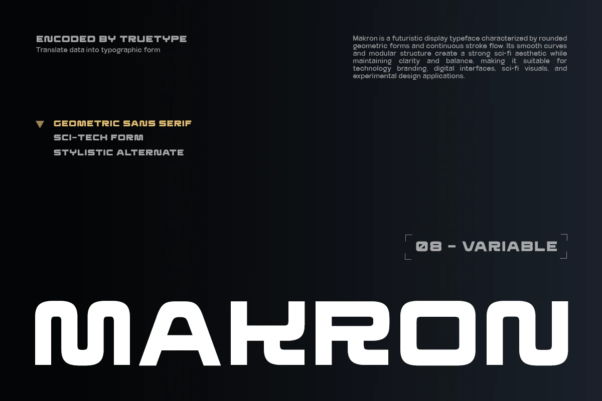
Best For: branding, website headers, editorial designs, modern designs
TRT Makron Font leans into a sci-fi mood with wide modular letterforms, rounded inner corners, and a continuous stroke flow that makes the wordmark feel engineered rather than rigid. The squared curves and softened terminals give it a compact, data-driven texture while keeping the overall tone smooth.
For Geometric Sans Serif Fonts, TRT Makron is strongest in short titles where its futuristic structure can carry the layout. Use it for UI headers, tech branding, or editorial callouts with a little tracking and strong contrast, because the dense forms stay clearer when each shape has room to separate.
Bold & Blocky Geometric Sans Serif Fonts
These heavy geometric fonts are built for short headlines, posters, sports-inspired branding, covers, and display layouts that need immediate impact.
Roph Font
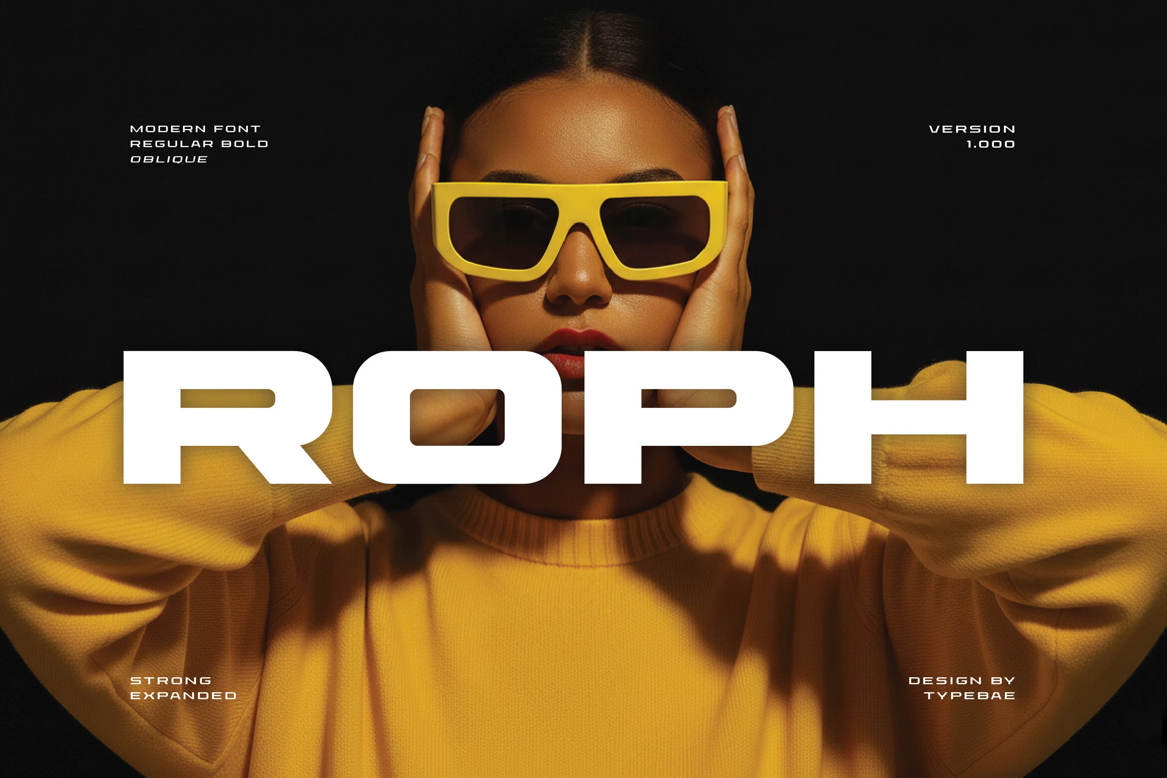
Best For: logos, branding, posters, website headers
Roph Font is built with broad geometric proportions, squared inner shapes, and thick strokes that give every letter a dense, engineered presence. Even with its heavy weight, the curves are smoothed just enough to keep the texture controlled rather than rigid, which suits the futuristic tone visible in the preview.
For Geometric Sans Serif Fonts, Roph is most effective when the type needs to dominate the layout. Its expanded width and blunt structure work especially well in short headlines, identity marks, and sports-inspired visuals, while a narrower supporting sans helps balance the hierarchy without competing with its bold silhouette.
Modeone Font
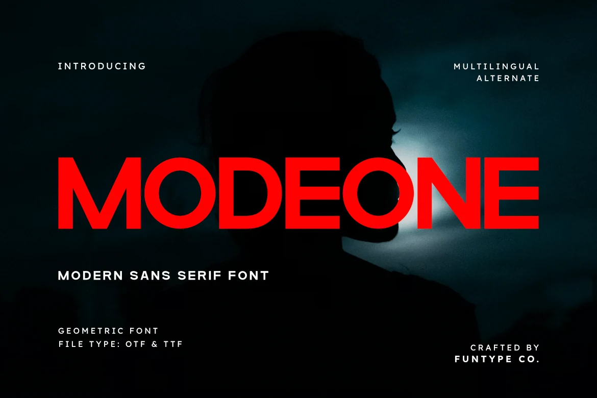
Best For: logos, branding, editorial designs, posters
Modeone Font has a heavy geometric build with broad uppercase proportions, round O forms, and clean, even strokes that keep the texture bold without looking clumsy. The spacing feels controlled and the letter shapes stay crisp, which gives the face a direct, high-contrast presence in big display settings.
If you are comparing Geometric Sans Serif Fonts for headline work, Modeone stands out for its ability to hold attention while staying tidy on the page. It works best with short lines, clear hierarchy, and plenty of surrounding space, so the weight reads as intentional and the simple forms stay sharp in branding or editorial layouts.
TRT Mont Broz Font
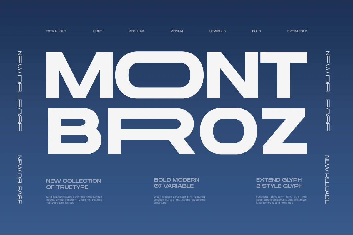
Best For: logos, branding, posters, headlines
TRT Mont Broz Font has the kind of broad, squared silhouette that makes a headline lock into place fast. Large counters, heavy strokes, and softly rounded corners keep the geometry assertive without feeling stiff, so the overall effect lands somewhere between sporty, futuristic, and editorial.
Within Geometric Sans Serif Fonts, this one works best when you let the width do the work. Keep it on short lines, build a strong title hierarchy, and give it enough margin around the wordmark so the rounded forms stay crisp in posters, covers, and branding systems.
Pragos Font
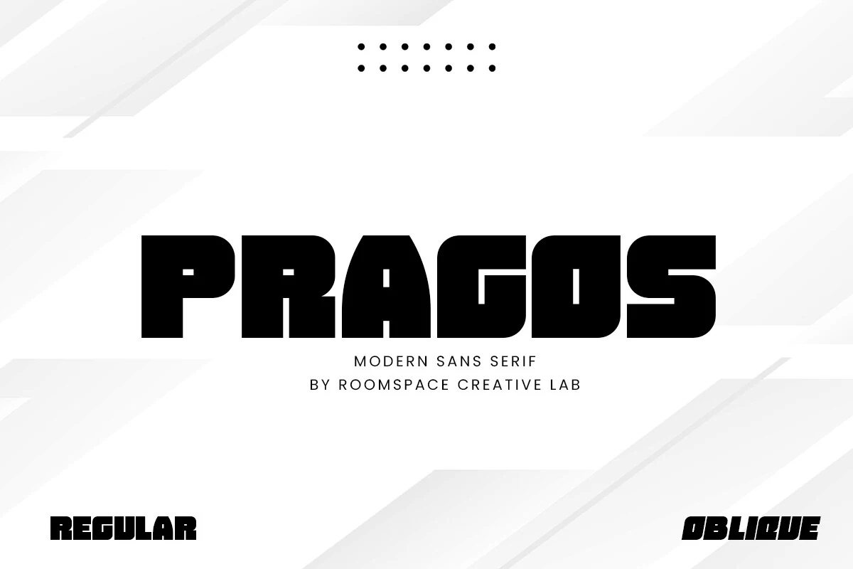
Best For: logos, posters, headlines, branding
Pragos Font has a dense, blocky build that feels sturdy from the first glance. Its box-shaped structure, deep curves, and tight counters give the letters a compact rhythm, while details like the arched A and squared bowls keep the design from feeling flat.
If you are browsing Geometric Sans Serif Fonts for statement typography, Pragos is best treated as a display face. Keep it to short words or bold title lines, and use clear spacing around it so the heavy forms and unusual shapes stay sharp instead of crowding the layout.
Bigbold Font
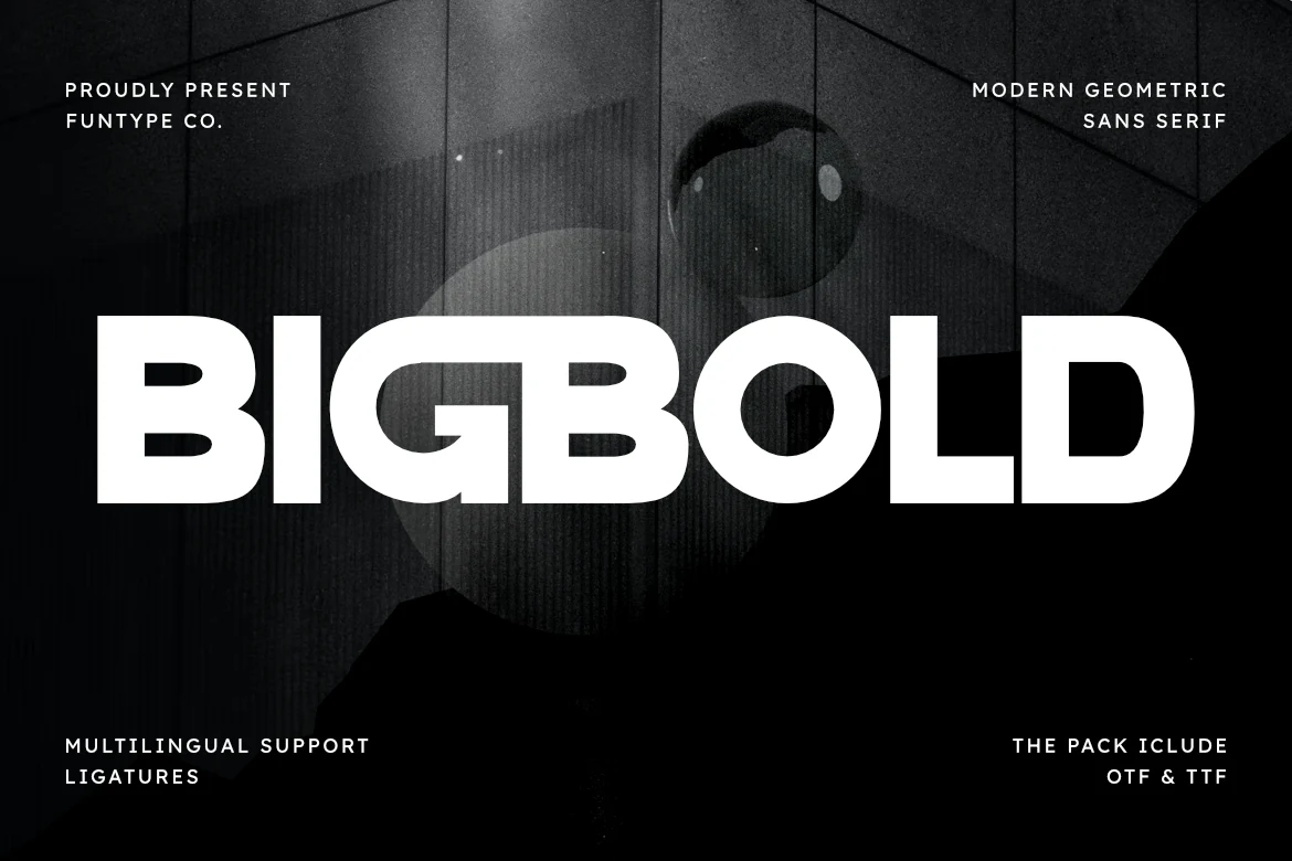
Best For: logos, branding, headlines, editorial designs
Bigbold Font lives up to its name with dense strokes, wide rounded bowls, and compact spacing that make every word land with force. The curved counters and softened corners keep the letters approachable, so the weight feels confident rather than harsh.
For Geometric Sans Serif Fonts that need instant impact, Bigbold works best in short headlines and strong identity pieces. Its ligatures help larger display settings feel more connected, and a little extra margin around the text keeps the heavy shapes clear in logos, covers, and bold editorial layouts.
Condensed & Editorial Geometric Sans Serif Fonts
This category focuses on tall, narrow geometric lettering for magazine covers, poster titles, fashion branding, and compact layouts with vertical presence.
Jugho Font
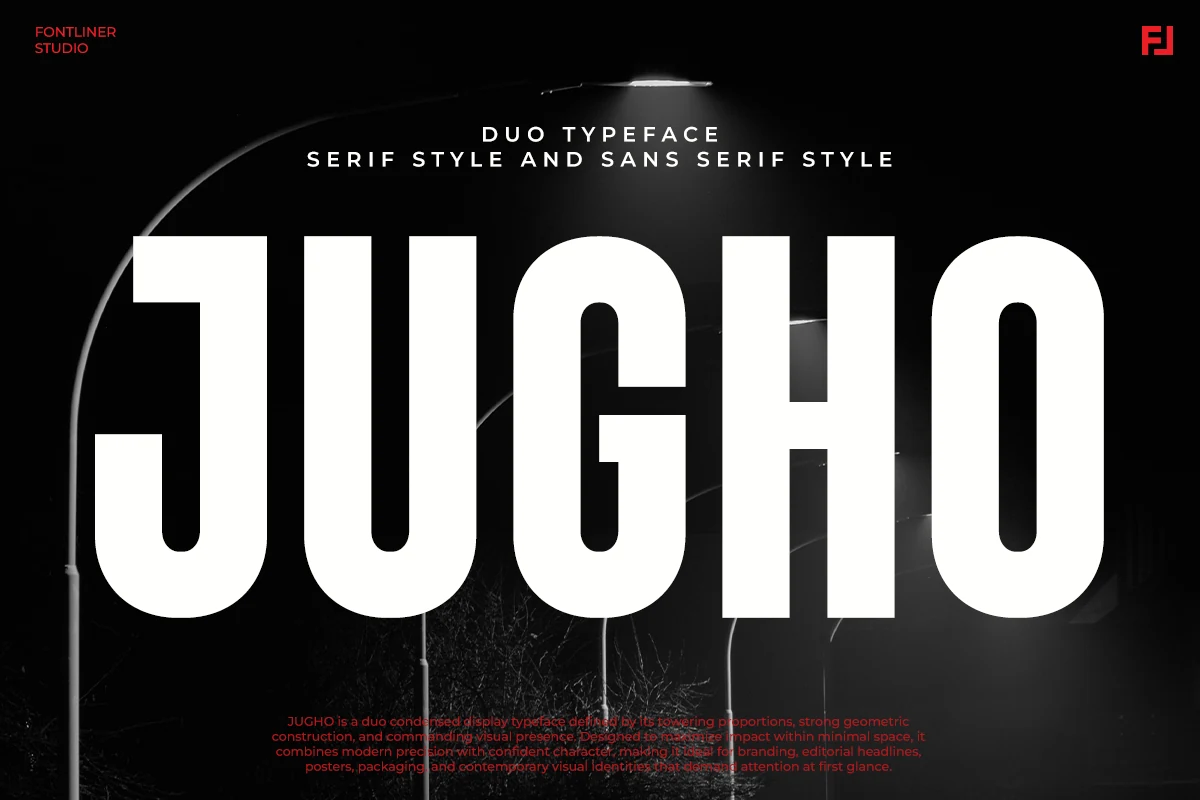
Best For: branding, magazine covers, posters, fashion branding
Jugho Font has an unmistakably tall, compressed silhouette with heavy vertical strokes, rounded lower corners, and a tight, commanding rhythm. In the preview, the sans style feels urban and architectural, with the narrow proportions doing most of the visual work while the smooth curves keep the texture polished rather than harsh.
For Geometric Sans Serif Fonts, Jugho is strongest when you need height, impact, and a clean modern edge in the same headline. Its condensed build suits poster titles, magazine mastheads, and packaging panels especially well, and it benefits from slightly looser tracking so the thick forms have room to read clearly at large sizes.
Ecliso Font
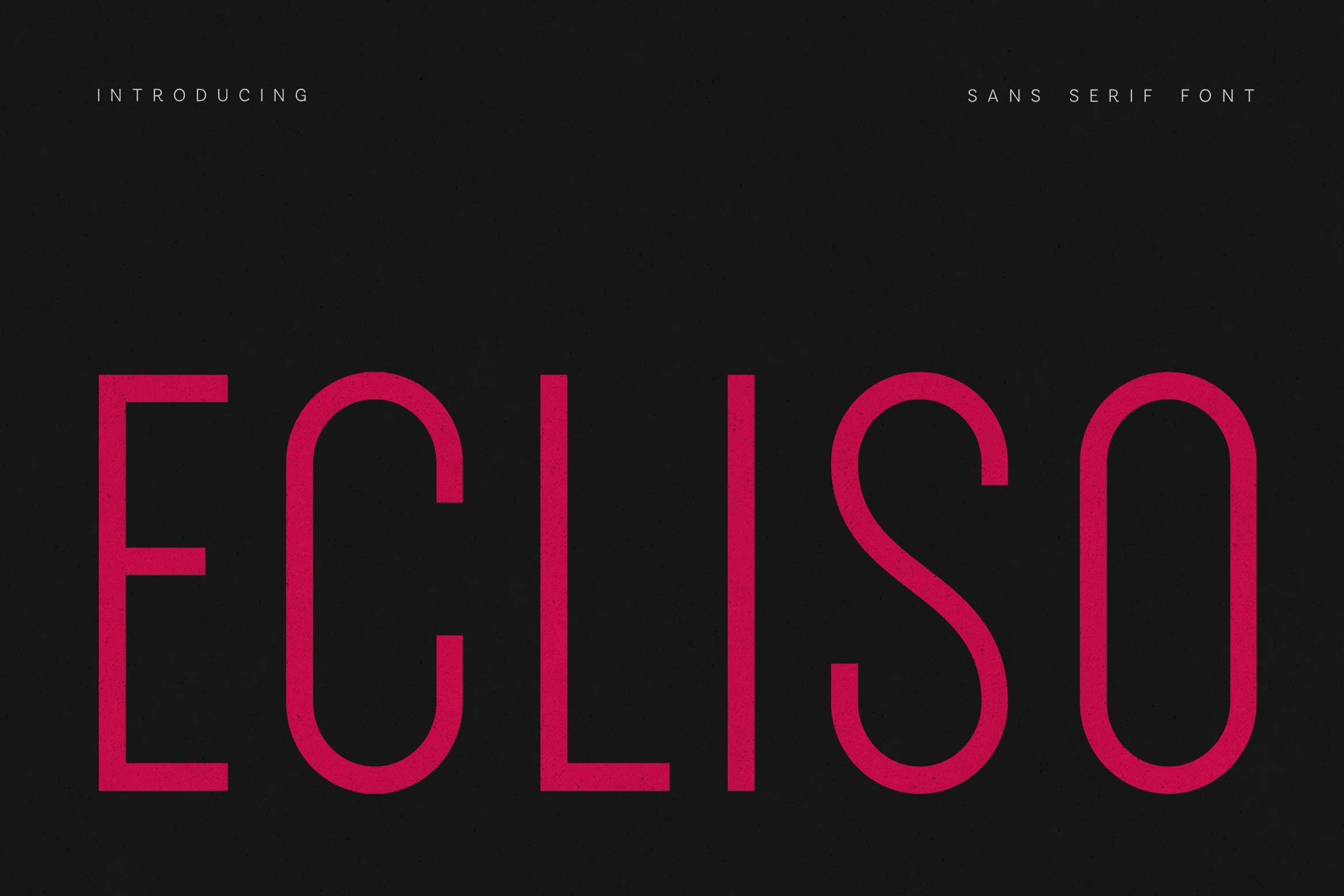
Best For: logos, branding, editorial designs, website headers
Ecliso Font uses tall geometric capitals with monoline strokes, narrow proportions, and clean-cut terminals. The rounded C and O soften the vertical structure, while the open spacing keeps a wordmark sharp instead of cramped.
For Geometric Sans Serif Fonts with a polished editorial tone, Ecliso depends on controlled spacing: use generous tracking for titles, strong contrast around the letters, and short brand phrases where its refined rhythm stays readable.
Minimal & Premium Geometric Sans Serif Fonts
Choose these cleaner geometric fonts for refined logos, high-end identity work, business cards, editorial systems, and layouts where spacing carries the style.
Cult Font
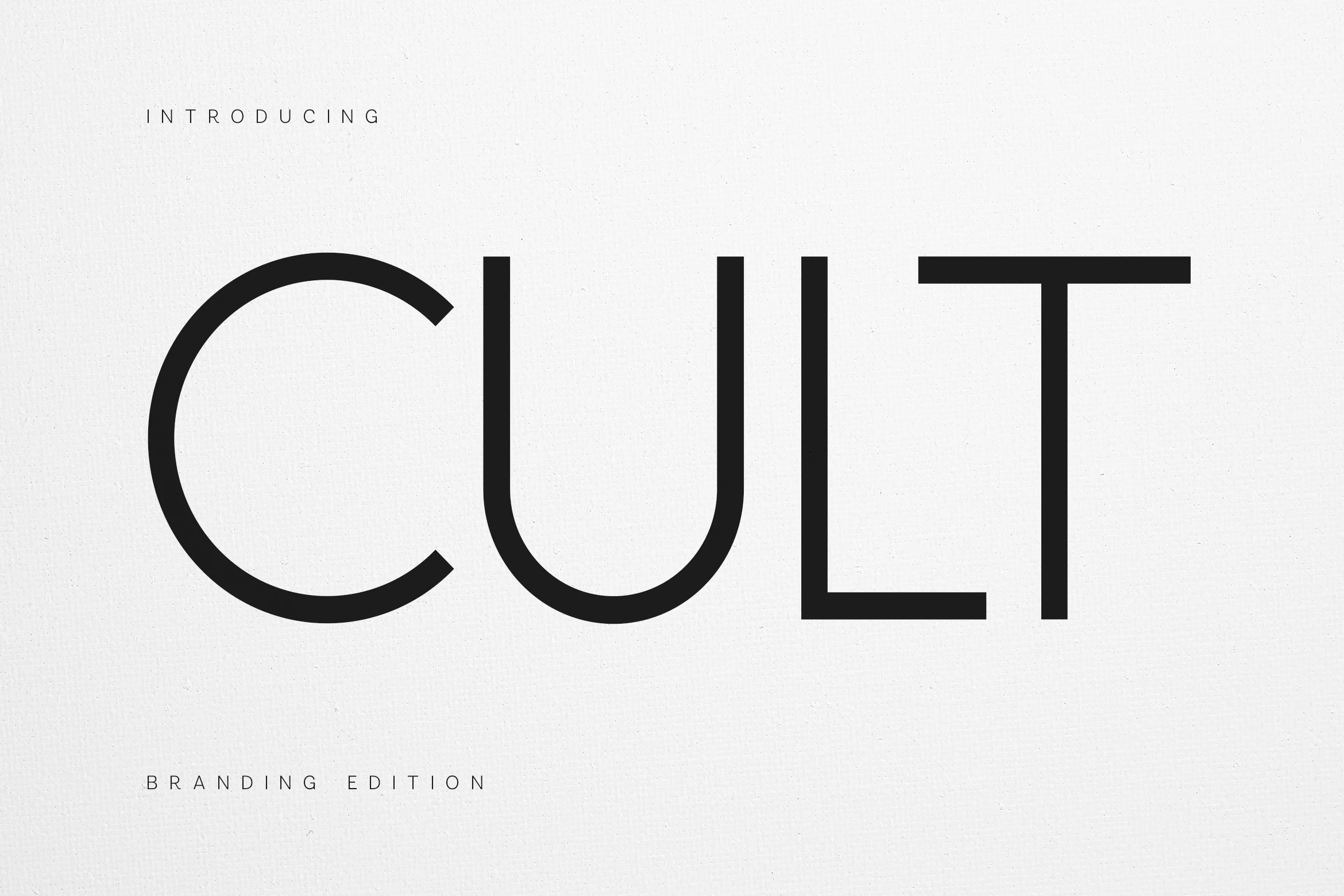
Best For: logos, branding, minimal designs, high-end designs
Cult Font is a pared-back geometric sans with very thin monoline strokes, broad circular curvature, and a deep rounded U that gives the wordmark a calm architectural rhythm. The generous proportions and sharp terminals make it feel precise and editorial, but never cold.
Within Geometric Sans Serif Fonts, Cult works best for identity systems where space and proportion do the styling. Use it large, keep tracking slightly open, and pair it with restrained layouts, because the slim strokes and wide forms shine in logos, headers, and short brand statements rather than dense text.
Neueral Grotesk Variable Font
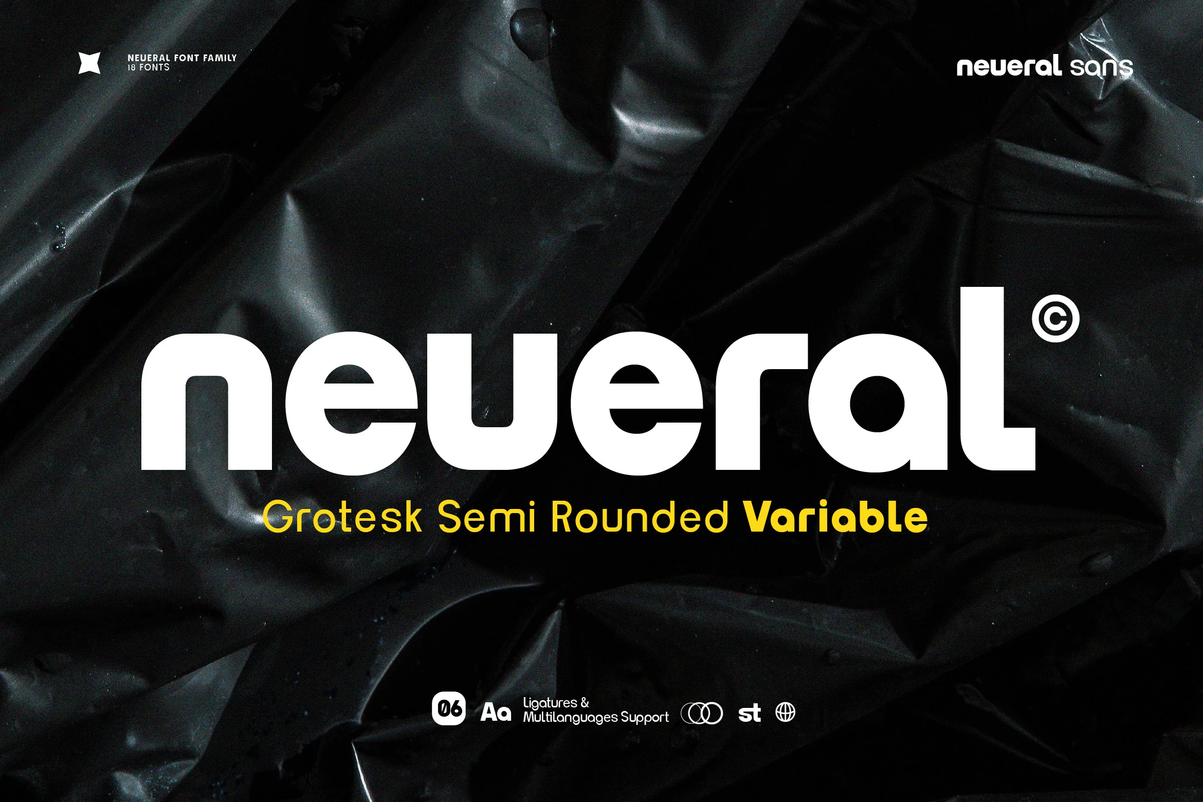
Best For: logos, branding, editorial designs, business cards
Neueral Grotesk Variable Font has a calm, neutral presence built from geometric shapes, broad counters, and softly rounded corners. The heavy preview weight shows how cleanly it fills space, with smooth joins and even strokes that keep bold display text feeling polished rather than blunt.
For Geometric Sans Serif Fonts, this family is especially useful because its 18 variations let you build hierarchy without losing consistency. It works best when you keep spacing disciplined and leading a little tight, which helps the semi-rounded forms stay crisp in logos, editorial layouts, and wayfinding-style typography.
Cenura Font
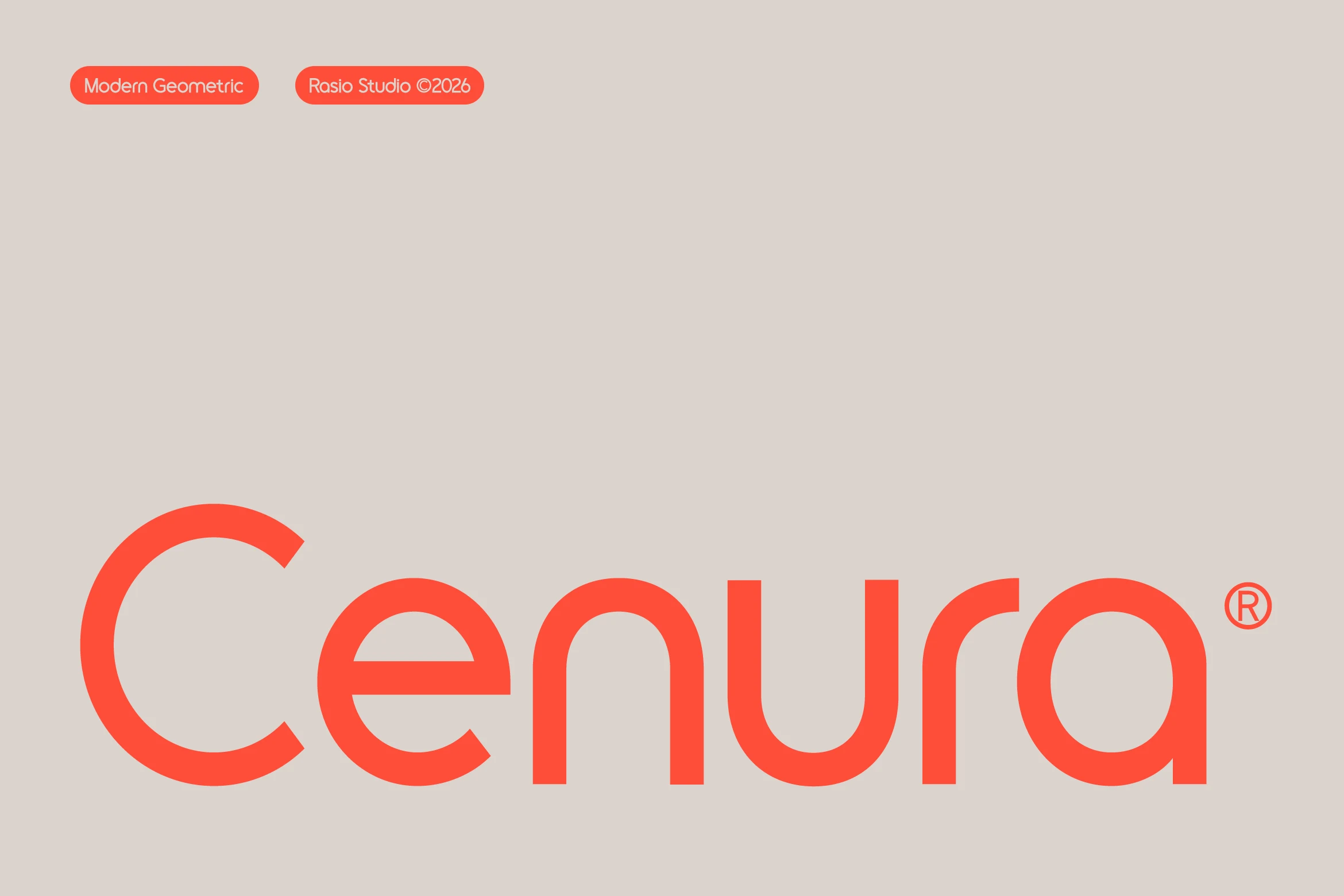
Best For: logos, branding, website headers, high-end designs
Cenura Font leans into geometry without looking cold. The preview shows wide circular bowls, monoline strokes, and crisp vertical stems, while the open lowercase e and broad C create a smooth, architectural rhythm.
For Geometric Sans Serif Fonts aimed at sleek identity work, Cenura is strongest in short lines where its rounded tracking and steady line weight stay visible. Give it generous spacing and plenty of negative space, and it holds a premium tone in logos, headers, and other display settings.
Conclusion
Choose rounded geometric sans serif fonts when you need softer branding, bold blocky styles for poster-level impact, condensed options for editorial layouts, minimal families for premium systems, and futuristic modular faces for tech-driven designs.