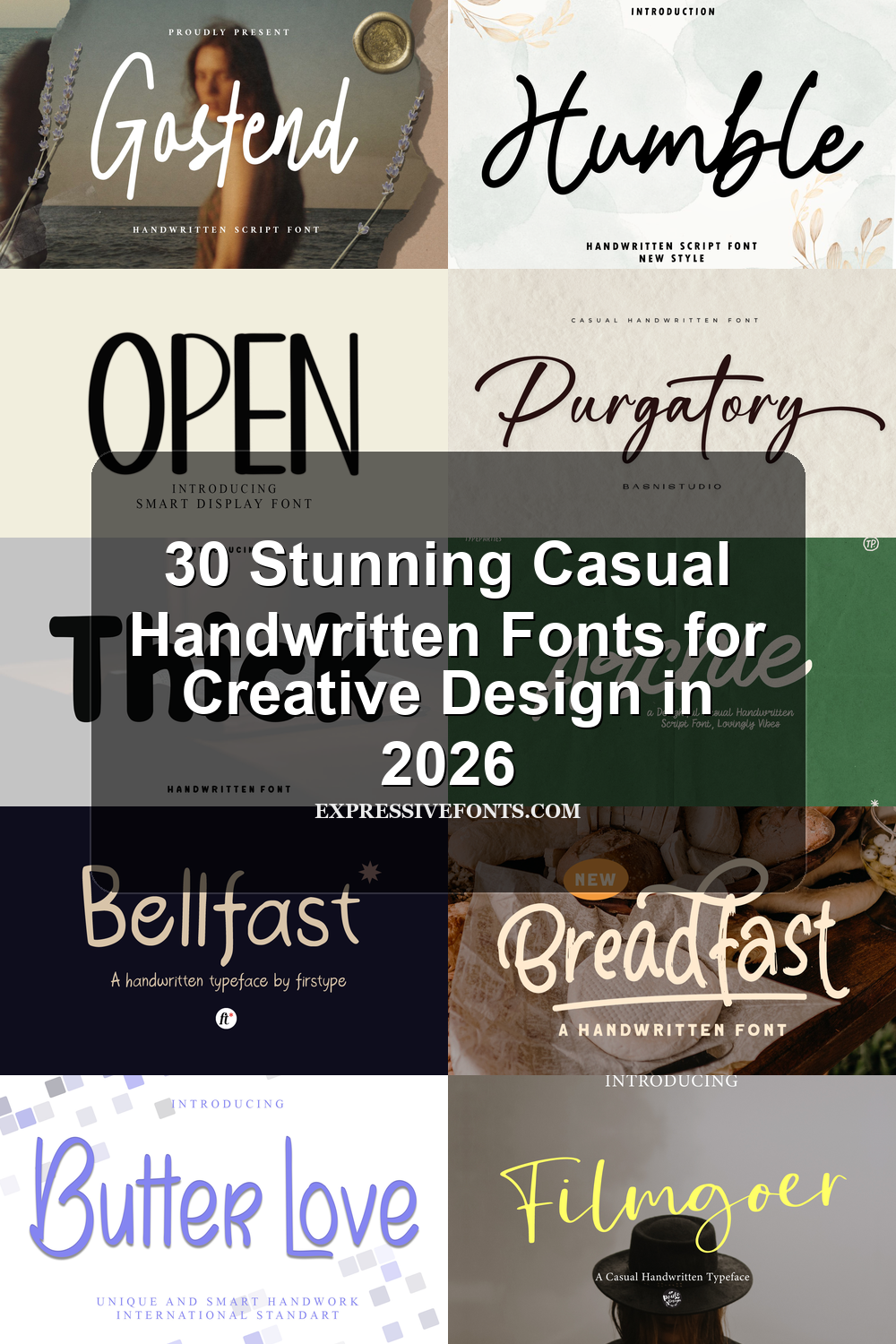
30 Stunning Casual Handwritten Fonts for Creative Design in 2026
Casual Handwritten Fonts are useful for designers who want relaxed lettering without losing readability. This collection covers script, brush, rounded, monoline, and signature-style fonts for logos, invitations, packaging, stickers, quotes, social media graphics, and friendly brand visuals. Use it to compare softer, cleaner, bolder, and more playful handwriting styles before choosing a font for your project.
Looking for more handwritten fonts? Browse our complete Handwritten Fonts collection to compare modern, cute, casual, bold, brush, signature, script, wedding, Cricut, and logo-friendly handwritten styles.
Elegant Signature Casual Handwritten Fonts
These graceful signature-style fonts use slim strokes, long swashes, and airy spacing for logos, invitations, personal branding, and refined quote graphics.
Sekar Wangi Font
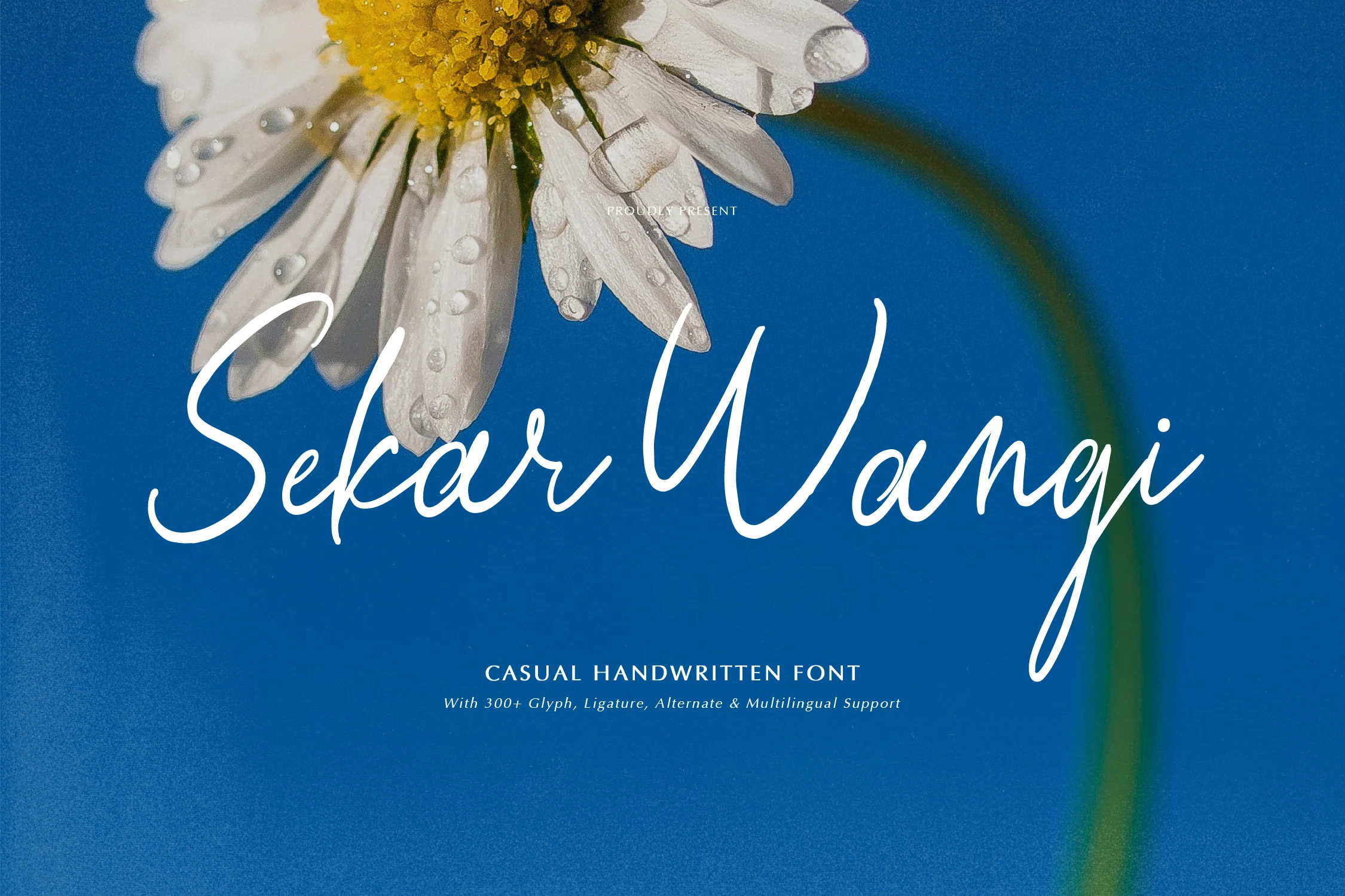
Best For: logos, branding, invitations, quotes
Sekar Wangi Font has a light, flowing script style with tall loops, slim strokes, and a relaxed baseline that keeps the lettering personal rather than polished. Its long entry and exit strokes give short names or phrases a graceful horizontal sweep, which suits Casual Handwritten Fonts with a softer, more intimate tone.
The thin line weight needs enough contrast against the background, especially when used over photography or textured packaging. Keep the wording brief, avoid tight tracking, and let the extended descenders shape the title hierarchy instead of forcing the font into dense text blocks.
Filmgoer Font
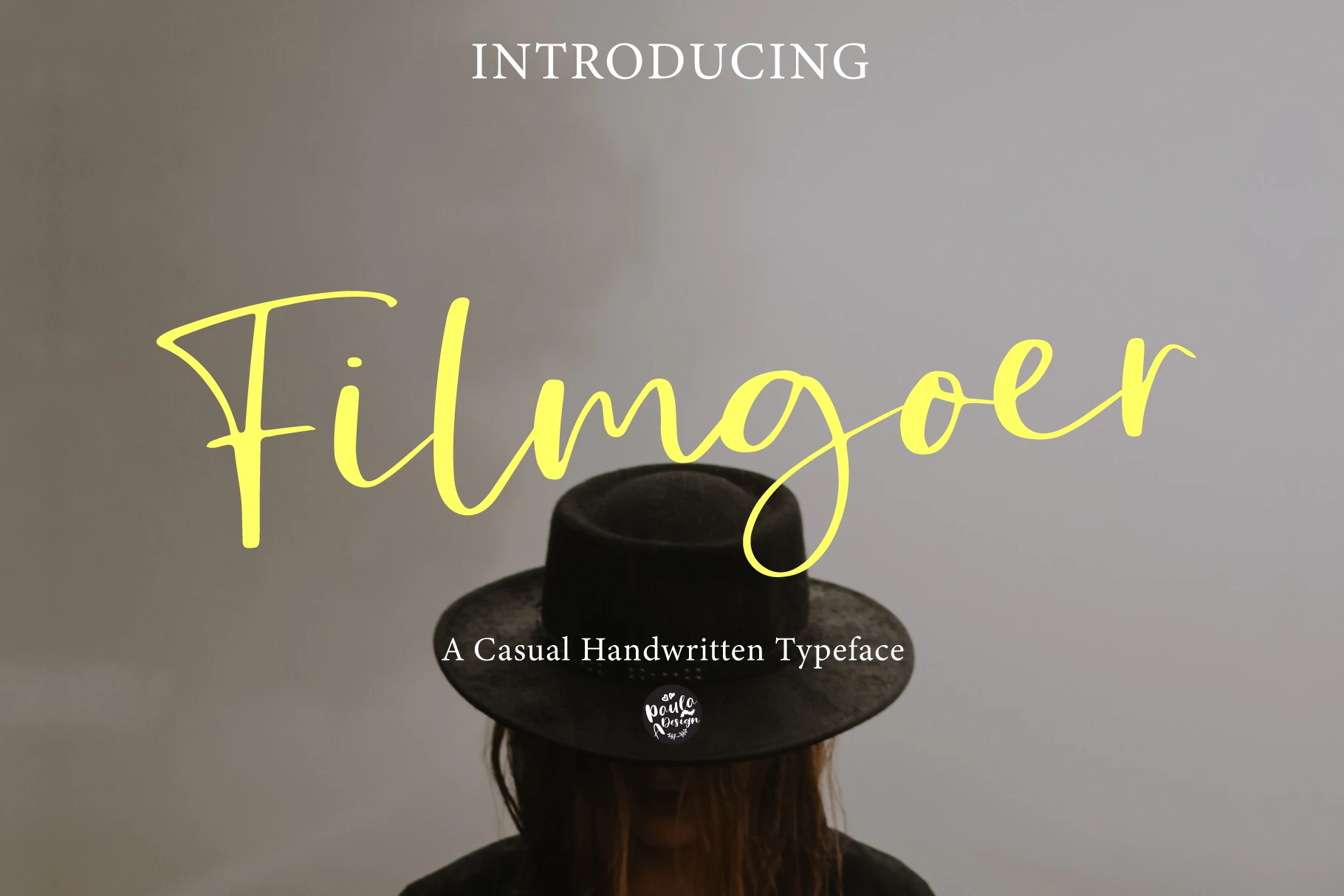
Best For: logos, invitations, wedding designs, quotes
Filmgoer Font has a light, flowing script style with rounded loops, slim connecting strokes, and a soft handwritten rhythm that feels relaxed and personal. Its long swashes and open letterforms give Casual Handwritten Fonts a more graceful, feminine direction without becoming overly delicate.
The extended strokes look best when the wording stays short, so names, quotes, and logo lines can keep their shape without tangling. Leave a little extra space around the baseline and pair it with a simple serif or clean sans for supporting text, especially in invitations or branding layouts.
Rocstaine Handwritten Font
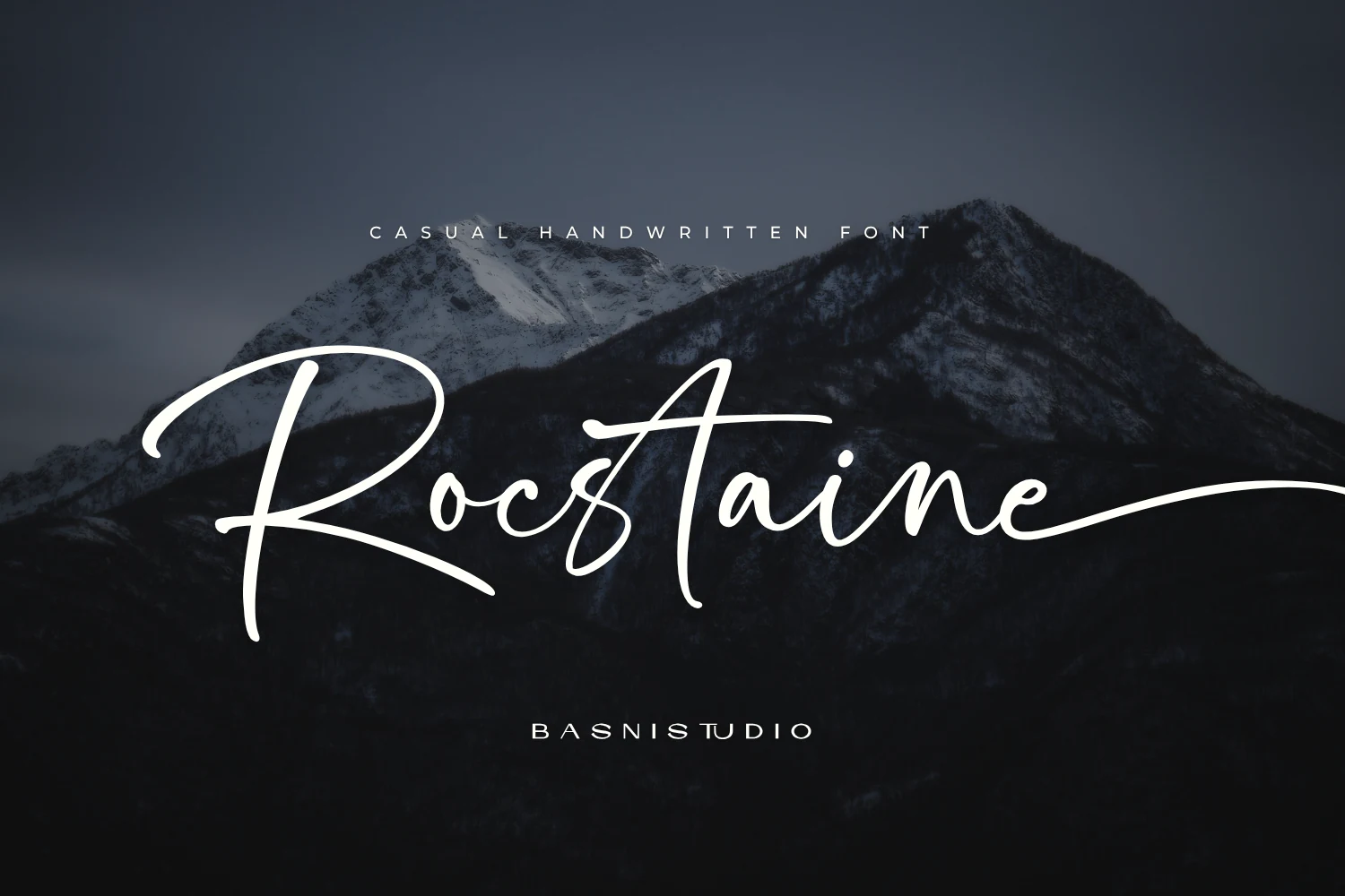
Best For: logos, branding, invitations, personal branding
Rocstaine Handwritten Font leans into a refined signature look, with long slender stems, broad airy spacing, and low sweeping lowercase forms that travel smoothly across the line. The tall ascenders and oversized opening stroke give Casual Handwritten Fonts a more spacious, atmospheric feel, so the script reads elegant without turning rigid.
It works best when you let those extended strokes shape the layout—names, logo lines, and invitation headings all benefit from the generous horizontal movement. Keep supporting text restrained and avoid tight line spacing, since the lofty ascenders and long terminal swash need breathing room to stay crisp and balanced.
Purgatory Font
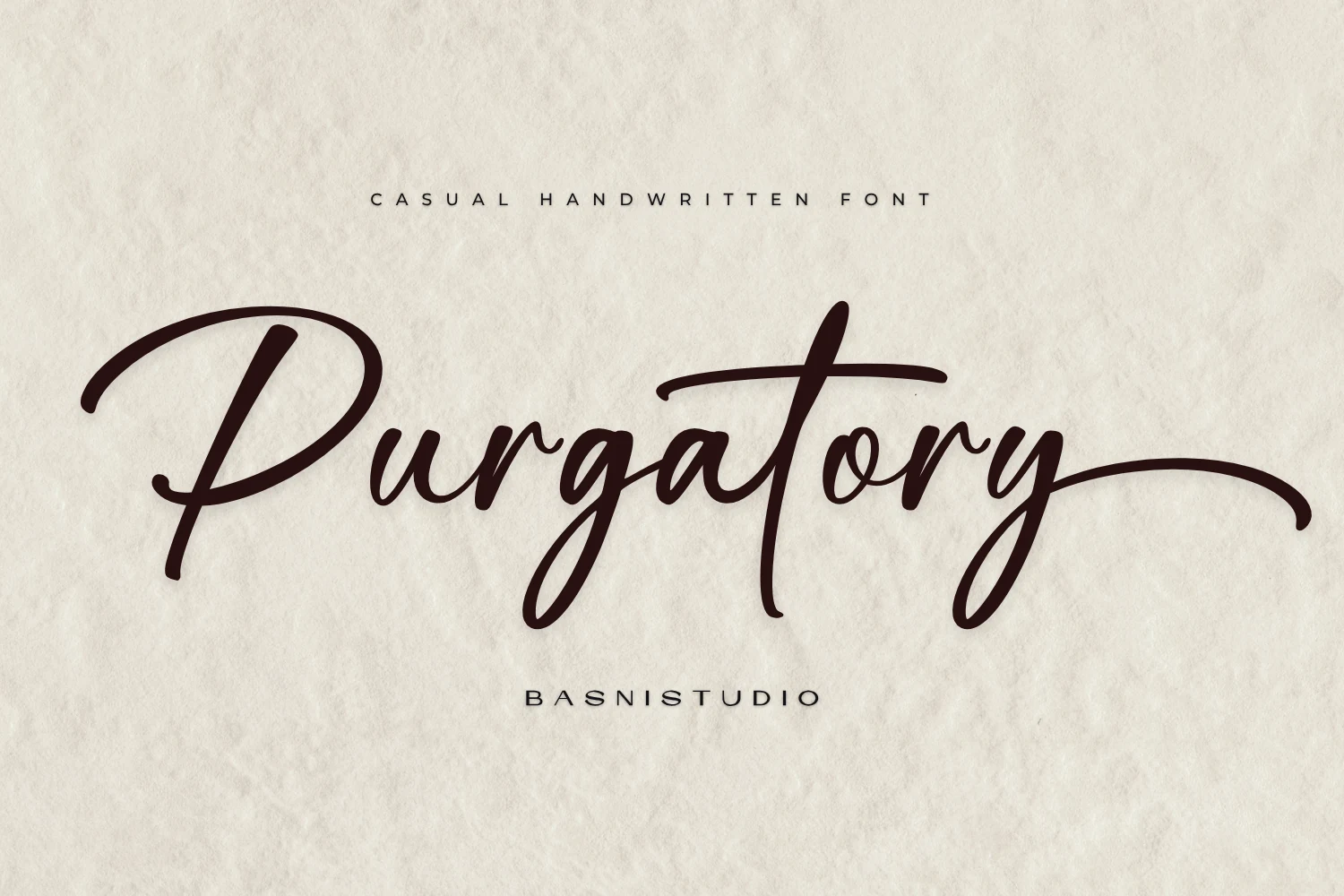
Best For: logos, branding, invitations, wedding designs
Purgatory Font has a poised handwritten rhythm, with looping capitals, smooth monoline strokes, and long exit swashes that stretch elegantly across the line. Those deep baseline dips and airy joins give Casual Handwritten Fonts a more refined, intimate character, closer to a pen-written signature than a loose brush script.
It shines in names, logo lines, and invitation headings where the extended terminals can shape the composition on their own. Keep the wording short and the surrounding layout calm, because the tall flourishes and linked strokes need breathing room to stay graceful instead of tangled.
Kartina Font
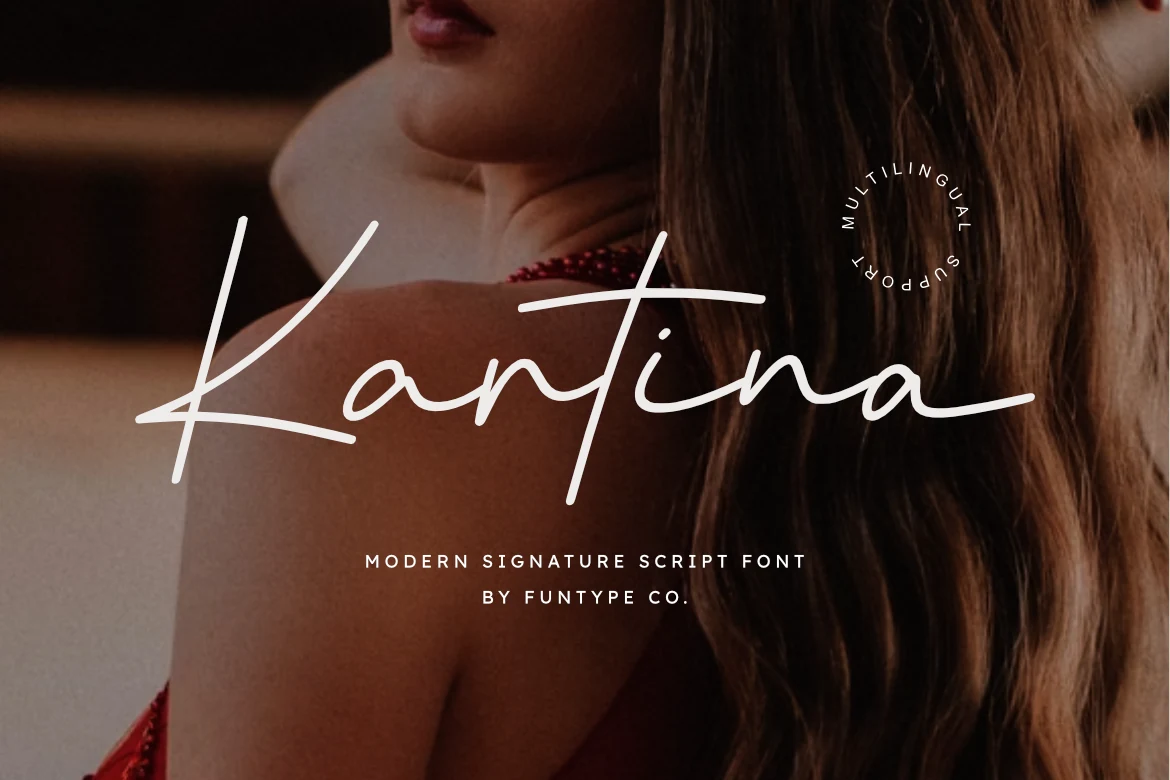
Best For: personal branding, fashion branding, beauty branding, luxury designs
Kartina Font has a refined signature feel, built from slim monoline strokes, a sweeping capital K, and long cross-strokes that give the script a poised, high-end rhythm. It fits Casual Handwritten Fonts with a cleaner, more polished voice, so names and short brand marks feel personal without losing precision.
The open spacing and even connections keep the lettering readable, while its wide horizontal flow helps a logo or headline stretch elegantly across a layout. Give it room at the sides and pair it with a restrained sans or serif; that contrast keeps the delicate line work crisp in boutique identities and premium social graphics.
Huntsparkle Font
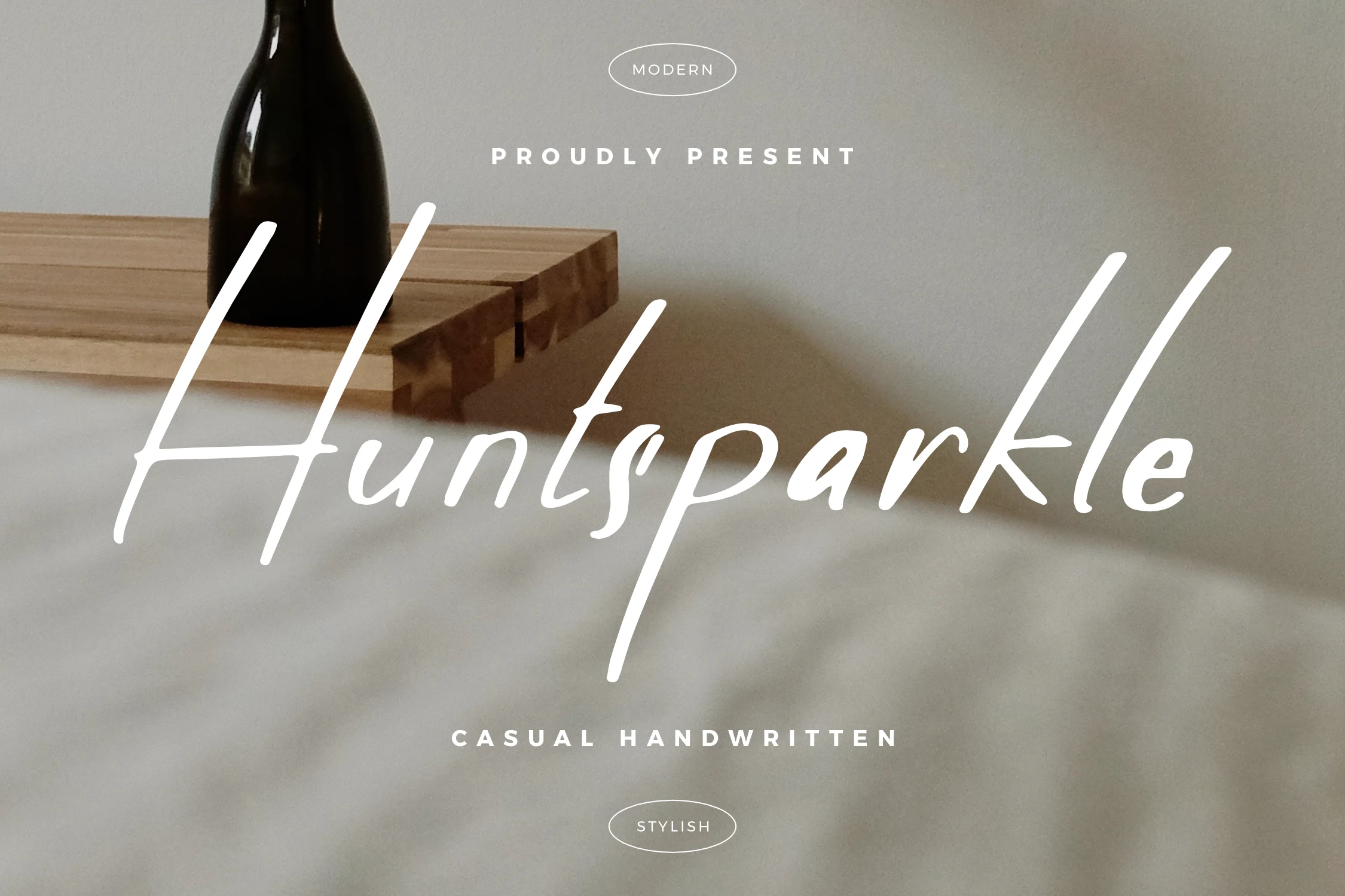
Best For: logos, branding, invitations, quotes
Huntsparkle Font has a slim, flowing script with elongated strokes, airy spacing, and a graceful baseline that keeps the lettering light rather than ornate. It gives Casual Handwritten Fonts a polished signature feel, with a tall opening swash and smooth monoline rhythm that reads cleanly in names and short titles.
The long ascenders and generous width help it stretch elegantly across a layout, so it works especially well when you want a wordmark to feel open and refined. Keep supporting text compact and understated; that contrast lets the delicate line work stay crisp in logos, invitations, and quote-based designs.
Bold Brush Casual Handwritten Fonts
This group focuses on heavier brush and marker styles that bring strong handmade impact to posters, T-shirts, packaging, headlines, and bold social graphics.
Thing King Font
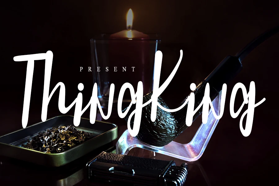
Best For: logos, posters, quotes, casual designs
Thing King Font leans bold and informal, with tall upright strokes, rounded terminals, and a steady handwritten rhythm that feels more confident than delicate. The letters stay open at display sizes, giving Casual Handwritten Fonts a cleaner, punchier presence for titles that need to read fast.
Because the strokes are thick and the word shapes are narrow, it works best when you keep the copy short and let the vertical lines do the work. Use it for a headline or quote with a little breathing room around each line, then pair it with a simple secondary typeface so the script keeps its impact.
Roster York Font
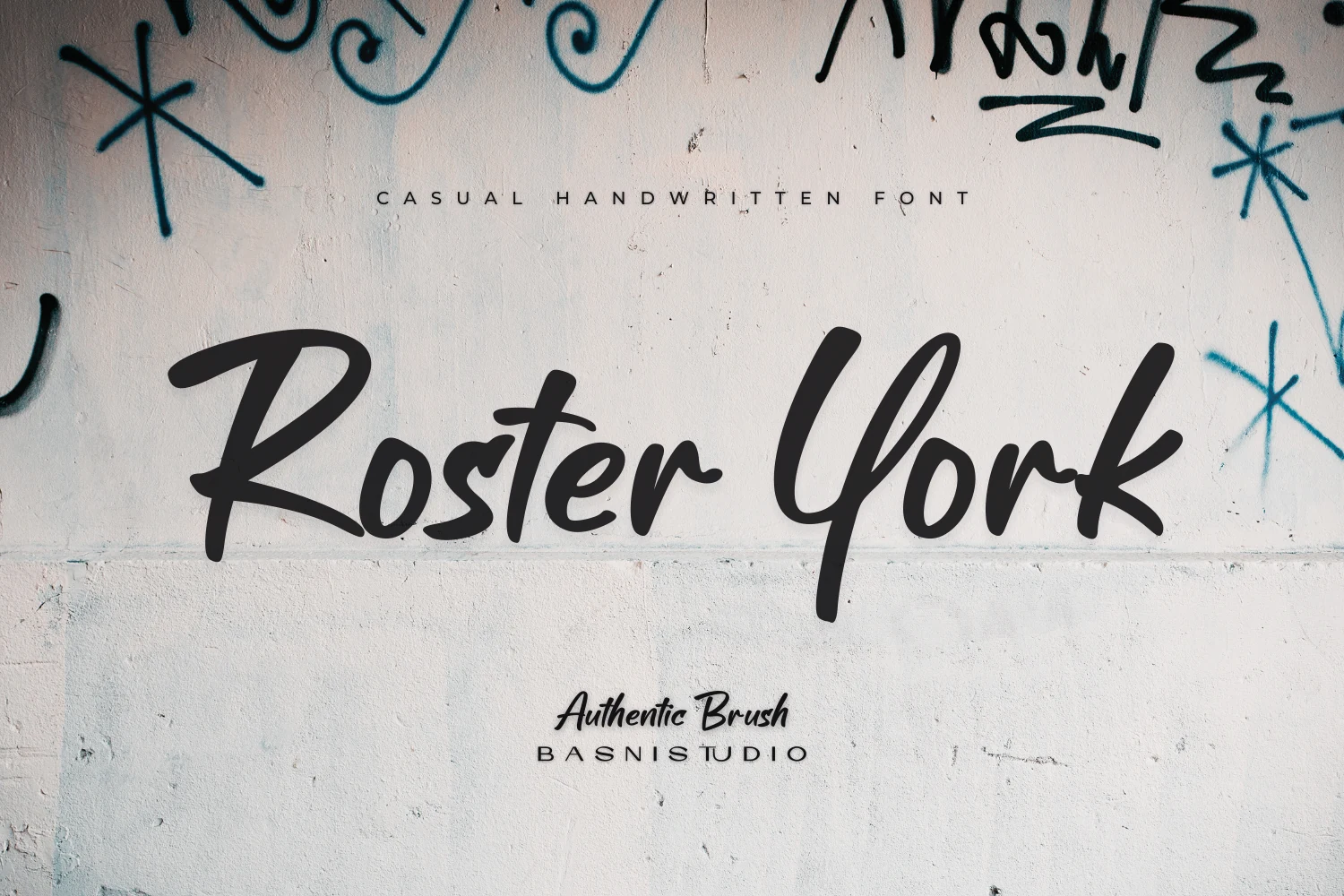
Best For: logos, posters, signage, T-shirts
Roster York Font has a heavy brush-script feel, with broad capitals, blunt stroke endings, and a fast painted rhythm that gives each word a bit of street-made attitude. It suits Casual Handwritten Fonts that need more punch than polish, especially when a headline should feel immediate and human.
The thick strokes and compact joins make it strongest in short lines, where the oversized R and Y can anchor the composition. Give it room on posters or packaging, then pair it with a clean sans for supporting text so the brush texture stays clear instead of crowded.
Smoothie Delights Font
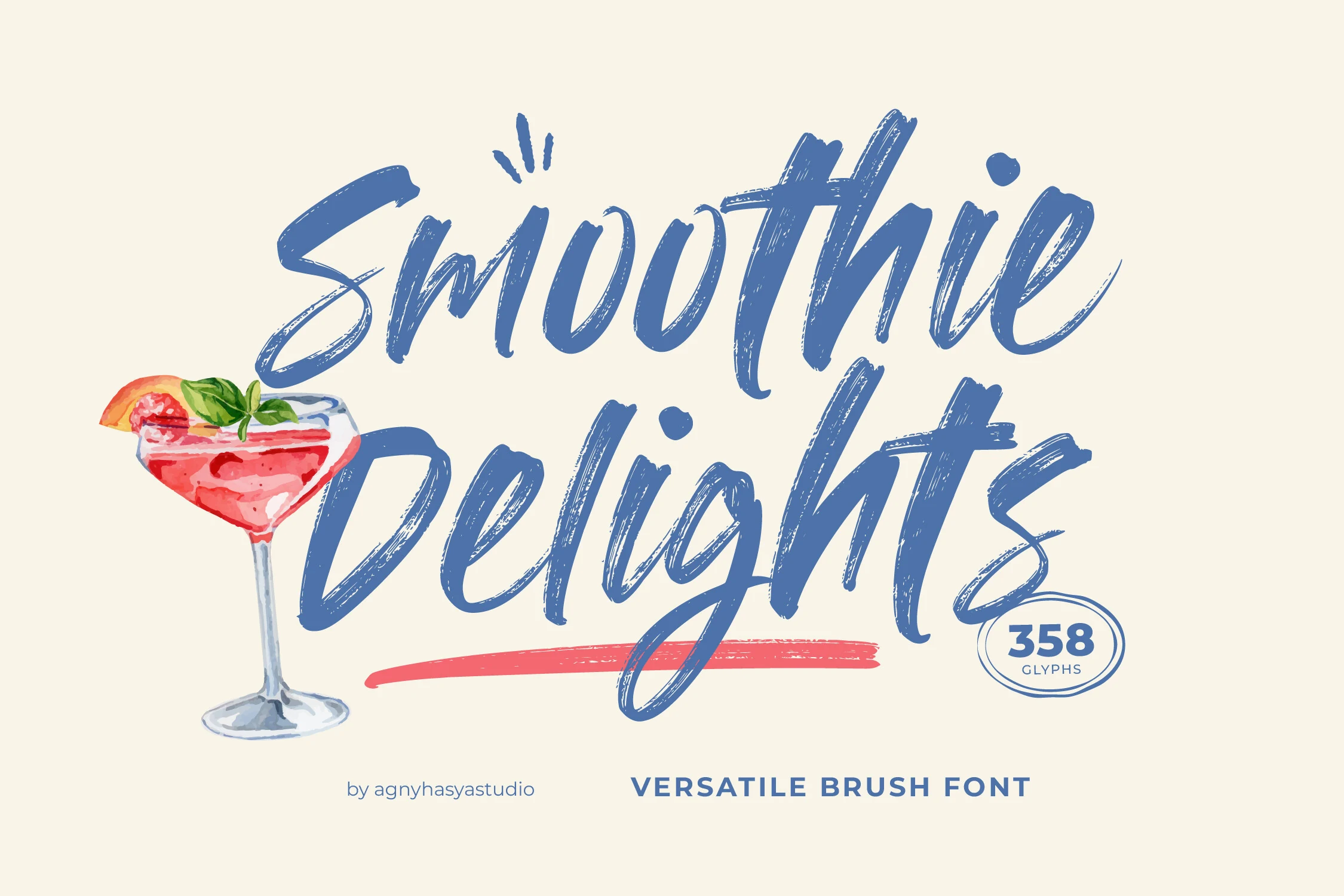
Best For: logos, packaging, social media graphics, posters
Smoothie Delights Font has broad brush lettering, visible dry-stroke texture, and tall looping forms that keep the script lively without losing clarity. That mix of movement and legibility gives Casual Handwritten Fonts a more graphic presence, especially when you want a headline to feel handmade but still easy to read at a glance.
The thick strokes work best when you let the texture show, so avoid shrinking it too far or packing lines too tightly. Use it for short display copy, and pair it with a restrained sans serif for supporting text to keep the composition balanced while the brush rhythm carries the visual energy.
Alison Phillips Casual Handwritten Font
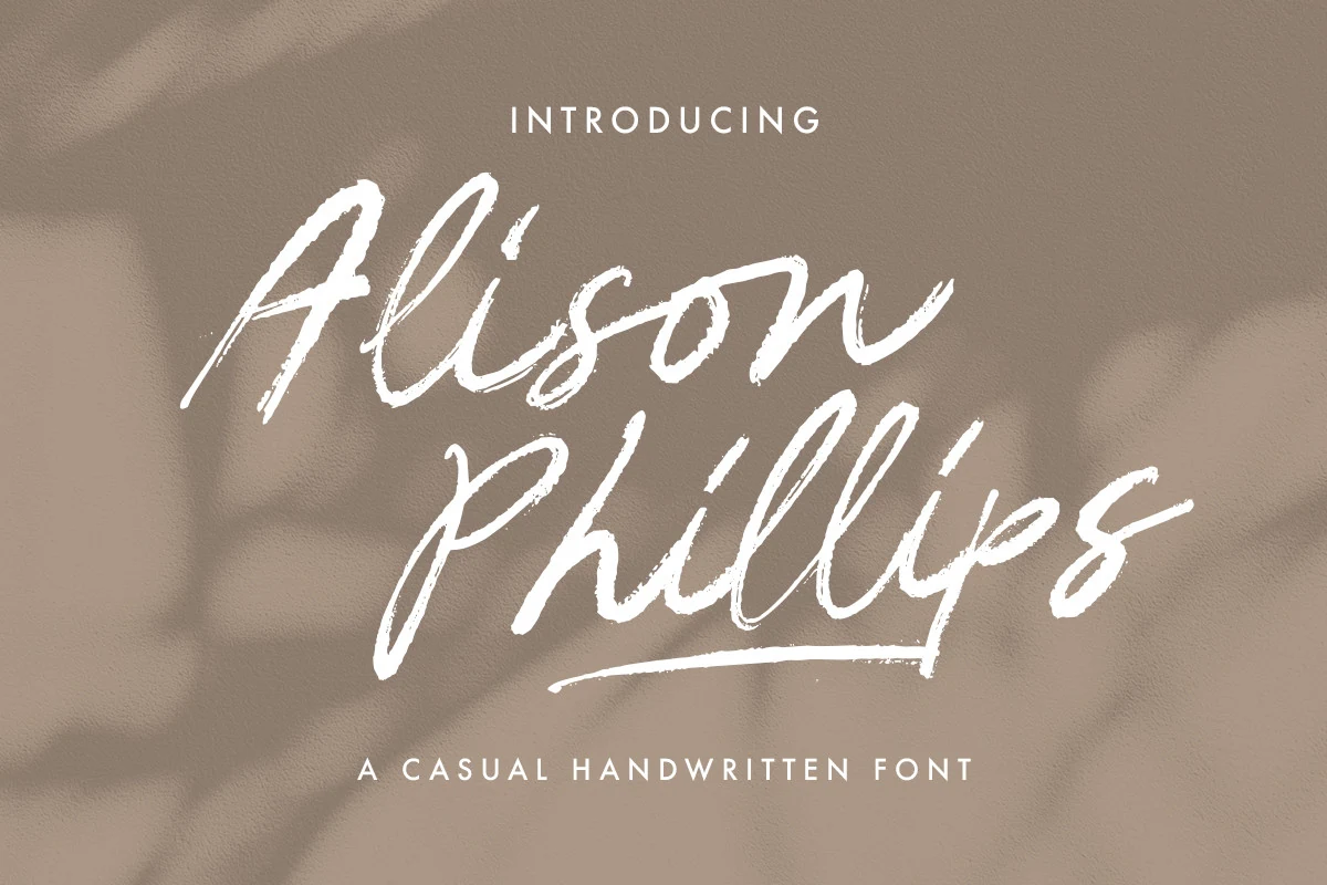
Best For: branding, social media graphics, invitations, quotes
Alison Phillips Casual Handwritten Font has a loose brush-script rhythm with dry, textured strokes, tall looping capitals, and a lively slant that keeps it feeling personal rather than polished. It suits Casual Handwritten Fonts that need real motion on the page, especially when a headline should look signed, spontaneous, and full of character.
The rough edges and long finishing underline give short phrases plenty of energy, while the open shapes keep the script readable at display size. Use it where contrast can do some work for you—clean backgrounds and a little extra breathing room help the brush texture stay crisp in logos, invites, and social posts.
Wildpaint Font
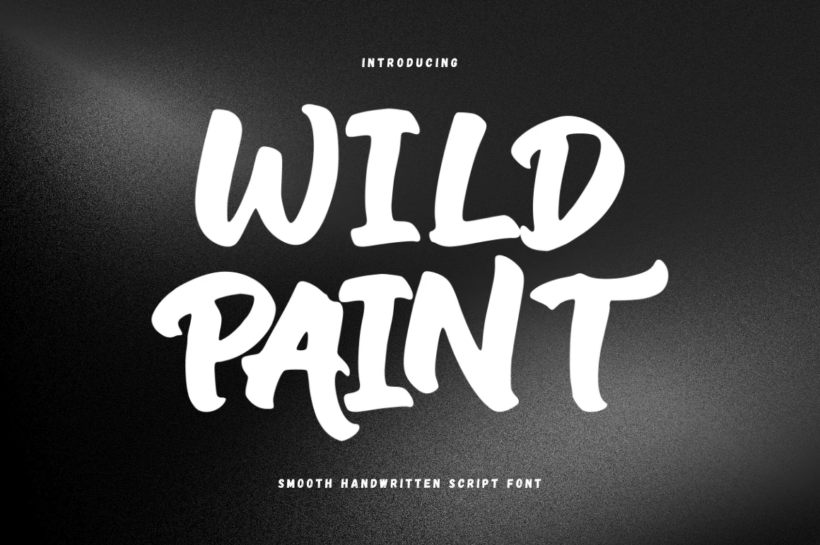
Best For: headlines, quotes, social media graphics, bold designs
Wildpaint Font leans into a chunky painted look, with thick strokes, soft corners, and slightly uneven contours that make each letter feel brushed by hand. Within Casual Handwritten Fonts, it stands out for its bold uppercase presence, giving short words a lively, informal attitude instead of a delicate script feel.
The broad shapes and compact rhythm make it strongest in display settings where impact matters more than refinement. Use it for short headlines or punchy quote layouts, and pair it with a simple supporting font so the heavy brush texture and quirky terminals stay clear rather than crowded.
Humble Font
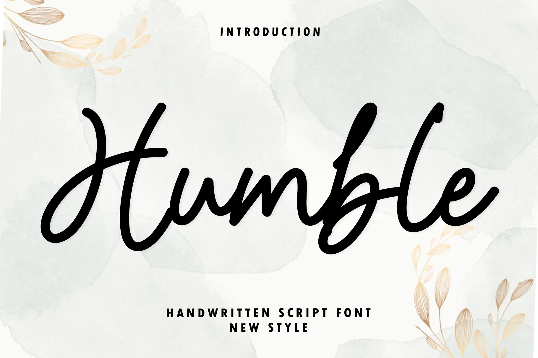
Best For: headlines, short phrases, minimal designs, clean designs
Humble Font has a bold handwritten script style with smooth marker-like strokes, rounded joins, and generous curves that make it feel relaxed but confident. It stands out within Casual Handwritten Fonts for its warm, even line weight, which gives the lettering a grounded, honest tone instead of a fussy calligraphic finish.
The rhythm is broad and friendly, so it performs best in headings and short statements where the thick strokes have room to breathe. A useful detail is its uniform weight: it keeps words clear against textured backgrounds and pairs neatly with simple sans serif text when you want clean hierarchy without losing personality.
Rounded & Playful Casual Handwritten Fonts
These chunky rounded fonts feel cheerful, simple, and approachable, making them useful for stickers, kids’ designs, craft labels, and casual display text.
Archie Font
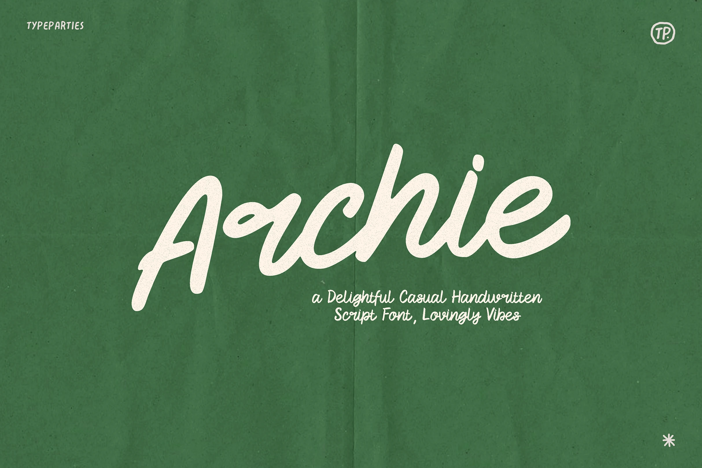
Best For: logos, invitations, social media graphics, quotes
Archie Font has rounded brush-script shapes, soft joins, and broad curves that give the lettering an easy, friendly rhythm. The thick strokes and open forms keep it readable for Casual Handwritten Fonts, while the slightly bouncy baseline adds enough movement to feel personal rather than polished.
It works especially well when you let the word shape carry the layout—short titles, names, or taglines look strongest with a little extra space around them. Pair it with a plain sans serif and keep the line count low, so the generous curves and compact connections do not start to crowd each other.
Punya Font
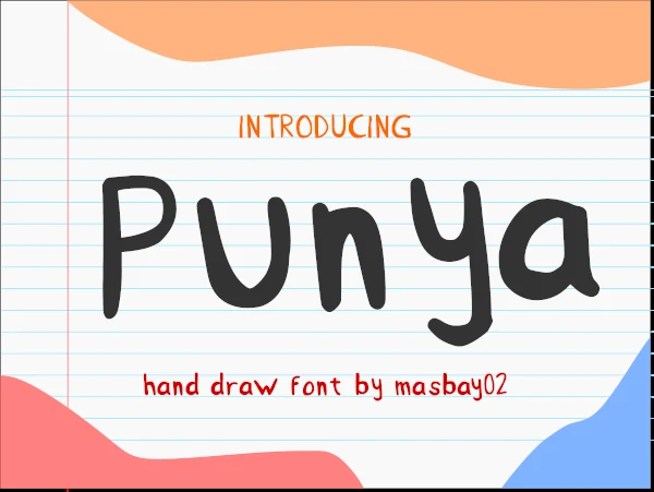
Best For: social media graphics, children’s designs, stickers, quotes
Punya Font uses thick rounded strokes, uneven hand-drawn curves, and a slightly wobbly rhythm that feels cheerful rather than polished. Its broad shapes and simple construction give Casual Handwritten Fonts a friendly, approachable look that stays readable in short headlines and playful display text.
The chunky letterforms work best when the copy is brief and the lines have room to breathe, so the spacing does not turn heavy. It suits simple graphics especially well, where a clean background lets the soft terminals and oversized bowls carry the personality without extra decoration.
Shyest Font
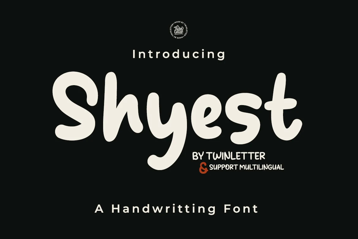
Best For: social media graphics, stickers, quotes, children’s designs
Shyest Font uses thick rounded strokes, soft corners, and a slightly bouncy rhythm that makes the lettering feel cheerful and easy to read. The chunky handwritten forms give Casual Handwritten Fonts a friendlier, more graphic look, so short words stay bold without losing their handmade character.
Because the shapes are wide and compact, it performs best in short headlines, stickers, or social posts where the word shape can do most of the work. Keep line breaks simple and pair it with a plain sans serif for secondary text, especially when you want the playful weight to stand out cleanly.
Thick Font
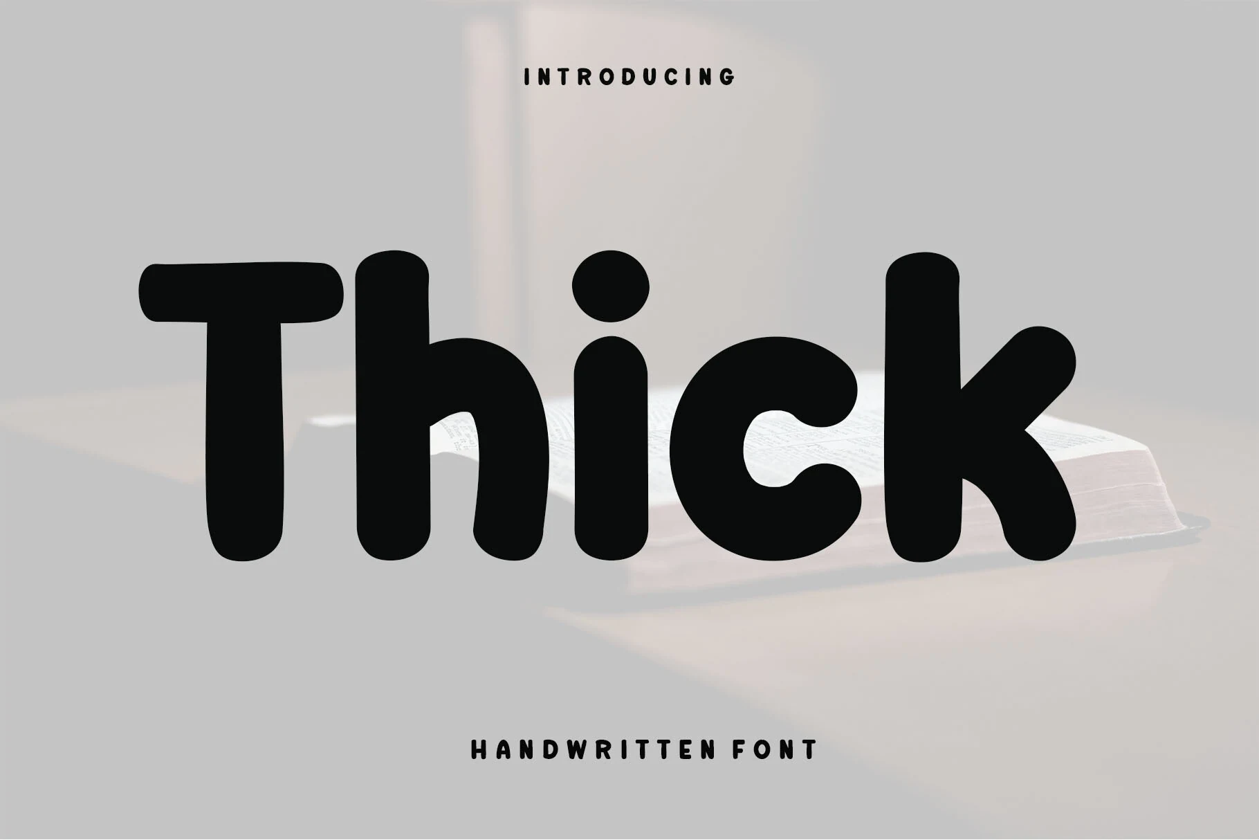
Best For: quotes, stickers, children’s designs, creative projects
Thick Font has a chunky handwritten look built from soft corners, broad monoline strokes, and compact rounded shapes. That weight gives Casual Handwritten Fonts a clearer, friendlier voice, especially when you want a word or title to feel approachable without losing legibility.
The heavy forms hold up well in short phrases, labels, and learning-focused layouts where quick reading matters. Keep the spacing slightly open and let the bold letter shapes do the work, then pair it with a simple secondary typeface so the playful rhythm stays clean rather than crowded.
Seamless Font
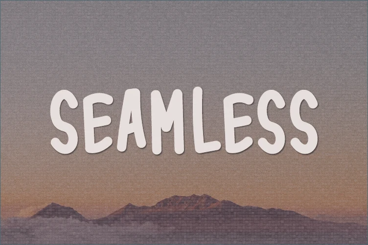
Best For: handmade designs, stickers, casual designs, creative projects
Seamless Font has a rounded, hand-cut look with tall all-caps letters, soft corners, and slightly uneven widths that keep the wordmark casual without becoming messy. Its chunky vertical strokes give it enough presence for display use, while the loose baseline adds the relaxed character expected from Casual Handwritten Fonts.
The letter shapes are simple and open, so it works well when a design needs a friendly title rather than a delicate script. Keep spacing fairly generous in short headlines, cards, craft labels, or classroom-style graphics; the rounded forms look cleaner when they are not compressed against busy textures.
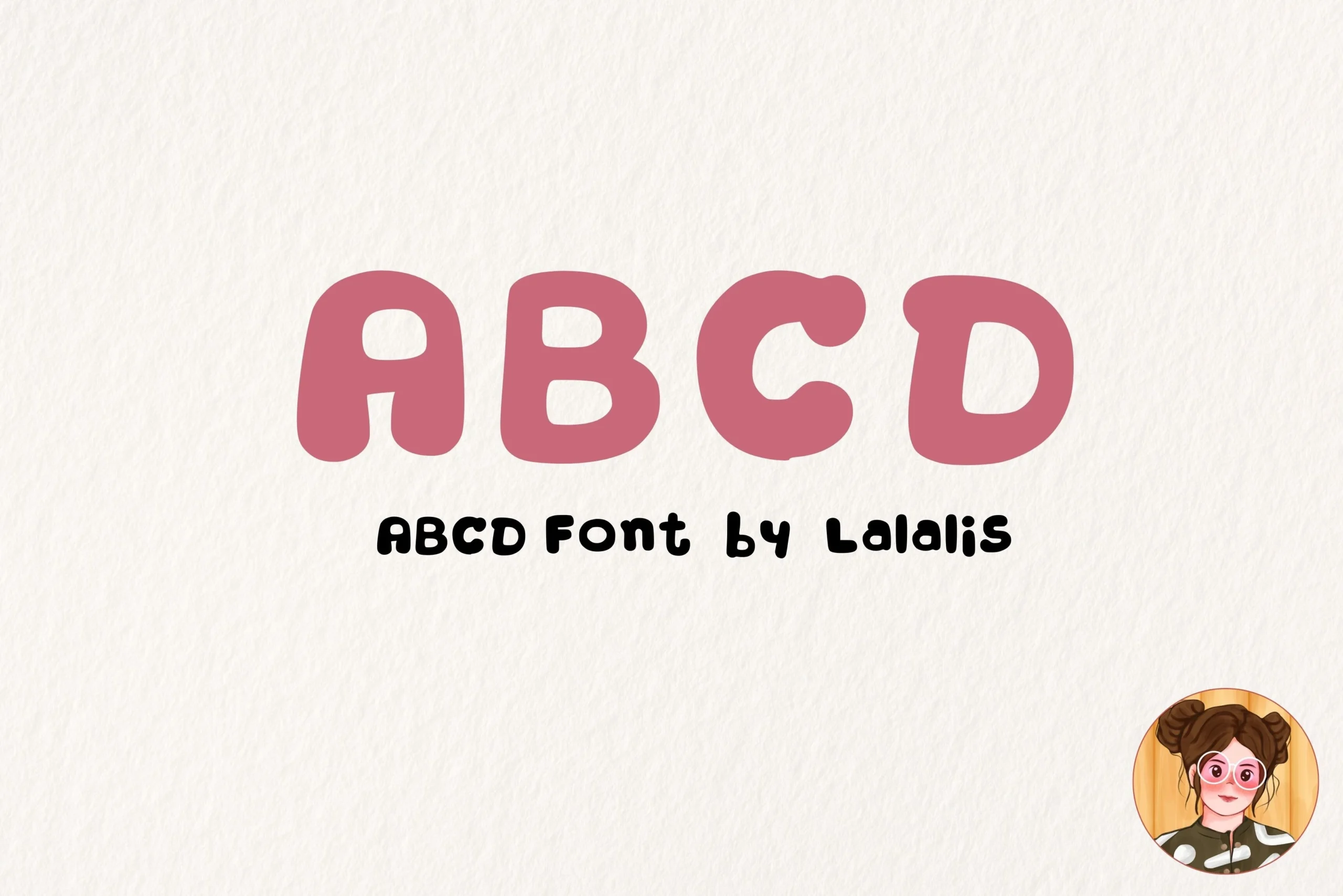
Abcd Font
Best For: children’s designs, stickers, playful designs, cute designs
Abcd Font uses chunky uppercase letters with soft corners, puffed proportions, and small irregular counters that give it a cheerful, hand-drawn bounce. Within Casual Handwritten Fonts, it feels closer to a bubbly title style, so it brings instant friendliness without needing extra decoration.
The weight is even and the shapes are compact, which helps short words read clearly at a glance. It works best in brief labels, kids’ graphics, or sticker text where the rounded forms can stay large; tighter copy would make those playful bowls and narrow inner spaces feel crowded.
Clean Monoline Casual Handwritten Fonts
These slim monoline fonts keep the handwritten look cleaner and more minimal, which works well for modern quotes, website headers, branding, and airy layouts.
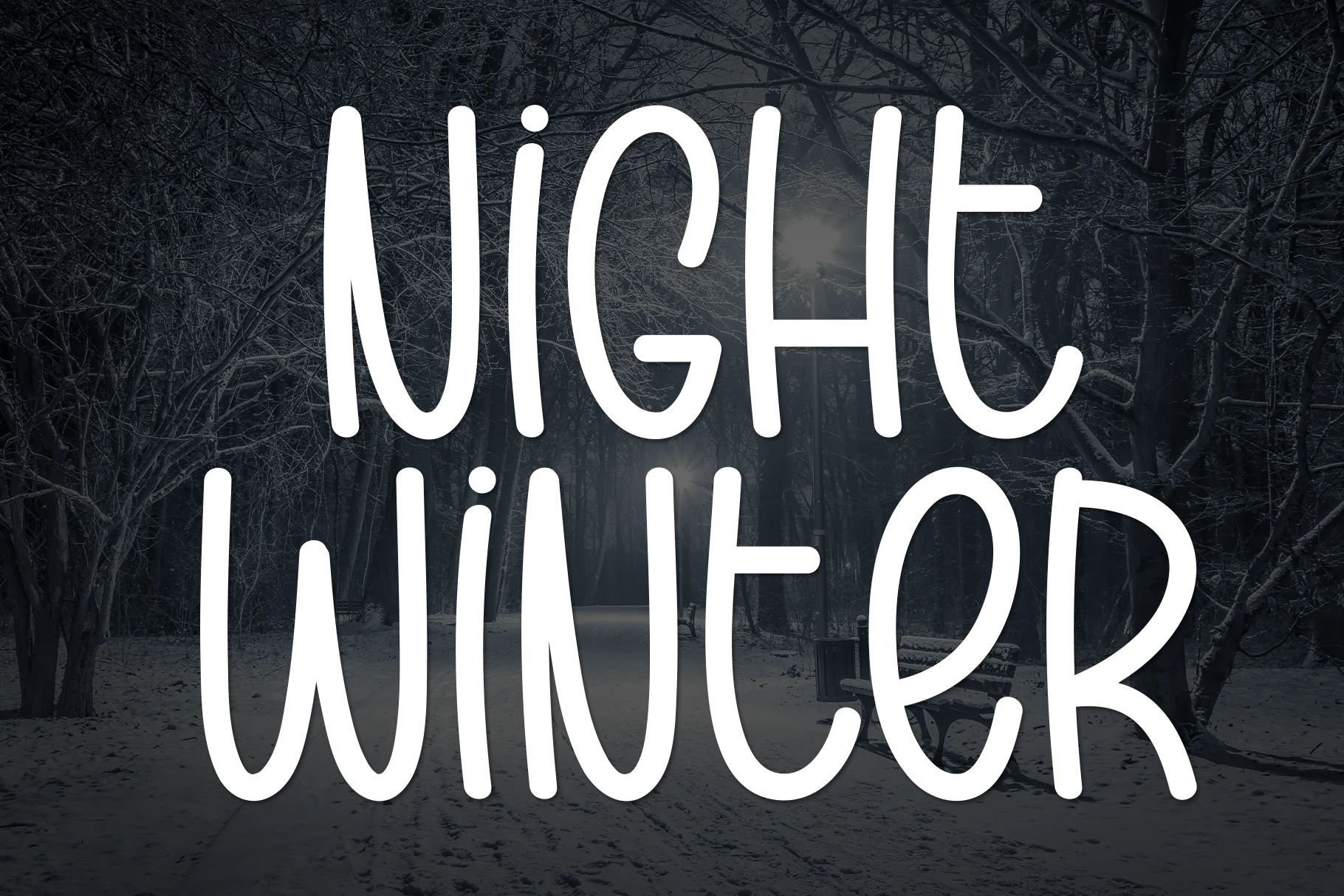
Night Winter Font
Best For: quotes, invitations, branding, social media graphics
Night Winter Font has a tall, narrow handwritten style with smooth monoline strokes, rounded turns, and generous spacing that keeps each letter easy to follow. That clean vertical rhythm gives Casual Handwritten Fonts a calmer, more graphic feel, so even larger words stay readable instead of turning messy.
Its slim proportions make it especially useful when you need a lot of presence without taking up too much width. Try it for stacked quotes, invitation headings, or social graphics, and give the lines a little breathing room so the long ascenders and descenders can shape the layout naturally.
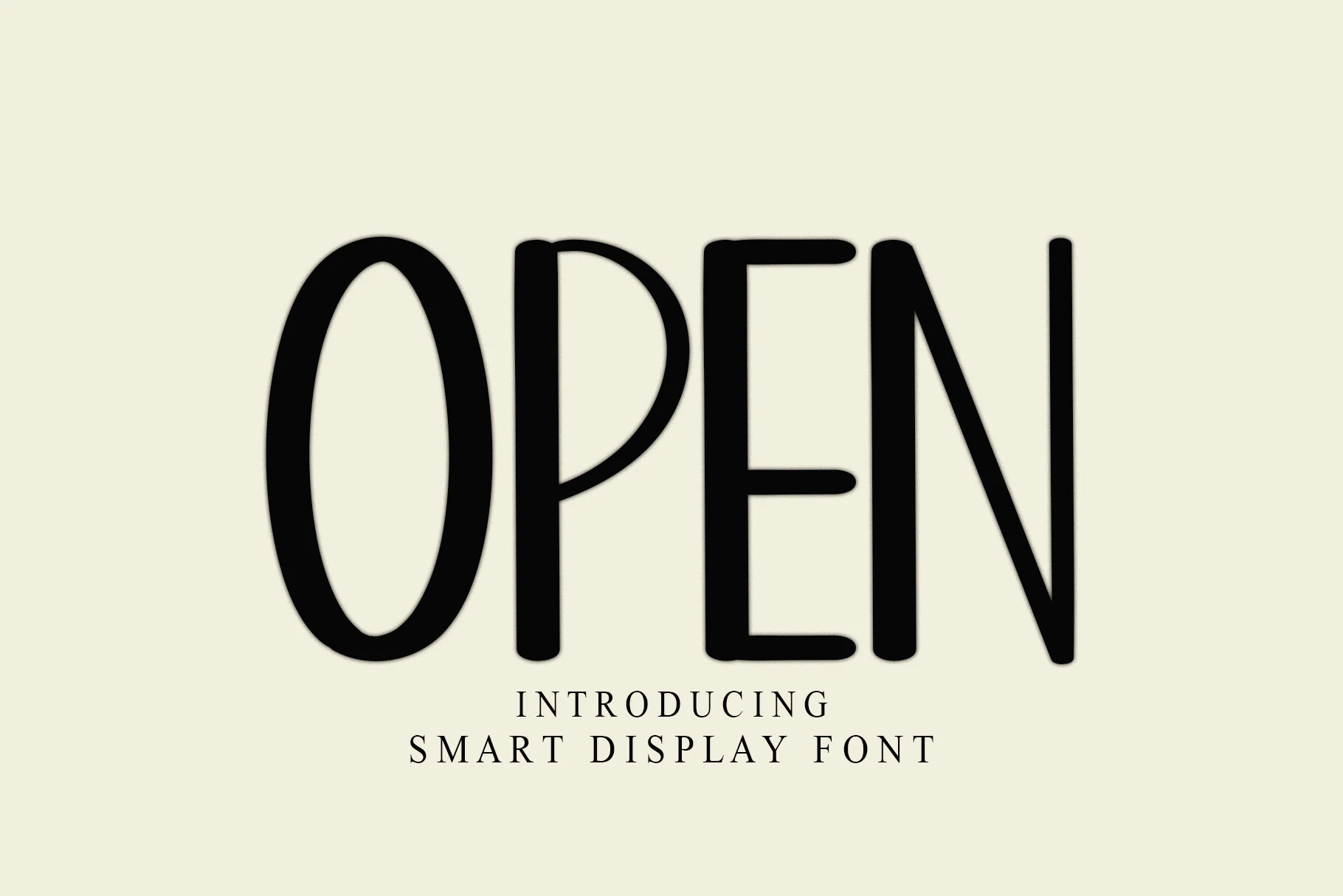
Open Font
Best For: invitations, social media graphics, quotes, minimal designs
Open Font has a tall, narrow handwritten structure with smooth monoline strokes, rounded corners, and generous vertical proportions. Those simple letterforms give Casual Handwritten Fonts a cleaner, calmer look, so the text feels friendly and handmade without becoming overly cute or busy.
The condensed shapes make it useful when you want a large headline without taking up too much width. It works especially well in airy layouts with short wording, where the slim rhythm and open counters can stay clear, while a smaller serif or sans handles supporting details underneath.
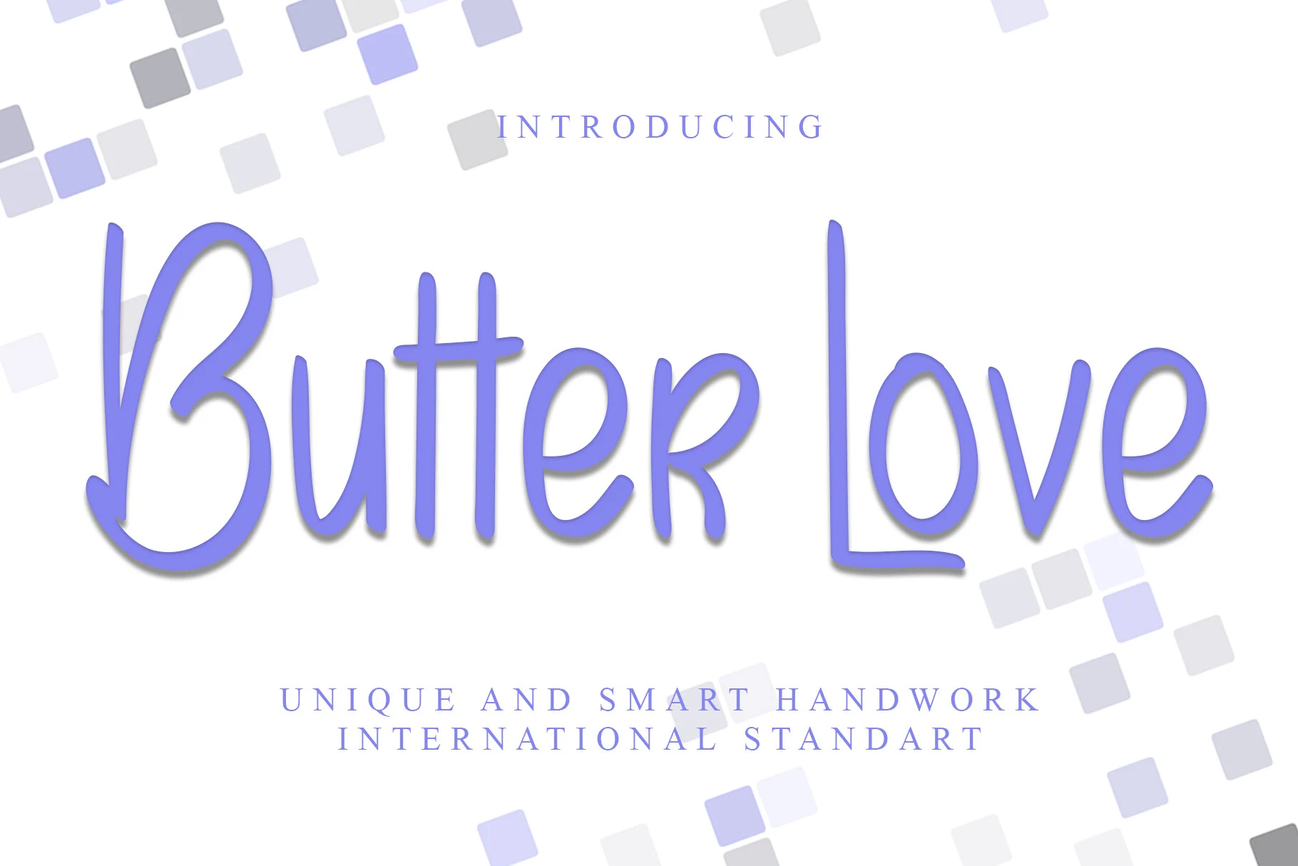
Butter Love Font
Best For: social media graphics, quotes, minimal designs, clean designs
Butter Love Font has a light, elongated handwritten style with ultra-slim strokes, tall verticals, and open curves that keep the lettering airy instead of delicate. It brings a restrained mood to Casual Handwritten Fonts, giving words a relaxed flow while staying easy to read.
The generous height and simple monoline structure make it especially effective in short phrases, where the narrow rhythm can stretch elegantly across a layout. Try it with plenty of white space and compact supporting text; that contrast helps the slim forms stay crisp in quotes, modern branding, and pared-back social graphics.
Riveqesik Font
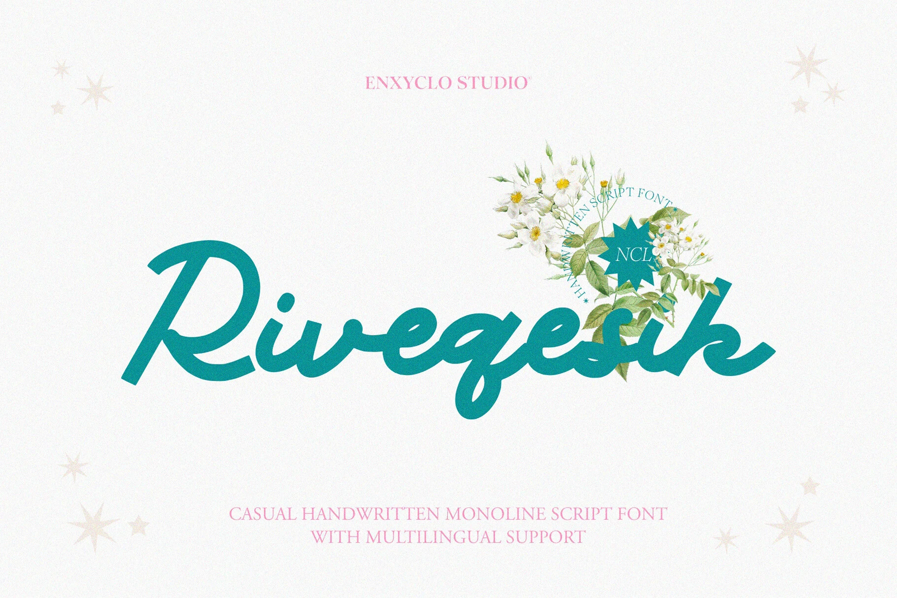
Best For: logos, branding, website headers, magazine covers
Riveqesik Font has a smooth monoline script structure with rounded joins, broad curves, and a gentle forward flow that keeps the lettering clean and easy to follow. It suits Casual Handwritten Fonts that need a polished, airy look rather than a rough brush texture, especially when a title should feel relaxed but still composed.
The even stroke weight helps it hold together at smaller sizes, though its connected rhythm is most effective in large headings where the sweeping forms can stretch across the layout. Give it enough horizontal space and pair it with a restrained secondary font to keep the script readable and the hierarchy clear.
Self Love Font
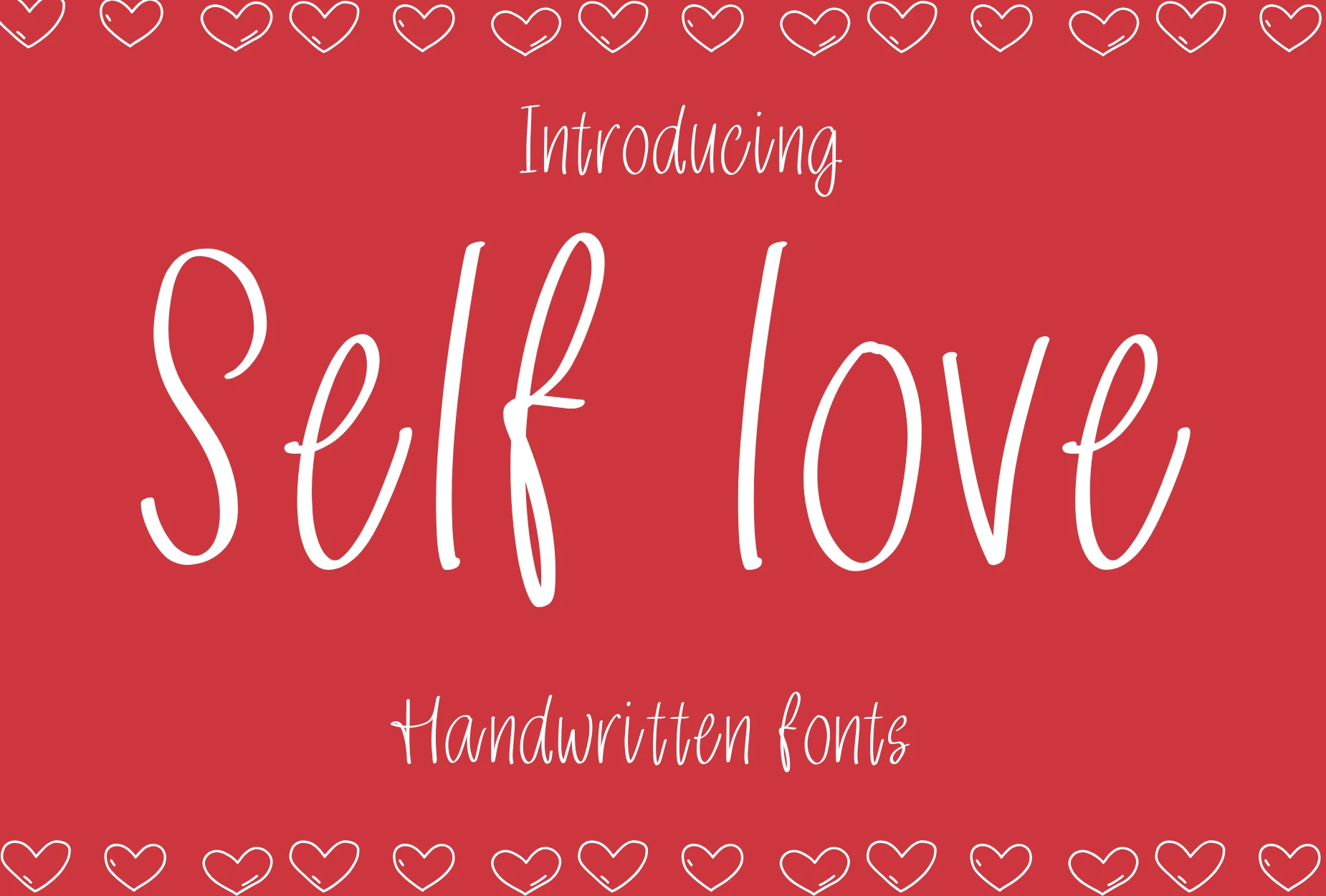
Best For: stickers, T-shirts, romantic designs, cute designs
Self Love Font has a slim, airy handwritten style with long vertical strokes, rounded turns, and a gently uneven rhythm that keeps it personal and light. It suits Casual Handwritten Fonts with a cleaner, more minimal mood, so short phrases feel warm without becoming overly decorative.
Its tall proportions read best in brief lines, where the open spacing and simple monoline structure can stay clear. For cards, planner pages, stickers, or mug and T-shirt designs, give it a little room between words; that extra space helps the narrow letters keep their soft, relaxed charm.
Lonthe Font
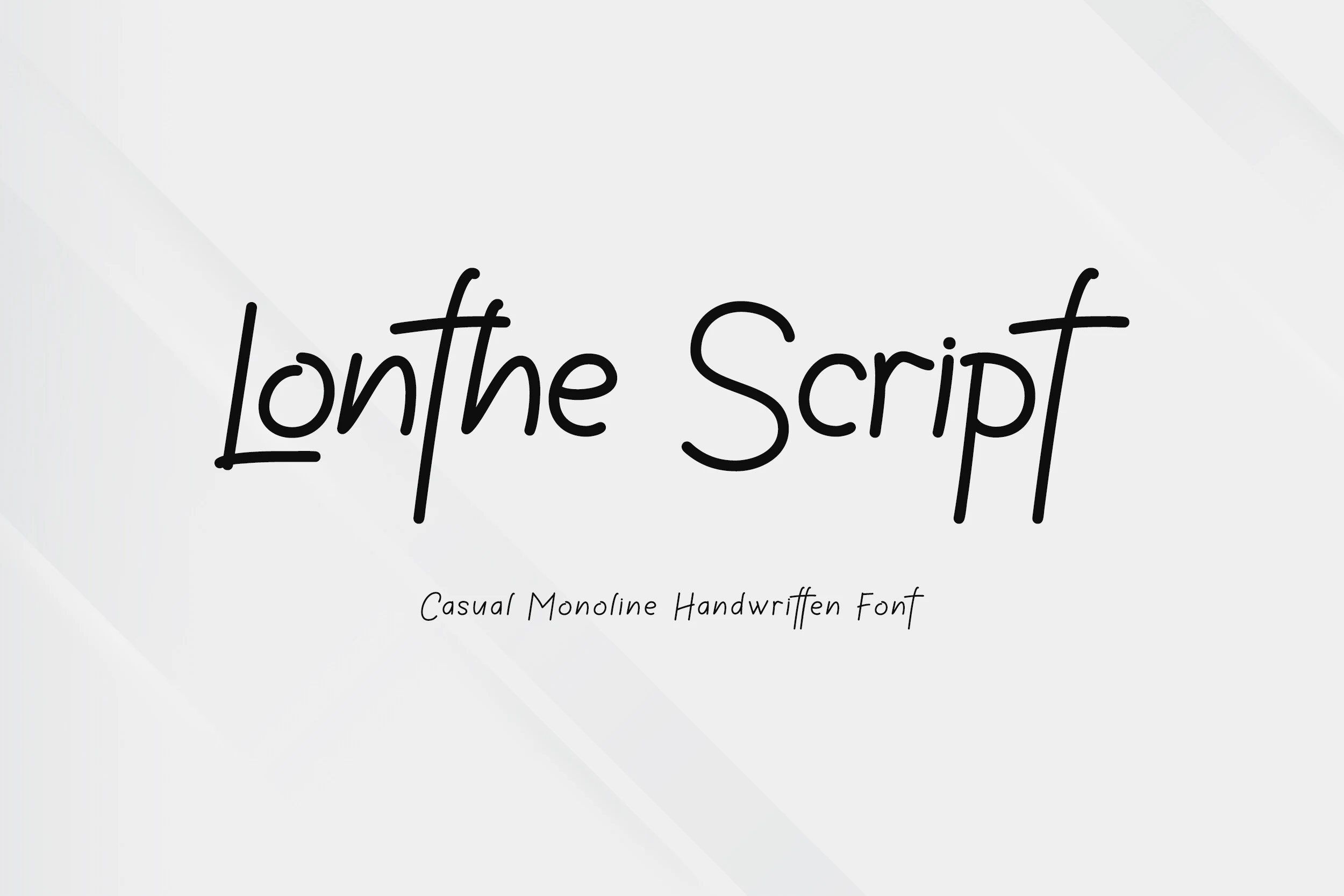
Best For: logos, branding, minimal designs, clean designs
Lonthe Font has a clean monoline structure with rounded terminals, slim upright strokes, and open counters that keep the lettering airy and easy to follow. Lonthe brings a pared-back voice to Casual Handwritten Fonts, balancing a natural handwritten flow with a polished, minimal rhythm.
Its even line weight helps names, logos, and short headers stay crisp, while the taller stems give simple layouts a little lift. It works best when spacing stays open and supporting text is kept restrained, so the smooth script can carry the hierarchy without losing its quiet elegance.
Friendly & Flowing Casual Handwritten Fonts
This set balances soft script curves with clear readability, making it practical for packaging, invitations, social posts, product labels, and warm brand marks.
Gostend Font
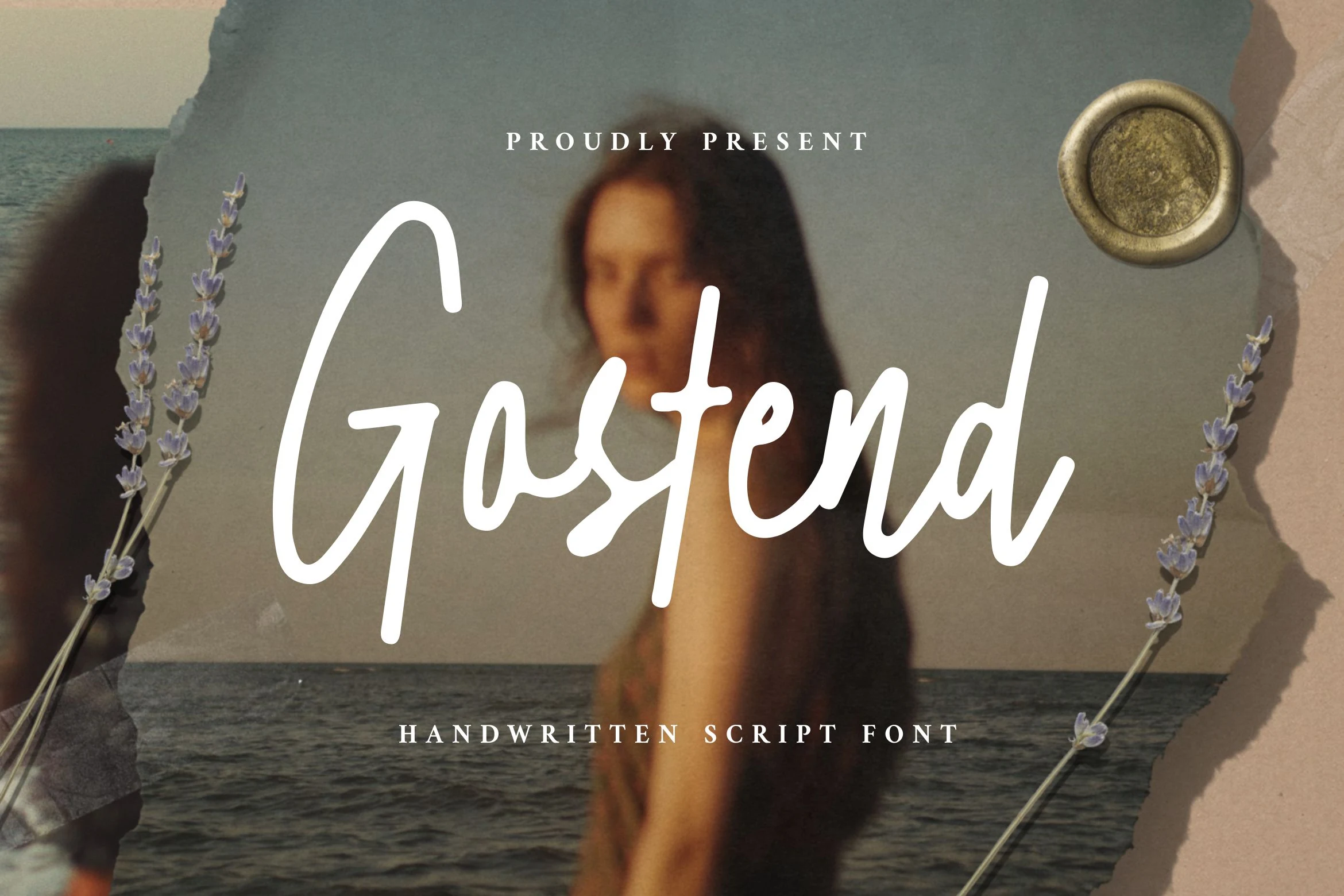
Best For: logos, posters, display text, branding
Gostend Font has a relaxed monoline script with tall verticals, rounded joins, and open counters that keep the lettering airy at display size. The long upright G and slim ascenders give it an easy contemporary flow, making it a strong fit for Casual Handwritten Fonts when you want something informal without looking messy.
It works best in short titles, logo lines, and posters where the smooth strokes have room to breathe. Keep supporting text simple and let the generous height carry the hierarchy, rather than stacking too many decorative elements around it.
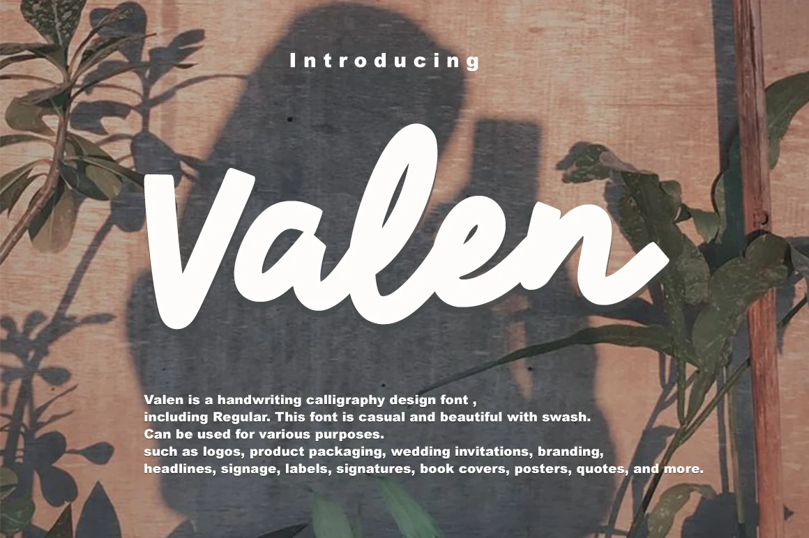
Valen Font
Best For: logos, invitations, quotes, social media graphics
Valen Font has a bold handwritten script style with rounded terminals, thick strokes, and soft curves that make the word shape feel warm and immediate. That fuller silhouette gives Casual Handwritten Fonts a friendlier, more graphic presence, so short titles and names read clearly while still feeling personal.
Its weight makes it strongest in brief lines, where the smooth joins and compact rhythm can hold attention without turning dense. Use it when you want a welcoming headline, and pair it with a light serif or simple sans so the script keeps its softness without crowding the layout.
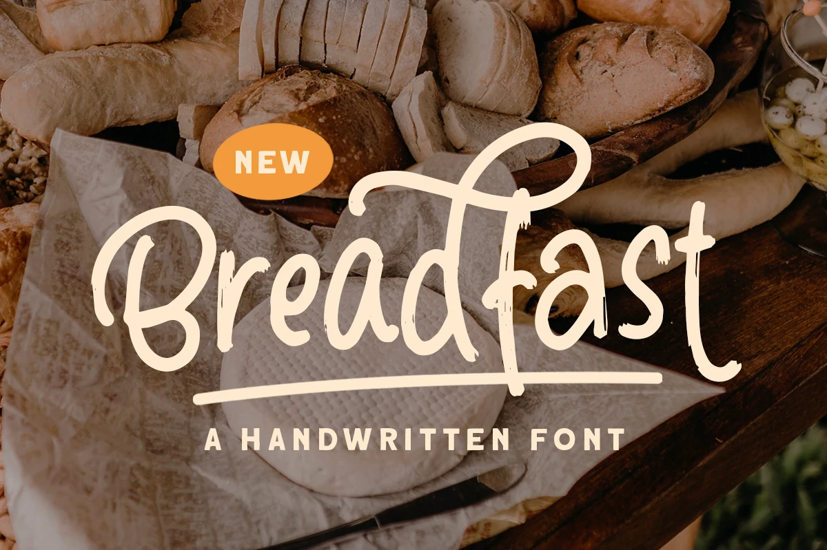
Breadfast Font
Best For: logos, packaging, product labels, casual designs
Breadfast Font has a relaxed handwritten flow with rounded bowls, tall looped ascenders, and slightly uneven stroke endings that keep it warm and approachable. It fits Casual Handwritten Fonts with a more organic feel, giving short titles and brand names a friendly rhythm without looking overly polished.
The broad curves and simple letter shapes stay readable, while the long underline adds a built-in display accent for packaging or signage. It works best when you let the wordmark breathe a little—moderate spacing and clear hierarchy help the looping tops and playful baseline stay crisp in menus, labels, and logo-style layouts.
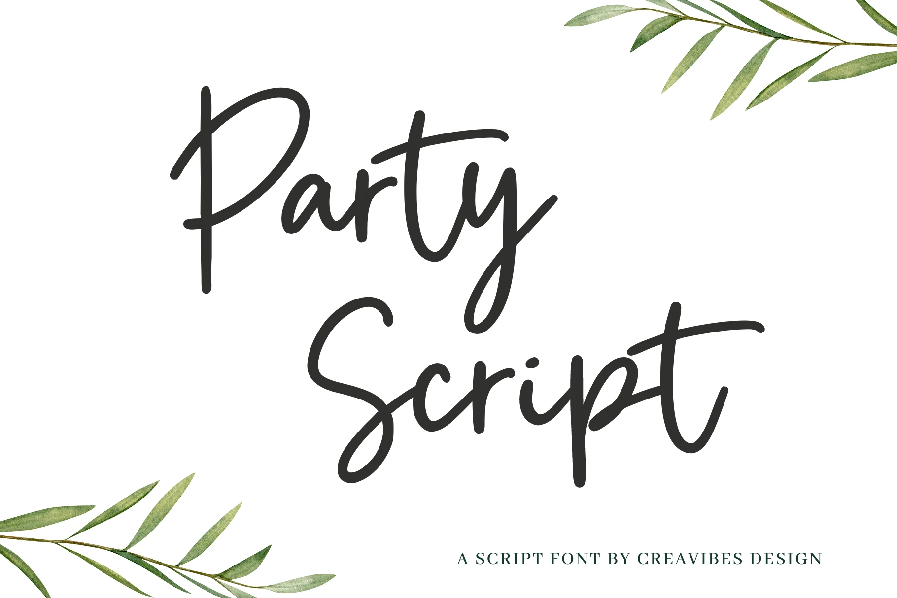
Party Script Font
Best For: invitations, quotes, social media graphics, casual designs
Party Script Font has a clean, flowing script style with tall ascenders, rounded turns, and broad entry strokes that give it an easy handwritten rhythm. It sits comfortably in Casual Handwritten Fonts, but the smoother line quality makes it feel more polished than messy, so it reads clearly while still keeping that relaxed, celebratory tone.
The oversized capitals and long cross-strokes give short phrases a natural sense of movement, especially in names, headings, or card fronts. Keep it as the star of the layout and pair it with simple supporting text; the open curves and generous proportions hold up best when the hierarchy stays clean and the wording stays brief.
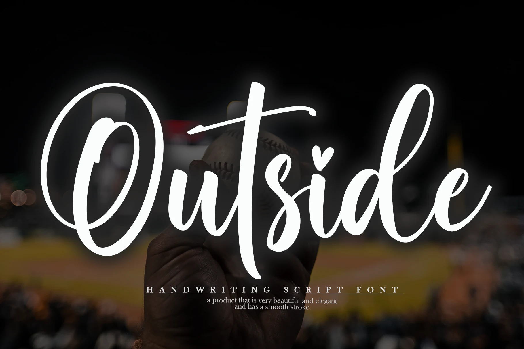
Outside Font
Best For: social media graphics, quotes, personal branding, casual designs
Outside Font has a smooth, rounded script style with a dramatic looping capital O, tall ascenders, and a relaxed baseline that keeps the lettering friendly and open. It fits Casual Handwritten Fonts that need a softer, more welcoming tone, with enough flow to feel expressive without becoming hard to read.
The strokes stay fairly even, so names and short phrases look clean while still feeling personal. A practical advantage is its generous width: it fills space beautifully in quotes, profile graphics, or simple branding, especially when paired with compact supporting text that lets the sweeping capitals do the work.
Bellfast Font
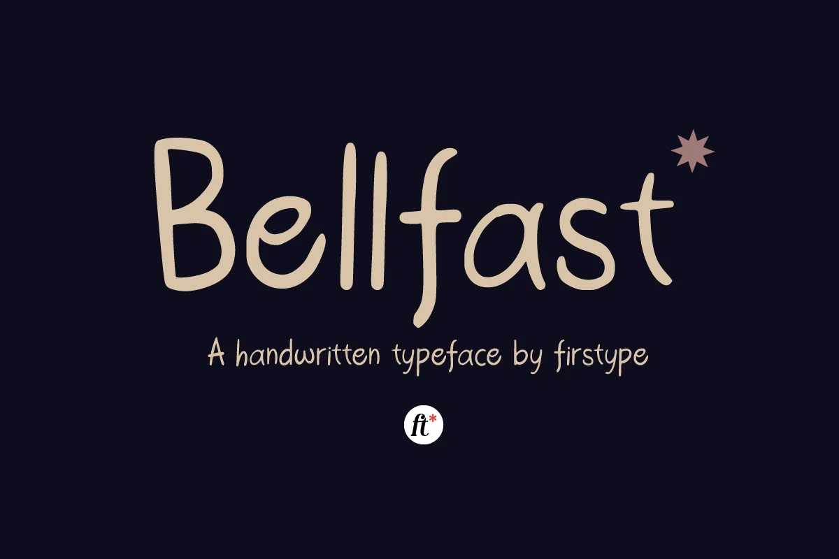
Best For: social media graphics, packaging, product labels, casual designs
Bellfast Font has a friendly handwritten look built from rounded monoline strokes, upright proportions, and slightly uneven curves that keep the lettering approachable. It fits naturally with Casual Handwritten Fonts, but instead of a messy brush texture, it leans clean and simplified, giving words a soft, conversational tone.
The open counters and steady spacing help short text stay clear, while the tall stems give simple wordmarks a little extra personality. It works especially well when you want packaging or social graphics to feel warm and personal; keep the surrounding layout uncluttered so the relaxed rhythm of the letters can do the work.
Conclusion
Choose elegant signature fonts when the design needs refinement, bold brush fonts when the headline needs impact, rounded fonts for playful work, clean monoline fonts for minimal layouts, and flowing scripts for warmer everyday branding.